Greetings, manufacturing companies! Are you seeking to enhance your online presence and reach more customers? Look no further, as we’ve got you covered with our guide to the top 50 manufacturing websites.
Our team of experts has scoured the web to find and evaluate the best manufacturing sites based on design, functionality, uniqueness, and user experience. From sleek and professional designs to effortless navigation, these sites are the crème de la crème of the manufacturing world.
Not only will you find inspiration for your own website, but you’ll also gain valuable tips on how to make your online presence stand out.
Tool up and give your manufacturing business a boost with the help of this guide! You’ll find website examples of industrial machinery, food & beverage, pharmaceutical, automotive, textile & clothing, and chemical manufacturers in this list! For examples within other industries, head back to our professional web design examples article!
Top Manufacturer Website Designs
1. Pierce Manufacturing
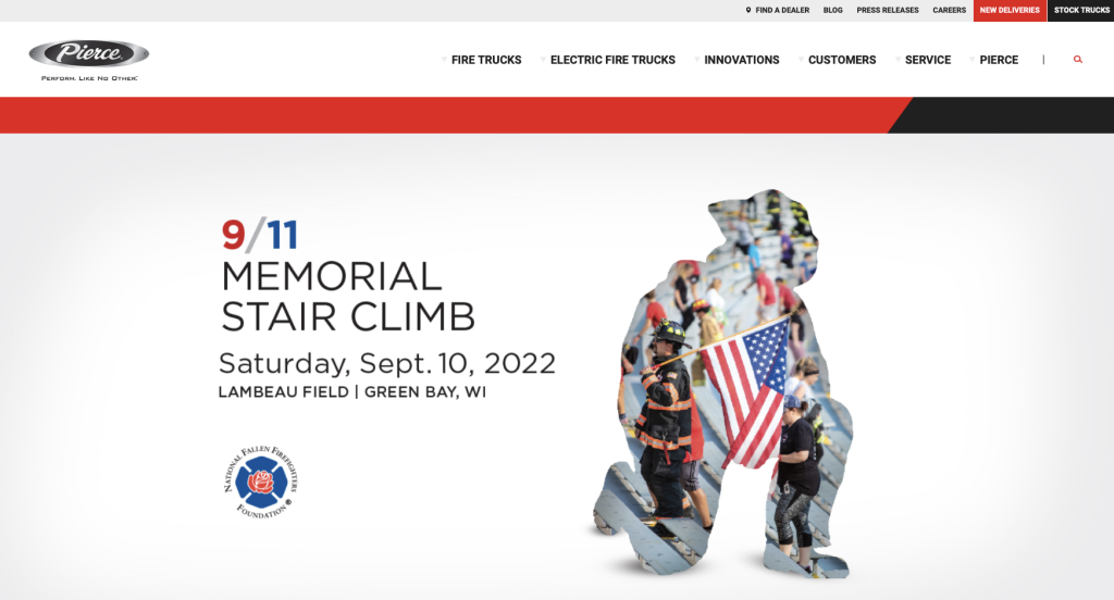
One of the first things that you will notice on visiting the website is the bold choice of colors. The red and black combination manages to capture the viewers’ attention the moment they click on the website link. Therefore, the average time spent on the website is higher, and the viewers are more likely to avail the services offered.
Also, the website lists all the latest blogs related to the service it provides, giving the users ample scope to properly understand what the brand is about. And you see all the brand’s social media handles highlighted at the bottom of the home page.
2. Lincoln Electric
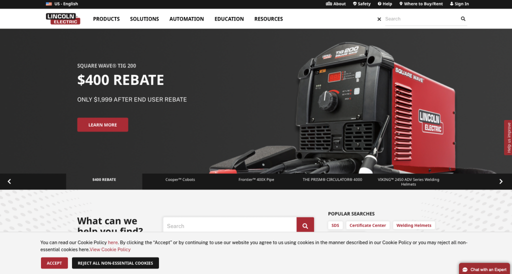
This website is built keeping the user’s convenience in mind. The first thing that will catch your attention after landing on the homepage is the “what can we help you find” option. You will have no problem locating the search bar and will be able to find what you’ve been looking for.
On the top left corner of the website, you will find the menu. And with one simple click, you will get access to a wide range of educational material and resources that might be of great use to you. The “help us improve” tab also requires a special mention.
3. Oshkosh Corporation

Once you visit the website, you will surely marvel at how the black and white combination gives it a clean and organized look. There are multiple images on the website that help to draw viewers’ attention and increase the time they spend on the site.
If you scroll down to the bottom of the home page, you will find a section that has the addresses of all the brands the website represents. And lastly, if you want to follow Oshkosh on social media, the links to the platforms are also made available at the end of the page.

4. Rice Lake Glass
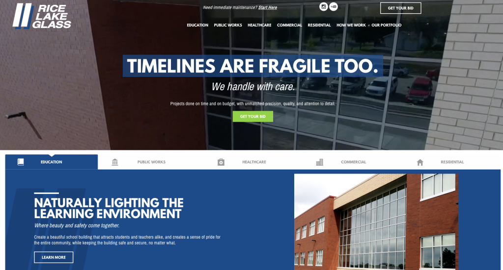
This website for Rice Lage Glass looks professional and stellar at the same time. The background color is white to ensure a pleasant experience for viewers, leading them to spend more time on the website. Also, the “Get You Bid” tab is colored green and turns orange as soon as you hover over it. This will make the website visitor want to click on it.
If you scroll down to the end of the page, you will find the necessary contact information. In case you want to work with them, there is a “careers” section to check out.
5. Eagle Performance Plastics
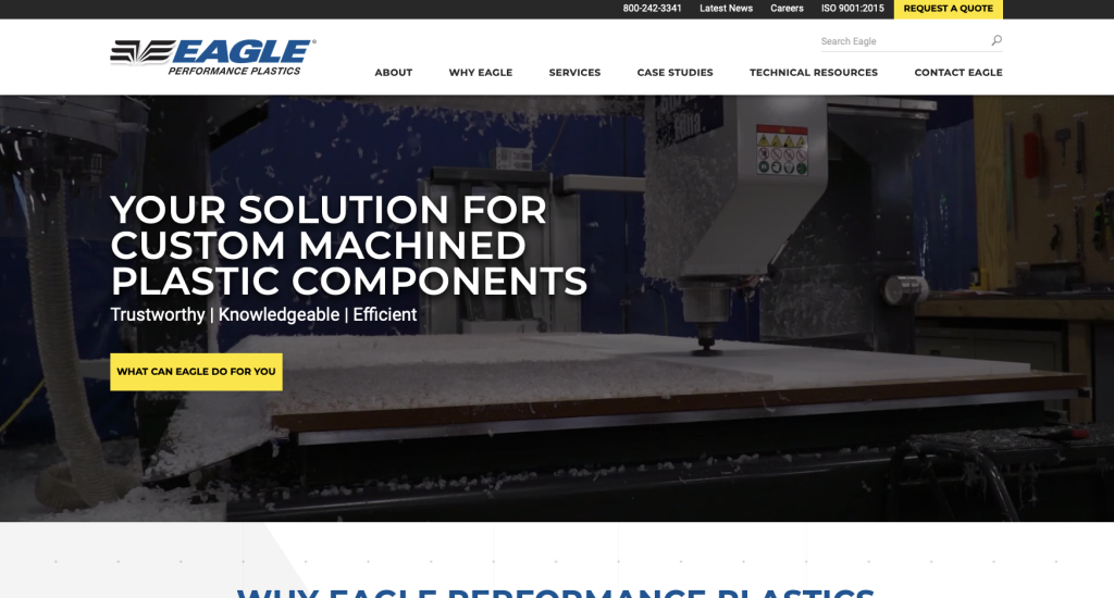
For those who do not like too many options and elements spread over a webpage, this website can be of great inspiration. The design elements are minimal, and the yellow and blue color scheme highlights all the important aspects of the website. Details about the company’s service and the “request a quote” option is highlighted in yellow and impossible to miss.
Additionally, if you want to read specific case studies published by the company, you can browse through the specific section dedicated to it towards the end of the home page. Scroll left or right, and you can click on the one you want to read.
6. Graco
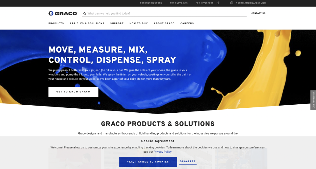
The website designers of Graco surely know how to attract people. Rest assured that the vibrant blue and yellow on the landing image will make you want to know what’s in store. On the home page, you will get to see a tab that says, “get to know Graco.” What better way to give the visitors a glimpse of what the company does?
As you scroll down the page, you will find all the services it provides listed in a clean and organized manner. So, you do not have to spend hours finding what you came looking for.
7. VanZeeland Manufacturing

You will definitely like the website if you are attracted to bold and minimalist designs. The black and yellow color scheme manages to draw your attention as it is quite eye-catching. And the first thing that you will get to see on opening the website is a quick peek of all the services that VanZeeland Manufacturing has to offer.
Head to the top of the page if you want to check the products and equipment the brand offers. If you want to get in touch with the company, you will find the contact number both at the top and at the bottom of the page.
8. Sonoco
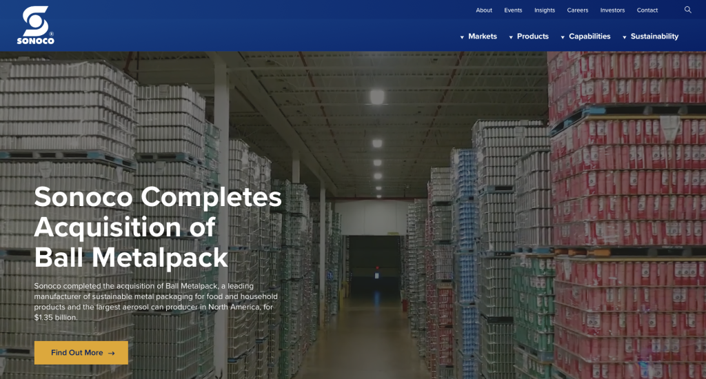
The first two things that will draw the visitor to the website and make them spend considerable time on it are the videos and “sustainability story” section that can be found on the home page. Sonoco broadly uses a blue and white color scheme for its website layout. However, to highlight special elements and features, the designers have put yellow to use.
If you are looking for the services the company provides, scroll down to the end of the page and click on the “let’s talk solutions” tab. Also, it is pretty impressive how the website links to all the other websites that the company owns.
9. A to Z Machine
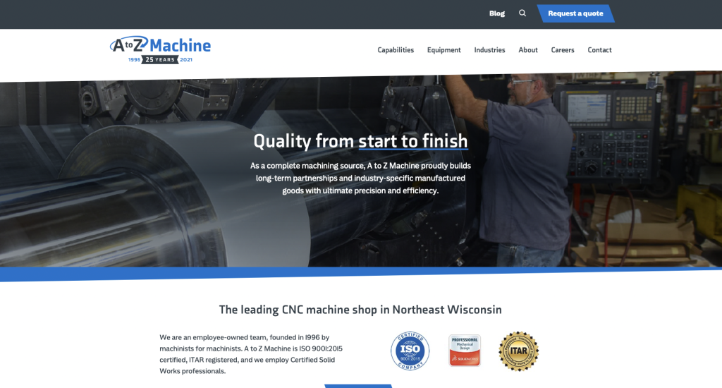
This website is a great example of how businesses can chart out their services clearly and boldly. The blue and bluish gray layout is such that you will have no trouble finding what you are looking for. And because of the font style and size, you will be able to read clearly without having to strain your eyes.
On the top right corner, you will find a menu section where you can get further details about the company and its equipment. Here, you will also find blogs that might interest you. And if you want a quotation, just head to the bottom of the web page.
10. Plexus Corp.

There’s only one word for this website – magnificent. As soon as one enters the website, they are welcomed with a pleasant red landing image that will only make them more inquisitive to find out more about the company. Also, you will find an introductory video on the home page that delves into how Plexus is helping build a better world.
Starting from company reports for job opportunities, the website has all the information that a visitor might be looking for. If you keep scrolling down, you will find a world map with red pins identifying all the places where the company operates.
Related: Take control of your digital marketing through lead generation, social media marketing, and online reputation management for your manufacturing company.
11. Evolution Manufacturing

This website is designed in a manner that demands your attention. The stellar teal and white combination is something that most visitors find highly appealing. On landing on the website, you will find a detailed “About Evolution Manufacturing” section that will help you get acquainted with the brand. This is followed by details of the services the company provides.
It is noteworthy how the designer has included a map at the end of the page, making it easy for visitors to locate the store. Additionally, there’s a contact form that you can use to drop messages to the company.
12. Proto-1 Manufacturing
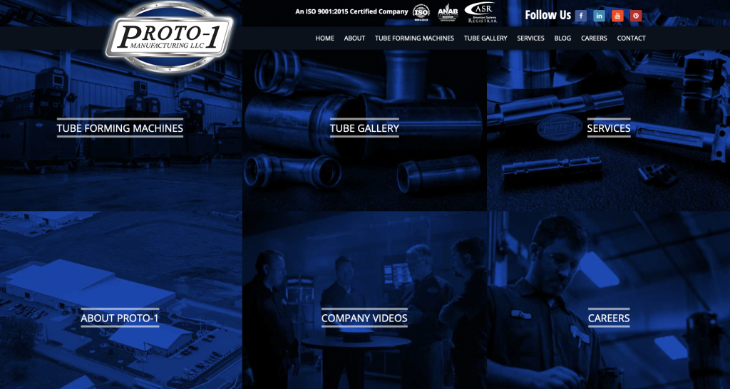
When it comes to designing a manufacturing website, Proto-1 Manufacturing has surely done a great job. The website has a good mix of images and written content that manages to describe the brand’s services perfectly. You will find important information about the companies that the brand has worked with.
And on the very top of the home page, you will find the links to all the company’s social media handles, including LinkedIn, Facebook, Youtube, and Pinterest. In case you are interested in reading blogs, go to the menu ribbon, and you will find them.
13. Encapsys
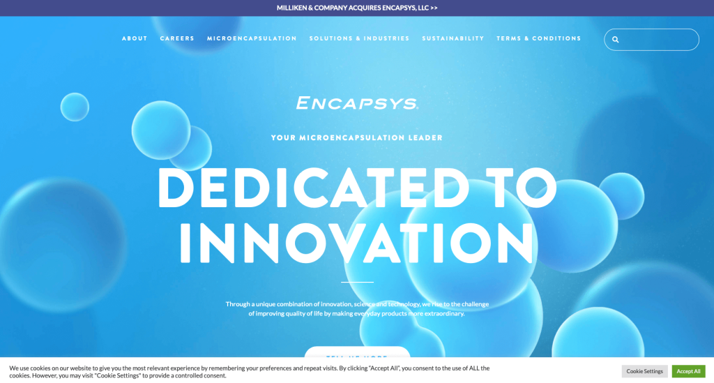
As the name suggests, the website manages to encapsulate the visitors by its extraordinary simplicity. On visiting the homepage, you will be greeted with a “tell me more” tab that will help you learn about what the company has to offer.
Click on the “about” option, and you will find a detailed history of the brand’s achievements, which have been listed neatly for visitors to see. And the soothing blue color scheme that the designers have chosen for this website will make you want to stay a bit longer and check out the services.
14. Go Fast Manufacturing
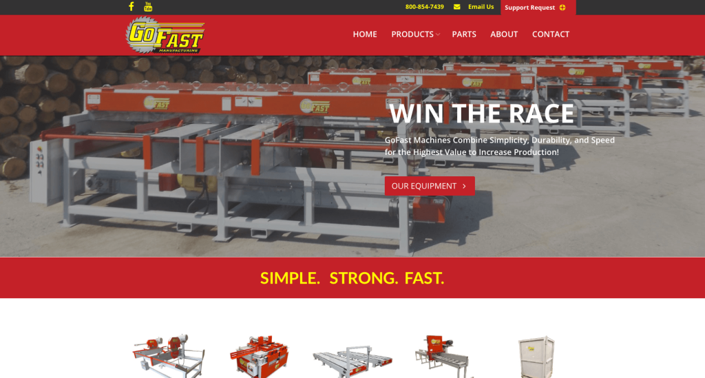
Go Fast Manufacturing’s website uses one of the most successful color combinations that enjoys popularity on the market: yellow and red. This color scheme runs throughout the website, and that, along with bold fonts, makes it very easy for the visitor to read the content.
Moreover, on scrolling just a bit, you will find a section where you will have to put in all your details, and the company will send a complete brochure. And on the top of the home page, there’s a “Support Request” section highlighted in red. You can click on it if you need any assistance from the company.

15. Sharretts Plating
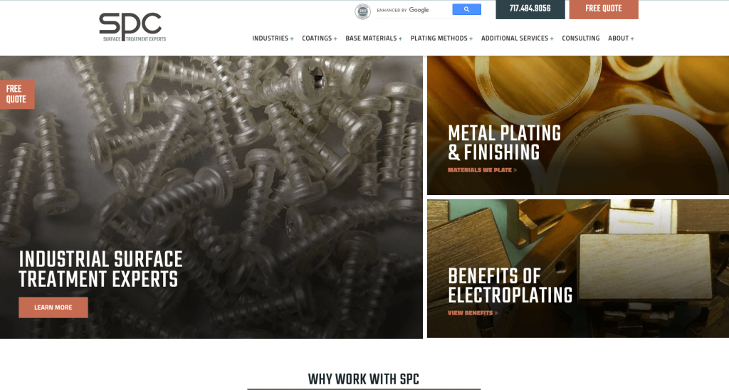
This website mainly relies on bright hues and colorful images to draw the visitors’ attention. And they do a good job at it. Because the pictures used are pretty bright, the designer has kept the background color white for a minimalistic appeal. So, the images and the text content pop out really well and become quite easy to read.
At the top right corner of the website, you will find a “free quote” tab in a rust-colored box. And in case you are interested in the newsletter that the company publishes, scroll down to the bottom of the page and enter your email id.
16. Plex Smart Manufacturing
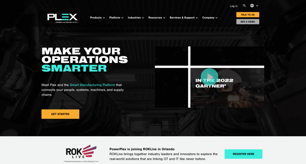
The one word that will come to your mind when visiting this website is innovation. In a smart way, the website designer has managed to use a black background and suitable design elements that will attract anyone who visits the site. On the top right corner of the home page, there’s a search icon that will quickly lead you to what you are looking for.
And if you scroll a bit down, you will notice that all the major customers of the brands have been highlighted and neatly listed. The website also has a chat box in case you have questions.
17. Marion Body Works
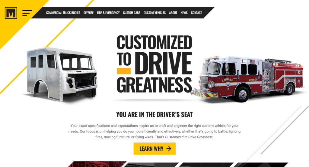
With a bold black and yellow color scheme, the website of Marion Body Works manages to reflect the service they provide clearly. At the start of the page, you will notice multiple images of the company’s custom vehicles. So, right at the beginning, the visitor gets a glimpse of what they are in for.
Every element is well thought out and organized, making it very easy for visitors to browse through the website. Also, the website features a section from which you can easily download a free guide that includes maintenance tips and checklists. And to connect on social media, simply head to the end of the page.
18. AngloAmerican
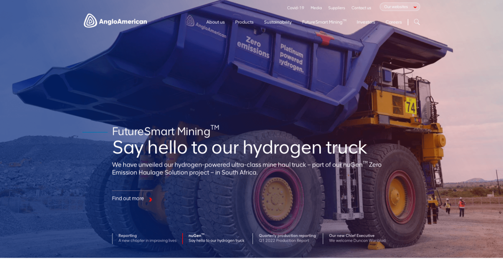
Along with white, the website of AngloAmerican uses purple and orange undertones, which makes it pretty eye-catching. The font used is bold and clearly spaced, making it easy to read the texts. There’s enough blank space on the website that makes both the written and visual content pop out.
The website has links to different company websites of all the countries in which it is present. You can scroll to the page end to check which countries the company operates in. At the page end, there is also a “red envelope” icon that you can click on to get the latest updates.
19. CST Tires
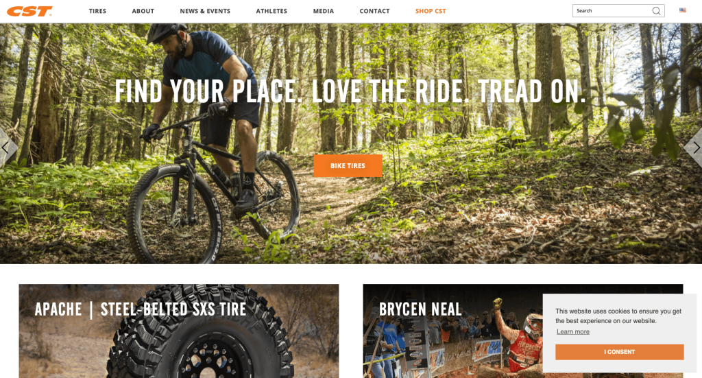
On the website’s home page, you will see more visual content than written. That makes the outlook very appealing and attractive as images manage to draw more attention than any other element. And these images all link out to the products and relevant achievements of the brand.
If you go to the top left corner of the home page, you will find all the important information regarding the brand. You can directly go to the “shop” tab and make purchases if you want. Also, you can head to the bottom of the page to find details about the warranty.
Related: Take a look at paid advertising options through a PPC agency with experience helping manufacturers get leads.
20. MAC Instruments

MAC Instruments has a website design that is spectacular and clean. The website uses a combination of black, gray, and white as background colors. And for the highlights, to make the options pop, the designers have very smartly used a beautiful shade of pastel blue. On the home page, you will find all the flagship products neatly charted out.
Also, the website makes it very easy for the visitor to find the necessary contact information. The address, phone number, and email address are listed at the topmost section and bottom of the website, making it easy for the visitor to access them.
21. Anduril
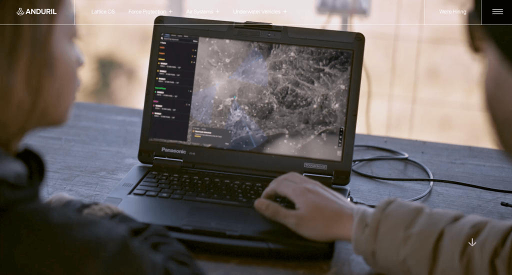
On visiting the website of Anduril, you will be welcomed with an intriguing video that will give you a glimpse of what the company is about. As you scroll through the page, you will notice that the layout is clean and crisp.
All the details are listed one after the other, and in case you want to delve into anything particular, you will just have to click on the “learn more” option.
The entire homepage is filled with bright and interesting images that tell you the brand story like nothing else. You will also find the contact information at the bottom of the page.
22. Rockwell Automation

This website is simple, well-organized, and makes good use of white space. The layout is well thought out, and that, along with the white space, makes sure that the visitors are not bombarded with content. All information is placed right where it should be, and you will not have a problem locating what you came looking for.
On the right-hand side of the page, there’s a “feedback” option, where you can leave your valued comments/suggestions for the company.
23. John Deere

The website of John Deere is designed in a way that the visitors won’t be left guessing what they are in for. On entering the website, you will be greeted with all the services that the company provides. And if you believe in sustainable and responsible purchasing, you can check out their “shop pre-owned section.”
To be honest, the color scheme of white and green goes well with the agricultural equipment services that the company offers. Towards the end of the page, you will find a “shop now” option to purchase John Deere merchandise.
24. Weima
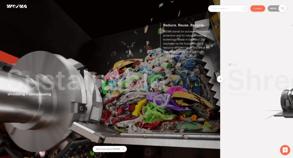
This website for Weima will have your attention from the moment you enter it. The first thing you will notice on the home page is a mix of intriguing images, graphics, and animation, all of which throw light on what the company does. And there is a small “swipe” option on the right side of the screen that you can use to check all that the company does.
On the top right of the screen, you will find the “contact” and “menu” options side by side. And towards the end of the page, you can check out the press coverage.
25. JCB
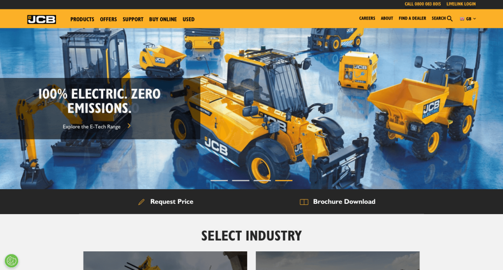
JCB is a company that needs no introduction, and the same is true for its website. Hover on the top left corner of the home page, and you will find all the products listed alphabetically, according to industry.
The layout is intuitive so that you will have no trouble buying a product or just getting a quotation. You will find the “request price” and “brochure download” options on an orange ribbon.
Wondering where all JCB can be of help? The website will guide you as it neatly displays all the areas JCB works in.
26. Caterpillar

The website of Caterpillar makes use of black and yellow as the primary colors. However, to make the sections pop out, the background color is kept white. And there’s enough blank space, ensuring that none of the visual or textual content looks cluttered.
Moreover, on heading to the top right corner of the screen, you get the “register now” option. You can click on it if you want to have a personalized website experience. One can also head over to the “CAT blog” option present on the home page to get expert advice and business tips.
27. Markforged

If you are looking for a website inspiration that is bold, precise, and will manage to grab the visitor’s attention, this is the one! The Markford website makes use of yellow and black to look appealing and make it look like they mean business. Also, the designers have used white for the fonts and kept them large to immediately draw the visitor’s attention to the textual content.
What is really interesting is the “how may I help you?” option, which remains present even when you scroll up and down the homepage.
28. DuPont
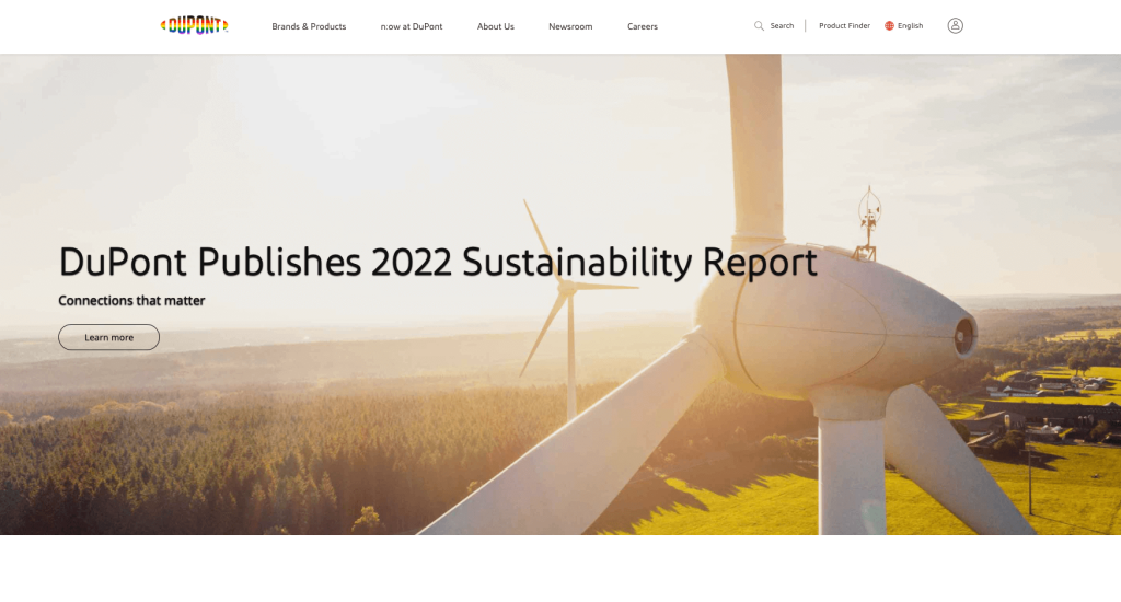
When it comes to creating a top-notch manufacturing website, Dupont has aced the game. The website has kept the background color white to ensure that all the other elements get highlighted.
On the homepage, you will find a great mix of relevant images and text that will tell you more about what the company has to offer. And every section has a “learn more” option, which you can click to get a deeper understanding.
Towards the end of the page, you will find all published news about the company and links to the social media handles of Dupont.
29. Molecular Products
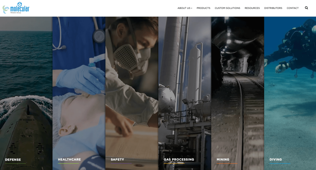
The website of Molecular Products has all the elements that are on point and manages to offer necessary information to the visitors. On landing on the homepage, you will see that all areas where the company provides services are listed neatly. And on each section, there is a “find out more” option that you can click to know about the services in detail.
You can even hover on the top right side of the screen to get access to the products and other resources offered by the company.
30. Tungco
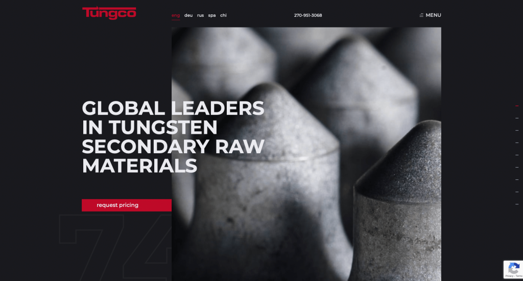
Tungco’s website uses one of the best color schemes that make it very visually attractive. The red and black color combination is bold and assertive and manages to grab the viewer’s attention. Honestly, the color scheme, along with the bold white fonts, is what makes the textual and visual content stand out.
Right after landing on the homepage, you will find “shop” and “sell” that you can click on to check the two primary services offered by the company. And on scrolling down the homepage, you will find details about what makes this company stand apart from its competitors.
31. Fairlawn Tool Inc.

The blue and gray color combination present on the Fairlawn Tool Inc goes well with the service and product it provides. To be honest, the blue is very soothing and striking at the same time. On the homepage, you will find details about the company and a “contact us” option that will help you get directly in touch with the company.
And towards the end of the page, you will find interesting blogs that you can go through to learn more about metal and its working. They are a good resource, and you will enjoy spending time reading them.
32. GE

If you like powerful images and bright visual components, this website of GE can work as a perfect inspiration for you. On the top ribbon of the homepage, you will find the company logo, “search” icon, and a menu with a list of options. Basically, all the needed information can be found here. And in case you have difficulty locating anything, just use the “search icon.”
In case you want to know a bit more about the team at GE, you will just have to scroll down the homepage.
33. Aalberts
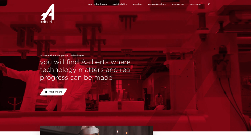
What’s most impressive and eye-catching about the website is the video that you see right after landing on the page. It uses a red filter, and that makes the content all the more intriguing. And in this video, you will find a “who we are” tab that you can click on to learn more about what Aalberts does.
If you scroll down, you will find interesting case studies, new reports, and job openings too. And in case you want to check out how the company is making a sustainable impact, you can click on the “take a tour option.”

34. Glauber
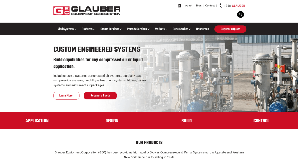
The website of Glauber will have you at hello. It is the red and white color combination used on the website that gives it a bright and attractive touch. And the layout is designed well so that you will have no problem browsing the website and finding what you’ve been looking for.
If you want to get a price estimate for the service that Glauber provides, there is a “request a quote” button right at the beginning of the homepage.
Related: Turbo charge your manufacturing company’s organic traffic through search engine optimization services like content writing, link building, and page speed optimization.
35. TexTech Industries
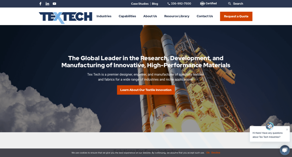
With colorful and interesting visuals and bold textual content, the TexTech Industries’ website will manage to grab your attention the moment you enter it. Quite interestingly, the designer has placed the logo in the middle of the top bar on the homepage to give it the proper limelight.
Interestingly, the “call” and “search” icons are all thoughtfully placed on the topmost ribbon on the website. You will find all that you need present on the ribbon.
36. Titan Systems
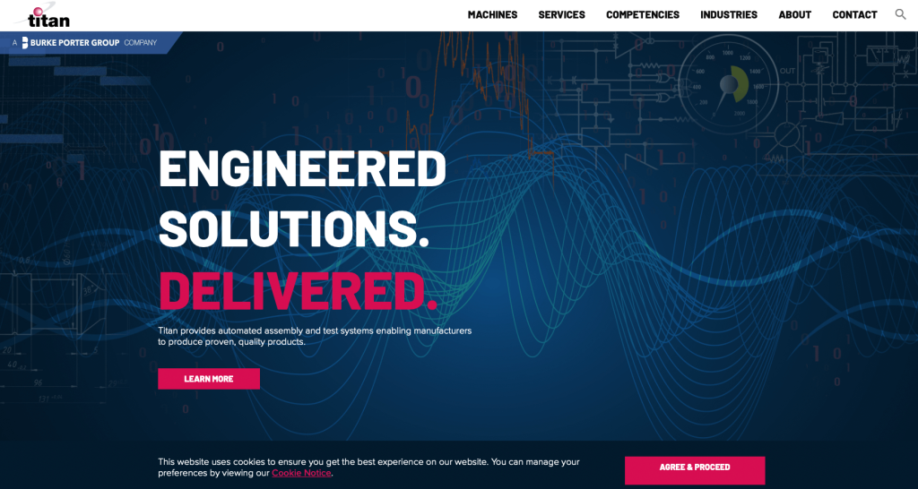
If you are inspired by websites with a professional feel to them, you will surely like this one. Titan Systems uses blue and a dark shade of pink for the highlights with white as the background color. Every element on the website is so well-spaced that you won’t experience any eye strain.
On scrolling down, you will find neatly divided sections that throw light on the areas in which the company operates.
37. Lockheed Martin

Right after entering the website of Lockheed Martin, you will be greeted with a vibrant image of a spaceship. And that gives off the right vibe about what the company does. The website of this aerospace and global security company uses a combination of blue and white, which is very pleasing to the eyes. And for the highlights, you will find occasional touches of orange too.
If you want regular updates about the latest innovations at Lockheed Martin, you can click on the “sign up now” option. You will have to put in your email address to get exclusive access to the newsletter published by the company.
38. Zeon Chemicals
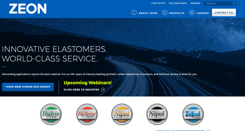
The website of Zeon Chemicals sure knows how to keep the visitors on their page for a long time. You will find encapsulating visuals that will give you a glimpse into what the company does and offers to its users. The best thing is that the homepage is not cluttered with too many elements that might confuse visitors.
You will find contact details, including the company’s phone number and email address, right at the beginning of the homepage.
39. Pelican

After landing on the website homepage of Pelican, you will be greeted with an invitation to sign up for its newsletter and receive a 10% discount code. This pop-up box is so well-designed that you would want to sign up. Once you move past this, you will be welcomed with visuals of rugged terrains and sturdy cargo cases.
The images are quite self-explanatory, so you will have no problem understanding what the company produces. To complement its products, the company website has used gray, black, and white as the main colors.
40. Seagate
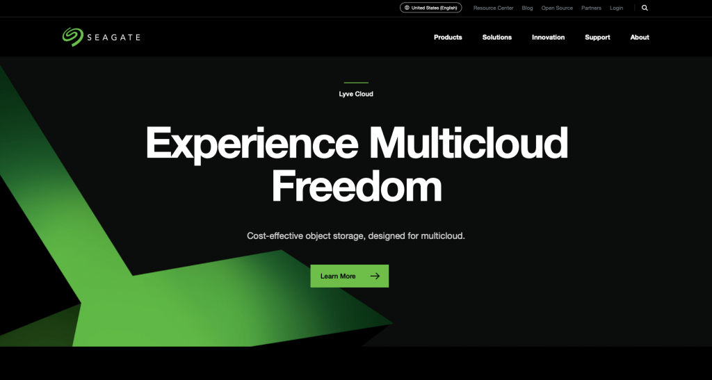
There’s no doubt that once you visit the website of Seagate, you will definitely spend considerable time on it to learn more about the company. The smart use of a vibrant green against a black background captures the visitors’ attention like nothing else. All the services and products that the company makes are listed in a clean and easy-to-find layout.
Also, within a few seconds of opening the website, you will get a pop-up survey form that the company requests you to fill out. With the help of your answers, it aims to improve its services.
41. FCX

Despite containing a number of elements, the FCX website is pretty eye soothing. This is only possible because all the textual and visual elements are well placed, and the website makes proper use of blank space.
Right on the homepage, you will find details about the new releases of the company and also get to know about its board members. Towards the end of the page, you will see all the awards that FCX has received over the years. And if you want to connect, links to its social media handles are also present in the form of their respective icons.
42. TrinityRail
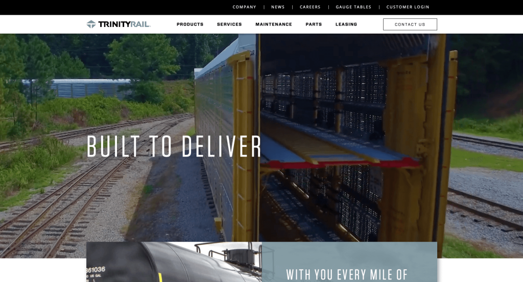
Trinity Rail aims to connect with the visitors the moment they enter the website. And to do that, it has included an appealing video on the homepage that highlights what the company has to offer. After the video, you will get to see a small section with textual content which delves into what the company does.
The UX interface of this website is exceptional, and that becomes clear from the layout. Moreover, the gray and black color scheme, with occasional touches of yellow and orange, surely adds to the beauty of the website.
43. T-L
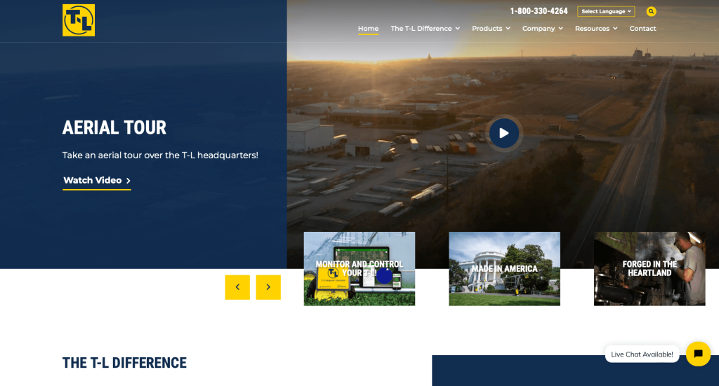
In order to build the right rapport with the visitors, the website highlights a very important thing on the homepage- testimonials. There is a right and left arrow button right below the “testimonials” section, which enables you to see all that users have to say about the products and service that T-L delivers.
The website uses blue as the primary color and yellow as the highlights. And on the bottom right of the screen, you will find a dialogue box that you can use to chat with the team at T-L.
44. Beechcraft

Aviation enthusiasts will love this website the moment they click on it. Right on the homepage, you will find attractive visuals of aircraft and the mechanisms involved in building them. To make things more interesting for the visitors, the website showcases a range of intriguing videos that highlight the journey of the company.
Largely the website is done in white, with occasional touches of red. And that is what ensures that the visitors’ attention rests solely on the content. At the end of the homepage, you will find the Twitter handle and some interesting tweets from the company.
45. Protolabs
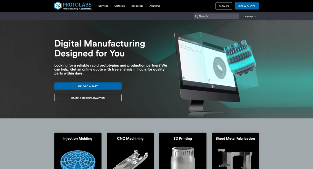
Right from the get-go, the website tells you what Protolabs is all about! Below the top ribbon, you will find a section that delves into what the company does. All the services provided by the brand are neatly charted out, and you will just have to click on the “learn more” option to know about a particular service in depth.
The website has introduced a new section where you can get help with your 3D printing project. And towards the later half of the homepage, you will find a section that charts out how the company works.
46. Xometry
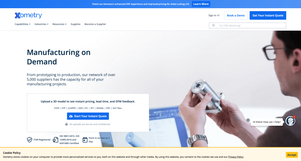
Xometry’s website uses a beautiful blue for the highlights on the homepage, which is majorly white in color. The font used is varied in size to give more importance to the textual content on the page. All the services that Xometry provides are listed in a row, with a “learn more” option present to the right of every service listing.
Also, there’s a chatbox on the bottom right of the screen that you can use to get your questions answered immediately.
47. Stora Enso
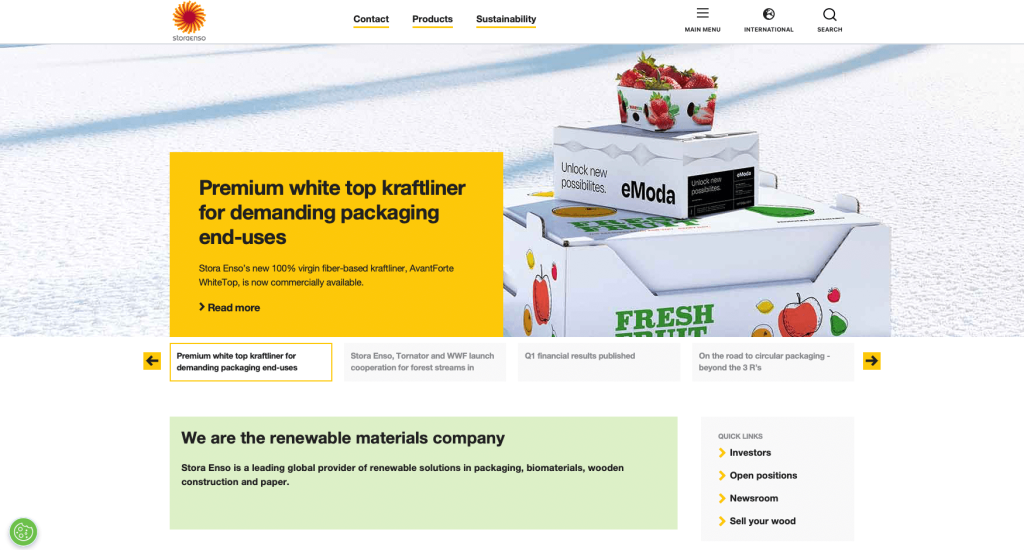
Stora Enso provides sustainable packaging solutions, and the visual elements used on its website reflect that well. After landing on the homepage, you will be greeted with a range of bright and colorful images that link directly to the sustainability efforts made by the company. You will also find a right and a left arrow that will help you easily scroll through the images.
And if you move toward the end of the page, you will find a range of sustainable solutions that the company offers.
48. UVify
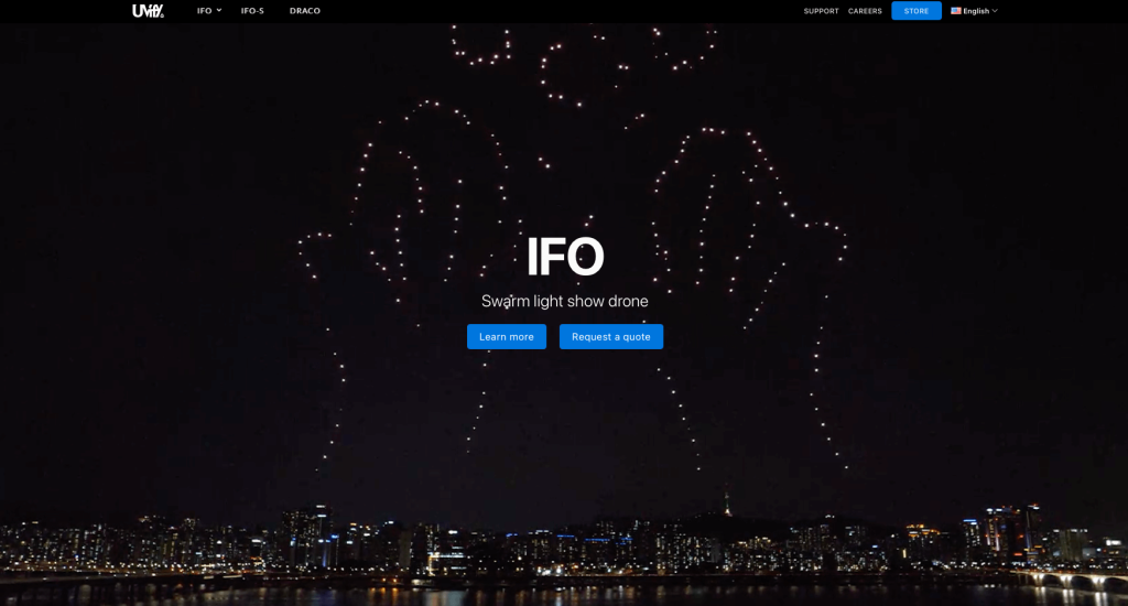
Uvify is a warm light show drone company, and on its website, you will find an interesting video depicting a fascinating drone performance in the night sky. The entire website is done in black and white, with blue used as a highlight color.
After spending a few minutes on the website, a pop-up box appears. You can put in your email address here and subscribe to UVify’s newsletter. And on scrolling to the end of the page, you will be asked to rate your website experience.
49. Lear
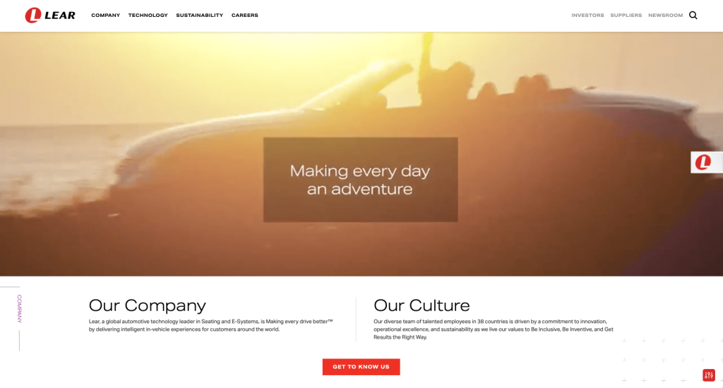
The website of Lear reflects exactly what the company aims to do- improve the driving experience. And this becomes clear from the video that is present on the website, which gives you a quick glimpse of what the company is all about.
On the bottom right of the screen, you will find a “settings” icon that helps you adjust the website experience. There are options that help visually impaired people or ones with cognitive disabilities or ADHD to better navigate the site.
50. Ihne & Tesch
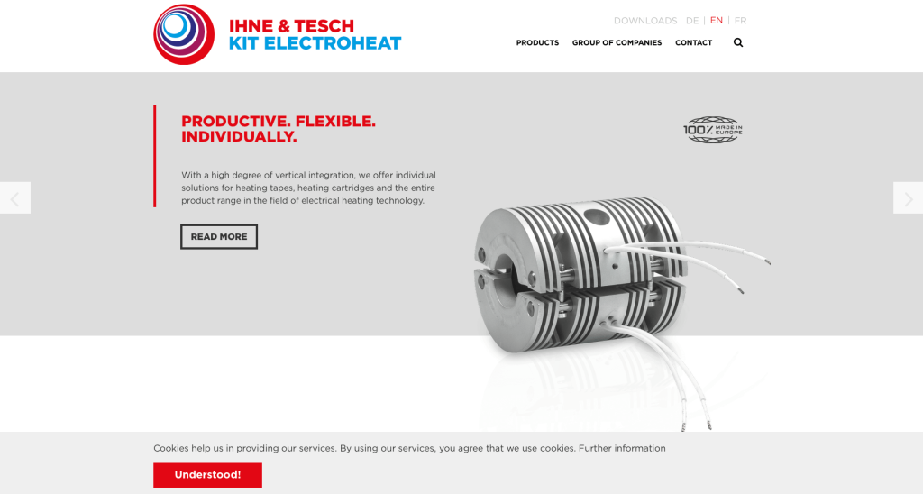
As the final entry, we have the Ihne And Tesch website. On the website, you will primarily find three colors- white, blue, and red. The first main section on the homepage lists all the services that the company provides, and there’s a scroll option that allows you to check all of them.
On heading toward the page end, you will notice that all the areas in which the company operates are listed in a clean and organized fashion. You will also find a world map with colored pins put on locations in which the company operates.
How to Build a Great Manufacturing Website
Are you in the process of building a new website for your manufacturing company? How exciting!
Let’s walk through some of the most important steps in building a new, or redesigning an existing, manufacturing company website.
Feel free to skip the first few sections if you already have a domain name, hosting service, and website platform picked out!
1.) Purchasing a Domain Name
Picking out a domain name for your manufacturing website is a crucial step in establishing your company’s online identity. It serves as the address that visitors will use to access your website, and it plays a significant role in branding and recognition of your company.
Here’s a step-by-step process to help you choose the perfect domain name:
- Brainstorm: Start by thinking of ideas for your domain name, considering the name of your business, the products you manufacture, and your industry.
- Simplicity: Try to keep your domain name simple, easy to spell, and pronounce. Avoid using complex words, hyphens, or numbers.
- Consistency: If your business has an established brand name, it’s generally a good idea to include it in your domain name. For example, if your business name is Lake Pizza Manufacturing, don’t register a domain name such as TopPizzaMaker.online.
- Availability: Check the availability of your desired domain names before proceeding. Most common domain names have already been purchased. If that is the case, see if your desired domain name isn’t being used and is available for sale. However, be cautious about investing too much money into buying a domain name that’s for sale.
- Domain Extensions: Consider which domain name extension best suits your website’s purpose. While .com is the most common and widely recognized extension, there are many other options available, such as .net, .org, or industry-specific extensions like .manufacturing.
- Legal Considerations: Before registering your domain name, it’s important to conduct a trademark search to ensure that your chosen name doesn’t infringe upon someone else’s intellectual property. For example, avoid registering a domain name that includes another manufacturing company’s business name or a well-known brand name.
- Register the Domain: Once you’ve settled on an available domain name, it’s time to register it through a reputable domain registrar. Based on our experience as a digital agency, we recommend using domain registrars like GoDaddy, or Namecheap as they are user-friendly and reliable.
2.) Selecting a Website Platform for Manufacturers
After figuring out your domain name, the next step is selecting a website platform for your manufacturing website.
Most manufacturers are going to develop content-based websites with contact forms and phone numbers to drive conversions.
You’ll typically only see manufacturer websites adding ecommerce if they are also the main distributor of their product, since most distribution channels don’t like seeing competition from the manufacturer online.
For Content Websites:
Manufacturing companies often find WordPress to be an excellent platform choice. However, there are alternative options like Wix and other hosted website builders available.
- WordPress: WordPress is a versatile and widely used content management system (CMS) that offers immense flexibility and customization options. It caters to all types of manufacturing company websites, from simple sites to more intricate ones that include product catalogs or incorporate third-party plugins for specialized functionalities. With a vast selection of manufacturing-themed themes and useful plugins, WordPress empowers you to create a highly personalized website tailored to your manufacturing company’s needs. If you value control and the ability to expand your website’s functionality over time, WordPress is an excellent choice. Although there is a hosted version of WordPress, most users opt for the open-source version installed on a web hosting account.
- Wix: The Wix platform shares similarities with WordPress, providing comparable page building features but as a hosted solution. We have successfully collaborated on manufacturing websites built on Wix, and it is a competent page builder, making it a confident recommendation. With Wix, you won’t need a separate web hosting service.
For Ecommerce Websites:
If your manufacturing company sells its products online, you’ll find satisfaction with either WooCommerce or Shopify.
- WooCommerce: If you intend to establish an online store for your manufacturing company using WordPress, WooCommerce is the ideal ecommerce plugin to integrate. It seamlessly blends with WordPress, enabling you to incorporate ecommerce functionality into your existing manufacturing company website. WooCommerce offers a diverse range of extensions, payment gateways, and inventory management tools, making it an excellent choice for manufacturers seeking to sell their products online.
- Shopify: The Shopify platform stands as a leading ecommerce solution that provides all the necessary features to create and manage an online business for manufacturers. It serves as a hosted ecommerce platform, eliminating the need to find a separate web hosting service. Similar to other ecommerce solutions, Shopify offers a user-friendly interface, customizable themes, built-in security, and a variety of features for inventory management, payments, and shipping.
Web Hosting Requirements
If you opt for platforms like WordPress or WooCommerce, you’ll need to select a web hosting service.
As an unabashed suggestion, we often recommend our own web hosting service for its exceptional compatibility with WordPress websites. For reliable web hosting services from other hosting companies, consider the following recommendations:
- WP Engine: This ranks among our preferred web hosting services for manufacturing companies. WP Engine offers an excellent control panel that simplifies the creation of staging websites. Their backup process is seamless as well. The only drawback we’ve observed is the imposed limits on PHP max_execution_time. However, be aware that their pricing escalates quickly if you require upgraded services.
- SiteGround: We have always had a positive experience working with SiteGround. Their live chat and email support are commendable, surpassing more renowned hosting firms. We’ve never had to wait long to connect with their support team, and the initial contact person typically resolves the issue. Their backup tools are user-friendly, and they offer reasonable pricing for manufacturing companies.
- Digital Ocean: This represents a great option for cloud hosting, although it may be too advanced for most manufacturing company websites. Unlike other cloud networks we’ve tested, we have never encountered issues with the Digital Ocean cloud network. Nevertheless, cloud hosting can become expensive when factoring in droplet (server instance) costs, operating system fees, control panel charges, server software expenses, offsite backup fees, and server management costs. For server administration recommendations, check out AdminGeekZ.
3.) Selecting a Website Template for Manufacturers
Many manufacturing companies opt to purchase and customize third-party website templates as it significantly reduces web development costs and turnaround time. However, if your manufacturing company prefers a custom design, you can hire a custom web developer or custom ecommerce developer to create a theme from scratch.
For the purpose of setting up a manufacturing company website, let’s focus on recommendations for finding pre-built website templates. Here are links to the main theme marketplaces to consider:
WordPress Manufacturing Themes
You can find free themes at wordpress.org, or explore manufacturing-inspired templates at ThemeForest.
Industrialist – Themeforest
$79
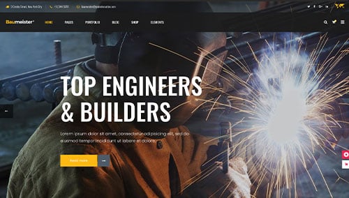
Baumeister – Themeforest
$79
Manufacturing – Themeforest
$59
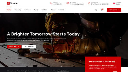
Steeler – Themeforest
$59
Wix Manufacturing Themes
Discover free and paid themes in the Wix marketplace at wix.com, some of which are suitable for manufacturing companies.
4.) Creating Content & Adding Images for Manufacturers
Now that you have your domain name, website platform, and theme in place, it’s time to start developing content for your manufacturing company’s website!
There are several valuable tips you can follow to craft engaging and effective website copy. Let’s explore a few:
- Understand your target audience: Before writing a single word, gain a clear understanding of your target audience. Define their demographics, preferences, and needs. Tailor your content to address their pain points, provide value, and resonate with them. This will enhance your visibility in search engines for manufacturing-related searches that are relevant to your business.
- Define your key messages: Determine the primary messages you want to convey through your website content. These messages should align with your brand, highlight your unique advantages, and effectively communicate the benefits of your manufacturing products or services.
- Keep it concise and scannable: Online readers tend to scan content, so ensure your writing is concise and easy to digest. Use short paragraphs, bullet points, subheadings, and bold text to break up the content and enhance readability.
- Create clear and compelling headlines: Craft attention-grabbing headlines that immediately convey the value and relevance of your manufacturing company. Well-crafted headlines can entice visitors to explore your website further and learn more about your offerings.
- Incorporate keywords strategically: Conduct research to identify relevant keywords and naturally integrate them throughout your content. This can improve your manufacturing website’s visibility in search engine results. However, avoid excessive keyword usage, as it can hinder readability and user experience. Tools like Ahrefs or Semrush can assist with keyword research.
- Maintain a conversational tone: Write in a conversational manner that resonates with your target audience in the manufacturing industry. Avoid jargon or overly technical language unless it is essential for your specific audience. For example, you might not need to explain intricate storage unit details in every description on your self storage website. Engage your readers by addressing them directly and adopting a friendly, approachable style.
- Edit and proofread: Always edit and proofread your content before publishing. Check for grammar, spelling, and punctuation errors. Ensure the flow of your content is smooth and logical, while aligning with your brand voice and style guidelines. Tools like Grammarly can be helpful!
- Leverage ChatGPT for assistance: If you encounter challenges generating ideas or need help refining the content on your manufacturing website, consider leveraging AI tools such as ChatGPT.
You should break up lengthy sections of text by incorporating relevant and high-quality images into your content. Here are some tips:
- Utilize high-quality images: Opt for visually appealing and well-composed high-resolution images. Blurry or pixelated images can detract from the overall quality of your manufacturing website.
- Ensure relevance: Select images that are relevant to your content and help illustrate your message. Images on your self storage website should complement the text and provide additional context or visual interest.
- Consider stock photo resources: Make use of reputable stock photo websites such as Unsplash, Pixabay, or Shutterstock to find a wide range of professional-quality images relevant to the manufacturing industry. Ensure compliance with licensing requirements and attribute images as necessary.
- Customize images when possible: If you have the necessary skills or resources, consider customizing or branding images to align with your manufacturing brand. This can contribute to a cohesive visual experience for your website visitors. Tools like Adobe Photoshop or Canva can be useful.
- Optimize image file sizes: Compress images to optimize their file sizes without compromising quality. Large image files can slow down your manufacturing website’s page speed, impacting user experience and SEO. Tools like TinyPNG can assist with image compression.
Don’t forget, well-crafted content and high-quality images go hand in hand to engage visitors and effectively convey your message. By following these tips, you can create compelling content that resonates with your audience and enhances their overall experience on your manufacturing site.
5.) Post Launch Work
Once you have built and launched your manufacturing website, there are several important tasks and services to consider for maximizing its effectiveness. Here are some basic suggestions to help you navigate post-launch activities:
- Search Engine Optimization (SEO): Implementing SEO strategies is crucial to improving your manufacturing company’s visibility in local search results. Conduct keyword research, optimize your content, and ensure your website has a solid internal linking structure. Regularly update and create fresh, high-quality content to attract organic traffic. If you want, consider hiring our SEO team or checking out third-party providers like The HOTH.
- Paid Advertising: For faster turnaround in traffic, consider utilizing paid advertising platforms like Google Ads or Facebook Ads to drive targeted traffic to your manufacturing business. You can hire our PPC management services or find talented professionals on websites like Mayple.
- Conversion Rate Optimization (CRO): Analyze your manufacturing website’s performance and user behavior through tools like Google Analytics. Identify areas where users may drop off or encounter barriers to conversion. Conduct A/B testing using tools like VWO to make data-driven changes to improve your manufacturing website’s conversion rates and overall user experience.
- Website Security: Protecting your manufacturing website from malware and other exploits is crucial. Ensure you have robust security measures in place, such as SSL certificates, web application firewalls (like Sucuri), and regular backups. Keep your CMS, plugins, and themes up to date to minimize vulnerabilities. Monitor your website for any potential security risks and respond promptly to any issues. It isn’t a bad idea to monitor for website uptime through a service like UptimeRobot, too.
- Website Maintenance: Regularly maintain your manufacturing website to ensure its optimal performance. If you are using WordPress, this includes updating plugins and themes, monitoring website speed and performance, and resolving any broken links or errors. If you want, consider hiring our website maintenance services or consider a freelancer from Upwork. Don’t forget to regularly backup your manufacturing website to safeguard against data loss or technical issues.
- User Feedback and Testing: Actively seek user feedback to understand visitor experiences and identify areas for improvement. Implement user testing and gather insights on how users interact with your manufacturing website. Use this feedback to make iterative enhancements and continuously optimize the experience.
- Content Updates: Keep your website content fresh and up to date. Regularly publish new blog posts about manufacturing, update product or service information, and ensure that all information is accurate and relevant. Engaging and valuable content not only attracts visitors but also encourages them to return and share your content with others interested in the manufacturing industry.
Remember, post-launch digital marketing activities are crucial for the long-term success of your manufacturing website. Stay proactive, monitor performance, and adapt your strategies to achieve your business goals and meet the needs of your audience.
FAQs about Web Development for Manufacturing Company Websites
No, your business does not need to be local to have a website built. Website development can be done remotely, and web development companies can work with clients from any location. Regardless of your business’s physical location.
Template websites for manufacturers offer cost savings, quick deployment, user-friendly interfaces, mobile responsiveness, proven designs, updates u0026 support, and potential SEO benefits.
WordPress is the best platform for manufacturing websites. It’s user-friendly, offers a wide range of plugins, SEO-friendly, responsive, customizable, supported by a large community, and scalable to meet various business needs.
If you find yourself needing assistance with your website down the road, it’s important to know that you can get help from professionals who specialize in web development. They offer ongoing support to address issues like technical glitches, updating content, improving the design, enhancing performance, ensuring security updates, and more.