In the chiropractic and physical medicine industry, your website serves as the digital front door to your clinic. For a patient suffering from chronic pain or a recent injury, your online presence must do more than just list your hours – it must immediately communicate clinical authority, compassionate care, and a clear path to relief. Our design team evaluated hundreds of websites across the wellness sector – from family chiropractic practices and sports medicine clinics to integrated rehabilitation centers and pain management specialists. We looked for the top 14 examples that masterfully balance professional credibility with a frictionless user experience, specifically analyzing their mobile-friendly booking tools, provider transparency, and educational resources.
Whether you are a solo practitioner or managing a multi-specialty wellness group, these examples represent the gold standard for chiropractic web design in 2026.
Note on Our Selection Process: We recently audited this guide to remove outdated designs and sites that no longer meet our performance standards. This curated list now focuses on the top 14 chiropractic websites providing the most strategic value in 2026.
The Top Chiropractic Website Designs
- 1. Fox Crossing Chiropractic
- 2. Chicago Chiropractic
- 3. Lakes Holistic Care
- 4. ChiroCenter
- 5. Springfield Wellness Center
- 6. Pure Health
- 7. Premier Health
- 8. MB Chiropractic
- 9. South Texas Chiropractic
- 10. Woodbury Family Chiropractic
- 11. Ford Chiropractic
- 12. Spring Lake Chiropractic
- 13. MiSpine Chiropractic
- 14. Austin Life Chiropractic
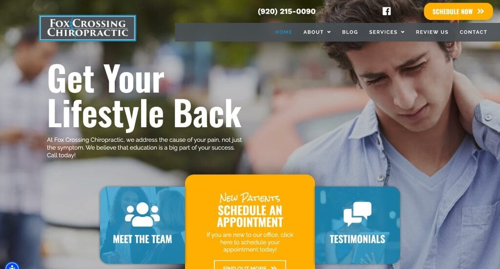
1. Fox Crossing Chiropractic
Why We Chose Fox Crossing Chiropractic
The Fox Crossing Chiropractic website stands out as a premier example of “Grassroots Validation Architecture and Frictionless Multi-Channel Scheduling.” In local wellness and musculoskeletal healthcare markets, building an immediate bridge of community trust is just as critical as clinical capability. This platform excels by keeping localized peer approval visible at all times while establishing clear, zero-friction paths to schedule care right from the entry point.
Key Design Highlights:
- Persistent Bottom-Left Social Proof Overlay: A standout technical feature of the site is the dedicated review widget overlay anchored directly in the bottom-left corner of the screen. This floating asset cycles through real-time patient feedback, keeping verified local patient satisfaction on display as users browse through various wellness treatments.
- Instant Above-the-Fold Intake Design: To capture high-intent users experiencing acute discomfort, the platform places distinct appointment scheduling targets directly in both the global header and the main hero section. This strategic dual-placement ensures that new and returning patients can jump into the appointment request pipeline without scrolling or hunting for contact information.
- Earned Merit and Awards Repository: The home page highlights the local recognition and industry awards the clinical team has won. Front-loading these regional accolades acts as an objective seal of quality, establishing immediate clinical excellence for the practice within the local community.
- Deep Narrative Peer Validation Grid: In addition to the floating widget, the home page features a structured, dedicated section for long-form patient reviews. Displaying these comprehensive text testimonials detailing successful relief from chronic discomfort, neck pain, and mobility issues anchors the brand’s care claims with trustworthy community confirmation.

2. Chicago Chiropractic
Why We Chose Chicago Chiropractic & Sports Injury Centers
The website for Chicago Chiropractic & Sports Injury Centers stands out as an exceptional model for “Comprehensive Symptom-to-Therapy Mapping and Persistent User Accessibility.” For individuals navigating acute musculoskeletal discomfort, a clinical website must swiftly clarify treatment capabilities while providing an effortless path to initiate care. This platform accomplishes this by balancing deep structural education with a constant, accessible contact channel right on the home page.
Key Design Highlights:
- Symptom-Driven Ailment Mapping: The home page clearly maps out the different ailments and conditions the clinical team can treat. Explicitly detailing common source issues – such as lower back pain, neck stiffness, sports injuries, headaches, and herniated discs – allows suffering users to instantly self-qualify their symptoms and understand how the clinic can help.
- Diversified Treatment and Therapy Ecosystem: To demystify the recovery process, the home page features a structured explanation of the various therapies they use during patient care. Highlighting a multi-disciplinary approach – including chiropractic adjustments, physical therapy modalities, massage therapy, and acupuncture – proactively educates patients on the comprehensive treatment paths available to them.
- Persistent Floating Contact Utility: A standout functional element of the site is the floating contact button anchored securely along the right side of the screen. This interactive conversion asset remains completely visible as users scroll down the page, providing a friction-free, omnipresent channel to initiate communication the exact second a patient decides to book an appointment.
- Grassroots Social Proof Integration: Authentic client testimonials are woven seamlessly into the home page layout. Showcasing long-form verified stories from real patients sharing accounts of pain relief, restored mobility, and returning to peak athletic performance builds strong community trust and reinforces the practice’s clinical authority.
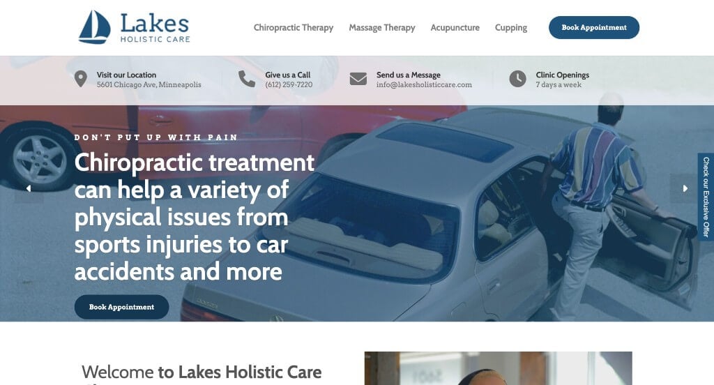
3. Lakes Holistic Care
Why We Chose Lakes Holistic Care
The Lakes Holistic Care web presence stands out as a premier benchmark for “Hyper-Localized Accessibility and Frictionless Patient Onboarding.” For individuals seeking pain relief or holistic wellness, a digital storefront must immediately break down barriers to entry. This platform masterfully accomplishes this by putting all critical operational data directly at the absolute top of the user experience, eliminating the search fatigue common on traditional medical websites.
Key Design Highlights:
- Immediate Above-the-Fold Contact Command: The website’s hero area features an exceptional layout that brings all core operational logistics right to the forefront. Displaying the clinic’s physical address, a direct phone line, an active email address, and precise opening hours right inside the main hero area ensures that high-intent users can initiate care or map their visit without scrolling an inch.
- Instant Conversational Engagement Hub: A prominent live chat widget is integrated seamlessly across the home page. Providing this instant, real-time communication channel allows browsing patients to quickly resolve individual questions about specific treatments, booking availability, or care practices, significantly speeding up the appointment-seeking funnel.
- Structured Holistic Service Blueprint: The home page maps out a clearly outlined service directory that effortlessly organizes their multidisciplinary treatments. Explicitly breaking down their core offerings – including chiropractic therapy, deep tissue massage, acupuncture, and cupping – allows fast-skimming users to instantly self-qualify their ailments against the clinic’s therapeutic capabilities.
- Dynamic Peer-to-Peer Testimonial Scroller: Social proof is prioritized through an interactive client testimonial scroller built directly onto the home page. This fluid component lets users browse real-world stories of pain relief, tension reduction, and compassionate bedside manner, anchoring the practice’s professional wellness claims with trustworthy community confirmation.
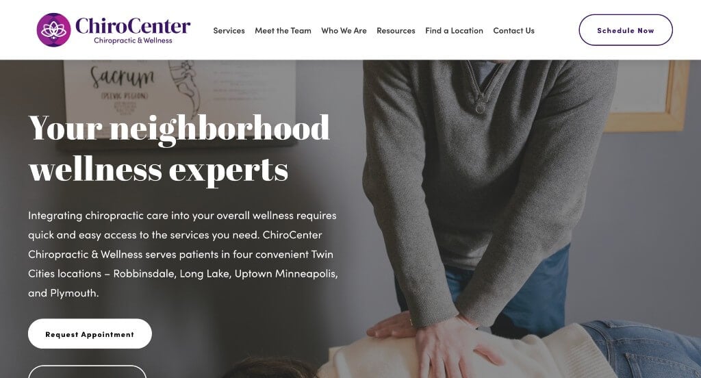
4. ChiroCenter
Why We Chose Chiropractic Center of Minnesota
The Chiropractic Center of Minnesota website stands out as an exceptional model for “Regional Network Accessibility and Persistent Structural Navigation.” For individuals managing acute musculoskeletal pain, a digital platform must remove geographic uncertainty and browsing fatigue. This site achieves this by pairing a clear multi-clinic layout with a smart, sticky interface that streamlines the patient onboarding experience.
Key Design Highlights:
- Uncluttered Multidisciplinary Service Blueprints: The website features a beautifully organized service directory that clearly explains their core clinical treatments on the home page. Explicitly detailing how their distinct holistic offerings – such as chiropractic care, massage therapy, acupuncture, and corrective exercise – work to preserve long-term health allows browsing users to instantly connect their symptoms to the clinic’s medical capabilities.
- Regional Access Distribution Infrastructure: To accommodate a broad local patient base, the home page cleanly highlights their multiple practice locations. Displaying their four convenient Twin Cities offices – Robbinsdale, Long Lake, Uptown Minneapolis, and Plymouth – directly on the main page allows users to instantly verify nearby care availability without digging through deep contact menus.
- Persistent Omni-Present Navigation Bar: A standout technical feature of the site is its highly responsive sticky header. As users scroll down the home page to research treatments and locations, the primary menu remains securely locked at the top of the viewport, enabling patients to instantly hop to different subpages or initiate an appointment request from any point without scrolling all the way back to the top of the screen.
- Expandable Peer Validation Gateway: Authentic client testimonials are featured prominently on the home page to provide immediate, localized social proof. By pairing these upfront, real-world stories of pain relief and restored mobility with a direct link to view more testimonials, the site builds deep consumer trust while keeping the core layout clean, scannable, and compact.

5. Springfield Wellness Center
Why We Chose Silveri Chiropractic
The Silveri Chiropractic website stands out as a premier benchmark for “Symptom-Focused Triaging and Friction-Free Patient Conversion.” For individuals suffering from sudden or chronic physical discomfort, a digital storefront must offer immediate solutions and clear answers. This platform achieves this by matching prominent scheduling targets with structured patient education directly on the home page.
Key Design Highlights:
- Immediate Above-the-Fold Intake Targets: The website removes all booking friction by placing primary appointment scheduling buttons inside both the global header and the main hero area. This dual-placement design ensures that high-intent users can jump straight into the scheduling pipeline the exact second they land on the page, without needing to scroll or search for contact options.
- Symptom-Driven Pain Mapping Matrix: The home page features a dedicated directory listing the various types of pain and conditions they treat. Explicitly calling out specific problem areas – such as back pain, neck stiffness, headaches, sciatica, and sports injuries – allows browsing patients to immediately connect their physical symptoms to the clinic’s therapeutic expertise.
- Dynamic Peer Validation Slider: Social proof is prioritized through an interactive patient testimonial slider built smoothly into the home page layout. This fluid component allows users to scroll through multiple verified, real-world stories of long-term pain relief and compassionate clinical care, anchoring the practice’s wellness claims with genuine community confirmation.
- Friction-Reducing Educational FAQ: The home page wraps up with an interactive Frequently Asked Questions section. Addressing lingering consumer questions regarding adjustment techniques, insurance coverage, and recovery expectations right on the main page resolves patient anxieties immediately before they enter the final scheduling funnel.
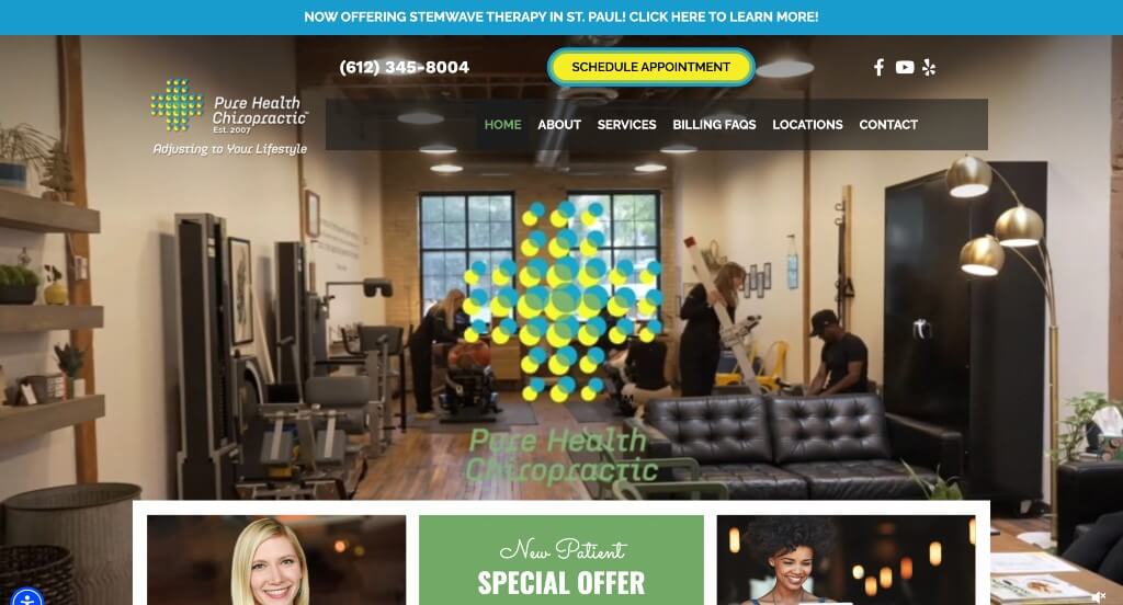
6. Pure Health
Why We Chose Pure Health Chiropractic
The Pure Health Chiropractic website stands out as a premier case study in “Cinematic Hospitality Branding and Frictionless Patient Onboarding.” In competitive local wellness ecosystems, a digital presence must immediately break down patient apprehension and clarify the clinical experience. This platform successfully bridges that gap by combining transparent behind-the-scenes visuals with highly accessible pathways to book care directly on the home page.
Key Design Highlights:
- Cinematic Practice and Visual Sourcing: The main hero area incorporates a high-definition video loop that showcases their actual office space, active staff, and comfortable client interactions. Visually pulling back the curtain on the treatment environment humanizes the clinical care team and dramatically reduces onboarding anxiety before a patient ever sets foot in the clinic.
- Frictionless Header Conversion Target: To accommodate high-intent users or patients seeking immediate relief from physical discomfort, the website integrates a prominent appointment scheduling button right in the header navigation menu. This sticky element ensures that a patient can transition from researcher to active client from any point on the page without scrolling.
- Earned Regional Merit and Awards: The home page proudly displays industry awards and local recognition the clinical team has achieved. Highlighting these accolades acts as an objective, third-party seal of excellence, instantly establishing deep medical authority and separating the clinic from standard local providers.
- Expandable Grassroots Trust Engine: Authentic social proof is prioritized through a dedicated patient testimonials module on the home page. By pairing these upfront, real-world success stories with a direct link to a comprehensive page of additional reviews, the platform satisfies a patient’s need for extensive validation while keeping the main home page clean and scannable.
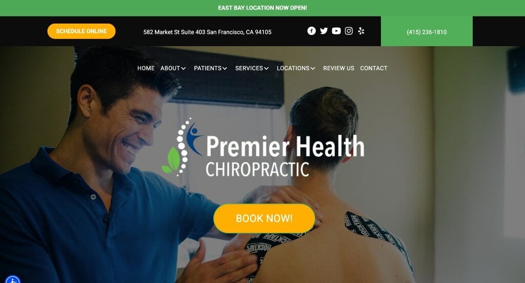
7. Premier Health
Why We Chose Premier Chiropractic (Market Street)
The Premier Chiropractic website serves as a premier benchmark for “High-Contrast Conversion Architecture and Proactive Patient De-Risking.” In dense urban healthcare markets, a digital platform must capture immediate user attention while breaking down deep-seated hesitation regarding alternative care. This platform accomplishes this by matching unmistakable scheduling triggers with targeted clinical education directly on the home page.
Key Design Highlights:
- High-Contrast Conversion Anchors: The website utilizes prominent, vibrant orange buttons specifically designed to guide users into scheduling an appointment online. This bold color choice cuts through the site’s primary color palette, ensuring that high-intent users or patients experiencing acute pain can instantly spot and engage the booking engine without any searching.
- Symptom-Driven Patient Self-Triaging: To help users quickly identify solutions to their discomfort, the home page displays a structured list of common symptoms they treat. Explicitly detailing familiar conditions – such as neck pain, lower back stiffness, headaches, and posture issues – allows browsing patients to immediately map their physical ailments to the clinic’s therapeutic capabilities.
- Myth-Busting Educational Section: A standout feature of the home page is the dedicated section titled “Common misconceptions about chiropractic care.” By directly addressing lingering anxieties, safety questions, and structural myths, this proactive asset educates site visitors, removes psychological barriers, and establishes the clinical team as trustworthy, transparent health advocates.
- Grassroots Community Validation: Real-world peer validation is integrated smoothly into the home page through authentic client testimonials. Showcasing these verified patient success stories detailing fast recovery timelines and compassionate bedside manners reinforces the practice’s clinical authority with trusted local social proof.
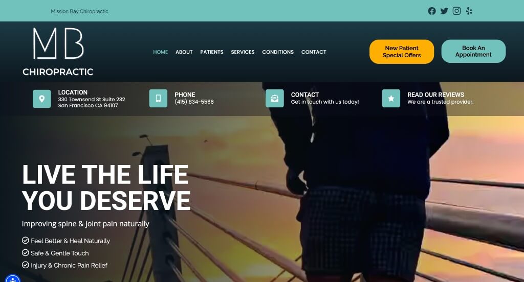
8. MB Chiropractic
Why We Chose Mission Bay Chiropractic
The Mission Bay Chiropractic web platform stands out as a premier case study in “Interactive Anatomical Triaging and High-Velocity Patient Onboarding.” In fast-paced urban wellness markets, a digital storefront must instantly capture user intent while educating patients on how care applies to their specific physical stressors. This platform masterfully balances immediate financial incentives with an immersive, visual system to map out bodily pain right on the home page.
Key Design Highlights:
- Double-Targeted Financial and Intake Triggers: The website completely removes conversion friction by integrating clear action buttons for booking an appointment alongside dedicated pathways for “New Patient Specials.” Placed prominently within both the global header navigation and the hero section, this configuration lets high-intent and price-sensitive users jump directly into the care pipeline without scrolling.
- Interactive Musculoskeletal Mapping: A major highlight of the home page is the advanced, interactive digital skeleton model. Users can hover over or tap specific anatomical touchpoints across the muscular and skeletal frame to instantly reveal information about related ailments and conditions, creating an engaging self-triaging experience that connects physical pain directly to the clinic’s solutions.
- Situation-Based Care Segmenting: Rather than just offering a flat list of technical therapies, the home page breaks down the distinct lifestyle situations and environments they can help with. Categorizing care by everyday contexts – such as repetitive office strain, athletic conditioning, posture correction, or accident recovery – helps users quickly understand how treatment integrates into their daily routines.
- Grassroots Social Validation Anchoring: Authentic patient testimonials are seamlessly incorporated into the home page layout. Showcasing verified local feedback regarding structural pain relief, restored physical mobility, and the team’s attentive bedside manner provides immediate community validation to support the clinic’s professional authority.

9. South Texas Chiropractic
Why We Chose South Texas Chiropractic
The South Texas Chiropractic website stands out as an exceptional benchmark for “Visual Symptom Triaging and Cohesive Professional Trust Architecture.” For individuals experiencing physical discomfort, a clinical homepage must quickly establish both the medical capability of its staff and a clear pathway to relief. This platform achieves this by matching intuitive, interactive anatomical mapping with deep, multi-layered credibility indicators.
Key Design Highlights:
- Interactive Anatomical Symptom Mapping: A major highlight of the home page is the interactive image of a woman featuring specific, clickable pain “hot spots.” This engaging visual element allows browsing patients to click on localized problem areas to instantly reveal targeted information about related ailments, creating an easy, self-directed path to connect their physical pain with the clinic’s solutions.
- Frictionless Header Conversion Gateway: To capture high-intent users or patients seeking immediate relief from chronic discomfort, the website integrates a prominent “Request an Appt” button directly into the global header navigation. This strategic placement ensures that users can jump straight into the scheduling pipeline from any section of the site without needing to scroll.
- Transparent Service Blueprints: The home page features a clearly organized directory where their core clinical treatments and therapies are explained. Breaking down these various holistic care offerings into digestible, patient-first descriptions ensures that fast-skimming users can confidently research their recovery options without being overwhelmed by dense medical jargon.
- Dual-Layered Trust and Authority Framework: The home page seamlessly combines a “Meet Our Doctors” introduction with a dedicated section for patient testimonials. Showcasing the unique backgrounds and expertise of their skilled physicians alongside real-world stories of pain relief and compassionate bedside manner builds deep, comprehensive community trust right from the start.

10. Woodbury Family Chiropractic
Why We Chose Woodbury Family Chiropractic
The Woodbury Family Chiropractic digital presence serves as a premier example of “Hyper-Authentic Localized Branding and High-Contrast Action Optimization.” In community wellness ecosystems, establishing absolute human trust and transparent clinical authority is just as crucial as providing seamless booking access. This platform masterfully achieves this by replacing standard medical imagery with real practice life, while maintaining an unmissable pathway to initiate care directly on the home page.
Key Design Highlights:
- High-Contrast Chromatic Booking Target: The website utilizes an eye-catching, bright yellow “Book Now” button positioned securely within the main header navigation menu. This intentional color choice creates immediate visual contrast against the primary brand palette, providing a zero-friction, omnipresent conversion tool that high-intent or pain-stricken patients can instantly spot from the second they land on the page.
- Human-Centric Behind-the-Scenes Media Sourcing: A major triumph of the home page layout is the complete omission of generic, cold stock photography in favor of real, high-quality images of their actual clinical staff and patients. Visually documenting their real adjustments, smiling team, and genuine patient interactions pulls back the curtain on the environment, immediately dissolving clinical anxiety and building deep consumer familiarity.
- Earned Merit and Professional Excellence Repository: The home page proudly highlights the various local and industry awards the clinical team has achieved over the years. Showcasing these regional accolades upfront acts as an objective, third-party seal of excellence, establishing deep community authority and separating the clinic from standard local practices.
- Grassroots Social Validation Integration: Authentic client testimonials are woven seamlessly into the home page layout to provide verified peer proof. Elevating these long-form stories of chronic pain relief, gentle prenatal or pediatric adjustments, and compassionate bedside manners anchors the practice’s professional wellness claims with trustworthy community confirmation.
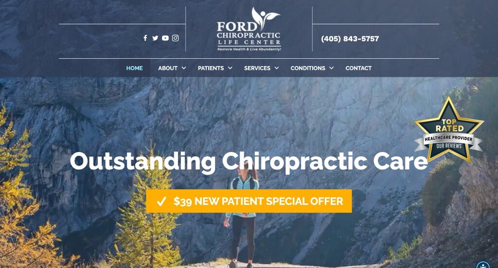
11. Ford Chiropractic
Why We Chose Ford Chiropractic
The Ford Chiropractic web platform stands out as a prime example of “Community Connectivity and Resource-Dense Patient Triaging.” In competitive local musculoskeletal health spaces, a clinic’s home page must seamlessly reduce a consumer’s research fatigue while providing quick social validation. This site successfully achieves this by balancing structural education with highly accessible social entry points right above the fold.
Key Design Highlights:
- Digital Community Networking Core: The header area is seamlessly integrated with prominent social media icons. Elevating these networking assets to the very top of the page enables patients to immediately transition from researchers to active community members, giving them easy access to ongoing wellness tips, video adjustments, and clinic updates.
- Symptom-Driven Ailment Blueprints: The home page maps out a dedicated directory explicitly highlighting the distinct ailments and physical conditions they treat. Clarifying target areas like neck sprains, chronic back pain, and joint stiffness helps individuals instantly self-qualify their symptoms and understand how chiropractic care directly addresses their discomfort.
- Dynamic Vertical Feedback Engine: Patient reviews are presented through an engaging vertical scrolling module built directly into the home page. This specialized layout delivers consistent peer confirmation about successful treatments, pain relief, and comforting clinical care without taking up unnecessary horizontal real estate.
- Anxiety-Reducing Fact Vault: The home page incorporates a well-organized Frequently Asked Questions section. Proactively answering common consumer questions regarding initial assessments, manual treatment mechanics, and recovery expectations removes lingering psychological barriers before the patient enters the final scheduling pipeline.
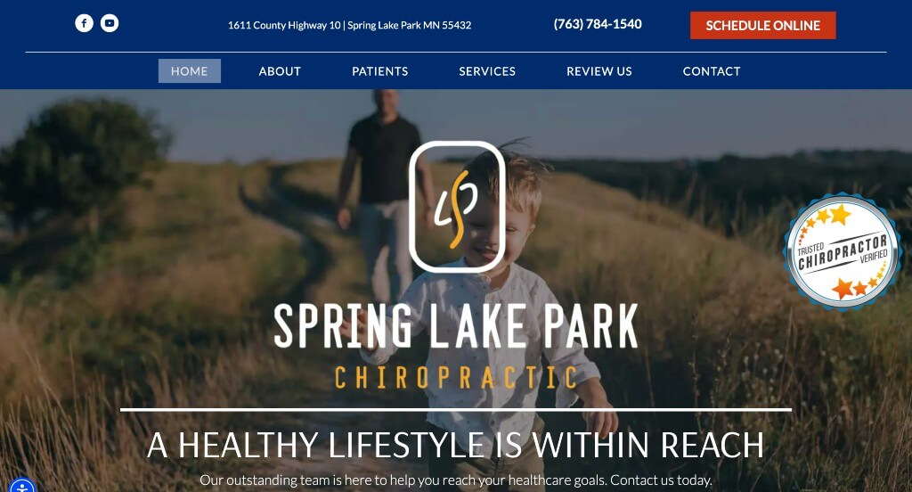
12. Spring Lake Chiropractic
Why We Chose Spring Lake Park Chiropractic
The website for Spring Lake Park Chiropractic serves as an excellent model for “High-Contrast Symptom Triaging and Dual-Channel Patient Communication.” For individuals seeking relief from acute physical pain, a digital platform must quickly clear the path to care. This site masterfully achieves this by pairing prominent, high-contrast action triggers with direct, multi-tiered channels for patient support.
Key Design Highlights:
- High-Contrast Chromatic Action Target: The website features an eye-catching, vibrant red “Schedule Online” button positioned securely within the header navigation. This intentional color choice cuts through the site’s primary layout palette, providing an unmistakable, omnipresent conversion tool that high-intent or pain-stricken patients can instantly spot without scrolling.
- Instant Conversational Engagement Hub: A prominent live chat widget is integrated directly onto the home page. Providing an immediate, real-time channel for browsing users to ask questions about appointments, insurance compatibility, or recovery timelines significantly reduces friction and helps convert passive web traffic into active clients.
- Symptom-Driven Patient Self-Triaging: To help users quickly identify solutions to their discomfort, a dedicated section on the home page explicitly outlines the various concerns and conditions they can help with. Clearly detailing common issues – such as spinal misalignments, chronic muscle tension, and injury recovery – allows patients to instantly map their physical ailments to the clinic’s therapeutic capabilities.
- Grassroots Community Validation: Real-world peer proof is prioritized through an authentic client reviews section built smoothly into the home page. Showcasing these verified patient success stories detailing swift pain relief and compassionate bedside manners reinforces the practice’s professional authority with trusted local social proof.
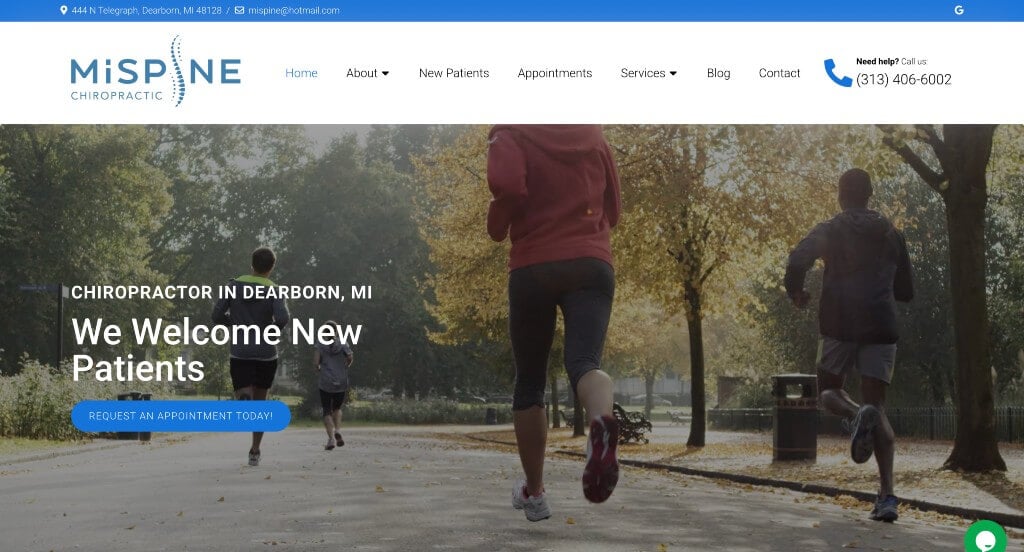
13. MiSpine Chiropractic
Why We Chose MiSpine Chiropractic
The MiSpine Chiropractic website stands out as a prime example of “Kinetic Procedural Sourcing and Frictionless Digital Intake.” For individuals navigating acute physical pain or spinal discomfort, a digital presence must quickly replace anxiety with clinical transparency. This platform achieves this beautifully by leading with real, high-fidelity treatment demonstrations alongside immediate communication channels directly on the home page.
Key Design Highlights:
- Kinetic Clinical Treatment Proof: A major highlight of the home page is an integrated video module that shows the practitioner actually performing manual adjustments on real patients. Pulling back the curtain on the actual treatment experience demystifies chiropractic care, normalizes the alignment process, and significantly reduces onboarding anxiety for nervous first-time visitors.
- Instant Conversational Engagement Hub: A prominent live chat widget is accessible directly on the home page layout. Offering this instant, real-time communication pipeline gives browsing patients an immediate way to ask specific questions about adjustment techniques, scheduling blocks, or insurance options, effectively capturing high-intent leads before they exit the site.
- Transparent Service Blueprints: Their core clinical treatments and specialized therapies are clearly outlined and showcased on the home page. Breaking down their distinct healthcare solutions into highly digestible, patient-first descriptions ensures that fast-skimming users can confidently match their physical complaints to the clinic’s therapeutic capabilities.
- Grassroots Community Validation Integration: Authentic patient reviews are woven smoothly into the home page layout to provide upfront social proof. Showcasing these long-form verified stories detailing successful journeys through chronic pain relief, posture correction, and compassionate bedside manners anchors the practice’s professional wellness claims with trustworthy community confirmation.
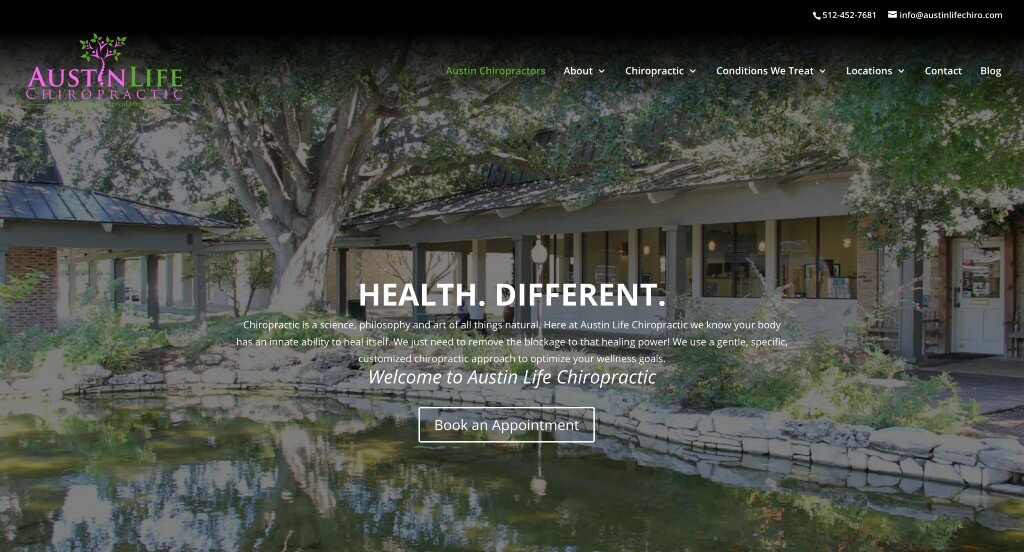
14. Austin Life Chiropractic
Why We Chose Austin Life Chiropractic
The website for Austin Life Chiropractic stands out as an exceptional example of “Creative Narrative Proof and High-Authority Patient Education.” In competitive metropolitan wellness markets, a clinic must quickly differentiate itself through authentic social validation and clear instructional content. This platform masterfully achieves this by replacing standard, text-heavy reviews with a highly visual, deeply human storytelling experience directly on the home page.
Key Design Highlights:
- Creative Chalkboard Narrative Gallery: A major highlight of the home page is the unique visual section featuring actual patients holding chalkboards that outline their personal health milestones and recovery breakthroughs. This highly authentic approach to social proof transforms traditional, text-based testimonials into unforgettable, humanized success stories that instantly connect with browsing users.
- Persistent Lower-Right Review Overlay: To supplement the visual gallery, a dedicated review widget remains anchored as a subtle overlay in the lower-right corner of the screen. This interactive component continuously presents real-time patient feedback, ensuring that a steady stream of verified community validation remains accessible no matter where a user scrolls.
- Frictionless Header Conversion Gateway: To cater to high-intent users or those experiencing immediate discomfort, the website places a prominent scheduling mechanism right in the main header navigation menu. This placement ensures that patients can smoothly transition from researching treatments to reserving a consultation block without losing their place on the page.
- Practitioner-Led Video Education Hub: The home page integrates direct video presentations from the clinical team explaining core chiropractic concepts and structural issues. Hearing directly from the practitioners not only establishes high-level medical authority but also builds immediate familiarity and comfort before the patient ever sets foot in the clinic.
WordPress Chiropractic Themes
You can find free themes at wordpress.org, or explore chiropractic-inspired templates on ThemeForest.
Vaidy – Themeforest
$59
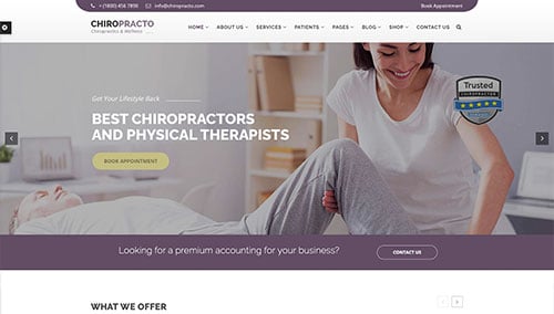
Chiropracto – Themeforest
$49
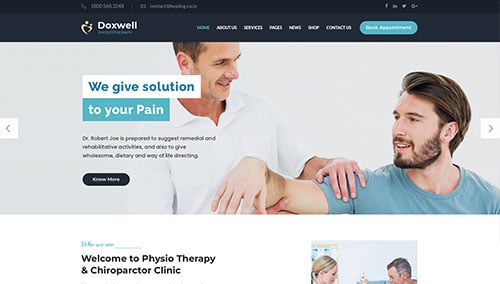
Doxwell – Themeforest
$59
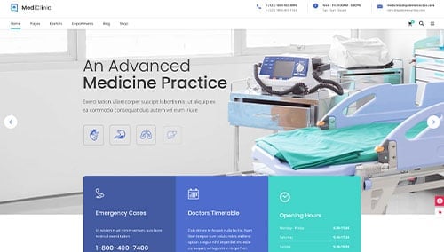
MediClinic – Themeforest
$69