In the heavy industrial sector, your website is a digital proof of capability. Whether your firm operates in aerospace, defense, or large-scale logistics, your online presence must immediately communicate structural integrity, technical precision, and global reliability. To win major contracts and secure long-term partnerships in 2026, your design must go beyond aesthetics to showcase your facility’s capacity and your commitment to innovation.
Our design team evaluated hundreds of industrial websites – from metals and mining giants to specialized chemical and transportation firms. We identified the top 10 examples that masterfully balance rugged industrial branding with high-performance functionality, specifically analyzing their technical data accessibility, safety credential transparency, and complex project storytelling.
Whether you are a specialized component manufacturer or a massive infrastructure provider, these examples represent the current benchmark for industrial web design in 2026.
Note on Our Selection Process: We recently audited this guide to remove outdated designs and sites that no longer meet our rigorous performance standards. This curated list now focuses on the top 10 industrial websites providing the most strategic value in 2026.
Top Industrial Website Designs
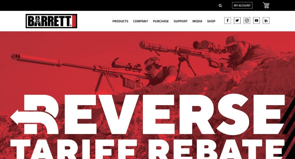
1. Barrett
Why We Chose Barrett Firearms
The website for Barrett Firearms (barrett.net) serves as a premier benchmark for “Elite Ballistic Merchandising and High-Authority Tactical Engineering Funnels.” As the legendary pioneer in long-range precision weapons and high-performance anti-materiel rifles, the digital storefront must project unyielding craftsmanship and structural integrity. This platform masterfully succeeds by organizing its layout around iconic, heavy-duty firearm systems and pairing them with fluid, cross-platform usability.
Key Design Highlights:
- Striking, High-Contrast Dual-Image Hero Canvas: The website opens with an impactful hero area anchored by two high-fidelity, commanding images. Rather than relying on busy background videos, these crisp, expansive visuals put the sheer design language and tactical profile of their elite platforms front and center, instantly validating their status as an American icon the moment the page loads.
- Streamlined Primary Weapon and Rifle Showcases: Positioned prominently on the homepage is a high-visibility framework dedicated to their primary products. Showcasing their world-renowned precision rifles – such as the iconic M107A1, the original high-performance Model 82A1, and the user-changeable modular MRAD system – the interface allows defense agencies, law enforcement, and long-range sport shooters to rapidly identify their legendary core catalog.
- Authentic Front-Page Mission Validation Testimony: Integrated smoothly into the primary homepage narrative is a dedicated section for verified customer testimonials. Featuring real-world praise regarding equipment survival rates, clear signal delivery under extreme stress, and exceptional global field support injects a commanding layer of peer-to-peer social proof right where prospective clients are evaluating the brand.
- Fluid Mobile Navigation and Adaptive Ergonomics: Translating a dense, highly specialized ecosystem of defense technologies onto smaller screens is flawlessly executed through a polished mobile framework. The responsive smartphone viewport elegantly stacks heavy layout matrices, balances technical text scaling, and ensures that interactive navigation nodes remain perfectly optimized for smooth, frictionless scrolling on the go.
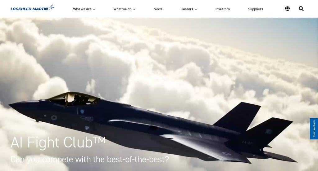
2. Lockheed Martin
Why We Chose Lockheed Martin
The website for Lockheed Martin serves as a premier benchmark for “Global Defense Merchandising and High-Scale Aerospace Trust Architecture.” As an international powerhouse leading the charge in aerospace, defense, arms, and advanced technology security systems, their digital storefront must project immense engineering dominance and global multi-domain innovation. This platform masterfully succeeds by leaning into compelling, fast-paced media streams that seamlessly transform deep engineering achievements into digestible, highly modern public narratives.
Key Design Highlights:
- Cinematic Multi-Domain Strategic Hero Video Loop: The platform opens with a high-definition, sweeping video loop that commands immediate global authority. By showcasing rapid sequences of advanced aircraft taking flight, orbital space payloads, and tactical defense systems in action, the media instantly captures the massive scale, technical complexity, and high-stakes impact of their machinery the exact split second the page loads.
- Interactive “What We Do” Enterprise Project Slider: Positioned prominently within the core homepage scroll path is a dedicated, beautifully integrated project slider titled “What We Do.” This interactive carousel highlights massive, flagship initiatives across air, land, sea, space, and cyber domains – giving government stakeholders, defense partners, and international ministries a fast, visual summary of their active operational capabilities.
- Modern Social-First “Shorts” Video Grid: Adapting seamlessly to contemporary content consumption habits, the homepage incorporates a dedicated matrix of vertical video “shorts.” This modern layout tool injects dynamic, snackable video segments directly into the enterprise discovery path, highlighting internal tech breakthroughs and operational testing in an incredibly engaging, mobile-friendly format.
- Editorial Global Insights and Feature Blog Triage: Embedded smoothly into the lower homepage workflow is a dedicated feature section for their corporate blog and global news updates. Showcasing timely stories regarding upcoming space missions, clean energy research, and engineering milestones elevates the platform from a clinical arms vendor into an authoritative, forward-thinking leader shaping the future of global security and scientific discovery.
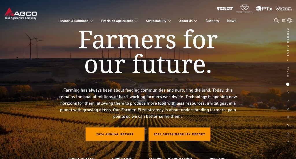
3. AGCO
Why We Chose AGCO Corporation
The website for AGCO Corporation serves as a premier benchmark for “Industrial AgTech Merchandising and High-Density Multi-Brand Conversion Architecture.” As a global leader in the design, manufacture, and distribution of smart agricultural machinery (including iconic brands like Fendt, Massey Ferguson, and Valtra), their digital storefront must project massive engineering scale while offering seamless utility to farmers and dealers. This platform masterfully succeeds by adopting a bold presentation model that transforms a vast corporate ecosystem into an effortlessly navigable, highly tactile experience.
Key Design Highlights:
- Immersive Vertical Slideshow Homepage Layout: The website completely reimagines the standard long-scroll corporate layout by structuring the homepage like a premium, vertical slideshow. As users scroll, the interface locks beautifully into massive, full-screen content blocks highlighting key pillars – like their “Farmer-First” strategy, sustainable innovations, and manufacturing excellence – creating an editorial storytelling flow that captures immediate user attention.
- Persistent Frictionless Sticky Header: To maintain fluid navigation across a deep, multinational platform, the desktop layout utilizes a beautifully engineered sticky header. As users transition between the full-screen story sections, the main navigation framework remains pinned elegantly to the top of the viewport, ensuring that critical corporate portals and investor updates stay instantly accessible.
- Sleek, High-Density Multi-Brand Mega Menu: To cleanly organize an enormous ecosystem of heavy equipment, digital precision farming solutions, and global services, the desktop navigation relies on an expansive mega menu. The dropdown systematically breaks down product segments – such as tractors, harvesting tech, and crop care – into clean, highly legible columns, creating a rapid, zero-friction discovery path to targeted product lines.
- Persistent Bottom Mobile Action Hub: Navigating heavy industrial operations on a smaller screen is made exceptionally smooth via sticky, persistent action buttons anchored along the bottom of the viewport. Housing instant gateways to high-value actions like finding a local dealer, accessing service information, or exploring investor relations, this mobile mechanic keeps essential conversions firmly within thumb’s reach at all times.
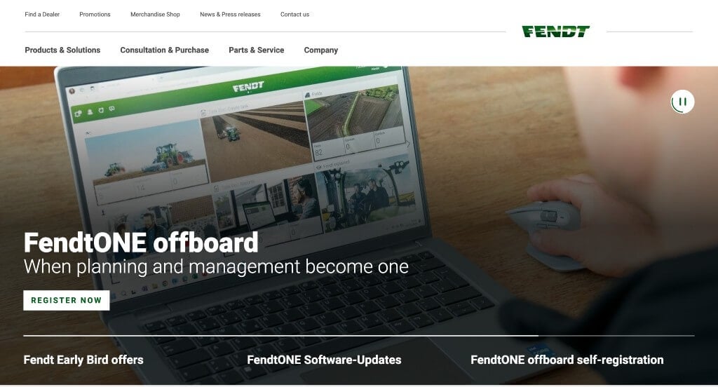
4. Fendt
Why We Chose Fendt
The website for Fendt serves as a premier benchmark for “Premium AgTech Merchandising and High-Fidelity Agricultural Conversion Architecture.” As a global leader in high-tech, precision farming equipment and smart agricultural machinery, their digital storefront must project unmatched engineering prestige and operational power. This platform masterfully succeeds by treating its homepage as an elite, high-visibility showroom that transforms heavy industrial machinery into an aspirational, software-forward solution for modern agricultural operators.
Key Design Highlights:
- Elite, High-Impact Hero Imagery Slideshow: The website commands immediate authority with an exceptional, full-screen media slideshow dominating the primary hero space. By deploying rich, razor-sharp imagery of their high-horsepower tractors, combines, and precision tech working in diverse field environments, the visual layout instantly captures the premium engineering and elite status of the brand the exact moment the page loads.
- High-Contrast “Award-Winning Lineup” Product Matrix: Positioned prominently within the core homepage scroll path is a dedicated section highlighting Fendt’s award-winning lineup of agricultural machinery. Displaying their flagship machinery categories through an organized, highly visual grid allows growers and dealership networks to rapidly explore the brand’s finest engineering feats – such as their world-renowned tractor and harvesting solutions – with zero visual clutter.
- Front-Page Editorial Blog and Tech Insights Triage: Positioned smoothly within the lower homepage layout is a dedicated feature section for their industry blog and resource center. Highlighting timely field stories, smart farming innovations, and dealer milestones elevates the platform from a clinical machinery catalog into an active, authoritative leader shaping the future of global food production and precision ag technology.
- Ultra-Clean Mobile View and Fluid Ergonomics: Translating an expansive ecosystem of complex heavy machinery, technical specifications, and dealer locators onto smaller screens is flawlessly managed. The mobile smartphone viewport elegantly stacks multi-column matrices, balances text scaling, and ensures that interactive navigation nodes remain perfectly optimized for smooth, frictionless scrolling for farmers browsing on the move.
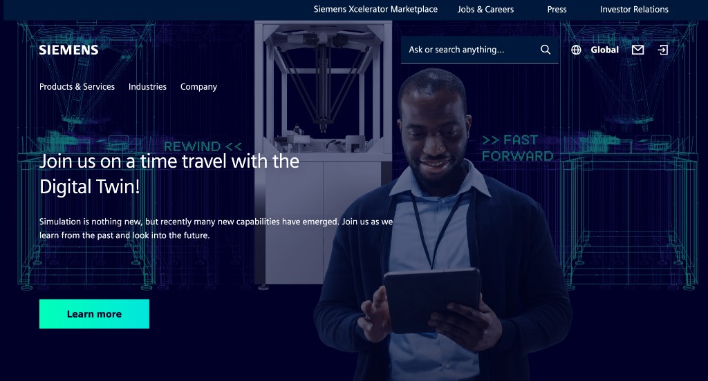
5. Siemens
Why We Chose Siemens
The website for Siemens (siemens.com) serves as a premier benchmark for “Industrial Conglomerate Merchandising and High-Density Multi-Domain Navigation.” As a global powerhouse spanning automation, digitalization, smart infrastructure, and mobility, their digital storefront must organize an overwhelming catalog of enterprise technologies into a structured, highly approachable user journey. This platform masterfully succeeds by deploying robust, persistent navigational mechanics that seamlessly anchor dense operational directories across all screen sizes.
Key Design Highlights:
- Comprehensive Front-Page Services and Offerings Mapping: The homepage serves as an exceptional corporate showcase, cleanly laying out their diverse technological pillars directly in the main scroll path. By explicitly framing their core offerings – ranging from digital factory automation and smart building infrastructure to advanced rail mobility and software ecosystems – the interface allows enterprise buyers, municipal developers, and investors to instantly map Siemens’ capabilities to their specific industrial scale.
- Sleek, High-Density Multi-Tiered Mega Menu: To cleanly coordinate an expansive network of global business units, product catalogs, and vertical industries, the desktop navigation relies on an incredibly robust mega menu. The dropdown systematically partitions complex software ecosystems and heavy engineering services into beautifully spaced, highly legible columns, giving technical buyers a rapid, zero-friction discovery path to deep-site engineering breakthroughs.
- Persistent Frictionless Sticky Header: To maintain fluid, effortless site navigation across a deep corporate web layout, the desktop experience utilizes a beautifully engineered sticky header. As users scroll deep into the homepage content or explore extensive service overviews, the primary navigation framework remains pinned elegantly to the top of the viewport, keeping search tools, contact portals, and core directories instantly accessible at any moment.
- Ultra-Clean Mobile Layout and Responsive Continuity: Translating an enterprise industrial portfolio into smaller viewports is expertly managed through a highly polished responsive framework. The mobile smartphone experience elegantly condenses the vast desktop mega menu into a clean, thumb-friendly touch interface, while text scaling and column structures adjust flawlessly to ensure smooth, zero-friction scrolling for business executives on the move.
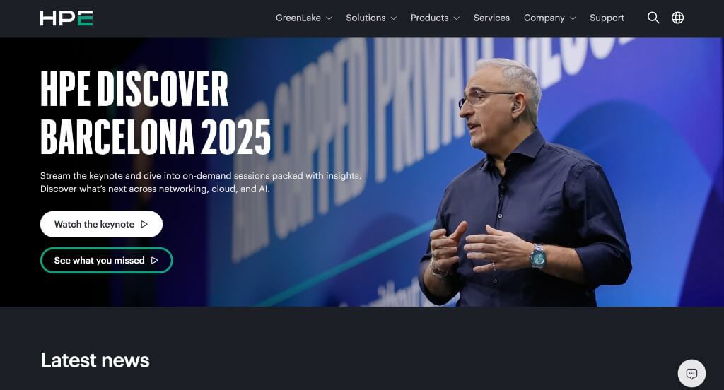
6. Hewlett Packard Enterprise
Why We Chose Hewlett Packard Enterprise (HPE)
The website for Hewlett Packard Enterprise serves as a premier benchmark for “Enterprise Edge-to-Cloud Merchandising and High-Trust B2B Funnel Architecture.” As a global leader in enterprise information technology, cloud computing, and digital transformation solutions, their digital storefront must project immense computational power and institutional reliability. This platform masterfully succeeds by treating its homepage as a clean, media-rich gateway that smoothly guides enterprise tech buyers, IT directors, and developers from initial validation directly into real-time engagement channels.
Key Design Highlights:
- Hybrid Media-Rich Hero Canvas: The platform opens with a compelling, high-fidelity media assembly dominating the primary hero real estate. By blending active video loops with striking imagery of data centers, cloud infrastructure, and intelligent edge technology, the interface immediately showcases the massive scale and tech-driven impact of their enterprise offerings the exact split second the page loads.
- Front-Page Global Case Study Triage: Embedded smoothly into the core homepage scroll path is a dedicated showcase highlighting real-world customer success stories and case studies. Highlighting how global organizations utilize HPE’s architecture to solve complex data infrastructure bottlenecks adds a powerful layer of validation, proving the firm’s capacity to scale operational efficiency right where prospects are evaluating the brand.
- Editorial Thought Leadership and Insights Blog: Positioned cleanly within the homepage layout is a dedicated feature section for their corporate blog and tech insights channel. Spotlighting timely pieces on artificial intelligence breakthroughs, edge computing, and hybrid cloud security trends elevates the platform from a clinical hardware and software vendor into an active, authoritative leader shaping the future of global enterprise technology.
- Instant Expert Conversational Support Portal: To assist high-intent commercial buyers who might have time-sensitive pre-purchase questions regarding product configurations, service agreements, or cloud scaling, the interface incorporates an active live chat feature. This direct communication layer removes massive corporate buying friction, providing an immediate, welcoming channel that converts casual site browsers into qualified sales leads.
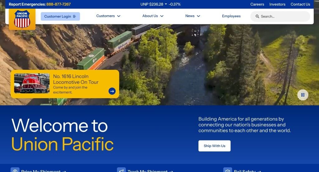
7. Union Pacific
Why We Chose Union Pacific Railroad
The website for Union Pacific serves as a premier benchmark for “Heavy Logistics Merchandising and High-Density Infrastructure Navigation.” As one of America’s premier transportation companies connecting global supply chains across thousands of rail miles, their digital storefront must project immense industrial scale and operational reliability. This platform masterfully succeeds by coupling sweeping industrial motion media with robust navigational mechanics that effortlessly anchor an expansive corporate ecosystem.
Key Design Highlights:
- Cinematic Supply-Chain Hero Video Loop: The platform establishes immediate industrial authority with a high-definition video sequence dominating the primary hero space. By flashing dynamic footage of freight trains traversing vast American landscapes, advanced intermodal facilities, and tech-driven rail yards, the media instantly captures the massive scale and economic impact of their logistics network the split second the page loads.
- Dynamic Media and Project Scroller Engine: Positioned smoothly within the primary homepage flow is an interactive content scroller dedicated to their latest logistics solutions, infrastructure projects, and strategic initiatives. This carousel allows supply chain managers, investors, and communities to rapidly cycle through key corporate milestones and operational breakthroughs without creating layout friction or overloading the page with text.
- Persistent Frictionless Sticky Mega Menu: To cleanly coordinate a vast network of shipping tools, real-time track tracing, career pathways, and investor relations, the desktop layout relies on an exceptionally robust sticky mega menu. As users scroll deep into the homepage, the primary navigation bar pins elegantly to the top of the viewport, deploying expansive dropdown columns that offer a zero-friction discovery path to deep technical data sheets and customer applications.
- High-Clarity Mobile Interface and Clean Touch Ergonomics: Translating an enterprise logistics ecosystem onto smaller screens is flawlessly managed through a polished mobile responsive framework. The mobile menu condenses complex industrial portals into a clean, highly scannable, and touch-optimized layout – ensuring that time-conscious supply chain professionals and field operators on the move can find critical tools instantly.
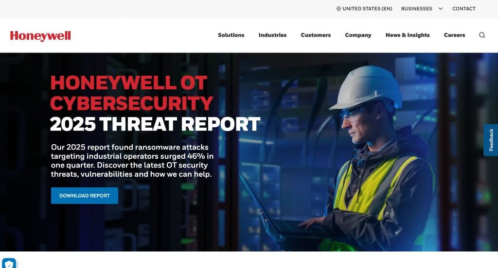
8. Honeywell
Why We Chose Honeywell
The website for Honeywell serves as a premier benchmark for “Multi-Industrial Conglomerate Merchandising and High-Fidelity Navigational Architecture.” As a global leader spanning aerospace, building technologies, performance materials, and safety solutions, their digital storefront must organize an incredibly dense operational ecosystem into an approachable, high-trust user journey. This platform masterfully succeeds by balancing broad corporate capabilities with modern, visually assisted navigation that remains fluid across all digital device profiles.
Key Design Highlights:
- Structured “What We Do” Enterprise Capability Matrix: The homepage features a dedicated, high-impact “What We Do” section positioned prominently within the primary scroll path. Rather than relying on vague corporate statements, this segment explicitly organizes their vast engineering reach into defined industrial pillars – such as aerospace innovation, building automation, and sustainable material technologies – allowing enterprise procurement officers and partners to instantly validate Honeywell’s technical alignment with their projects.
- Icon-Assisted Desktop Navigation Architecture: A standout aesthetic and functional triumph of the desktop interface is the integration of crisp, intuitive iconography directly within the primary dropdown menus. By pairing technical category names with clean, modern visual icons, the navigation engine reduces cognitive load, allowing users to rapidly scan and identify complex industrial sectors and product categories with zero friction.
- Front-Page Editorial Insights and Global Blog Triage: Embedded smoothly into the homepage workflow is a dedicated feature section highlighting their corporate blog and industry insights. Spotlighting timely pieces on artificial intelligence breakthroughs, energy transition strategies, and industrial internet of things (IIoT) updates elevates the platform from a standard equipment manufacturer into an authoritative, forward-thinking thought leader shaping the future of global technology.
- Fluid Mobile Viewport and Optimized Touch Ergonomics: Translating a sprawling, multinational conglomerate layout onto smaller screens is flawlessly executed through a highly polished responsive framework. The mobile smartphone experience elegantly condenses heavy data grids and nested navigation tiers into a clean, thumb-friendly layout that ensures smooth scrolling and effortless discovery for busy executives and field engineers on the move.

9. Waste Connections
Why We Chose Waste Connections
The website for Waste Connections serves as a premier benchmark for “High-Scale Utility Merchandising and Frictionless Regional Service Architecture.” As one of the largest waste management, recycling, and environmental services providers in North America, their digital storefront must effortlessly guide millions of diverse users – from local homeowners to enterprise industrial facility operators – to localized waste disposal solutions. This platform masterfully succeeds by treating its homepage as a clean, highly transactional service matrix that combines wide-market capabilities with real-time customer conversion tools.
Key Design Highlights:
- Dual-Market Residential and Commercial Capability Showcase: The homepage avoids any navigational ambiguity by immediately partitioning its primary service lines into distinct, high-visibility paths for both residential consumers and commercial enterprises. Showcasing trash pickup, recycling programs, dumpster rentals, and specialized industrial waste management directly in the main scroll path allows local residents and corporate procurement managers to instantly self-identify and find their specific disposal track.
- Sleek, High-Density Multi-Tiered Mega Menu: To cleanly organize an enormous infrastructure network spanning waste collection, recycling facilities, landfills, and commercial sustainability initiatives, the desktop navigation relies on an expansive mega menu. The dropdown systematically breaks down regional services, bill-pay portals, and corporate responsibility documents into beautifully spaced, highly legible columns, giving users a zero-friction discovery path to deep-site resources.
- Front-Page Customer Review and Community Trust Matrix: Integrated smoothly into the homepage layout is a dedicated section showcasing verified customer reviews and community feedback. Highlighting real-world testimonials regarding reliable pickup schedules, clean operations, and courteous local drivers injects an essential layer of local accountability and peer-to-peer social proof right where new customers are evaluating waste disposal providers.
- Instant Conversational Service and Support Portal: To immediately assist fast-moving property managers, contractors, or new residents who might have time-sensitive questions regarding holiday collection schedules, service setup, or dumpster sizing, the interface incorporates an active live chat feature. This real-time accessibility removes typical logistical buying friction, providing an immediate, welcoming communication channel that converts casual site browsers into scheduled accounts.
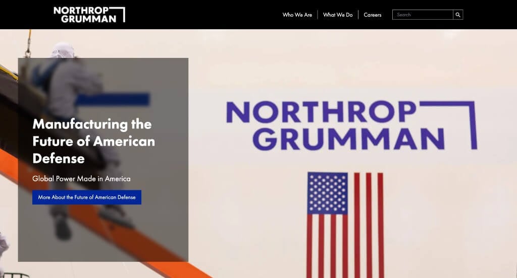
10. Northrop Grumman
Why We Chose Northrop Grumman
The website for Northrop Grumman serves as a premier benchmark for “Global Defense Merchandising and High-Impact Aerospace Engineering Showrooms.” As an international leader in pioneering aerospace, defense, and space systems, their digital platform must project unparalleled technological superiority and national security trust. This storefront masterfully succeeds by abandoning dense defense jargon in favor of a visually stunning, media-forward layout that frames their global security solutions as cinematic triumphs.
Key Design Highlights:
- High-Fidelity and Impactful Media Integration: The website immediately commands institutional authority by leveraging exceptionally sharp, high-contrast imagery and sweeping cinematic videos throughout the layout. From deep-space telescopes to cutting-edge stealth aircraft, the visual assets are treated with elite, editorial precision – capturing the immense scale and real-world impact of their engineering breakthroughs the split second the page loads.
- Front-Page Strategic Project Showcase: Positioned directly within the primary homepage scroll path is a dedicated showcase highlighting their flagship engineering initiatives and multi-domain platforms. Rather than burying their accomplishments in deep technical directories, this curated exhibition brings their major breakthroughs in autonomous systems, cyber security, and aerospace design straight to the forefront, allowing government stakeholders and partners to rapidly review active capabilities.
- Streamlined Mobile Viewport and Clean Grid Architecture: Translating an enterprise defense portfolio onto smaller screens is flawlessly managed through a highly polished responsive framework. The mobile layout elegantly rearranges multi-column grids into a clean, single-column stack, balancing typography scaling and maintaining fast, intuitive touch ergonomics for defense executives and engineering talent browsing on the go.
- Omnichannel Connectivity Social Footer Matrix: Anchoring the conclusion of the homepage journey is a beautifully structured, cohesive social ecosystem section housed inside the footer. Compiling clean, direct portals to their active social media platforms ensures that prospective talent, investors, and defense enthusiasts can seamlessly pivot from formal corporate capabilities to real-time, culture-focused storytelling across the web.
WordPress Industrial Themes
You can find free themes at wordpress.org, or consider industrial-inspired templates on ThemeForest.
Industrial – Themeforest
$69
Industrium – Themeforest
$39
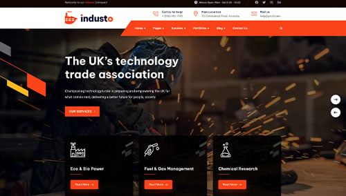
Industo – Themeforest
$59
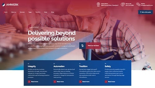
Amwerk – Themeforest
$69