In the competitive landscape of modern e-commerce, your Shopify store is more than just a checkout button – it is an immersive brand experience. Shopify has become the definitive platform for retailers who demand unmatched uptime, mobile-first responsiveness, and a frictionless path to purchase. However, the most successful brands go beyond the default settings to create bespoke digital storefronts that captivate and convert.
Our e-commerce development team analyzed hundreds of storefronts to identify the top 11 examples that push the boundaries of the Shopify ecosystem. We evaluated these sites based on conversion rate optimization (CRO) strategies, sophisticated product storytelling, and seamless third-party integrations. These selections demonstrate how to leverage Shopify’s robust infrastructure while maintaining a unique, high-end brand identity.
Whether you are a direct-to-consumer (DTC) startup or an established brand scaling to global markets, these examples represent the current benchmark for Shopify excellence in 2026.
Note on Our Selection Process: We recently audited this guide to remove inactive storefronts and sites that no longer meet our rigorous standards for performance and UX. This curated list now focuses on the top 11 Shopify websites providing the most strategic value in 2026.
Top Shopify Website Designs
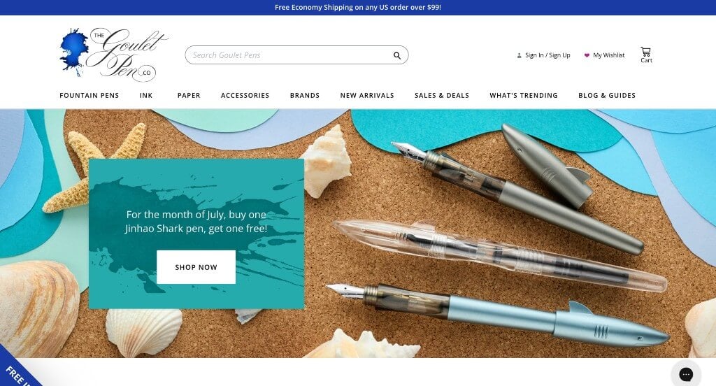
1. Goulet Pen Company
Why We Chose Goulet Pens
The website for Goulet Pens serves as a premier benchmark for “High-Density Hobbyist Merchandising and Community-Driven Commerce Flow.” For a specialty retailer catering to fountain pen and fine writing enthusiasts, a digital storefront must act as both an efficient hyper-market and an educational hub. This platform masterfully succeeds by structuring an immense inventory of highly specific products into a clean, easy-to-navigate framework that values user guidance as much as direct conversion.
Key Design Highlights:
- High-Density Front-Page Product Galleries: The homepage acts as a rich, visual catalog by showcasing curated product collections throughout the entire main scroll path. Organizing items into specialized grids – such as new arrivals, trending fountain pens, and seasonal ink samples – enables hobbyists and gift-shoppers to rapidly browse hot items and jump straight into the purchasing pipeline.
- Masterfully Structured High-Density Mega Menu: To organize an expansive catalog of thousands of specialized pens, nib sizes, paper types, and bottled inks without causing user fatigue, the interface relies on a robust mega menu system. The expanded navigation breaks down options by brand, color, price, and technical feature into crisp, accessible columns, ensuring enthusiasts can locate exact writing tools within seconds.
- Educational Community Blog Integration: Positioned seamlessly within the homepage workflow is a dedicated section spotlighting their latest blog content. Featuring expert fountain pen care guides, ink swatching videos, and handwriting tips elevates the platform from a simple retail shop to an essential industry resource hub, building incredible brand authority and customer loyalty.
- Instant Expert Conversational Live Chat: To assist customers navigating the complex technicalities of fine writing – such as nib compatibility, ink properties, or fountain pen maintenance – the homepage integrates an active live chat portal. This communication tool connects shoppers directly with knowledgeable specialists, instantly resolving pre-purchase technical questions and reducing cart abandonment.
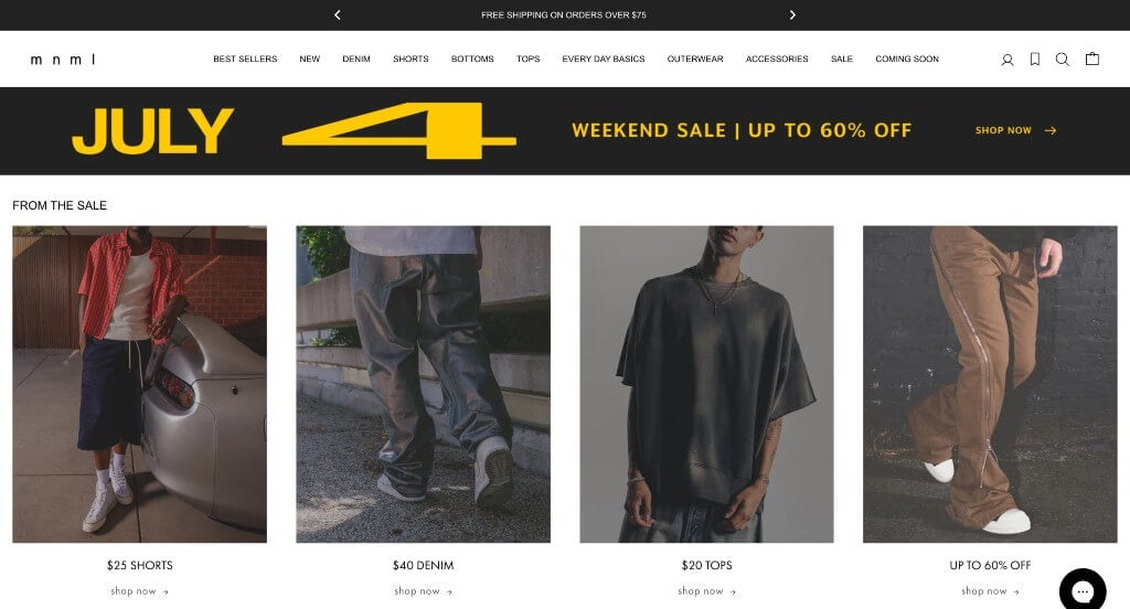
2. mnml
Why We Chose mnml
The website for mnml serves as a premier benchmark for “High-Velocity Streetwear Merchandising and Frictionless Mobile Commerce.” In the fast-paced direct-to-consumer fashion industry, an e-commerce platform must replicate the rapid browsing habits of social media feeds while making the purchasing process entirely seamless. This platform masterfully succeeds by reducing design clutter and allowing a high-density matrix of product photography to drive the retail experience.
Key Design Highlights:
- High-Density Front-Page Product Grid: The homepage strips away traditional corporate filler and promotional fluff, filling the screen with an extensive collection of their products right from the start. This continuous wall of curated streetwear enables fashion-forward shoppers to immediately start browsing the catalog the moment they land on the site.
- High-Fidelity, High-Contrast Product Photography: To ensure online buyers know exactly what they are purchasing, the layout relies on exceptionally crisp, clear product imagery. By utilizing clean studio lighting that accurately captures fabric drapes, wash textures, fit silhouettes, and hardware details, the visuals minimize purchase hesitation and reduce return rates.
- Streamlined Mobile-First Interface Architecture: Engineered specifically for the mobile shopper, the smartphone layout delivers a remarkably clean, easy-to-follow interface on smaller screens. Product tiles scale proportionally, navigation elements remain thumb-accessible, and scrolling feels incredibly fluid, ensuring an uncompromised checkout funnel on the go.
- Dynamic Global Announcement Bar Header: Positioned at the absolute top of the site is a dedicated announcement banner that actively rotates through new collection drops, limited-time sales, and special shipping offers. This minimalist communication strip keeps returning customers immediately informed of time-sensitive retail events without interrupting the core shopping grid below.
3. G Fuel
Why We Chose G FUEL
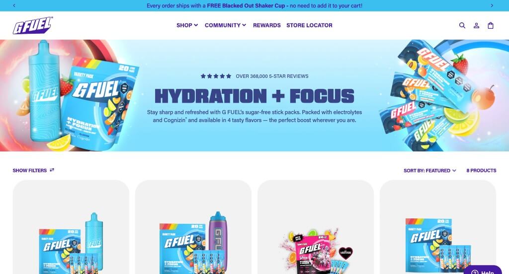
The website for G FUEL serves as a premier benchmark for “High-Energy Gaming Commerce and Multi-Device Visual Synchronization.” As a leading energy drink brand deeply rooted in esports, creator, and gaming culture, the digital storefront must match the fast-paced, vibrant lifestyle of its community. The platform masterfully achieves this by pairing action-packed motion graphics with a crisp, punchy color palette and robust social proof that translates flawlessly across any hardware setup.
Key Design Highlights:
- High-Impact Product-Focused Hero Video: The home page opens with a dynamic, high-energy video loop dominating the primary hero real estate. By flashing fast-paced cuts of their latest energy formula tubs, shaker cups, and collaborative pop-culture flavor drops right at the top of the page, the site instantly builds excitement and showcases its physical product lineup in a premium, commercial-grade format.
- High-Contrast Pop-Aesthetic Color Scheme: The layout cleverly pairs a clean, bright white background with electrified purple and blue accent colors. This deliberate contrast creates a highly focused visual environment where the vivid label artwork and graphic branding on the supplement tubs virtually pop off the screen, using punchy tones to guide the viewer’s eye effortlessly toward primary conversion points.
- Community-Backed Front-Page Review Grid: Positioned clearly within the primary homepage flow is a dedicated section highlighting verified user reviews. Showcasing authentic customer feedback regarding taste profiles, energy longevity, and shipping speeds injects a vital layer of social proof directly into the browsing journey, reassuring new buyers before they head to checkout.
- Flawless Mobile Alignment and Layout Continuity: The platform boasts an agile responsive framework that transitions smoothly down to handheld screens. The mobile layout preserves the core branding elements while keeping all product tiles, text columns, and call-to-action buttons in perfect alignment, ensuring an easy-to-understand and frictionless mobile shopping experience.
4. Death Wish Coffee
Why We Chose Death Wish Coffee
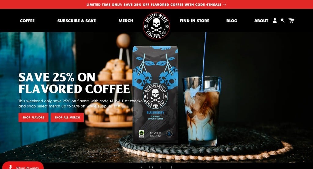
The website for Death Wish Coffee serves as a premier benchmark for “High-Velocity Beverage Merchandising and Authority-Backed Brand Positioning.” For a cult-favorite coffee brand famous for roasting some of the strongest blends in the world, the digital storefront must balance its raw, high-octane attitude with highly refined retail mechanics. This platform masterfully succeeds by mixing bold, dark brand elements with immediate product discovery routes and undeniable mainstream social proof.
Key Design Highlights:
- Immediate Front-Page “New Arrivals” Showcase: The homepage features a dedicated, high-visibility layout section celebrating their latest coffee blends, limited-edition roasts, and fresh merchandise drops. Positioning these new releases directly in the main scroll path creates immediate interest for returning subscribers and collectors looking to grab their newest products right as they land on the site.
- Masterfully Structured High-Impact Mega Menu: To organize an expansive catalog of ground coffee, whole beans, single-serve pods, brewing gear, and branded apparel without overwhelming the user, the interface utilizes a beautifully designed mega menu system. The dropdown navigation organizes products into clean, easily digestible columns that balance sleek typography with intuitive pathways, making it easy to move toward a checkout.
- Mainstream Media “Featured On” Authority Triage: A major structural highlight of the home page layout is a prominent “Featured On” section highlighting top-tier media platforms where the brand has been discussed. Showcasing highly recognizable badges from major television networks and national publications adds an instant layer of mainstream authority, validating their bold product claims to first-time buyers.
- Community-Backed Flavor and Strength Testimonials: Positioned smoothly across the home page workflow are authentic customer reviews and testimonials. Displaying real customer accounts that validate the coffee’s bold flavor notes, smoothness, and high-energy caffeine kick provides relatable proof that turns curious browsers into confident customers.
5. Chubbies Shorts
Why We Chose Chubbies Shorts
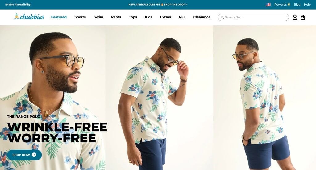
The website for Chubbies Shorts serves as a premier benchmark for “High-Velocity Lifestyle E-Commerce and Frictionless Customer Support Integration.” For an iconic apparel brand built on vibrant, casual styling, the digital storefront must capture a fun, high-energy aesthetic while executing flawless retail mechanics. This platform masterfully succeeds by keeping its home page focused entirely on visual product discovery and providing instant communication pathways for the modern shopper.
Key Design Highlights:
- High-Density, Shopable Homepage Grid: Rather than hiding its seasonal apparel behind corporate filler, the homepage opens directly into a rich, shopable matrix of products. This immediate integration of direct retail cards right in the main scroll path allows visitors to instantly browse trending swim trunks, shorts, and casual wear, drastically reducing the time it takes to move from discovery to purchase.
- High-Fidelity, Color-Accurate Product Media: The layout relies on crisp, exceptionally high-quality product photography that lets users clearly evaluate patterns, fabric drape, and style details. By capturing both clean studio angles and active lifestyle shots, the visuals accurately showcase garment textures and fits, ensuring online buyers can select items with absolute confidence.
- Streamlined High-Density Mega Menu: To organize an expansive and continuously growing apparel catalog – ranging from casual shorts and swimwear to performance tops and accessories – the interface utilizes an intuitive mega menu system. The expanded dropdown partitions styles, collections, and sizing categories into clean, beautifully spaced columns that simplify site-wide navigation.
- Dual-Track Conversational Support Footer: A standout structural feature of the site design is the customer support block embedded directly in the footer, offering instant options for both live web chat and SMS text support. Elevating customer service to a dedicated, mobile-friendly text channel aligns perfectly with the communication habits of a digital-native audience, instantly resolving pre-purchase questions.
6. Peak Design
Why We Chose Peak Design
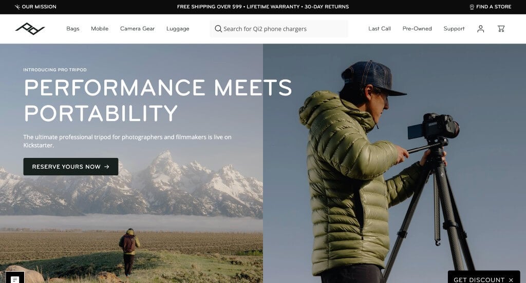
The website for Peak Design serves as a premier benchmark for “Minimalist Technical Merchandising and High-Fidelity Mobile Ergonomics.” For a brand globally recognized for engineering premium, high-utility carry solutions and camera gear, the digital storefront must reflect that same commitment to precision and clean functionality. This platform masterfully succeeds by keeping the interface remarkably uncluttered while using rich, real-world media to demonstrate product utility right from the main scroll path.
Key Design Highlights:
- Cinematic, Real-World Hero Video Loop: The website opens immediately with a high-fidelity, beautifully captured video dominating the primary hero area. Rather than showing static studio product shots, the video showcases their bags, tripods, and camera clips being actively used in rugged, real-world travel and adventure scenarios, instantly proving the product line’s durability and practical design.
- Simplistic and Focused Mega Menu Blueprint: To organize an advanced ecosystem of technical backpacks, travel cases, and mobile accessories without causing cognitive overload, the site utilizes a beautifully stripped-back mega menu. By leaning on clean typography, generous whitespace, and minimal sub-categories, the navigation path feels intuitive and completely frictionless for busy creators.
- Curated Front-Page Best Sellers and Category Index: Positioned smoothly down the home page is a dedicated directory highlighting their most popular, community-verified gear alongside explicit product category blocks. Presenting these high-conversion, top-tier items right on the main scroll path gives new visitors a trusted starting point and a direct path to checkout.
- Streamlined and Ultra-Clean Mobile Navigation: Built with a strict mobile-first mindset, the smartphone layout delivers an exceptionally clean, responsive experience on smaller screens. Text scales perfectly, imagery remains high-impact without slowing down load times, and the touch-friendly menus ensure navigating their technical catalog feels fluid and effortless on the go.
7. Fangamer
Why We Chose Fangamer
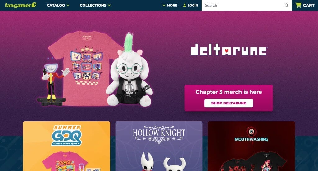
The website for Fangamer serves as a premier benchmark for “Pop-Culture Fandom Merchandising and Community-Centric Retail Layouts.” For an independent gaming merchandise hub, the digital storefront must capture the passionate, creative spirit of the gaming community while presenting a vast catalog of unique apparel, physical media, and collectibles. This platform masterfully succeeds by treating its homepage as a rich, colorful gallery space that grounds its products in social proof and community-driven storytelling.
Key Design Highlights:
- Vibrant High-Density Product Matrix: The homepage features a stunning arrangement of bright, colorful gaming assets and apparel options. By combining exceptional, high-fidelity product photography with a beautifully structured grid layout, the site displays its items with an inviting, tactile quality that turns basic scrolling into a fun discovery process for passionate fans.
- Curated Front-Page Product Review Triage: A major structural highlight of the layout is the placement of verified customer reviews linked directly to specific products on the home page. Showcasing real enthusiast feedback regarding fabric comfort, print quality, and design details builds rapid, authentic trust with gamers who value high-quality collectibles.
- Visual Instagram Social Proof Grid: Positioned seamlessly within the homepage workflow is a dedicated Instagram highlight feed. Showcasing real-world imagery of fans wearing their favorite apparel and displaying merchandise in their homes provides an excellent layer of peer-to-peer social proof, seamlessly bridging the gap between digital retail and the broader gaming community.
- Editorial Behind-the-Scenes Blog Feature: The platform incorporates a dedicated layout section spotlighting their latest blog entries. Featuring insights into product development, artist collaborations, and company announcements elevates the site from a standard storefront into an authentic, narrative-driven space where fans can connect deeply with the creators behind the products.
8. Silk & Willow
Why We Chose Silk & Willow
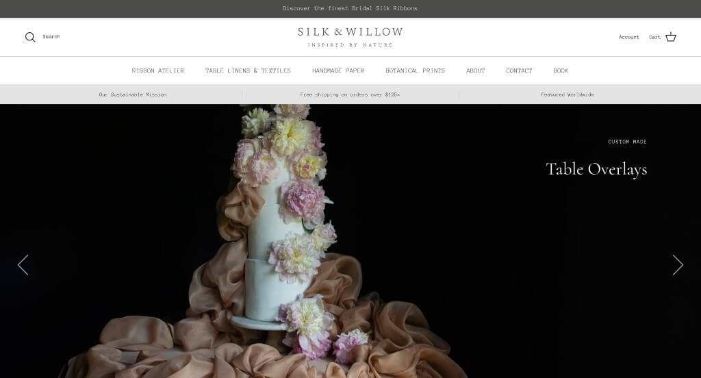
The website for Silk & Willow serves as a premier benchmark for “Artisanal Aesthetic Minimalisms and Intuitive Color-Driven Merchandising.” For a luxury, eco-friendly wedding textile brand specializing in plant-dyed silk ribbons and linens, the digital storefront must capture the organic, poetic nature of the physical products. This platform masterfully succeeds by pairing a pristine, gallery-like layout with an innovative, color-centric search architecture that caters perfectly to visual artists and event designers.
Key Design Highlights:
- Immersive Creative Slideshow Hero: The website utilizes its prime hero real estate to run a curated slideshow showcasing their hand-dyed creations in real-world settings. Leading with these sweeping, romantic images of tablescapes and bridal bouquets instantly establishes a high-end mood and provides immediate inspiration for designers arriving on the site.
- High-Contrast Gallery Aesthetic Canvas: The homepage features a crisp, clean white background that serves as a pristine backdrop for the product photography. Because their hand-dyed textiles are typically shot against rich, moody, and dark backgrounds, this intentional layout contrast allows the intricate textures and subtle color variations of the fabrics to pop with remarkable clarity.
- Innovative “Search by Color” Floating Portal: A standout functional triumph of the site is the persistent “Search Color” button anchored seamlessly in the bottom right corner of the screen. Recognizing that wedding planners and brides shop strictly by palette, this interactive tool allows users to select a specific shade and immediately filter the catalog for matching textiles, removing massive friction from the design process.
- Fluid Mobile Flow and Spatial Continuity: The platform scales effortlessly down to handheld devices, delivering a highly responsive mobile experience that feels completely unhurried. The product grids downsize beautifully, typography maintains its elegant proportion, and the touchscreen scrolling remains incredibly smooth, making mobile browsing feel natural and luxurious.
9. Cowboy
Why We Chose Cowboy
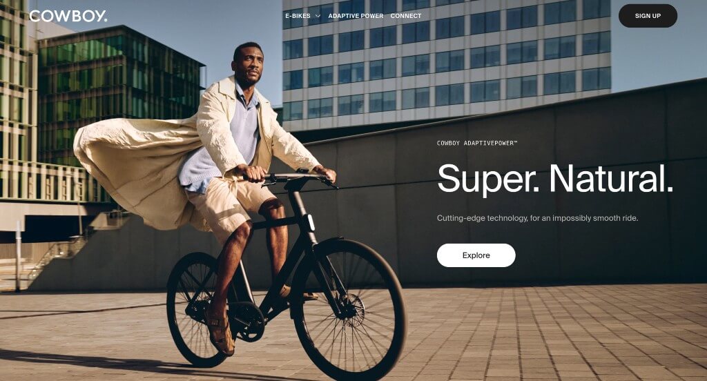
The website for Cowboy serves as a premier benchmark for “Kinetic Product Storytelling and Immersive Mobile Hardware Conversion.” For an innovative, high-end connected electric bike manufacturer, a digital storefront must go beyond basic specification sheets – it must convey the invisible feeling of motion, smart connectivity, and superior frame engineering. This platform masterfully succeeds by treating its homepage as an interactive, cinematic journey that feels as sleek and modern as the bikes themselves.
Key Design Highlights:
- Lifestyle-Driven Multi-Persona Hero Video: The website immediately commands attention with a high-fidelity video loop dominating the primary hero real estate. By showing the electric bike being actively ridden by a diverse range of people through various urban environments, the media instantly communicates versatility, effortless speed, and real-world utility the split second the page loads.
- Macro Design Detail and High-Fidelity Imagery: Throughout the homepage layout, massive, razor-sharp product images take center stage. These oversized visuals isolate specific engineering achievements – such as the seamlessly integrated battery, internal cable routing, and custom-molded cockpit – allowing design-conscious consumers to clearly inspect the premium build quality and craftsmanship without any visual clutter.
- Immersive “Scrolly-telling” Interactive Mechanics: A major technical highlight of the desktop experience is the deliberate use of scrolly-telling web animation. As the user moves down the page, traditional scrolling gives way to an interactive presentation where the bike components dynamically disassemble, rotate, or highlight smart software features in response to the user’s scroll speed, transforming passive reading into active digital exploration.
- Fluid Mobile Ergonomics and Learning Pathways: The platform boasts an exceptionally agile mobile framework built for seamless touch interaction on smaller screens. The dense animations and large-scale media scale proportionally down to smartphones without compromising site speed or readability, keeping the product’s technical details perfectly aligned, easy to understand, and highly interactive on the go.
10. Meller
Why We Chose Meller
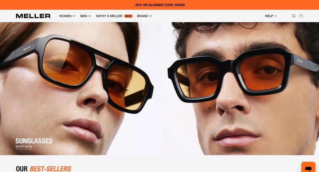
The website for Barcelona-born eyewear brand Meller serves as a premier benchmark for “High-Velocity Fashion Merchandising and Lifestyle-Driven Social Proof.” For a direct-to-consumer accessories brand competing in a highly visual market, a digital storefront must blend effortless navigation with immediate trust anchors and styling inspiration. This platform masterfully succeeds by treating its homepage as a curated digital lookbook that aggressively eliminates buyer hesitation.
Key Design Highlights:
- Editorial “How to Style Them” Inspiration Block: A standout structural feature on the home page is the dedicated “How to Style Them” lifestyle section. Rather than displaying sunglasses as isolated product listings, this layout illustrates how to build an entire fashion aesthetic around different eyewear models. Pairing the products with contemporary streetwear outfits helps shoppers visualize the items in the real world, driving immediate styling inspiration.
- Global Trustpilot Social Proof Integration: Placed prominently within the primary homepage flow is an official Trustpilot review integration. Showcasing real-time, verified customer scores and feedback directly on the main scroll path provides an immediate layer of global credibility regarding shipping reliability, frame durability, and lens clarity, reassuring first-time international buyers.
- Fluid, Visual-First Mega Menu Architecture: To organize an expansive collection of sunglasses, blue light glasses, and watches without cluttering the screen, the platform utilizes a beautifully structured mega menu. The dropdown layout balances clean, minimal typography with integrated product visuals, allowing users to jump directly to specific frame shapes (like round, square, or aviator) within a single click.
- Proactive Front-Page FAQ Triage: Positioned smoothly near the bottom of the homepage workflow is a clean, accessible Frequently Asked Questions directory. By tackling common pre-purchase friction points – such as shipping times, return policies, UV protection standards, and prescription options – right on the front page, the interface efficiently resolves customer doubt before they reach the checkout funnel.
11. autobrush
Why We Chose AutoBrush
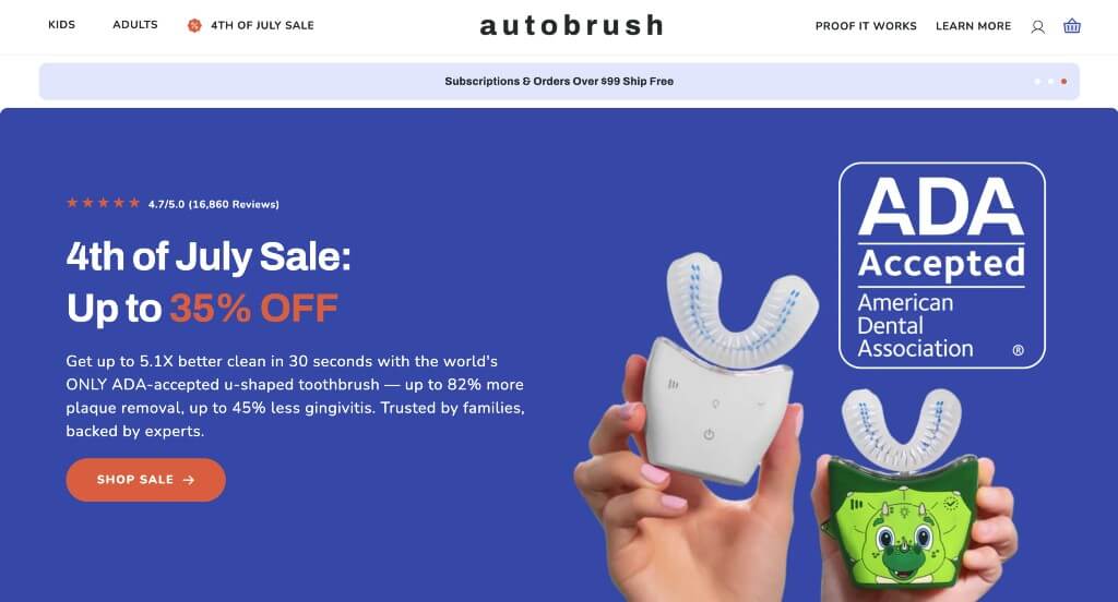
The website for AutoBrush serves as a premier benchmark for “Disruptive Health-Tech Education and High-Trust D2C Conversion Architecture.” For a brand introducing a novel, 360-degree automatic toothbrush design, the digital storefront must overcome consumer skepticism by aggressively educating the user on dental efficacy while streamlining the e-commerce funnel. This platform masterfully succeeds by structuring its homepage as an educational trust-building engine, combining clinical justification with rich social proof.
Key Design Highlights:
- Thematic “Why AutoBrush” Comparative Hub: A major structural anchor of the homepage layout is the dedicated “Why AutoBrush” section. This highly focused area explicitly breaks down the core engineering advantages of a U-shaped brush over traditional nylon toothbrushes, translating complex dental benefits into clear, consumer-friendly reasons to buy.
- Dual-Format Review and Social Proof Engine: Positioned directly on the front page is a robust customer feedback grid that blends both text-only reviews and user-submitted imagery. Showcasing real families, children, and adults actively using the physical product provides a crucial layer of raw, authentic social proof that validates the device’s comfort and cleaning power.
- Intuitive Mega Menu and Front-Page FAQ Triage: To organize a diverse catalog spanning adult models, kid-friendly animal characters, foaming toothpastes, and whitening accessories, the site utilizes a high-density mega menu system. This is paired with an inline Frequently Asked Questions accordion block near the bottom of the scroll path, proactively neutralizing common customer doubts about dental safety, vibration modes, and sizing right on the front page.
- Instant Conversational Customer Support Channel: To immediately assist parents or individual shoppers who might have nuanced pre-purchase questions regarding dental health compatibility, charging setups, or warranty coverage, the interface incorporates an active live chat portal. This real-time asset effectively lowers buying friction and guides hesitant browsers toward a confident checkout.
Recommended Shopify Themes
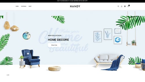
Handy – Themeforest
$59
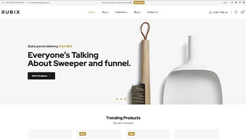
Rubix – Themeforest
$69
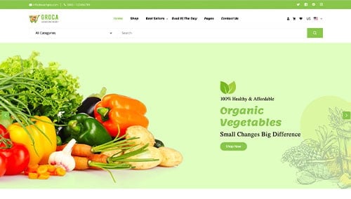
Groca – Themeforest
$59
Venedor – Themeforest
$59