In the physical therapy and rehabilitation industry, your website is the first step in a patient’s journey toward recovery. For someone dealing with chronic pain or post-surgical limitations, your online presence must immediately communicate clinical authority, personalized care, and a clear path to improved mobility. Our design team evaluated hundreds of physical therapy websites – from local boutique clinics and sports medicine specialists to large-scale rehabilitation networks. We looked beyond the visuals to identify the top 10 examples that excel in conversion-focused design, specifically analyzing their mobile-friendly scheduling, provider transparency, and the use of educational resources that build trust before the first appointment.
Whether you specialize in orthopedic manual therapy, pediatric development, or geriatric rehabilitation, these examples represent the current benchmark for digital excellence in the therapy world.
Note on Our Selection Process: We recently audited this guide to remove outdated designs and sites that no longer meet our performance standards. This curated list now focuses on the top 10 physical therapy websites providing the most strategic value in 2026.
Top Physical Therapy Website Designs
1. Orthopedic Spine Therapy
Why We Chose Orthopedic & Sports Physical Therapy (OSPT)
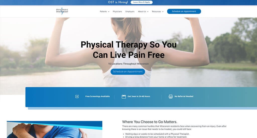
The website for Orthopedic & Sports Physical Therapy serves as a premier benchmark for “Value-Driven Consumer Transparency and Segmented Regional Social Proof.” When patients are seeking physical rehabilitation, they are often facing both physical vulnerability and financial uncertainty. This platform masterfully tackles these consumer barriers by combining bold competitive cost analytics with highly localized patient feedback tools directly on the home page.
Key Design Highlights:
- Transparent Value-Driven Pricing Matrix: A standout architectural feature of the home page is a dedicated price comparison chart that explicitly measures their operational pricing against regional competitors. Providing this level of upfront financial transparency builds immense consumer trust and instantly positions the practice as an accessible, patient-first healthcare option.
- Segmented Location Social Proof Engine: Authentic patient validation is prioritized through an advanced reviews slider equipped with interactive tabs that organize testimonials by specific clinic locations. Allowing users to sort reviews ensures that prospective patients can read verified feedback tied directly to the precise facility and clinical team they plan to visit.
- Redundant High-Visibility Booking Triggers: A major functional triumph of the layout is the placement of prominent “Request an Appointment” buttons within both the global header and the primary hero area. Multiplying these primary call-to-action triggers ensures that injured or high-intent users can instantly launch the scheduling pipeline the moment they land on the site.
- Experiential Brand Differentiation Core: The home page incorporates a compelling section titled “Our Patients Call This Our ‘WOW Factor'” to highlight their unique treatment philosophies and patient care standards. Defining these specific clinical differentiators and specialized therapeutic benchmarks helps humanize the brand while articulating why their rehabilitation model outperforms standard industry alternatives.
2. Athletico Physical Therapy
Why We Chose Athletico Physical Therapy
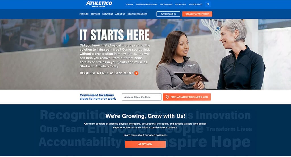
The website for Athletico Physical Therapy serves as a premier benchmark for “Financial Accessibility Transparency and Educational Resource Integration.” For patients seeking physical rehabilitation, understanding insurance coverage is often a primary barrier to starting treatment. This platform masterfully removes that friction by prioritizing financial validation alongside clear clinical pathways and healthcare education directly on the home page.
Key Design Highlights:
- Upfront Financial Accessibility Verification: A major highlight of the home page is the explicit, prominent mention that the company accepts health insurance. Addressing this critical administrative and financial concern right at the initial point of contact eliminates consumer guesswork, giving prospective patients immediate peace of mind and the confidence to move forward with care.
- Transparent Service Delivery Blueprints: Their primary physical therapy, rehabilitation, and specialized wellness services are clearly highlighted in a dedicated section on the home page. Pairing these high-level service summaries with a direct link to view all offerings allows fast-skimming users to quickly confirm if the clinic can treat their specific injury or condition.
- Authority-Building Thought Leadership Hub: A dedicated section on the home page brings their active health and wellness blog directly to the forefront. Featuring up-to-date educational articles, injury prevention tips, and expert recovery advice positions the organization as a trusted industry leader while providing valuable, free resources to patients.
- Grassroots Community Validation Integration: Authentic patient testimonials and recovery success stories are woven smoothly into the home page layout to provide upfront social proof. Elevating these verified, real-world experiences regarding successful therapeutic outcomes and compassionate clinical care anchors the network’s professional reputation with trustworthy community confirmation.
3. Illinois Bone & Joint Institute
Why We Chose Illinois Bone & Joint Institute (IBJI)
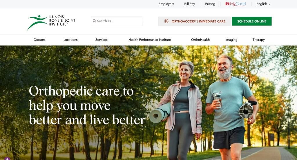
The website for the Illinois Bone & Joint Institute serves as a premier benchmark for “Anatomical Navigation Frameworks and Multi-Regional Healthcare Scaling.” When patients seek specialized orthopedic care, they often look for intuitive ways to isolate their specific pain points while verifying regional clinic accessibility. This platform masterfully streamlines this exploration by matching an advanced interactive lifestyle blueprint with extensive regional mapping directly on the home page.
Key Design Highlights:
- Interactive Anatomical Symptom Blueprint: A major technical highlight of the home page is an interactive image of a woman running that features clickable hot-spots across the body. Selecting these localized points seamlessly directs users to specific interior pages detailing matching orthopedic injuries, symptoms, and specialized treatments, transforming a standard search into an intuitive self-triage tool.
- Geographic Multi-Location Mapping and Index: The home page integrates a comprehensive physical map paired with a structured, scannable directory list of cities where they operate. Providing this immediate, dual-layered regional overview allows patients to instantly cross-reference their orthopedic needs with the nearest physical care facility or specialized clinic location.
- Value-Driven Brand Differentiation Core: A dedicated “Why Choose Us?” section on the home page explicitly outlines the organization’s unique care philosophies, consolidated services, and advanced clinical infrastructure. Defining these distinctive performance indicators and patient-centric advantages builds immediate institutional trust before a visitor enters the scheduling funnel.
- Authority-Building Thought Leadership Hub: A dedicated section on the home page brings their active orthopedic and musculoskeletal health blog directly to the forefront. Featuring timely, expert-written medical insights, recovery resources, and wellness tips positions the institute as an empathetic industry authority while giving patients valuable educational resources right from the start.
4. PT Solutions Physical Therapy
Why We Chose PT Solutions Physical Therapy
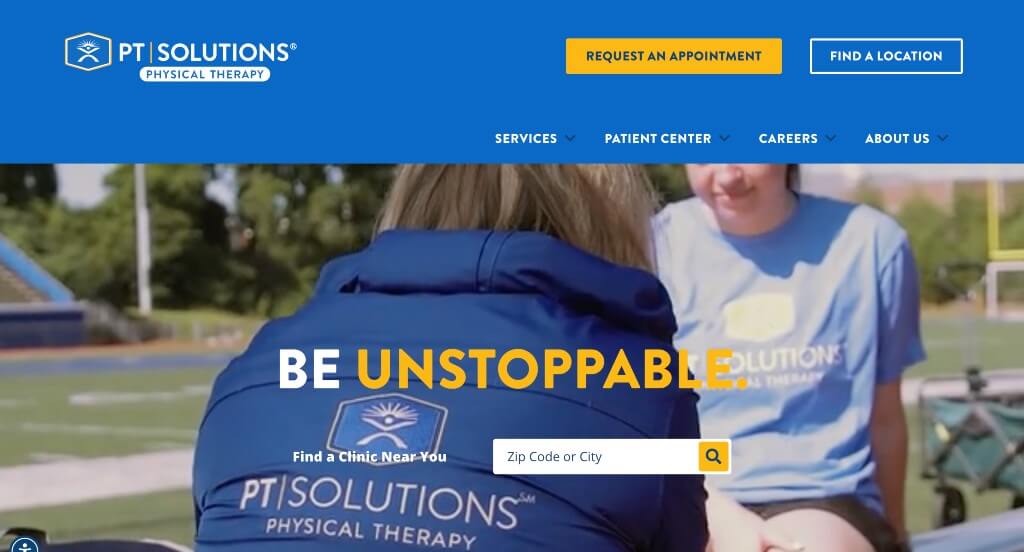
The website for PT Solutions Physical Therapy stands out as a premier example of “Community-Integrated Trust Networks and Structured Treatment Profiling.” For patients looking to rehabilitate an injury, a digital presence must immediately validate the clinical quality of the practice while demonstrating its active role in the surrounding region. This platform masterfully answers those user expectations by anchoring clear specialty directories, regional social integration, and localized clinical outreach directly on the home page.
Key Design Highlights:
- Value-Driven Brand Differentiation Core: A dedicated section titled “What Makes PT Solutions Better” explicitly outlines the practice’s unique treatment philosophies, clinical standards, and research-backed methodologies. Clarifying these objective performance indicators right away gives prospective patients immediate peace of mind and builds operational trust before they initiate the enrollment process.
- Transparent Service Delivery Blueprints: A comprehensive “Featured Therapies” section on the home page clearly organizes and showcases their primary specialized treatments and rehabilitation programs. Breaking these medical solutions down into highly digestible, structured sections allows fast-skimming users to quickly confirm that the practice can accommodate their specific recovery goals.
- Continuous Google Review Validation Slider: Real-world patient validation is prioritized through an interactive Google reviews slider module built directly into the home page layout. Delivering a steady stream of verified, high-rating client testimonials regarding successful outcomes and compassionate bedside manners anchors the practice’s clinical reputation with trustworthy community confirmation.
- Civic Credibility and Local Partnership Gallery: The home page layout incorporates a dynamic “Community Partners” slider highlighting their official alliances with local sports teams, educational systems, and regional organizations. Showcasing these institutional relationships visually cements the brand’s local authority, framing the clinical network as an embedded, trusted healthcare staple within the community.
5. Texas Star Rehab and Performance Center
Why We Chose Texas Star Rehab and Performance Center
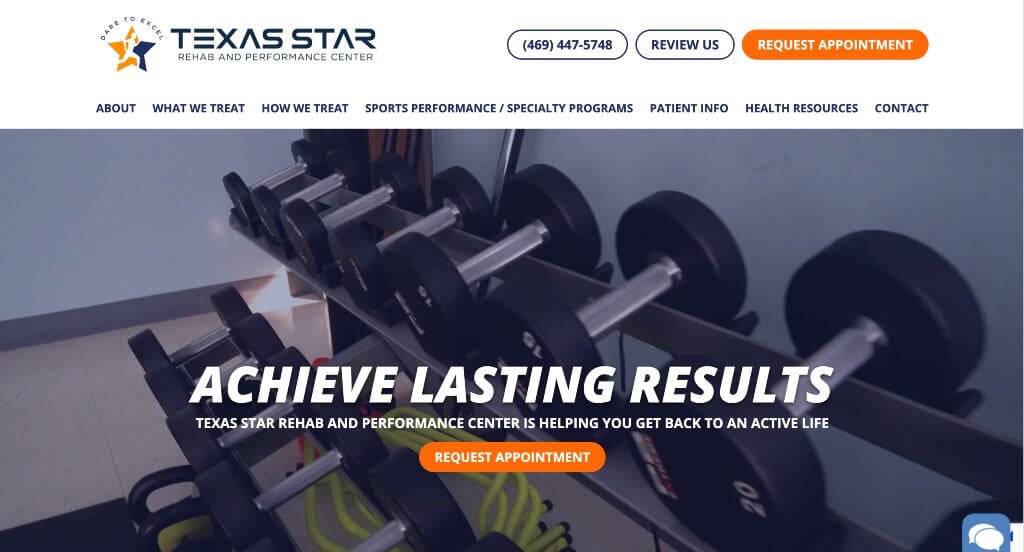
The website for Texas Star Rehab and Performance Center stands out as an exceptional model for “Elite Performance Validation and Instant Conversational Conversions.” For active individuals and competitive athletes, a physical therapy website must immediately demonstrate high-tier clinical capability and provide lightning-fast methods to connect with specialists. This platform masterfully accomplishes this by pairing elite athletic social proof with intuitive, interactive anatomical exploration tools right on the home page.
Key Design Highlights:
- Elite Athlete Validation Gallery: A major visual and strategic highlight of the home page is the prominent integration of testimonials and images featuring elite, high-profile athletes who train and rehabilitate at the facility. Showcasing these recognizable figures acts as an undeniable stamp of professional excellence, instantly reassuring everyday patients that they are receiving the exact same elite level of care, diagnostic precision, and cutting-edge therapeutic technology.
- Interactive Anatomical Symptom Blueprint: The website incorporates a dynamic interactive graphic of a running athlete embedded with clickable hotspots. Selecting these localized joint and muscle markers seamlessly routes users to detailed, dedicated interior pages outlining matching injuries, rehabilitation strategies, and targeted clinical techniques, helping patients intuitively self-triage their pain.
- Instant Conversational Engagement Hub: A dedicated live chat widget is built directly into the home page layout. Providing this real-time communication pipeline gives browsing users an immediate, low-barrier channel to ask questions regarding therapy availability, insurance coverage, or specialized sports performance programs, capturing high-intent leads before they navigate away.
- Direct-Line Header Booking Trigger: A primary functional anchor of the platform’s layout is a highly prominent “Request an Appointment” call-to-action button positioned permanently inside the global header. Placing this critical gateway at the highest point of the visual hierarchy ensures that visitors can effortlessly launch the booking process from any device at any point in their browsing experience.
6. Kins Physical Therapy
Why We Chose Kins Physical Therapy
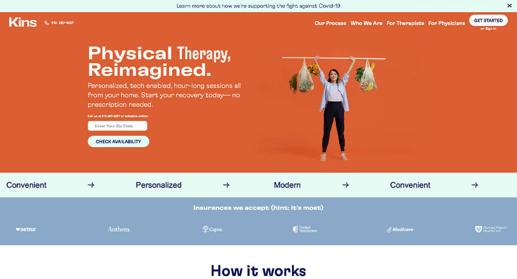
The website for Kins Physical Therapy stands out as a premier example of “Transparent Clinical Onboarding and Persistent Frictionless Communication.” For patients seeking home-based or hybrid physical rehabilitation, a digital platform must clearly articulate how the remote care framework operates while immediately dismantling barriers to enrollment. This platform masterfully achieves this by matching a structured, step-by-step patient journey blueprint with highly accessible, interactive patient-support tools directly on the home page.
Key Design Highlights:
- Linear Operational Process Blueprint: A major structural highlight of the home page is the explicit, sequential breakdown of their patient enrollment and treatment lifecycle. By grouping the workflow into three distinct milestones – “Check your eligibility,” “Get started at home,” and “Your plan, your way” – the site completely demystifies the specialized care model, giving prospective patients clear expectations before they begin care.
- Frictionless Floating Communication Gateway: The website layout incorporates an intuitive, interactive contact form widget positioned persistently in the bottom right corner of the screen interface. Giving users a low-barrier, expandable communication channel ensures that browsing individuals can immediately submit programmatic questions regarding insurance coverage, scheduling availability, or clinical capabilities without navigating away from the page.
- Transparent Service Delivery Blueprints: Their primary physical therapy solutions, clinical specialties, and localized treatment options are clearly highlighted in a dedicated section on the home page. Organizing these clinical services into clean, scannable content blocks ensures that fast-skimming users can instantly match their physical recovery goals or chronic conditions with the practice’s healthcare solutions.
- Proactive Client Inquiry Triage Hub: To further ease patient hesitation, the home page features a dedicated frequently asked questions (FAQs) section addressing common administrative and therapeutic concerns upfront. Delivering these direct, clear answers regarding session structures, equipment needs, or clinical parameters effectively cuts down on incoming introductory phone volume while accelerating consumer confidence.

7. Center Point Physical Therapy
Why We Chose Centerpoint Physical Therapy
The website for Centerpoint Physical Therapy stands out as an exceptional model for “Dual-Channel Communication Accessibility and Streamlined Mobile Connectivity.” For patients managing physical pain or injury, a digital platform must make reaching a coordinator effortless across both desktop and mobile devices. This site masterfully addresses that operational need by embedding permanent, dual-action text and voice gateways alongside descriptive clinical overviews directly on the home page.
Key Design Highlights:
- Persistent Mobile Action-Target Footer: A standout structural highlight of the mobile layout is a clean, highly optimized sticky footer bar that remains locked to the bottom of the viewport. This floating element houses prominent, dedicated buttons allowing on-the-go users to either call or text the clinic with a single tap, eliminating all communication friction for mobile researchers.
- Dual-Channel Header Contact Hub: The desktop and mobile global header configurations explicitly provide separate dedicated contact numbers for both traditional phone calls and direct text messaging. Offering this distinct choice right at the top of the page respects modern consumer communication preferences, allowing patients to initiate a conversation using their preferred method instantly.
- Comprehensive Treatment Type Directories: The home page layout incorporates a dedicated section detailing their various specialized rehabilitation and therapy types. Breaking down these different clinical modalities into structured, easy-to-read sections ensures that fast-skimming users can effortlessly identify the exact physical therapy program that addresses their specific injury or recovery goals.
- Grassroots Community Validation Integration: Authentic patient testimonials and recovery success stories are woven smoothly into the home page layout to provide upfront social proof. Showcasing these verified, real-world experiences regarding successful therapeutic outcomes and compassionate bedside manners anchors the practice’s professional reputation with trustworthy community confirmation.
8. Synergy Rehab
Why We Chose Synergy Rehab
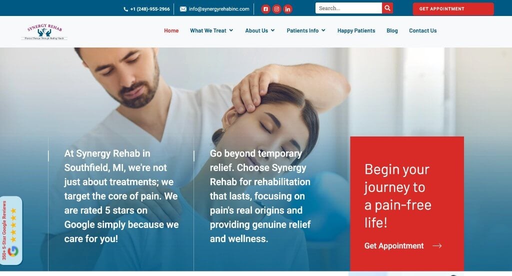
The website for Synergy Rehab stands out as an exceptional model for “Persistent Utility Docking and Redundant Conversion Architecture.” When prospective patients look for physical rehabilitation, a website must eliminate logistical barriers and keep scheduling options instantly accessible. This platform masterfully achieves this balance by pairing prominent communication touchpoints with highly responsive layout tools directly on the home page.
Key Design Highlights:
- Persistent Side-Tab Informational Hub: A major functional highlight of the user interface is the integration of persistent tabs positioned along the sides of the page. These floating navigation anchors allow visitors to instantly access additional company details or launch a direct communication channel at any point during their browsing experience, completely bypassing the need to scroll back to the top menu.
- Redundant High-Visibility Booking Triggers: The home page strategically incorporates multiple call-to-action buttons dedicated entirely to booking an appointment. Spacing these interactive triggers evenly throughout the primary page sections ensures that high-intent users can effortlessly initiate the scheduling workflow the exact moment they decide to take action.
- High-Contrast Bold Header Communications: The global header configuration prioritizes a prominent, bold contact number that immediately draws the eye. Placing this vital piece of communication data at the absolute highest point of the visual hierarchy ensures that users looking to speak with a care coordinator can find the clinic’s line instantly on any device.
- Iconographic Service Slider Matrix: A dedicated interactive service slider on the home page smoothly presents their distinct physical therapy offerings. Pairing each specialized medical service with a crisp, high-quality vector icon translates complex clinical categories into highly digestible visual markers, allowing fast-skimming researchers to quickly verify the practice’s rehab capabilities.
9. Movement X
Why We Chose Movement-X
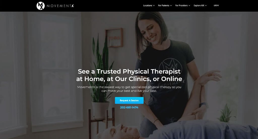
The website for Movement-X serves as a premier benchmark for “Data-Driven Credibility Architecture and Nationwide Care Optimization.” For patients seeking mobile or in-home physical therapy services, a digital storefront must immediately build institutional trust while clearly illustrating how the specialized service operates across different regions. This platform masterfully tackles these user expectations by merging undeniable reputation markers with nationwide accessibility tools directly on the home page.
Key Design Highlights:
- High-Visibility Google Rating Validation: A major highlight of the home page is the prominent display of their impressive 4.99-star Google rating. Placing this precise, near-perfect metric at the forefront of the user experience instantly builds a strong sense of clinical authority and reassures prospective patients of the consistent quality they can expect from the provider network.
- Geographic Nationwide Location Blueprint: The home page integrates a comprehensive nationwide location map that visually maps out their operating territories. Providing this interactive geographical overview allows browsing patients to instantly verify if these specialized physical therapists are accessible within their local community or state, eliminating administrative searching.
- Linear Operational Process Blueprint: A dedicated “How It Works” section on the home page explicitly details the sequential steps of a patient’s care journey. Breaking down the onboarding process into clear, highly digestible stages eliminates any confusion surrounding mobile or out-of-clinic physical therapy, setting transparent expectations for new users before they book.
- Grassroots Community Validation Integration: Authentic patient testimonials and recovery success stories are woven smoothly into the home page layout to provide upfront social proof. Elevating these verified, real-world experiences regarding exceptional therapeutic outcomes and personalized care anchors the practice’s professional claims with trustworthy community confirmation.

10. Foothills Physical Therapy & Sports Medicine
Why We Chose Foothills Sports Medicine Physical Therapy
The website for Foothills Sports Medicine Physical Therapy stands out as an exceptional model for “Immersive Visual Empathy and Redundant Conversion Engineering.” For patients navigating physical limitations or sports injuries, a digital interface must quickly cultivate an atmosphere of welcoming clinical expertise. This platform masterfully accomplishes this by combining a highly interactive anatomical navigation module with an authentic media narrative right on the home page.
Key Design Highlights:
- Cinematic Humanization Hero Loop: The website’s primary hero area features a high-fidelity video loop that captures real clinical staff and patients interacting during rehabilitation sessions. Leading with this warm, energetic visual narrative instantly lowers consumer hesitation, allows prospective patients to preview the clinic’s uplifting environment, and highlights the team’s hands-on, empathetic care model.
- Interactive Anatomical Symptom Blueprint: A major technical asset on the home page is a dynamic graphic of a woman embedded with clickable hotspots over various joints and muscle groups. Selecting these responsive markers seamlessly guides users to detailed information regarding common injuries, conditions, and specialized recovery strategies for that specific body part, allowing users to intuitively self-triage their discomfort.
- Redundant High-Visibility Booking Triggers: The home page layout strategically incorporates multiple “Request an Appointment” buttons spaced out across the entire user journey. Distributing these primary call-to-action targets throughout the page ensures that high-intent visitors can effortlessly launch the scheduling pipeline the exact moment they decide to take action, regardless of how far they scroll.
- Continuous Patient Review Validation Slider: Real-world patient success stories are heavily prioritized through an interactive reviews slider module built directly into the home page layout. Delivering a steady stream of verified testimonials regarding successful therapeutic outcomes and compassionate bedside manners anchors the practice’s professional reputation with trustworthy community confirmation.
WordPress Physical Therapy Themes
You can find free themes at wordpress.org or explore physical therapy-inspired templates at ThemeForest.
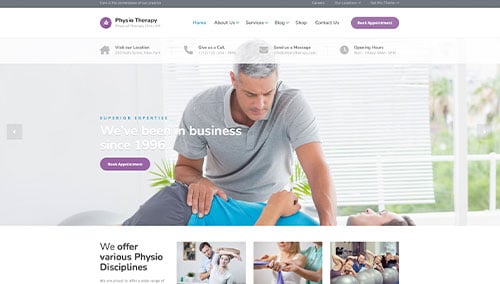
Physio – Themeforest
$59
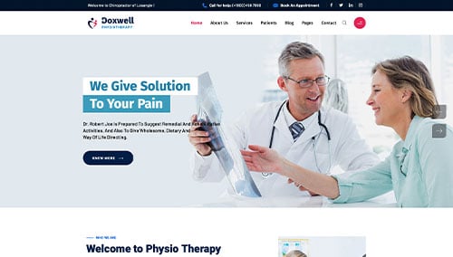
Doxwell – Themeforest
$59
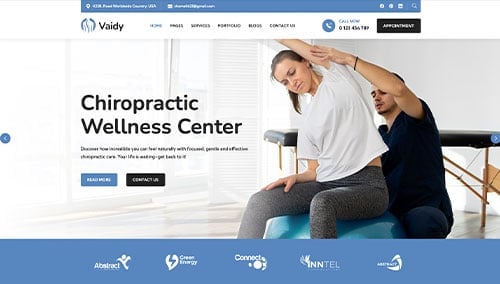
Vaidy – Themeforest
$69
Chiropractor – Themeforest
$49