In the global agribusiness sector, your website is a vital link in the supply chain. Before a distributor, retailer, or industrial partner commits to a contract, they use your online presence to evaluate your operational capacity, sustainability standards, and technical expertise. To lead in 2026, an agricultural website must go beyond “farm imagery” to demonstrate how your organization leverages technology and precision to feed a growing world.
Our design team evaluated hundreds of agricultural websites – from crop production leaders and food processing giants to agricultural equipment manufacturers and chemical innovators. We looked for the top 9 examples that masterfully balance industrial credibility with a high-performance user experience, specifically analyzing their product catalog transparency, sustainability reporting, and the effective use of large-scale facility storytelling.
Whether you are a specialized local producer or a global logistics powerhouse, these examples represent the current benchmark for digital excellence in the agricultural trade.
Note on Our Selection Process: We recently audited this guide to remove outdated designs and sites that no longer meet our performance standards.
Top Agriculture Company Website Designs
1. Garden Sweet
Why We Chose Garden Sweet
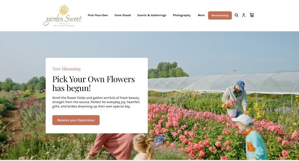
The digital storefront for Garden Sweet Click to open side panel for more information serves as a premier benchmark for “Agritourism Experience Merchandising and High-Conversion Community-Supported Agriculture (CSA) Architecture.” For a local pick-your-own farm, orchard, and flower bounty, the website must instantly bridge old-school agricultural charm with modern, friction-free customer convenience. The interface achieves this beautifully by organizing its diverse field activities, subscription tiers, and geographical access points into a welcoming, highly scannable grid that works perfectly across all device sizes.
Key Design Highlights:
- Structured Farm Experience and Service Showrooms: The homepage functions as a beautifully curated menu of the farm’s seasonal offerings. By explicitly laying out distinct operational tracks – such as pick-your-own berries, pick-your-own flowers, a seasonal farm stand, and community volunteer programs – the layout allows local visitors to instantly map out their weekend itinerary and see exactly what experiences are currently active in the fields.
- Transparent Community Membership and Subscription Pricing Models: Lowering the barrier to entry for community-supported agriculture, the homepage incorporates a prominent, high-visibility pricing section. This layout option explicitly breaks down membership tiers, point structures, and financial investment levels directly on the landing page, allowing local families to confidently assess and select the right farm share plan without navigating through deep sub-menus.
- Integrated Interactive Geographical Location Anchor: To ensure smooth physical arrivals and eliminate regional navigation friction, the homepage embeds a live, high-fidelity Google Map directly within the scroll path. This native interactive component allows visitors to instantly map out proximity, identify local crossroads, and launch precise mobile driving directions to the property right from the browser.
- Pristine, Touch-Optimized Mobile Scroll Fluidity: Because a massive percentage of agritourism traffic occurs on the fly while families are traveling or actively out in the fields, the mobile interface is engineered to be exceptionally clean and effortless to navigate. By utilizing responsive scaling rules, large tap targets, and an elegant, single-column vertical stack, the platform ensures that looking up picking hours or checking a pricing tier remains entirely frictionless on any handheld screen.
2. The Sill
Why We Chose The Sill
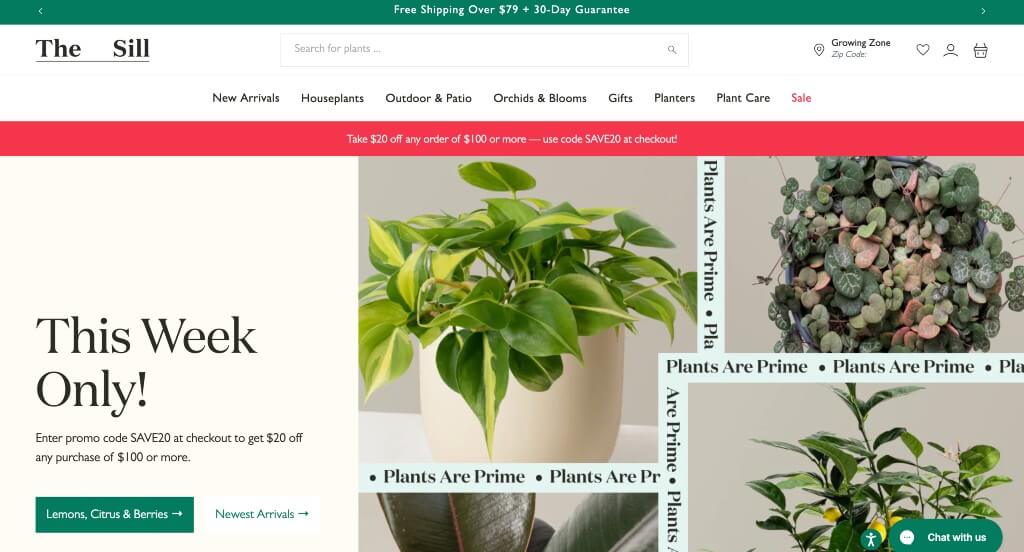
The desktop website for The Sill serves as a premier benchmark for “Direct-to-Consumer (DTC) Botanical Merchandising and High-Trust E-Commerce Architecture.” For an online plant nursery and lifestyle brand, the digital storefront faces the unique challenge of shipping living goods while building immense customer confidence around ongoing plant care. The desktop layout masterfully addresses this by framing a highly sophisticated product taxonomy inside a warm, accessible, and community-backed shopping ecosystem.
Key Design Highlights:
- Elevated Peer Validation and High-Trust Review Showrooms: Overcoming the hesitation of ordering delicate live plants online is handled seamlessly by embedding authentic customer reviews directly into the homepage scroll path. Showcasing verified customer feedback alongside explicit star ratings builds instant platform reliability, reassuring first-time plant parents that their greenery will arrive safe, healthy, and beautifully intact.
- Curated “New Arrival” and Core Category Showrooms: The homepage serves as a beautifully balanced, highly visual inventory matrix that spotlights fresh seasonal inventory and classic botanical staples. By cleanly grouping trending items, new arrivals, low-light varieties, and pet-friendly collections right on the front page, the layout allows users to rapidly self-select items that match their unique style and home lighting conditions.
- Instant Real-Time Live Chat Support Gateway: To immediately assist customers with real-time care questions, shipping logistics, or customized plant recommendations, the homepage features an accessible Live Chat interface. This immediate communication channel lowers buying friction, giving shoppers instant access to horticultural advice and support right when they are making a high-consideration purchase.
- Spacious, High-Fidelity Desktop Mega Menu: Organizing an extensive product footprint – spanning live indoor plants, faux botanicals, designer planters, soil mixes, and interactive care workshops – is gracefully executed via an impressive desktop mega menu. Hovering over primary navigation headers reveals a wide, multi-column drop-down panel that beautifully organizes products by size, care difficulty, and botanical family into clean, scannable blocks.
3. Floret Flowers
Why We Chose Floret Flowers
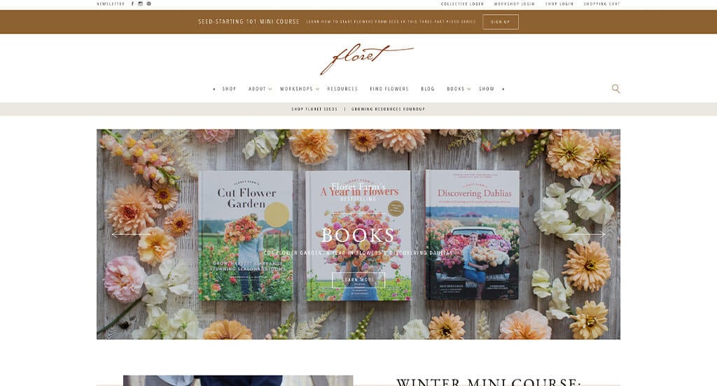
The desktop website for Floret Flowers serves as a premier benchmark for “Artisanal Agricultural Merchandising and High-Trust Editorial Brand Architecture.” As a world-renowned flower farm, seed company, and educational hub, their online presence must balance extensive retail operations with deep storytelling. The desktop interface perfectly achieves this by adopting a classic, editorial aesthetic that frames their business not merely as a commercial seed vendor, but as a passionate protector of seasonal flower farming traditions.
Key Design Highlights:
- Spacious Multi-Category Desktop Mega Menu: Managing an expansive digital blueprint – spanning an e-commerce seed and bulb shop, intensive training workshops, documentary media projects, and an enormous variety-tracking library – is handled gracefully through a beautifully structured mega menu. Hovering over top-level navigation links opens an organized, multi-column drop-down workspace that maps out deep-site resources cleanly to keep discovery effortless.
- Front-Page Curated Thought-Leadership Blog Engine: Seamlessly establishing their position as the leading global voice in organic floriculture, the homepage features a dedicated, highly visual editorial gallery. Displaying their award-winning instructional blog posts and seasonal growing guides directly in the main scroll path turns the storefront into an active educational community, pulling visitors into deeper site involvement.
- Cinematic Journey and Historical Documentary Showrooms: To build a deep, personal connection with their global audience, the homepage incorporates a high-production video module mapping out the history and spirit of the farm. This narrative video walks viewers through their initial farming roots, hard-won operational triumphs, and ultimate evolution into a premier breeding facility, providing the emotional foundation that transforms casual shoppers into lifelong brand champions.
- Neutral Palette Framing with Timeless Typography: The visual language of the website intentionally rejects bright flashing buttons or heavy neon blocks, opting instead for soft neutral backdrops and traditional serif typography. This understated, classic canvas acts as a sophisticated, quiet frame – allowing the rich, natural colors and intricate details of their high-fidelity flower photography to command absolute focus across the page.
4. Bowles Farming Company
Why We Chose B-Farm
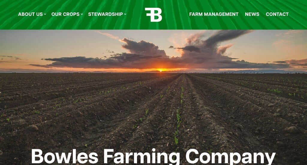
The digital storefront for B-Farm serves as a premier benchmark for “Purpose-Driven Commercial Design and High-Trust Brand Identity Architecture.” For an organization focused on sustainability, agricultural systems, or green-tech development, the digital experience must balance a strong ethical message with approachable operational transparency. The interface achieves this beautifully by stripping away unnecessary decorative fluff, using a natural color palette, and prioritizing clean human connection to establish quick authority on both desktop and mobile layouts.
Key Design Highlights:
- Cohesive, Eco-Centric Green and White Visual Canvas: The entire website relies on a highly disciplined, thematic color scheme dominated by crisp whites and natural greens. By intentionally avoiding loud, clashing gradients or distracting secondary colors, the layout creates an open, refreshed, and environmentally conscious environment that mirrors the core values and natural spirit of the brand.
- Uncompromising, Front-and-Center Mission Manifestos: The homepage completely rejects confusing corporate buzzwords in favor of an identity-driven narrative that makes its core purpose unmistakable upon landing. This immediate, bold framing ensures that any visitor can instantly understand the brand’s long-term objectives and overarching impact, turning standard site traffic into a communal, value-aligned experience.
- Authentic Team Portraiture and Human Trust Anchors: Overcoming the cold, sterile impression often associated with corporate business layouts, the homepage prominently features real imagery of their actual team. Showcasing the faces behind the operations humanizes the organization, building immediate accessibility and proving to prospective partners that real, passionate experts are driving the mission forward.
- Pristine, Responsive Mobile Scroll Optimization: Translating a mission-driven brand experience into a seamless handheld format is handled with exceptional care, resulting in a mobile interface that is incredibly clean and fluid to navigate. By utilizing adaptive text scaling, maintaining spacious touch targets, and preserving a logical vertical stacking rhythm, the platform guarantees an effortless research path for users browsing on the move.
5. Plenty
Why We Chose Plenty
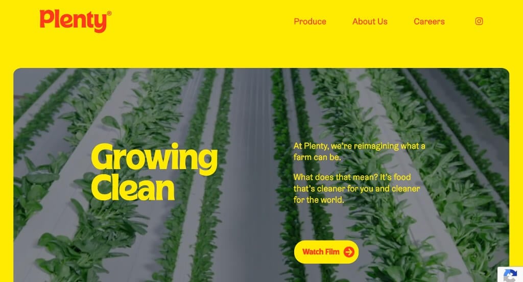
The desktop website for Plenty serves as a premier benchmark for “Disruptive AgTech Merchandising and Immersive Digital Storytelling Architecture.” As a pioneer in commercial indoor vertical farming, Plenty faces the challenge of explaining a highly advanced engineering concept while making the food itself look incredibly fresh and delicious. The digital storefront accomplishes this by ditching traditional, static retail rows for a hyper-modern, kinetic scrolling experience that positions agricultural technology as a beautiful, sustainable art form.
Key Design Highlights:
- Immersive Scroll-Driven “Scrollytelling” Narrative: Rather than forcing users to click through traditional sub-pages, the homepage utilizes an active scrollytelling framework. As desktop users advance down the page, elements animate in fluid synchronization with the scroll bar, beautifully sequencing information to guide the viewer step-by-step through their indoor growing methodology without causing content fatigue.
- High-Impact, Narrative-Driven Visual Showrooms: The website relies heavily on massive, studio-quality imagery that acts as a core vehicle for the brand’s message. By blending close-up, vivid photography of crisp, pesticide-free greens with grand interior shots of their glowing vertical growing towers, the visual structure masterfully pairs high-yield automated technology with clean, appetizing food design.
- Highly Distinctive, Custom Identity Styling: Breaking completely away from generic, sterile corporate layouts, the interface uses a unique design language featuring deep, warm colors, bold organic fonts, and distinctively rounded corners on image frames and UI panels. This playful yet premium styling elevates the brand above standard agricultural aesthetics, giving it a friendly, forward-thinking, and highly memorable consumer identity.
- Innovation-Focused “Growing Differently” Showcase Matrix: A central pillar of the website’s communication strategy is the dedicated “Growing Differently” section. This module actively breaks down exactly how Plenty is reinventing traditional farming life – highlighting incredible space savings, massive water conservation statistics, and continuous year-round crop yields to prove the long-term viability of their indoor vertical ecosystems.
6. Case IH
Why We Chose Case IH
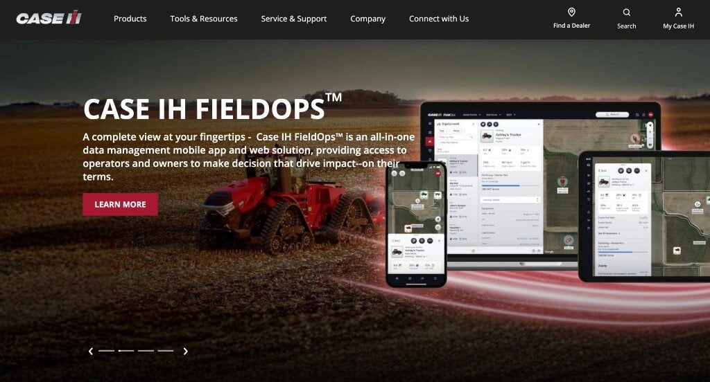
The desktop website for Case IH serves as a premier benchmark for “Industrial Heavy-Equipment Merchandising and High-Scale Agricultural Fleet Architecture.” Managing a massive, complex catalog that spans commercial tractors, continuous-flow combines, and advanced precision farming software requires an interface that can distill heavy specifications into clean, accessible data paths. The website masterfully accomplishes this by relying on a highly structured structural foundation that balances dense engineering data with a seamless, conversion-focused user journey.
Key Design Highlights:
- Front-Page Industrial Product Showrooms: The homepage functions as a heavy-duty corporate showroom, grouping massive agricultural fleets into clean, high-visibility categories right from the start. By organizing everything from high-horsepower tracked tractors to harvesting combines and tillage tools in immediate view, the layout allows farm operators and commercial procurement officers to jump directly into the relevant machinery tier without digging through nested layers.
- Massive Multi-Tiered Desktop Mega Menu: Navigating a global inventory that covers heavy machinery, precision tech upgrades, financing plans, and replacement parts is simplified through an advanced desktop mega menu. Hovering over primary navigation headers opens a massive, multi-column panel that cleanly organizes equipment lines alongside field support networks, dealer locators, and parts catalogs into distinct, highly scannable visual paths.
- Balanced Content Layout Grid: The homepage layout is organized into a tight, clean geometric grid that establishes quick visual balance across wide screens. This modular design structure seamlessly balances giant, action-shot product banners with text blocks, financing promotions, and technological news cards – preventing information overload while keeping the overall user path highly scannable and orderly.
- Frictionless Mobile Navigation and Scaling: Translating an expansive agricultural ecosystem into an easy handheld experience is achieved beautifully through responsive design architecture. The mobile view trims down horizontal text clutter, adapts the large mega menu into an intuitive vertical accordion tray, and uses touch-friendly buttons, making it effortless for farmers and operators to look up technical specs or find local dealers while out in the field.
7. Eden Moor
Why We Chose Edenmoor
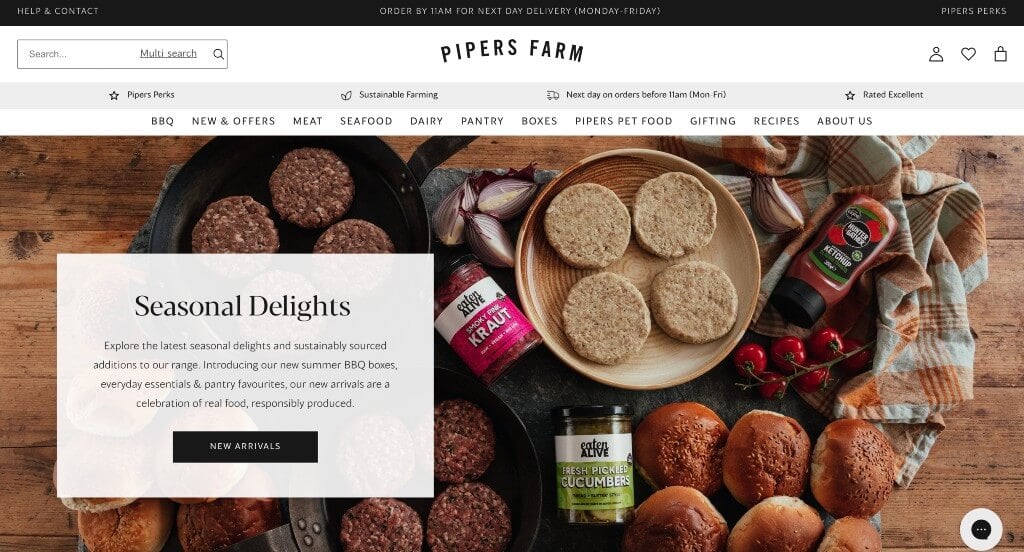
The desktop website for Edenmoor serves as a premier benchmark for “High-End Culinary Merchandising and High-Trust Hospitality Conversion Architecture.” For a premium dining destination, a digital storefront must go beyond basic menu lists to evoke the precise atmosphere, care, and sensory experience of a physical table reservation. The desktop interface flawlessly achieves this by trading overwhelming website clutter for a minimalist, editorial layout that handles guest inquiries with high-touch concierge efficiency.
Key Design Highlights:
- Real-Time Concierge Live Chat Integration: To immediately elevate the guest onboarding experience and address high-intent requests – such as dietary adjustments, private event bookings, or custom seating options – the homepage integrates a direct Live Chat interface. This instant communication portal mimics a premium front-desk concierge, lowering booking friction and accelerating table reservations right from the landing page.
- High-Contrast Black and White Canvas with Premium Food Photography: The interface relies on a deeply elegant, stark black and white color profile. By keeping the background architecture free of colorful distractions, the layout transforms into a gallery space where vibrant, ultra-high-definition culinary photography commands absolute focus, making every plate arrangement look incredibly crisp, artisanal, and appetizing.
- Authentic Social Proof and Patron Review Showrooms: Overcoming the hesitation often associated with high-consideration reservation bookings is handled seamlessly through an integrated customer review section on the homepage. Showcasing verified patron testimonials and dining feedback directly within the primary scroll path establishes fast platform reliability, confirming their exceptional execution in food preparation, service pacing, and hospitality.
- Identity-Driven “Our Pillars” Value Core: Rather than relying purely on aesthetic appeal, the homepage features a dedicated “Our Pillars” section that explicitly communicates the restaurant’s operational philosophy. This structured breakdown outlines their commitments – such as sustainable ingredient sourcing, culinary precision, and immersive guest hospitality – giving prospective diners a transparent understanding of the values and mastery behind the menu.
8. Fork Farms
Why We Chose Fork Farms
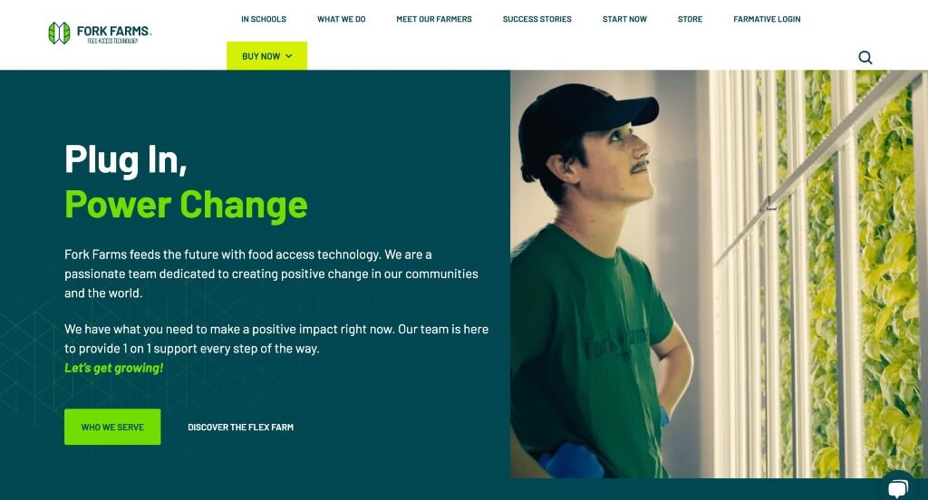
The desktop website for Fork Farms serves as a premier benchmark for “AgTech Impact Merchandising and High-Conversion Sustainable Innovation Architecture.” As a pioneer in scaling mobile indoor hydroponic farming systems, their digital presence must rapidly demystify controlled-environment agriculture for schools, communities, and commercial growers alike. The desktop layout effortlessly accomplishes this by pairing straightforward product accessibility with rich, mission-driven media that turns advanced hydroponic technology into an approachable community movement.
Key Design Highlights:
- Spacious Multi-Track Desktop Mega Menu: Managing a diverse operational footprint – covering specialized indoor growing platforms, custom nutrient packages, educational STEM curricula, and commercial scale-up resources – is handled beautifully through a high-fidelity mega menu. Hovering over top-level options drops down an organized, multi-column panel that routes educators, growers, and corporate buyers straight to their ideal entry points.
- Impact-Driven Hydroponic Video Showrooms: Positioned centrally within the homepage scroll path, an immersive video module directly tackles the environmental and societal impact of local hydroponic farming. By visually demonstrating how their indoor platforms conserve water, eliminate food miles, and secure year-round fresh produce, the video expertly shifts the conversation from basic hardware specs to real-world global solutions.
- Front-Page Community and Thought-Leadership Blog Engine: Seamlessly reinforcing their position as a leading authority in accessible indoor agriculture, the homepage incorporates a dedicated, visually rich blog feature section. Displaying fresh agronomy insights, hydroponic success stories, and localized growing tips right on the front page continuously educates visitors and pulls them deeper into the brand’s active ecosystem.
- Real-Time Automated Live Chat Engagement Hub: To immediately connect with high-intent institutional buyers, grant managers, or curious growers right as they evaluate the platform, the homepage incorporates a direct Live Chat gateway. This fluid support terminal provides instant access to expert technical guidance, system customization quotes, and general troubleshooting, significantly speeding up the evaluation journey.

9. Alpine Village Farms
Why We Chose Alpine Village
The digital storefront for Alpine Village serves as a premier benchmark for “Premium Destination Merchandising and Immersive Hospitality Experience Architecture.” For a mountain community, real estate, and vacation hub, the online layout must instantly evoke the crisp, scenic luxury of its physical location while handling multi-currency global visitors with total ease. The interface beautifully achieves this by trading cluttered retail grid styles for a rich, lifestyle-driven showcase that turns regional stay options and outdoor experiences into a cohesive premium destination brand.
Key Design Highlights:
- High-Fidelity Destination and Property Imagery: The homepage relies heavily on studio-quality, high-resolution lifestyle and property images as its main communication engine. Spotlighting mountain settings, pristine accommodations, and local scenery directly on the landing page establishes an aspirational tone, letting visiting guests visually immerse themselves in the premium mountain experience right from the start.
- Integrated Social Proof Instagram Feed Engine: Bridging the gap between corporate marketing and real-world guest experiences, the homepage features a dynamic, embedded Instagram media feed gallery. Displaying real-time, user-generated snapshots and candid village moments turns the storefront into an active social community, proving the destination’s vibrant, year-round lifestyle through authentic visual social proof.
- All-in-One Service, Program, and Experience Blueprints: Rather than scattering critical details across confusing internal sub-menus, the homepage functions as a complete directory that outlines their full operational ecosystem. From retail product rentals and specialized seasonal programs to community activities and lodging amenities, everything is explained in clear, scannable layout modules so buyers can plan an entire visit from a single page.
- Persistent Utility Overlay with Currency Selection and Social Shortcuts: Tailored perfectly for an upscale, international consumer audience, the layout integrates an anchored, floating right-side menu panel. This compact vertical hub houses instant social media channels alongside a responsive currency converter, providing international visitors with effortless financial clarity and frictionless community connectivity without interrupting their scroll path.
WordPress Agricultural Themes
You can find free themes at wordpress.org or explore agricultural-inspired templates on ThemeForest.
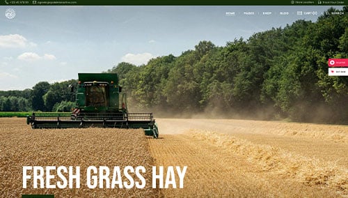
Agraria – Themeforest
$79
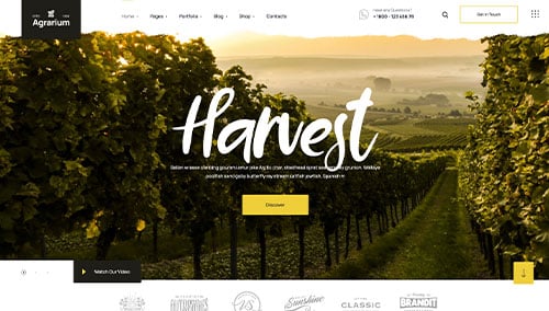
Agrarium – Themeforest
$59
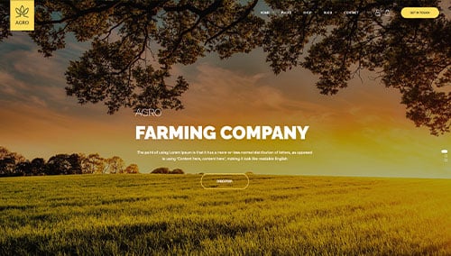
Agro – Themeforest
$59
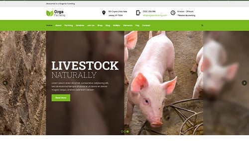
Orga – Themeforest
$69