In the privacy-first and AI-driven inbox of 2026, an email marketing campaign is no longer just a broadcast – it is a dynamic, one-to-one conversation. For brands ranging from high-growth startups to enterprise giants, a winning email strategy must achieve a masterful balance: navigating “Intelligent Inboxes” that filter for relevance while delivering “Hyper-Personalized” content that feels helpful rather than intrusive. To thrive in 2026, your campaigns must move beyond static templates to embrace “Micro-Moment Automation,” where triggers are based on real-time intent signals – like scroll depth or zoom interactions – rather than simple abandoned carts.
Our analysis of the current email landscape focused specifically on “Zero-Party” data integration, interactive AMP elements, and dark-mode optimization. These elements work together to earn “Inbox Trust,” ensuring that your messages aren’t just delivered, but are prioritized by AI-driven sorting algorithms that reward deep engagement and authentic brand-to-human connection.
Whether you are a founder building your first welcome sequence or a CRM director orchestrating a global omnichannel journey, the following benchmarks represent the gold standard for email marketing campaigns in 2026.
Note on Modern Standards: Current industry leaders demonstrate a clear commitment to “Lighter, Faster, Greener” code and strict authentication protocols like BIMI and DMARC. This selection focuses on campaign structures that prioritize relevance over frequency and human-centric storytelling, providing the most strategic value to both the sender and the subscriber in 2026.
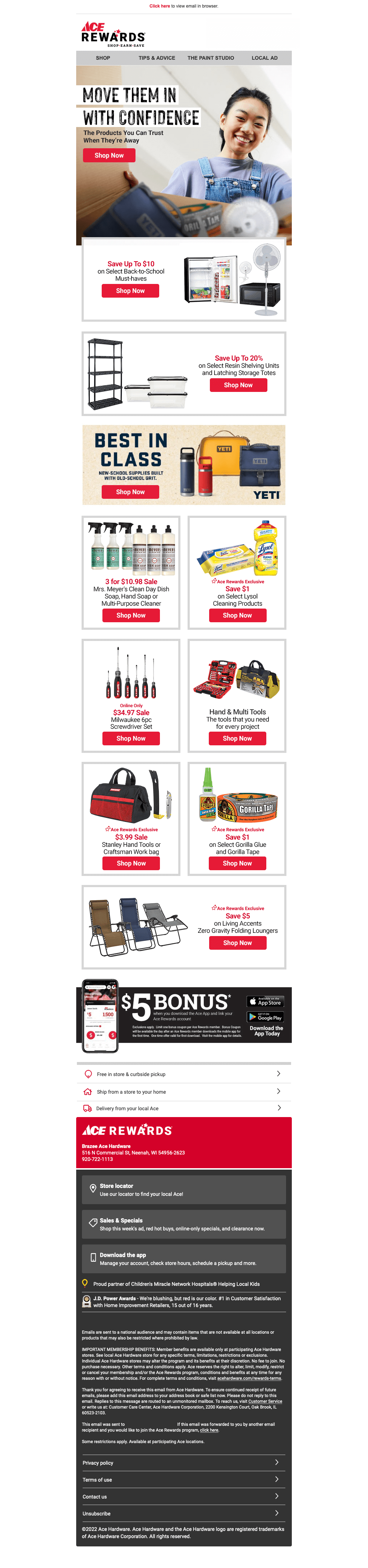
1. Ace Hardware
We liked how all of this email campaign uses boxes to organize all of their information. Small red accents allow for customers to find buttons and important content. Also, lots of images of products can be found, each displayed in its own box. Even a mini menu bar can be noticed to help out. The benefits of shopping from this brand are mentioned near the bottom.
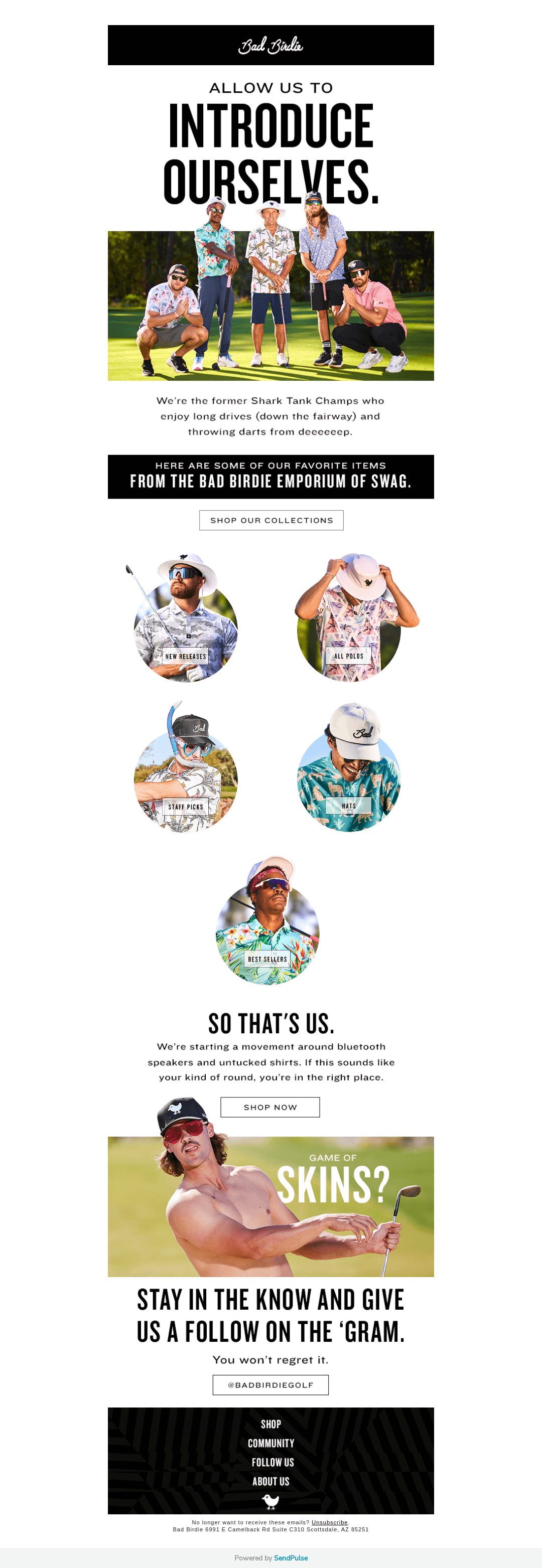
2. Bad Birdie
Bad Birdie is a brand that makes great use of well developed images to display their products. We liked how their styling looks similar to a site while still showcasing simplicity. We liked how their images extended from the frame to grab attention. Including buttons to help customers get to the specific products they wish to see was a good choice.
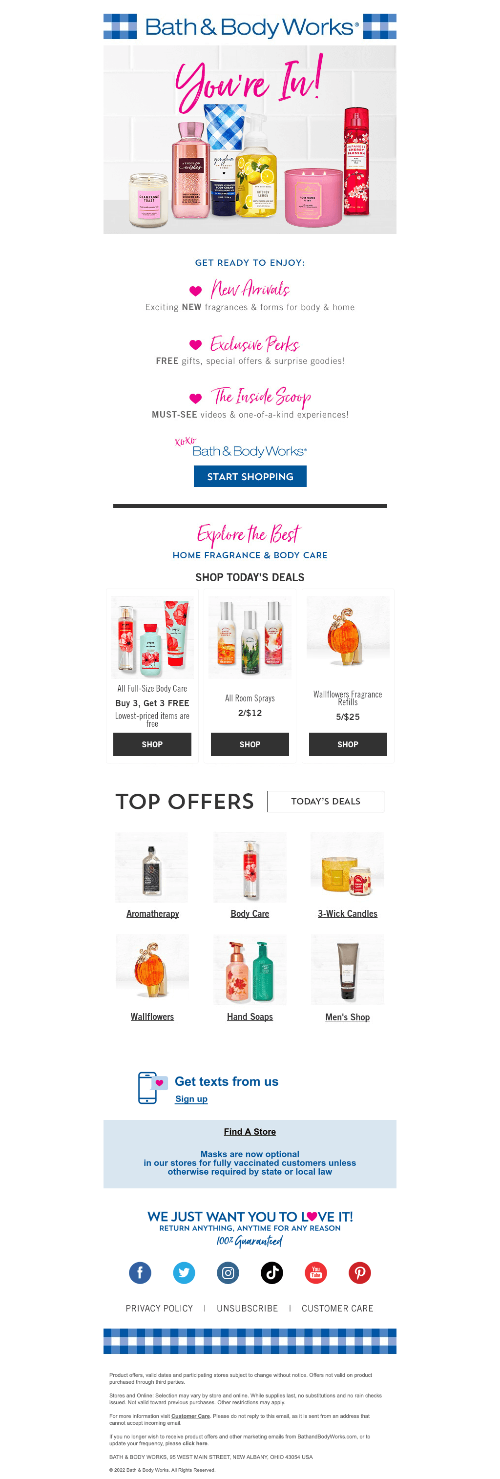
3. Bath & Body Works
Bath & Body Works uses a colorful template for its email marketing campaign that matches with their store if you’ve ever visited one. Adding in lots of heart graphics and pink accents was sleek and relaxing. We loved their creative fonts that are a mix of basic, elegant and simple. Pricing was clearly labeled throughout their image thumbnails.
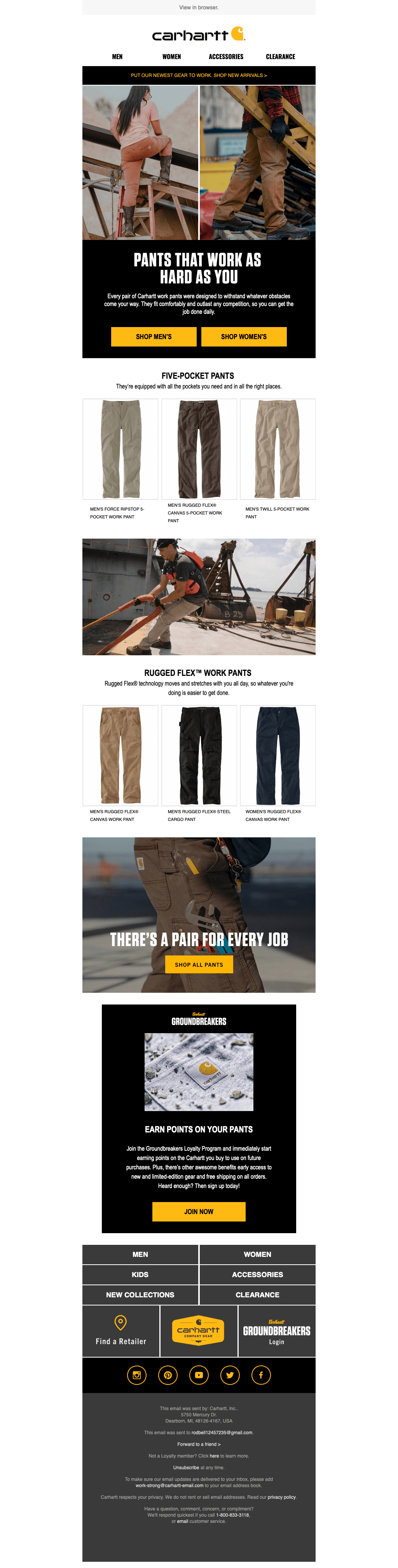
4. Carhartt
Imagery is another big seller here. We liked how they use a variety of product images and product in use pictures. Having a yellow accent just like in their logo design was a perfect choice. As for the buttons, it helps to organize all of this. Overall this was simple and really spoke to their business’ feel.
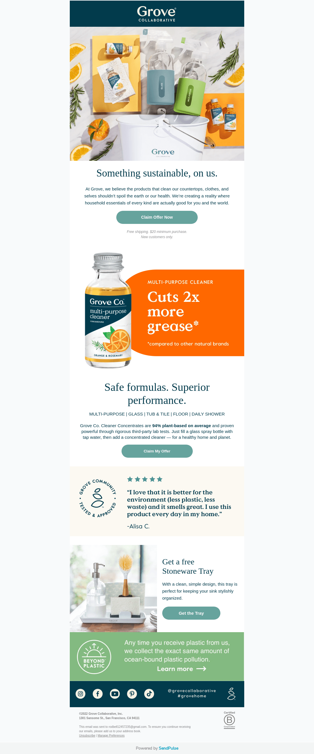
5. Grove
Grove makes great use of muted, natural colors throughout that match with their products for a cohesive look. Well-planned imagery was used to make their visual appeal even better. Adding in buttons matching with their relaxing color scheme. A small portion of a section provides customer reviews, making this a unique and effective design. Lastly, there is a blue bar that contains links to various social media pages connected to them.

6. Hydroflask
We loved how this company focuses on the relaxing feel of their product. A simple font is used that is professional and easy to read. The email marketing template for Hydro Flask does things a little differently than most others by focusing on the use of solid colors instead of images or graphics. Making sure to use their logo design at the top was a brilliant choice.

7. Kohls
Making sure to include lots of Kohls’ sales was a great idea. We liked that they visually included their Kohls cash graphics so customers can know what to expect. Adding in tape like graphics to show trends that are set was perfect. The main colors used in this template include red, black, and white, each serving a specific purpose.

8. Lacoste
Having a simple design is something that always helps more people enjoy their design. Lots of intriguing images speak for a great majority of this example. Small amount of text written in simple font was another amazing choice. Not too much else is going on with this email campaign, but that’s okay because the images will speak for their business.
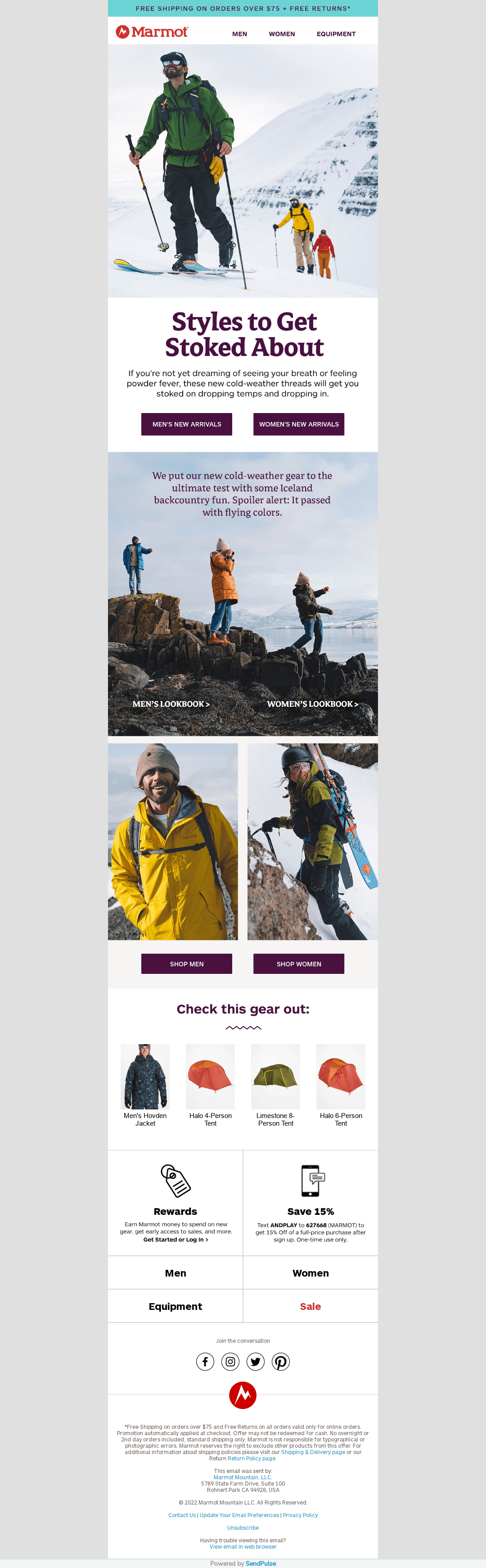
9. Marmot
Marmot maintains a solid balance of text and images for its marketing message, so it doesn’t overwhelm the customer. They clearly thought about their color choices when they picked them out because they harmonized together beautifully. Adding buttons to shop for women or men was an option we didn’t miss. Some of the offerings are displayed in the lower section and are followed by simple white and black icons. These icons have black text which informs customers about various sections, such as the rewards, sales, and product categories, while buttons appear in purple, attracting attention instantly.

10. Newegg
Newegg surely made use of lots of images of their products. This keeps customers involved but they don’t have to sit and read lots of words. We liked how their layout for images created a downwards arrow, signifying that there is more. Showing their new (discounted) prices in red was perfect. We also liked how they pushed customers to download their app to get information and deals right away.
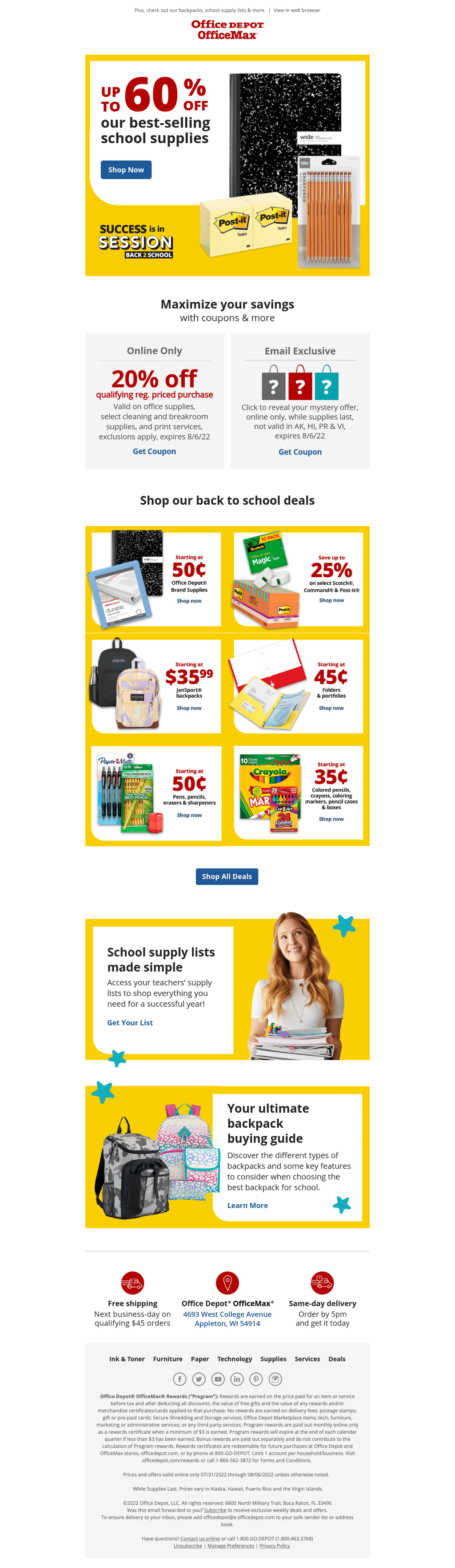
11. Office Depot
Here, bright yellow can be found to frame images of their products. We liked how their pricing is written largely so customers for sure know the prices. Including deals based on the current seasons was also a great idea. We also loved that their logo design was carefully displayed at the top.

12. Speck
Speck clearly displays their products and we loved that about them. A white, gray, and blue color scheme helps to keep everything organized in a manner that attracts customers’ attention. Lots of whitespace is used to help maintain a relaxing feel to their site. Many images have blue buttons underneath them allowing customers to visit their website directly.
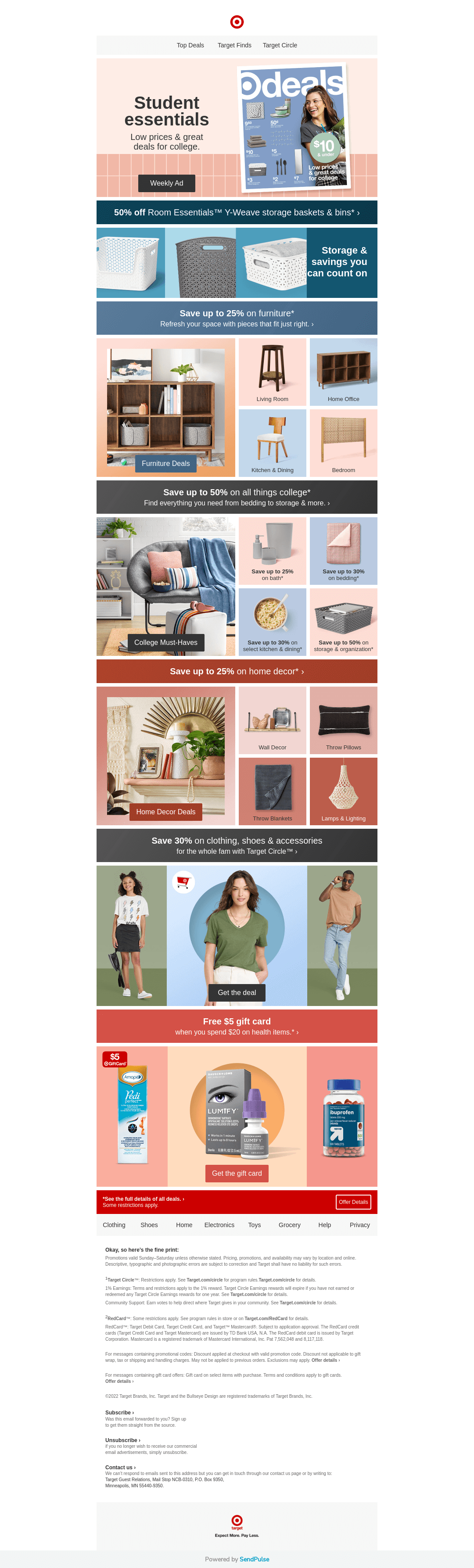
13. Target
Utilizing many colorful backgrounds for their images, Target is another great option for ideas when making an email campaign. Including lots of different products was perfect. It was clear that they have a variety of objects. It was useful that their design had some repetition but some variety of elements so it didn’t seem boring.
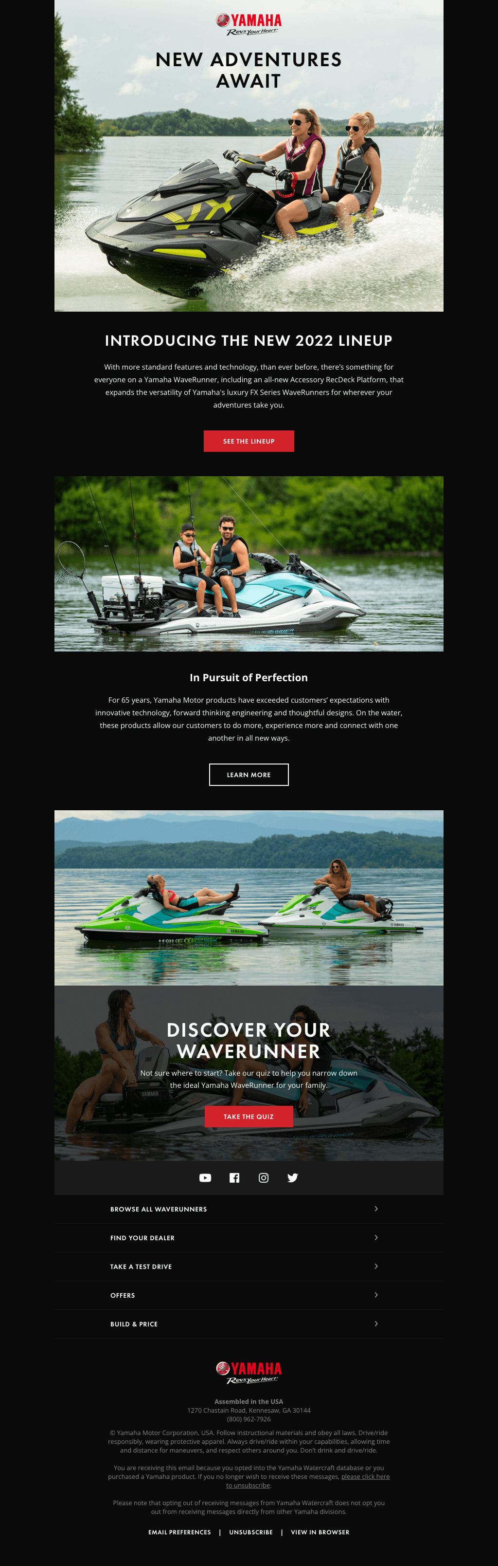
14. Yamaha
Yamaha’s high-quality imagery was clearly their best feature. A feeling of unity was built through their images that clearly tell a story. Having really short paragraphs once again saves the day because customers feel less overwhelmed by written content. This site almost has us at a loss for words.
Build an email list by offering e-books or webinars in exchange for email addresses and using sign-up forms on your website or social media.
Measure success with metrics like open rates, click-through rates, conversions, and unsubscribes to refine your email strategy.
Yes. Make sure to personalize emails with names, tailored content, and product recommendations based on past interactions.
One-hundred percent. Mobile optimization is essential because of how many emails are opened on smartphones. Responsive design enhances user experience.
The best email send time varies by audience. Test different times and analyze open rates to find what works.