In the digital-first economy, your website is the most critical asset in your brand’s arsenal. It is the intersection of strategy, psychology, and technology. To lead in 2026, a website must do more than just function; it must dominate its vertical through unmatched user experience (UX), high-performance architecture, and immersive storytelling.
Our agency has meticulously analyzed thousands of digital storefronts and corporate portals to curate this definitive collection of excellence. We evaluated each entry based on conversion rate optimization (CRO), accessibility (WCAG), mobile-first responsiveness, and brand authenticity. This master guide serves as a strategic blueprint for businesses looking to transcend the status quo and set new industry standards.
Explore our curated galleries categorized by industry, platform, and functional architecture to find the inspiration for your next digital evolution.
Note on Our Selection Process: We recently audited this guide to remove outdated entries, or sites that no longer meet our performance standards.
Our Top Ranked Websites of 2026
1. Sustainable 9
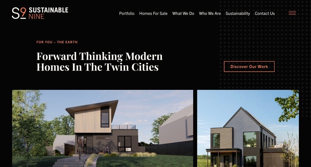
This one caught our attention because of their unique color palette. Using a black background was a nice way to create a sophisticated template. We liked their subtle patterned graphics that accent their pages. We also thought it was nice how this company used their logo as a loading icon. Including lots of images and having a web domain that matches their company were other helpful additions.
Ranked in our Favorite Home Builder Websites Article
2. Oh
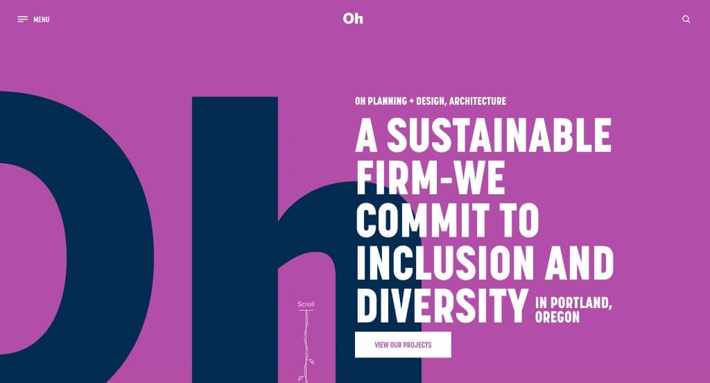
Here we have an example that uses lots of bright colors to create an unforgettable design. We liked the simple graphics that guide people downwards in their information. Showing off lots of their featured projects within the homepage was another choice that we liked. Their font was professional but very bold, making their information easier to read.
Ranked in our Favorite Architect Websites Article
3. Asheville Bee Charmer
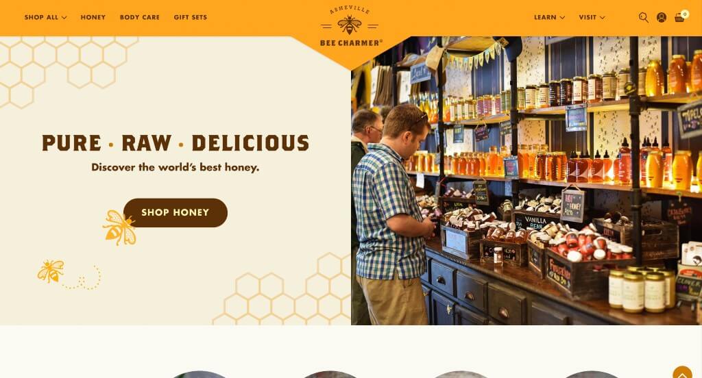
Asheville Bee Charmer created a template that is unique to their brand and we loved it. Using graphics that go along with the nature of honey bees was a brilliant idea. This color scheme was also logical for their products which is really nice. This company also did a really good job with their images that show off their products and their store.
Ranked in our Favorite WooCommerce Websites Article
4. Magic Spoon
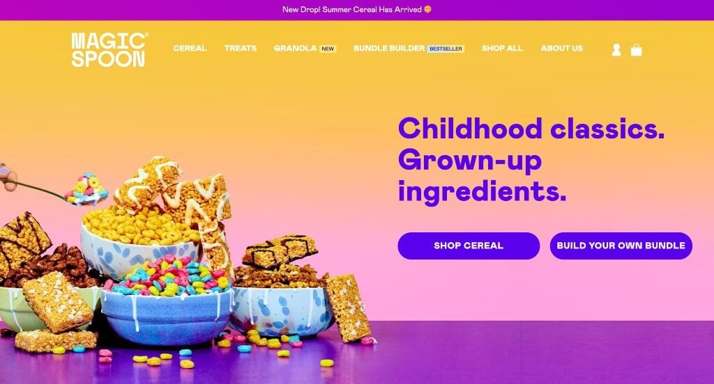
Right away, Magic Spoon grasps the attention of young children due to its bright colors. Also having spinning animations for cereal bites was something that stood out to us. Offering cereal and treat packs along with a build your own bundle helps customers feel they are getting more for their dollars. We also liked how Magic Spoon made great use of short video clips and buttons to engage customers into their content a bit more.
Ranked in our Favorite Ecommerce Websites Article
5. Fishing The Feed
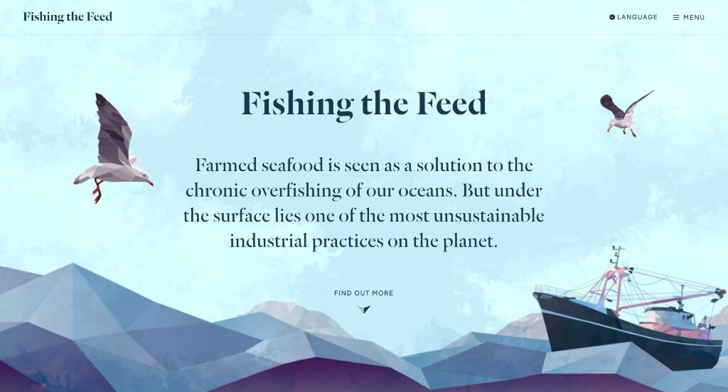
We loved this example because of their unique graphics that appear throughout their pages. They picked out interesting fonts which we also liked because it creates a brand identity. This example has lots of fun transitions and animations which was another reason that we were drawn to it. Including lots of call to actions near the end of their site was another smart choice.
Ranked in our Favorite Interactive Websites Article
6. The Ridge
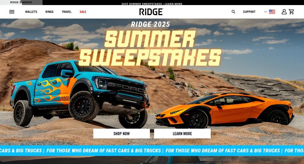
The Ridge clearly showcases who they are and their simplistic but modern products. Creating a logo with angled edges allows for a unique look that seems to match their company. Sorting everything so customers can shop by the specific thing that they are looking for is really nice. Having football and baseball team items that will attract customers who are fans. We also thought it was a great choice to pick a domain that matches their business name.
Ranked in our Favorite Shopify Websites Article
7. Black Diamond
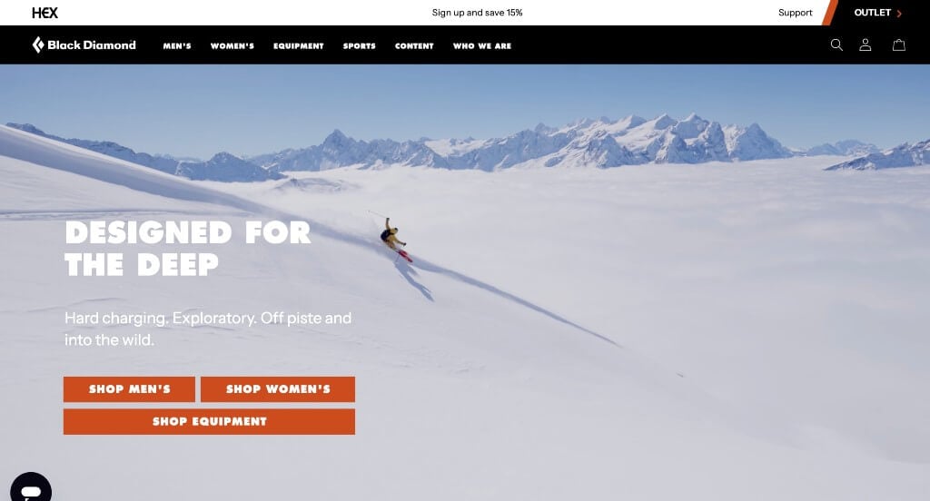
Black Diamond is sure to make an impact with their bold fonts and basic backgrounds. Adding in small splashes of orange color was helpful to create a stunning design. Though their logo design is simple, it’s memorable and makes sense for their brand. Having lots of buttons was a choice that was extremely smart. We also noticed how there was a search bar within their design.
Ranked in our Favorite Ecommerce Websites Article
8. Secrid
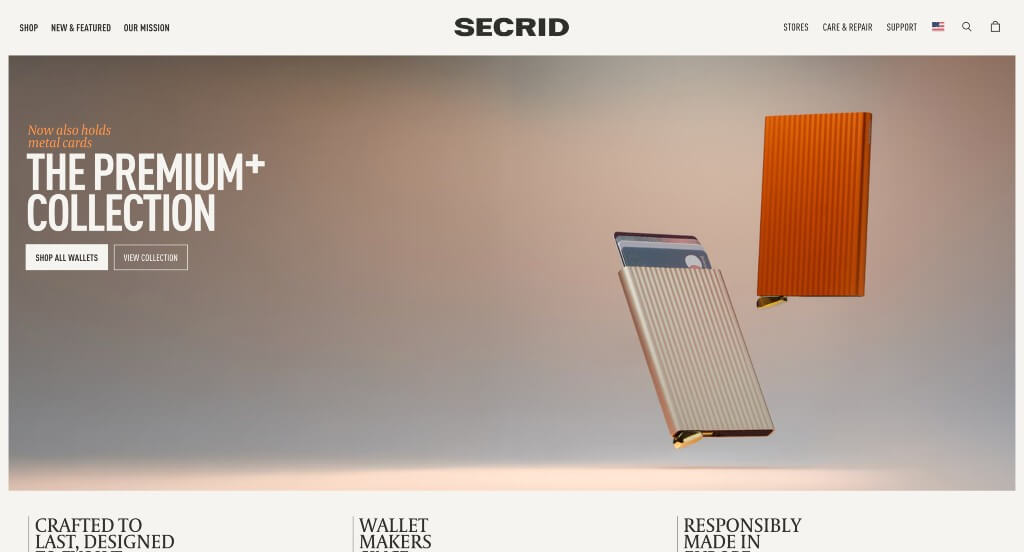
We really liked how as viewers scroll down, the company name goes into the site’s search bar. This color scheme is very basic but follows a very natural feel. We liked how their products had little animations upon hover. As you scroll through, you’ll find there’s lots of white space but it’s filled with large product images. Small graphics are found to be used as a bit of visuals. This is a great website to gain inspiration from.
First time ranking in our articles!
9. Travel Nevada
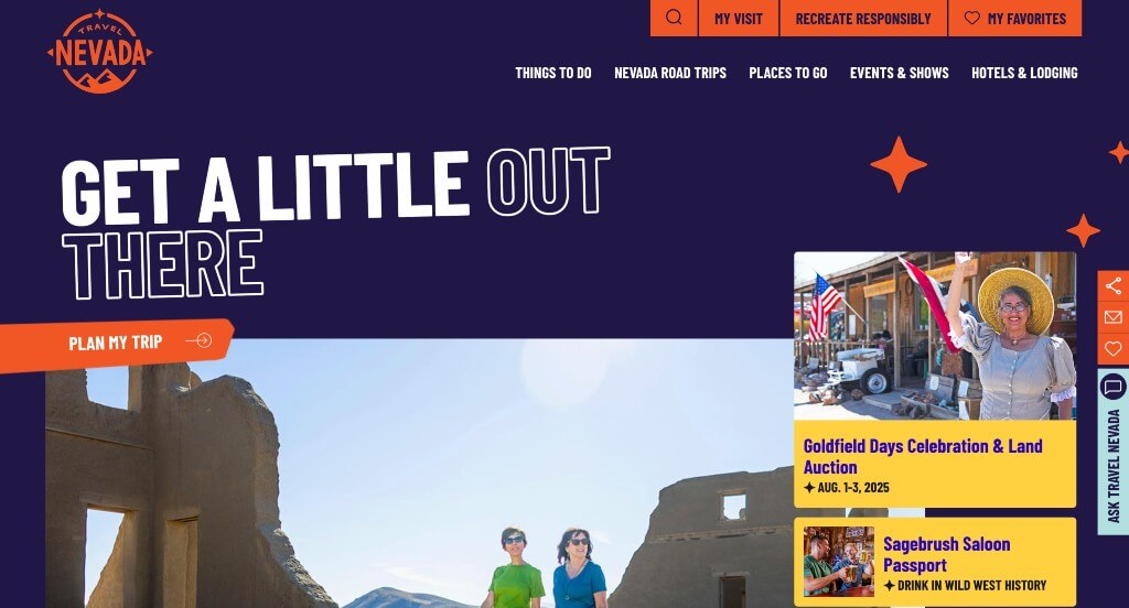
This made it on our list of favorite websites because of their blend of graphics that really breathe life into their page. We loved the color scheme that was used for this company because it felt unique to them. Using large and bold fonts really attracted attention to the information that is most important which is a great choice. We also felt that this navigation bar was well labeled making it easy to find information.
Ranked in our Favorite Tourism Websites Article
10. DD NYC
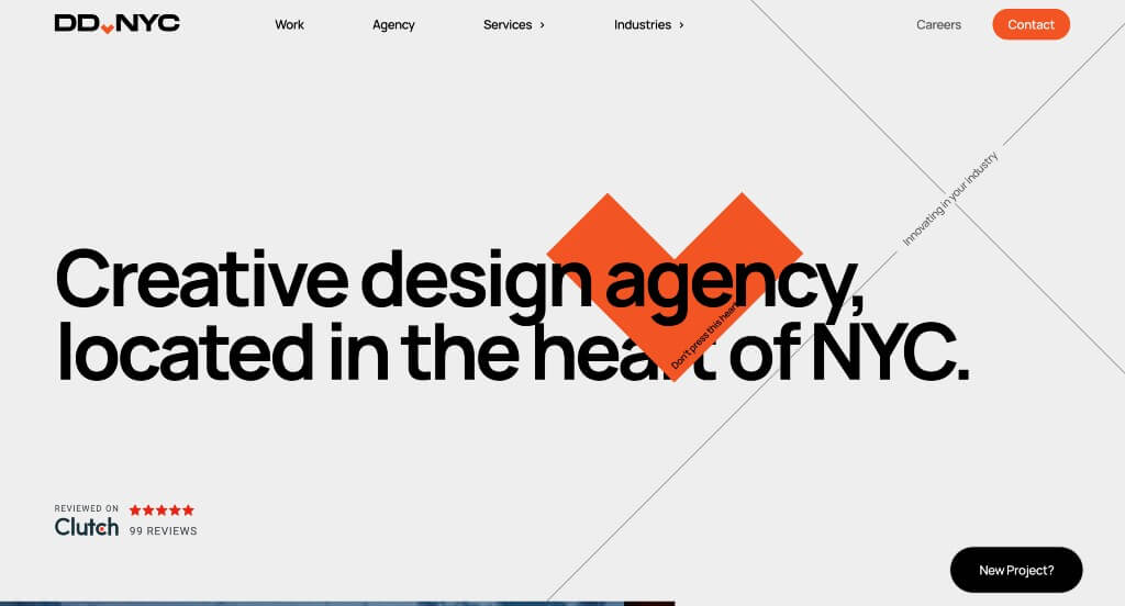
Here we have an example that is sure to be enjoyed because of their interactive animations that appear throughout the design. Including some of their more notable clients in a slideshow was a great way to show off that they are a well known brand. Including statistics about their company was another way to get customers excited about working with them.
Ranked in our Favorite Web Design Websites Article
11. Jot
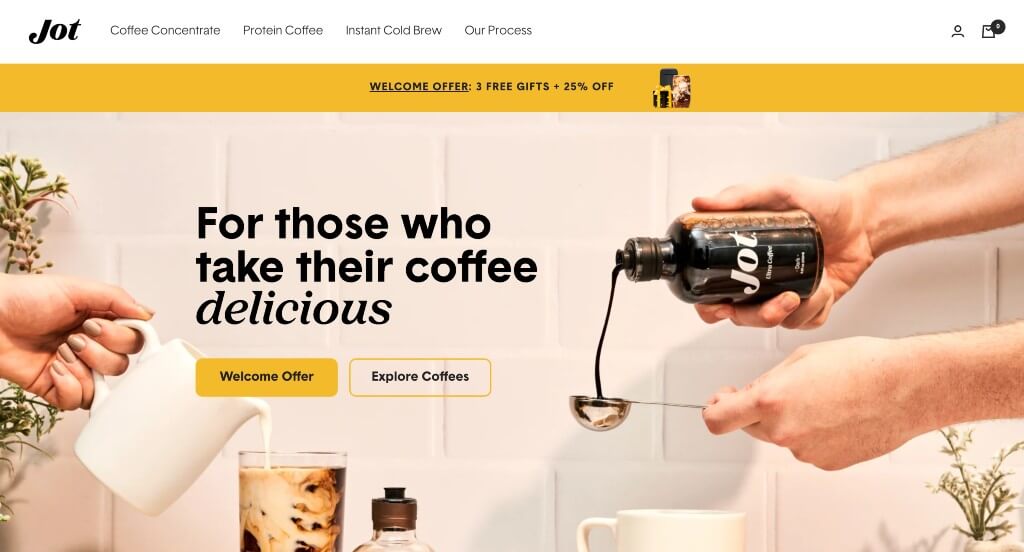
Jot certainly takes advantage of colors and imagery to give off a relaxed coffee enthusiast vibe. We loved how there was short animations related to their business to add a bit of interest. They also made sure to use a simple and professional font that looks amazing. Another thoughtful feature was their prices that utilize the strikeout feature to show current discounts. For anyone looking for design styles that relate to coffee websites, this is one to review for sure!
First time ranking in our list!
Engineering the Future of Digital Retail
At WebCitz, we don’t just “design” websites; we engineer digital environments. A beautiful site is useless if it doesn’t convert, and a fast site is wasted if it doesn’t tell a story. Our approach combines data-driven UX research with bespoke creative direction to ensure your brand doesn’t just join the conversation – it leads it.
To help inspire your next evolution, we have curated a master library of top-tier designs categorized by platform, architecture, and industry.
Browse by Platform
Focusing on the technical stack that powers your growth.
Browse by Functional Architecture
Optimizing the specific pages that drive your conversion funnel.
Browse by Industry Vertical
Professional & Technical Services
Strategic designs that establish authority and build immediate trust in competitive fields.
Construction, Home & Industrial
Lead-generation focused layouts engineered to convert local searches into project inquiries.
Health, Wellness & Medical
Clean, empathetic, and professional interfaces designed for the modern healthcare patient.
Lifestyle, Retail & Hospitality
Immersive, brand-centric designs that capture your unique atmosphere and turn digital browsers into loyal patrons.
Specialized Sectors
Strategic, high-utility websites engineered to meet the distinct operational needs and niche market demands of diverse global industries.
- Corporate Websites
- Small Business Websites
- Manufacturing Websites
- Industrial Websites
- Non-Profit Websites
- B2B Websites
- Church Websites
- Consultant Websites
- Information Websites
- Wedding Websites
- Subscription Websites
- City Websites
- Woodworking Websites
- Dispensary Websites
- Computer Repair Company Websites
- Auto Dealer Websites
- Hotel Websites
- Finance Websites
- Funeral Home Websites
- Mortgage Broker Websites
- Auto Repair Websites
- Hair Salon Websites
- Daycare Websites
- Tattoo Websites
- Sports Websites
- Jewelry Websites
- Photographer Websites
- Travel Agency Websites
- Fashion Websites
- Museum Websites
- Software Websites
- Tourism Websites
- Florist Websites
- Automotive Websites
- Artisan Websites
- Agricultural Sites
- Web Design Companies
- Staffing Agency Websites
- Catering Websites
- Limo Websites
- Self Storage Websites