In the AI-driven marketing landscape of 2026, a Facebook ad campaign is no longer just about clever copy – it is a sophisticated algorithm signal. For brands ranging from high-growth e-commerce to enterprise SaaS, a winning Meta presence must achieve a masterful balance: leveraging Advantage+ automation for efficiency while maintaining a human-centric, “unpolished” authenticity that stops the scroll. To thrive in 2026, your strategy must move beyond generic targeting to embrace “Creative-as-Targeting,” where your visual assets do the heavy lifting of finding your ideal audience through deep behavioral resonance.
Our analysis of the current digital landscape focused specifically on UGC-style video structures, “Us vs. Them” comparison frames, and dynamic creative optimization (DCO). These elements work together to feed the algorithm the “clean data” it needs, ensuring that your message reaches the right user at the exact moment of intent while bypassing the “ad fatigue” that often plagues highly polished, studio-produced content.
Whether you are a solo entrepreneur testing your first offer or a global brand scaling to eight-figure monthly spends, the following benchmarks represent the gold standard for Facebook and Instagram ad campaigns in 2026.
Note on Modern Standards: Current industry leaders demonstrate a clear commitment to Server-Side Tracking (CAPI) and the use of 9:16 vertical video formats designed for Reels and Stories. This selection focuses on campaign structures that prioritize authenticity, rapid creative iteration, and high-ROAS automation, providing the most strategic value to both the advertiser and the modern consumer in 2026.
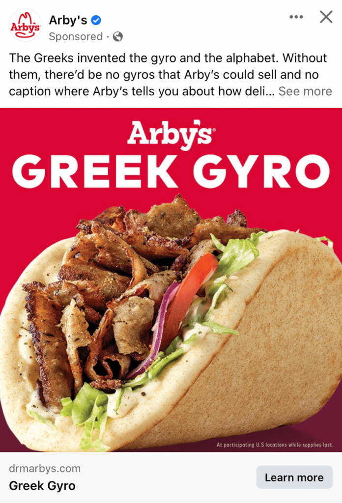
1. Arby’s
Most everyone is familiar with the popular fast-food chain, Arby’s. But somehow, they as a company have to keep new customers rolling in and old ones coming back. Using a very high-quality image to create a mouth-watering ad was amazing and clearly worked. It was also pretty smart to feature their new release because it catches the attention of people who go there because they’ve never seen it before. Finally, making great use of their signature red as the background was another brilliant idea.
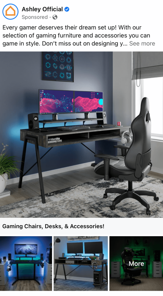
2. Ashley Furniture
When it comes to purchasing something as large as furniture, most customers like to visualize a space where the furniture could live. Because of that, Ashley Furniture made great use of full sets for their products. Their interesting lighting setups in their images may also be noticed to create more captivating visuals. We liked how really the only written content was their caption for their post, allowing images to be their main focus.
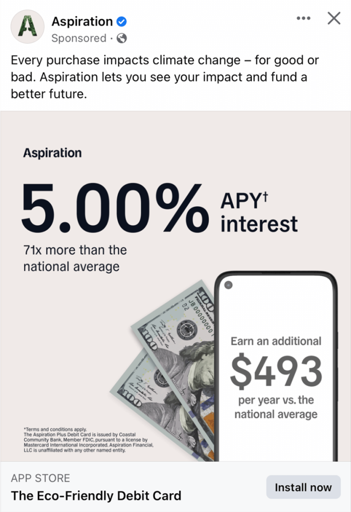
3. Aspiration
Here we have a simple example with lots of white space, helping their Facebook campaign maintain calm. We can see here that they are trying to save money for a specific cause based on the phone and 100-dollar bills. It was also smart to include fine print for their more technical information. Their caption was very short and straightforward, which we liked.
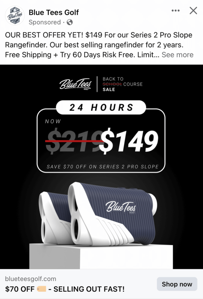
4. Blue Tees
Blue Tees was brilliant to use a large image to display a certain product they sell. It was even smarter to show new prices by slashing out the old price. Their dark background makes this example seem very luxurious. Blue Tees made sure to use all caps for this ad to help information stand out more. We also loved their complex logo design that was used for their profile picture.
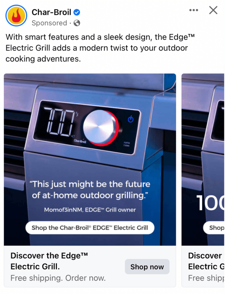
5. Char-Broil
This company does a great job making sure that their customers know that they are very modern. Showing their digital screens on their products, along with stainless steel covers, was a great way to showcase that. Adding in buttons to get people to the information they wish to see was brilliant.
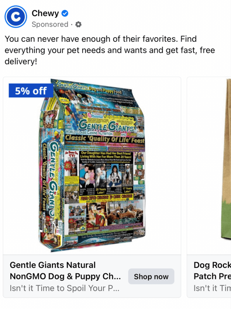
6. Chewy
Showcasing a lower price on dog food was an amazing way to hook viewers. Dog food is a necessity for any pet owner and if they can get a small deal, they will usually take it. Soon enough, they’ll be looking at puppy presents for an upcoming pup-birthday or other occasions. Image backgrounds have been kept simple to minimize clutter and make them look coherent with common Facebook feed.
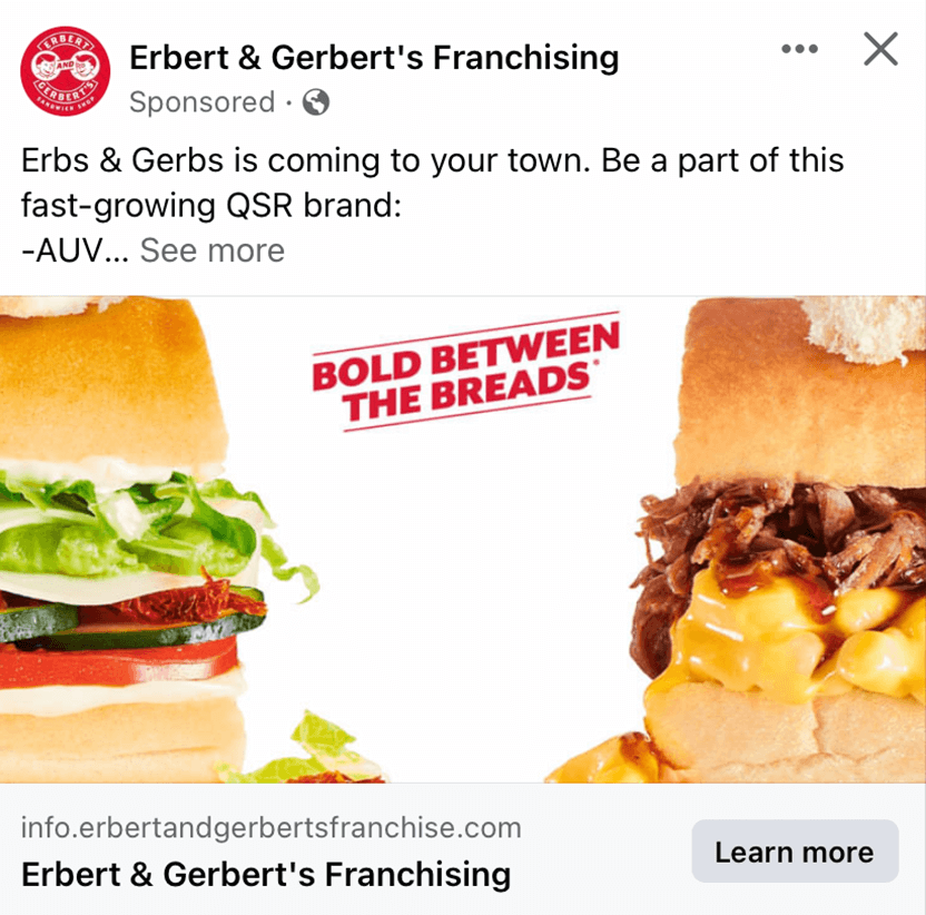
7. Erbert & Gerbert’s
Everything about this layout is engaging, but their images stand apart from their other features. The reflection against some of the elements of these sandwiches really elevated their tasty looks. Their use of white space helps bring light to their phrase “Bold Between the Breads”. Sometimes, simple is better.
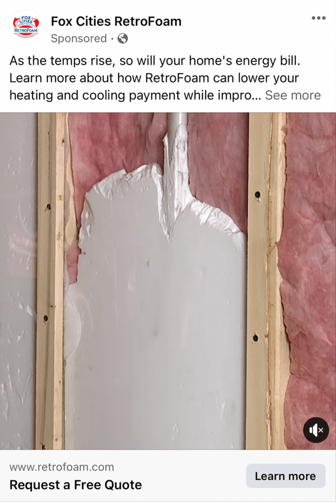
8. Fox Cities RetroFoam
Though Fox Cities RetroFoam isn’t the most exciting example, it is very straightforward. People who are their target market will easily be intrigued if this is something they need done to their home. We liked how their caption correlates to the face of saving money on energy by paying for their service. Overall, this was a great one to look at for inspiration.
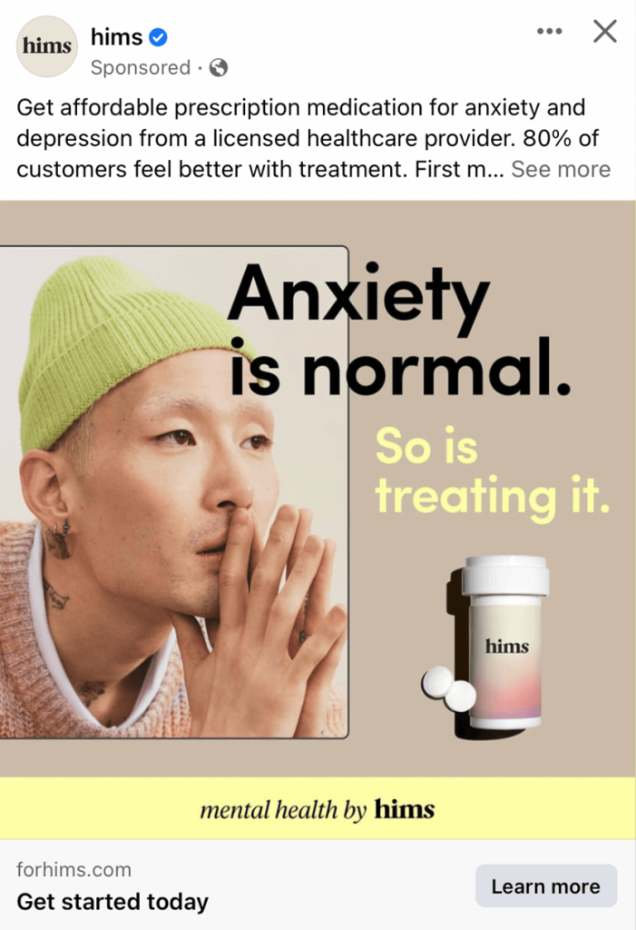
9. hims
Hims does a great job with a minimalistic and modern template that will appeal to their young male target audience. Accents of pastel yellow were not what was expected, so it generated more attention online. We thought it was perfect because even just this short advertisement matches their website’s feel, making returning customers recognize their ads faster.
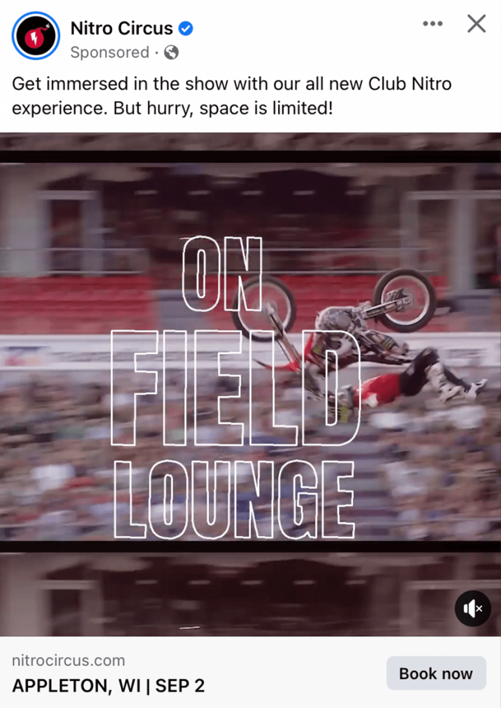
10. Nitro Circus
Here’s a company that makes a stunning video that captures viewers. We liked how their primary text has been used to create a sense of rush to match their feel of an adrenalin rush provided by their video. It was also very helpful to include the location and date, so customers already know if they can attend before clicking the link.
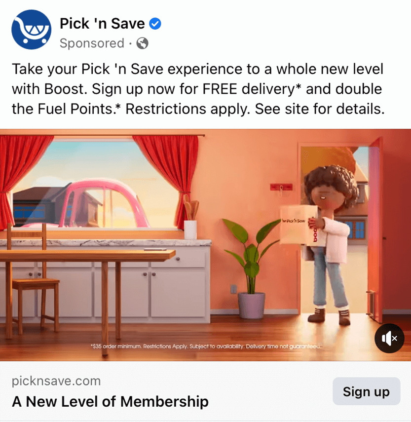
11. Pick ‘n Save
This company stands out because of its creative and memorable animated people. These are used in many of their commercials and print ads, which helps create unity. What makes this Facebook ad impressive is that the brand has moved away from using plain, boring graphics or images. Additionally, a bright color palette is quite welcoming, so most users who come across this ad will stop scrolling and check out the whole thing.
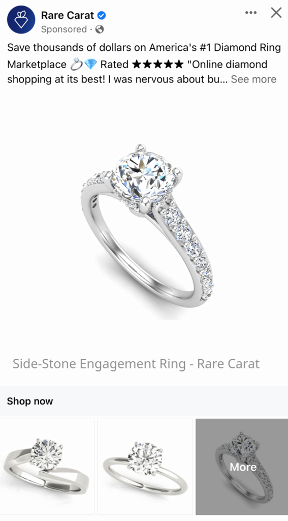
12. Rare Carat
Right away, we noticed this brand’s cute and creative logo that seems to be a diamond turned into a carrot. They clearly show their products, which is something that should always be done. This ad is a prime example of a straight-to-the-point design. It was helpful to include a “more” image that allows customers to see additional designs that aren’t found on this small template.
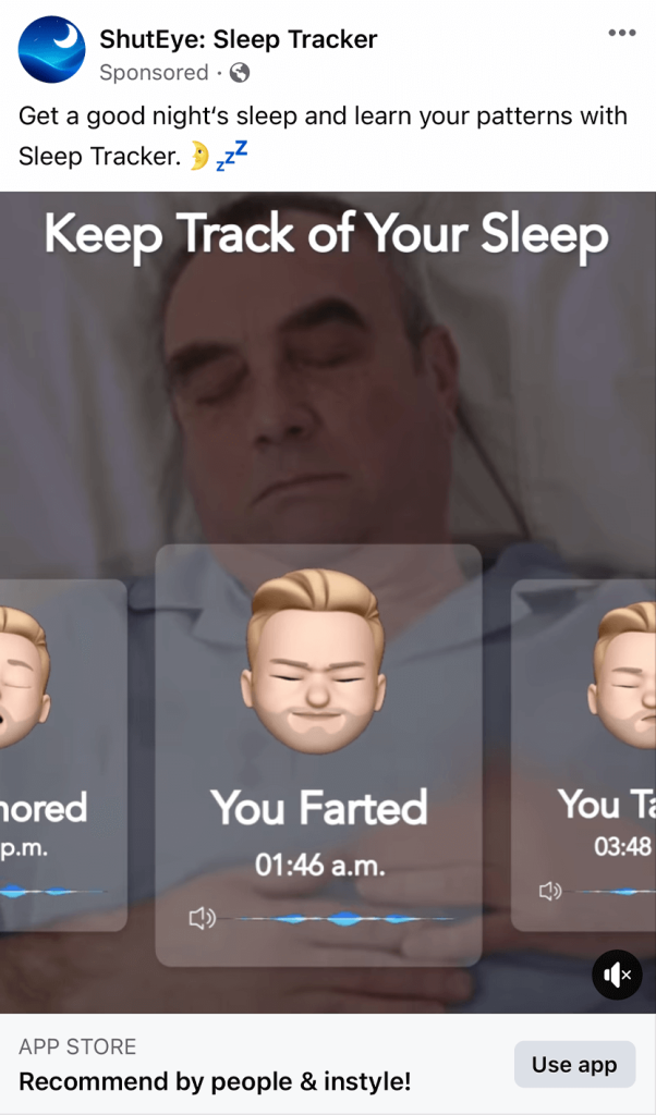
13. ShutEye Sleep Tracker
Ads don’t need to be boring, as proven by Shut Eye Sleep Tracker. We thought it was fun to add memojis to show different things you did while you slept. We thought it was cool that they created an example of what information you’ll gain if you use their product. Their creative animations also made this ad even better. On another note, the placement of text in this example is worth mentioning as it doesn’t clash with their primary message.
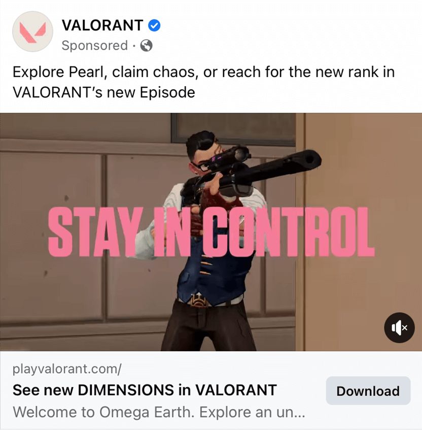
14. VALORANT
Here we have a video game ad that makes great use of animated videos, just as the game appears. Their brightly colored fonts contrast with their more muted colored animations. We thought it was helpful to use capital letters for certain words in their ad to help them stand out. Another great example to gain inspiration from.
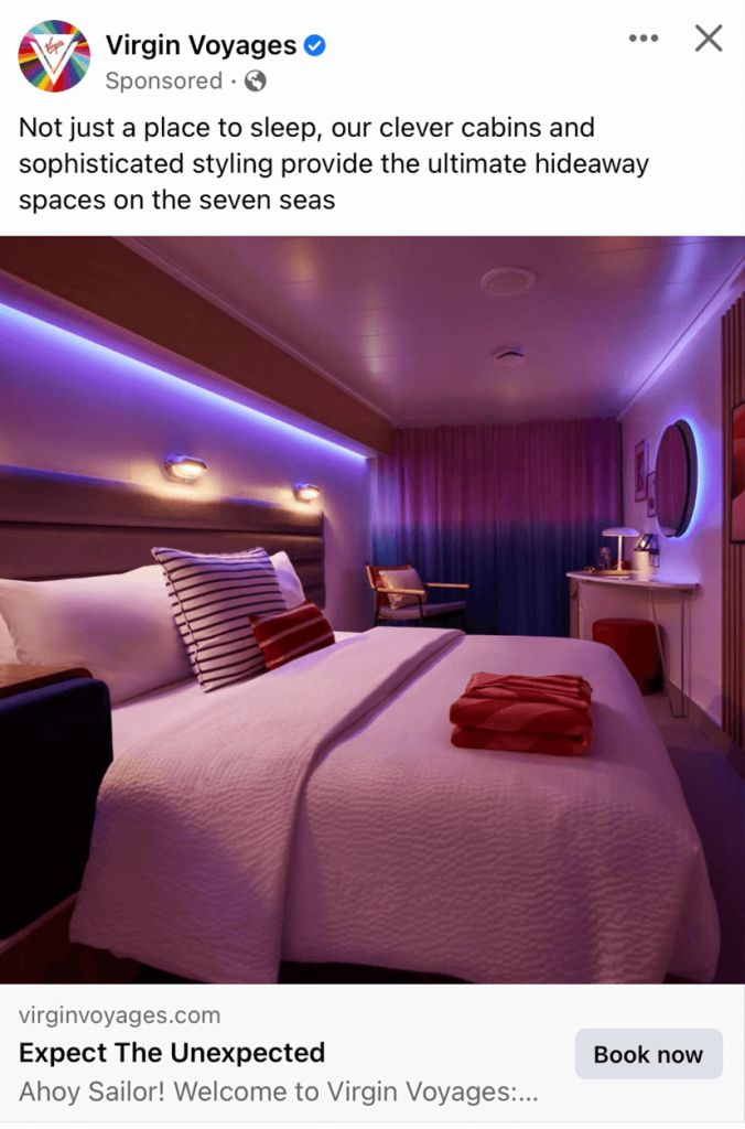
15. Virgin Voyages
Love, love, love! This company did an amazing job with their imagery and playing with interesting lighting. When it comes to booking accommodations, many customers prefer to look for options with a proper ambiance, and this is a perfect example. Including a neatly done bed and folded towels also conveys a message of cleanliness, which increases trust in their company for potential customers.
Facebook ads help you to reach your specific customers based on demographics, interests, and behaviors. It’s effective for brand awareness, lead generation, and driving conversions.
Facebook offers many pre-designed formats that include images, videos, carousel templates, slideshows, and more. Each format serves a purpose for a variety of different goals that will engage audiences in unique ways.
Facebook Pixel is a code snippet you can add into your website to track user interactions and gather data. All of this will help you to measure ad effectiveness, track conversions, and retarget your users.
A/B testing involves running multiple versions of your ad to multiple segments of your audience to see which performs better. This will help you find the best ad for your customers.
Yes, these types of ads are built to effectively promote events, webinars, or product launches. This is only one of the positives of Facebook ads.
To optimize your ads for mobile users, make sure to have captivating visuals, concise copy, and easy-to-click buttons.