In the global digital marketplace, your ecommerce website is more than just a catalog – it is a sophisticated sales engine that must balance brand storytelling with rigorous conversion science. To compete in 2026, a world-class online store must provide a seamless experience that mirrors the personalized touch of a physical boutique while maintaining the lightning-fast efficiency of a modern distribution hub.
Our ecommerce strategy team evaluated hundreds of storefronts across every major platform – from custom-coded enterprise solutions to high-performance Shopify and WooCommerce builds. We looked for the top 10 examples that excel in customer journey mapping, persuasive product presentation, and checkout friction reduction. These sites represent the pinnacle of digital retail, showcasing how to turn casual browsers into loyal brand advocates.
Whether you are launching a boutique D2C brand or scaling a global retail powerhouse, these examples offer the ultimate blueprint for ecommerce excellence.
Note on Our Selection Process: We recently audited this guide to remove outdated storefronts and sites that no longer meet our performance or security standards. This curated list now focuses on the top 10 ecommerce websites providing the most strategic value in 2026.
Top Ecommerce Website Designs
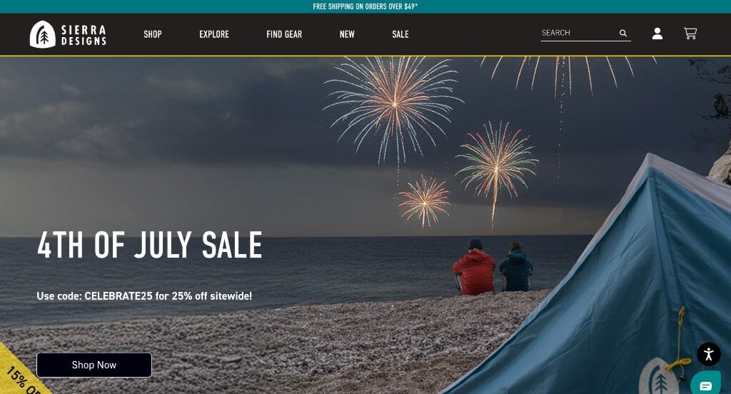
1. Sierra Designs
Why We Chose Sierra Designs
The website for Sierra Designs serves as a premier benchmark for “Immersive Technical Merchandising and Experiential Community Commerce.” For a heritage outdoor equipment brand manufacturing high-performance tents, sleeping bags, and apparel, a digital storefront must bridge the gap between digital retail and the raw, physical experience of the backcountry. This platform masterfully succeeds by treating its homepage as an interactive field guide, shifting from cinematic lifestyle media straight into highly targeted, context-rich product discovery.
Key Design Highlights:
- Cinematic, Adventure-Driven Hero Video Loop: The website opens with a sweeping, high-definition video sequence dominating the primary hero area. Capturing raw, unscripted footage of backpackers navigating rugged trails, setting up camp, and weathering elements instantly taps into the explorer’s mindset, validating the gear’s durability and outdoor utility the moment the page loads.
- Interactive Lifestyle Hotspot Merchandising Engine: A major structural triumph of the homepage layout is an interactive, full-screen feature image showing two campers in a real-world outdoor environment. By overlaying subtle, clickable “hotspots” directly onto their gear, the interface allows users to discover exactly which tent, sleeping bag, or apparel item is being used in the photo, transforming a passive lifestyle image into a highly engaging, contextual shopping gateway.
- Visual Instagram Community Proof Grid: Positioned seamlessly within the lower homepage workflow is a dedicated Instagram social feed feature. Showcasing real-world imagery generated by real hikers and campers out in the wild provides an authentic layer of peer-to-peer social proof, effortlessly bridging the gap between official brand manufacturing and the global community of outdoor enthusiasts.
- Instant Expert Conversational Live Support Channel: To assist explorers who might have immediate, technical questions regarding gear specifications—such as tent hydrostatic head ratings, temperature limits on sleeping bags, or pack volume capacities—the homepage integrates an active live chat portal. This real-time asset connects shoppers directly with knowledgeable specialists, instantly resolving complex product inquiries and streamlining the path to purchase.
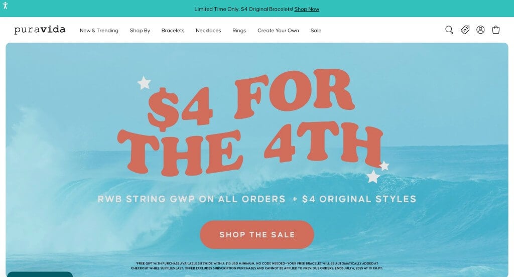
2. Pura Vida
Why We Chose Pura Vida Bracelets
The website for Pura Vida Bracelets serves as a premier benchmark for “High-Velocity Lifestyle Retail and Mainstream Credibility Architecture.” For an accessory brand built on a casual, sun-soaked lifestyle aesthetic, a digital storefront must capture a distinct, high-energy mood while executing flawless e-commerce mechanics. This platform masterfully succeeds by combining a vibrant, product-dense catalog grid with clear authority triggers that eliminate purchase hesitation for first-time buyers.
Key Design Highlights:
- Vibrant, High-Density Visual Catalog Grid: The homepage features an extensive matrix of shopable items right on the main scroll path. Utilizing exceptionally bright, high-quality product photography, the layout accurately captures the intricate threads, vivid colors, and styling of their stacked bracelets and jewelry, allowing shoppers to effortlessly browse and select items.
- Mainstream Media “Featured In” Authority Triage: A major structural highlight of the layout is the prominent placement of a “Featured In” section. Displaying recognizable logos from top-tier fashion magazines and national media outlets adds an instant layer of widespread credibility, validating the brand’s massive cultural footprint to prospective customers.
- Community-Backed Customer Review Engine: Integrated seamlessly within the core homepage flow is a dedicated customer feedback section. Showcasing real-world testimonials regarding bracelet durability, color vibrancy, and comfortable sizing injects crucial peer-to-peer social proof directly into the browsing loop, boosting buying confidence.
- Instant Conversational Customer Support Channel: To immediately assist shoppers navigating gift-giving options, subscription details, or tracking information, the platform incorporates an active live chat portal. This real-time communication channel offers an easy way to resolve pre-purchase inquiries, keeping the user’s shopping momentum moving smoothly toward checkout.
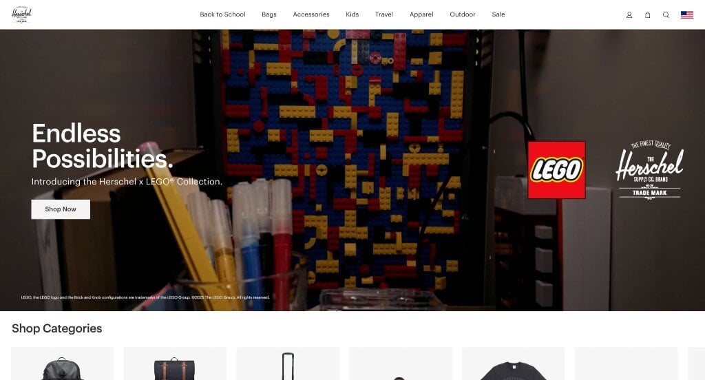
3. Herschel
Why We Chose Herschel Supply Co.
The website for Herschel Supply Co. serves as a premier benchmark for “High-Impact Visual Merchandising and Frictionless Multi-Device Travel Commerce.” For a global lifestyle brand celebrated for its timeless backpacks, luggage, and accessories, the digital storefront must reflect the clean, utilitarian design of the products themselves. This platform masterfully succeeds by minimizing layout clutter and allowing oversized, high-fidelity media assets to drive an incredibly smooth retail journey across all devices.
Key Design Highlights:
- Dynamic Multi-Incentive Global Announcement Bar: Positioned at the absolute top of the viewport is a streamlined announcement header. Rather than just listing a static discount, this communication strip actively highlights a rotation of critical consumer incentives—including current sales events, free shipping thresholds, and extended return policies—capturing value-conscious shoppers the moment they arrive.
- Oversized, High-Impact Product Media Assets: The homepage trades dense walls of text for massive, ultra-crisp product imagery and lifestyle video loops. These large-scale visuals isolate fine canvas textures, premium zipper hardware, and inner lining details, allowing consumers to visually inspect the durability and build quality of the bags without needing to hunt through deep specification tables.
- Sleek High-Density Mega Menu Navigation: To organize an expansive product ecosystem spanning backpacks, duffels, hard-shell luggage, apparel, and kids’ gear, the desktop interface relies on a beautifully balanced mega menu. The expanded dropdown partitions styles and collections into highly legible columns, creating a straightforward and rapid path to specific inventory categories.
- Ultra-Clean Mobile Scrolling and Touch Ergonomics: Built with a modern, mobile-first approach, the smartphone layout delivers an exceptionally responsive and fluid experience on smaller screens. Product tiles resize cleanly into a readable vertical flow, buttons remain easily thumb-accessible, and complex navigation elements fold away effortlessly, ensuring a zero-friction checkout funnel on the go.
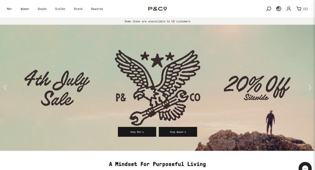
4. P&Co
Why We Chose P&Co
The website for P&Co serves as a premier benchmark for “Subcultural Lifestyle Merchandising and High-Identity D2C Retail Layouts.” For a brand deeply rooted in alternative culture, motorcycling, and vintage utility apparel, the digital storefront must feel less like a clinical warehouse and more like a curated, attitude-driven lookbook. This platform masterfully succeeds by prioritizing highly stylized storytelling layouts alongside clean, modern interface mechanics that anchor the brand’s gritty aesthetic.
Key Design Highlights:
- Highly Stylized, Editorial Product Imagery: The homepage eschews standard flat-lay retail shots in favor of rich, character-driven product photography. Captured with moody lighting, cinematic film grain, and raw locations, the visuals emphasize the rugged texture of the canvas, custom graphics, and heavy denim—selling an entire lifestyle identity rather than just a garment.
- Immersive Front-Page Lookbook Integrations: Positioned directly within the main scroll path are dedicated feature windows for seasonal lookbooks. This allows fashion-forward buyers to see how individual pieces blend seamlessly into styled outfits, encouraging full-look visualization and organically increasing average order values.
- Minimalist, Transparent Sticky Header and Mega Menu: To keep navigation accessible without interrupting the large, immersive media assets, the layout features a sleek, transparent sticky navigation bar. As users scroll, it anchors cleanly to the top of the viewport, housing a robust mega menu that breaks down collections by style, fit, and accessory categories with zero visual noise.
- Instant Conversational Lifestyle Support Channel: To bridge the gap between digital shopping and an authentic boutique experience, an active live chat portal is integrated smoothly into the workflow. This gives customers a direct line to ask about specific garment measurements, fabric weights, or restock timelines, resolving pre-purchase friction right from the home page.
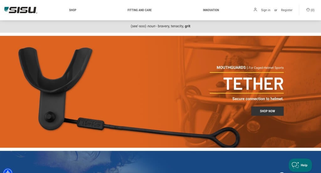
5. SISU
Why We Chose SISU Guard
The website for SISU Guard serves as a premier benchmark for “High-Performance Athletic Merchandising and Technical Protective Education.” For a brand specializing in ultra-thin, high-tech athletic mouthguards, the digital storefront must overcome the consumer perception that maximum safety requires a bulky, uncomfortable product. This platform masterfully succeeds by utilizing a high-contrast visual design that educates athletes and parents on its unique science right from the home page.
Key Design Highlights:
- High-Contrast Palette with Feature-Driven Explanations: The homepage balances a crisp, professional layout with punchy, high-energy accent colors that fit the sports industry perfectly. Instead of relying purely on aesthetic marketing, the main scroll path is packed with clear, digestible breakdowns explaining their Diffusix™ technology and how a guard so thin can distribute impact forces effectively.
- Streamlined Athletics-Focused Mega Menu: To help athletes, parents, and coaches quickly find the exact protection they need, the site features a well-structured shopping mega menu. The dropdown menu organizes the inventory cleanly by sport type (such as lacrosse, hockey, or roller derby), age group, and protection level, ensuring users can find the right fit within a click or two.
- Agile, User-Friendly Mobile Navigation: Recognizing that many young athletes and busy parents shop directly from their smartphones at tournaments or practices, the platform delivers an incredibly smooth mobile layout. The scrolling mechanics are entirely fluid, the text remains sharp and highly legible on small screens, and touch targets are sized perfectly for zero-friction mobile browsing.
- Instant Support and Fit-Guidance Live Chat: To assist shoppers who might have immediate questions regarding sizing, custom molding processes, or dental warranty coverage, the interface incorporates an active live chat feature. This real-time resource provides instant clarity on technical fitting steps, ensuring customers can purchase with absolute confidence.
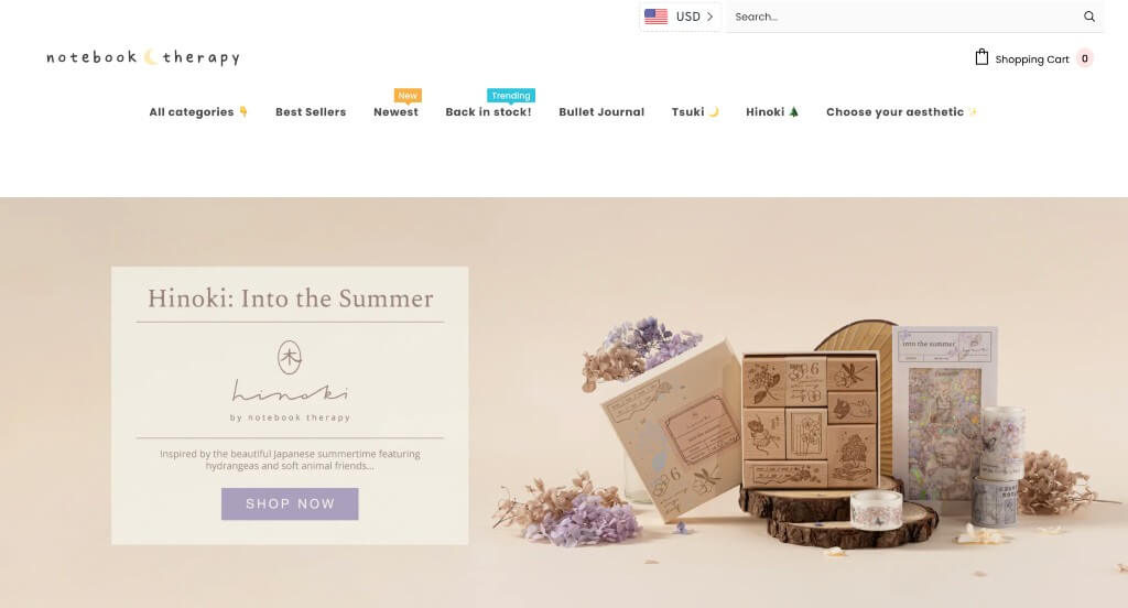
6. Notebook Therapy
Why We Chose Notebook Therapy
The website for Notebook Therapy serves as a premier benchmark for “Whimsical Pastel Aesthetics and Cozy Community-Driven E-Commerce.” For a bullet journaling and stationery brand catering to a passionate, design-conscious audience, the online storefront must feel like an inviting, artistic workspace. This platform masterfully succeeds by using clean space, cohesive color stories, and peaceful lifestyle scenes to transform everyday study tools into curated personal rituals.
Key Design Highlights:
- Immersive Multi-Product Aesthetic Hero Scene: The homepage opens with a beautiful, high-fidelity hero showcase that arranges notebooks, pens, and pouches together within a single, perfectly styled setting. This cohesive visual introduction doesn’t just display product lines—it instantly demonstrates how the entire collection complements a beautifully organized, creative lifestyle.
- High-Detail Product Visuals on a Pristine Backdrop: The homepage grid places detailed, ultra-crisp product photography against a clean white canvas. This intentional layout choice allows the delicate pastel color palettes, intricate gold-foil cover stampings, and tactile linen textures of the journals to take center stage, giving shoppers a true sense of the product quality.
- Editorial Behind-the-Desk Creative Blog Triage: Embedded smoothly into the primary homepage scroll is a dedicated feature section for their blog. Spreading inspiration through bullet journal setup guides, aesthetic study tips, and community artwork highlights lifts the site from a simple retail shop into an indispensable creative destination for stationery enthusiasts.
- Fluid Mobile Navigation and Layout Continuity: The platform translates beautifully to smaller screens, keeping the cozy, artistic layout intact for mobile shoppers. The image grids scale proportionally, text sizes remain completely legible, and touch targets are optimized for frictionless scrolling, making it effortless to browse new collections on the go.
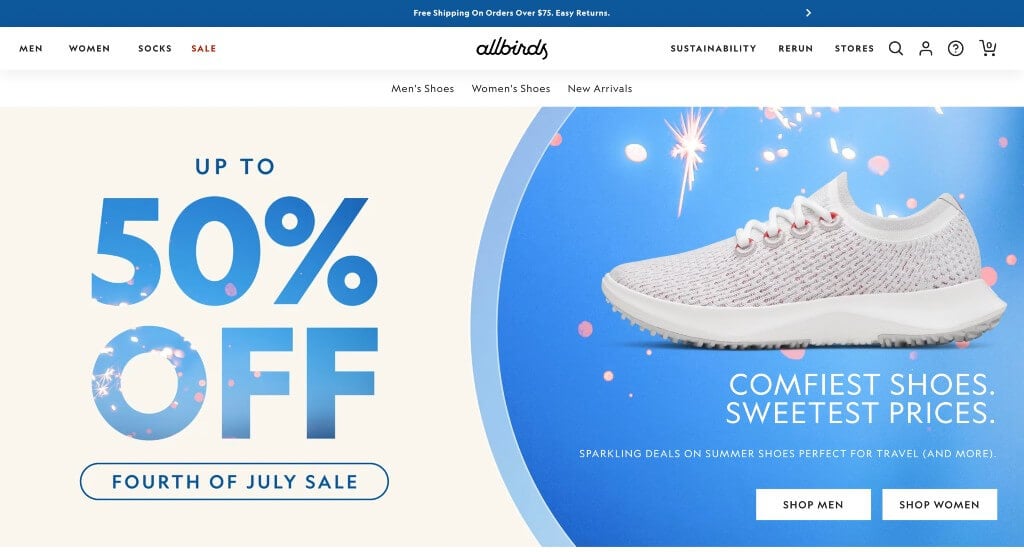
7. Allbirds
Why We Chose Allbirds
The website for Allbirds serves as a premier benchmark for “Sustainable Minimalist Merchandising and High-Conversion Direct-to-Consumer Funnels.” For a pioneering brand built on eco-friendly materials and clean, unbranded shoe designs, the digital storefront must mirror that same philosophy of simplicity and purpose. This platform masterfully succeeds by keeping the visual interface incredibly light, letting material-focused photography and natural navigation guide the user.
Key Design Highlights:
- Pristine, High-Quality Product Photography: The homepage features crisp, high-fidelity product imagery captured against clean, solid white backgrounds. This intentional studio lighting strips away all distractions, allowing shoppers to easily inspect the unique textures of the sustainable materials—like the coarse weave of their merino wool or the breezy structure of their eucalyptus tree fiber.
- Frictionless Front-Page Category Directory: Positioned right in the primary homepage flow are clear, visual category blocks. Rather than forcing users to dig through complex menus, these immediate gateways divide the catalog cleanly by gender and product type (such as running shoes, everyday sneakers, or apparel), giving both new and returning customers a rapid starting point.
- Dynamic Multi-Incentive Global Announcement Bar: Positioned at the absolute top of the site is a streamlined communication banner. This dedicated header actively communicates vital customer touchpoints—such as active seasonal sales, free shipping thresholds, and easy return windows—capturing value-conscious shoppers the exact second they land on the page.
- Fluid Mobile Scrolling and Touch Ergonomics: Built to accommodate a high volume of smartphone traffic, the mobile interface delivers an exceptionally clean and responsive layout on smaller screens. The product tiles, text sizing, and call-to-action buttons scale down perfectly without losing alignment, keeping the browsing experience natural, fast, and remarkably easy to follow on the go.
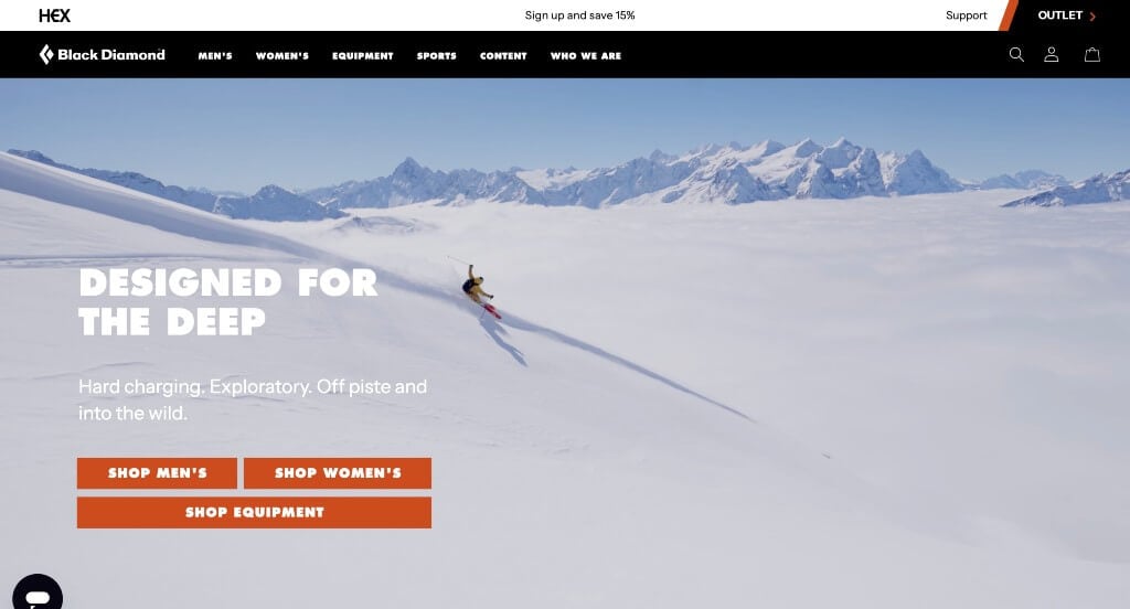
8. Black Diamond
Why We Chose Black Diamond Equipment
The website for Black Diamond Equipment serves as a premier benchmark for “Technical Alpine Merchandising and High-Context Adventure Commerce.” For a legendary manufacturer of premium climbing, skiing, and mountain gear, the digital experience must balance rugged subcultural authenticity with high-velocity retail mechanics. This platform masterfully succeeds by immersing users in extreme outdoor environments through large-scale media, then shifting into interactive discovery modules that connect technical apparel and hardware directly to the user’s next adventure.
Key Design Highlights:
- High-Impact Alpine Ascent Hero Scene: The homepage commands immediate attention with a breathtaking, large-scale hero photograph featuring climbers scaling a rugged peak using the brand’s technical gear. Leading with this uncompromising, real-world imagery instantly taps into the explorer’s mindset, validating the elite performance and safety of their products the split second the page loads.
- Interactive “The Trail Running Kit” Hotspot Engine: A standout architectural feature of the homepage layout is an interactive product assembly section labeled “The Trail Running Kit.” By mapping contextual “hotspots” across a curated collection of gear, the interface allows users to click directly on specific items—like headlamps, technical apparel, or hydration vests—to learn how they work together, bridging the gap between standalone products and functional, real-world setups.
- High-Fidelity Studio Product Grid: Beyond the immersive lifestyle scenes, the homepage showcases individual products through exceptionally crisp, high-quality photography. These clean, detailed studio visuals isolate fine product details, stitch textures, and hardware components, giving outdoor athletes absolute confidence in the craftsmanship of the gear before they head to checkout.
- Front-Page Editorial Blog Integration: Positioned smoothly within the lower homepage workflow is a dedicated feature section for their editorial blog. Spotlighting deep mountain dispatches, athlete expedition stories, and gear development insights elevates the platform from a standard retail store into a rich community hub where core enthusiasts can connect deeply with the brand’s technical heritage.
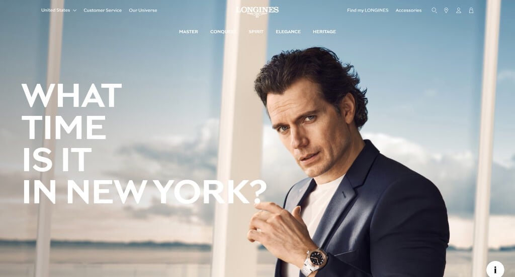
9. Longines
Why We Chose Longines
The landing page for the Longines Spirit Zulu Time serves as a premier benchmark for “Horological Luxury Merchandising and High-End Editorial Storytelling.” For an elite Swiss watchmaker celebrating a century of aviation heritage, a digital experience must communicate precision, craftsmanship, and luxury value. This platform masterfully succeeds by balancing rich, cinematic video clips with delicate, motion-driven layouts that evoke the premium tactile feeling of fine mechanical timepieces.
Key Design Highlights:
- Cinematic, Micro-Detail Hero Video Loop: The landing page opens immediately with an exquisite, high-fidelity video sequence dominating the primary hero space. By flashing extreme close-ups of the watch’s intricate mechanical movements, polished ceramic bezels, and detailed dial finishing, the media instantly establishes the timepiece’s luxury status and masterful build quality the second the page loads.
- Macro-Photography Product Showcases: Throughout the layout, exceptionally sharp, high-quality images isolate the unique design characteristics that make the Zulu Time collection stand out. These oversized, clear visuals allow watch enthusiasts to closely inspect subtle case brushings, luminescent hour markers, and the signature multi-timezone GMT hand, simulating a premium in-hand boutique experience.
- Gentle Motion-Driven Scroll Animations: As users move down the page, the interface utilizes graceful, smooth fade-in and slide animations on the product cards. These elegant micro-interactions react organically to the user’s scroll speed, adding a sense of weightlessness and luxury refinement to the visual narrative without distracting from the watch specifications.
- White-Glove Conversational Live Support Portal: To assist high-intent collectors navigating luxury price points, specific mechanical movements, or bracelet sizing configurations, the page integrates a polished live chat channel. Offering instant connection to a knowledgeable concierge provides a tailored customer service experience that mirrors the attentive care found in a physical retail boutique.
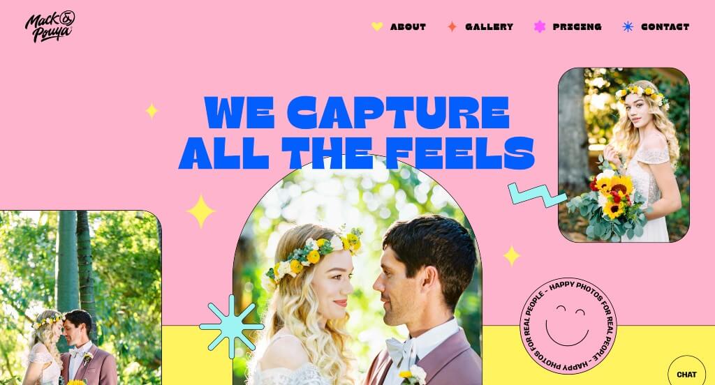
10. Mack & Pouya Photography
Why We Chose Mack Pouya
The portfolio website for Mack Pouya serves as a premier benchmark for “Immersive Creative Storytelling and Highly Interactive Kinetic Branding.” For a professional photographer, a digital portfolio must do more than just house static image grids—it needs to express a distinct artistic personality and create an unforgettable user experience. This platform masterfully succeeds by turning a traditional photography site into a playful, highly engaging digital playground that blends stunning visual art with creative, interactive conversion mechanics.
Key Design Highlights:
- Vibrant, Photography-First Hero Canvas: The website opens with a bright, high-energy hero layout that positions their stellar photography directly at the center of the experience. By pairing professional, high-fidelity imagery with a fun, welcoming design tone, the interface instantly captures the photographer’s creative style and hooks visitors the moment the page loads.
- Immediate Front-Page Portfolio Grid: Rather than hiding the artwork behind deep navigation layers, the homepage integrates a premium visual portfolio right into the main scroll path. This immediate access allows prospective clients to instantly browse and appreciate the lighting, composition, and emotional depth of past shoots without any browsing friction.
- Playful Animations and Integrated Graphics: Throughout the entire homepage journey, the site utilizes charming custom animations and graphic elements. These lively micro-interactions add a sense of joy and approachability to the browsing experience, effortlessly guiding the viewer’s eye down the page while reinforcing a memorable, creative brand identity.
- Interactive Pricing Estimator and Booking Ecosystem: A brilliant structural triumph of the site is its seamless dual-stage booking funnel. The homepage offers a delightful, interactive tool to estimate project pricing on the fly, paired immediately below with a beautifully designed, real-time booking calendar that lets clients instantly verify date availability, making the scheduling process entirely frictionless.
- Kinetic Physics-Engine Interactive Footer: Breaking away from standard, boring website footers, the bottom of the page features a dynamic, interactive physics sandbox. As you scroll into the footer space, a cluster of colorful, playful balls dropped into the frame tumble down, each carrying text labels. Users can actively click, toss, and play with these elements, leaving a lasting, high-delight final impression that completely redefines traditional site navigation.
Recommended Ecommerce Themes
WooCommerce Themes
Reebox – Themeforest
$48
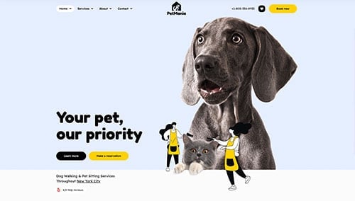
PetMania – Themeforest
$89
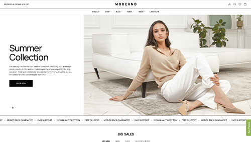
Moderno – Themeforest
$59
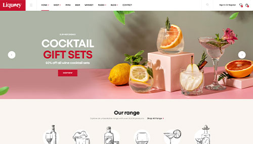
Liquory – Themeforest
$49
Shopify Themes
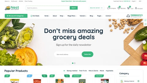
Nest – Themeforest
$59
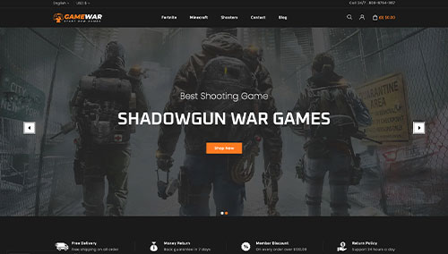
GameWar – Themeforest
$39
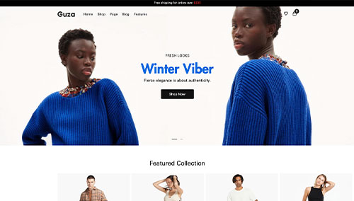
Guza – Themeforest
$39
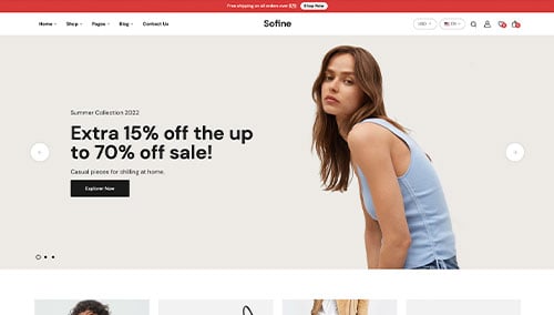
Sofine – Themeforest
$69