User Experience (UX) is the invisible thread that connects a brand’s goals with a user’s needs. In 2026, exceptional UX design goes beyond “ease of use” – it involves anticipating user intent, reducing cognitive friction, and creating meaningful emotional connections. A website with superior UX doesn’t just look good; it feels intuitive, guiding the visitor toward their goal with surgical precision and effortless flow.
Our UX strategy team analyzed hundreds of digital platforms to identify the top examples that master the science of interaction. We evaluated these sites based on accessibility standards (WCAG), micro-interaction quality, information architecture, and performance-centric design. These selections prove that when user-centricity is the priority, the result is higher engagement, lower bounce rates, and increased conversion.
Whether you are designing a complex SaaS dashboard or a minimalist portfolio, these examples represent the current benchmark for UX excellence.
Note on Our Selection Process: We recently audited this guide to remove outdated designs and sites that no longer meet our performance standards.
Top UX Website Designs
1. Happy Sleep
Why We Chose Happy Sleep
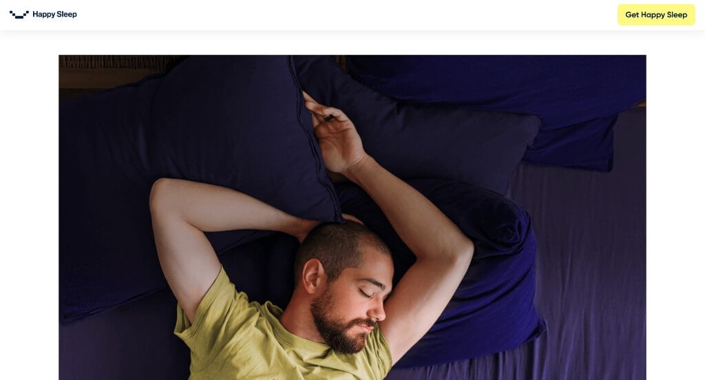
The mobile storefront for Happy Sleep serves as a premier benchmark for “High-Trust Direct-to-Consumer (D2C) Sleep Merchandising and Immersive Digital Retail Architecture.” As an innovator in premium mattress engineering and sleep systems, their digital platform must convert an investment-level health purchase into an effortless, transparent, and tactile online experience.
Key Design Highlights:
- Authentic Social Proof and Review Showrooms: Overcoming the inherent challenge of buying a mattress digitally without testing it physically, the mobile layout prioritizes direct customer success stories right in the central homepage flow. Showcasing highly visible star ratings, verified buyer endorsements, and comfort benchmarks immediately establishes robust operational credibility, neutralizing purchasing anxiety for first-time visitors.
- Interactive Scroll-Driven Narrative Framework (Scrollytelling): Moving completely away from static retail grids, a dedicated section of the homepage utilizes a seamless mobile scrollytelling mechanism. As smartphone users advance through the scroll path, the site dynamically peels back and deconstructs product layer mockups, material callouts, and orthopedic benefits. This interactive cadence captures absolute consumer focus and explains complex material science far better than standard text ever could.
- Integrated Front-Page FAQ Repository: Anticipating structural customer objections and shipping inquiries long before checkout, the homepage features a clean, beautifully organized Frequently Asked Questions (FAQ) matrix. Addressing core inquiries regarding trial periods, warranty protections, and return mechanics directly on the front page eliminates purchasing friction and accelerates the consumer decision-making cycle.
- Immersive Cinema-Scale Wide Content Blocks: A highly distinct feature of the layout is its reliance on wide, edge-to-edge cinematic imagery and content containers that bleed seamlessly into the margins of the viewport. Eliminating standard structural padding around premium lifestyle photography and product details maximizes precious smartphone screen real estate, surrounding the visitor in a premium, ultra-luxurious visual landscape.
2. Parallel
Why We Chose Parallel
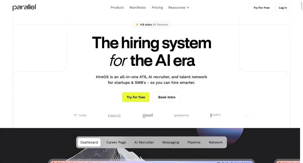
The desktop website for Parallel’s HireOS serves as a premier benchmark for “High-Velocity B2B SaaS Merchandising and AI-Native Recruitment Product Architecture.” As an all-in-one Applicant Tracking System (ATS) tailored specifically for modern, lean startups, their digital presence must rapidly prove that their platform can cut through recruiting bloat. The desktop interface beautifully accomplishes this by ditching abstract graphics in favor of tactical product transparency, utilizing explicit software visualizations and personal outreach to convert scaling founders and talent leaders.
Key Design Highlights:
- High-Fidelity Platform Walkthroughs and Functional Screenshots: Rather than forcing prospective buyers to guess what the software interface actually looks like, the desktop layout is packed with crisp, highly contextual product screenshots. Showing the actual AI pipeline ranking systems, custom candidate kanban boards, and unified communication dashboards directly on the landing page eliminates software ambiguity, proving the platform is intuitive and ready to deploy immediately.
- Transparent Capabilities Framework and Feature Mapping: The homepage acts as a comprehensive, highly structured service blueprint that leaves zero questions about what the platform offers. By explicitly detailing their core architectural quadrants – spanning an AI-native ATS, global talent marketplace, automated applicant screening, and custom career sites – the layout guides desktop visitors through a logical, feature-by-feature discovery process that matches their specific hiring headaches.
- Personalized “Letter from the Founder” Narrative Anchor: Breaking away from cold, sterile corporate messaging, the homepage incorporates a dedicated, personal letter from the founder, Cory OKeefe. Grounding the company’s origin story in a real-world mission – explaining why traditional recruiting tech is fundamentally broken for modern, lean startups – establishes profound brand vulnerability and professional trust that resonates directly with fellow founders.
- High-Trust Social Proof and Peer Review Showrooms: Neutralizing B2B buying skepticism is effortlessly handled by embedding authentic customer reviews and enthusiastic testimonials from verified co-founders and talent leaders right into the central scroll path. Displaying specific speed metrics – such as hiring a senior marketing role in under 4 weeks – provides tangible operational validation that justifies the platform’s efficiency claims to desktop decision-makers.
3. Ikon Pass
Why We Chose Ikon Pass
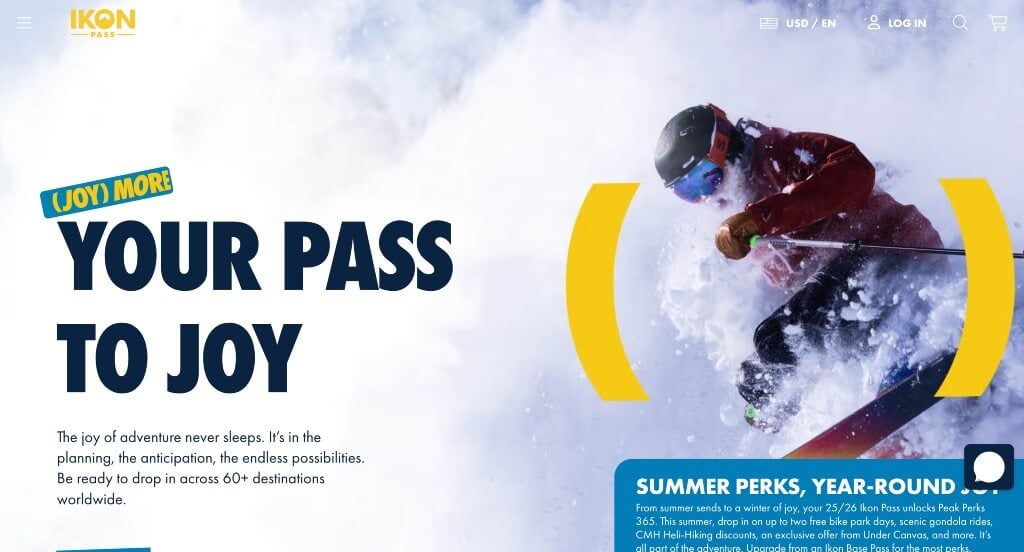
The desktop website for Ikon Pass serves as a premier benchmark for “High-Yield Adventure Tourism E-Commerce and Immersive Seasonal Sports Architecture.” Managing a vast global network of over 70 alpine destinations, the platform must quickly transform complex mountain logistics, variable tier permissions, and high-ticket seasonal pricing into a frictionless, ultra-premium retail destination. The widescreen layout masterfully achieves this by blending clean data tables with cinematic, edge-to-edge branding to convert winter sports enthusiasts into immediate pass holders.
Key Design Highlights:
- Frictionless Promo and Package Navigation Carousel: To prevent visual clutter while simultaneously advertising multiple high-value product updates, the homepage integrates a smooth, intuitive carousel module. This banner allows desktop users to rapidly cycle through major seasonal promotions, child pass bundling discounts, and distinct travel savings without forcing the consumer down deep or confusing sub-navigation paths.
- On-Demand Conversational Customer Care and Live Chat: Recognizing that a multi-destination ski pass is a major financial commitment requiring precise customization (such as factoring in blackout dates, insurance options, or regional access boundaries), the interface integrates an accessible live chat portal. This desktop tool gives customers instant access to support specialists, dramatically lowering abandonment rates at the absolute peak of the sales funnel.
- Transparent Pass Detail Blueprint and Pricing Matrices: The homepage completely eliminates shopping ambiguity by laying out its core pass options – including the Ikon Pass, Ikon Base Pass, and Ikon Session Pass – in a side-by-side comparative table. Displaying upfront tier costs, specific destination limits, and alternative Affirm installment options right on the primary landing page empowers users to confidently self-select their ideal package.
- Immersive Full-Width Visual Frame and Cohesive Branding: Maximizing modern widescreen resolutions, the platform embraces an expansive, edge-to-edge layout that trades standard restrictive white margins for beautiful, cinematic outdoor media. This expansive framing is meticulously anchored by a bold, highly unified color palette and striking alpine typography, ensuring the digital interface looks exceptionally polished and aligns seamlessly with Ikon’s adventurous, premier lifestyle brand.
4. Apple
Why We Chose Apple
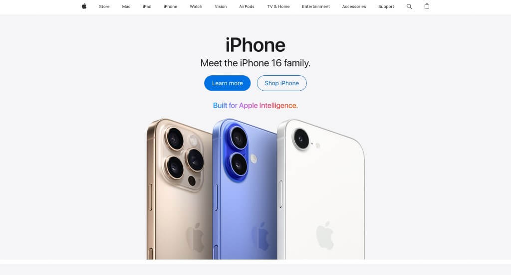
The desktop website for Apple serves as the ultimate premier benchmark for “Master-Class Minimalist E-Commerce and Cinematic Product Merchandising Architecture.” As a global titan of hardware and digital services, Apple’s digital storefront completely sets the standard for how premium retail brands display luxury tech online. The platform abandons cluttered banners and aggressive sales text in favor of an exceptionally clean, editorial flow that lets their industrial product design take full ownership of the user’s screen.
Key Design Highlights:
- Immersive, Edge-to-Edge Grid Matrix: The homepage relies on a massive, full-width grid structure that functions as a series of premium digital billboards. By locking each flagship product – like the latest iPhone, MacBook, or Apple Watch – into its own giant, high-contrast block with generous negative space, the interface completely controls the viewer’s focus and ensures that the hardware itself feels like a work of art.
- Streamlined Universal Desktop Mega Menu: Managing a dense corporate ecosystem across dozens of product variants, support ecosystems, and business portals is seamlessly achieved via an elegant desktop mega menu. Hovering over any primary header link unlocks a beautifully styled, flat drop-down panel that populates specific product sub-categories alongside subtle text columns, preventing navigation fatigue while providing deep-site access.
- Cinematic Entertainment Showcases with Massive Media Sliders: Transitioning from hardware commerce to digital streaming entertainment, the lower portion of the homepage features giant, sweeping slider carousels dedicated to Apple TV+ content. These horizontal carousels feature massive, high-definition title graphics and live preview stills that auto-advance, giving desktop users a rich, theatrical look into their active streaming library directly from the main store layout.
- Integrated Universal Contextual Promotion and Financing Bars: Running quietly directly beneath the primary global navigation, Apple strategically implements a clean, high-visibility promotional strip. Rather than relying on flashing pop-ups or neon discount tags that would ruin their premium aesthetic, they use this dedicated space to display text links highlighting trade-in values, student discounts, or zero-interest monthly installment plans. This elegant integration acts as a powerful final conversion hook right alongside the main navigation tree.
5. Marcus Medical
Why We Chose Marcus Medical
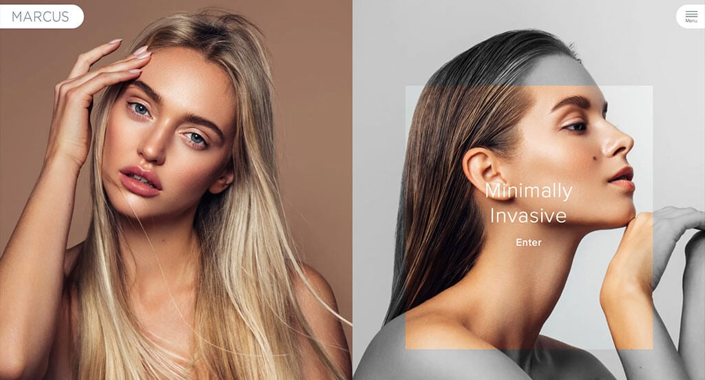
The desktop website for Marcus Medical serves as a premier benchmark for “Premium Medical Aesthetic E-Commerce and Dynamic Patient-Centric Experience Architecture.” In the high-end cosmetic and plastic surgery sector, a digital storefront must immediately project pristine clinical authority while offering a personalized, anxiety-free onboarding path. The desktop layout masterfully achieves this by blending deep professional credentials with a unique, user-controlled content filtering system that customizes the entire storefront based on a patient’s clinical intent.
Key Design Highlights:
- Persistent Sticky Header with Integrated “Book Now” Portal: To maintain an effortless conversion path as users browse deep clinical descriptions, the interface features a beautifully pinned sticky header. This navigation bar remains anchored to the top of the viewport during scrolling, keeping a high-visibility, contrasting “Book Now” call-to-action button continuously accessible to capture patient intent the moment they decide to schedule a consultation.
- Deep Clinical Accountability and Front-Page Surgeon Biography: Establishing immense medical trust and elite industry positioning, the homepage reserves premium layout real estate for the professional biography and academic credentials of Dr. Keith Marcus. Highlighting board certifications, specialized training, and medical milestones right on the front page humanizes the practice and provides the rigorous scientific validation necessary for elective medical procedures.
- Authentic Patient Social Proof and Testimonial Showrooms: Overcoming the natural skepticism associated with aesthetic transformations is gracefully managed by embedding direct patient testimonials within the primary homepage scroll path. Displaying real-world patient success stories and detailed procedural praise creates an immediate layer of empathetic reassurance, validating the clinic’s safety standards and artistic results for desktop visitors.
- Dynamic Sidebar Navigation and Interactive Content Toggling: A highly innovative hallmark of the desktop experience is the persistent right-hand sidebar menu, allowing visitors to instantly toggle between “Facial Plastic Surgery” and “Minimally Invasive” treatment paths. Selecting either track instantly rewrites the global menu directories and swaps out the homepage content blocks to match that specific category. This interactive personalization filters out irrelevant information, delivering a hyper-focused, bespoke user experience tailored to the patient’s exact cosmetic goals.

6. Symbol Audio
Why We Chose Symbol Audio
The desktop website for Symbol Audio serves as a premier benchmark for “Ultra-Premium Heritage Commerce and High-End Audio-Furniture Merchandising.” As a boutique manufacturer building bespoke solid-wood console stereos and vinyl storage cabinets, their digital storefront must effortlessly justify investment-level furniture pricing. The desktop interface masterfully achieves this by matching audiophile utility with an elegant, mid-century modern aesthetic, treating its layout like a high-end print design magazine.
Key Design Highlights:
- Impressive Multi-Column Desktop Mega Menu: Managing a catalog that bridges technical electronic components with customizable furniture sizing is seamlessly handled via an expansive, editorial mega menu. Hovering over the primary header reveal opens an incredibly clean, wide panel that organizes product collections, custom finish options, and audio integration details into distinct, highly readable columns that prevent navigation clutter.
- Meticulous Fine-Furniture Product Grid Matrix: To display their craftsmanship without falling into standard e-commerce traps, the homepage relies on an immaculate, high-contrast grid layout. Each block isolates a specific furniture console or record storage unit with generous negative space, allowing desktop viewers to appreciate the clean lines, material joinery, and premium wood grains as if they were browsing an upscale design gallery.
- Unconventional Bottom-of-Screen Sticky Announcement Bar: Breaking away from the standard practice of placing promo banners at the absolute top of the page, the interface anchors a sleek, persistent announcement bar along the bottom of the desktop viewport. This smart layout choice keeps high-value messaging – such as custom freight shipping updates or lead-time notifications – permanently visible to shoppers without interrupting the beautiful, premium branding of their main global header.
- Stylized, Identity-Driven Hero Showcase Imagery: Capturing absolute user focus the exact second the interface initializes, the desktop hero section leverages large, exquisitely styled photography. Rather than showing isolated product cutouts, these sweeping lifestyle images depict their stereos and vinyl cabinets styled beautifully in high-end, mid-century modern living spaces, instantly establishing the exact analog lifestyle brand identity this business commands.

7. The Adventure Group
Why We Chose The Adventure Group
The desktop website for The Adventure Group serves as a premier benchmark for “High-Impact Experiential Tourism E-Commerce and Immersive Activity Architecture.” As a premier provider of outdoor excursions in British Columbia, including ziplining, snowmobiling, and white-water rafting, their digital presence must translate raw, high-octane physical thrills into a seamless booking path. The desktop layout accomplishes this perfectly by matching a highly energetic, theme-driven visual identity with modern conversion layout structures that guide users straight into the wild.
Key Design Highlights:
- Persistent Sticky Header with Live Chat and Instant Booking: To maximize reservation conversions as visitors explore diverse tour itineraries, the interface locks a functional sticky header to the top of the viewport. This header hosts a real-time conversational live chat bubble alongside a prominent, high-contrast “Book Now” call-to-action button, ensuring that whether a customer has a technical safety question or is ready to secure a tour slot, the gateways are permanently accessible during scrolling.
- Adrenaline-Driven Layout and Immersive Aesthetic Framework: The homepage moves completely away from sterile corporate styling, utilizing an adventurous combination of deep wilderness color tones, rugged graphical textures, and dynamic visual layering. This stylized framing mimics the natural pacing of an outdoor expedition, instantly giving desktop viewers the thrilling sensation of embarking on a real-world adventure the second they step onto the landing page.
- Minimalist Desktop Hamburger Menu Integration: Rather than cluttering the cinematic layout with a massive text-heavy header link tree, the platform embraces a sleek desktop hamburger menu. Clicking this clean navigation trigger reveals an expansive, beautifully structured side panel that cleanly lists seasonal activities and corporate packages, keeping the primary homepage completely uncluttered while maintaining effortless site-wide access.
- Authentic Guest Social Proof and Review Showrooms: Validating tour safety, guide expertise, and overall trip excitement is gracefully handled by embedding direct customer reviews and traveler testimonials within the primary homepage scroll path. Showcasing real-world praise from past participants establishes immediate operational trust, providing the definitive social proof required to convert hesitant families and thrill-seekers into confident bookers.
8. The Year of Greta
Why We Chose The Year of Greta
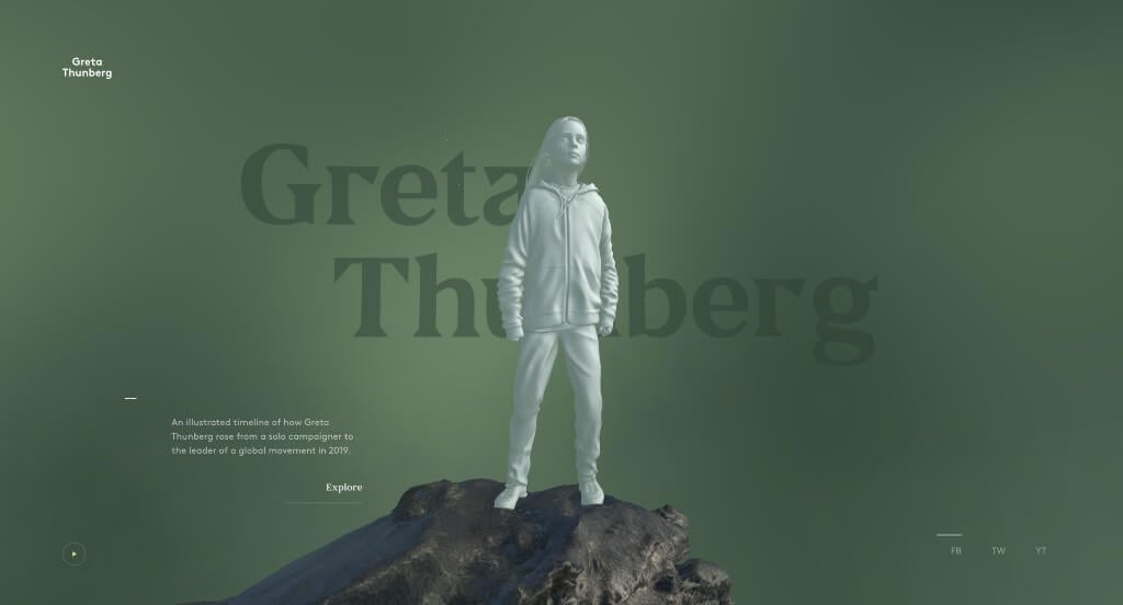
The desktop website for The Year of Greta serves as a premier benchmark for “Immersive WebGL Storytelling and Cinematic Digital Activism Architecture.” Built to document the profound global impact of environmental activist Greta Thunberg, the platform completely discards traditional linear webpage scrolling. Instead, the desktop interface utilizes cutting-edge 3-D rendering and physics-based interactive canvases to transform a historical timeline into a deeply emotional, museum-grade digital exhibition.
Key Design Highlights:
- Interactive 3-D Holographic Hero Anchor: The website establishes a wildly impactful first impression by positioning a stylized, hologram-like 3-D model of Greta standing atop a massive boulder. Leveraging advanced parallax and desktop mouse-tracking mechanics, the entire environmental asset shifts, tilts, and responds dynamically to the user’s cursor movements, pulling the viewer into a highly responsive spatial landscape the moment the page initializes.
- Ambient Ambient Audio Integration: Tucked elegantly into the bottom-left corner of the screen is a minimalist audio trigger. Clicking this tiny play button layer unlocks a rich, documentary-style audio track that blankets the experience with atmospheric soundscapes and news commentary discussing Greta’s global influence, instantly turning a passive reading session into a multi-sensory desktop journey.
- Sleek Minimalist Global Social Gateways: Maintaining an uncluttered, art-gallery aesthetic across widescreen viewports, the platform positions its primary social connection links in the bottom-right corner of the homepage. This strategic placement anchors the edge of the viewport without distracting from the central visual art, offering a clean, friction-free path for visitors to share the experience or connect with the movement.
- Dynamic Spiral Timeline and Interactive Video Vortex: Clicking the primary “Explore” call-to-action triggers a breathtaking architectural transition. The landing page shifts to reveal an interactive, swirling spiral of media blocks arranged chronologically along a timeline that wraps completely around the central figure. As desktop users scroll, the timeline dynamically twists and rotates through 3-D space, allowing visitors to navigate her historic journey through fluid, interactive video windows.
9. Creative Navy
Why We Chose Creative Navy
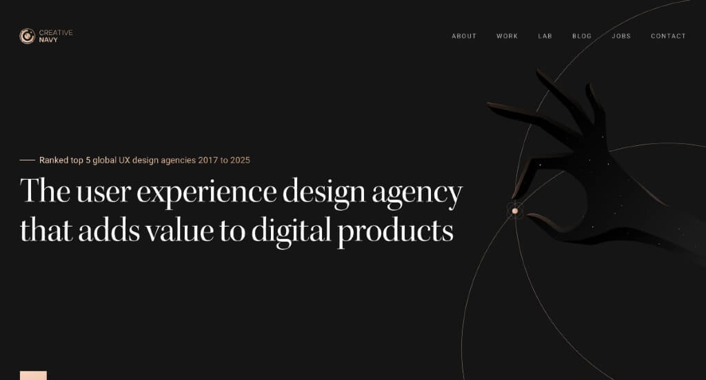
The desktop website for Creative Navy serves as a premier benchmark for “Elite UX/UI Design Product Merchandising and High-Trust Professional Agency Portals.” As an award-winning global user experience agency specializing in highly complex embedded graphical interfaces, medical software, and enterprise platforms, their digital storefront must effortlessly prove their structural engineering prowess. The desktop layout masterfully achieves this by blending clean, logic-driven information hierarchies with deep transparency, allowing prospective B2B clients to instantly see both their strategic methods and real-world results.
Key Design Highlights:
- High-Credibility “This Just Happened” Editorial Banner: Establishing immense operational authority the moment users scroll, the homepage features a dedicated, high-visibility media gallery titled “This just happened.” By showcasing recent industry articles, design journal mentions, and major press breakthroughs directly in the primary path, the layout builds immediate social proof and anchors Creative Navy as a top-tier global voice in user experience thought leadership.
- Intelligent Matrix for Cross-Industry Portfolio Filtering: Showcasing a massive enterprise portfolio without causing navigation fatigue is gracefully managed via a sleek, interactive project gallery matrix. Desktop visitors can instantly filter their extensive casework across four highly specialized sectors – Enterprise, Startups, Public, and Medical – with a single click. This frictionless sorting allows potential high-value clients to fast-track directly to relevant case studies that match their specific operational niche.
- Cinematic Capabilities Walkthrough Below the Fold: To capture absolute focus and break away from dense paragraphs, a crisp, strategically placed video module rests directly underneath the primary hero area. This video serves as an engaging visual proof-of-concept, instantly demonstrating how their design squads collaborate, run user research, and bring complex multi-platform interfaces to life across modern viewports.
- Transparent Service Blueprints Explaining the “What” and “How”: The homepage acts as an open, deeply educational framework that meticulously breaks down their exact business model and product execution strategies. Rather than relying on vague agency buzzwords, the layout details precisely what they build (from embedded GUIs to sophisticated SaaS applications) and exactly how they do it using structured team frameworks, blending user psychology with rigorous design operations.

10. Vergo
Why We Chose Vergo
The desktop website for Vergo serves as a premier benchmark for “High-Velocity FinTech SaaS Merchandising and AI-Native Financial Operations Architecture.” Tailored for modern accounting and finance leaders, the digital storefront must rapidly communicate financial security, seamless software interoperability, and massive labor-saving automation. The desktop interface expertly solves this by turning its homepage into a clear, feature-mapped blueprint that bridges traditional corporate ledger workflows with cutting-edge artificial intelligence.
Key Design Highlights:
- Persistent Sticky Header with Direct Demo Reservation Gateway: To ensure that high-intent finance executives and decision-makers have a friction-free onboarding path, the interface locks a clean sticky header to the top of the viewport. This header hosts a prominent, high-contrast “Book Demo” call-to-action button that remains permanently accessible during browsing, allowing users to schedule a platform walkthrough the exact moment they recognize its operational value.
- Comprehensive Accounts Payable and Automation Blueprinting: The homepage serves as a highly structured functional map that leaves zero doubt about how Vergo optimizes corporate accounting. It cleanly details its core AP automation engines, expense management tracks, AI-powered processing, and ERP integrations alongside strict financial controls and customizable approval workflows, showing desktop visitors exactly how the software eliminates manual entry and human error.
- Data-Driven Social Proof and Real-World Case Studies: Neutralizing B2B purchasing skepticism is gracefully handled by embedding actual customer case studies directly into the central homepage scroll path. Highlighting real-world success stories, operational efficiency metrics, and implementation wins gives prospective buyers the definitive proof needed to trust the platform with their corporate treasury.
- Integrated Front-Page FAQ Repository: Anticipating structural technical questions, security objections, and onboarding inquiries long before a sales call, the homepage features a beautifully organized Frequently Asked Questions (FAQ) matrix. Addressing core inquiries regarding security standards, software compatibility, and implementation timelines directly on the front page eliminates purchasing friction and accelerates the consumer decision-making cycle.

11. Cinch PR
Why We Chose Cinch PR
The desktop website for Cinch PR serves as a premier benchmark for “Bold Lifestyle Public Relations Merchandising and High-Impact Boutique Agency Portals.” As a premier PR and communications firm representing major consumer, food, hospitality, and travel brands, their digital presence must instantly project immense creative confidence and narrative authority. The desktop interface beautifully accomplishes this by trading cluttered tech-stacks for a clean, editorial-forward layout driven by massive typography and luxury imagery.
Key Design Highlights:
- Cinematic Multi-Slide Hero Showcase: Capturing immediate visual command the exact second the interface initializes, the desktop hero section leverages a rotating slider of large, exquisitely styled images. This cinematic showcase uses high-saturation photography from their premier client campaigns, immediately plunging desktop visitors into the upscale lifestyle and hospitality worlds that Cinch PR commands.
- Profound Narrative Onboarding with the “Who We Are” Anchor: Positioned strategically directly below the primary hero rotation, a dedicated “Who We Are” section serves as a personal brand introduction. Rather than hiding their identity in sub-menus, this layout choice anchors the top of the scroll path, introducing their strategic ethos, media relationships, and boutique agency personality to prospective clients right away.
- Aggressive, High-Contrast Typography and Large Editorial Text: A highly distinct stylistic signature of the homepage is its reliance on exceptionally large, bold editorial text blocks. By scaling up their core messaging and agency headlines across wide desktop monitors, the interface forces absolute clarity, creating a high-fashion editorial magazine atmosphere that feels incredibly modern and self-assured.
- Curated Portfolio Blueprint and Featured Project Showrooms: Demonstrating their media placement power without overwhelming the viewer, the homepage integrates a dedicated catalog of featured client projects. Each case block isolates a premier brand partnership with generous whitespace and beautiful presentation framing, allowing desktop enterprise buyers to rapidly assess Cinch PR’s execution quality, creative depth, and market reach at a glance.

12. Storylane
Why We Chose Storylane
The desktop website for Storylane serves as a premier benchmark for “Demo-Led Growth (PLG) SaaS Merchandising and High-Conversion Software Architecture.” As a leading B2B platform that enables software companies to build interactive product walkthroughs, their own website must practice exactly what they preach. The desktop interface masterfully accomplishes this by relying on hands-on interactivity, ditching static text blocks to let prospects experience the product’s utility in real-time.
Key Design Highlights:
- Interactive Multi-Tab Platform Showrooms: To effectively communicate complex feature sets without overwhelming desktop visitors, the homepage integrates an interactive tabbed control matrix. Users can rapidly toggle between different operational categories – such as editing dashboards, analytics hubs, or personalization settings – which instantly swaps out a high-fidelity platform screenshot to visualize that specific environment without forcing the user to load a new page.
- Elevated Peer Review Galleries with Integrated Case Studies: Neutralizing corporate buying skepticism, the client testimonial section goes far beyond basic quote blocks. The homepage features an impressive showroom of verified reviews from top-tier software brands, seamlessly attaching direct links to comprehensive case studies directly within individual testimonials so enterprise buyers can instantly review deep, data-driven ROI metrics.
- On-Demand “Take a Tour” Immersive Sandbox Gateway: The primary conversion vehicle on the desktop layout is an omnipresent, high-visibility “Take a Tour” call-to-action button. Clicking this trigger instantly launches an interactive, live guided walkthrough of Storylane itself, letting prospective buyers actively click through hotspots, explore features, and experience the exact end-user value proposition before ever committing to a sales call or sign-up form.
- Persistent Sticky Header with Streamlined Mega Menu: Managing a dense corporate ecosystem of product documentation, template libraries, and enterprise tier options is elegantly managed via an anchored sticky header. Hovering over the top-level categories opens a spacious, multi-column desktop mega menu that maps out use-cases and resources cleanly, ensuring that secondary navigation remains effortlessly accessible during long-form homepage browsing.

13. Jasper AI
Why We Chose Jasper
The desktop website for Jasper serves as a premier benchmark for “AI-Native Enterprise SaaS Merchandising and Immersive Brand Storytelling Architecture.” As a pioneer in generative AI for enterprise marketing teams, Jasper’s digital presence must prove that artificial intelligence is highly structured, collaborative, and measurably effective. The desktop interface masterfully handles this by wrapping complex data and workflow orchestration in an energetic, highly interactive visual system that turns a software discovery path into an engaging playground.
Key Design Highlights:
- Impressive Enterprise-Grade Desktop Mega Menu: Managing an expansive ecosystem of AI capabilities, corporate solutions, prompt templates, and community resources is seamlessly handled via a spacious mega menu. Hovering over the top-level navigation reveals a beautifully structured drop-down panel that maps out specialized use cases, business roles, and learning centers into crisp, organized columns that ensure deep-site exploration remains effortless.
- Dynamic Interactive Hero Showcase with Reactive Hover Grids: The desktop interface commands absolute visual focus from the exact second it initializes with a bright, colorful hero area packed with human imagery, geometric shapes, and high-impact client success metrics. This vibrant canvas incorporates a playful grid backdrop featuring a responsive mouse-tracking effect – as the user moves their cursor across the screen, the underlying grid modules dynamically shift colors, delivering an immediate feeling of digital creativity and technical agility.
- Fluid, Micro-Interaction Animations Throughout the Homepage: Moving far beyond static corporate landing pages, the homepage features a series of neat, highly polished scroll-driven animations and interface transitions. As desktop users advance down the page, software elements assemble themselves, metrics fluidly counter-increment, and visual assets glide into place, continuously capturing user engagement while silently demonstrating the concept of automated efficiency.
- Gamified “Why Modern Marketing Teams Choose Jasper” Interactive Hub: A central pillar of the homepage conversion strategy is a dedicated value-proposition section framed under a bold editorial headline. This area trades dense paragraphs for a highly colorful, interactive layout that empowers desktop visitors to click through core enterprise benefits – such as global brand voice guardrails or multi-channel campaign acceleration – proving the platform’s corporate utility through vibrant, user-controlled visual modules.