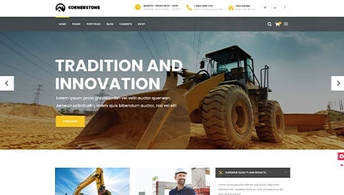
In the concrete and flatwork industry, your website serves as a digital foundation for your business. It is the place where property owners and general contractors look for proof of your experience, the scale of your equipment, and the quality of your finish. In a competitive market, your online presence must communicate structural integrity, aesthetic versatility, and professional reliability.
Our design team evaluated hundreds of websites across the sector – from residential decorative concrete and flatwork specialists to large-scale commercial pumping and cutting operations. We analyzed these sites for portfolio clarity, equipment showcase, and the seamlessness of their quote-request process.
Whether you specialize in stamped patios, high-tolerance industrial floors, or specialized maintenance, these 12 examples represent the benchmark for concrete web design in 2026.
Note on Our Selection Process: We recently audited this guide to remove outdated designs and sites that no longer meet our performance standards. This curated list now focuses on the top 12 concrete websites providing the most strategic value in 2026.
Top Concrete Company Website Designs
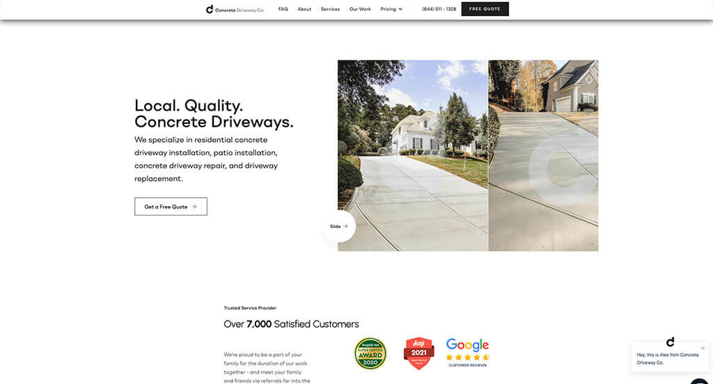
1. Concrete Driveway Co.
Why We Chose Concrete Driveway
The Concrete Driveway website uses high-end interactive elements and smart conversion triggers to create a premium feel. By focusing on project specificity and dynamic navigation, the site guides homeowners through the decision-making process with professional ease.
Key Design Highlights:
- Smart Conversion Trigger: When you scroll down on the home page, a sticky “free quote” form appears. This ensures that the primary call to action remains anchored and accessible at the exact moment a user is consuming information, making it incredibly convenient to request an estimate without scrolling back to the top.
- Project Scope Clarity: The home page explains the type of project they take on. By clearly defining their focus – such as residential driveways, extensions, or replacements – they effectively qualify their leads and ensure that potential clients understand exactly where their expertise lies.
- Dynamic Information Delivery: The site features a cool vertical scroller for the “Why Choose Concrete Driveway” section on the home page. This interactive element breaks the standard scrolling pattern, catching the user’s eye and making the company’s value propositions feel more modern and engaging.
- High-Impact Social Proof: There is a really nice customer testimonials section that highlights past successes. By presenting these reviews in a visually polished format, the site builds the necessary trust and emotional connection required for high-ticket home improvement projects.

2. L.R.E. Foundation Repair
Why We Chose LRE Foundation Repair
The LRE Foundation Repair website is built on the principles of technical authority and visual proof. By prioritizing real-world results and maintaining multiple conversion paths, the site effectively addresses the high-stakes concerns of homeowners dealing with structural issues.
Key Design Highlights:
- Persistent Mobile Accessibility: The mobile header retains an easy way to contact them at all times. This design choice ensures that users on mobile devices – who may be looking for immediate help with a structural emergency – have instant access to a click-to-call or contact feature without needing to hunt through menus.
- Layered Information Architecture: The services and solutions are outlined high up on the home page, then go more in depth further down the home page. This “top-down” approach allows casual browsers to get a quick overview of what the company offers while providing the deep technical details that analytical researchers need to feel confident in a foundation repair specialist.
- Visual Performance Proof: The home page showcases before and after photos of their work. In a specialized industry like foundation and concrete repair, high-quality visual evidence of a successful transformation is the most powerful way to demonstrate competency and build trust with potential clients.
- Strategic Conversion Points: The site utilizes multiple calls to action to request a free quote or get in touch across the entire layout. By repeating these prompts at various stages of the user journey, the site ensures that no matter where a visitor decides they are ready to move forward, a clear path to the next step is readily available.
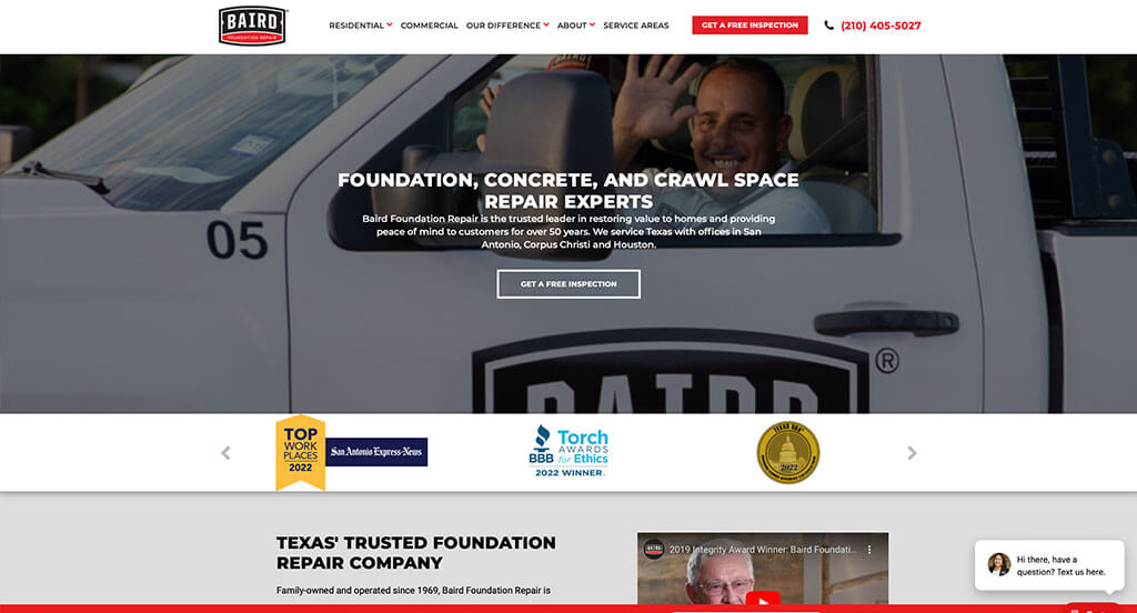
3. Baird Foundation Repair
Why We Chose Baird Foundation Repair
The Baird Foundation Repair website is a premier example of “Legacy-Driven Design and High-Clarity Navigation.” By stripping away unnecessary clutter and emphasizing their long-standing history in the community, the site creates an immediate sense of permanence and reliability that is vital for the foundation repair industry.
Key Design Highlights:
- Streamlined Header Architecture: The site features a clean, simple, and uncluttered header with a prominent phone number and a button to get a free inspection. This minimalist approach ensures that the most important actions are not lost in a sea of navigation links, allowing high-intent users to find exactly what they need in seconds.
- Legacy and Heritage Focus: The home page showcases that they have been family-owned since 1969. Highlighting over five decades of family leadership serves as a powerful trust signal, suggesting a level of accountability and local commitment that larger, corporate competitors often lack.
- Persuasive Value Proposition: There is a solid “Why Choose Baird Foundation Repair?” section on the home page. This section effectively articulates their specific advantages, helping homeowners understand the unique benefits of their service standards before moving toward a formal inquiry.
- Comprehensive Regional Footprint: The home page is finished off with integrated Google reviews, a nice service area map, and a grid of location information. This combination provides final social proof while giving absolute geographic clarity, ensuring that visitors know exactly where the company operates and how well they serve those specific communities.

4. A-1 Concrete Leveling & Foundation Repair
Why We Chose A-1 Concrete Leveling
The A-1 Concrete Leveling website stands out for its “Efficiency-Driven Navigation and Visual Validation.” By prioritizing a fast path to specific services and providing undeniable proof of their results through interactive media, the site effectively builds confidence for homeowners looking to repair rather than replace their concrete.
Key Design Highlights:
- Accelerated Service Discovery: The hero area has a unique dropdown where you can select the service you are interested in, click “go” and be brought to that page. This specialized tool allows users to bypass general navigation and jump straight to their specific pain point, whether it is driveway leveling, sidewalk repair, or foundation work.
- Multi-Format Social Proof: The site features a video testimonial on the home page, followed by text reviews. This tiered approach to social proof is highly effective; the video provides a high-trust, emotional connection, while the text reviews provide the volume and data points needed to verify consistent quality.
- Process Transparency: The home page outlines how it works to demystify the technical aspects of concrete leveling. By breaking down the specialized “pumping” process into simple, digestible steps, the site lowers the barrier to entry for customers who might be unfamiliar with this alternative to full concrete replacement.
- Interactive Results Showcase: There is a really nice before-and-after pictures section with an interactive slider. This feature allows users to grab a vertical bar and slide it back and forth over a single image frame to reveal the “before” state on one side and the “after” result on the other, providing a dynamic and highly persuasive look at the precision of their work.
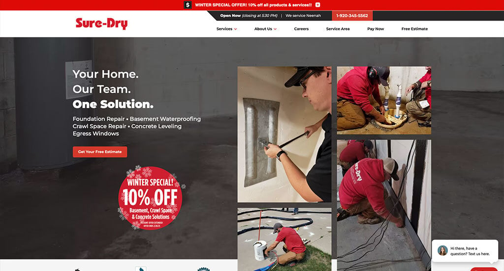
5. Sure-Dry
Why We Chose Sure-Dry Basements
The Sure-Dry Basements website is a benchmark for “Conversion-Ready Local Authority.” By placing the primary contact method in the most visible area of the site and grounding their reputation in local data, they create a high-trust environment that encourages homeowners to take action immediately.
Key Design Highlights:
- High-Visibility Lead Capture: The site features a quick contact form in the hero section. This strategic placement ensures that the very first thing a visitor sees is a path to a solution, catering to high-intent users who want to book an inspection without having to navigate through multiple pages.
- Instant Reputation Verification: Google reviews are integrated directly onto the home page. By showcasing real-time feedback from local customers near the top of the experience, the site uses social proof to validate their expertise and alleviate the common anxieties associated with basement and foundation repair.
- Geographic Service Confirmation: A detailed service area map and list are featured on the home page. This provides absolute transparency regarding their coverage zones, allowing homeowners in Northcentral and Northeastern Wisconsin to instantly confirm that they are within the service region.
- Modular Solution Overview: The “our solutions/services” section is clearly outlined on the home page. By categorizing their offerings into distinct blocks – such as basement waterproofing, foundation repair, and crawl space moisture control – the site makes it easy for users to find the specific technical answer to their home’s problem.
6. Poly Lift USA
Why We Chose Poly Lift USA
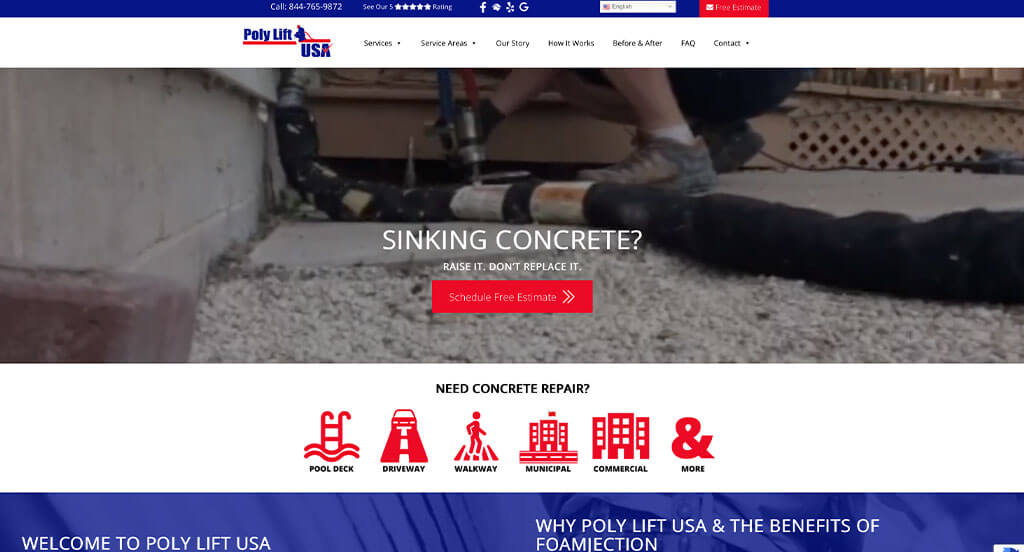
The Poly Lift USA website is a standout example of “Process-Driven Transparency and Professional Engagement.” By utilizing high-quality video of their actual team and a clear breakdown of their specialized technology, the site builds immediate confidence in their modern approach to concrete repair.
Key Design Highlights:
- Authentic Visual Engagement: The hero section features a video of real people doing the work, paired with a prominent button to schedule a free estimate. Seeing the actual crew in action with their equipment creates a level of authenticity and accountability that static stock photos simply cannot match.
- Rapid Service Navigation: Right below the hero area, there is a comprehensive list of the services they offer, with each item linked to interior pages for more info. This allows visitors to quickly find the specific application they need – whether it is pool deck leveling or driveway repair – and move deeper into the site with a single click.
- Social Proof Integration: The site features integrated Google reviews to provide immediate third-party validation. By showcasing their high rating and customer feedback directly on the homepage, they leverage their reputation to ease the decision-making process for new visitors.
- Technical Process Education: The home page includes a step-by-step outline of “How it Works,” explaining their specific process for foam injection. This educational section is crucial for a specialized service like polyjacking, as it helps the homeowner understand how the non-invasive technology works to lift and stabilize concrete.

7. Ayers Basement Systems
Why We Chose Ayers Basement Systems
The Ayers Basement Systems website is a masterclass in “Regional Specificity and Visual Proof.” By focusing on a frictionless entry point for estimates and a clear display of their geographical reach, the site successfully positions itself as the go-to authority for foundation and basement needs in the Michigan and Indiana regions.
Key Design Highlights:
- Clear Service Categorization: The “What We Do” section on the home page outlines services with clarity and precision. By grouping complex technical tasks into easy-to-understand categories like basement waterproofing and crawl space repair, the site helps homeowners quickly identify the solution that fits their specific problem.
- Granular Geographic Reach: The site features a list of various cities they service in WI and MI. This extensive list provides absolute transparency for the user while acting as a powerful local SEO signal, ensuring that residents in specific municipalities feel confident that help is available in their exact neighborhood.
- Zip-Code Driven Lead Capture: The home page offers free estimates by allowing users to fill out their zip code quickly. This “low-friction” start to the conversion funnel is highly effective because it asks for a simple, non-invasive piece of information to initiate the relationship between the customer and the company.
- Compelling Visual Evidence: There is a nice-looking before-and-after section on the home page. In a high-stakes industry like foundation repair, providing high-quality visual documentation of past projects is the most persuasive way to demonstrate competency and reassure potential clients of the quality they can expect.
8. American Concrete Leveling
Why We Chose American Concrete Leveling
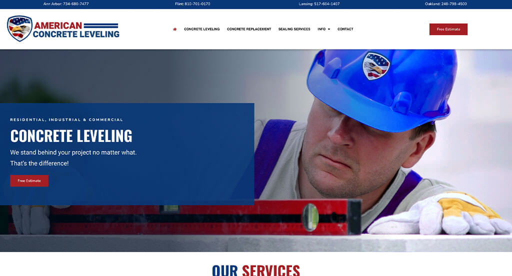
The American Concrete Leveling website is a standout example of “Regional Accessibility and High-Impact Visuals.” By providing direct access to local branches and utilizing interactive proof of their workmanship, the site effectively builds a bridge of trust with Michigan homeowners looking for reliable concrete solutions.
Key Design Highlights:
- Localized Contact Strategy: The top bar has contact numbers for each location. This ensures that customers from different regions can immediately reach the branch closest to them, creating a sense of local presence and reducing the friction usually found in centralized corporate phone systems.
- Interactive Result Verification: There are cool before and after sliders on the home page under the “See Our Work” section. This interactive feature allows visitors to manually control the “reveal” of a repair, providing undeniable visual evidence of the effectiveness of their leveling and caulking services.
- Differentiated Value Proposition: The “What Makes Us Great?” section outlines why you should choose them. By explicitly listing their unique selling points – such as their specialized equipment or customer service standards – the site helps potential clients distinguish them from other local contractors.
- Logical Information Flow: The services are clearly explained, followed by integrated Google reviews. This layout follows a natural psychological progression where the user first learns about the “what” (the services) and then immediately sees the “proof” (the high-star ratings) to validate that information.
9. SAM The Concrete Man
Why We Chose Sam The Concrete Man (Columbus)
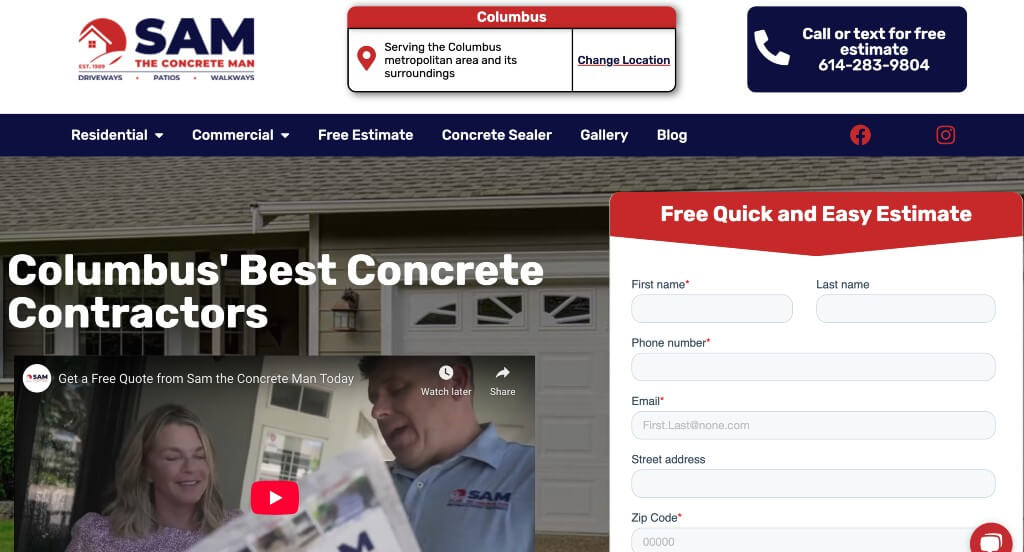
The Sam The Concrete Man website is a premier example of “High-Accessibility and Process Clarity.” By combining immediate digital communication tools with a transparent roadmap for new clients, the site ensures that homeowners feel supported from their very first click through to the start of their project.
Key Design Highlights:
- Dual-Channel Immediate Contact: The site features a free estimate form right in the hero area and a live chat widget. This combination allows users to choose their preferred method of engagement – whether it is a structured form for a formal quote or a real-time conversation for quick questions – maximizing the chances of lead capture.
- Streamlined Service Overviews: The services are clearly explained on the home page with intuitive headings and descriptions. This straightforward layout helps visitors quickly navigate the company’s offerings, such as driveways, patios, and walkways, without having to hunt for information.
- Client Onboarding Transparency: A dedicated “What To Expect” section on the home page explains how to get started with them. By outlining the initial consultation and estimation steps, the site removes the “unknowns” of hiring a contractor, making the prospect of starting a large home improvement project feel manageable and professional.
- Real-Time Reputation Proof: The home page features integrated Google reviews to provide local social proof. Showcasing authentic feedback from the Columbus community allows potential customers to verify the quality of work and customer service based on the experiences of their neighbors.

10. HomeSpec Basement Fix
Why We Chose Basement Fix
The Basement Fix website is a standout example of “Localized Trust and Problem-Solving Clarity.” By focusing specifically on the needs of the Greater Detroit area and providing a unique interactive experience for reviews, the site positions itself as a reliable, community-focused expert in foundation and basement repair.
Key Design Highlights:
- Solution-Oriented Navigation: The “Our Solutions” section on the home page highlights services with clear, descriptive headers. This allows homeowners to quickly map their specific household problem – such as a wet basement or a cracked wall – to a professional service offered by the company.
- Innovative Social Proof: The site features a unique vertical testimonials slider on the home page. This vertical movement breaks the traditional horizontal scrolling pattern found on most sites, drawing the user’s eye and encouraging them to engage more deeply with the positive experiences of past customers.
- Community-Centric Value Proposition: A dedicated “Why Greater Detroit Homeowners Choose Us” section on the home page outlines why they believe you should choose them. By addressing their local roots and specific regional expertise, the company builds a stronger emotional connection with nearby residents compared to national chains.
- Visual Problem Identification: The home page gives examples of various issues they can fix using real-world scenarios. This educational approach helps users diagnose their own home’s structural health, making the transition from “noticing a problem” to “requesting a fix” feel logical and necessary.
11. ACME Concrete
Why We Chose Acme Concrete
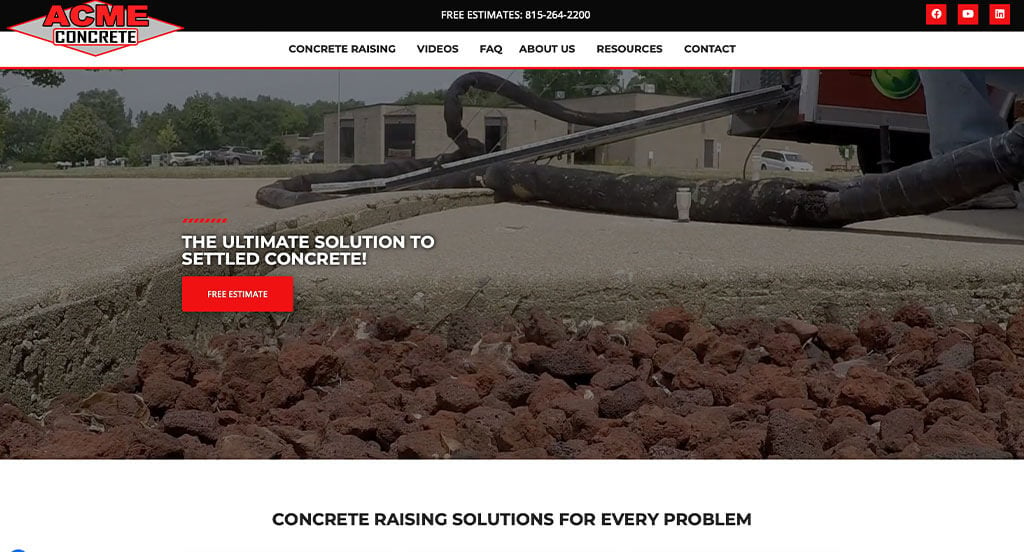
The Acme Concrete website is an excellent example of “Educational Engagement and Instant Accessibility.” By utilizing multimedia to explain specialized technology and providing immediate communication channels, the site ensures that homeowners feel both informed and supported throughout their research process.
Key Design Highlights:
- Immediate Communication Channel: A live chat widget is offered on the site to provide instant support. This allows visitors to ask quick questions or start a consultation in real-time, capturing leads who might otherwise hesitate to fill out a longer form or make a phone call.
- Technical Process Education: The home page explains what they do, which is polyurethane concrete raising, and outlines the process nicely. By breaking down the “polyjacking” method into digestible information, the site helps the customer understand how this modern, non-invasive alternative to mudjacking works to stabilize their property.
- Informative Video Resource: The home page has a video on it that answers questions about concrete raising. This video acts as a virtual consultation, addressing common homeowner concerns and providing a visual demonstration of their expertise that builds trust much faster than text alone.
- Transparent Reputation Management: The site features integrated Google Reviews to showcase authentic customer feedback. Placing these reviews directly on the landing page provides the social proof necessary to validate their technical claims and reassure potential clients of their consistent service quality.

12. Concrete Polyfix
Why We Chose Concrete Polyfix
The Concrete Polyfix website is a standout example of “Dynamic Visual Proof and Market Versatility.” By utilizing interactive imagery and video, the site effectively demonstrates the immediate value of their specialized concrete lifting services to both homeowners and business owners alike.
Key Design Highlights:
- Operational Transparency: The hero contains a video showing how people work on-site. This immediate visual introduction gives potential customers a clear look at the equipment, the crew, and the non-invasive nature of the polyurethane injection process, building trust through transparency.
- Dual-Market Targeting: A dedicated “Who We Serve” section on the home page outlines residential and commercial applications. By clearly segmenting these two audiences, the site ensures that whether a visitor is a homeowner with a sunken sidewalk or a facility manager with a warehouse floor issue, they feel they have found the right specialist.
- Interactive Results Verification: The site features before and after images on the home page where the “after” is shown when you hover. This interactive “reveal” mechanic is a highly engaging way to showcase workmanship, forcing the user to physically participate in seeing the transformation of the concrete.
- Geographic and Social Authority: Above the footer, you can find integrated Google reviews and a nice service area map. Placing these two elements together provides a powerful “final word” on the page – confirming exactly where they work and proving how much their customers appreciate the results.
WordPress Construction Themes
You can find free themes at wordpress.org or explore construction-inspired templates on ThemeForest.
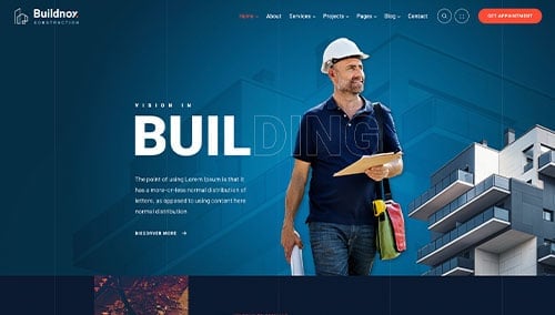
Buildnox – Themeforest
$49
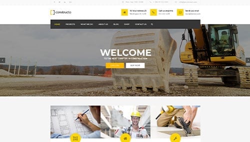
Constructo – Themeforest
$59
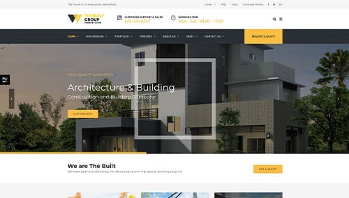
TheBuilt – Themeforest
$59
Cornerstone – Themeforest
$79