In the electrical contracting industry, your website is your 24/7 digital dispatcher. Whether a homeowner is facing an urgent power issue or a general contractor is vetting firms for a commercial build, your online presence must immediately communicate technical expertise, safety compliance, and professional reliability. In a competitive market, a winning design does more than look good – it streamlines the path from “problem” to “solution.”
Our design team evaluated hundreds of electrical websites – from local residential service electricians and “emergency response” specialists to large-scale industrial and commercial contractors. We looked for the top 8 examples that excel in conversion-focused design, specifically analyzing their mobile-first accessibility, service area clarity, and prominent trust signals like licensing and safety certifications.
Whether you are a solo master electrician or managing a multi-crew contracting firm, these examples represent the current benchmark for digital excellence in the electrical trade.
Note on Our Selection Process: We recently audited this guide to remove outdated designs and sites that no longer meet our performance standards. This curated list now focuses on the top 8 electrician websites providing the most strategic value in 2026.
Top Electrician Website Designs
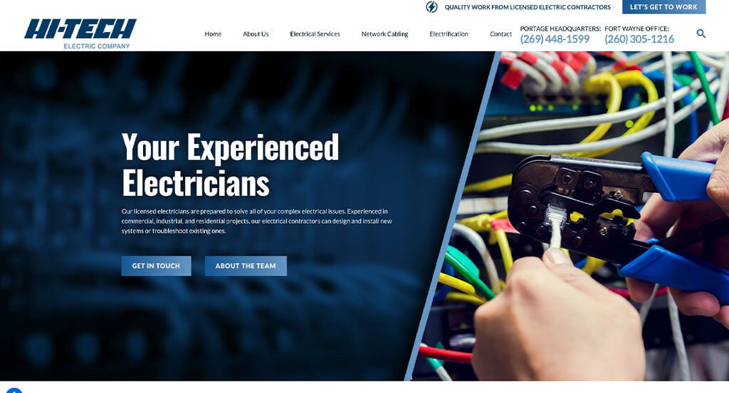
1. Hi-Tech Electric
Why We Chose Hi-Tech Electric
The website for Hi-Tech Electric serves as a premier benchmark for “On-Demand Field Service Intake and Omnichannel Communication Infrastructure.” In the competitive electrical contracting and emergency repair market, a digital presence must immediately assure customers of technical competence while eliminating all friction from the booking process. This platform masterfully achieves this by anchoring its service layouts with real-time support tools and a highly accessible, multi-channel communication bar.
Key Design Highlights:
- Omnichannel Persistent Sticky Footer: A major functional asset of the layout is an optimized sticky footer that remains locked to the bottom of the viewport during scrolling. This floating command bar provides instant, single-click access to text, call, email, or chat with the dispatch team, removing all communication barriers for homeowners or property managers facing urgent electrical issues.
- Instant Conversational Chat Integration: The home page features a dedicated live chat widget built directly into the user experience. Providing this real-time communication channel allows commercial clients or distressed property owners to quickly ask about service technician availability, emergency response times, or base dispatch pricing without waiting for email replies.
- Granular Commercial & Residential Service Directory: The firm’s primary electrical capabilities, wiring specialties, and repair services are clearly outlined directly on the home page. Breaking down these technical solutions into highly readable, structured blocks allows visitors to instantly match their specific residential, commercial, or industrial project needs with the company’s field expertise.
- Continuous Client Testimonial Slider: The home page layout prioritizes immediate social proof by embedding an interactive customer review slider. Showcasing a steady rotation of verified, real-world experiences regarding response times, safety standards, and pricing transparency anchors the contractor’s reputation with trustworthy community confirmation.

2. Randy’s Electric
Why We Chose Randy’s Electric & Plumbing
The website for Randy’s Electric & Plumbing serves as a premier benchmark for “Hyper-Local Social Proof Mapping and Process Transparency Architecture.” In the home services sector, a digital storefront must immediately build intense local trust while making it effortless for distressed property owners to book service. This platform masterfully succeeds by pairing an innovative, interactive geographic proof-of-work asset with clear informational videos right on the home page.
Key Design Highlights:
- Hyper-Local “Your Neighbors Trusted Randy” Project Map: A major structural highlight of the user interface is a dedicated tab anchored to the left side of the viewport. Clicking this tab opens a dynamic map that visually plots the company’s previously completed service calls across local neighborhoods, giving prospective customers immediate, undeniable geographic proof that their nearby neighbors rely on the firm.
- Process Transparency Video Narrative: The home page prominently features a “What to Expect When You Work with Randy’s Electric & Plumbing” video. Leading with this clear, operational overview helps ease homeowner anxiety by explaining exactly how technicians arrive, treat the home, and provide upfront pricing, eliminating standard industry guesswork before a dispatcher is even sent out.
- Instant Conversational Chat Integration: A standout functional asset of the homepage is the integration of a dedicated live chat widget. Providing this real-time communication pipeline gives property owners an immediate, low-barrier channel to ask rapid questions about service availability, dispatch fees, or emergency booking options without needing to make a phone call.
- Cohesive Reviews and Services Blueprint: The layout beautifully structures their primary field services alongside verified customer feedback directly within the home page flow. Combining these detailed capability blocks with direct public validation gives users a clear understanding of the firm’s technical expertise and reliable reputation in a single, high-efficiency scroll.
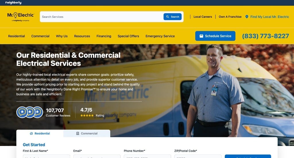
3. Mr. Electric
Why We Chose Mr. Electric
The website for Mr. Electric serves as a premier benchmark for “Ubiquitous Booking Conversion and Proactive Client Education.” For a national home services franchise, a digital storefront must accommodate both frantic emergency requests and scheduled property upgrades with absolute efficiency. This platform masterfully answers that need by blanket-coating the layout with friction-free booking entry points while addressing common consumer barriers directly on the home page.
Key Design Highlights:
- Ubiquitous, Omnipresent Service Booking Rails: A major functional asset of the user interface is the relentless, strategic positioning of online booking options. By embedding direct scheduling calls-to-action in the primary hero area, locking them into the global header, and repeating them throughout the home page, the platform ensures that users can instantly secure an appointment the second they decide to book, from any point on the page.
- Granular Capability Mapping with Deep Navigational Gateways: Their primary electrical solutions, upgrades, and repair capabilities are explained clearly through dedicated sections on the home page. Breaking down these complex technical offerings into highly readable, distinct blocks – each paired with a seamless link for deeper information – allows residential and commercial clients to effortlessly evaluate the firm’s technical scope before diving into specialized service pages.
- Proactive Structural FAQ Framework: To alleviate common anxieties regarding electrical code compliance, diagnostic fees, and project timelines, the home page features a dedicated frequently asked questions (FAQs) matrix. Providing these direct, transparent answers upfront builds immediate consumer confidence and handles objections long before a service technician is dispatched to the property.
- Continuous Brand-Wide Public Validation: The home page layout prioritizes immediate social proof by embedding verified customer reviews directly within the main page flow. Highlighting these real-world accounts of technician professionalism, punctual arrivals, and clean execution anchors the franchise’s marketing claims with trustworthy, grassroots community confirmation.
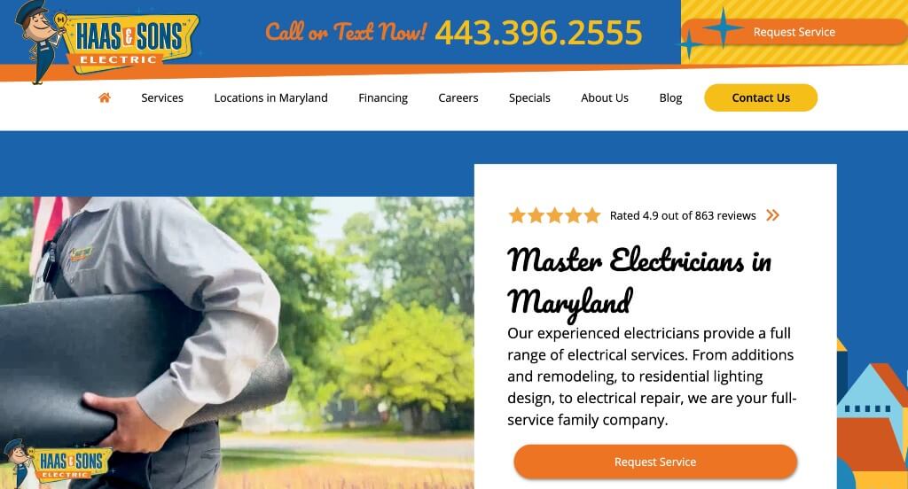
4. Haas & Sons Electric
Why We Chose Haas & Sons Electric
The website for Haas & Sons Electric serves as a premier benchmark for “Tactile Visual Validation and Localized Authority Architecture.” In the residential electrical contracting market, a digital storefront must immediately remove consumer skepticism regarding technical skill while confirming they actually service the user’s neighborhood. This platform masterfully handles these goals by matching an interactive proof-of-work asset with clear geographical targeting directly on the home page.
Key Design Highlights:
- Tactile Before-and-After Craftsmanship Slider: A major interactive asset of the home page is a dynamic before-and-after image comparison slider. Allowing prospective clients to physically slide between messy, outdated electrical panels or lighting setups and their crisp, newly installed counterparts provides undeniable visual proof of their technical neatness and attention to safety code compliance.
- Transparent Geographical Service Area Triage: The home page layout incorporates a dedicated directory highlighting the specific cities and communities they service. Explicitly showcasing these target service locations directly on the front page eliminates immediate user guesswork, helping local homeowners instantly confirm that a service van can be dispatched to their exact neighborhood before they initiate a quote.
- Granular, Jargon-Free Service Outlines: Their core electrical installations, panel upgrades, and home safety capabilities are explained clearly through structured sections on the home page. Breaking down these complex electrical solutions into accessible, straightforward descriptions allows property owners to quickly evaluate the firm’s technical scope without getting bogged down in dense trade terminology.
- Cohesive High-Contrast Brand Identity: The interface utilizes a highly polished, unified color palette and clean logo design that establishes a professional visual theme across the entire homepage. Maintaining these consistent brand guidelines anchors the contractor’s local authority, ensuring the digital experience feels organized, reliable, and fundamentally trustworthy from the top header to the footer.
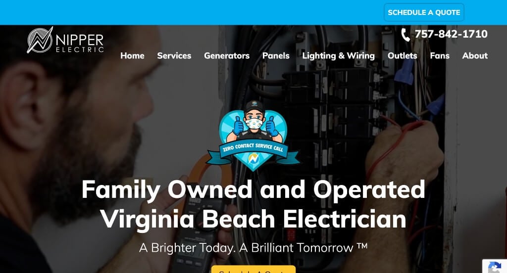
5. Nipper Electric
Why We Chose Nipper Electric
The website for Nipper Electric serves as a premier benchmark for “Unified Brand Narrative and Constant Conversion Accessibility.” In the competitive residential and commercial electrical space, a digital storefront must balance immediate accessibility for urgent service needs with a polished, professional identity that builds immediate trust. This platform masterfully strikes that balance by combining a pervasive mobile-first conversion rail with a highly engaging, custom visual framework directly on the home page.
Key Design Highlights:
- Ubiquitous Full-Width Sticky Footer Rail: A major functional asset of the layout is a persistent, full-width sticky footer that remains locked to the bottom of the viewport as users explore the site. This floating command bar gives browsing property owners immediate, single-click access to dial the dispatch line or jump straight into the service scheduler, entirely eliminating navigational friction when an electrical issue arises.
- Cohesive Kinetic Brand Identity and Custom Artwork: The interface utilizes a highly intentional design theme where the logo, color palette, and custom artwork operate in perfect harmony. Enhanced by crisp, smooth scroll animations throughout the home page, this unified aesthetic holds visual interest, guides the user’s eye down the page, and makes the local contractor feel modern, organized, and deeply professional.
- Granular, Accessible Service Outlines: Their primary electrical installations, emergency repairs, and lighting capabilities are clearly explained through structured sections on the home page. Breaking down these technical solutions into highly readable, straightforward descriptions allows homeowners and commercial managers to instantly match their specific project needs with the firm’s field expertise.
- Friction-Free Home Page Intake Portal: The layout smoothly incorporates a direct contact inquiry form positioned strategically within the main home page flow. Embedding this accessible form directly into the primary interface eliminates the need to jump to an external contact page, giving high-intent users a fast, low-barrier pathway to request service quotes or panel inspections.
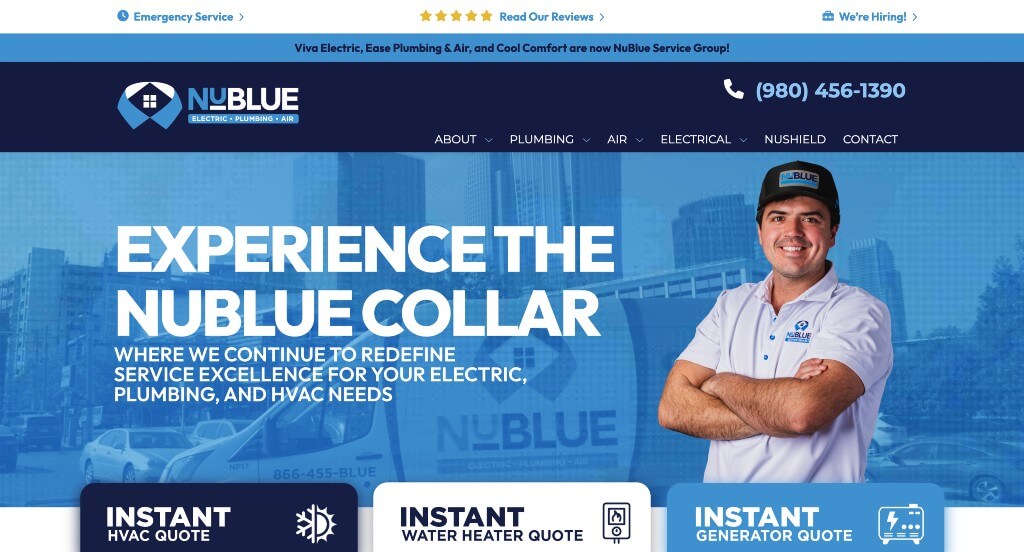
6. NuBlue
Why We Chose NuBlue
The website for NuBlue serves as a premier benchmark for “High-Contrast Conversion Anchoring and Localized Trust Infrastructure.” In the fast-paced residential service industry, a digital storefront must immediately capture high-intent users while systematically removing doubts regarding their service footprint and reliability. This platform masterfully executes this strategy by pairing an unmissable primary call-to-action with interactive geographic validation directly on the home page.
Key Design Highlights:
- High-Contrast Call-to-Action Header Anchor: A standout functional asset of the user interface is the integration of a prominent, big red “Book Online” button anchored firmly within the global header. By locking this high-visibility element at the top of the page, the platform ensures that homeowners dealing with urgent plumbing, heating, or cooling issues can instantly secure a service slot at any moment, regardless of how far down the page they scroll.
- Localized Service Area Map Integration: Rather than forcing visitors to hunt through dense text lists to verify location availability, the home page features a dedicated, visual service area map. Displaying their exact geographical reach directly on the front page eliminates user guesswork, allowing local property owners to instantly confirm that a NuBlue service technician can be dispatched to their neighborhood.
- Structured “Why Choose NuBlue?” Advantage Block: A major strategic asset of the home page layout is the dedicated “Why Choose NuBlue?” section. This clear visual block explicitly outlines the company’s core values, response guarantees, and service standards, providing prospective clients with immediate, compelling reasons to choose them over regional competitors right from the start.
- Continuous Brand-Wide Public Validation: Authentic client reviews are woven smoothly into the home page framework to supply immediate real-world verification. Showcasing these verified accounts of technician professionalism, rapid arrival times, and transparent pricing anchors the company’s marketing claims with trustworthy, grassroots community confirmation.
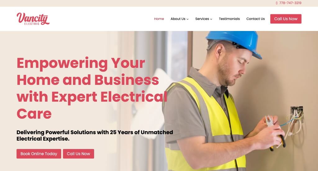
7. Vancity Electrician
Why We Chose Vancity Electric
The website for Vancity Electric serves as a premier benchmark for “Frictionless Transactional Velocity and Values-Driven Brand Alignment.” For modern consumers seeking residential or commercial trade services, a digital presence must deliver instant operational gratification while proving the business is a responsible, trustworthy fixture within the community. This platform masterfully bridges these two elements by combining a hyper-efficient booking portal with deep social responsibility assets directly on the home page.
Key Design Highlights:
- Frictionless 60-Second Automated Booking System: A major operational asset of the user interface is the integration of a lightning-fast, 60-second automated online scheduling tool. By reducing the booking funnel to a simple, automated one-minute process, the platform completely eliminates traditional phone tag and lengthy email estimate delays, maximizing conversion rates from high-intent property owners.
- Structured “Giving Back Is In Our DNA” Core Section: To differentiate the firm from standard transactional contractors, the home page features a dedicated “Giving Back Is In Our DNA” section. Explicitly highlighting their community initiatives, environmental practices, or local charity partnerships directly on the front page builds immediate emotional alignment, giving modern consumers a compelling ethical reason to choose them over regional competitors.
- Proactive Structural FAQ Matrix: To handle common client objections, pricing anxieties, and code compliance queries upfront, the home page incorporates a highly legible frequently asked questions (FAQs) block. Providing these transparent, clear answers directly on the main page flow helps simplify the electrical service process, building consumer confidence before a technician even arrives.
- Continuous Google Review Slider Proof: The homepage layout prioritizes instant social proof by embedding an interactive Google review slider. Showcasing a steady rotation of unedited, five-star public feedback regarding technician neatness, promptness, and professional execution instantly verifies their marketing claims with authentic, third-party validation.
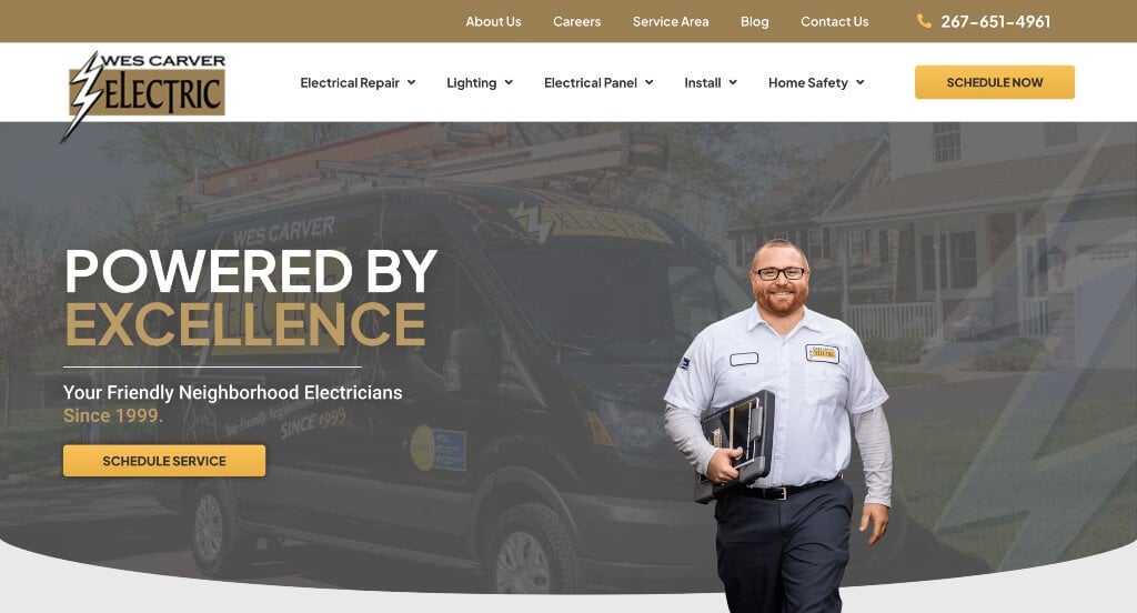
8. Wes Carver Electric
Why We Chose Wes Carver Electric
The website for Wes Carver Electric serves as a premier benchmark for “Instant Conversion Accessibility and Value-Driven Credibility Architecture.” In the competitive home services market, a digital storefront must capture high-intent users immediately upon arrival while systematically answering why they should be trusted over regional competitors. This platform masterfully achieves this by stacking friction-free scheduling pathways right at the top of the user experience and grounding them with structured local proof.
Key Design Highlights:
- Immediate Multi-Channel Scheduling Above the Fold: A standout operational asset of the user interface is the inclusion of multiple ways to schedule an appointment online without needing to scroll. By placing these distinct digital intake pathways immediately in the initial hero and header viewports, the platform ensures that homeowners facing urgent electrical needs can secure a service slot or request an estimate instantly, completely eliminating initial layout friction.
- Structured “Why Choose Wes Carver Electric?” Advantage Block: The home page features a dedicated “Why Choose Wes Carver Electric?” section that explicitly outlines the firm’s core service standards, technician background checks, and quality guarantees. Defining these competitive advantages clearly on the main page provides prospective clients with direct, compelling arguments to trust this team with their home’s infrastructure right from the start.
- Granular, Jargon-Free Service Directory: The company’s primary electrical capabilities – ranging from safety inspections and panel upgrades to custom lighting installations – are clearly listed and organized on the home page. Breaking down these complex technical solutions into highly readable, structured visual blocks allows property owners to instantly verify that the firm handles their exact electrical needs.
- Continuous Client Testimonial Integration: To anchor their marketing claims with authentic social proof, verified client testimonials are woven smoothly into the home page framework. Showcasing these real-world accounts of technician professionalism, punctual arrivals, and clean execution supplies immediate, grassroots validation that reinforces the brand’s trustworthy regional reputation.
WordPress Electrician Themes
You can find free themes at wordpress.org, or consider electrician-inspired templates at ThemeForest.
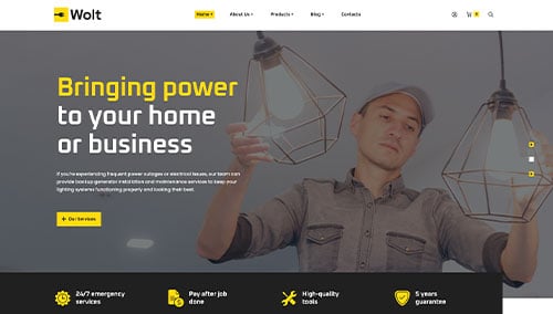
Wolt – Themeforest
$59
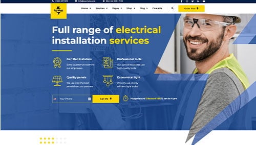
MrWatt – Themeforest
$34
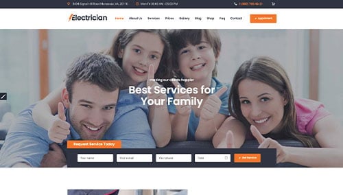
Electrician – Themeforest
$69
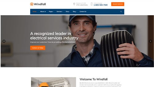
Windfall – Themeforest
$49