In the wellness industry, your website is the digital extension of your studio’s atmosphere. Before a student ever steps onto a mat, they use your online presence to gauge the energy, inclusivity, and professionalism of your practice. To thrive in 2026, a yoga website must do more than list class times – it must evoke a sense of tranquility and clarity while providing a high-performance path to booking and membership.
Our design and UX team evaluated hundreds of yoga and movement websites – from boutique local studios and high-energy power yoga hubs to global online platforms and restorative retreats. We identified the top examples that masterfully balance serene aesthetics with technical efficiency, specifically analyzing their mobile-first class scheduling, instructor storytelling, and the seamless integration of video content.
Whether you are building a personal brand as a solo teacher or managing a multi-location wellness center, these examples represent the current benchmark for yoga web design in 2026.
Note on Our Selection Process: We recently audited this guide to remove outdated designs and sites that no longer meet our performance standards.
Top Yoga Website Designs
1. Waves Yoga Studio
Why We Chose Waves Yoga Studio
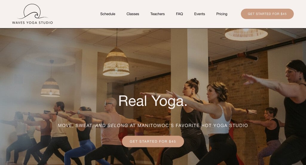
The digital storefront for Waves Yoga Studio serves as a premier benchmark for “Experiential Fitness Merchandising and High-Conversion Boutique Wellness Architecture.” For local movement studios and wellness sanctuaries, an online platform must do more than simply display class timetables – it needs to accurately project the mood, physical energy, and vibrant community spirit of the studio space. The interface masters this objective, combining immersive storytelling elements with a structured onboarding funnel to turn curious web browsers into active studio members.
Key Design Highlights:
- Immersive, Atmosphere-Driven Video Hero Backgrounds: Instantly welcoming visitors into the studio culture without relying on stagnant imagery, the primary hero area features a custom, high-fidelity video loop. Showcasing real people flowing through yoga postures within the actual studio environment immediately communicates the space’s visual aesthetic, lighting, and welcoming energy, breaking down intimidating barriers for newcomers before they ever step onto a mat.
- Low-Barrier Introductory Pricing and Onboarding Modules: The homepage builds a high-conversion gateway by explicitly showcasing their promotional introductory pricing packages directly within the main scroll path. Intentionally positioning an accessible, risk-free starter rate right upfront – paired with a clean contextual link to explore full class options – captures high-intent prospects at their peak moment of interest.
- Integrated Support Peer-Validation Hubs: Balancing their pricing models with genuine community verification, the website incorporates authentic client reviews across the homepage. Highlighting real-world transformation stories, teacher praise, and friendly neighborhood feedback provides powerful social proof that reassures prospective students they are joining a safe, supportive, and skilled community.
- High-Utility Tiered Top Announcement Ribbons: Ensuring that time-sensitive studio announcements reach every single user immediately, the layout features a dedicated alert bar anchored directly above the primary header. This high-visibility space functions as a friction-free communication channel for crucial, changing updates – such as schedule adjustments, seasonal wellness workshops, or retail discount codes – without disrupting the primary layout flow below.
2. Prana Yoga Center
Why We Chose Prana Yoga Center
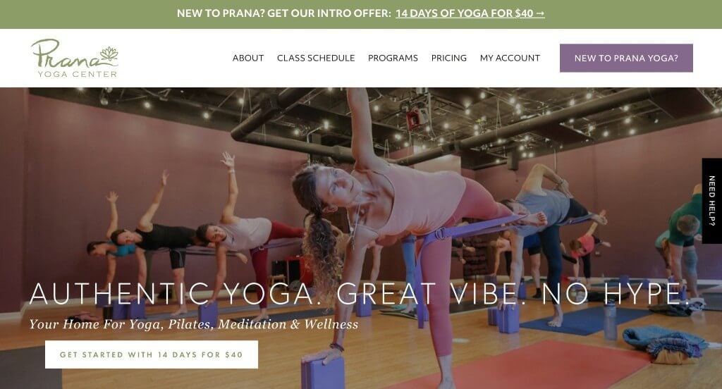
The digital presence for Prana Yoga Center serves as a premier benchmark for “High-Empathy Boutique Fitness Merchandising and Inclusive Studio Onboarding Architecture.” In the competitive local wellness and yoga sector, a website’s primary mandate is to lower the barrier of intimidation that often keeps newcomers from attending their first class. The platform achieves this beautifully, combining authentic visual glimpses of their practice space with targeted, interactive guidance tools that greet new students with the same warmth they would receive at the front desk.
Key Design Highlights:
- Authentic, Atmosphere-Driven Hero Environments: Instantly establishing an inviting and grounded community tone, the central hero area displays a high-fidelity image showcasing real students practicing inside the studio. Sidestepping sterile, uninspiring stock modeling in favor of an actual glimpse into their space immediately communicates the lighting, environment, and inclusive nature of the studio, making the practice feel attainable to all skill levels.
- Proactive “Need Help?” Interactive Onboarding Portals: To catch and support hesitant newcomers who might feel overwhelmed by a diverse class schedule, the layout implements a dedicated, persistent “Need Help?” floating tab anchored along the right side of the screen. This modern accessibility tool functions as an immediate digital concierge, gently steering first-time visitors toward beginner resources, studio etiquette, and class selection paths.
- Structured Front-Page Service Matrices and Path Blueprints: The homepage acts as an organized wellness hub by explicitly mapping out their core offerings, classes, and specialized workshops within the primary scroll path. Visually itemizing distinct disciplines – ranging from gentle restorative flows to advanced teacher training paths – allows incoming practitioners to easily self-select the exact program that fits their personal goals.
- Integrated Support Peer-Validation Hubs: Validating their instructional quality and community culture, the homepage embeds genuine customer reviews directly within the main narrative flow. Showcasing heartfelt testimonials from dedicated long-term students offers powerful social proof, reassuring prospective members of the teachers’ compassion, knowledge, and welcoming spirit before they ever book a mat.
3. TBY Yoga
Why We Chose TBY Yoga
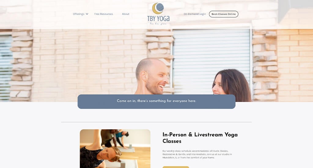
The digital platform for TBY Yoga serves as a premier benchmark for “High-Touch Community Merchandising and Multi-Tiered Wellness Onboarding Architecture.” For a holistic yoga institute that extends far beyond casual fitness to offer deep educational tracks, the digital storefront must seamlessly cater to two distinct audiences: absolute beginners looking for a gentle entry point, and advanced practitioners seeking rigorous certification. The interface achieves this balance flawlessly, pairing an intuitive real-time communication framework with structured educational pipelines to guide users effortlessly from curiosity to registration.
Key Design Highlights:
- Real-Time Interactive Live Chat Communication Hubs: Recognizing that prospective students often have immediate, personal questions regarding physical limitations, class prerequisites, or training schedules, the platform integrates a live chat utility. This instant communication anchor lowers the operational barrier to entry, giving visitors immediate access to studio guidance and personalized care right when their intent to join is highest.
- Persistent, Conversion-Optimized Header Booking Gateways: Keeping the primary enrollment pipeline front and center through every phase of the user scroll, the header features a prominent, high-contrast “Book Your Class” button. This smart structural placement eliminates menu hunting, providing a direct, fast-tracked path to the studio’s scheduling matrix the moment a user decides to commit to a session.
- Comprehensive Multi-Tiered Service Matrix Showcases: The homepage effectively maps out the studio’s extensive educational breadth by organizing their diverse service ecosystem into a highly structured, scannable directory. Explicitly compartmentalizing their offerings – ranging from accessible beginner classes and standard daily practices to specialized workshops, academic lectures, and comprehensive Yoga Teacher Training (YTT) tracks – allows visitors to instantly locate the exact tier that matches their experience level.
- Integrated Support Peer-Validation Hubs: Balancing their deep educational programming with emotional community trust, the homepage anchors its reputation by embedding verified client reviews directly within the main scroll path. Showcasing authentic success stories from both casual practitioners and certified graduates provides powerful social proof, validating the studio’s welcoming culture and instructional excellence.
4. The Sanctuary
Why We Chose The Sanctuary Chicago
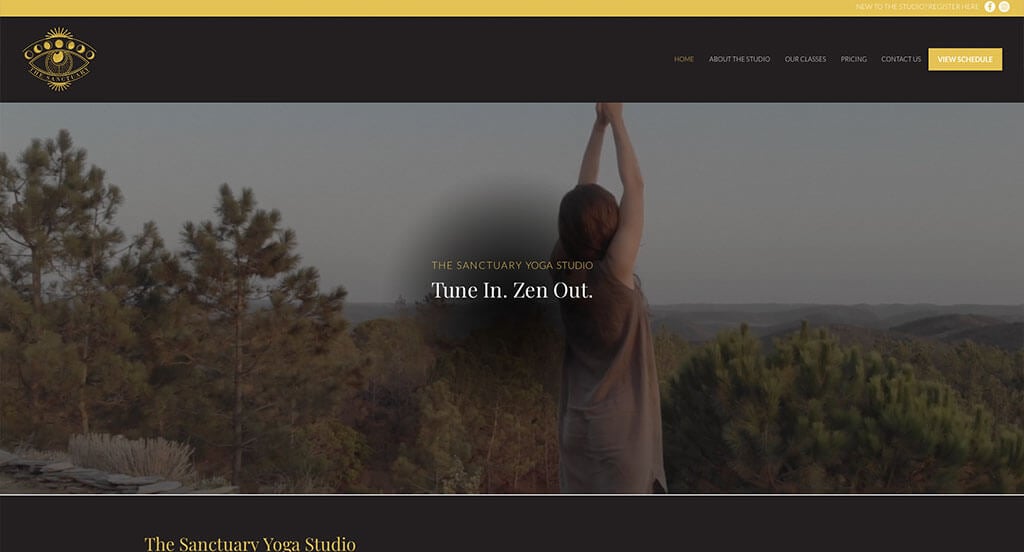
The digital presence for The Sanctuary Chicago serves as a premier benchmark for “Experiential Wellness Merchandising and Dynamic Community Onboarding Architecture.” For a holistic center offering multi-sensory healing and mindful movement, an online platform must act as an energetic window into the physical experience. The site accomplishes this perfectly by transforming complex, high-touch healing modalities into clear educational resources while embedding zero-friction booking tools right within the central narrative flow.
Key Design Highlights:
- Real-Time Interactive Live Chat Communication Hubs: Understanding that restorative therapies and spiritual healing can raise deeply personal questions for newcomers, the interface features an integrated live chat utility. This responsive communication anchor provides immediate accessibility, allowing visitors to ask about class styles, accessibility, or preparation tips at their peak moment of curiosity.
- Deep-Dive Informational Modality Showcases: The homepage removes the ambiguity surrounding holistic therapies by explicitly detailing their full ecosystem of yoga styles and specialized sound healing practices right on the front page. Laying out clear, clear breakdowns of their restorative acoustic paths and movement flows helps visitors easily educate themselves on the therapeutic benefits and choose the right class for their personal healing journey.
- Frictionless Front-Page Booking Gateways: Rather than forcing interested browsers to navigate away to a separate portal or a confusing third-party schedule app, the layout integrates direct booking paths straight into the homepage layout. This clean structural design shortens the path to purchase, allowing high-intent visitors to secure a spot in a daily session the moment they finish reading about the practice.
- Dynamic Time-Sensitive Event Calendars and Showrooms: Driving continuous engagement and recurring class packages, the homepage prominently features an upcoming workshops and events matrix. Showcasing special limited-run programming, communal circles, and immersive healing retreats directly in the main scroll lane encourages immediate registration for unique events that go beyond their standard weekly schedule.
5. Up Yoga
Why We Chose Up Yoga
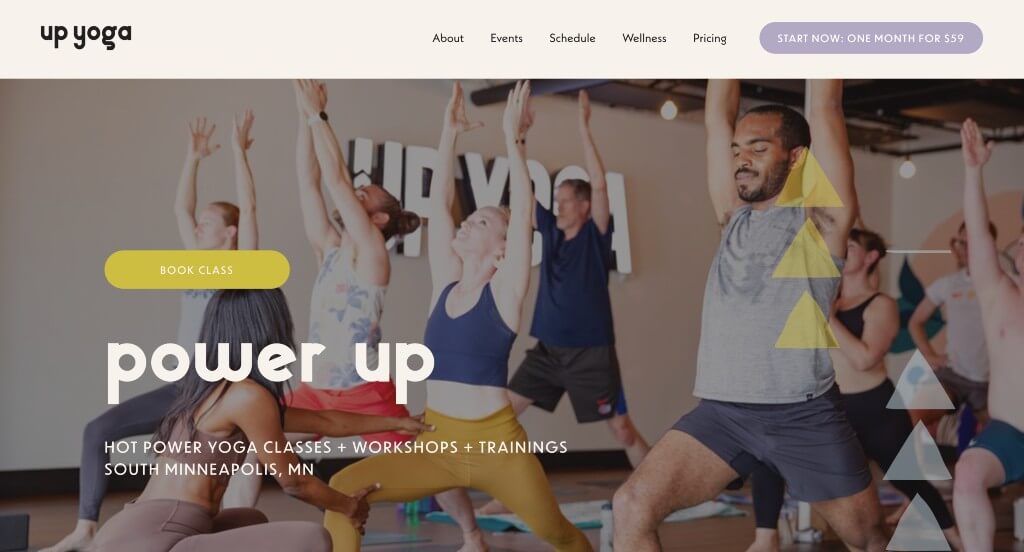
The digital platform for Up Yoga serves as a premier benchmark for “Authentic Community Merchandising and High-Conversion Boutique Fitness Architecture.” In a fitness market crowded with overly processed, generic commercial marketing, an independent yoga studio’s website must act as an honest reflection of its physical space. The interface accomplishes this flawlessly, trading corporate stock photography for real-life snapshots of its local community while keeping its highest-value client acquisition offer anchored in the primary user flow.
Key Design Highlights:
- High-Impact Introductory “First Month for $59” Conversion Hubs: The homepage builds an incredibly effective gateway for new students by aggressively highlighting their promotional starter membership. Emphasizing a risk-free, high-value introductory rate right within the primary scroll path removes pricing anxiety, making it simple for curious newcomers to commit to their first month of practice.
- Authentic, Community-Grounded Visual Showrooms: Breaking away from the sterile, perfectly polished stock imagery that makes many fitness sites feel distant, the layout strictly utilizes real photography taken inside their actual studio. Displaying genuine images of their own diverse clientele, dedicated teachers, and welcoming physical environment immediately sets an approachable, inclusive tone before a user ever rolls out a mat.
- Comprehensive, First-Touch Care and Offering Matrices: The website structures its physical paths by explicitly mapping out their core offerings, classes, and wellness events directly on the front page. Cleanly presenting their diverse schedule styles and studio workshops allows incoming practitioners to easily select the exact practice track that matches their personal flexibility and strength goals.
- Integrated Support Peer-Validation Hubs: Balancing their pricing strategies with real-world emotional confirmation, the homepage embeds verified client reviews across the main narrative scroll. Highlighting heartfelt success stories from active community members provides crucial social proof, reassuring prospective students of the instructional safety, support, and friendly atmosphere they will experience at the studio.
6. YogaFit Studio
Why We Chose YogaFit Studios
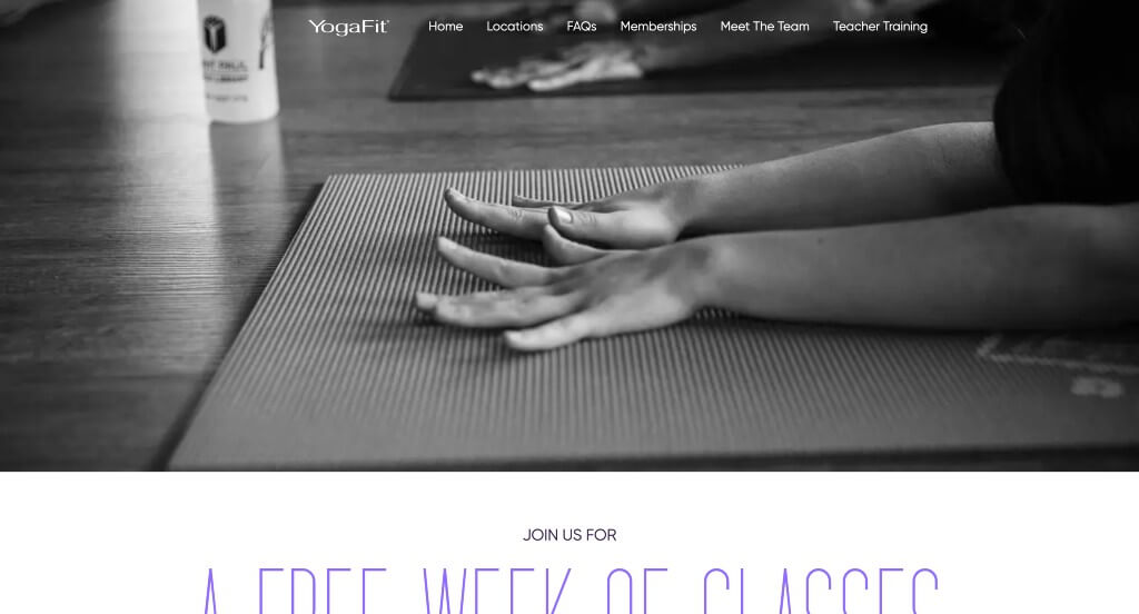
The digital presence for YogaFit Studios serves as a premier benchmark for “Authentic Identity Merchandising and Streamlined Fitness Conversion Architecture.” In a corporate landscape where boutique fitness platforms often fall back on highly stylized, sterile asset packs, this website establishes immediate trust through visual honesty. By anchoring its digital storefront in real-world spaces and tangible human experiences, the interface eliminates the emotional distance typical of franchise models, making the transition from digital visitor to active studio member feel natural and welcoming.
Key Design Highlights:
- Visual Honesty and Community-Focused Studio Showrooms: Bypassing standard corporate stock models, the homepage is built entirely around authentic photography captured inside their actual physical studios. Showcasing real people of diverse backgrounds and fitness levels flowing through movements in their genuine practice spaces projects an inclusive, highly approachable community atmosphere that completely strips away beginner intimidation.
- Value-Driven “Why YogaFit” Differentiation Frameworks: The layout anchors its operational identity through a dedicated “Why YogaFit” narrative module embedded directly within the primary scroll path. Rather than relying on vague lifestyle taglines, this section outlines their core pillars – focusing on flexible accessibility, modern class styling, and welcoming instruction – giving prospective members a clear, structured understanding of what sets their practice apart.
- Comprehensive, First-Touch Fitness and Class Matrices: The website structures its core offerings by explicitly laying out their full menu of yoga and fitness classes right on the front page. Organizing distinct training styles – ranging from low-impact restorative flows to high-intensity sculpt sessions – allows incoming practitioners to easily self-select the precise workout track that aligns with their personal physical goals.
- Persistent, Conversion-Optimized Sticky Headers: Ensuring that essential navigation pathways remain effortlessly accessible at any point during the user journey, the layout utilizes a smooth sticky header framework. As users explore class descriptions and studio philosophies down the page, the primary menu anchors itself perfectly at the top of the viewport – providing a zero-friction path to find a nearby location or book a mat the exact moment they decide to take action.
7. Core Power Yoga
Why We Chose CorePower Yoga
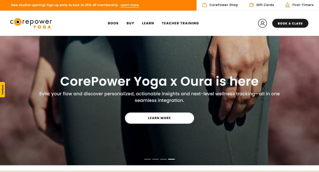
The digital platform for CorePower Yoga serves as a premier benchmark for “High-Scale Fitness Merchandising and Frictionless Multi-Location Conversion Architecture.” As a major national yoga brand, the digital ecosystem must successfully bridge the gap between high-volume, corporate-level structure and a warm, inviting localized studio feel. The interface navigates this masterfully by organizing complex multi-tier membership systems and class formats into an elegantly compressed, highly intuitive front-page layout.
Key Design Highlights:
- Frictionless, High-Intent Header Booking Gateways: Keeping the primary enrollment pipeline front and center through every phase of the user scroll, the header features a high-contrast “Book a Class” action button. This strategic structural placement completely bypasses administrative menu layers, allowing returning practitioners to instantly bridge the gap between landing on the site and securing a mat in their local studio.
- Streamlined, Single-Tier Desktop Mega Menus: Managing a vast national network of corporate structures, teacher training tracks, retail collections, and studio locations is handled cleanly through a beautifully simplified mega menu. The navigation expands into a clean, well-spaced directory that eliminates option paralysis, ensuring that users can instantly self-select their specific journey without cluttering the homepage view.
- Interactive Dynamic Class and Membership Sliders: Condensing a massive amount of operational data into a tidy visual footprint, the homepage implements a coordinated presentation slider to break down class types and membership tiers. This interactive design allows visitors to effortlessly swipe through varying heat levels, intensities, and pricing models – making their complex national product ecosystem immediately scannable.
- Integrated Support Peer-Validation Hubs: Balancing their corporate scale with genuine community validation, the homepage anchors its brand loyalty by embedding authentic customer reviews directly within the primary scroll path. Showcasing real-world stories of sweat, personal growth, and welcoming instruction provides powerful social proof that reminds prospective members that beneath the nationwide network lies an inclusive, encouraging studio culture.
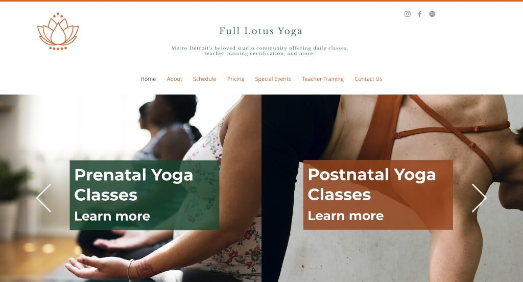
8. Full Lotus Yoga
Why We Chose Full Lotus Yoga
The digital home for Full Lotus Yoga serves as a premier benchmark for “Hyper-Local Wellness Merchandising and Frictionless Studio Lead Generation Architecture.” For a multi-location fitness entity, the primary challenge is to unify geographically distinct communities under a single cohesive brand banner while minimizing the friction required for a visitor to physically attend a class. The interface accomplishes this flawlessly, organizing location logistics, entry-level pricing, and time-sensitive studio events into a single, high-conversion homepage scroll.
Key Design Highlights:
- Multi-Location Spatial Navigation and Geographic Blueprints: Rather than hiding critical address, parking, and scheduling information behind separate contact subpages, the homepage explicitly outlines their different studio locations right within the primary viewport. Providing this upfront geographic clarity ensures that incoming practitioners can immediately identify their closest studio and understand its distinct community neighborhood footprint without administrative hunting.
- Low-Barrier Introductory Pricing and Onboarding Modules: The homepage builds a high-conversion gateway for new students by aggressively highlighting their promotional introductory pricing packages directly within the main text flow. Explicitly positioning a risk-free, budget-conscious starter rate right upfront addresses cost anxieties immediately, making it incredibly simple for curious beginners to take the financial leap and book their first mat.
- Dynamic Time-Sensitive Event Calendars and Showrooms: Driving continuous community engagement and recurring enrollment spikes, the homepage prominently features a dedicated listing for upcoming workshops, special classes, and master series. Showcasing limited-run programming – such as restorative workshops or seasonal flow events – directly in the main scroll lane encourages immediate sign-ups for unique experiences that go beyond their standard weekly schedule matrix.
- Front-Page Zero-Friction Lead Generation and Contact Frameworks: Maximizing visitor acquisition, the homepage integrates a clean, low-barrier contact form directly into the base layout. Positioning a direct submission channel right within the primary scroll path removes the extra step of loading a new page, allowing prospective students with specific questions about physical limitations, corporate bookings, or membership freezes to instantly initiate contact with the front desk.
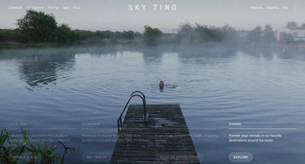
9. Sky Ting
Why We Chose Skyting Yoga
The digital platform for Skyting serves as a premier benchmark for “Avant-Garde Wellness Merchandising and High-Velocity Interactive Booking Architecture.” Moving far away from the predictable, generic aesthetics of traditional fitness portals, the interface captures the brand’s distinct, design-forward identity. It masterfully consolidates an expansive, multi-disciplinary ecosystem – ranging from physical studio spaces to global lifestyle drops – into a highly functional landing path that balances high-end art direction with effortless utility.
Key Design Highlights:
- Interactive, Motion-Driven Hero Environments: Breaking away from stagnant hero banners, the site opens with a unique, experimental hero section featuring engaging hover effects. This interactive visual playground instantly sets a modern, trendsetting tone, signaling to visitors that the brand approaches movement and design from a completely fresh, contemporary perspective.
- High-Utility Front-Page Digital Class Calendars: Maximizing convenience and immediate enrollment, the homepage integrates a massive, fully operational class schedule matrix directly into the primary scroll. Rather than forcing users to jump to external booking platforms, the clean layout allows high-intent students to view teachers, times, and open mats, and book a spot in real time without leaving the main page.
- Cinematic On-Demand Video and Streaming Showrooms: Bridging the gap between the physical studio and global digital access, the homepage prominently showcases their premium digital video catalog. Providing this visual look into their virtual library effectively validates their streaming subscriptions, allowing remote practitioners to sample the class atmosphere, pacing, and instructional style before committing to an online membership.
- Omnichannel Brand Ecosystem and Service Matrices: The homepage functions as a highly structured directory that maps out their extensive, multi-tier brand offerings. By cleanly itemizing a vast range of services – including global wellness retreats, curated lifestyle merchandise, intensive teacher courses, in-person studio sessions, on-demand libraries, specialized spa services, live-stream classes, and a plethora of daily movement formats – the interface positions the brand as a complete, modern lifestyle ecosystem.
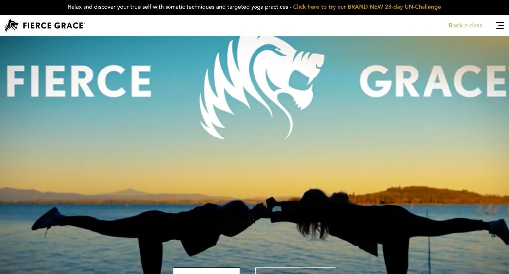
10. Fierce Grace
Why We Chose Fierce Grace
The digital home for Fierce Grace serves as a premier benchmark for “High-Octane Fitness Merchandising and Dynamic Lifestyle Onboarding Architecture.” Rather than presenting yoga as a purely slow, tranquil practice, the platform mirrors the brand’s signature athletic intensity and bold identity. The interface accomplishes this beautifully by matching energetic multi-sensory storytelling with clear community engagement hubs, creating a fast-moving front page that feels less like a quiet studio directory and more like a high-performance wellness movement.
Key Design Highlights:
- High-Energy, Motion-Driven Cinematic Hero Showrooms: Instantly setting a powerful, athletic tone from the exact moment the page loads, the primary hero section utilizes a high-velocity video loop. Showcasing dynamic movements, diverse sweat-inducing classes, and the intense physical energy of their actual studio practice completely redefines traditional yoga imagery, immediately engaging high-intent fitness enthusiasts.
- Integrated Support Peer-Validation Hubs: Balancing their intense brand positioning with real-world reassurance, the homepage embeds authentic client testimonials directly into the main narrative scroll. Highlighting real stories of physical transformation, welcoming spaces, and structural class benefits provides essential social proof that builds deep consumer trust for incoming practitioners.
- Coordinated Front-Page Blog and Event Editorial Networks: Solidifying their status as a holistic lifestyle authority, the homepage features a dedicated, highly visual matrix showcasing upcoming events and recent editorial blog pieces. Blending time-sensitive special workshop opportunities directly with deep-dive educational articles keeps the community continuously engaged beyond standard daily class schedules.
- High-Utility Tiered Top Announcement Ribbons: Ensuring that time-sensitive operational updates reach every visitor instantly, the site implements a clean announcement bar positioned directly above the main navigation header. This dedicated alert space functions as a friction-free communication channel for critical, fluid updates – such as limited-time membership sales, seasonal retreat updates, or holiday hour adjustments – without disrupting the clean layout flow below.
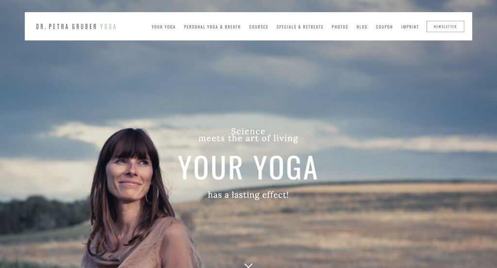
11. Dr. Petra Gruber Yoga
Why We Chose Petra Gruber Yoga
The digital platform for Petra Gruber Yoga serves as a premier benchmark for “High-End Editorial Wellness Merchandising and Minimalist Solopreneur Brand Architecture.” For an independent, premium yoga instructor and spiritual guide, the website must act as a direct reflection of personal artistry, professional depth, and mindful sophistication. The interface navigates this beautifully, utilizing a stark, high-contrast aesthetic that frames her clinical expertise, lifestyle retreats, and philosophical insights like a high-end editorial magazine rather than a generic fitness directory.
Key Design Highlights:
- High-Contrast, High-Impact Minimalist Visual Showrooms: The platform establishes immediate aesthetic authority by pairing a pristine, clean white background with carefully curated, striking imagery. This intentional high-contrast layout strips away distracting design clutter, allowing the vibrant, soulful photography of the practice to draw the user’s eye directly to key narrative messages and call-to-action touchpoints.
- Premium Event and Experiential Retreat Matrices: The homepage functions as a high-value travel and wellness showcase by prominently featuring upcoming workshops and destination retreats directly within the primary scroll path. Elevating these premium, high-intent offerings on the front page immediately captures travelers and dedicated students looking for immersive wellness experiences beyond the standard studio model.
- Deep-Dive Informational Modality and Service Blueprints: The website structures its core health offerings by explicitly outlining her specific services and yoga methodologies on the front page. Breaking down individual teaching styles – ranging from precise anatomical movements to deeply restorative practices – helps visitors quickly grasp her unique instruction style and self-select the right path for their body.
- Front-Page Editorial Insight and Philosophical Blog Hubs: Solidifying her status as an expert lifestyle mentor and spiritual guide, the homepage features a dedicated editorial showcase for her active journal. Integrating thought-provoking wellness articles, mindfulness techniques, and personal philosophy directly into the main scroll transforms the digital storefront into an ongoing, high-value source of personal enrichment.
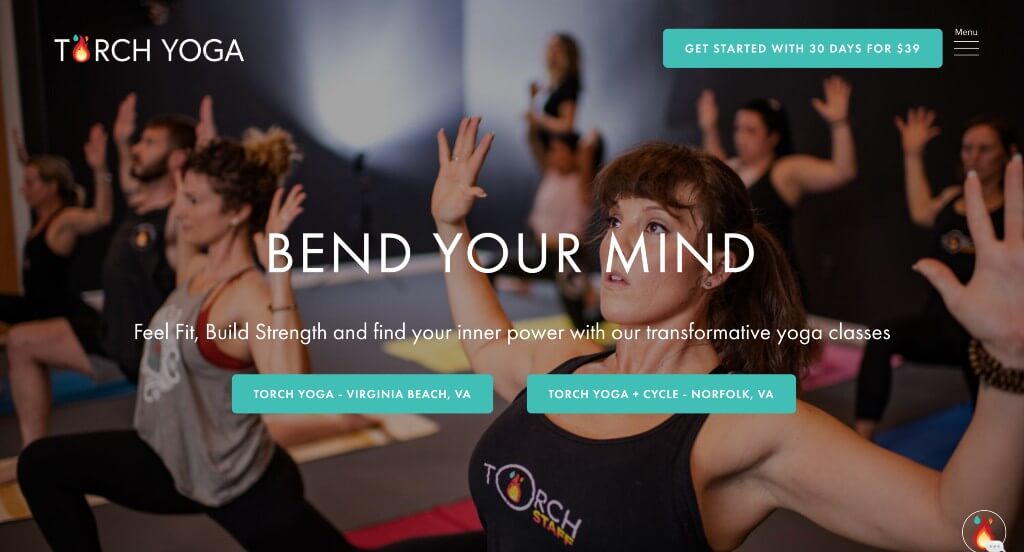
12. Torch Yoga
Why We Chose Torch Yoga Studio
The digital storefront for Torch Yoga Studio serves as a premier benchmark for “Immersive Digital Storytelling and Cinematic Conversion Architecture.” Rather than relying on rigid, static blocks of text, the platform utilizes dynamic movement to draw visitors into its brand experience. The interface achieves this beautifully by combining interactive menu options with interactive layout techniques, transforming the simple act of scrolling into an engaging, continuous tour of the studio’s warmth and class variety.
Key Design Highlights:
- Cinematic Video Testimonial Validation Hubs: Moving far beyond standard written reviews, the homepage features high-fidelity video testimonials from real students. Showcasing actual faces, spoken stories of personal growth, and authentic emotion directly within the main scroll path provides powerful, cinematic social proof that builds immediate trust for incoming practitioners.
- Fluid Front-Page Scrollytelling Frameworks: To create a highly engaging user experience, the website utilizes interactive scrollytelling – where visual elements, text overlays, and media shift dynamically as the user scrolls down the page. This fluid, motion-driven approach guides visitors through the studio’s philosophy step by step, maintaining high user engagement and naturally drawing the eye toward booking actions.
- Expansive Canvas Desktop Hamburger Navigation: The site adopts a clean, design-forward navigation style by implementing a large desktop hamburger menu that opens into a full-screen overlay. This choice keeps the main homepage completely free of visual clutter, while providing an organized, beautifully spaced directory for users to instantly access class formats, location data, and pricing matrices.
- Comprehensive, First-Touch Care and Offering Showcases: The homepage explicitly details their full menu of classes, workshop structures, and wellness options directly within the primary scroll path. Clearly outlining distinct class intensities, heat levels, and style descriptions allows new visitors to easily self-educate and discover the exact practice that aligns with their personal fitness goals.
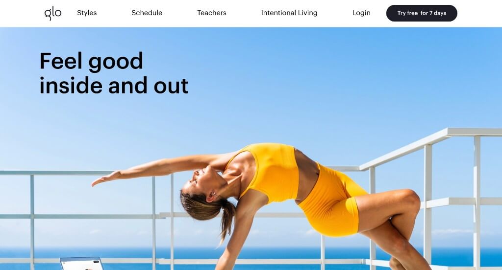
13. Glo
Why We Chose Glo
The digital platform for Glo serves as a premier benchmark for “High-Scale Digital Health Merchandising and Hyper-Personalized User Onboarding Architecture.” As a global leader in on-demand, streaming wellness, the website’s primary challenge is to organize thousands of specialized classes into a highly intuitive, approachable front page. The interface accomplishes this beautifully by replacing generic product listings with goal-oriented navigation paths and deep instructor storytelling, allowing a massive digital catalog to feel like a boutique, tailored fitness program.
Key Design Highlights:
- Goal-Oriented “Explore by Focus” Navigation Frameworks: Rather than forcing users to sift through complex search filters, the homepage features a centralized “Explore by Focus” discovery grid. This design allows visitors to self-select their exact personal wellness goals – such as stress relief, strength building, prenatal care, or sleep improvement – and instantly routes them to a curated content path tailored to their needs.
- Instructor Branding and Professional Authority Showrooms: Recognizing that long-term subscription retention relies heavily on the bond between student and instructor, the homepage includes a dedicated section introducing their world-class teachers. Showcasing clear portraits, expert credentials, and individual teaching philosophies humanizes the digital app, allowing remote practitioners to find a guide they connect with before starting a trial.
- Transparent, Value-Driven Membership Blueprints: To de-risk the subscription model for first-time users, the homepage explicitly maps out how the membership works and details exactly what the platform offers. Visually itemizing the user experience – explaining features like custom program scheduling, offline downloading, and cross-device streaming – clearly communicates the total value of the subscription upfront.
- High-Utility Tiered Top Announcement Ribbons: Ensuring that promotional offers and new platform updates catch the eye immediately, the site features a sleek announcement bar anchored directly above the primary navigation header. This high-visibility space serves as a zero-friction communication channel for key updates – such as limited-time trial extensions, new masterclass series, or global community challenges – without cluttering the main page layout.
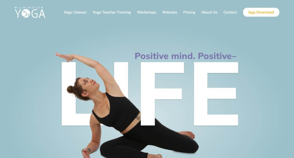
14. Wilmington Yoga Center
Why We Chose Wilmington Yoga Center
The digital presence for Wilmington Yoga Center serves as a premier benchmark for “High-Touch Regional Wellness Merchandising and Immersive Studio Community Architecture.” For a well-established, multi-disciplinary yoga hub, the website must instantly communicate both professional breadth and local warmth. The platform navigates this balance smoothly, utilizing a clean grid structure and authentic multimedia storytelling to present its diverse offerings while welcoming prospective students into a thriving local community.
Key Design Highlights:
- Immersive, Atmosphere-Driven Video Showrooms: Instantly breaking down the barriers of beginner intimidation, the homepage features a high-fidelity video component that showcases their actual studio space filled with real practitioners. Giving visitors an immediate, authentic look at the studio’s interior, lighting, and supportive group dynamics allows them to visualize themselves in the space before ever stepping onto a mat.
- Symmetric, First-Touch Care and Offering Grids: The website structures its expansive menu of classes, workshops, and teacher training programs into a beautifully organized, balanced grid system on the front page. This clean layout layout categorizes diverse practice styles and educational paths into distinct, highly scannable visual blocks, enabling users to self-select the exact program that fits their personal goals without experiencing option paralysis.
- Persistent, Low-Friction Social Communication Anchors: Keeping community engagement front and center, the interface implements a dedicated socials tab anchored along the right side of the homepage viewport. This highly accessible design element connects users directly to the studio’s active social channels, allowing visitors to easily tap into real-time daily schedules, lifestyle content, and community updates outside the formal website structure.
- Integrated Support Peer-Validation Hubs: Validating their instructional quality and welcoming culture, the homepage embeds genuine student testimonials directly within the primary scroll path. Showcasing heartfelt, real-world success stories from active community members provides powerful social proof that reassures prospective practitioners of the teachers’ compassion, expertise, and inclusive spirit.
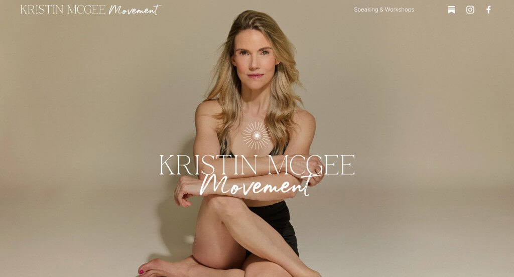
15. Kristin McGee Movement
Why We Chose Kristin McGee Yoga
The digital platform for Kristin McGee serves as a premier benchmark for “High-Empathy Solopreneur Merchandising and Fluid Personal Brand Architecture.” For a globally recognized fitness authority and celebrity instructor, an online presence must balance personal approachability with a highly structured commercial funnel. The interface masters this balance by using fluid, organic design motifs to translate her individual teaching style into a welcoming, professional digital home that easily converts casual fans into dedicated platform subscribers.
Key Design Highlights:
- Fluid, Atmosphere-Driven Organic Visual Aesthetics: The homepage establishes an immediate sense of mindfulness and ease by pairing a bright, soothing color palette with flowing, wavy design elements. Moving away from rigid layouts in favor of these organic lines visually mirrors the fluid motion of a yoga practice, instantly creating a calm, inviting environment that aligns perfectly with her personal wellness philosophy.
- Authoritative, Relationship-Building Bio Showrooms: To foster immediate trust and human connection, the homepage features a beautifully integrated biography section highlighting Kristin’s extensive background, journey, and wellness credentials. Sharing her personal story and professional expert status right on the front page establishes deep credibility, helping incoming students build an emotional connection with her as a mentor before they dive into her training programs.
- Transparent, Direct Membership and Access Blueprints: Removing all pricing ambiguity, the homepage features a clean, highly structured breakdown of available membership options and digital subscription paths. Clearly itemizing package inclusions – such as on-demand libraries, specialized series, and live virtual classes – allows users to easily evaluate the value of the platform and select the exact tier that fits their schedule and budget.
- Integrated Support Peer-Validation Hubs: Validating her global reputation and effective instruction, the homepage anchors its community trust by embedding genuine customer reviews directly within the main scroll path. Showcasing heartfelt, real-world transformation stories and student praise provides powerful social proof, reassuring prospective members of the exceptional quality, approachability, and supportive nature of her teaching style.
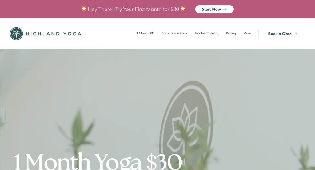
16. Highland Yoga
Why We Chose Highland Yoga
The digital presence for Highland Yoga serves as a premier benchmark for “Multi-Location Studio Merchandising and High-Intent Conversational Wellness Architecture.” For a multi-studio fitness brand, the website must immediately bridge the gap between unified brand messaging and distinct localized booking options. The platform accomplishes this seamlessly, organizing physical locations and dynamic visual proof into a cohesive frontend experience that makes booking a class intuitive for both new and long-term students.
Key Design Highlights:
- Frictionless, High-Intent Header Booking Gateways: Keeping the primary transaction funnel front and center through every phase of the user experience, the navigation bar integrates a prominent “Book a Class” action button. This strategic layout placement bypasses administrative submenus entirely, providing a direct, fast-tracked path to the scheduling matrix the exact moment a visitor decides to commit to a sweat session.
- Atmosphere-Driven Cinematic Video Hero Showrooms: Instantly breaking down the emotional barriers of beginner intimidation, the primary hero banner features a high-fidelity background video loop showcasing their actual practice space. Giving visitors a real-world look at the studio’s interior aesthetic, warm heating dynamics, and supportive group environment allows them to visualize themselves practicing in the space before ever stepping through the physical doors.
- Geographic Blueprint and Multi-Location Directories: Rather than hiding critical address, parking, and distinct studio schedules behind confusing contact forms, the homepage clearly maps out their expanding footprint, showcasing their multiple branches directly on the main page. This upfront spatial clarity ensures incoming practitioners can instantly self-select their closest neighborhood studio without administrative friction.
- Integrated Support Peer-Validation Hubs: Balancing their growth scaling with authentic community validation, the homepage anchors its brand trust by embedding genuine student testimonials directly within the primary scroll path. Sharing real-world success stories from active community members provides powerful social proof that reassures prospective practitioners of the teachers’ compassion, instructional expertise, and welcoming spirit.
WordPress Yoga Themes
You can find free themes at wordpress.org, or consider yoga-inspired templates at ThemeForest.
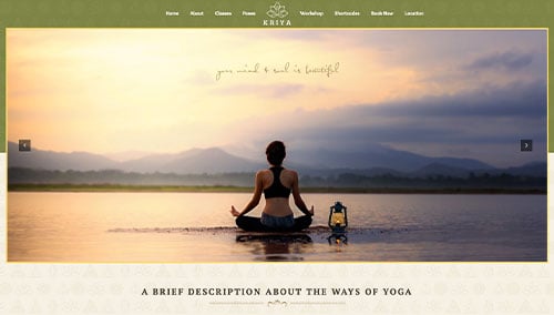
Kriya – Themeforest
$69
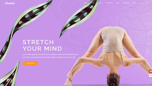
Anahata – Themeforest
$79
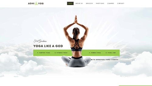
Adhi – Themeforest
$59
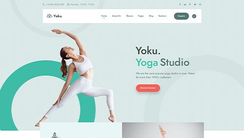
Yoku – Themeforest
$64
WooCommerce Yoga Themes
You’ll find plenty of ecommerce yoga themes for WooCommerce on ThemeForest.
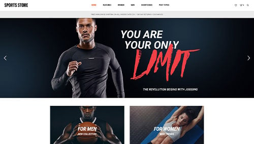
Sports Store – Themeforest
$59
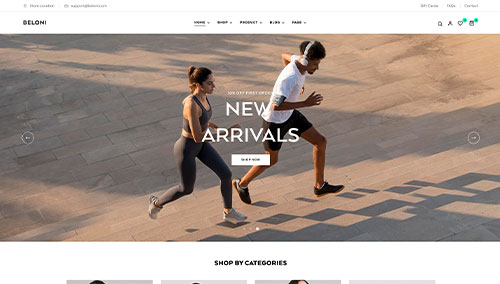
Beloni – Themeforest
$59
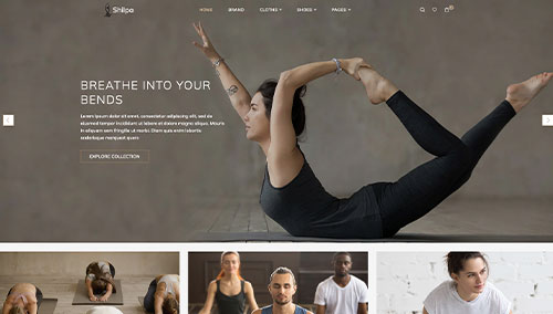
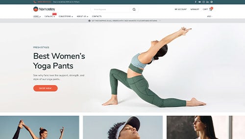
Shopify Yoga Themes
You can find free and paid themes at themes.shopify.com, or consider options through marketplaces like ThemeForest.
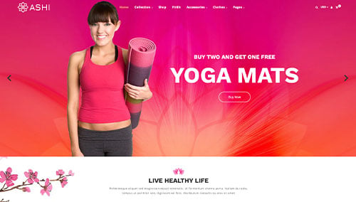
Ashi – Themeforest
$59
Shilpa – Themeforest
$59
Namastey – Themeforest
$39
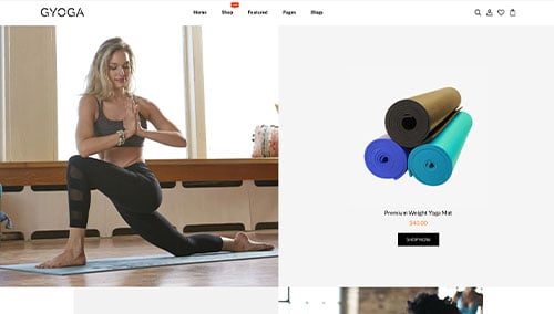
Gyoga – Themeforest
$56