In the hospitality industry, a restaurant’s website is the digital equivalent of a tasting menu – it must provide an immediate sense of flavor, atmosphere, and service quality. For modern restaurateurs, an online presence is a high-stakes conversion tool that must turn a casual browser into a confirmed reservation. To succeed in 2026, a restaurant’s design must go beyond static menus; it must create a sensory-driven user experience that functions flawlessly on mobile devices while people are on the move.
Our marketing and design team recently audited the digital presence of hundreds of eateries – ranging from Michelin-starred fine dining establishments and boutique bistros to high-volume casual franchises and local hotspots. We narrowed the field to 8 definitive examples that lead the industry in visual storytelling, mobile-first booking workflows, and integrated menu architecture. We specifically analyzed these sites for their ability to balance high-resolution food photography with rapid load times and intuitive third-party reservation links.
Whether you are a chef-owner launching a new concept or a restaurant group optimizing for higher seat turnover, these examples provide the definitive blueprint for hospitality web design. Use these industry leaders to inspire a digital presence that reflects the passion and culinary excellence of your kitchen.
Note on Our Selection Process: We recently refined this guide to ensure every featured site meets our 2026 standards for local SEO performance, mobile usability, and e-commerce readiness. This curated collection focuses on the eateries and hospitality brands providing the most strategic value to hungry patrons today.
Top Restaurant Website Designs
1. Forage Kitchen
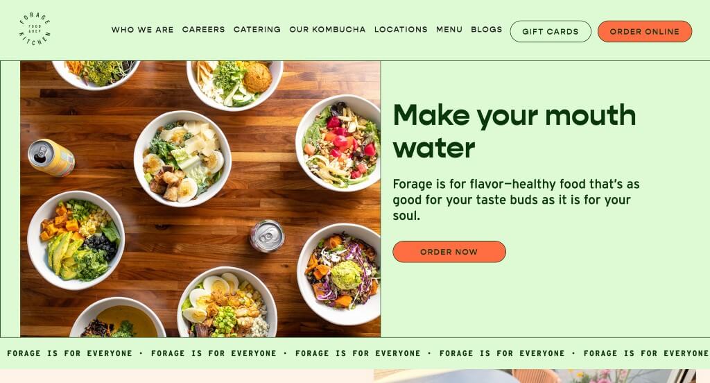
This was a website that we really appreciated because of their color scheme that is energetic and powerful. Using lots of buttons to help viewers navigate their content was another smart idea. We really liked their use of interesting fonts that helps them as a company stand out from their competitor brands.
2. Hasia
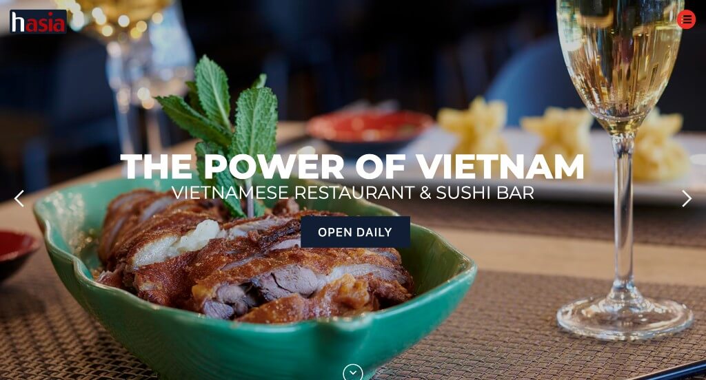
Hasia has a great layout with a good ratio of images to written content. For the color scheme, they use red alongside navy color to really pull the whole website together. We liked how they offer discounts upon entry of this site, which helps them stand out because not every restaurant offers discounts. We also enjoyed their creative graphics. Lastly, it was important to have a contrast in a variety of fonts (large, small, simple, decorative, bold, along with skinny).
Related: Rank higher for searches like “local restaurants” with the help of SEO services.
3. Desert Chill

Without hesitation, we see a bright and exciting color scheme. Many different designs, colors, and patterns are included to spice it up. It was unique to have different frame shapes for this company’s images. Having a fun and simple logo design also helps this company out. Including buttons help users navigate the site.
4.Kuma’s Corner
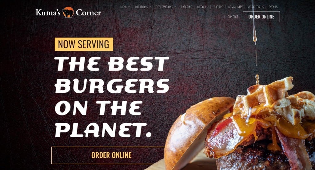
This was an amazing example because of the way their information and visuals are laid out. We also really liked how this example had textured backgrounds because it really helps them stand out from other restaurant sites. It was nice how when information was included in the form of written text, it was short and easy to read.
5. Santa Barbara Shellfish Company
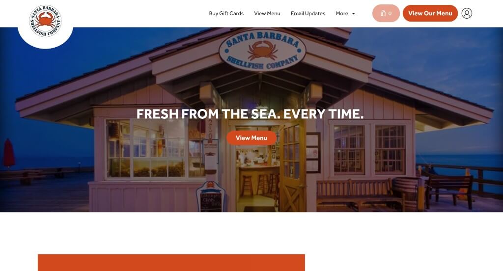
Bright orange color really adds to this template to highlight important information. A section to feature customer testimonials, showing good experiences was a nice touch. Many images of meals can be found to show potential customers what their meals could look like. Santa Barbara Shellfish Company’s contact information is noticeable along with a Google map.
Related: Bring targeted local traffic to your restaurant with the help of a managed PPC campaign.
6. Veggiegrill
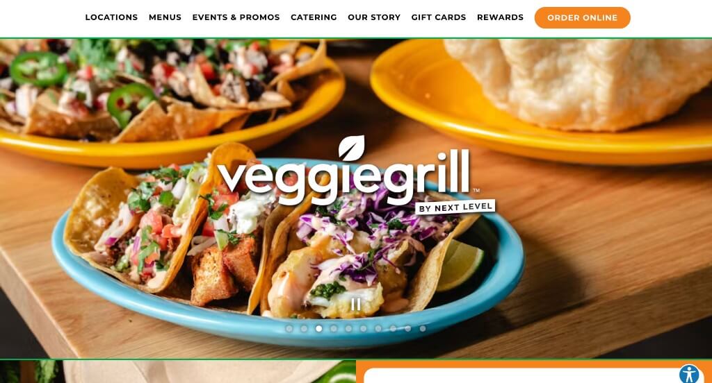
Veggiegrill has many strong headlines with big, capital letters. Bright colors are used to draw attention to headlines to give customers more information. This website is easy to read and understand information provided within the pages. Having a simple and refined logo design also brings reliability for your business. We also thought having a slideshow of well-prepared dishes was a great choice for this homepage.
7. Lawry’s Restaurants
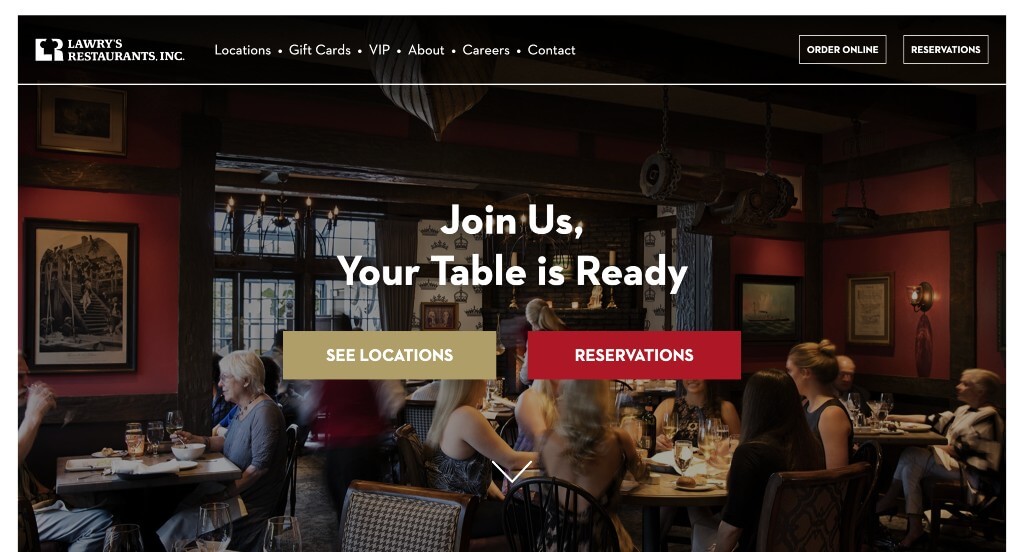
It’s very convenient for potential customers to plan their events with each location due to pictures of what it looks like inside, along with a short form for date and size of party. We noticed this company’s clever logo design that includes their business’s monogram along with a chef’s hat. Large buttons are used to help customers get to the information they need.
8. Snooze
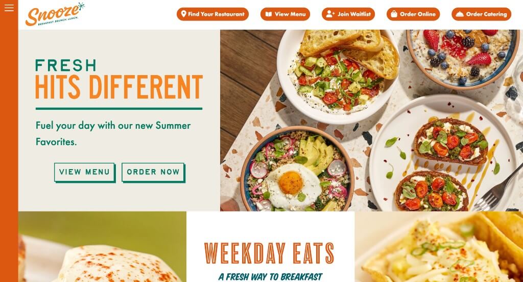
This restaurant website had many images or few short clips throughout the site, which helps them stand out from competitors. Along with that, stunning fonts and graphics are included. Having an incredible layout weaving many elements together was an interesting feature. We also thought using bright colors was also nice. Make sure to think about this example when trying to find inspiration for your new site.
WordPress Restaurant Themes
Find free themes at wordpress.org or explore restaurant templates on ThemeForest.
Savory – Themeforest
$69

Laurent – Themeforest
$75

Picante – Themeforest
$59

Patio Time – Themeforest
$64
