In the world of professional engineering, your website is the digital blueprint of your firm’s capabilities. Whether you are bidding on a massive civil infrastructure project or providing niche mechanical consulting, your online presence must immediately communicate technical authority, precision, and operational reliability. To win high-value contracts in a competitive global landscape, your design must go beyond aesthetics to demonstrate your firm’s ability to solve complex problems.
Our design team evaluated hundreds of engineering websites – from boutique structural and environmental consultancies to large-scale civil, mechanical, and electrical engineering firms. We looked for the top 9 examples that masterfully balance sophisticated project storytelling with high-performance functionality, specifically analyzing their case study architecture, talent acquisition flows, and the effective use of technical data visualization.
Whether you are scaling a local specialized firm or managing a global engineering powerhouse, these examples represent the benchmark for digital excellence in 2026.
Note on Our Selection Process: We recently audited this guide to remove outdated designs and firms that no longer meet our performance standards. This curated list now focuses on the top 9 engineering websites providing the most strategic value in 2026.
Top Engineering Firm Website Designs
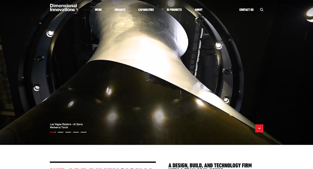
1. Dimensional Innovations
Why We Chose Dimensional Innovations (DI)
The website for Dimensional Innovations (dimin.com) serves as a premier benchmark for “Experiential Design-Build Merchandising and Immersive Spatial Storytelling.” As a multidisciplinary firm uniting strategy, fabrication, and technology to engineer physical spaces, their digital storefront must transcend standard corporate agency layouts. This platform masterfully succeeds by treating its homepage as a physical exhibition space brought to life digitally, prioritizing large-scale motion media and geographic transparency to validate their boundary-pushing execution capabilities.
Key Design Highlights:
- Cinematic, High-Impact Multi-Disciplinary Hero Video: The website commands immediate authority with a high-fidelity video loop dominating the primary hero real estate. Showing rapid, sweeping sequences of custom fabrications, dynamic lighting arrays, physical architecture, and digital interactions immediately communicates the immense scale, versatility, and precision engineering behind their creations the exact second the page loads.
- Segmented Cross-Industry Expertise Directory: Rather than offering a generalized service menu, the homepage purposefully maps out the diverse industries where the company shines. Dividing their capabilities into specific corporate, sports, healthcare, entertainment, and higher education sectors allows enterprise clients to immediately self-identify and recognize the firm’s specialized market familiarity.
- Premium Portfolio-First Discovery Grid: Strategically woven into the homepage scroll path is an editorial collection of project portfolio imagery. Stripping away heavy text blocks, these large-scale visual cards emphasize the sheer craftsmanship and aesthetic impact of their physical installations, inviting visitors to seamlessly explore deep case studies based on visual prestige.
- Interactive Project Mapping and Geo-Proof Engine: A major technical highlight of the experience is the custom interactive world map embedded right on the homepage. By allowing users to click red dynamic plus-signs mapped over geographic regions, the interface instantly pulls up localized lists of completed installations. This clever mechanic effortlessly proves their global reach, operational scale, and real-world credibility through a highly engaging spatial interface.
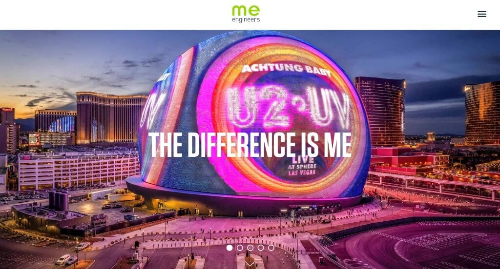
2. ME Engineers
Why We Chose M-E Engineers
The website for M-E Engineers serves as a premier benchmark for “High-Impact Engineering Merchandising and Immersive Structural Performance Storytelling.” For a global leader in mechanical, electrical, and plumbing (MEP) engineering responsible for some of the world’s most advanced sports stadiums and commercial facilities, a digital storefront must go beyond standard technical blueprints. This platform masterfully succeeds by converting complex built-environment engineering into a highly visual, fluidly animated narrative that bridges elite physics with premium design.
Key Design Highlights:
- Highly Impactful and Commanding Hero Canvas: The homepage opens with a striking, high-fidelity hero image that immediately establishes the massive scale and prestige of the firm’s work. Leading with an iconic, beautifully lit architectural masterpiece instantly validates their elite market position and commands the attention of developers and architects the second the page loads.
- Kinetic “How We Work” Animation Sequence: A major structural highlight of the homepage is the “How We Work” methodology section, brought to life through visually interesting, custom web animations. As users scroll, the abstract stages of their consulting, design, and execution workflows assemble dynamically on the screen, transforming traditional operational text into an engaging, high-tech visual experience.
- Premium Cross-Platform Project Portfolios: Integrated seamlessly throughout the entire homepage flow are crisp, large-scale project images that showcase their completed work in the field. Each visual tile functions as an intuitive, zero-friction gateway, prompting users to click through to deep-dive case studies that detail the complex engineering behind iconic global venues.
- Ultra-Clean Mobile Layout and Fluid Readability: Translating a dense portfolio of structural engineering feats onto smaller devices is a major UX challenge, but this platform delivers a flawless mobile framework. The responsive smartphone layout ensures that complex graphics and image grids stack perfectly into a clean, easy-to-follow vertical path, keeping touch interaction completely natural for busy executives on the go.
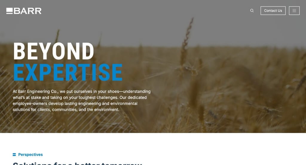
3. BARR
Why We Chose Barr Engineering
The website for Barr Engineering (barr.com) serves as a premier benchmark for “Human-Centric B2B Consulting Merchandising and High-Authority Environmental Storytelling.” For an employee-owned firm integrating complex engineering and environmental consulting solutions, the digital storefront must project deep technical capability while remaining grounded in collaborative partnerships. This platform masterfully succeeds by shifting away from cold, mechanical corporate layouts and placing internal expertise and field outcomes at the heart of the user experience.
Key Design Highlights:
- Cinematic Sector-Focused Hero Video Loop: The website establishes immediate real-world authority with a high-definition video sequence dominating the primary hero real estate. By flashing sweeping footage of active project sites across sectors like power, fuels, mining, and manufacturing, the media instantly captures the massive scale and environmental precision of their operations the moment the page loads.
- Internal Thought Leadership and Staff Testimony: A major structural highlight of the homepage is the inclusion of direct quotes from the firm’s engineers and specialists. Giving prominent real estate to the actual people executing the work underscores the authentic, relational advantages of their employee-owner model and highlights a deep corporate culture focused on sustainable, creative problem-solving.
- Outcome-Driven Project Portfolio Triage: Embedded smoothly into the core homepage scroll path is a gallery of past project images. Stripping away unnecessary text blocks, these visual panels showcase completed infrastructure and environmental restorations in the field, doubling as intuitive, zero-friction gateways that link directly to comprehensive, multi-disciplinary case studies.
- Sleek, High-Density Full-Screen Hamburger Navigation: To organize an expansive operational ecosystem spanning dozens of services and vertical industries, the desktop layout utilizes an impressive, oversized hamburger menu. When activated, it expands into a highly legible, spacious panel that partitions their services and insights cleanly – providing an effortless, rapid discovery pathway for corporate clients and prospective talent alike.
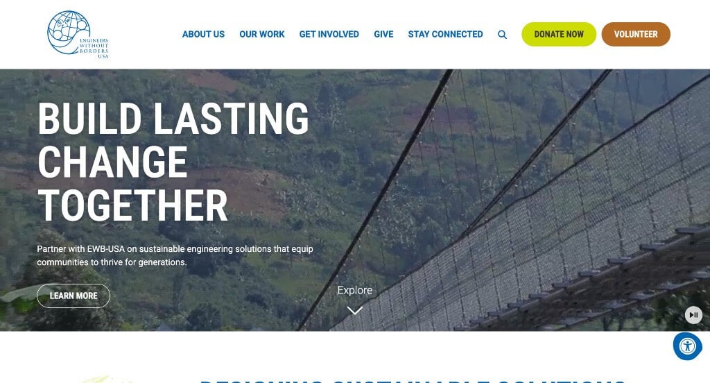
4. Engineers Without Borders
Why We Chose Engineers Without Borders USA (EWB-USA)
The website for Engineers Without Borders USA serves as a premier benchmark for “Impact-Driven Humanitarian Merchandising and High-Trust Non-Profit Conversion Architecture.” For an organization that connects highly skilled volunteer engineers with underserved global communities to build sustainable infrastructure, a digital presence must transcend standard charity layouts. This platform masterfully succeeds by treating its homepage as a dynamic bridge between clinical engineering precision and deeply human, community-led narrative building.
Key Design Highlights:
- Cinematic, Mission-Driven Hero Video Loop: The website opens with a powerful, high-definition video sequence that commands the primary hero real estate. By capturing raw, real-world footage of volunteers working alongside community members to construct bridges, drill clean water wells, and install renewable solar arrays, the media instantly validates the organization’s hands-on global impact the second the page loads.
- Deeply Authentic Front-Page Volunteer Testimony: Integrated smoothly into the primary homepage flow is a dedicated matrix of verified student and professional volunteer reviews. Showcasing honest feedback about the profound personal growth, technical writing skills, and rewarding real-world project management experienced in the field injects a commanding layer of peer-to-peer proof that drives immediate recruitment validation.
- Sleek, High-Density “Our Work” Mega Menu Architecture: To neatly organize an massive humanitarian ecosystem – encompassing diverse technical sectors (WASH, civil works, structures, energy) and various volunteer pathways – the desktop layout relies on a gorgeous mega menu. The dropdown breaks down structural divisions and geographic programs into clean, highly legible columns, providing frictionless navigation for donors, communities, and chapter leaders alike.
- Editorial “News and Stories” Thought Leadership Hub: Positioned cleanly within the homepage scroll path is a curated feature section for their blog and field dispatches. Spotlighting timely field updates, conference breakthroughs, and technical engineering insights elevates the platform from a basic donation portal into an authoritative, community-driven resource center for global development and climate resilience.
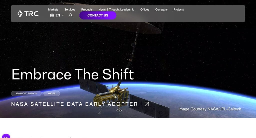
5. TRC
Why We Chose TRC Companies
The website for TRC Companies (trccompanies.com) serves as a premier benchmark for “Data-Driven Infrastructure Merchandising and High-Scale Enterprise Authority Architecture.” For a massive global firm specializing in engineering, environmental consulting, and construction management solutions, the digital storefront must communicate immense technical scale without overwhelming the user. This platform masterfully succeeds by organizing its homepage into a linear, performance-backed narrative that seamlessly pairs comprehensive capability directories with concrete, quantified real-world results.
Key Design Highlights:
- Highly Structured “Markets We Serve” Sector Index: A major architectural triumph of the homepage layout is the dedicated “Markets We Serve” directory. By explicitly mapping out their deep institutional familiarity with diverse commercial sectors – such as power and utilities, transportation, real estate, and government infrastructure – the interface allows enterprise clients to immediately self-identify and validate the firm’s niche regulatory expertise.
- Objective “Our Numbers” Quantified Results Engine: Positioned prominently on the front page is a high-visibility, data-driven section titled “Our Numbers.” By translating decades of corporate operational growth into clean, bold statistical milestones – such as total completed projects, staff count, and geographic footprint – the interface injects a powerful layer of immediate, undeniable institutional capability right into the discovery path.
- Comprehensive Service and Capability Directory: The homepage features a beautifully organized and concise listing of their primary engineering and consulting offerings. By breaking down incredibly complex workflows – such as digital grid modernization, environmental remediation, and sustainable infrastructure design – into clear, bite-sized descriptive blocks, the interface allows busy decision-makers to rapidly assess the firm’s operational fit.
- Outcome-Driven “Our Work” Project Case Triage: Integrated smoothly into the lower homepage scroll path is a gallery showcasing their past projects. Stripping away heavy text walls, these visual panels spotlight completed real-world infrastructure and environmental feats in the field, doubling as zero-friction gateways that link directly to comprehensive, multi-disciplinary case studies.

6. GHT Limited
Why We Chose GHT Limited
The website for GHT Limited (ghtltd.com) serves as a premier benchmark for “Human-Centric MEP Merchandising and High-Impact Full-Screen Desktop Navigation.” For a leading mechanical, electrical, and plumbing (MEP) engineering firm shaping corporate interiors and high-performance buildings, the digital storefront must mirror the spatial layout and structural precision of their designs. This platform masterfully succeeds by treating its homepage as a clean, highly modern showroom that effortlessly balances structural project showcases with a vibrant, culture-first brand identity.
Key Design Highlights:
- Immersive Full-Screen Hamburger Navigation Engine: A standout architectural highlight of the desktop experience is the sleek, sticky hamburger menu button. When clicked, it smoothly expands into an ultra-clean, full-screen overlay menu. This design choice removes cluttered header navigation from the main scroll path, while providing desktop users with an organized, highly spacious directory to dive deeper into services, leadership, or career pathways.
- Prominent, High-Contrast “Latest Projects” Gallery: Strategically anchored in a primary position on the homepage is a high-visibility showcase dedicated to their newest architectural achievements. By placing their real-world structural triumphs front and center using large-scale, razor-sharp imagery, the interface immediately builds heavy commercial credibility and validates their engineering capability the moment a user begins to scroll.
- Culture-Driven Internal Team Testimony: Breaking away from the dry, purely technical tone common in traditional engineering firms, the homepage seamlessly incorporates direct quotes from active team members. Highlighting genuine employee enthusiasm about the company’s progressive culture and innovative design environment injects an authentic human element, making the firm highly attractive to both high-tier corporate clients and top-tier incoming talent.
- Ultra-Clean Mobile View and Adaptive Layout Continuity: Translating a dense portfolio of commercial engineering feats onto smaller screens is flawlessly managed through an exceptionally clean mobile framework. The responsive smartphone layout ensures that heavy image grids, typography scales, and structural elements stack beautifully into a single, intuitive vertical path, keeping touch interaction completely natural on the go.
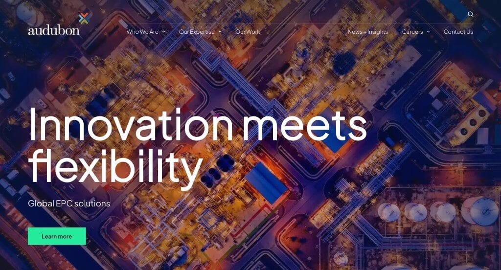
7. Audubon Companies
Why We Chose Audubon Companies
The website for Audubon Companies (auduboncompanies.com) serves as a premier benchmark for “Enterprise Engineering Merchandising and High-Authority Sector Navigation.” For a leading provider of engineering, procurement, fabrication, and construction (EPFC) services across the energy, power, and infrastructure industries, the digital storefront must communicate deep technical capability and immense operational scale. This platform masterfully succeeds by organizing its layout into highly structured pathways that allow industrial clients and asset owners to instantly map the firm’s technical solutions to their specific operational needs.
Key Design Highlights:
- High-Density “Our Expertise” Mega Menu Architecture: The centerpiece of the platform’s desktop navigation is a robust, beautifully organized “Our Expertise” mega menu. Instead of listing complex operational capabilities in long, confusing dropdown text strings, the interface partitions their deep engineering disciplines, technical specializations, and service lines into clean, highly legible columns, creating a rapid, frictionless path to targeted deep-site information.
- Highly Segmented “Industries We Serve” Sector Index: A major structural highlight of the homepage layout is the dedicated “Industries We Serve” directory. By explicitly organizing their deep corporate familiarity with distinct commercial sectors – such as oil and gas, petrochemicals, renewables, power generation, and pipeline transmission – the interface allows enterprise stakeholders to immediately self-identify and validate the firm’s niche regulatory and engineering background.
- Comprehensive “Services We Offer” Functional Framework: Rather than relying on vague corporate summaries, the homepage features a dedicated section that breaks down their core engineering offerings. Outlining specialized workflows – including conceptual design, project management, procurement logistics, and automation engineering – into clear, digestible information blocks allows busy operators to quickly assess how the firm fits their exact project scale.
- Sleek, Professional Grid Flow and Information Density: The platform balances heavy technical information with a modern corporate layout, ensuring that the visual interface feels clean and authoritative rather than overwhelming. High-contrast typography and thoughtful spacing keep the operational details scannable, letting the firm’s specialized capabilities stand at the absolute center of the user journey.
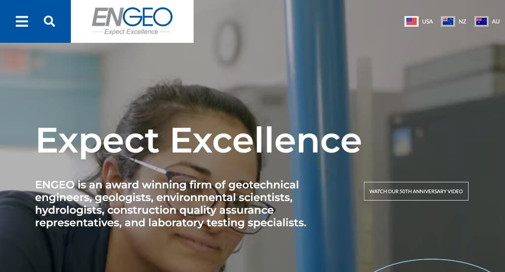
8. ENGEO
Why We Chose ENGEO
The website for ENGEO serves as a premier benchmark for “Geotechnical Authority Merchandising and High-Density Navigational Architecture.” For an award-winning global engineering firm specializing in geotechnical, environmental, and water resources engineering, the digital storefront must communicate immense geological precision and cross-continental operational scale. This platform masterfully succeeds by balancing rich, site-specific motion media with robust technical directories and highly unified connectivity networks that streamline their massive global footprint.
Key Design Highlights:
- Cinematic, Field-Force Hero Video Loop: The website establishes immediate real-world authority with a sweeping, high-fidelity video sequence dominating the primary hero real estate. By flashing continuous footage of massive infrastructure projects, precision geological testing, structural grading, and drone-captured field operations, the media instantly captures the massive scale and multi-disciplinary impact of their engineering work the exact second the page loads.
- Comprehensive Front-Page Service Outline: The homepage completely avoids vague corporate descriptions, choosing instead to clearly map out its primary engineering services in highly structured, digestible blocks. Outlining their core pillars – such as geotechnical design, environmental monitoring, hydrologic modeling, and construction testing – allows developers and municipal partners to rapidly assess the firm’s technical capabilities.
- Expansive Desktop Hamburger Navigation Engine: To elegantly organize an enormous operational ecosystem spanning dozens of international offices, specialized technical service lines, and deep-site case studies, the desktop layout utilizes an impressive, oversized hamburger menu. When activated, it expands into a full-bleed, beautifully spaced directory that partitions their corporate insights, career pathways, and services into highly legible columns for an effortless discovery path.
- Omnichannel Ecosystem Social Footer: Anchoring the conclusion of the homepage journey is a robust, well-organized social footer matrix housing clean, direct links to all of their active social media platforms. By compiling their channels – including LinkedIn, Instagram, Facebook, and YouTube – into a unified footer segment, the interface seamlessly bridges the gap between formal corporate engineering and dynamic, cultural storytelling, letting prospective clients and top-tier engineering talent connect deeply with the brand across the web.
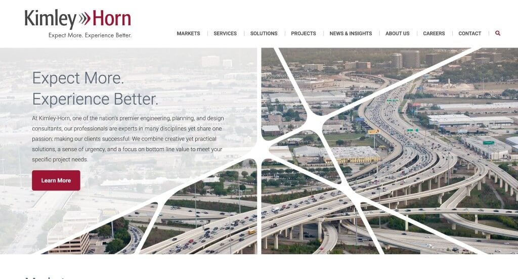
9. Kimley Horn
Why We Chose Kimley-Horn
The website for Kimley-Horn serves as a premier benchmark for “High-Velocity Infrastructure Merchandising and High-Fidelity Responsive Design.” As one of the nation’s premier engineering, planning, and environmental consulting firms, their digital storefront must project immense corporate capability and multidisciplinary mastery while remaining sleek and highly approachable. This platform masterfully succeeds by pairing dynamic asset frameworks with crisp navigation systems that preserve a premium, fast-loading user experience across all devices.
Key Design Highlights:
- Hybrid Motion-and-Image Hero Canvas: The website opens with a compelling, high-fidelity media assembly dominating the primary hero real estate. By blending active video loops with striking project imagery, the interface immediately showcases the sheer scale and diverse impact of their structural, transit, and environmental projects the exact second the page loads.
- Interactive Dynamic Project Slider Engine: Positioned smoothly further down the homepage is a beautifully integrated, fluid project slider. This interactive showcase allows developers, municipal partners, and prospective talent to cycle through premium cards of completed works, maximizing the exposure of their extensive nationwide portfolio without cluttering the page layout or overwhelming the viewer with dense text blocks.
- Persistent Frictionless Sticky Header: To maintain fluid, zero-friction site navigation across a deep corporate ecosystem, the desktop layout utilizes a beautifully engineered sticky header. As users scroll deep into the homepage content, the primary navigation bar pins elegantly to the top of the viewport, ensuring that critical service directories, career paths, and contact gates remain instantly accessible at any moment.
- Ultra-Clean Mobile Layout and Fluid Ergonomics: Translating an enterprise engineering portfolio onto smaller devices is expertly managed through a highly polished responsive framework. The mobile viewport cleanly stacks multi-column grids, balances text scaling, and preserves the fast, intuitive scrolling behavior required for modern, time-conscious business executives browsing on the move.
WordPress Engineering Themes
You can find free themes at wordpress.org or explore engineering-inspired templates at ThemeForest.
Fabrica – Themeforest
$69
Nortech – Themeforest
$59
Industrial – Themeforest
$49
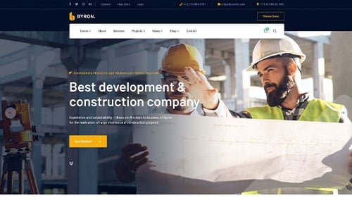
Byron – Themeforest
$59