In the dental and orthodontic industry, your website is the digital front door to your practice. Before a patient ever sits in your chair, they use your online presence to evaluate your level of care, your technology, and your professionalism. In a competitive local market, your design must communicate clinical excellence, patient comfort, and modern innovation.
Our design team analyzed hundreds of dental websites – from boutique general practices and pediatric specialists to high-end periodontic and orthodontic clinics. We evaluated these sites based on mobile-first appointment scheduling, the use of high-quality “real” office photography, and clear communication of insurance and financing options.
Whether you are a solo practitioner or managing a multi-location dental group, these 11 examples represent the gold standard for dental web design in 2026.
Note on Our Selection Process: We recently audited this guide to remove outdated designs and sites that no longer meet our performance standards. This curated list now focuses on the top 11 dental websites providing the most strategic value in 2026.
Top Dentist Website Designs
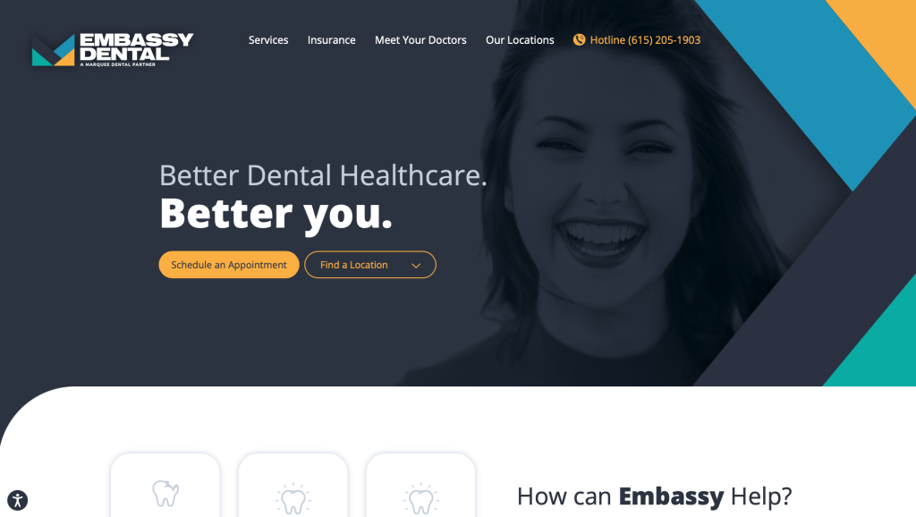
1. Embassy Dental
Why We Chose Embassy Dental
The Embassy Dental website stands out as a prime example of “Accessible Clinical Information Design and Local Patient Conversion.” Dental practices often struggle to present their full suite of general, cosmetic, and specialty services without overcomplicating the interface. This platform solves that problem by matching clean typography with a logical, stress-free path to book an appointment right on the home page.
Key Design Highlights:
- Polished and Scannable Menus: The main navigation features a beautifully styled and well-laid-out services menu. Instead of presenting a crowded drop-down list of clinical jargon, the interface organizes their treatments into intuitive categories (such as preventative, restorative, and cosmetic care) that let users browse with ease.
- Direct Structural Service Grid: Their primary dental services are clearly outlined on the home page immediately below the hero area. Displaying these options upfront quickly confirms the clinic’s core capabilities – such as teeth cleanings, crowns, implants, or emergency dentistry – allowing fast-skimming property owners to verify the care they need in seconds.
- Frictionless Intake Closure: Positioned strategically above the footer on the home page is a clean, structured contact and appointment request form. Placing this lead-capture module at the natural termination point of the user’s scroll ensures that as patients finish reading about the practice, they can seamlessly input their details without having to navigate back to a separate page.
- Authentic Local Peer Proof: Real-world customer testimonials are integrated smoothly onto the home page. Showcasing verified stories of gentle cleanings, accommodating schedulers, and transparent pricing anchors Embassy Dental’s marketing claims with trustworthy social proof right before the final booking form.
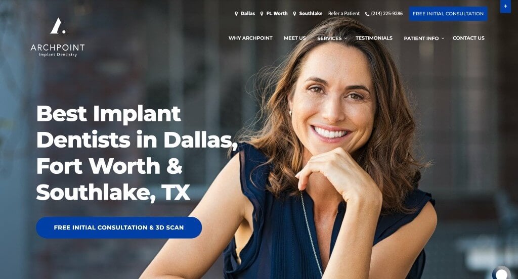
2. ArchPoint Dental
Why We Chose ARCHPOINT Implant Dentistry
The ARCHPOINT Implant Dentistry website is an outstanding case study in “Specialized Clinical Authority and Comparative Trust Modeling.” High-value, complex surgical procedures like full-mouth dental reconstructions require an elevated level of patient education and psychological safety. This platform successfully navigates consumer skepticism by replacing generic dental claims with rigorous operational proof and highly visual client outcomes directly on the home page.
Key Design Highlights:
- Specialized Competitive Matrix: The section titled “Why ARCHPOINT Implant Dentistry?” utilizes an clear, point-by-point comparison grid against standard dental providers. By directly contrasting their centralized multi-specialist care, on-site laboratory, and accelerated healing techniques (like Platelet-Rich Fibrin) with the outsourced labs and fragmented multiple-office referrals of other clinics, the brand builds an uncompromised case for operational efficiency.
- Meticulous Architectural Advantages: A detailed value section on the home page explicitly maps out what makes the practice stand out from standard cosmetic operations. Highlighting structural assets – such as an all-in-one location housing both oral surgeons and prosthodontists, advanced 3D digital precision mapping, an on-site master lab, and a lifetime implant warranty – justifies premium pricing through unmatched capability.
- Dual-Proof Visual Testimonials: Moving beyond standard text-only reviews, the home page testimonial section integrates high-resolution before and after clinical photography seamlessly into the patient experience. Showing side-by-side smile transformations alongside emotional personal accounts transforms a technical surgical procedure into life-altering personal proof.
- Humanizing Elite Multi-Specialist Roster: To reinforce clinical safety before a patient schedules an intake consultation, the home page showcases high-quality dentistry staff pictures and professional credentials. Displaying senior board-certified Oral and Maxillofacial Surgeons and Prosthodontists gives regional patients direct visibility into the exact elite clinical minds managing their surgical care.
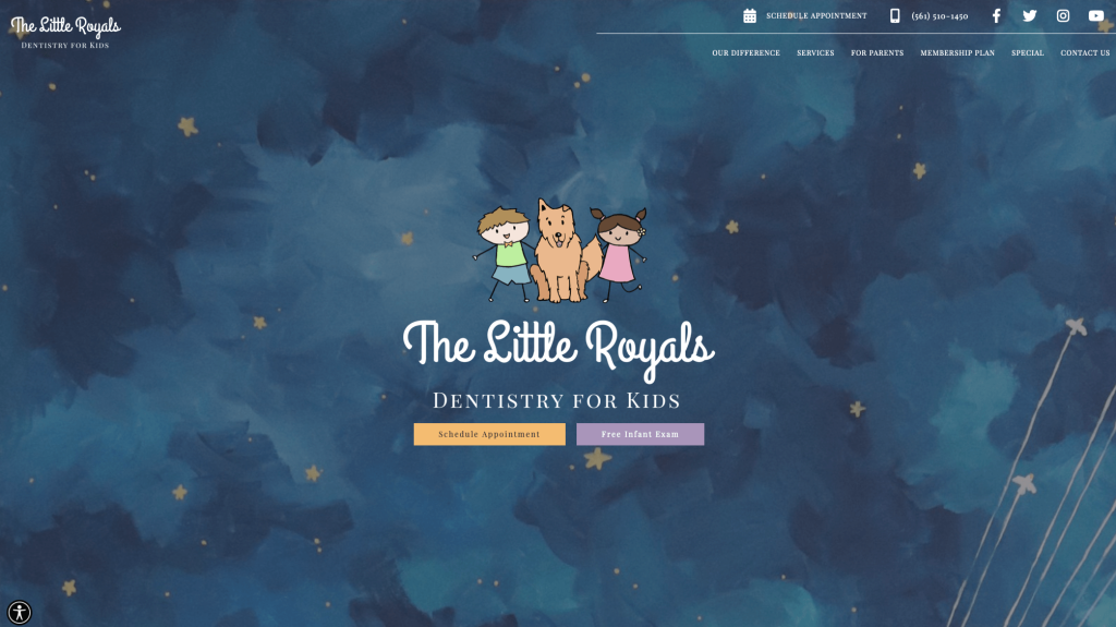
3. Little Royals Dentistry
Why We Chose The Little Royals Dentistry for Kids
The Little Royals Dentistry for Kids Click to open side panel for more information features a web platform that stands out as a masterpiece in “Immersive Theme Branding and High-Comfort Pediatric Onboarding.” Medical and dental anxiety is incredibly common among children. This website directly counters that fear by trading clinical, sterile visuals for an imaginative, storybook atmosphere from the exact moment a parent and child land on the page.
Key Design Highlights:
- Immersive Storybook Aesthetics: At first look, the site’s design feels heavily inspired by the whimsical aesthetic of “The Little Prince” book and movie theme. Featuring a deep starry-sky background, soft pastel celestial planets, and delicate shooting stars that occasionally glance across the hero area, the layout immediately triggers a sense of magical wonder rather than medical dread.
- Aggressive Utility Navigation Top-Bar: To ensure operational efficiency matches the beautiful design, the header top bar serves as a centralized hub for high-intent actions. It features dedicated, highly visible tap-targets allowing busy parents to instantly schedule an appointment, launch a direct phone call, or check out their social media channels for practice updates.
- Transparent Pediatric Service Architecture: Their core preventive and specialized treatments are clearly explained on the home page below the main banner. By categorizing their clinical offerings into gentle, child-friendly descriptions – such as regular cleanings, tongue-tie releases, laser dentistry, and infant exams – parents can verify the team’s custom qualifications in a glance.
- Relatable Community Validation Loop: Authentic customer testimonials are integrated smoothly onto the home page. Highlighting real-world stories from local parents who praise the team’s endless patience, gentle demeanor, and ability to make children excited about visiting the dentist reinforces the practice’s unique comforting atmosphere.
4. Kingstowne Dentist
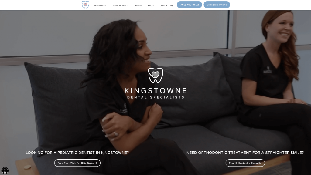
Why We Chose Kingstowne Dental Specialists
The Kingstowne Dental Specialists website serves as an excellent case study for “Frictionless Intake Design and Relatable Practice Onboarding.” Medical and dental websites often struggle to balance administrative data with a comforting user experience. This platform successfully avoids information barriers by placing essential patient scheduling links and welcoming visual highlights directly on the home page.
Key Design Highlights:
- Immediate High-Comfort Visuals: The main hero area features a high-quality video loop showing real staff members and patients interacting in an open, welcoming environment. Moving past static, cold dental equipment photography immediately humanizes the clinical space and lowers dental anxiety from the very first interaction.
- Persistent Header Action Targets: To capture high-intent patients looking to secure care quickly, the top header incorporates a clear “Schedule Online” button paired with a distinct corporate phone number. Keeping these intake hooks locked at the top ensures that busy clients can book or call within seconds without hunting through deeper submenus.
- Centralized Digital Foothold: A dedicated home page section showcases high-resolution imagery of their state-of-the-art office interior alongside photos of the actual practitioners who work there. Introducing the dental staff and the physical care space upfront helps local families form a personal connection with the practice before booking an intake session.
- All-In-One Administrative Closure: Positioned strategically above the footer is a comprehensive contact block featuring an interactive appointment request form. Bundling their operational hours, secure email link, direct telephone lines, and precise street address into a single footer module provides a convenient, low-friction endpoint for the user’s scroll.
5. Cox Bond Dental
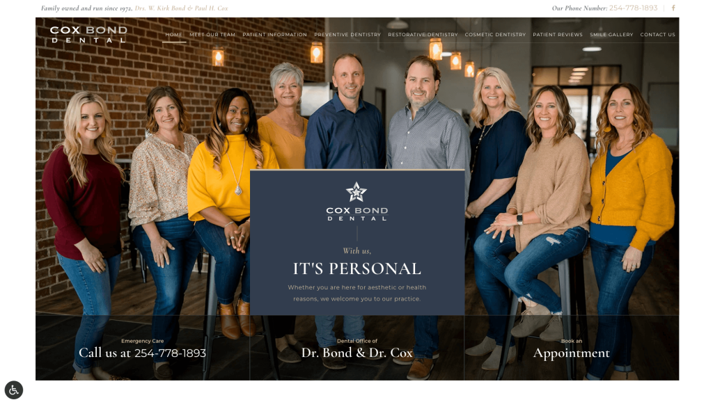
Why We Chose Cox Bond Dental
The Cox Bond Dental website serves as a premier benchmark for “Humanized Authority and Simplified Clinical Choice.” Medical and dental platforms frequently overwhelm patients with dense clinical definitions. This site completely avoids that friction by prioritizing immediate personal connection and structuring treatment paths right on the home page.
Key Design Highlights:
- Humanizing Team-First Hero Banner: The main hero area features a high-quality, welcoming group portrait of the actual dentists and clinical staff. Showcasing the genuine local team upfront – rather than relying on sterile, corporate dental stock imagery – immediately builds psychological comfort and lowers patient anxiety the moment they arrive.
- Streamlined Procedural Triaging: The “Featured Procedures” section organizes their primary treatment lines directly on the home page. Breaking down their clinical capabilities into distinct, approachable pathways (such as preventive maintenance, cosmetic dentistry, and advanced restorative care) allows fast-skimming patients to qualify their dental needs in a glance.
- High-Impact Peer Validation: Moving past small, easy-to-miss review carousels, the home page features a prominently displayed, large-format client testimonial block. Giving deep visual weight to an authentic, long-form patient story creates a compelling emotional anchor that validates the practice’s standard of care.
- Authoritative Practitioner Introductions: A dedicated “Meet Our Doctors” directory introduces the individual dentists managing client health. Providing real professional snapshots and a look at their backgrounds establishes strong clinical credibility before a new patient ever books an intake consultation.

6. Smile & Company
Why We Chose Smile & Company
The Smile & Company website stands out as a premier case study in “Dynamic Kinetic Branding and High-Empathy Patient Onboarding.” Dental care often triggers high consumer anxiety. This platform directly counters that friction by abandoning clinical, static layouts in favor of an immersive, interactive experience that prioritizes human connection from the exact moment a user lands on the page.
Key Design Highlights:
- Immersive Full-Screen Vertical Page Flipping: The home page utilizes a unique full-window vertical scroll mechanism that completely switches the visual landscape and color palette on each scroll action. This fluid transition framework creates a modern narrative flow, keeping the user engaged while systematically delivering key practice pillars without standard page clutter.
- On-Demand Virtual Intake Entry: The top header features a high-visibility, primary call-to-action button for a virtual consultation. Providing a remote, low-pressure digital onboarding option directly accommodates modern consumer habits, letting hesitant or busy patients initiate a smile assessment from the comfort of home.
- Kinetic Practice and Interaction Proof: The main hero banner incorporates a high-definition video loop showing their beautifully designed boutique office environment alongside real, positive client-staff interactions. Visually leading with relaxed, smiling faces and a warm, inviting space humanizes the clinical team and lowers dental dread instantly.
- Core Value Anchoring: The messaging across the home page intentionally emphasizes trust, kindness, and compassion. Front-loading these human values over technical dental jargon establishes a strong emotional baseline for the patient-provider relationship, reinforcing that the practice prioritizes psychological comfort as much as clinical expertise.
- Frictionless Geographic Distribution: Strategic regional operations and center details are cleanly mapped out directly above the footer. Placing this location block at the natural endpoint of the vertical scroll path allows well-informed users to instantly confirm their nearest clinic and transition directly into the appointment funnel.
7. Del Mar Dental Studio
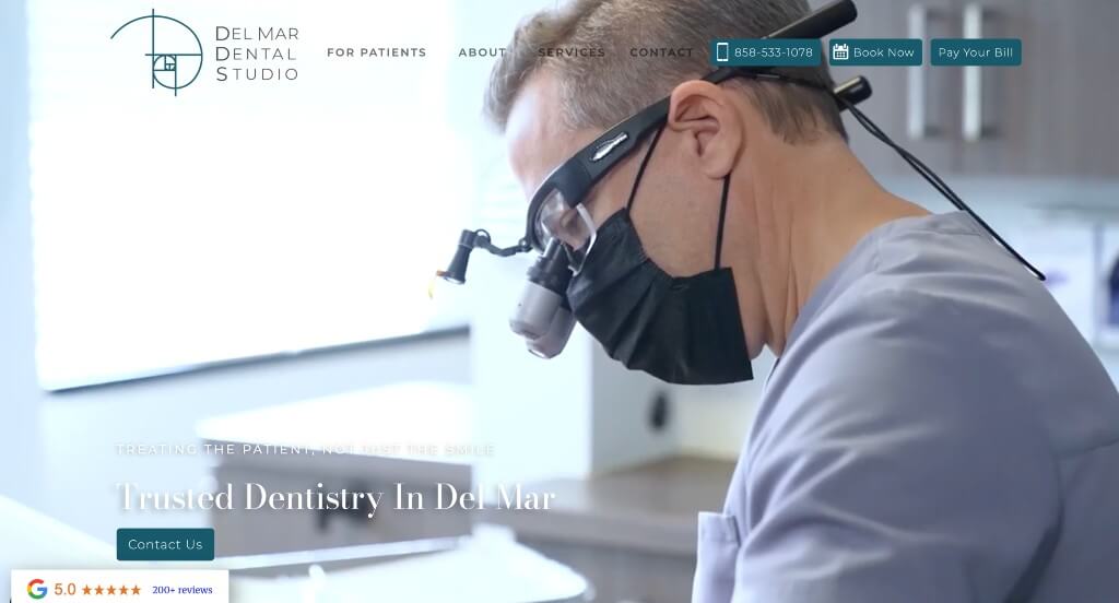
Why We Chose Del Mar Dental Studio
The Del Mar Dental Studio website serves as a premier benchmark for “Immersive Spatial Transparency and Credibility Grouping.” Dental procedures frequently cause hesitation and anxiety among patients. This platform directly lowers those digital barriers by combining transparent video tours, multi-layered peer validation, and detailed doctor introductions directly on the home page.
Key Design Highlights:
- Kinetic Practice and Interaction Proof: The main hero area incorporates a high-definition video loop showcasing their actual boutique office environment and real, comfortable patient-staff interactions. Visually leading with relaxed smiles and a warm, inviting clinical space humanizes the care team and lowers dental anxiety from the exact second a user lands on the page.
- Dual-Layered Reputation Anchoring: The homepage utilizes an exceptional two-part social proof system. An immediate, high-visibility Google rating badge is locked into a sticky bottom-left corner overlay to capture attention above the fold, while exhaustive, long-form text reviews are showcased further down the page to build deep peer validation as the user scrolls.
- Organized Procedural Triaging: Their core preventive, cosmetic, and restorative services are clearly outlined on the home page. Breaking down their clinical capabilities into distinct, approachable pathways allows fast-skimming patients to qualify their dental needs and discover specialized treatments without clicking deep into submenus.
- Authoritative Practitioner Bios: A dedicated home page section introduces the individual dentists managing client care, featuring crisp professional portrait pictures and comprehensive clinical biographies. Introducing the doctors’ backgrounds and care philosophies upfront establishes strong medical credibility before a new patient ever initiates a booking.
8. Tend
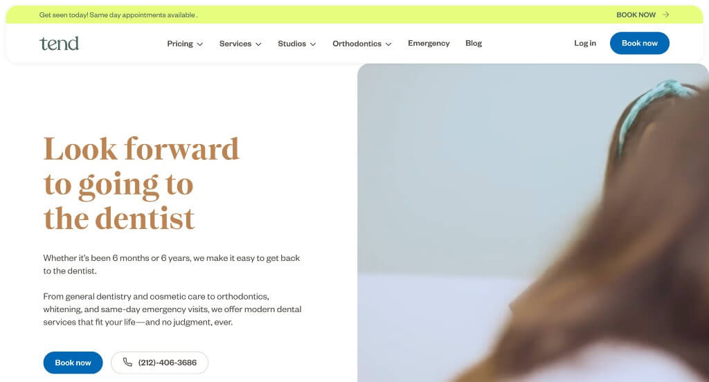
Why We Chose Tend
The Tend website stands out as a premier case study in “Modern Consumerization and Low-Anxiety Healthcare Branding.” Traditional dental platforms often feel cold, clinical, and intimidating. Tend completely flips this narrative by positioning dental care as a premium wellness and lifestyle experience, using transparent differentiation and clean, modern layouts directly on the home page.
Key Design Highlights:
- Value-Driven Value Proposition: The dedicated section titled “The Tend Dental difference” outlines exactly why you should choose them. By addressing common industry pain points upfront – such as promising transparent pricing with no hidden fees, state-of-the-art painless technology, and a soothing environment where patients can watch Netflix during procedures – the brand creates an uncompromised case for customer comfort.
- Frictionless Geographic Onboarding: Their clinical network and locations are clearly outlined on the home page. Grouping their boutique studios cleanly by major metropolitan hubs allows urban professionals to instantly verify local studio availability and jump directly into the booking funnel.
- Social Proof Integration: Authentic reviews from real patients are integrated smoothly into the home page layout. Showcasing verified feedback that highlights comfortable cleanings, friendly hygienists, and beautiful office aesthetics validates their core promise of redefining the standard dental visit.
- Authoritative Lifestyle Resource Hub: A well-maintained dental wellness blog is featured prominently lower on the home page. Sharing fresh, actionable educational content – ranging from preventative oral health routines to aesthetic care tips – seamlessly transitions the platform from a basic transactional booking tool into a trusted everyday wellness authority.
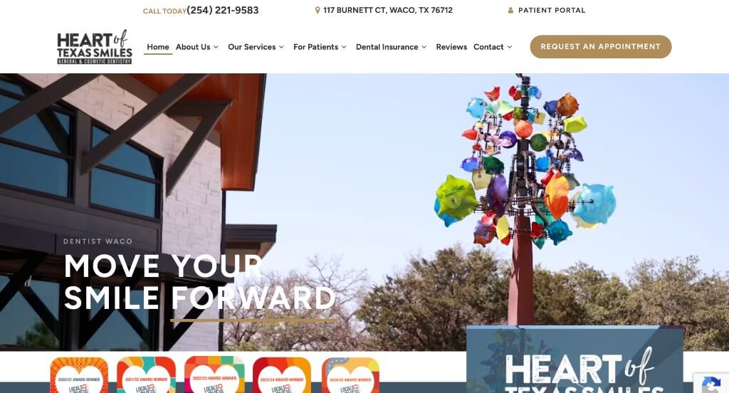
9. Heart of Texas Smiles
Why We Chose Waco Family Dental
The Waco Family Dental website stands out as a premier benchmark for “Community-Centric Trust Modeling and High-Transparency Onboarding.” In a medical sector where patient anxiety is exceptionally common, this dental platform successfully removes psychological barriers by layering modern visual evidence with an aggressive, multi-tiered local reputation system right on the home page.
Key Design Highlights:
- Kinetic Practice and Interaction Proof: The main hero area incorporates a high-definition video loop showcasing their actual modern office interior, advanced clinical tools, and genuine, relaxed patient-staff interactions. Visually leading with a welcoming atmosphere humanizes the team and lowers dental dread from the exact second a user lands on the page.
- Continuous Regional Validation: The home page proudly displays a sequential line of local community awards spanning from 2020 through to the present time, emphasizing that “Locals Love Us.” Showcasing back-to-back annual accolades proves a long-standing, consistent track record of exceptional regional care.
- Strategic Narrative Social Proof: Rather than relying entirely on standard, uncontextualized review widgets, the platform features a dedicated, engaging copy block titled “Where Did All Those Stars Come From?” This section connects their aggregate star ratings to precise clinical pillars – such as gentle cleanings, scheduling flexibility, and compassionate emergency care – making their high ratings highly educational.
- Direct Multi-Platform Peer Proof: Augmenting their community narrative, real-world Google reviews are integrated smoothly lower on the home page. Displaying unedited, high-star feedback from local families provides the final layer of peer validation necessary to convert casual browsing traffic into active appointment requests.
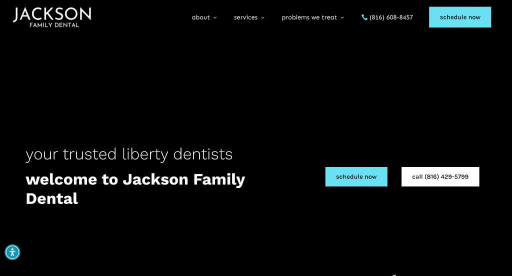
10. Jackson Family Dental
Why We Chose Jackson Family Dental
The Jackson Family Dental website serves as a premier benchmark for “Immersive Transparency and Patient Self-Triaging.” In a clinical market where dental anxiety is a significant hurdle to patient onboarding, this platform removes psychological barriers by layering dynamic visual proof with comprehensive educational infrastructure right on the home page.
Key Design Highlights:
- Kinetic Practice and Facility Verification: The main hero area incorporates a high-definition video loop showcasing their actual practitioners, state-of-the-art operatory tools, and real, comfortable patient-staff interactions. Visually leading with a warm, inviting clinical atmosphere humanizes the team and mitigates dental dread from the exact second a user lands on the page.
- Granular Procedural Mapping: The “Our Expertise” section comprehensively outlines their clinical capabilities directly on the home page. Organizing their services into distinct, readable tracks allows fast-skimming property owners to immediately qualify their dental needs and verify the team’s specialized qualifications without clicking deep into submenus.
- Proactive Friction Relief Directory: A detailed FAQ directory is positioned strategically on the home page, directly tackling high-anxiety patient concerns. Offering clear, bite-sized answers regarding treatments, preventative schedules, and clinical protocols resolves lingering user hesitation before the formal intake process begins.
- Authentic Social Proof Anchor: Real-world peer validation is prioritized through a prominently featured client testimonial block on the home page. Elevating a long-form patient narrative of compassionate care and professional service anchors the practice’s marketing claims with authentic, trustworthy community validation.
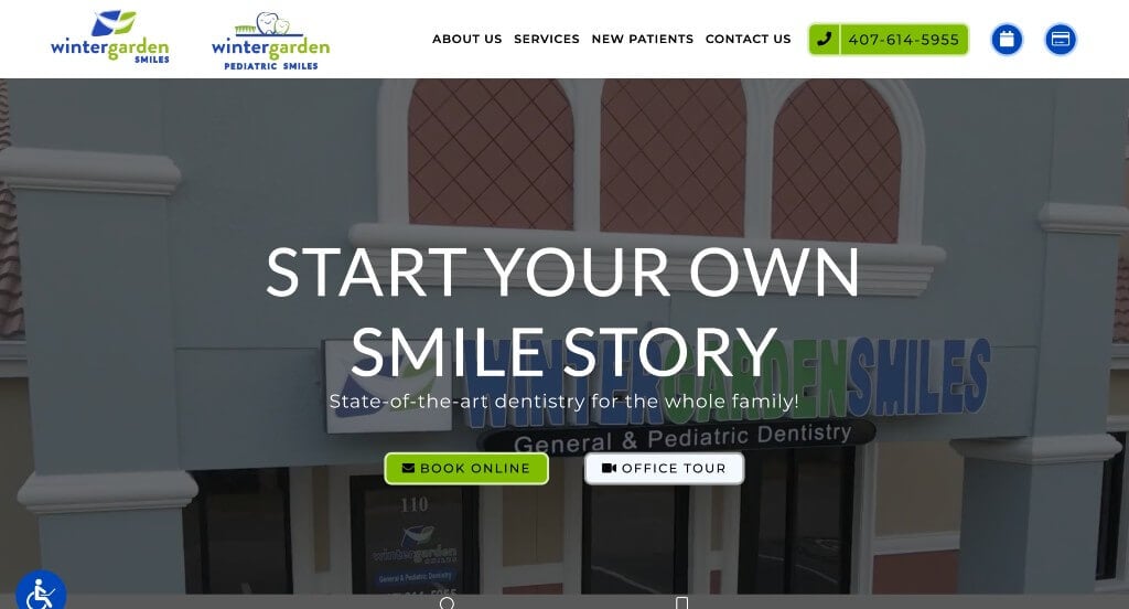
11. Winter Garden Smiles
Why We Chose Winter Garden Smiles
The Winter Garden Smiles website stands out as a premier example of “Persistent Navigation Utility and Multi-Channel Intake Optimization.” Dental emergencies and appointment scheduling often happen on the go, requiring high levels of immediate accessibility. This platform addresses that need by placing direct communication anchors and multiple touchpoints seamlessly across its layout.
Key Design Highlights:
- Frictionless Sticky Footer Utility: A standout feature of the site is its persistent, sticky footer. This conversion bar stays locked to the bottom of the viewport as users scroll, giving immediate mobile and desktop access to one-click driving directions or direct phone lines without forcing patients to hunt for a contact page.
- Continuous Onboarding Touchpoints: High-intent options to schedule an appointment or get in touch are strategically placed throughout the home page. Distributing these call-to-action hooks between text blocks captures user interest at multiple reading depths, streamlining the intake path for both new and returning families.
- Structured Procedural Breakdowns: Their primary pediatric, cosmetic, and general dental services are clearly explained on the home page. Categorizing their treatments into intuitive, readable modules allows fast-skimming patients to qualify their dental needs and discover specialized options in a glance.
- Authentic Social Proof Integration: Real-world customer testimonials are built smoothly onto the home page layout. Showcasing verified reviews from local patients who praise the staff’s gentle care, welcoming environment, and professional treatment plans adds a layer of community confirmation right alongside the service offerings.
WordPress Dental Themes
You can find free themes at wordpress.org, or explore dental-inspired templates at ThemeForest.
DentiCare – Themeforest
$69
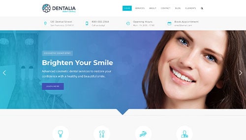
Dentalia – Themeforest
$69
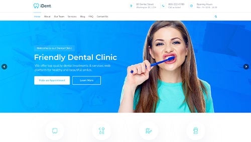
iDent – Themeforest
$59
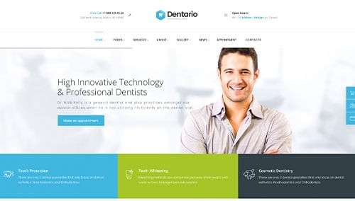
Dentario – Themeforest
$69