In the landscaping industry, your website is your digital showroom. Before a client ever requests an on-site estimate, they use your online presence to judge the quality of your craftsmanship, the scale of your projects, and the professionalism of your crew.
A high-performing landscaping website must do more than just list services – it must use high-impact imagery and intuitive galleries to help property owners visualize their own outdoor transformations. Our team analyzed hundreds of sites across the green industry to identify the top 10 examples that masterfully balance stunning visual portfolios with the lead-generation tools needed to grow a business.
From luxury hardscaping and irrigation specialists to commercial lawn care and snow removal firms, these designs set the standard for the industry in 2026.
Note on Our Selection Process: We recently audited this guide to remove outdated designs and sites that no longer meet our performance standards. This curated list now focuses on the top 10 landscaping websites providing the most strategic value in 2026.
The Top Landscaping Website Designs
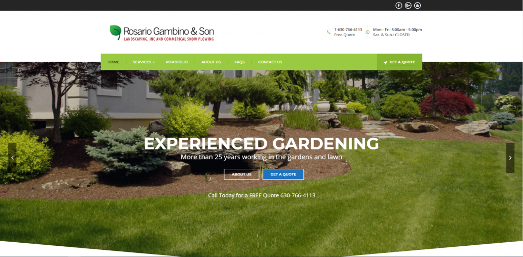
1. Rosario Gambino & Son
Why We Chose RGS Landscaping
The RGS Landscaping website is a masterclass in minimalist, high-conversion design. By stripping away “fluff” and focusing on a clean, professional aesthetic, the site allows their work to take center stage while making it incredibly easy for a potential client to move from browsing to requesting an estimate.
Key Design Highlights:
- Clean, No-Fluff Layout: The site utilizes a streamlined and modern design that avoids visual clutter. This “breathable” layout ensures that the user’s attention is directed toward the most important elements – the project photos and the calls to action – creating a premium feel that reflects the precision of their landscaping work.
- High-Visibility Contact Access: By placing the phone number directly in the header, the company ensures that users never have to go searching for a way to get in touch. This is a critical “ease-of-use” feature that caters to customers who are ready to talk to a professional immediately.
- Double-Point Quote Access: The site features a “Get a Quote” button both in the main navigation and the hero area. This dual-placement strategy ensures that the primary goal of the website – generating leads – is always front and center, regardless of how the user interacts with the page.
- Interactive “Why Choose Us” Accordion: The homepage includes an expandable FAQ-style section that outlines their value proposition. This interactive feature allows the site to provide detailed reasons for their superiority without cluttering the page with a wall of text, letting the user engage with the information at their own pace.
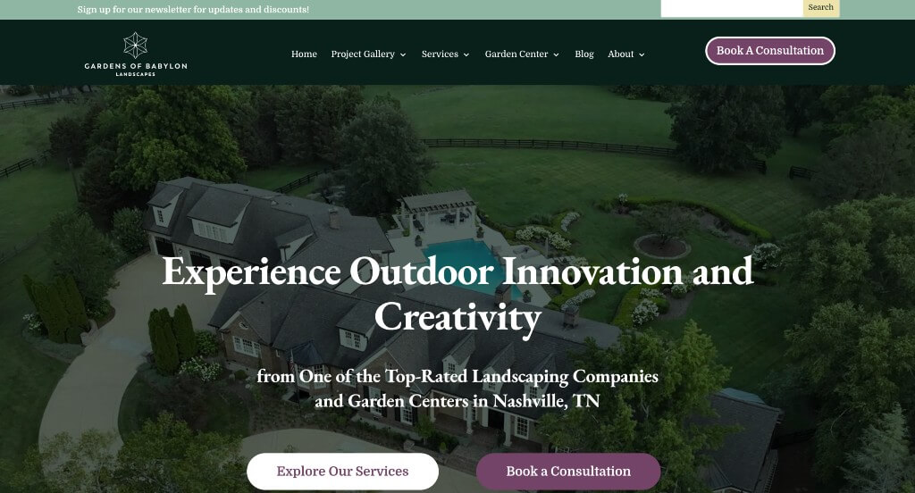
2. Gardens of Babylon
Why We Chose Gardens of Babylon
The Gardens of Babylon website expertly blends organic aesthetic with high-utility conversion tools. By combining a lush, nature-focused design with very clear pathways for scheduling, they successfully bridge the gap between “inspirational browsing” and “active project planning.”
Key Design Highlights:
- Dual-Path Hero Conversion: The hero section is engineered for speed, featuring two prominent “Book a Consult” buttons alongside easily accessible phone numbers above the fold. This ensures that whether a user is looking for a digital or phone-based connection, the solution is visible the moment the page loads.
- Localized Visual Inspiration: The site features a charming project slider showcasing photography from local landscapes they’ve transformed. By focusing on regional work, they provide relatable social proof that helps potential clients visualize how the company’s style would fit into their own local environment.
- Icon-Driven Service Architecture: The homepage utilizes elegant service tiles paired with custom iconography to categorize their diverse offerings. This visual shorthand makes the site easy to navigate at a glance, allowing users to quickly distinguish between landscaping, maintenance, and retail services.
- Step-by-Step Operational Roadmap: The “What to Expect” section provides a comprehensive breakdown of their project process. By detailing every phase – from initial design to the final build – they demystify the professional landscaping experience and set clear, professional expectations for the client before the first meeting even occurs.
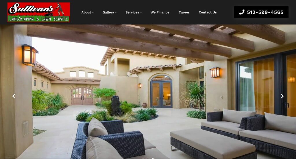
3. Sullivan’s
Why We Chose Sullivan’s Landscaping Service
The Sullivan’s Landscaping website excels at operational transparency, making the complex world of professional landscaping feel manageable and predictable. By focusing on a “no-surprises” approach, the site builds immediate trust with homeowners who are looking for a reliable, professional partner for their outdoor transformations.
Key Design Highlights:
- Predictable Project Roadmap: The homepage features a detailed outline of their process, walking the client through exactly what to expect from the initial consultation to the final reveal. This transparent “curtain-pull” helps eliminate the anxiety of the unknown and positions the company as a highly organized and disciplined firm.
- Specialized “Focus Area” Navigation: By grouping their expertise into defined “Focus Areas,” the site allows visitors to quickly identify the company’s core strengths. This categorization makes the site highly navigable and ensures that clients with specific needs – like hardscaping or drainage – can find their niche instantly.
- Story-Driven Project Gallery: Rather than a simple grid of photos, the homepage provides images of past projects with links to detailed info. This allows potential customers to explore the “why” and “how” behind a project, providing deeper proof of their craftsmanship and problem-solving abilities.
- Instant Conversion Header: The site features a high-utility header with direct links to call or book a consult. By keeping these primary actions pinned to the top of the experience, Sullivan’s ensures that the path from “interested visitor” to “active lead” is as short and frictionless as possible.
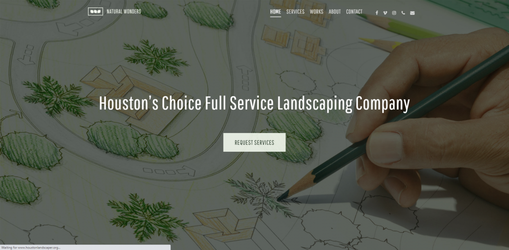
4. Houston Landscaper
Why We Chose Exterior Designs
The Exterior Designs website is a perfect example of hyper-local authority. By combining specific geographic targeting with a wealth of social proof and educational content, the site establishes itself as the go-to expert for the Houston area, making it incredibly easy for local residents to verify both the company’s proximity and their quality of work.
Key Design Highlights:
- Hyper-Local Service Targeting: The homepage does an excellent job of outlining their services alongside specific Houston neighborhoods. This strategy not only helps with local SEO but also provides instant confirmation to the user that “Yes, they work in my specific area,” removing a common barrier to inquiry.
- Seamless Social Validation: With a live Google review slider integrated on the homepage, the site leverages real-time customer satisfaction. This constant stream of third-party praise serves as a “digital word-of-mouth” that builds trust far more effectively than standard static testimonials.
- High-Impact Project Showcase: By highlighting recent projects directly on the homepage, the site provides a current look at their design capabilities. This “freshness” signals to potential clients that the company is active, busy, and consistently producing high-quality landscapes across the city.
- Educational & Accessible Lead Capture: The layout features a strategic pairing of an FAQ section followed immediately by a contact form. By answering the user’s most common questions first and then providing a clear place to reach out, the site effectively “warms up” the lead and increases the likelihood of a successful form submission.
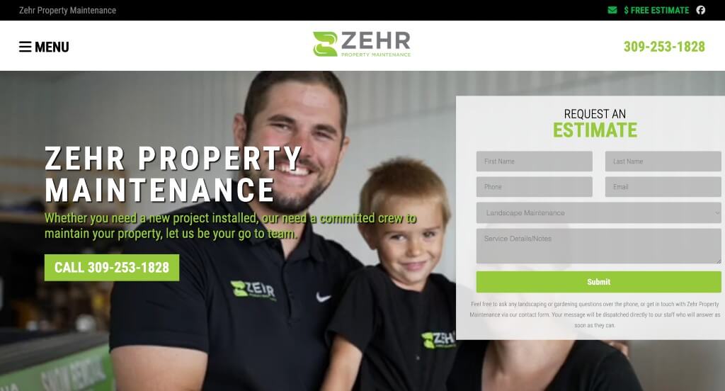
5. ZEHR Property Maintenance
Why We Chose Zehr Property Maintenance
The Zehr Property Maintenance website stands out by blending family-oriented values with industrial-strength professionalism. By utilizing high-energy video and a transparent service hierarchy, the site establishes a deeply personal connection while simultaneously proving they have the equipment and expertise to handle large-scale projects.
Key Design Highlights:
- Personalized “Behind-the-Scenes” Hero: The homepage opens with a compelling video montage that alternates between the crew in action and candid shots of the owner’s family. This storytelling approach builds immediate emotional trust, positioning the company as a local, family-run business that is personally invested in the community.
- Tiered Service Expertise: The site uses interactive service tiles that do more than just list offerings; they specifically highlight which services the team is “exceptional” at. This transparency helps customers understand the company’s core strengths, while the detailed descriptions and “learn more” links provide a deep dive into their technical capabilities.
- Geographic Clarity: The homepage features a comprehensive city list for their service area, ensuring that local homeowners and property managers can instantly verify coverage. This clear communication helps qualify leads and improves the site’s relevance in local search results.
- Persistent Mobile Accessibility: The mobile experience is engineered for quick action, keeping the phone number prominently in the header and hero area. Combined with a “Request an Estimate” form that is easy to navigate on a touchscreen, the site ensures that potential clients can reach out the moment they are inspired by the portfolio.
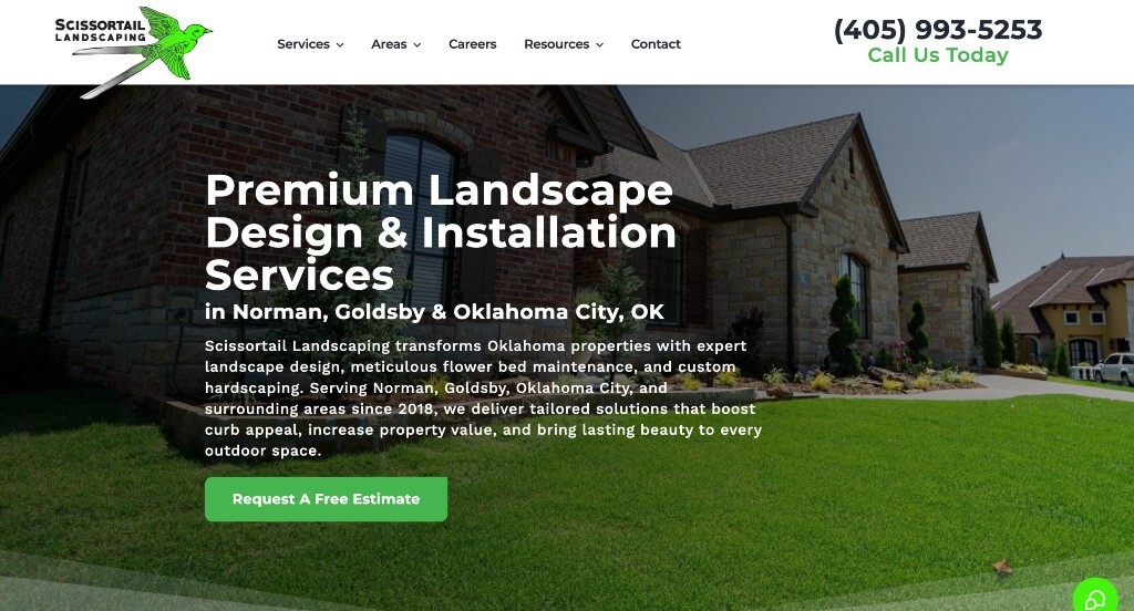
6. Scissortail Landscaping
Why We Chose Scissortail Landscape & Design
The Scissortail website is a masterclass in creative branding and local positioning. By integrating their unique brand mascot directly into their project showcases, they create a memorable visual narrative that separates them from the standard, more corporate-looking landscaping firms in the Oklahoma City area.
Key Design Highlights:
- Dynamic Brand Integration: The site features a truly unique hero video overlay, where their bird logo (the Scissortail) appears to fly over the footage of their completed projects. This clever use of motion graphics makes the branding feel alive and reinforces the company’s identity in a way that is both modern and artistic.
- Frictionless Lead Entry: The layout prioritizes immediate access to contact tools, placing the phone number and “Book a Consult” buttons in high-visibility areas. This ensures that the moment a visitor is impressed by the visual storytelling, they have a clear and easy path to start their own project.
- Rapid Portfolio Social Proof: Immediately below the hero area, the site presents a curated gallery of diverse projects. By placing these images “front and center,” Scissortail provides instant proof of their versatility, ranging from intricate hardscapes to lush garden designs, before the user even begins to read the text.
- Value-Driven Local Authority: The homepage effectively combines a “Why Choose Us” section with a specific list of service cities. This pairing addresses the two most important questions a visitor has: “Are they good at what they do?” and “Do they work in my neighborhood?” – answering both with clarity and professional confidence.
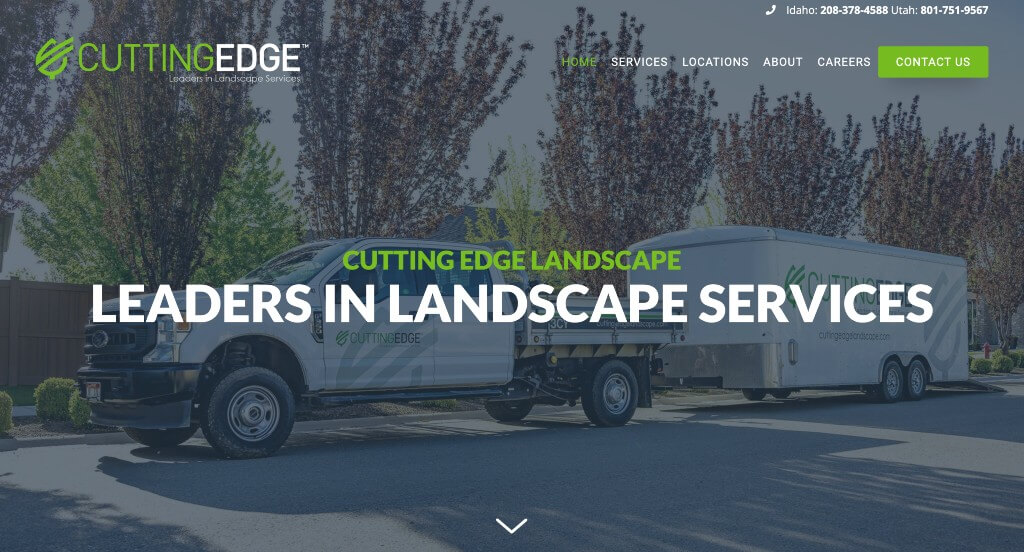
7. Cutting Edge Landscape
Why We Chose Cutting Edge Landscape
The Cutting Edge Landscape website is a standout for its data-driven authority and interactive education. By using hard numbers to prove their scale and interactive visuals to explain their services, the site caters to both residential and large-scale commercial clients who value efficiency, experience, and proven results.
Key Design Highlights:
- Quantifiable Success Metrics: The homepage features a dynamic “by the numbers” tally showcasing their years in business, employee count, and the massive scale of square footage they maintain. This “Proof of Scale” immediately establishes them as a heavyweight in the industry, capable of handling high-volume professional contracts.
- Interactive Educational Discovery: A unique feature of the site is an interactive graphic with clickable elements that allow users to explore their service offerings. This gamified approach to information gathering is far more engaging than a standard list, encouraging visitors to spend more time on the page learning about their expertise.
- Modular Service Exploration: Directly below the fold, the site uses cleanly organized service tiles to categorize their work. This ensures that whether a client is looking for landscape maintenance, construction, or snow removal, they can find their specific path within seconds of arriving.
- Validated Industry Excellence: The site includes a scrolling slider dedicated to awards and accolades. By showcasing third-party recognition in a moving gallery, they reinforce their position as an industry leader and provide continuous visual proof of their commitment to quality and professional standards.
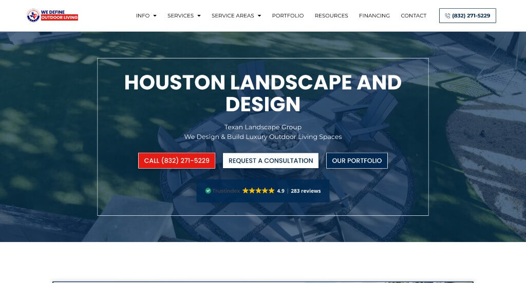
8. Texan Landscape Group
Why We Chose Envy Exterior Design
The Envy Exterior Design website is a masterclass in multi-media social proof and visual engagement. By utilizing video testimonials and interactive scroll animations, they create a dynamic environment that effectively bridges the gap between seeing a beautiful photo and trusting the team behind it.
Key Design Highlights:
- High-Trust Video Testimonials: While many sites use text-based quotes, this site features video testimonials from actual clients alongside a Google review slider. Seeing and hearing a satisfied customer tell their story adds a layer of authenticity and emotional weight that text alone cannot replicate.
- Animated Process Roadmap: The “How It Works” section is elevated by engaging scroll animations that guide the user through their design and build phases. This makes the educational part of the site feel like a journey, keeping the user’s attention fixed on the screen as they learn about the company’s professional workflow.
- Streamlined Service Discovery: The homepage utilizes a fluid services slider, allowing visitors to swipe through various offerings like outdoor kitchens, pools, and patio covers. This interactive element keeps the homepage compact while still providing a broad overview of their high-end exterior solutions.
- Direct Regional Targeting: By clearly listing all the cities they serve on the homepage, the site provides instant clarity for Houston-area residents. This not only assists with local search rankings but also ensures that visitors can immediately confirm their property is within the company’s service radius.
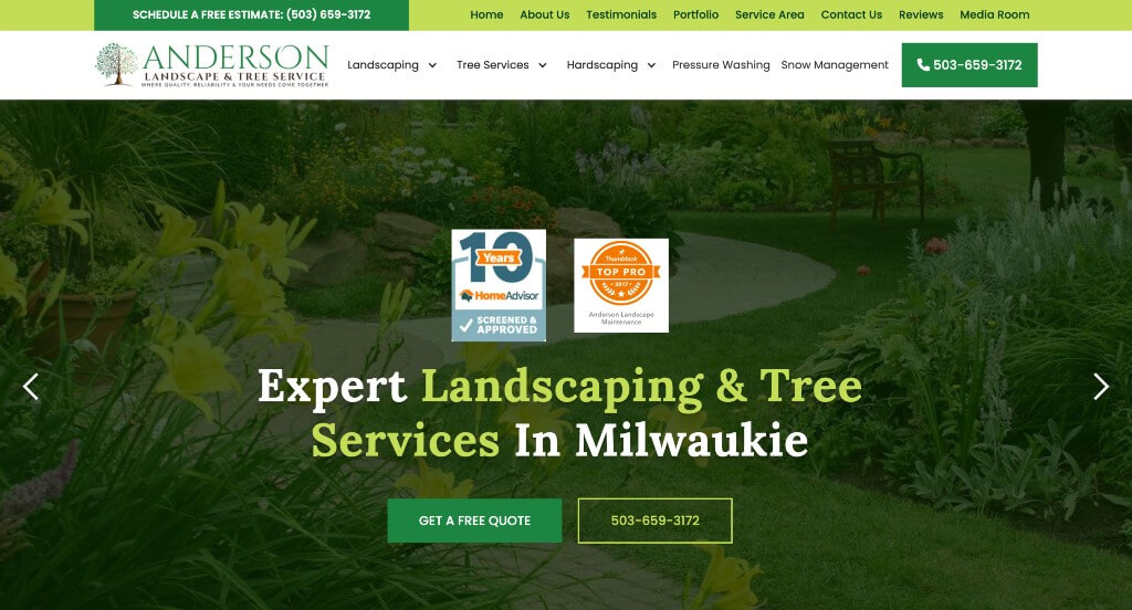
9. Anderson
Why We Chose Anderson Landscape & Maintenance
The Anderson Landscape & Maintenance website is built on the principle of “Essential Efficiency.” It avoids unnecessary complexity in favor of a direct, results-oriented layout that provides the three things every landscaping lead wants: proof of quality, proof of location, and an easy way to start the conversation.
Key Design Highlights:
- Integrated Social Credibility: The homepage features a dynamic Google reviews scroller, allowing the company’s reputation to speak for itself. By pulling in real-time feedback, they provide immediate reassurance to new visitors that the business is active, reliable, and highly rated by the local community.
- High-Impact Project Gallery: The site uses prominent imagery of completed projects to showcase their versatility and attention to detail. This visual proof serves as a silent portfolio, allowing the quality of their lawn care and landscaping work to act as the primary selling point.
- Zero-Friction Lead Capture: Unlike sites that hide their contact options on a separate page, this layout features a prominent quote form directly on the homepage. This “one-click” accessibility is perfect for busy homeowners who want to request information quickly without navigating through multiple menus.
- Clear Operational Scope: The homepage provides a concise list of both their service capabilities and their geographic service area. By pairing what they do with where they do it in a single view, they effectively qualify leads and ensure that visitors know exactly how the company can help them before they even hit the scroll bar.
Landscaping WordPress Themes
You can find free themes at wordpress.org or explore landscaping-inspired templates on ThemeForest.
The Landscaper – Themeforest
$59
Greennova – Themeforest
$39
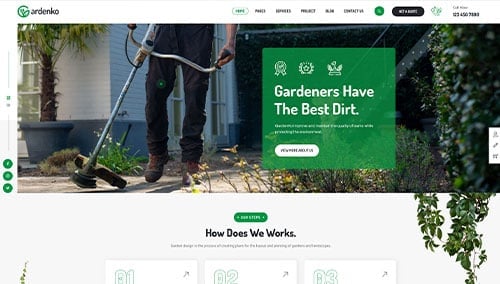
Gardenko – Themeforest
$59
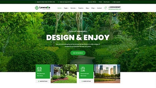
Lawnella – Themeforest
$59
WooCommerce Landscaping Themes
There are plenty of ecommerce landscaping themes for WooCommerce available on ThemeForest.
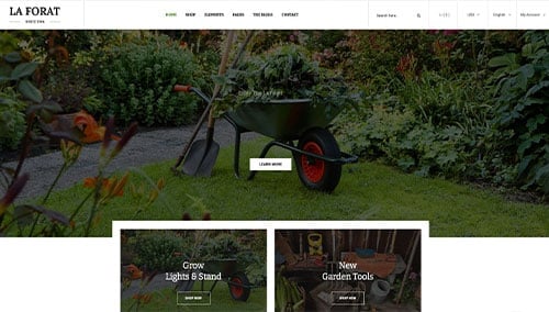
LaForat – Themeforest
$59
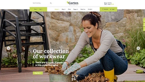
Garten – Themeforest
$110
Shopify Landscaping Themes
You can find free and paid themes at themes.shopify.com or explore options through marketplaces like ThemeForest.
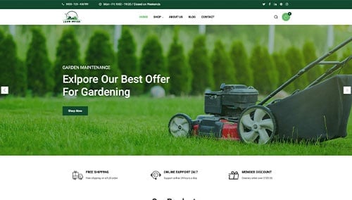
Lawn Mover – Themeforest
$58
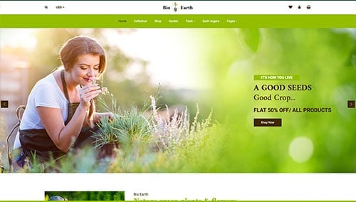
BioEarth – Themeforest
$59