In the healthcare industry, your website is often the first step in a patient’s journey toward care. Whether you are managing a private clinic, a specialized laboratory, or a large-scale hospital network, your online presence must immediately communicate clinical authority, patient empathy, and technical reliability. In 2026, a medical website must move beyond aesthetics to prioritize accessibility, data security, and seamless patient navigation.
Our design team evaluated hundreds of healthcare websites – from pharmaceutical manufacturers and diagnostic labs to outpatient clinics and health insurance providers. We looked for the top 9 examples that masterfully balance professional credibility with a high-end user experience (UX), specifically analyzing their mobile-first appointment flows, provider transparency, and clear paths to care.
Whether you are scaling a specialized practice or managing a global medical brand, these examples represent the current benchmark for digital excellence in healthcare.
Note on Our Selection Process: We recently audited this guide to remove outdated designs and sites that no longer meet our performance standards. This curated list now focuses on the top 9 medical websites providing the most strategic value in 2026.
Top Medical Company Website Designs
1. Children’s Hospital and Medical Center
Why We Chose Children’s Nebraska
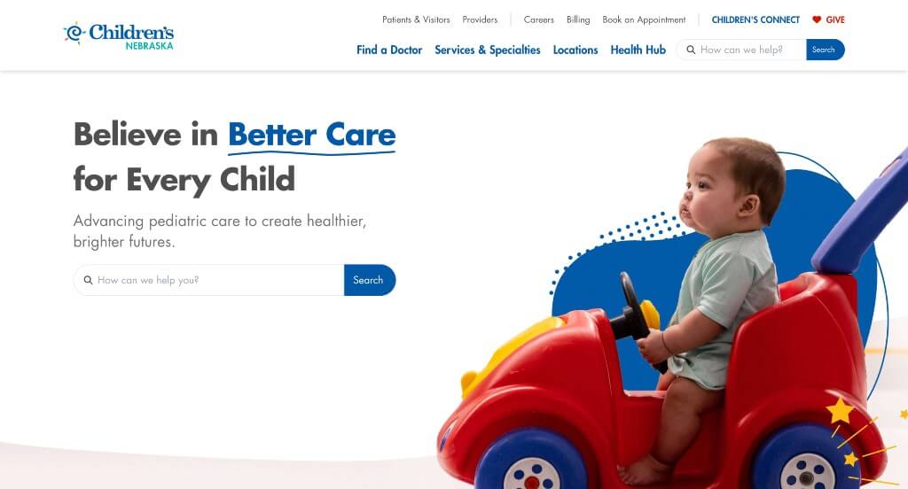
The Children’s Nebraska website is an exceptional model for “Patient-Centric Triaging and Local Care Accessibility.” Hospital networks manage vast amounts of complex clinical data. This platform successfully avoids information overload by structuring its layout around the immediate needs of parents – focusing on intuitive discovery, clear medical routing, and fast location mapping directly from the home page.
Key Design Highlights:
- Immediate High-Intent Navigation Hub: The prominent search function positioned right within the main hero area acts as an immediate triage tool. Parents arriving under stressful circumstances can bypass secondary navigation menus to instantly look up specific pediatric symptoms, departments, or physicians.
- Streamlined Clinical Routing Modules: The primary medical services and specialties they offer are displayed clearly on the home page using defined categories. Partitioning care into four core pillars – Primary Care, Specialty Care, Behavioral Health, and Emergency Medicine – helps fast-skimming families qualify and select the appropriate tier of medicine within seconds.
- Frictionless Spatial Onboarding: Key regional campuses, like the main hospital on Dodge Street and the dedicated Emergency Department, are showcased directly on the home page. Each listing includes an immediate call to action to see more locations or grab direct navigation via a prominent “Directions” link, removing administrative friction when time matters most.
- Dynamic Local Resource Integration: A curated news and medical resource directory is featured further down the page. Sharing time-sensitive clinical guidance – such as tracking regional outbreaks, detailing innovative behavioral health openings, and sharing inspirational patient success stories – seamlessly transitions the hospital platform into an authoritative community wellness resource.
2. Altru Health System
Why We Chose Altru Health System
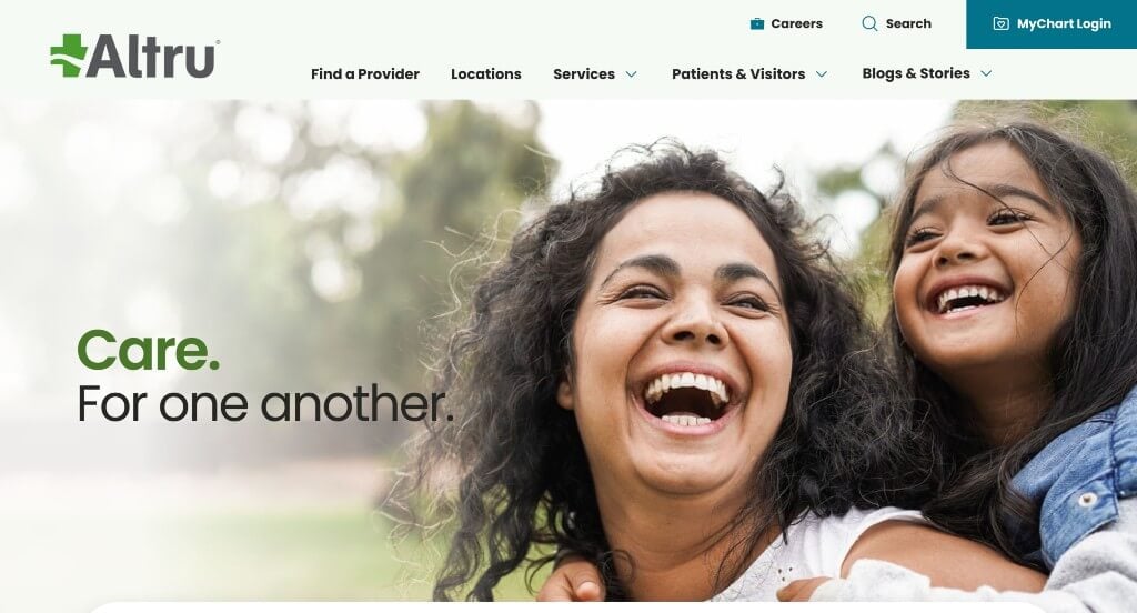
The Altru Health System website stands out as a premier example of “Intuitive Patient Navigation and Modern Responsive Accessibility.” Healthcare platforms often struggle to organize extensive clinical databases without confusing the user. Altru addresses this challenge by pairing a clean, adaptive mobile design with clear, multi-layered search functions right on the home page.
Key Design Highlights:
- Frictionless Triaging Hub: Positioned directly inside the main hero area is an intuitive, multi-tiered search hub. This interface allows arriving patients to quickly sort their inquiries by specific provider, location, or medical specialty, bypassing complex navigation paths and reducing stress during critical moments.
- Polished Dropdown Megamenus: The desktop navigation features exceptionally well-styled megamenus and dropdown panels. Instead of displaying a dense, overwhelming list of raw text links, the menus incorporate helpful content descriptions alongside organized clinical groupings (such as Family Medicine, Orthopedics, and Cancer Care), helping users scan and self-triage efficiently.
- Value-First Patient Onboarding: The dedicated section titled “Altru. Care that makes a difference” establishes a strong, mission-driven baseline for the provider-patient relationship. Placing this clear statement of culture and excellence on the home page smoothly transitions into immediate action items, including Express Clinic access, pharmacy refills, and billing tools.
- Clean, Mobile-Optimized Interface: The layout shifts seamlessly into an exceptionally clean mobile view on smaller viewports. By collapsing extensive desktop panels into structured tap targets, maintaining crisp typographic scaling, and preserving the central search tools, the site ensures a reliable user experience across all devices.
3. Icarus Medical
Why We Chose Icarus Medical
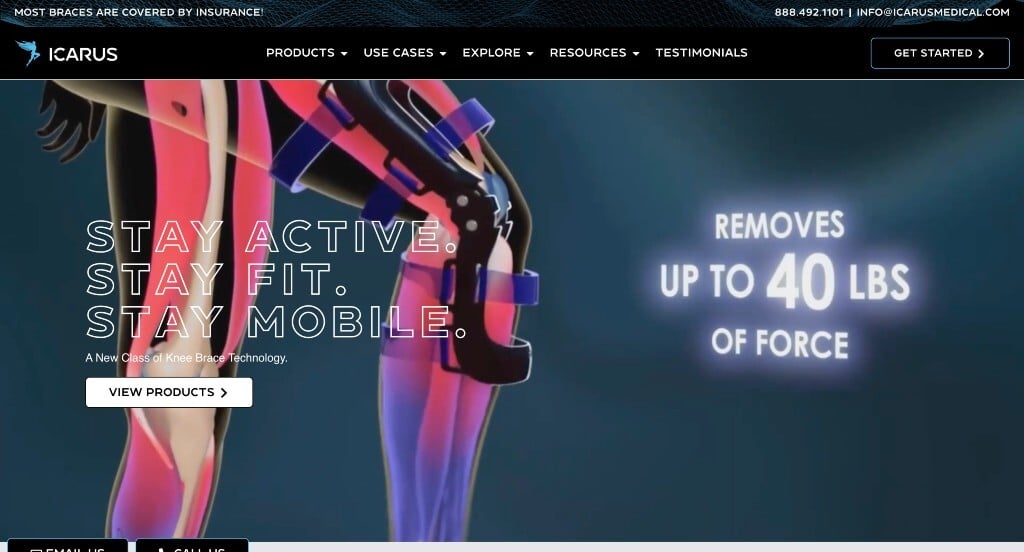
The Icarus Medical website is a standout benchmark for “Advanced Medical Product Efficacy and Tech-Enabled Customization.” Medical hardware and orthopedic devices require high levels of trust and clear operational onboarding. This site avoids dense, sterile text by combining immersive visual evidence with a simple, digital customization process right on the home page.
Key Design Highlights:
- Kinetic Product Validation: The main hero area features a high-fidelity video loop showing their custom orthotics and braces in action during everyday activities and high-impact sports (like running, skiing, and pickleball). Seeing a lightweight, slim-profile brace flex naturally provides immediate proof of mobility, cutting through consumer skepticism about bulky medical gear.
- Streamlined Digital Onboarding Chain: Their custom-fit fabrication method is broken down into a clean, four-part “Our Process” outline. Displaying these steps – Scan (via an iPhone 3D app), Fit (engineered custom design), Receive (delivered in two weeks), and Support – demystifies advanced custom orthotics and highlights the ease of digital onboarding.
- Deep Multi-Tiered Social Proof: The platform features an extensive testimonial carousel alongside medical success metrics from clinical partners. This broad peer validation is anchored further down the page by a dedicated feature called “Dave’s Story.” This deep dive highlights the company’s background and mission to relieve bone-on-bone pain, transforming technical engineering into a relatable human narrative.
- Organized, Case-Specific Product Grid: Their full engineering line – including the Ascender unloader, Adonis joint-distraction brace, and Hermes dynamic ankle-foot orthosis (AFO) – is cleanly presented on the home page. Each entry explicitly states its ideal medical use cases (such as patellofemoral pain, osteoarthritis, foot drop, or post-op recovery), letting patients and clinicians identify the correct brace in a single scroll.
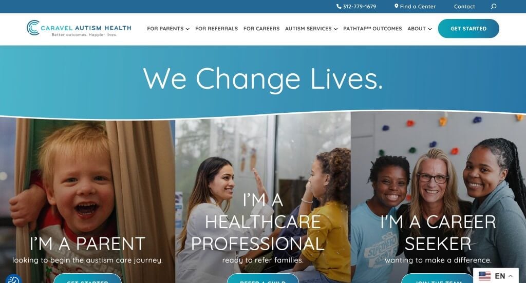
4. Caravel Autism
Why We Chose Caravel Autism Health
The Caravel Autism Health website is a premier model for “Compassionate Care Linearization and Interactive Value Modeling.” Navigating pediatric developmental therapies can be highly emotional and confusing for families. This platform completely eliminates administrative and therapeutic ambiguity by mapping a transparent clinical path and supporting it with rich, interactive brand validation right on the home page.
Key Design Highlights:
- Linearized 3-Step Clinical Journey: The home page brilliantly structures its primary medical onboarding into a clear 3-step process module: Diagnostic Evaluation (establishing developmental baselines), ABA Therapy (implementing the individualized gold-standard care), and Caregiver Collaboration (partnering with parents for continuous progress at home). Breaking down specialized pediatric therapy into a predictable roadmap minimizes parental anxiety from the very first scroll.
- Interactive Value Differentiation Grid: The dedicated “Why Choose Caravel?” section uses an engaging, interactive layout to present the brand’s key operational advantages. Instead of relying on a wall of text, users can seamlessly toggle through five core values – including their Clinical Center of Excellence, proven data-driven outcomes via their proprietary PathTap™ software, and highly certified talent pools – making information digestion light and educational.
- Geographically Partitioned Directory: To make regional onboarding completely effortless, the home page features a clean, organized network directory outlined by state. Detailing their 70+ clinics across nine states (such as Wisconsin, Minnesota, and Illinois) with clear center counts allows families to rapidly verify local availability before entering the formal intake funnel.
- Deeply Relatable Peer Proof: The section titled “What Our Families Have to Say” showcases an beautifully styled review slider backed by heartwarming photography. Highlighting long-form narratives where parents and grandparents share real emotional victories – such as children speaking their first words, overcoming food aversions, and learning to dress themselves – perfectly balances Caravel’s technical data metrics with genuine human proof.
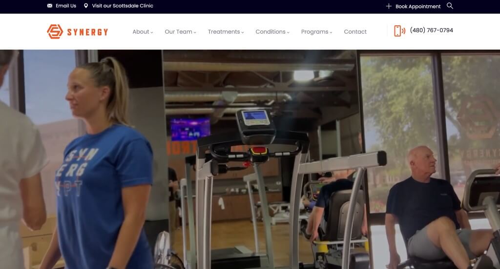
5. Synergy Physical Therapy
Why We Chose Synergy Physical Therapy
The Synergy Physical Therapy website is an exceptional model for “Outcome-Driven Positioning and Transparent Clinical Credibility.” In a rehabilitation market flooded with generic clinics offering passive treatments, this platform uses bold, philosophy-driven messaging, direct local proof, and humanizing workforce layouts to capture high-intent patients right on the home page.
Key Design Highlights:
- Immediate Regional Validation: The homepage proudly highlights their selection as the “Best of Our Valley 2026 Winner” for Best Physical Therapist by AZ Foothills. Displaying this trusted local accolade immediately gives arriving users strong community confirmation of their clinical standard of care.
- Philosophical Value-Driven Differentiation: A dedicated section titled “What makes us different than the rest?” outlines their clinical framework. By explicitly stating that they do things differently – such as replacing passive modalities like ice or heat with active, high-repetition neurological training – the brand establishes an assertive, results-driven identity. This approach is reinforced by their blunt corporate mantra: “We exercise patients hard because it’s necessary. Period.”
- Structured Clinical Technique Grid: The home page clearly outlines their most common treatment techniques – including Cupping, Dry Needling, Manual Therapy, Functional Training, and Gait Training – complete with dedicated buttons for further details. Organizing advanced clinical procedures into structured, bite-sized components helps patients easily verify and explore targeted recovery paths.
- Humanizing Multidisciplinary Team Showcase: The site prominently features their entire treatment and operational staff directly on the home page, displaying portraits of Doctors of Physical Therapy (DPT), Physical Therapist Assistants (PTA), and their Director of Operations. Putting real, local clinicians at the forefront builds human trust before a patient books an intake session.
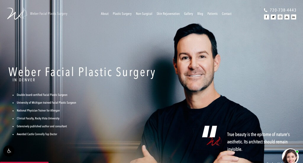
6. Weber Facial Plastic Surgery
Why We Chose Weber Facial Plastic Surgery
The Weber Facial Plastic Surgery website stands out as a premier benchmark for “Elite Specialized Authority and Dynamic Patient Validation.” In an industry where patients experience high levels of vulnerability and demand perfection, this medical platform avoids generic, sterile templates. Instead, it pairs meticulous credentials with media-rich patient proof to build immediate psychological safety.
Key Design Highlights:
- Credential-Focused Trust Architecture: The section titled “Six Reasons He Gets It Right” details Dr. Weber’s exact medical advantages. Outlining high-level clinical metrics – such as his double board certification, 16+ years in private practice, over 4,000 completed facial procedures, and specialized expertise in awake, in-office surgeries without general anesthesia – proactively satisfies the rigorous vetting standards of high-end cosmetic consumers.
- Cinematic Video Proof Engine: Moving past static text reviews, the homepage integrates dynamic video testimonials from actual clients. Allowing browsing patients to watch real people share their personal stories regarding procedures like rhinoplasty or chin implants provides deep peer validation, turning clinical outcomes into authentic human experiences.
- Organized Regional and National Onboarding: The site maps out its extensive destination practice network, catering to a broad patient base traveling from across the United States. Providing dedicated navigation hooks for out-of-town travelers alongside their regional Lone Tree/Denver office layout immediately confirms their status as a premier national center for facial aesthetics.
- Real-Time Patient Interactive Assistant: To capture leads efficiently and streamline client inquiries, the site features a live virtual assistant and chat widget. This round-the-clock point of contact lets patients quietly ask technical questions about recovery windows, financing, or scheduling, making onboarding simple and private.
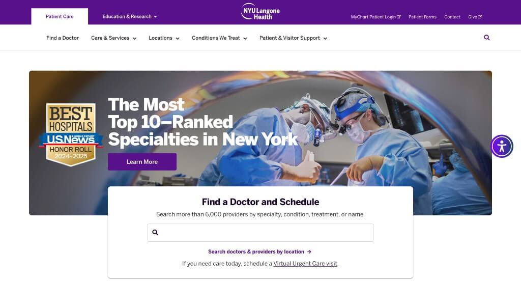
7. NYU Langone Health
Why We Chose NYU Langone Health
The NYU Langone Health website is a gold standard for “Enterprise-Scale Clinical Navigation and Community-Impact Branding.” Managing one of the nation’s largest academic medical centers requires a digital platform that can synthesize millions of data points – spanning world-class patient care, scientific research, and medical education – without overwhelming the end-user. This site flawlessly balances complex clinical triaging with human-centered storytelling directly on the home page.
Key Design Highlights:
- Expansive Digital Megamenu System: The website utilizes a highly sophisticated, multi-column expansive megamenu. Instead of forcing users to dig through convoluted subpages, this layout cleanly organizes extensive directories – including “Find a Doctor,” “Locations,” “Conditions & Treatments,” and “Academics” – into clear, scannable link grids that expedite patient self-triaging.
- Streamlined Regional Access Hub: A dedicated “Our Locations” section on the home page maps out NYU Langone’s massive clinical network. Seamlessly partitioning major hospital campuses, emergency rooms, outpatient care centers, and local doctor’s offices provides tri-state residents with instant geographic validation and rapid appointment routing.
- Human-Centered Peer Validation: Moving past cold, institutional statistics, the prominent “Community Stories” section highlights how this health system has directly impacted real people. Showcasing long-form, magazine-style narratives of patients overcoming complex medical diagnoses anchors NYU Langone’s clinical prestige in authentic human gratitude and empathy.
- Authoritative, Up-to-Date Knowledge Base: An active health and wellness newsroom blog is integrated directly onto the home page, featuring up-to-date scientific insights, breakthrough research summaries, and preventative medical tips. Keeping this content fresh establishes immediate medical authority and positions the website as a continuous public health resource.
8. Emkiro
Why We Chose Emkiro Health Services
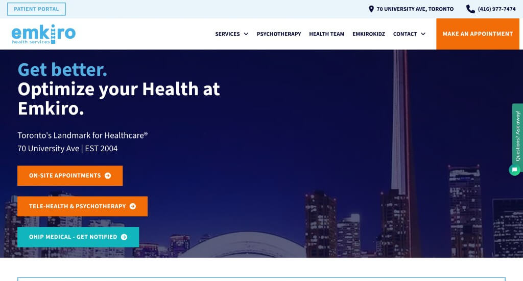
The Emkiro Health Services website stands out as an exceptional model for “Comprehensive Multidisciplinary Triaging and On-Demand Onboarding.” Operating as a busy downtown Toronto medical and wellness core, the platform efficiently organizes an extensive range of traditional medical and rehabilitative services into a clear, single-page presentation that prevents user confusion.
Key Design Highlights:
- Accessible, Multi-Channel Engagement: Positioned persistently on the right side of the screen is an active communication tab that offers a quick way to chat. This floating interface gives patients an on-demand digital connection to ask swift administrative or booking questions, lowering onboarding friction for users who prefer typing over phone calls.
- Dual-Action Clinical Grid: The home page clearly outlines their primary chiropractic and wellness services – including physiotherapy, massage therapy, acupuncture, and chiropody – alongside a targeted list of musculoskeletal and systemic conditions they treat. Mapping distinct treatment tracks directly next to painful symptoms helps fast-skimming patients quickly match their conditions to the proper therapeutic solution.
- Polished Urban Reputation Loop: Real-world reviews and patient success stories are integrated smoothly onto the home page. Showcasing authentic local feedback – where downtown professionals praise the clinic’s efficient lunchtime scheduling, seamless direct insurance billing, and comprehensive care – builds deep community trust at the primary point of intent.
- Fluid Mobile Interface Architecture: The website is engineered with a mobile-first philosophy, resulting in a responsive mobile view that looks nice and flows beautifully. By compressing dense service grids into sleek tap targets, sizing contact buttons for thumb navigation, and preserving the right-side chat widget, the platform maintains a premium, stress-free user experience on any smartphone.
9. Arkansas Surgical Hospital
Why We Chose Arkansas Surgical Hospital
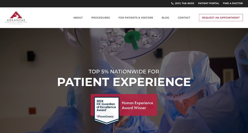
The Arkansas Surgical Hospital website is an excellent benchmark for “Immersive Action-Driven Onboarding and Specialization Trust.” Healthcare websites can easily feel cold and intimidating. This platform eliminates digital barriers by combining transparent behind-the-scenes visual evidence with highly accessible booking paths directly on the home page.
Key Design Highlights:
- Kinetic Clinical Trust: The hero section features an active video loop showcasing their actual surgical staff and clinical teams doing the work. Moving past static stock photos of generic handshakes, this cinematic peek into their state-of-the-art operating rooms builds immediate, transparent trust before a patient ever sets foot in the facility.
- Frictionless Header Intake Onboarding: A prominent, primary “Request an Appointment” call-to-action button is permanently locked into the header. For high-intent orthopedic, spine, or pain management patients looking to quickly coordinate care with a specialist, this persistent navigation placement captures leads the exact moment they decide to take action.
- Exploratory Multimedia Guidance: A dedicated video directory section on the home page explicitly illustrates how Arkansas Surgical Hospital can help you. Offering accessible video assets – ranging from virtual pre-testing overviews and post-op mobility training to direct physician Q&As – answers common patient anxieties right on the spot.
- Fresh Educational Integration: The latest articles, medical staff additions, and community award updates from their news blog are featured prominently on the home page. Keeping this data fresh establishes immediate medical authority and positions the hospital as an active, continuously reliable resource for regional wellness.
WordPress Medical Themes
You can find free themes at wordpress.org, or explore medical-inspired templates on ThemeForest.
Medicare – Themeforest
$69
MediClinic – Themeforest
$69
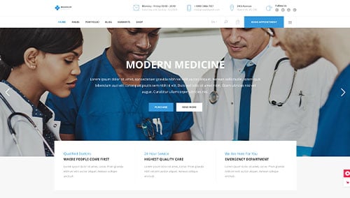
Medigroup – Themeforest
$79
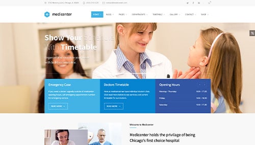
MediCenter – Themeforest
$69
WooCommerce Medical Themes
You’ll find a variety of ecommerce medical themes for WooCommerce on ThemeForest.
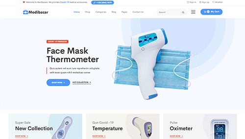
Medibazar – Themeforest
$49
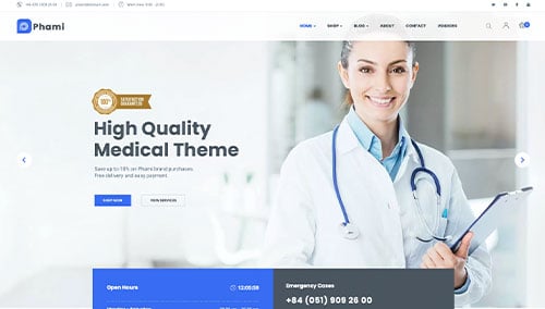
Phami – Themeforest
$59
Shopify Medical Themes
Explore free and paid themes at themes.shopify.com, or consider options from marketplaces like ThemeForest.
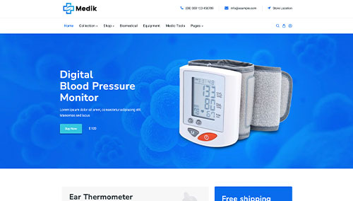
Medik – Themeforest
$59
Medz – Themeforest
$59