In the non-profit sector, your website is the primary engine for your mission. Whether you are a local community charity or a global advocacy group, your online presence must do more than simply explain what you do – it must inspire action, build unwavering trust, and demonstrate measurable impact. In 2026, a world-class non-profit site must master the balance between emotional storytelling and frictionless donation technology.
Our design team evaluated hundreds of non-profit websites – ranging from educational and healthcare foundations to environmental, religious, and social justice organizations. We identified the top 14 examples that excel in conversion-focused design, specifically analyzing their mobile-first donation flows, impact transparency, and the effective use of high-impact visual narratives.
Whether you are scaling a grassroots movement or managing an established international foundation, these examples represent the benchmark for non-profit digital excellence.
Note on Our Selection Process: We recently audited this guide to remove outdated designs and organizations that no longer meet our performance standards. This curated list now focuses on the top 14 non-profit websites providing the most strategic value in 2026.
Top Non-Profit Organization Website Designs
- 1. Surfrider Foundation
- 2. Water.org
- 3. Charity: Water
- 4. Heifer International
- 5. Warrior Rising
- 6. International Rhino Foundation
- 7. Mobilize Recovery
- 8. Alzheimer’s Association
- 9. Best Friends Animal Society
- 10. Conservation International Foundation
- 11. Do Something
- 12. David Suzuki Foundation
- 13. The Humane League
- 14. Memphis Zoo
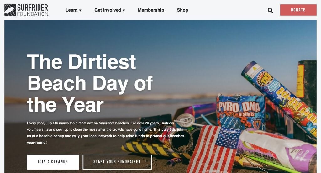
1. Surfrider Foundation
Why We Chose Surfrider Foundation
The website for the Surfrider Foundation serves as a premier benchmark for “High-Impact Non-Profit Merchandising and Civic Activation Architecture.” As a global network dedicated to the protection and enjoyment of the world’s oceans, waves, and beaches, their digital storefront must translate environmental passion into immediate grassroots action, corporate donations, and community advocacy. This platform masterfully succeeds by structuring its homepage as an evocative mission-driven ecosystem, seamlessly shifting high-intent visitors from environmental awareness directly into localized conservation paths and retail support.
Key Design Highlights:
- Mission-Driven Core Imperative Alignment: The website immediately commands institutional authority and moral urgency by placing a high-impact breakdown of their foundational mission directly at the top of the homepage scroll path. Explicitly defining exactly what they fight for – such as plastic reduction, ocean protection, beach access, and clean water – allows eco-conscious citizens and corporate philanthropists to instantly align their personal values with the foundation’s systemic legal and ecological battles.
- Front-Page Strategic Campaign and Project Tracker: Positioned dynamically within the primary homepage flow is an interactive showcase dedicated to their current active campaigns and coastal projects. Rather than burying ongoing environmental litigation or local policy efforts in deep-site archives, this curated exhibition brings real-time battles straight to the forefront, giving visitors an immediate, transparent window into the organization’s real-world impact and policy victories.
- Deep-Dive Deep Educational Program Showrooms: To prevent the scale of their nationwide efforts from overwhelming general visitors, the homepage strategically isolates and features one of their signature core programs – such as the Blue Water Task Force or Ocean Friendly Restaurants – inviting users to “learn more.” This focused spotlight reduces choice fatigue, providing a clean educational gateway that transforms casual site browsers into specialized coastal advocates.
- E-Commerce Native Advocacy and Merchandising Integration: Capitalizing beautifully on a dual model of fundraising and brand exposure, the homepage features a stylized retail showcase highlighting their official, sustainably produced branded apparel and accessories. Showcasing high-quality surf lifestyle merch directly on the front page effortlessly taps into secondary revenue streams, transforming a standard donation funnel into a vibrant consumer lifestyle community.
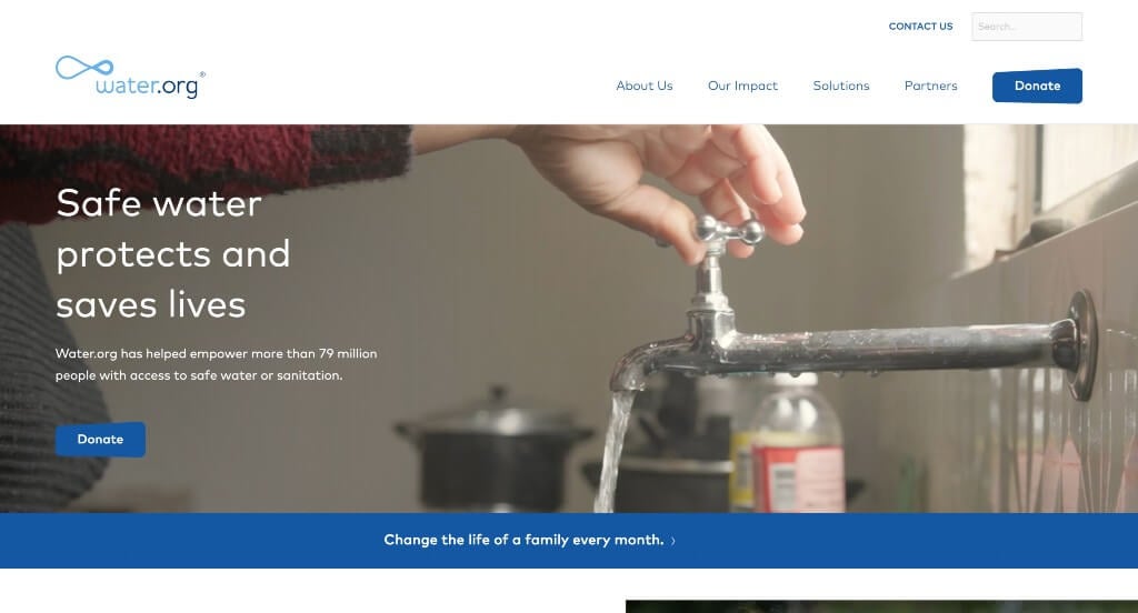
2. Water.org
Why We Chose Water.org
The website for Water.org serves as a premier benchmark for “High-Impact Philanthropic Merchandising and Strategic Civic Onboarding Architecture.” Co-founded by Gary White and Matt Damon to pioneer market-driven solutions to the global water crisis, their digital storefront must translate deep humanitarian data into immediate emotional resonance and global donor mobilization. This platform masterfully succeeds by coupling sweeping human-centric media with highly transparent, micro-donation value metrics that effortlessly transform casual browsers into long-term global advocates.
Key Design Highlights:
- Cinematic, Mission-Driven Hero Video Loop: The platform establishes immediate global urgency and moral authority with a high-definition video sequence dominating the primary hero space. By flashing dynamic, respectful footage of families, children, and resilient communities across the globe finally gaining access to clean, running water, the media instantly captures the real-world human impact of their infrastructure funding the split second the page loads.
- Multi-Channel “Change Lives” Action Architecture: Positioned prominently within the primary homepage flow is the dedicated “Help change lives with safe water” mobilization hub. Instead of presenting a vague or singular donation track, this section clearly organizes and calls out various actionable pathways for user involvement – allowing corporate partners, monthly sustainers, and community advocates to instantly select the exact engagement model that matches their philanthropic capacity.
- Micro-Donation Catalyst and Impact Matrix: A major psychological and conversion-focused triumph of the homepage layout is the “Your donation is a powerful catalyst” section. By explicitly breaking down how a seemingly modest micro-donation – such as just $5 – can be mathematically leveraged into long-term, sustainable water access for an individual, the interface completely eliminates donor skepticism and empowers small-scale everyday givers with a profound sense of transactional impact.
- High-Impact “Smart Way” Solutions and Global Milestone Overview: Woven smoothly into the lower layout workflow is the section titled “There’s a smart way to end the water crisis.” This area directly explains how access to funds is the primary barrier preventing families from obtaining clean water and sanitation. It highlights their real-world milestones – noting that their solutions have empowered more than 92 million people across 15 countries in Africa, Asia, and Latin America to access taps and toilets via small, affordable loans – and provides an immediate “See our impact” or “Learn about our smart solutions” gateway link to explore their global work further.
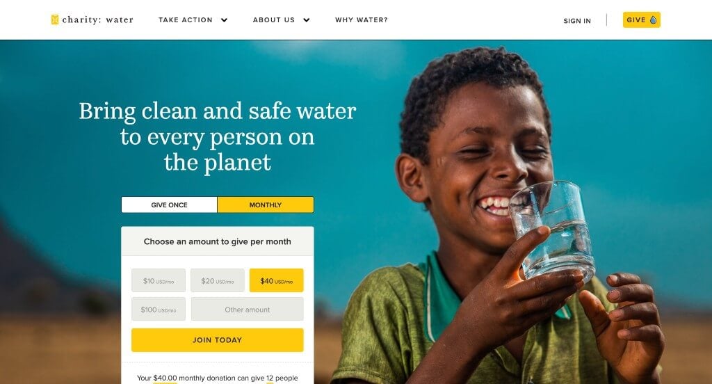
3. Charity: Water
Why We Chose charity: water
The website for charity: water serves as a premier benchmark for “High-Impact Digital Philanthropy and Visual Accountability Architecture.” Famed for disrupting the non-profit sector with its transparent “100% Model,” the organization’s digital storefront must translate the abstract concept of the global water crisis into an immediate, emotionally compelling, and highly verifiable narrative. This platform masterfully succeeds by treating its homepage as a transparent proof-of-impact pipeline, eliminating donor skepticism through seamless interactive verification and friction-free mobile accessibility.
Key Design Highlights:
- High-Conversion Native Hero Donation Terminal: Capitalizing on immediate visitor intent, the platform features a fully integrated, streamlined donation module built directly into the primary hero real estate. By allowing users to seamlessly toggle between one-time or monthly sustaining gifts and immediately choose or input an amount the split second the page loads, the interface removes all navigational steps and captures generosity at the absolute peak of emotional engagement.
- Interactive Proof-of-Impact Mapping Matrix: Anchoring the core psychological trust of the layout is the section titled “Know that your donation is making a difference.” Rather than relying on static charts or vague summaries, this area integrates a dynamic, interactive map ecosystem. By publicly sharing photos, completion updates, and precise GPS coordinates for their funded clean water projects around the world, the platform delivers on its “Give water. Get proof.” brand promise right on the front page.
- Front-Page Grassroots Action and Mobilization Directory: To comfortably scale participation across diverse supporter demographics, the homepage outlines an array of distinct, highly organized pathways to get involved. From starting a personal birthday fundraiser or securing corporate brand sponsorships, to joining their monthly giving community (The Spring) or setting up legacy giving, the layout effectively reduces choice friction and funnels visitors into specialized advocacy tracks.
- Ultra-Clean Mobile Viewport and Gestural Continuity: Translating a large-scale international development ecosystem onto smaller viewports is flawlessly managed via an expertly optimized mobile framework. The smartphone experience strips away layout clutter, balances ample whitespace, and arranges heavy interactive features into smooth, single-column scroll paths, ensuring that time-conscious users can comfortably read stories or securely complete a transaction on the go.
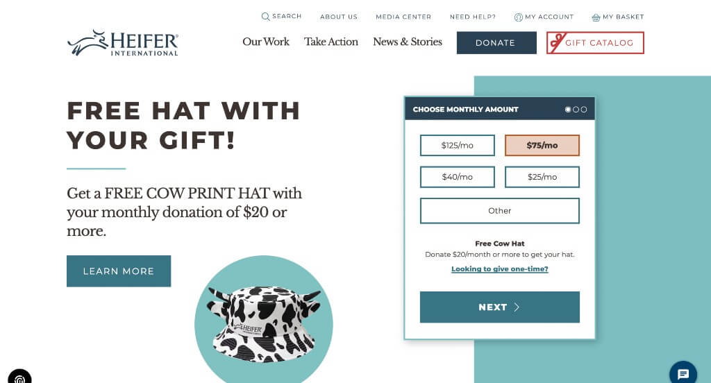
4. Heifer International
Why We Chose Heifer International
The website for Heifer International serves as a premier benchmark for “High-Velocity Philanthropic Merchandising and Strategic Civic Engagement Pipelines.” With a storied global mission centered on ending hunger and poverty while caring for the Earth through sustainable agriculture, their digital storefront must translate large-scale international community development into clear, immediate, and trustworthy action items. This platform masterfully succeeds by organizing its homepage into a high-intent transactional interface that balances immediate, frictionless giving with a rich library of community stories and advocacy funnels.
Key Design Highlights:
- Frictionless Native Hero Donation Terminal: Capitalizing on immediate visitor intent, the platform features a streamlined, high-contrast donation widget built directly into the primary hero real estate. By allowing users to seamlessly choose an amount or select custom giving parameters the split second the page loads, the interface removes multi-step checkout friction and captures donor generosity at the absolute peak of user engagement.
- Front-Page Grassroots Action and “How to Get Involved” Directory: To comfortably scale participation across a diverse audience of supporters, the homepage features a dedicated, highly organized section outlining a variety of distinct pathways to join their mission. Whether a visitor wants to fundraise independently, explore corporate partnership tracks, participate in school programs, or shop the iconic gift catalog, the layout systematically reduces choice friction and funnels users into specialized advocacy tracks.
- Real-Time On-Demand Conversational Chat Infrastructure: A major customer service and donor assurance triumph of the homepage layout is the integration of a live chat portal. By surfacing immediate, real-time access to support specialists right during the browsing experience, the interface easily eliminates transactional hesitation, answers immediate inquiries regarding tax receipts or project details, and builds immense personal trust before the user completes their journey.
- Front-Page Editorial Storytelling and Global Impact Triage: Positioned smoothly within the primary homepage flow is a dedicated feature section highlighting their curated blog and field updates. Spotlighting deep-dive articles on sustainable farming practices, women’s empowerment initiatives, and local success stories across the globe elevates the platform from a standard charity repository into a vibrant, forward-thinking curator of real-world environmental and economic transformation.
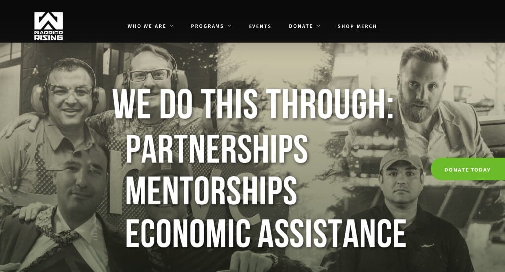
5. Warrior Rising
Why We Chose Warrior Rising
The website for Warrior Rising serves as a premier benchmark for “High-Impact Veteran Advocacy Merchandising and High-Trust Philropic Mobilization Architecture.” Dedicated to helping U.S. military veterans and their immediate families achieve the American dream by transforming them into “vetrepreneurs,” their digital storefront must effortlessly project mission clarity, operational scale, and community validation. The platform masterfully succeeds by coupling transparent real-time impact data with strategic, highly visible giving pathways that reduce donation hesitation.
Key Design Highlights:
- Immediate Mission Absolute Clarity: The website completely avoids ambiguity by delivering an instantly understandable core purpose right at the top of the homepage. By explicitly defining their role in providing training, mentorship, and funding to help veterans start and scale sustainable businesses, the interface ensures that corporate sponsors, everyday donors, and aspiring veteran entrepreneurs immediately recognize the organization’s distinct civic blueprint.
- Frictionless Above-the-Fold Desktop Donation Engine: Maximizing donor onboarding velocity, the desktop experience features two strategically positioned, high-contrast donation buttons located entirely above the fold. By placing these primary gateways within immediate view upon landing, the interface successfully caters to high-intent traffic, allowing supporters to effortlessly launch into a secure checkout track before scrolling deep into the page.
- Dynamic Real-Time Social Proof and Donation Overlays: A standout interactive highlight of the layout is a persistent notification widget that pops up gracefully in the bottom left corner of the viewport. By periodically cycling through real-time announcements of recent financial contributions made by other supporters, the platform establishes an active, community-wide momentum that subtly validates the charity’s trustworthiness and encourages immediate participation.
- Animated Data-Backed Metric and Milestone Counters: Positioned dynamically within the core layout is an eye-catching, animated metric showcase that tracks their ongoing organizational footprint. By displaying live running tallies of the exact number of veterans assisted alongside the thousands of education hours provided – both for the current calendar year and since the nonprofit’s inception – the interface delivers a commanding level of mathematical proof, showing donors exactly how their contributions translate into physical systemic impact.
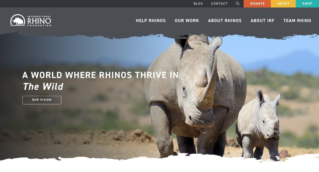
6. International Rhino Foundation
Why We Chose International Rhino Foundation
The website for the International Rhino Foundation (rhinos.org) serves as a premier benchmark for “High-Impact Wildlife Conservation Merchandising and Immersive Global Advocacy Layouts.” Tasked with protecting the world’s five remaining rhino species across Africa and Asia, their digital storefront must translate extreme ecological urgency into rapid community mobilization and retail-driven support. The platform masterfully succeeds by coupling a dual-tier navigation system with structured grassroots entry points that seamlessly capture both quick transactions and long-term donor commitments.
Key Design Highlights:
- High-Contrast Global Announcement Bar Matrix: Positioning conversion opportunities at the absolute peak of the visual layout, the website utilizes a dedicated announcement bar running entirely above the main header. Packed with distinct, colorful buttons inviting visitors to Donate, Adopt, or Shop, this premium real estate allows high-intent conservationists and holiday gift buyers to bypass standard informational paths and execute immediate financial support the exact millisecond the homepage loads.
- Frictionless Persistent Sticky Header Navigation: To maintain effortless browsing flow as users digest deep ecological data, the layout implements a beautifully engineered sticky header. As visitors scroll down the page to review global projects or range state updates, the core navigation elements pin cleanly to the top of the viewport, keeping essential educational portals and primary conversion gateways continuously accessible.
- Persuasive “How You Can Join the Fight” Activation Hub: Woven directly into the central scroll path is a dedicated, highly actionable segment explicitly titled “How You Can Join the Fight.” Rather than relying on ambiguous requests for help, this interface maps out clear, distinct pathways for user involvement – such as reading the annual State of the Rhino report, engaging with World Rhino Day events, or symbolically adopting specific rhinos in the field – which dramatically lowers choice friction and builds immediate grassroots momentum.
- Front-Page Field Updates and Editorial Storytelling Triage: Positioned cleanly within the lower layout workflow is an active repository of global news and insights straight from their conservation blog. Showcasing real-time reports from the field, updates on community partnerships, and critical anti-poaching developments transforms the platform from a static fundraising repository into a living, transparent mirror of on-the-ground environmental impact.

7. Mobilize Recovery
Why We Chose Mobilize Recovery
The website for Mobilize Recovery serves as a premier benchmark for “High-Impact Civic Advocacy Merchandising and National Movement-Building Architecture.” Dedicated to expanding access to recovery support, eliminating stigma, and organizing grassroots advocacy for those experiencing substance use disorder, their digital storefront must effortlessly project policy impact, national scale, and community solidarity. The platform masterfully succeeds by coupling persistent transactional access with structured community blueprints, turning casual web traffic into organized local activism.
Key Design Highlights:
- Frictionless “Donate” Global Header Integration: Maximizing philanthropic intake from the absolute moment a user arrives, the primary layout features a highly prominent, contrast-oriented “Donate” call-to-action button anchored permanently within the header space. Positioned in this premium screen real estate, it ensures that high-intent philanthropists, corporate partners, and everyday advocates can instantly launch into a secure giving gateway at any phase of their site interaction.
- Persistent Frictionless Sticky Header Navigation: To maintain an effortless and uninterrupted user journey as visitors engage with dense grassroots advocacy material, the interface features a beautifully engineered sticky header. As users scroll deep into the homepage content, the main navigation bar pins cleanly to the top of the viewport, keeping essential mobilization tools, event listings, and primary conversion links continuously accessible within the immediate viewing frame.
- Comprehensive Front-Page Programs and Initiatives Blueprint: The homepage entirely avoids vague organizational slogans, choosing instead to clearly layout its core strategic pillars directly in the central scroll path. By explicitly detailing their foundational programs – such as national bus tours, policy workshops, leadership training, and regional mobilization events – the interface allows individuals to rapidly match their personal advocacy goals with the movement’s active national campaigns.
- Front-Page Community Insights and Editorial Storytelling Triage: Positioned smoothly within the lower layout workflow is a dedicated feature section highlighting their curated blog and advocacy updates. Spotlighting real-time field reports, survivor success stories, and critical policy developments elevates the platform from a static organization directory into a living, transparent chronicle of real-world systemic change.
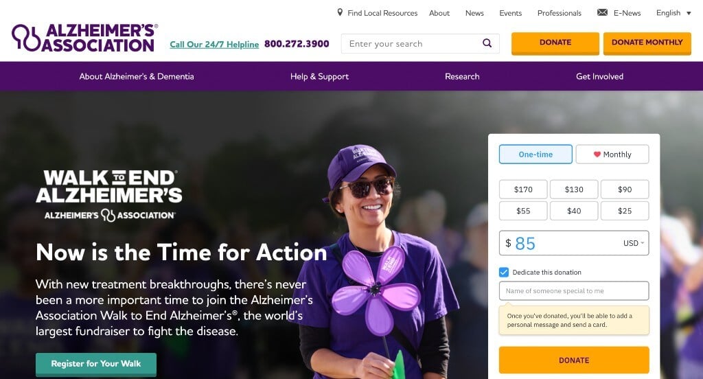
8. Alzheimer’s Association
Why We Chose Alzheimer’s Association
The website for the Alzheimer’s Association (alz.org) serves as a premier benchmark for “High-Scale Healthcare Philanthropy and High-Trust Patient Support Portals.” As the leading voluntary health organization in Alzheimer’s care, support, and research, their digital storefront must address two vastly different user intents simultaneously: providing immediate, compassionate crisis resources for caregivers and securing massive philanthropic backing for medical research. This platform masterfully succeeds by treating its homepage as a bifurcated, highly accessible navigation ecosystem that entirely eliminates user friction during times of high emotional stress.
Key Design Highlights:
- High-Conversion Native Hero Donation Terminal: Capitalizing on immediate visitor intent and seasonal campaigns, the website features a fully integrated, streamlined donation module built directly into the primary hero real estate. By allowing users to seamlessly select custom financial tiers or easily toggle between one-time and monthly recurring gifts the exact split second the page loads, the interface captures philanthropic generosity without forcing users through a multi-step navigational path.
- Dual-Purpose Patient Care and Support Blueprints: A major empathetic and structural triumph of the homepage layout is its clear explanation of how the organization actively serves those affected by Alzheimer’s and other dementias. By cleanly showcasing direct, immediate access to clinical care resources – such as their 24/7 Helpline, local support chapters, educational programs, and professional caregiver training tools – the layout acts as a vital sanctuary for families seeking urgent guidance.
- Comprehensive “How to Get Involved” Activation Matrix: To scale civic participation comfortably across diverse global demographics, the homepage outlines an array of distinct, highly organized pathways to join the fight against dementia. By structuring clear options to participate in signature fundraising events (like the Walk to End Alzheimer’s and The Longest Day), volunteer locally, advocate for public policy changes, or donate directly, the interface effectively reduces choice friction and funnels visitors into specialized engagement tracks.
- Ultra-Clean Mobile Viewport and Accessibility Continuity: Translating a massive, resource-heavy healthcare ecosystem onto smaller screens is flawlessly managed through an expertly optimized mobile framework. The smartphone interface elegantly handles critical whitespace, condenses complex text matrices into clean single stacks, and keeps vital lifelines – such as the 24/7 crisis helpline number – perfectly touch-accessible and unobstructed for stressed caregivers seeking help on the go.
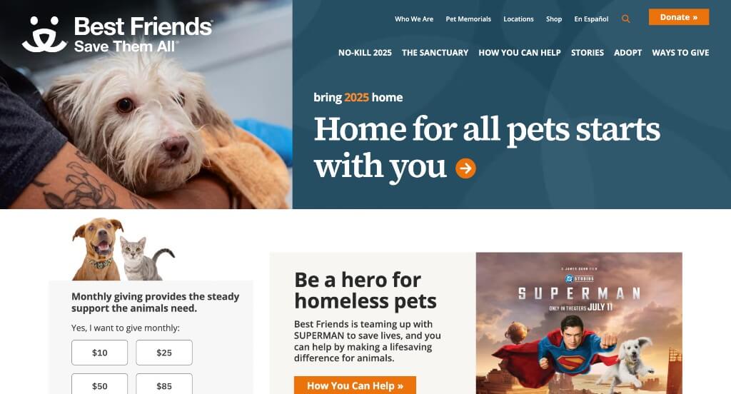
9. Best Friends Animal Society
Why We Chose Best Friends Animal Society
The website for Best Friends Animal Society serves as a premier benchmark for “High-Impact Animal Welfare Merchandising and High-Trust Community Mobilization Architecture.” As a leading national organization dedicated to ending the killing of dogs and cats in America’s shelters, their digital storefront must translate passionate advocacy into immediate local actions, adoptions, and charitable donations. This platform masterfully succeeds by structuring its homepage as a solution-oriented sanctuary, balancing immense moral clarity with continuous transactional access and proactive donor assurance.
Key Design Highlights:
- Immediate “No-Kill” Mission Absolute Clarity: The website completely avoids ambiguity by delivering an instantly understandable core purpose right at the top of the homepage. By explicitly defining their singular, bold imperative – to bring the entire country to a “no-kill” status and ensure no pet is killed in a shelter simply for lacking a home – the interface ensures that casual animal lovers, corporate sponsors, and volunteers immediately recognize the profound legal and ethical scope of their work.
- Comprehensive Front-Page “Ways to Help” Activation Grid: To scale participation comfortably across a nationwide audience, the homepage cleanly maps out various actionable pathways for direct user involvement. Rather than presenting a vague request for help, the interface organizes clear, distinct choices – inviting visitors to adopt a pet, foster local shelter animals, volunteer at regional centers, or advocate for municipal safety laws – which systematically reduces choice friction and funnels users into specialized grassroots tracks.
- Persistent, Multi-Layered Donation Touchpoints Throughout Scroll Path: Capitalizing beautifully on varying levels of donor intent, the layout features a highly strategic array of various ways to donate as you scroll deeper into the homepage. By seamlessly surfacing distinct, well-timed giving mechanics – ranging from standard one-time giving widgets and monthly sustainers (The Guardians) to symbolic pet sponsorships and legacy giving – the framework continuously captures generosity at multiple emotional touchpoints without disrupting the narrative flow.
- Proactive Structural FAQ and Reassurance Directory: Positioned smoothly within the lower homepage scroll path is a dedicated, highly functional Frequently Asked Questions section. By directly addressing common, high-anxiety visitor inquiries – such as where donor funds are allocated, how local shelter data is tracked, and how individuals can get involved in their own specific towns – the interface efficiently builds deep organizational trust and removes personal hesitation right at the final point of conversion.
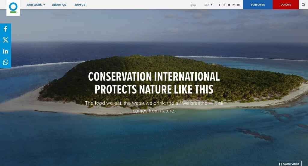
10. Conservation International Foundation
Why We Chose Conservation International
The website for Conservation International serves as a premier benchmark for “High-Trust Ecological Merchandising and Immersive Global Conservation Architecture.” Tasked with protecting the critical nature that humanity relies on for food, fresh water, livelihoods, and a stable climate, their digital storefront must translate massive geopolitical and environmental science initiatives into immediate personal relevance. This platform masterfully succeeds by departing from traditional layout conventions, pairing a highly unique structural navigation system with tightly categorized, impact-driven pathways to global action.
Key Design Highlights:
- Unconventional Left-Sidebar Global Navigation Architecture: Breaking away from traditional, crowded top-horizontal headers, the desktop platform utilizes a distinctive left-sidebar menu layout. This unique design approach keeps the primary site directory beautifully organized and permanently accessible along the left edge of the viewport, freeing up immense, unobstructed screen real estate to showcase sweeping, high-fidelity environmental photography and campaign journalism.
- Three-Pillar Strategic Activation Matrix (Climate, Ocean, Biodiversity): The homepage completely avoids overwhelming general visitors with unstructured data, choosing instead to organize its primary mobilization tracks into three hyper-focused environmental pillars. By prompting users to explore and support targeted efforts across Climate, Ocean, or Biodiversity, the interface systematically reduces choice friction, allowing corporate philanthropists and everyday environmentalists to instantly funnel their intent into the specific global causes they care about most.
- Front-Page Editorial Journalism and Field Impact Triage: Positioned smoothly within the central homepage scroll path is a dedicated feature section highlighting their curated blog and scientific dispatches. Spotlighting real-time field reports, interviews with indigenous leaders, and deep-dives into conservation biology transforms the website from a static donation repository into a living, authoritative newsroom tracking global environmental progress.
- Ultra-Clean Mobile Viewport and Typographic Balance: Translating a large-scale, content-heavy global enterprise onto smaller screens is flawlessly managed via an expertly optimized mobile framework. The smartphone experience gracefully transitions away from the sidebar structure into an intuitive, hidden mobile menu while prioritizing a highly readable, single-column scroll path. Generous whitespace, large touch-friendly buttons, and crisp typography ensure that time-conscious users can comfortably consume global impact stories and securely complete transactions on the go.
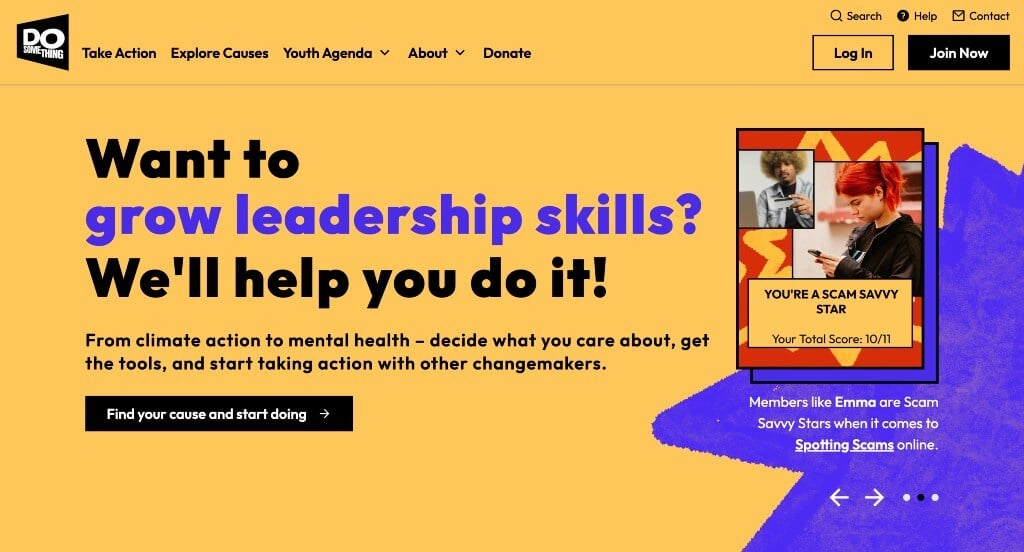
11. Do Something
Why We Chose DoSomething.org
The website for DoSomething.org serves as a premier benchmark for “High-Energy Youth Activation Architecture and Gamified Civic Merchandising.” As one of the largest organizations dedicated exclusively to young people and social change, their digital storefront must translate complex global issues into highly approachable, immediate, and culturally resonant peer-to-peer actions. This platform masterfully succeeds by treating its homepage as a vibrant, youth-centric dashboard that strips away institutional stuffiness in favor of interactive engagement, bold aesthetics, and fluid mobile ergonomics.
Key Design Highlights:
- Interactive Multi-Option Social Impact Slider: Rather than overwhelming young changemakers with dense programmatic listings, the homepage utilizes an engaging, user-controlled carousel slider showcasing diverse ways to “do good.” This interactive component allows gen-z and youth advocates to effortlessly cycle through immediate, bite-sized volunteer campaigns – ranging from mental health advocacy to environmental cleanups – matching their personal interests with actionable causes in seconds.
- Vibrant Gen-Z Aesthetic and Geometric Design Language: Breaking entirely away from the muted, overly formal design palettes of traditional non-profits, the interface embraces high-contrast, ultra-bright color blocking paired with sharp, modern geometric patterns. This deliberate, youth-culture-forward visual framework mirrors a modern lifestyle and media brand, establishing immediate cultural alignment and making social activism feel inherently exciting, trendy, and communal.
- High-Impact Explainer Video Integration: The platform secures instant operational clarity and community trust through an authentic video segment woven directly into the homepage layout. By dynamically showcasing real young people collaborating on real-world projects, the media completely demystifies what the organization does, demonstrating the tangible power of collective youth activism the moment a visitor arrives.
- Ultra-Clean Mobile Viewport and Snackable Content Continuity: Given that its core demographic is mobile-first, the platform features an flawlessly optimized smartphone framework. The mobile experience effortlessly translates the bright geometric blocks and interactive sliders into a perfectly stacked, single-column scroll path. Large, touch-friendly tap targets, minimized load friction, and perfectly balanced whitespace ensure that users can discover campaigns, log volunteer hours, and share actions across social channels seamlessly on the go.

12. David Suzuki Foundation
Why We Chose David Suzuki Foundation
The website for the David Suzuki Foundation serves as a premier benchmark for “High-Trust Science-Based Advocacy and Democratic Mobilization Architecture.” As Canada’s preeminent voice for environmental preservation, climate solutions, and biodiversity protection, their digital storefront must translate rigorous scientific research into rapid civic action and systemic policy pressure. This platform masterfully succeeds by organizing its layout into a dual-purpose funnel that pairs an extensive, expert-led educational database with immediate, multi-channel grassroots entry points.
Key Design Highlights:
- High-Efficiency Multi-Tier Global Mega Menu: Navigating a sprawling, multi-decade ecosystem of environmental research and regional campaigns is made entirely effortless through a beautifully engineered mega menu. By organizing deep-site branches – such as specialized climate solutions, biodiversity research, and local community activities – into structured, scannable dropdown matrices, the desktop framework eliminates navigation friction and connects users to their desired content tracks in a single click.
- Front-Page Strategic “Featured Projects” Showcase: Positioned prominently within the primary homepage flow is a dedicated portal showcasing their most critical current active initiatives. Highlighting specialized, real-time campaigns – ranging from clean energy grid modeling to indigenous-led land stewardship and environmental justice initiatives – ensures that visitors instantly witness the organization’s contemporary, on-the-ground operational impact.
- Direct Multi-Channel Civic “Your Voice Matters” Grid: A major tactical triumph of the homepage layout is its structured civic action hub, explicitly urging users to “Write a letter,” “Sign a petition,” or “Phone now.” Rather than relying on passive requests for support, this framework lowers the barrier to political participation by providing direct digital channels to contact MPs, lobby for renewable infrastructure, or demand environmental protections right from the front page.
- Expert-Led “Science Matters” Editorial Showrooms: The platform commands absolute institutional credibility by populating its layout with deep-dive articles, briefings, and analyses authored by environmental scientists and policy specialists. Merging real-world educational journalism with evidence-based research updates transforms the platform from a standard charity repository into a high-authority newsroom that cleanly explains global ecological needs and solutions.

13. The Humane League
Why We Chose The Humane League
The website for The Humane League serves as a premier benchmark for “High-Velocity Institutional Advocacy Merchandising and Frictionless Grassroots Mobilization.” As a hyper-focused international nonprofit dedicated to ending the abuse of animals raised for food, their digital storefront must translate systemic agricultural data into urgent, consumer-driven activism. The platform masterfully succeeds by treating its homepage as a high-conversion, multi-channel action matrix that entirely minimizes onboarding friction on both desktop and mobile devices.
Key Design Highlights:
- Frictionless Native Hero Donation Terminal: Capitalizing on immediate visitor intent, the platform features a streamlined, high-contrast donation widget built directly into the primary hero real estate. By enabling users to seamlessly select financial tiers or easily toggle between one-time and monthly recurring gifts the exact split second the page loads, the interface captures philanthropic generosity without forcing users through multi-step checkout paths.
- Front-Page Institutional Petitions and Accountability Portals: A major tactical triumph of the homepage layout is its prominent showcase of live corporate and legislative petitions aimed at improving the lives of farm animals. Bringing these active campaigns directly to the front page allows visitors to instantly add their signatures to major institutional pressure campaigns, immediately converting passive web traffic into active consumer advocates.
- Dynamic, Multi-Layered Conversion Architecture: The homepage entirely avoids linear layout fatigue by weaving a diverse range of contextually placed call-to-action (CTA) modules throughout the entire scroll path. By fluidly alternating between gateways to deep-dive educational articles, volunteer opportunities, active petitions, and secondary giving tracks, the framework continuously captures user interest across multiple different engagement preferences.
- Ultra-Clean Mobile Viewport and Snackable Content Continuity: Translating a high-intensity advocacy movement onto smaller viewports is flawlessly managed via an expertly optimized mobile framework. The smartphone interface handles dense campaign messaging by stacking multi-column content into single, high-readability scrolls. Large touch targets, well-balanced whitespace, and optimized widget layouts ensure that time-conscious users can read field reports, sign petitions, and securely complete transactions on the go.

14. Memphis Zoo
Why We Chose Memphis Zoo
The website for the Memphis Zoo serves as a premier benchmark for “Immersive Family Entertainment Merchandising and High-Velocity Guest Conversion Infrastructure.” As an elite wildlife conservation institution, their digital platform must successfully balance world-class educational authority with a highly energetic, welcoming virtual storefront that excites parents, educators, and travelers alike. This platform masterfully succeeds by treating its homepage as a colorful, media-rich gateway that entirely eliminates visitor friction and optimizes trip planning.
Key Design Highlights:
- Vibrant Visual Storytelling and High-Energy Color Palette: The website immediately commands attention by packing the homepage with brilliant imagery of active animals and high-fidelity wildlife exhibits. Complemented by a bright, nature-inspired color hierarchy, the design creates an immediate emotional connection for families, mirroring the exciting, hands-on atmosphere found within the physical grounds.
- Cinematic, Species-Diverse Hero Video Loop: Setting a high-fidelity visual tone the exact split second the page loads, the layout dominates the primary viewport with an immersive hero video. By flashing dynamic footage of a wide variety of animals in motion, the media instantly captures the scale and diversity of the zoo’s inhabitants, driving immediate engagement from users of all ages.
- Mega-Menu Driven “Plan Your Adventure” Action Hub: Maximizing guest onboarding velocity, the global header navigation features a highly prominent, action-oriented portal button that triggers an expansive mega-menu layout. Rather than forcing users to sift through complex background directories, this mega-menu cleanly organizes critical trip-planning pillars – such as seasonal special events, specialized adventure guides, and a transparent “Know Before You Go” operational advisory section – into an instantly scannable, multi-column directory.
- Direct Front-Page Exhibit Exploration Gateways: Eliminating deep navigation paths for high-intent researchers, the homepage integrates streamlined entry points that allow visitors to access deep-dive information on various zoo habitats right from the main scroll path. This structural layout enables families to map out their must-see animal exhibits and educational zones long before they step foot past the ticketing gates.
WordPress Nonprofit Themes
You can find free themes at wordpress.org, or explore nonprofit-inspired templates on ThemeForest.
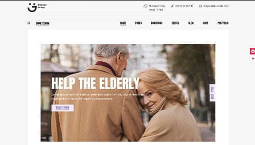
Goodwish – Themeforest
$69
DoGood – Themeforest
$79
LoveIcon – Themeforest
$29
Act – Themeforest
$44