WooCommerce is far more than just a WordPress plugin; it is a global powerhouse that enables brands to create fully bespoke, high-conversion shopping experiences. Because it offers total control over the checkout funnel and product architecture, WooCommerce is the platform of choice for retailers who refuse to be boxed in by the limitations of SaaS platforms.
Our development team analyzed hundreds of digital storefronts to identify the top 9 examples that masterfully leverage the extensibility and speed of WooCommerce. We evaluated these sites based on mobile-first checkout optimization, advanced product filtering, and seamless brand storytelling. These selections prove that when engineered correctly, WooCommerce can handle everything from niche boutique collections to high-volume enterprise inventories.
Whether you are launching your first online store or migrating to a more flexible ecosystem, these examples represent the benchmark for WooCommerce excellence in 2026.
Note on Our Selection Process: We recently audited this guide to remove outdated storefronts and sites that no longer meet our performance or security standards. This curated list now focuses on the top 9 WooCommerce websites providing the most strategic value in 2026.
Top WooCommerce Website Designs
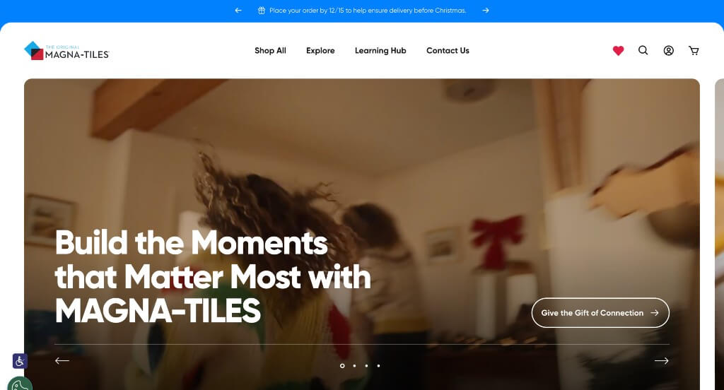
1. Magna-Tiles
Why We Chose Magna-Tiles
The website for Magna-Tiles serves as a premier benchmark for “Vibrant E-Commerce Play Patterns and Frictionless Parental Onboarding.” For a globally recognized educational toy brand, the digital storefront must capture a child’s imaginative wonder while simultaneously satisfying a parent’s analytical checklist regarding durability, safety, and learning value. This platform masterfully succeeds by enveloping a conversion-focused retail funnel in a high-energy, colorful aesthetic that makes product exploration feel like play.
Key Design Highlights:
- High-Contrast Playful Color Blocking: Embracing its identity as a foundational children’s creative toy, the home page features a confident use of bright, saturated primary and secondary colors. Rather than relying on cold corporate neutrals, these energetic tones mirror the translucent hues of the physical magnetic tiles themselves, instantly establishing a playful brand connection while using bright accents to segment different areas of the page.
- Curated Retail Integration and Featured Sets: Positioned prominently on the front page is a dedicated directory highlighting their featured building sets and trending expansion packs. Presenting these highly visual product cards right on the main scroll path enables parents and gift-shoppers to immediately view popular collections, check age recommendations, and move straight into the buying process.
- Proactive Front-Page FAQ Resolution: A major structural highlight of the layout is the placement of common Frequently Asked Questions directly on the home page. By handling crucial buying considerations upfront – such as plastic safety standards, component compatibility, and magnetic strength – the design instantly dispels parental skepticism and reduces pre-purchase friction before a user ever adds an item to their cart.
- Educational and Community Blog Spacing: The homepage incorporates a dedicated layout section spotlighting their latest blog entries and STEM lesson ideas. Showcasing up-to-date articles on open-ended play styles, spatial development benefits, and classroom building activities elevates the site from a basic toy store to a valuable learning resource, deepening long-term brand loyalty.
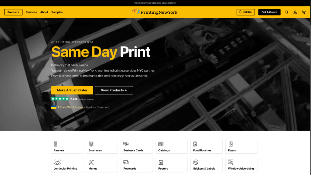
2. Printing New York
Why We Chose Printing New York
The website for Printing New York serves as a premier benchmark for “High-Velocity Commercial Conversion and Comprehensive Service Taxonomy.” In a fast-paced corporate market where businesses require rapid turnarounds on marketing and administrative materials, a digital storefront must balance immediate transaction paths with absolute clarity on production capabilities. This platform masterfully succeeds by keeping its home page focused on clear service divisions while handling customer objections through structured trust blocks.
Key Design Highlights:
- High-Visibility Header Transaction Anchor: Positioned prominently within the primary site header is a dedicated “Get a Quote” button. Placing this critical call to action at the absolute top of the interface ensures that busy corporate clients, event coordinators, and graphic designers can initiate a commercial print order instantly upon landing on the page.
- Direct Commercial Service and Offering Index: The home page features a comprehensive, beautifully structured directory of their core print services. Explicitly laying out their vast production capabilities – spanning large-format printing, custom binding, corporate signage, and direct mail fulfillment – allows commercial buyers to instantly verify project compatibility without wading through complex site menus.
- The “4 Reasons to Get Printing Started With Us” Value Proposition: A major structural highlight of the layout is a dedicated section outlining the company’s distinct competitive advantages. Explicitly defining their unique value drivers – such as rapid local turnaround times, advanced eco-friendly inks, precise color-matching guarantees, and competitive pricing structures – efficiently tackles buyer hesitation right upfront.
- Dual-Track Resource Hub and Proactive FAQ Triage: Positioned smoothly in the lower homepage workflow is a featured blog feed followed by a robust Frequently Asked Questions section. Spotlighting helpful design tips, file setup guidelines, and print care insights establishes their technical expertise, while the subsequent FAQ layer handles final pre-purchase inquiries regarding paper stocks, bleed dimensions, and delivery logistics.
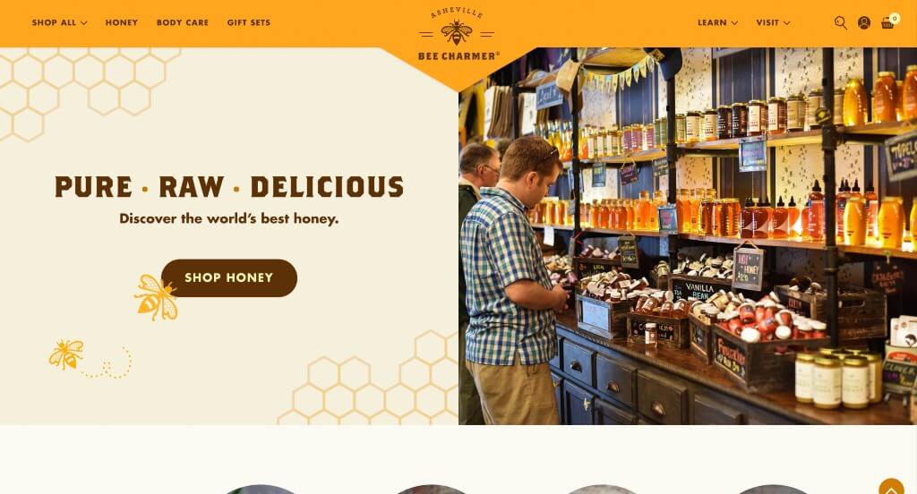
3. Asheville Bee Charmer
Why We Chose Asheville Bee Charmer
The website for Asheville Bee Charmer serves as a premier benchmark for “Artisanal Culinary Storytelling and Content-Driven Retail Conversion.” For a specialty food brand, a digital storefront must do more than display products – it needs to evoke flavor, capture regional charm, and inspire immediate culinary use. This platform masterfully succeeds by treating the homepage as an interactive tasting room, wrapping its e-commerce inventory in rich recipes and deep educational content.
Key Design Highlights:
- Thematic “Honey of the Week” Dynamic Promo: A major standout on the home page is the dedicated “Honey of the Week” spotlight feature. Rather than just placing a random bottle on sale, the layout elevates the promotion by pairing a specific, artisanal flavor with a curated culinary recipe that uses it. This clever cross-merchandising approach shifts the product from a basic pantry item to an essential ingredient, giving foodies a compelling reason to buy.
- Comprehensive Artisanal Flavor Directory: The home page beautifully showcases their extensive collection of varietal honeys, infused selections, and bee-centric lifestyle goods. Organizing these distinct product paths into clean, visual blocks allows online shoppers to immediately appreciate the massive diversity of flavors – such as hot pepper infused, lavender, or sourwood honeys – right from the main scroll path.
- Artfully Styled, High-Density Mega Menu: To organize an expansive catalog of specialty honeys, skin care products, and gift sets without overwhelming the browser, the interface utilizes a beautifully styled mega menu system. The dropdown layout balances clean, elegant typography with generous whitespace and clear category divisions, turning site navigation into an effortless, visual browsing experience.
- Narrative-Driven Educational Blog Integration: Positioned smoothly in the homepage workflow is a section highlighting their recently updated blog. Showcasing fresh articles on sustainable beekeeping, the science behind honey crystallization, and unique pairing tips establishes the company as an authentic, trusted authority in the artisanal food movement, building deep community trust.
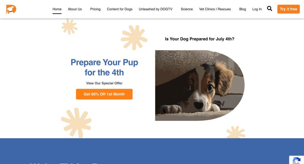
4. DogTV
Why We Chose DOGTV
The website for DOGTV serves as a premier benchmark for “Niche Subscription Conversion and Dynamic Visual Segmentation.” For a specialized streaming service designed for pets and their owners, the digital storefront must quickly educate the user on a unique product concept while making the subscription funnel incredibly straightforward. This platform masterfully succeeds by mixing lively color-blocked storytelling with rich, multi-media social proof directly on the homepage.
Key Design Highlights:
- Alternating Color-Blocked Section Layout: A major structural highlight of the home page is the intentional switching of background colors as you scroll down the page. This rhythmic alteration between distinct corporate tones serves as a clear visual guide, beautifully breaking up different messaging blocks – shifting from product benefits to features to proof – without causing reading fatigue.
- Rich, Authentic Video Testimonial Streams: Rather than relying solely on standard text reviews, the homepage integrates dynamic video testimonials. In a unique industry like pet media, showing real pet parents sharing their video success stories – and catching glimpses of calm, entertained dogs interacting with the service – supplies an undeniable layer of authentic, emotional social proof.
- Transparent Subscription Pricing Architecture: The homepage features a clear, dedicated pricing breakdown that handles customer vetting right upfront. Explicitly laying out monthly and annual subscription plans side-by-side, along with free trial details, simplifies the decision-making process and removes common checkout hesitation for ready-to-register pet owners.
- Instant Conversational Live Chat Pathway: To assist browsing customers who might have immediate questions about app compatibility, device setups, or science-backed programming, the layout includes an active live chat feature. This real-time communication portal offers a low-barrier channel to address customer support queries instantly, keeping users moving smoothly down the conversion path.
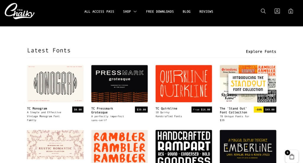
5. Tom Chalky
Why We Chose Tom Chalky
The website for digital asset and font designer Tom Chalky serves as a premier benchmark for “High-Contrast Creative Retail Merchandising and Direct Asset Conversion.” For an independent digital creator, a digital storefront must immediately display artistic style while eliminating any friction between inspiration and a final download. This platform masterfully succeeds by keeping the interface remarkably clean and hyper-focused on direct retail pathways right from the main scroll path.
Key Design Highlights:
- Fresh, Artist-Driven Hero Showcase: The website opens by dedicating its prime hero real estate to his latest font creations and design asset releases. Leading with these stylized, large-scale typography lockups acts as an immediate portfolio display, capturing the attention of graphic designers and art directors looking for fresh creative tools the split second the page loads.
- Direct Front-Page E-Commerce Catalog: A major structural highlight of the layout is how it showcases premium digital products directly on the home page. By integrating product grids with clear pricing and quick access paths right on the main scroll path, the site allows creators to easily find the brush kits, textures, or typefaces they want and move straight to checkout without unnecessary clicking.
- High-Contrast Monochrome Aesthetic: The platform utilizes a deliberate black-and-white color palette across its primary layout blocks. Stripping away competing color noise ensures that the intricate textures, colorful design examples, and detailed font previews stand out with absolute clarity, using neutral space to make the artwork the true focal point of the page.
- Instant Conversational Live Support Channel: To assist designers who might have immediate questions regarding extended commercial licensing, software compatibility, or file installation steps, the home page includes an active live chat feature. This real-time communication portal offers a low-barrier channel to resolve technical inquiries instantly, keeping the creative workflow moving smoothly.
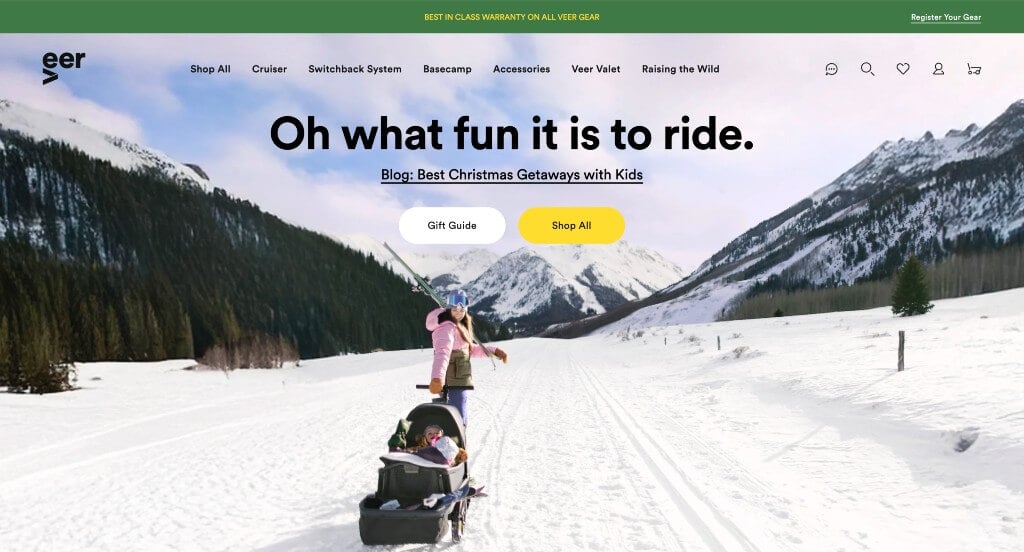
6. Veer
Why We Chose Veer
The website for Veer serves as a premier benchmark for “Rapid Functional Demonstration and Authority-Backed Commerce Flow.” For an innovative product manufacturer, a digital storefront must instantly bridge the gap between a consumer’s curiosity and their understanding of how a product operates in the real world. This platform masterfully succeeds by using active video demonstrations to eliminate product skepticism, while reinforcing the buying journey with structured educational content and prominent customer praise.
Key Design Highlights:
- High-Impact Rapid Product Assembly Hero: The website opens immediately with a high-quality, fast-paced video loop dominating the primary hero area. Showing a featured product being quickly assembled and put to use right as the page loads instantly conveys its practical engineering, ease of use, and unique value proposition without requiring the user to read long manuals or dense feature lists.
- Direct Front-Page Product Catalog Showcase: The homepage beautifully structures a dedicated product directory that places their core inventory on center stage. Organizing these items into a clean, highly visual grid right on the main scroll path allows browsing consumers to easily scan the product lineup, check key specifications, and move directly toward a final purchase.
- Thematic “Recent Accolades” Social Proof Triage: A major structural highlight of the layout is the prominent placement of a “Recent Accolades” section. Rather than grouping these customer reviews into a basic, hidden testimonial block, framing them as celebrated accolades elevates the status of everyday customer feedback into prestigious brand milestones, building massive consumer trust.
- Editorial Insight and Resource Hub Feature: Positioned smoothly in the lower homepage workflow is a dedicated section highlighting their latest blog articles. Showcasing fresh commentary, lifestyle tips, and deeper product insights establishes the brand as an engaged, helpful authority in its space while giving visitors a reason to stay connected with the company long after their initial purchase.
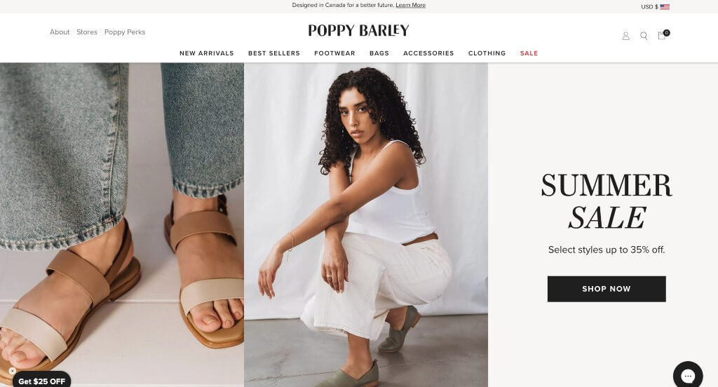
7. Poppy Barley
Why We Chose Poppy Barley
The website for Poppy Barley serves as a premier benchmark for “High-End Fashion Taxonomy and Strategic Direct-to-Consumer Conversion.” For an ethical luxury footwear and accessories brand, a digital storefront must instantly convey material quality and brand value while providing an incredibly smooth path to checkout. This platform masterfully succeeds by anchoring its homepage with high-fidelity product photography, highly organized navigation layers, and high-impact promotional placement.
Key Design Highlights:
- High-Conversion Sales Promotion Hero Core: The website utilizes its most valuable real estate – the primary hero area – to actively promote their latest seasonal sale. Leading with a bold, clear promotional message the exact split second the page loads instantly captures the attention of deal-seeking shoppers, creating immediate buying urgency and driving traffic directly to discounted collections.
- Immediate Below-the-Hero Category Triage: Positioned strategically right beneath that primary hero area is a clean, visual row of product categories. Placing these direct shopping links immediately in the user’s primary scroll path eliminates browsing friction, allowing customers to jump straight to their preferred collection – such as boots, flats, or bags – without digging into complex dropdown menus.
- High-Fidelity, Texture-Focused Product Media: The homepage relies on exceptionally crisp, close-up product photography that highlights the premium craftsmanship of their items. By capturing the exact texture of the leather, clean stitching lines, and structural details, the visuals effortlessly communicate the brand’s luxury quality and sustainable manufacturing standards without relying on dense walls of text.
- Curated “Meet Our Best Sellers” Showcase: A major structural highlight of the layout is the dedicated “Meet Our Best Sellers” section. Showcasing their most popular, community-verified footwear and accessory models gives new visitors a trusted starting point, focusing attention on high-demand products and streamlining the path to purchase.
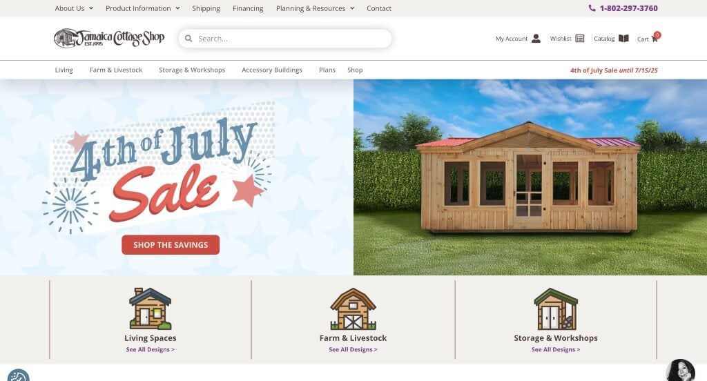
8. Jamaica Cottage Shop
Why We Chose Jamaica Cottage Shop
The website for Jamaica Cottage Shop serves as a premier benchmark for “High-Trust Blue-Collar E-Commerce and Frictionless Lead Acquisition.” For a manufacturer of premium post-and-beam timber frames, sheds, and cottages, a digital storefront must overcome the challenge of selling massive, high-ticket physical structures online. This platform masterfully succeeds by treating its homepage as a comprehensive trust-building engine, combining upfront process transparency with highly accessible communication hooks.
Key Design Highlights:
- High-Intent Lead Magnet Form Integration: Positioned directly on the home page is a high-visibility contact form offering free shed blueprints and design plans. By placing this high-value asset directly in the main scroll path, the site effortlessly lowers the barrier to entry, capturing qualified contractor and homeowner leads who are actively plotting out a future building project.
- The “Ordering Cottages Made Easy” Process Map: To demystify the complex logistics of buying and shipping full-scale timber kits, the homepage features a dedicated “Ordering Cottages Made Easy” framework. Breaking down the customization, manufacturing, and freight delivery steps into clear, straightforward stages eliminates buyer anxiety and establishes transparent workflow expectations right upfront.
- Community-Backed “Customer Stories” Showcase: A major structural highlight of the layout is the dedicated “Customer Stories” directory. Rather than presenting basic, generic text blurbs, framing these testimonials as in-depth stories – detailing how real clients transformed raw kits into backyard studios, tiny homes, or functional workshops – adds immense relational proof and inspires prospective buyers.
- Mobile-First Scrolling and Sticky Communication Anchor: The platform utilizes an exceptionally fluid mobile layout built for seamless handheld navigation. A critical performance feature is the persistent, sticky “Call Now” button anchored cleanly to the bottom of the screen as you scroll, giving on-the-go builders and rural property owners immediate, one-tap access to a live sales representative at any point during their research.
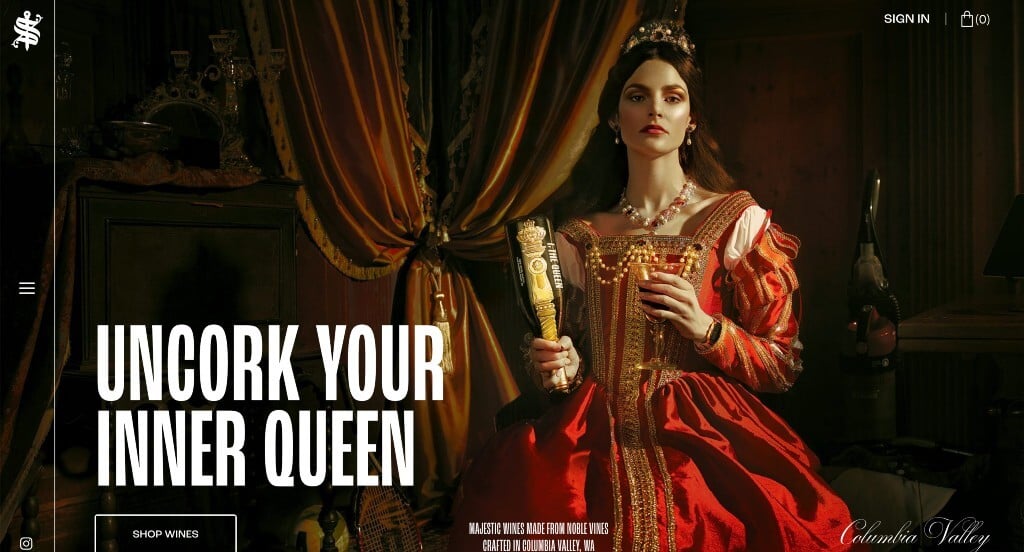
9. Scepter & Sword
Why We Chose Scepter & Sword
The website for Scepter & Sword serves as a premier benchmark for “Cinematic Digital Luxury and Immersive Spatial Navigation.” In the premium viticulture space, a winery’s online presence must do more than list product specifications – it needs to evoke the drama, craftsmanship, and exclusive pedigree of its collection. This platform masterfully succeeds by subverting traditional web mechanics, using experimental cursor physics and unexpected axes of movement to transform simple product discovery into an unforgettable sensory journey.
Key Design Highlights:
- Morphing Context-Aware Cursor Physics: The moment a user arrives on the site, the standard mouse cursor dynamically morphs into an oversized, elegant circle housing the text “Scroll to navigate.” This fluid micro-interaction serves as a striking sensory greeting, signaling that the user has entered an unconventional, high-end digital showroom that demands active, physical exploration.
- Avant-Garde Horizontal Scroll Architecture: Defying traditional vertical scrolling expectations, moving the scroll wheel pushes the homepage seamlessly across a horizontal plane. This sideways canvas mimics the slow, deliberate turning of a high-fashion editorial magazine, forcing the viewer to break away from rapid scanning and instead focus entirely on each curated visual block as it glides into view.
- High-Contrast Cinematic Photojournalism: The layout relies heavily on dramatic, moody, and deeply evocative imagery to establish its luxury branding. By pairing deep shadows with sharp, high-contrast lighting on bottle textures and vineyard elements, the visual assets create an aura of mystery and prestige that elevates the wine from a standard beverage to an artisanal masterpiece.
- Dynamic Full-Scale Video and Action Integration: Anchoring the horizontal layout is a massive, premium video asset that injects continuous motion and emotional weight into the homepage experience. This cinematic backdrop immediately leads into a clean, targeted call to action that directs captivated visitors straight into their wine collection, beautifully closing the loop between creative storytelling and digital commerce.
Recommended WooCommerce Themes
Druco – Themeforest
$59
Reebox – Themeforest
$48
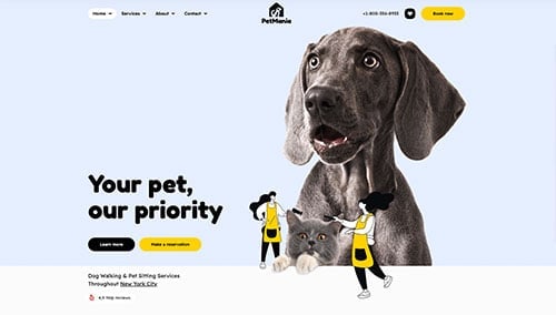
PetMania – Themeforest
$89
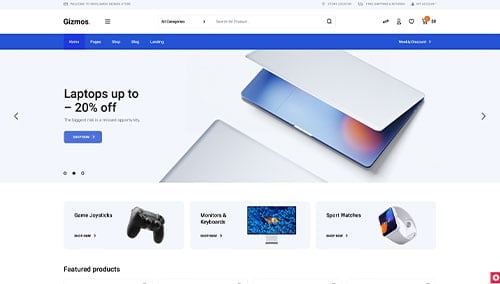
Gizmos – Themeforest
$89