WordPress powers over 40% of the internet, but there is a massive difference between a “basic template” and a high-performance, custom-engineered WordPress experience. Because of its unmatched flexibility, WordPress is the platform of choice for everything from agile startups and local non-profits to global enterprise brands.
Our development team analyzed hundreds of sites to identify the top 10 examples that push the boundaries of what this CMS can do. We looked beyond the standard features to find sites that excel in custom block architecture, rapid load times, and sophisticated user journeys. These selections prove that when paired with expert design and optimized hosting, WordPress is an unrivaled tool for digital growth.
Whether you are launching a brand-new project or looking to modernize an existing site, these examples represent the benchmark for WordPress excellence in 2026.
Note on Our Selection Process: We recently audited this guide to remove outdated designs and sites that no longer meet our performance standards. This curated list now focuses on the top 10 WordPress websites providing the most strategic value in 2026.
Top WordPress Website Designs
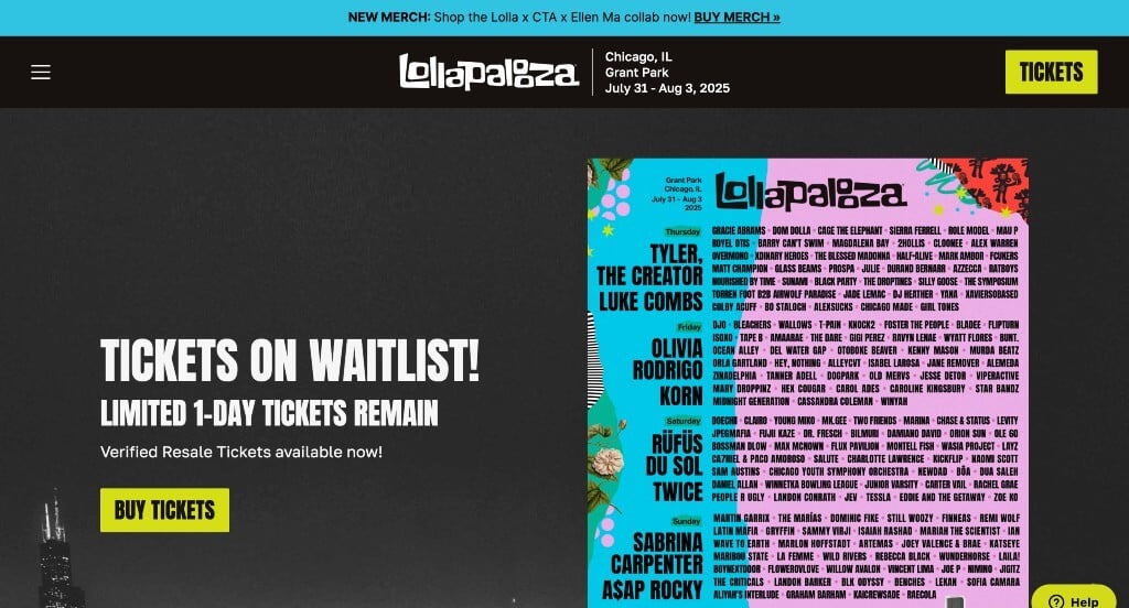
1. Lollapalooza
Why We Chose Lollapalooza
The website for Lollapalooza serves as a premier benchmark for “High-Energy Festival Atmosphere and Cinematic Interaction Mechanics.” Capturing the massive scale, cultural weight, and raw excitement of a legendary four-day music festival within a digital interface is no easy feat. This platform masterfully succeeds by ditching traditional, corporate layouts in favor of an intense visual sensory experience – using bold aesthetics and cutting-edge web development tricks to make browsing feel like you are already standing at the main stage.
Key Design Highlights:
- Immersive “Scrollytelling” Cinematic Scroll Mechanics: That unique layout shift you noticed is a highly modern web design technique known as Scrollytelling or Scroll-Driven Video/Animation Container Layering. Instead of standard, passive scrolling where elements simply slide up and down, the interface reaches a fixed focal point and essentially locks the screen horizontally. As you continue to scroll your mouse wheel, it acts as a playback controller – triggering cinematic background videos, shifting text layers across different depths, and morphing layout elements in real time like a movie sequence. This keeps users deeply locked into the interactive visual flow.
- High-Octane Visual Media and Festival Energy: The home page is driven by massive, full-bleed images and high-definition video loops bursting with high-energy crowd shots, flashing stage lights, and live performance clips. By putting the physical festival experience front and center, the site immediately pumps adrenaline into the user journey, instantly reminding music fans exactly why they need to buy a ticket.
- Bold, Maximalist Color Shock Palettes: Embracing a confident, youth-culture aesthetic, the user interface features an incredibly bold use of vibrant, high-contrast colors. Rather than relying on safe, boring neutral tones, the platform uses rich, neon-adjacent color blocking to create visual separation between content zones, giving the entire experience a loud, artistic punch that mirrors the eclectic spirit of the festival itself.
- Hero-Centered, High-Visibility Lineup Presentation: Instead of burying the most sought-after information deep within a sub-page, the festival’s star-studded lineup is featured prominently right inside the primary hero section on the home page. The typography is stylized yet beautifully structured and clean, allowing fans to instantly scan headliners and daily schedules the exact split-second they arrive on the site.
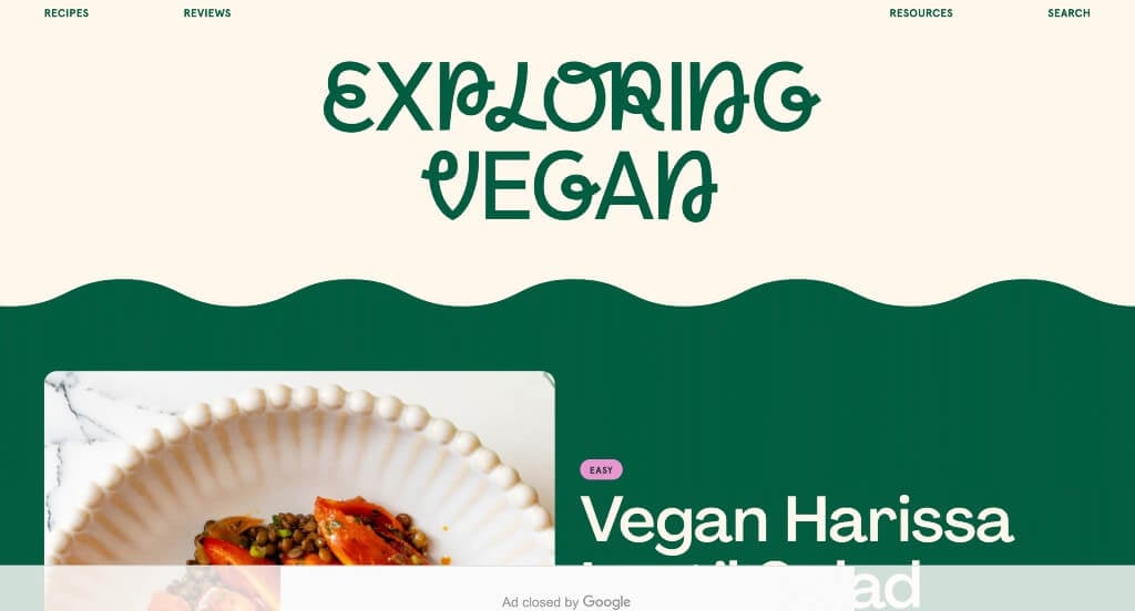
2. Exploring Vegan
Why We Chose Exploring Vegan
The website for Exploring Vegan serves as a premier benchmark for “High-Impact Editorial Food Presentation and Vibrant Accessibility.” In the online culinary space, a recipe blog must do more than just list ingredients; it needs to trigger immediate sensory appeal while making the user feel capable of recreating the dish. This platform masterfully succeeds by ditching traditional, cluttered blog layouts in favor of an energetic, editorial magazine style that makes plant-based cooking look both incredibly delicious and completely approachable.
Key Design Highlights:
- High-Fidelity, Sensory-Driven Culinary Media: The website relies on exceptionally high-quality food photography that serves as the visual anchor for every section. By prioritizing crisp lighting, rich colors, and close-up textures, the meals are framed to look undeniably enticing, effortlessly breaking the outdated stereotype that plant-based dining is plain or restrictive.
- Bold and Modern Pastel Color Theory: A major brand differentiator is the confident use of bold pastel background blocks and accents throughout the home page. Rather than hiding behind a standard, sterile all-white template, these contemporary pastel tones give the layout a stylish, welcoming personality that helps separate different content streams without visual fatigue.
- Maximalist Typography and Expressive Graphics: The platform utilizes oversized, heavy typography and crisp graphic elements to instantly establish a clear visual hierarchy. This large, confident lettering makes scanning for meal categories – like quick weeknight dinners or simple five-ingredient plates – entirely effortless, allowing users to capture vital information in a single glance.
- Polished Mobile Fluidity and Playful Animations: The transition down to smaller screens is beautifully executed through a clean, highly optimized mobile framework. The mobile user interface stacks information flawlessly while incorporating smooth, subtle scroll animations that bring the content to life without lagging on handheld devices, ensuring a premium browsing experience on the go.
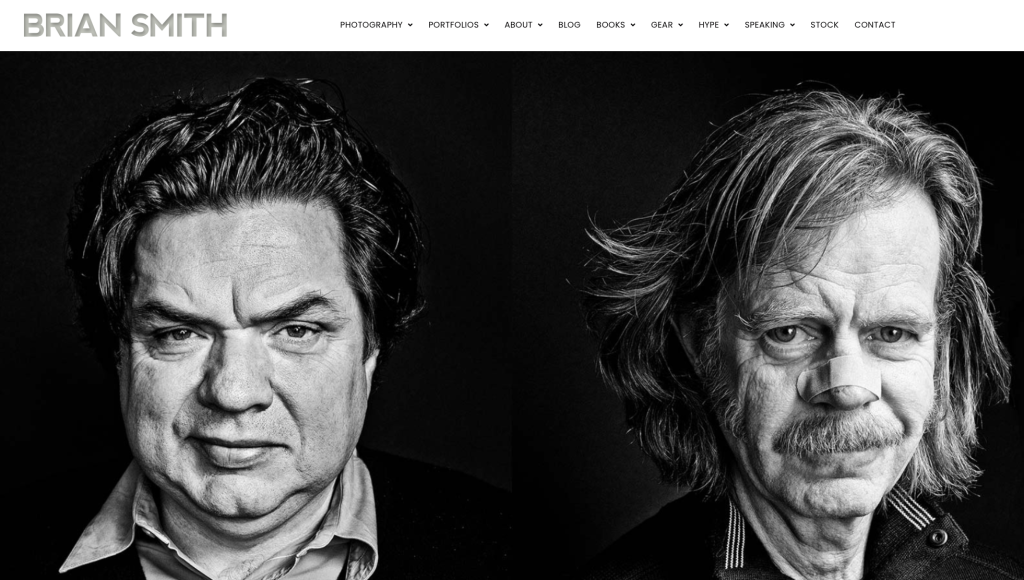
3. Brian Smith
Why We Chose Brian Smith Pictures
The website for celebrity portrait photographer Brian Smith serves as a premier benchmark for “High-Fidelity Portfolio Curation and Editorial Identity Layout.” For an award-winning visual artist, a digital storefront must act as a premium gallery space where the user interface completely yields to the artwork itself. This platform masterfully succeeds by treating its homepage as a clean, high-impact canvas that immediately establishes his professional caliber through immaculate image scaling and crisp structural hierarchy.
Key Design Highlights:
- Elite Celebrity Portraiture Hero Core: The website opens immediately with breathtaking, high-definition portrait photography filling the primary hero area. Leading with these striking, world-class celebrity images is a masterclass in instant credibility placement for a photography portfolio, capturing the viewer’s absolute focus and establishing his elite creative status the exact split-second the page loads.
- Multi-Genre Portfolio Specialization Directory: The homepage beautifully structures and showcases the diverse styles of photography he masters, ranging from commercial campaigns and fine art to intense editorial portraits. Organizing these distinct portfolios into clear, highly visual blocks allows creative directors, magazine editors, and commercial agencies to instantly map out his technical versatility.
- Narrative-Driven Behind-The-Scenes Blog Feed: The homepage smoothly incorporates a dedicated section spotlighting his latest blog articles. Rather than just showing final polished images, featuring his insights on gear choice, lighting setups, and the behind-the-scenes stories of his celebrity shoots positions the photographer as an approachable industry expert and educator.
- Minimalist, Image-First Mobile Navigation Flow: The platform utilizes an incredibly clean and responsive mobile framework built specifically to handle large media files without slowing down. The interface effortlessly stacks his portrait galleries and blog summaries into a smooth, distraction-free vertical lane, ensuring that on-the-go creative directors can swipe through his professional body of work with absolute visual clarity.
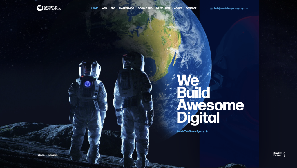
4. Watch This Space Agency
Why We Chose Watch This Space Agency
The website for Watch This Space Agency serves as a premier benchmark for “Deconstructive Visual Storytelling and Uncompromised Transactional Transparency.” For a forward-thinking creative or digital agency, a website must do more than host a portfolio – it needs to prove the team’s mastery of cutting-edge front-end development and spatial design. This platform masterfully succeeds by treating the user interface as a living, expanding canvas that balances avant-garde scroll animations with upfront business mechanics.
Key Design Highlights:
- Deconstructive Kinetic Hero Transition: The platform makes a memorable creative statement the moment it loads with a high-impact hero area. As the user begins to scroll, the primary image dynamically fragments and breaks apart, opening up the physical framework of the site to fluidly invite the next section into view. This modern manipulation of layers gives the brand a distinct, technologically sophisticated edge.
- Mixed-Media “Recent Projects” Showcase: To demonstrate their creative versatility, the homepage incorporates a lively portfolio grid that blends vivid static imagery with looping digital video snippets. This fast-paced, mixed-media presentation style immediately captures attention, allowing prospective clients to rapidly sample the agency’s production quality, motion capabilities, and aesthetic range in a few short seconds.
- Radical Front-Page Pricing Transparency: In an industry where costs are notoriously hidden behind long consulting loops, this platform confidently displays their pricing architecture directly on the homepage. Laying out project tiers or service costs upfront strips away common B2B vetting friction, instantly filtering for high-intent leads who respect clear, uncomplicated business terms.
- Macro-Scale Global Finale Background: Anchoring the bottom of the homepage is a massive, full-width video loop depicting a rotating Earth against a dark void. This cinematic choice functions as a dramatic visual exclamation point, grounding the agency’s bold identity with a sense of cosmic, macro-level scale while serving as an unforgettable backdrop for their final call to action.
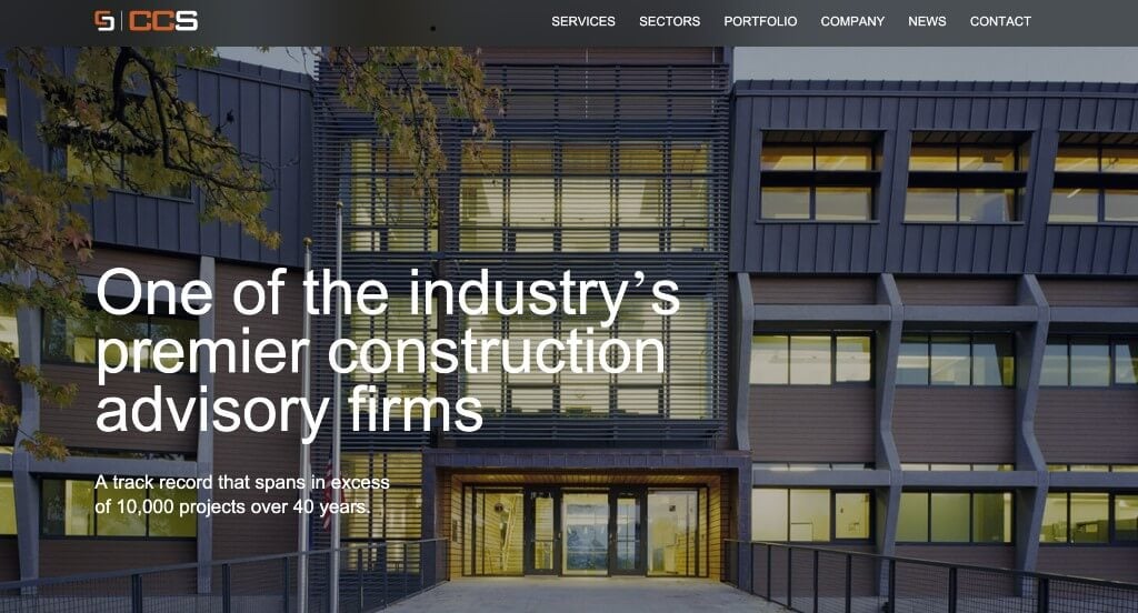
5. CCS
Why We Chose CCS Difference
The website for CCS Difference serves as a premier benchmark for “Micro-Interactive Brand Engagement and Fluid Narrative Progression.” For a consultancy or specialized service firm, a digital presence must feel sophisticated, intentional, and deeply interactive to stand out. This platform masterfully succeeds by converting standard corporate information into a series of rewarding, tactile discoveries – using custom mouse physics and elegant reveal triggers that keep users highly focused on their core message.
Key Design Highlights:
- Custom Interactive Pointer Flair: The website immediately elevates the browsing experience by attaching a dynamic shadow dot that fluidly tracks the user’s mouse movements across the screen. This responsive micro-interaction adds a layer of subtle, high-end polish to the interface, giving the digital space a tactile and active feel the moment a user begins exploring.
- Gentle Parallax Content Reveal Animations: As users scroll down the homepage, text blocks and visual elements gently fade and glide into view rather than snapping rigidly onto the screen. These smooth scroll-triggered animations establish a comfortable reading rhythm, directing the viewer’s eye naturally from one conceptual block to the next without visual clutter.
- The Clickable “Ripple Effect” Process Engine: A major structural highlight of the layout is “The Ripple Effect” section, which breaks down the firm’s operational methodology. By engineering this process guide into an interactive, clickable environment, the site invites active user engagement, transforming what could be a sterile procedural list into an engaging exploration of how they create impact.
- Experiential “Fields of Expertise” Directory: The homepage features a specialized “Fields of Expertise” section that maps out their core corporate capabilities. Built as a highly interactive grid, it prompts users to hover or click to reveal deeper content, stimulating immediate curiosity and guiding prospective clients naturally toward more granular service details.
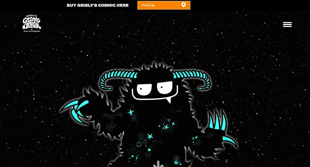
6. Grisly Comic
Why We Chose Grisly’s Cosmic
The development website for Grisly’s Cosmic serves as a premier benchmark for “Maximalist Brand Immersive Experience and Playful Omnichannel Conversion.” In the modern retail space, food and beverage brands must deliver an unforgettable digital personality to pull consumers away from standard competitors. This platform masterfully succeeds by converting standard product details into a rich, interactive “scrolly-telling” universe – pairing high-octane animations with clean navigation architecture to turn casual curiosity into a direct path to purchase.
Key Design Highlights:
- Spectacular High-Impact Hero Entrance: The website opens with a dramatic, custom intro animation sequence the exact moment the page loads. By immediately taking over the user’s field of view with polished movement mechanics, the hero area sets an energetic, premium tone that signals creative authority and demands the viewer’s absolute focus.
- Character-Driven Scrolly-Telling Narrative: The homepage relies heavily on scroll-driven animation tracks that reveal custom brand characters and cosmic illustrations as the user moves down the page. Rather than dropping information into a standard, static text grid, the layout acts like a fluid comic strip, using vibrant, bold colors to make learning about the brand’s product lines a genuinely entertaining visual story.
- Dual-Track Retail and E-Commerce Conversion: While the layout embraces an eccentric design, it never loses sight of business essentials. The platform clearly integrates intuitive user paths that let consumers instantly locate brick-and-mortar storefronts nearby or complete a swift online transaction, turning high-energy web traffic into measurable physical and digital sales.
- Immersive Desktop Hamburger Overlay: To protect the rich layout and ensure featured videos remain entirely free of distraction, the desktop interface utilizes a minimalist hamburger menu icon. When clicked, this navigation system gracefully expands to fill the entire screen – hiding busy background layers and offering a beautifully organized, easy-to-follow directory that prevents user frustration.
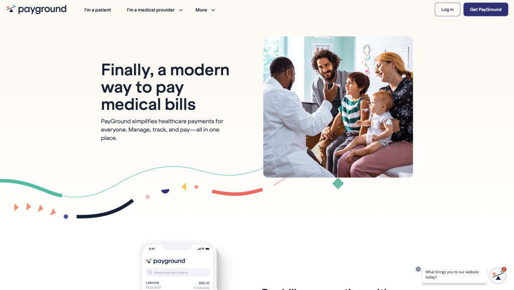
7. Payground
Why We Chose PayGround
The website for PayGround serves as a premier benchmark for “FinTech Transparency and Highly Contextual Interface Marketing.” In the healthcare payments and financial technology landscape, complex systems must be made approachable to reduce billing friction for patients and providers alike. The platform masterfully achieves this by matching a strongly unified branding theme with tangible proof of product performance directly on the home page.
Key Design Highlights:
- Empirical Application Interface Exposure: A major structural highlight of the homepage is the direct inclusion of an application interface screenshot. Rather than hiding the product behind abstract mockups or walls of technical text, showing the actual mobile dashboard gives users immediate familiarity with the platform’s simplified billing tracking, building fast consumer confidence before an account is even created.
- Unified, Themed Graphic Ecosystem: The home page employs a beautifully coordinated system of themed custom illustrations and iconography. By ensuring all visual graphics share an identical illustrative language, color palette, and corporate style, the design drastically reinforces its brand identity, helping its financial management tool stand out and feel highly polished.
- Frictionless and Clean Mobile Adaptation: The platform utilizes an agile responsive framework engineered for absolute clarity on mobile devices. Data columns, interface previews, and navigation points smoothly collapse into a balanced, easy-to-follow vertical layout that eliminates unnecessary zooming or text truncation for on-the-go medical bill management.
- Patient-Centric Social Proof Validation: Authentic client testimonials are positioned intentionally across the home page workflow. Showcasing real-world accounts of simplified checkout processes, consolidated medical invoicing, and stress-free family billing management anchors the firm’s software claims with deep, relatable customer validation.
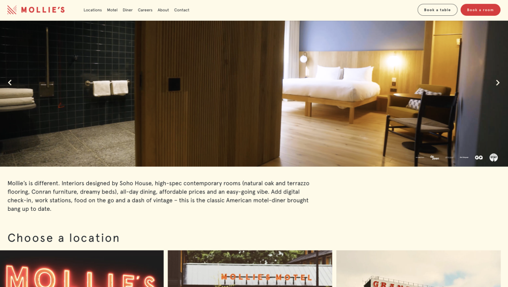
8. Mollie’s
Why We Chose Mollie’s
The website for Mollie’s serves as a premier benchmark for “High-Impact Hospitality Branding and Experiential Location Marketing.” For a modern motel and diner concept inspired by classic Americana, a digital storefront must balance nostalgic warmth with cutting-edge tech convenience. This platform masterfully succeeds by treating the homepage as a high-fidelity visual documentary, providing immediate sensory clarity on what it feels like to visit, eat, and stay at their venues.
Key Design Highlights:
- Full-Screen Bold Hamburger Navigation: To maintain an incredibly clean, uncluttered canvas on desktop, the user interface routes its site architecture through a minimalist hamburger menu. When clicked, it expands into a confident, full-screen overlay featuring oversized, bold typography. This approach eliminates standard navigation noise while turning the menu itself into a striking design statement that makes finding a room or booking a table effortless.
- Proprietary, High-Fidelity Hospitality Photojournalism: Rather than relying on generic, uninspired hospitality stock images, the home page uses stunning, custom photography unique to the business. By displaying crisp, high-impact visuals of their actual retro-modern diners, sleek motel rooms, convenient drive-thrus, and custom mobile app, the site gives travelers an authentic, transparent preview of the physical guest experience.
- Contextual Location Profiles with Narrative Detail: Positioned clearly on the home page is a dedicated directory of their physical properties. Instead of just listing addresses or dropping pins on a standard map, each location is paired with a rich, curated description that outlines the specific personality, surrounding amenities, and unique features of that venue, helping guests choose the perfect spot for their stay.
- Grassroots Guest Testimonial Validation: To solidify their reputation for excellent service and comfort, verified customer reviews are integrated smoothly into the home page flow. Showcasing these authentic accounts of diner food quality, room cleanliness, and seamless app check-ins builds immediate consumer trust, reassuring road-trippers and weekend travelers alike.
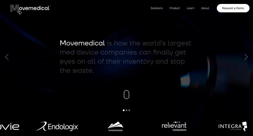
9. Movemedical
Why We Chose Move Medical
The website for Move Medical serves as a premier benchmark for “Enterprise B2B Precision Mechanics and Immersive Product Storytelling.” In the medical device supply chain and logistics sector, enterprise platform providers must communicate extreme technical accuracy while keeping corporate decision-makers engaged. The platform masterfully accomplishes this by combining deeply interactive scroll paths with an incredibly organized, structured navigation blueprint.
Key Design Highlights:
- Dynamic and Repeating “Scrollytelling” Interlayers: The platform makes an impactful visual statement by utilizing a sophisticated “scrolly-telling” mechanic directly upon the first scroll. Instead of using this advanced scroll-driven technique as a one-time gimmick, the homepage periodically returns to it throughout the vertical flow. This design choice continually snaps the visitor’s focus back to key software metrics, inventory data layers, and system processes as they naturally morph in response to the user’s scroll wheel.
- High-Fidelity, Cinema-Grade Explainer Video: The homepage features a professionally edited, high-quality video that explicitly showcases what their platform solves. By focusing on crisp cinematography, real enterprise environments, and clear interface previews, the video provides immediate clarity on their complex enterprise logistics software, allowing prospective enterprise clients to grasp their value proposition in seconds.
- Streamlined Enterprise Mega Menu Blueprint: To cleanly map out a high-density site structure without overwhelming corporate buyers, the interface utilizes a masterfully organized mega menu system. The expanded menu partitions software features, target roles, case studies, and compliance data into distinct, easy-to-navigate columns, creating a low-friction pathway for healthcare executives seeking specific technical details.
- The “4 Simple Steps to Get Started” Operational Framework: Positioning a structured process guide directly on the home page helps demystify the enterprise software onboarding experience. By explicitly mapping out their project initiation lifecycle into four clean, predictable steps, the platform reduces the typical corporate anxiety surrounding system migrations and alignment, setting transparent, straightforward expectations from day one.
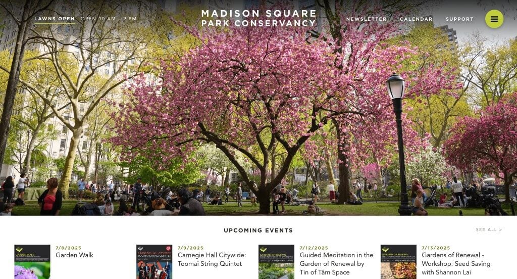
10. Madison Square Park Conservancy
Why We Chose Madison Square Park Conservancy
The website for the Madison Square Park Conservancy serves as a premier benchmark for “Dynamic Civic Programming and Curated Cultural Stewardship Architecture.” For a prominent urban green space, a digital presence must act as a living community dashboard that balances daily park utility with world-class art exhibition programming. This platform masterfully succeeds by anchoring its layout with high-impact event imagery and organizing dense seasonal schedules into an incredibly clean, accessible interface.
Key Design Highlights:
- High-Impact Event-Driven Hero Identity: The home page opens with a striking, large-format hero image that vividly captures a live community gathering or seasonal event in the park. By leading with human energy and active programming rather than just standard landscape shots, the design instantly highlights the park’s role as a vibrant, cultural town square in the heart of the city.
- Immediate “Below-the-Fold” Event Triage: Positioned strategically right beneath the primary hero section is a dedicated directory highlighting upcoming public programs. Placing this calendar data immediately in the user’s primary scroll path ensures that local residents and tourists can rapidly scan for daily activities, family workshops, or live performances without digging into sub-menus.
- Curated Artistic Installation Showcases: The homepage features a high-visibility layout section celebrating their latest outdoor contemporary art installations. Giving these large-scale sculptures and creative exhibitions prime visual placement honors the park’s reputation as a world-class, open-air gallery and deepens civic engagement with the conservancy’s cultural projects.
- Streamlined Desktop Hamburger Menu Architecture: To maintain an elegant canvas that allows full-scale imagery to shine, the user interface routes its dense site structure through an intuitive desktop hamburger icon. When clicked, it expands into a beautifully organized navigation drawer that makes finding park rules, membership sign-ups, and historic archives incredibly simple and clutter-free.
Recommended WordPress Themes
Industrium – Themeforest
$47
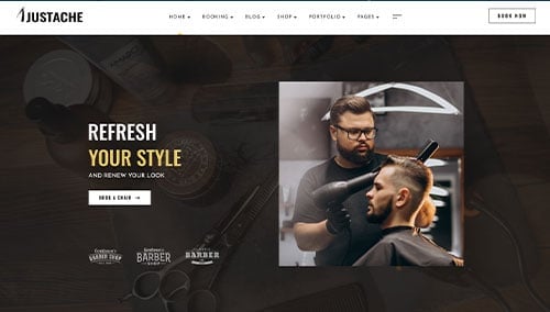
Justache – Themeforest
$29
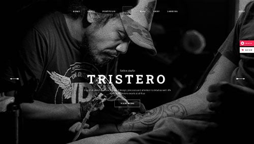
Tristero – Themeforest
$79
Palette – Themeforest
$69