In the financial services industry, your website is the digital embodiment of your firm’s precision and integrity. Whether you are a solo CPA or a mid-sized accounting firm, your online presence must immediately communicate fiduciary trust, technical expertise, and an unwavering attention to detail. To win the confidence of high-net-worth individuals and corporate decision-makers, your design must balance professional gravitas with modern accessibility.
Our design team evaluated hundreds of financial websites – from boutique tax advisory firms and bookkeepers to large-scale forensic accounting and wealth management practices. We looked for the top 9 examples that masterfully bridge the gap between sophisticated branding and a frictionless user experience (UX), specifically analyzing their mobile-first client portals, service transparency, and the effective use of localized trust signals.
Whether you are scaling a specialized tax practice or managing a full-service accounting firm, these examples represent the current benchmark for digital excellence in 2026.
Note on Our Selection Process: We recently audited this guide to remove outdated designs and sites that no longer meet our rigorous standards for security and professional branding. This curated list now focuses on the top 9 accounting websites providing the most strategic value in 2026.
The Top Accounting Firm Website Designs
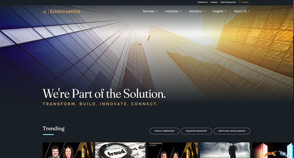
1. EisnerAmper
Why We Chose EisnerAmper
The website for EisnerAmper serves as a premier benchmark for “Modern Professional Services Merchandising and High-Authority B2B Trust Architecture.” For a leading global audit, tax, and advisory firm, a digital storefront must project corporate credibility, deep regulatory expertise, and absolute security while remaining approachable. This platform masterfully succeeds by ditching the dense, text-heavy layouts traditionally found in corporate finance, replacing them with a streamlined, mobile-optimized experience centered around thought leadership and client success.
Key Design Highlights:
- Thought Leadership and Blog Triage Integration: Positioned prominently on the homepage is a curated feature section for the firm’s insights and blog updates. Instead of burying corporate announcements, the layout highlights timely analysis on tax laws, market trends, and business strategies, instantly positioning the firm’s advisors as proactive industry authorities to prospective corporate clients.
- Sleek, High-Density B2B Mega Menu: To organize an enormous suite of corporate services – spanning specialized tax accounting, cybersecurity advisory, and niche industry solutions – the desktop interface utilizes a beautifully organized mega menu. The dropdown breaks down complex technical service lines into clean, highly legible categories, allowing corporate decision-makers to locate their specific industry sector in a single click.
- Front-Page Client Success and Review Triage: A major structural highlight of the homepage workflow is the inclusion of verified client testimonials. Showcasing real-world corporate success stories and client feedback directly on the main scroll path provides an essential layer of institutional trust, validating the firm’s relationship-driven approach and execution capabilities.
- Frictionless Mobile View and Adaptive Navigation: Built to accommodate busy executives browsing on the move, the smartphone layout delivers an exceptionally smooth, responsive experience. The interface maintains a fluid vertical scroll, while the mobile navigation menu collapses into a highly responsive, thumb-friendly touch layout – ensuring complex financial insights and contact options are completely effortless to navigate on smaller screens.
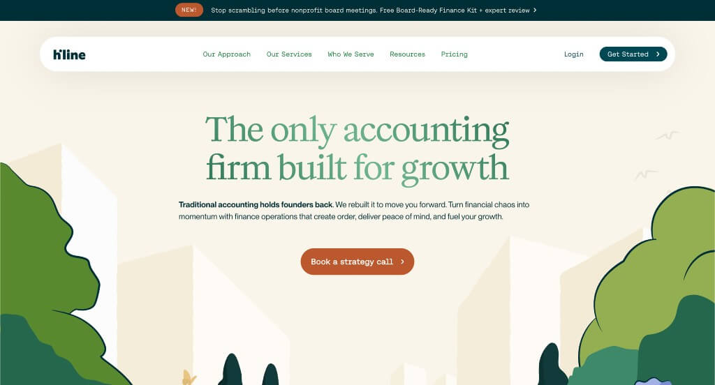
2. Hiline
Why We Chose Hiline
The website for Hiline serves as a premier benchmark for “Strategic Financial Merchandising and High-Clarity FinTech Trust Architecture.” For a modern, outsourced financial operations firm handling complex bookkeeping, tax, and CFO services for growing businesses, a digital storefront must immediately project absolute organization, relief, and financial clarity. This platform masterfully succeeds by treating its homepage as an empathetic, structured solution map that transforms a traditionally stressful corporate burden into a well-defined operational pipeline.
Key Design Highlights:
- Empathetic “Financial Chaos Stops Here” Anchor: The homepage utilizes a powerful, high-impact section anchored by the definitive statement, “Financial chaos stops here.” By directly addressing the core pain point of business owners – operational stress and unorganized numbers – this bold focal area creates immediate emotional resonance and positions the brand as the ultimate stabilizing solution the moment a user scrolls.
- Thematic “How It Works” Procedural Hub: A major structural triumph of the homepage layout is the dedicated “How It Works” onboarding matrix. This highly clear sequence strips the mystery out of outsourcing corporate finance, explicitly walking prospective clients through what to expect during integration and detailing exactly why the firm’s tech-enabled approach stands out from traditional, slow-moving accounting firms.
- Transparent Service Directory and Feature Index: Rather than hiding their offerings behind vague corporate summaries, the homepage features a comprehensive list and detailed description of their financial services. Breaking down complex workflows – like real-time bookkeeping, payroll administration, and strategic tax planning – into clean, digestible blocks allows busy executives to quickly gauge how the platform fits their exact operational scale.
- Front-Page B2B Client Review Triage: Integrated smoothly near the bottom of the homepage workflow is a robust directory of verified client reviews. Showcasing authentic testimonials from founders and operators regarding saved time, cleaner metrics, and scaling support injects a vital layer of peer-to-peer social proof directly into the browsing loop, boosting buying confidence just before the final call to action.

3. Aldaris CPA Group
Why We Chose Aldaris CPA
The website for Aldaris CPA serves as a premier benchmark for “High-Conversion Professional Services Architecture and Systematic B2B Trust Building.” For a specialized accounting and CPA firm, a digital presence must immediately establish absolute financial credibility while making it incredibly easy for busy founders and individuals to initiate contact. This platform masterfully succeeds by treating its homepage as a highly organized case for its services, systematically neutralizing client hesitation through structural reasons to buy and frictionless scheduling mechanics.
Key Design Highlights:
- Persistent “Schedule a Meeting” Floating Action Tab: A major structural triumph of the interface is the sticky call-to-action tab anchored securely to the bottom of the viewport. By keeping this scheduling portal permanently accessible as users scroll through different services and proofs, the layout removes all browsing friction, allowing high-intent prospects to book a consultation the exact moment they decide to take action.
- Thematic “10 Reasons to Choose Aldaris” Value Engine: Positioned directly on the front page is a highly focused, structured section explicitly detailing ten distinct operational advantages of partnering with the firm. This definitive index acts as a powerful educational hub, translating complex accounting workflows into straightforward, high-value arguments that separate the firm from traditional, less transparent competitors.
- Dynamic Google Review Social Proof Slider: Integrated smoothly into the primary homepage flow is an interactive slider showcasing verified Google reviews. Displaying real-time, peer-to-peer testimonials regarding tax savings, reliable communication, and audit support right on the main scroll path provides an immediate layer of authentic public credibility that reassures skeptical corporate decision-makers.
- Proactive Front-Page FAQ Resolution Triage: Near the bottom of the homepage journey, the platform incorporates a clean, accessible Frequently Asked Questions directory. By identifying and answering common financial anxieties – such as pricing structures, onboarding timelines, and virtual consultation steps – right on the homepage, the interface efficiently resolves customer doubts before they reach out to book a call.
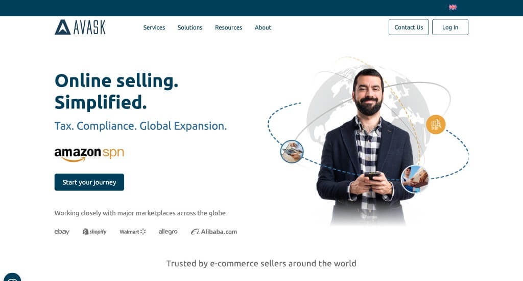
4. Avask
Why We Chose AVASK
The website for global e-commerce expansion and indirect tax firm AVASK serves as a premier benchmark for “High-Velocity B2B Service Merchandising and Multi-Format Trust Architecture.” For an international consulting firm helping digital brands navigate complex cross-border logistics, VAT compliance, and global marketplace scaling, the digital experience must project massive scale and bulletproof operational reliability. This platform masterfully succeeds by converting an intricate global service suite into a linear, easy-to-digest homepage narrative that blends interactive feature layers with deeply convincing user proof.
Key Design Highlights:
- Thematic “Why Choose AVASK” Competitive Anchor: Positioned prominently within the primary homepage flow is a dedicated, highly structured value-proposition hub. This segment clearly translates the firm’s global presence, regulatory expertise, and technological advantages into explicit business outcomes, instantly clarifying what sets them apart from traditional, localized tax firms the moment a user scrolls into the section.
- Interactive Vertical Service Showcase Slider: A major technical highlight of the desktop layout is the integration of an elegant vertical slider area designed to unpack their core services. By pinning the viewport and allowing users to cycle through critical operational pillars – such as cross-border logistics, VAT compliance, and marketplace expansion – via active scrolling, the interface keeps users engaged without overwhelming them with dense text walls.
- Multi-Format Video and Written Social Proof Engine: To bridge the trust gap for high-value corporate clients, the homepage utilizes a robust dual-format testimonial grid. By pairing immediate, easily scannable written reviews with deeply authentic, high-fidelity video testimonials from successful enterprise sellers, the platform injects a commanding layer of peer-to-peer validation right into the discovery pipeline.
- High-Visibility Integrated Contact Portal: Strategically anchored directly above the site footer is a clean, comprehensive contact and consultation form. Placing this high-conversion capture mechanism at the conclusion of the homepage journey ensures that corporate decision-makers, freshly validated by the interactive services and client stories, can seamlessly take action and initiate onboarding without needing to hunt for an explicit contact page.

5. Badger CPA
Why We Chose Badger CPA
The website for Badger CPA serves as a premier benchmark for “Modern Boutique Financial Merchandising and Accolade-Backed Authority Architecture.” For a contemporary accounting and advisory firm, a digital presence must break away from the dry, uninspired design models historically tied to traditional CPA firms. This platform masterfully succeeds by structuring its homepage as a clean, highly scannable service directory that seamlessly bridges the gap between proactive digital customer service and undeniable professional validation.
Key Design Highlights:
- Streamlined Front-Page Service Grid: The homepage features a beautifully organized and concise listing of their primary financial services. By breaking down complex workflows – such as business tax preparation, strategic consulting, and outsourced accounting – into clear, bite-sized descriptive blocks, the interface allows business owners to instantly assess how the firm fits their specific operational scale.
- Prestigious “Our Awards” Accolade Showcase: A major structural highlight of the homepage layout is a dedicated section celebrating the firm’s industry recognition and awards. Displaying official badges and corporate honors directly on the main scroll path adds an immediate layer of mainstream professional authority, proving to prospects that their financial operations are being handled by a decorated, top-tier team.
- Community-Backed Customer Testimonial Matrix: Integrated smoothly into the primary homepage flow is a dedicated section highlighting verified client testimonials. Showcasing authentic success stories and feedback from real business owners regarding tax savings and responsive communication provides a vital layer of peer-to-peer social proof that builds trust right before conversion.
- Instant Expert Conversational Support Widget: To immediately assist busy entrepreneurs who might have time-sensitive pre-purchase questions regarding tax deadlines, entity formation, or onboarding procedures, the interface incorporates an active live chat portal. This real-time accessibility removes massive friction, providing a welcoming communication channel that converts casual browsers into booked consultations.
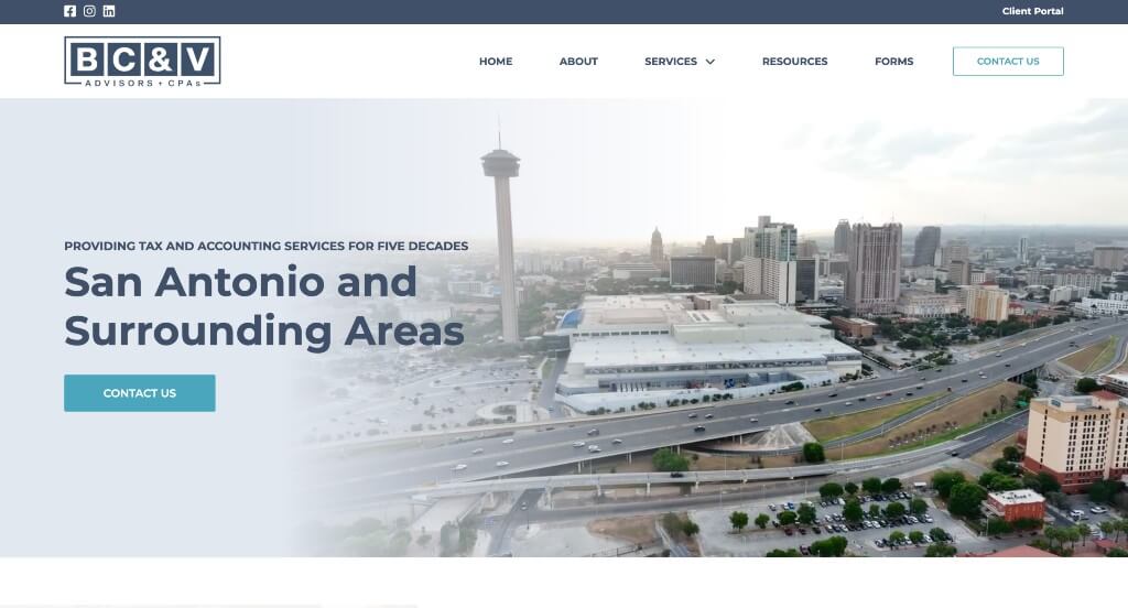
6. BC&V Advisors + CPAs
Why We Chose BCV CPA
The website for BCV CPA serves as a premier benchmark for “Heritage-Backed Financial Merchandising and High-Clarity Industry Vertical Architecture.” For a well-established accounting and advisory firm, a digital storefront must balance a rich history of professional reliability with an easy-to-navigate directory of technical capabilities. This platform masterfully succeeds by converting its corporate legacy into an interactive narrative, pairing it with highly structured pathways that speak directly to the unique needs of diverse business sectors.
Key Design Highlights:
- Interactive Historical Timeline Engine: A major structural and storytelling highlight of the homepage is the dedicated, clickable historical timeline. By allowing users to interactively jump through different years to discover how the firm has scaled, adapted, and grown its expertise over the decades, the interface transforms traditional “About Us” filler into a highly engaging proof of stability, adaptation, and long-term corporate heritage.
- Highly Segmented Industry Vertical Directory: Rather than offering a generic, one-size-fits-all financial solution, the homepage features a dedicated section showcasing the specific industries they commonly serve. Explicitly mapping out their familiarity with sectors like real estate, construction, or healthcare allows prospective commercial clients to immediately see themselves in the firm’s portfolio and validate their niche regulatory expertise.
- Transparent Service and Offering Matrix: The homepage lays out a comprehensive, clean directory of their core accounting, tax, and consulting services. Breaking down complex workflows into highly scannable, well-defined service blocks allows busy business owners to rapidly assess the firm’s technical scope and find the exact operational support they require without digging through deep site layers.
- Fluid Mobile Scaling and Layout Continuity: Built with a strict focus on the modern, mobile-first executive, the platform boasts a highly agile responsive framework. The interactive elements – including the detailed timeline and multi-column service tiles – scale proportionally down to smartphone viewports, maintaining a fluid vertical scroll path that ensures effortless navigation on the move.
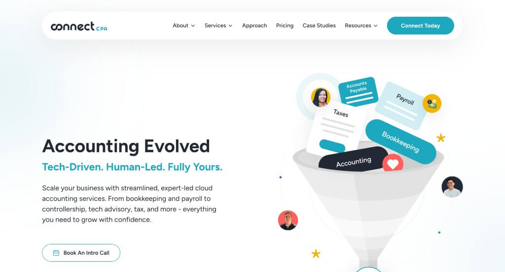
7. Connect CPA
Why We Chose ConnectCPA
The website for ConnectCPA serves as a premier benchmark for “Hyper-Modern Cloud Accounting Merchandising and Frictionless Virtual B2B Funnels.” For a forward-thinking, cloud-based CPA firm built around modern tech stacks like Xero and QuickBooks, the digital storefront must feel distinctly agile, advanced, and free of traditional corporate stuffiness. This platform masterfully succeeds by pairing an incredibly sleek, high-end visual layout with intuitive navigation that mirrors the seamless efficiency of the cloud software they implement for their clients.
Key Design Highlights:
- Gorgeous Visual-First Mega Menu Architecture: The primary desktop navigation features an exceptionally designed, spacious mega menu. Rather than relying on standard, uninspired text drop-downs, the interface structures its services, app integrations, and resource centers into clean, beautifully spaced columns enhanced with subtle iconography and plenty of breathing room, making deep site discovery a visual pleasure.
- Frictionless Above-the-Footer Booking Anchor: Strategically positioned at the natural conclusion of the homepage scroll path is a prominent, high-contrast call-to-action block designed to book a consultation. Placing this intuitive gateway directly above the footer ensures that once a business owner has been educated by the page content, they can seamlessly transition into the onboarding funnel without needing to search for a separate contact page.
- Authentic Front-Page Client Testimonial Flow: Integrated smoothly into the primary homepage narrative is a dedicated section for verified client testimonials. Featuring real-world success stories from modern founders and digital businesses highlights ConnectCPA’s ability to eliminate financial headaches, providing powerful peer-to-peer validation right where prospective clients are evaluating the firm’s capabilities.
- Ultra-Clean Mobile Ergonomics and Fluid Scrolling: Built with a sophisticated mobile-first approach, the smartphone experience is flawlessly executed. The dense column layouts and interactive elements stack elegantly into a single, intuitive vertical flow. Touch targets are perfectly sized for thumbs, and the gorgeous mega menu condenses into a highly responsive mobile menu, ensuring a zero-friction browsing experience on the go.

8. Xendoo
Why We Chose Xendoo
The website for Xendoo serves as a premier benchmark for “High-Velocity FinTech Merchandising and Frictionless Conversational Conversion Architecture.” For an agile, tech-forward online bookkeeping and accounting platform tailored for small businesses, the digital experience must quickly demystify complex financial services while removing all barriers to communication. This platform masterfully succeeds by treating its homepage as a clear, value-driven software-as-a-service (SaaS) funnel that keeps crucial contact channels permanently within arm’s reach.
Key Design Highlights:
- High-Clarity Service Explanations: The homepage completely avoids dense financial jargon, choosing instead to map out its bookkeeping, tax, and CFO services in highly structured, digestible blocks. By clearly stating exactly what tasks are handled – such as weekly balance sheets, real-time profit and loss tracking, and expert tax preparation – the interface allows busy entrepreneurs to immediately understand the exact operational value they are purchasing.
- Persistent Multi-Channel Sticky Footer: A standout conversion mechanic of the interface is the permanent sticky footer anchored securely to the bottom of the screen. By housing instant, individual buttons for texting, calling, or booking a free consultation, the layout ensures that no matter where a user is on their scroll path, they can seamlessly initiate contact the exact second they are ready to convert.
- High-Fidelity Video Testimonial Engine: Rather than relying solely on easily fabricated text reviews, the homepage integrates an immersive grid of verified video testimonials from real small business owners. Seeing and hearing actual founders discuss how the platform saved them time, organized their expenses, and minimized tax stress adds an incredibly authentic layer of peer-to-peer social proof.
- Front-Page Thought Leadership and Blog Triage: Positioned smoothly within the lower homepage layout is a dedicated feature section for their educational blog and resource center. Highlighting timely advice on tax deductions, small business growth strategies, and financial planning elevates the platform from a clinical accounting vendor to an indispensable, authoritative business partner.
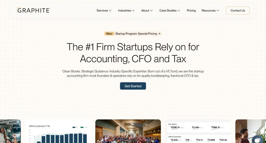
9. Graphite
Why We Chose Graphite Financial
The website for Graphite Financial serves as a premier benchmark for “Premium Boutique FinTech Merchandising and High-Clarity Advisory Conversion Funnels.” For a specialized accounting, bookkeeping, and fractional CFO firm built to support high-growth startups and venture-backed companies, the digital storefront must project institutional financial precision alongside an agile, modern tech-driven mindset. This platform masterfully succeeds by organizing its homepage into an accessible, clear, and highly convincing solution map that systematically eliminates typical industry jargon in favor of direct, value-driven communication.
Key Design Highlights:
- High-Clarity Startup and Growth Service Mapping: The homepage completely avoids dense, confusing financial jargon, choosing instead to clearly lay out its accounting, CFO, and tax services in highly structured, digestible blocks. By clearly stating exactly how they partner with growing teams – defining everything from day-to-day bookkeeping mechanics to strategic capital raise preparation – the interface allows busy founders to rapidly assess the firm’s operational fit.
- Community-Backed Customer Review Matrix: Integrated smoothly into the primary homepage flow is a dedicated section highlighting verified customer reviews from innovative companies and founders. Showcasing authentic testimonials regarding saved runway, cleaner reporting structures, and smooth financial scaling provides a vital layer of peer-to-peer social proof that builds immediate trust right in the heart of the evaluation path.
- Proactive Front-Page FAQ Resolution Triage: Positioned cleanly near the bottom of the homepage scroll path is a responsive Frequently Asked Questions directory. By identifying and answering common startup-specific financial anxieties – such as how onboarding works, software integrations, and when to hire a fractional CFO versus a full-time team member – the interface efficiently resolves customer doubts before they ever reach out to book a call.
- Instant Conversational Expert Support Channel: To immediately assist fast-moving entrepreneurs who might have time-sensitive pre-purchase questions regarding tax deadlines, entity formation, or specific venture capital reporting requirements, the interface incorporates an active live chat portal. This real-time accessibility removes massive friction, providing an immediate, welcoming communication channel that converts casual browsers into booked consultations.
WordPress Accounting Themes
You can find free themes at wordpress.org or explore accounting-inspired templates on ThemeForest.
Finance – Themeforest
$69
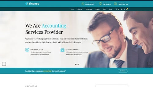
Tax Help – Themeforest
$69

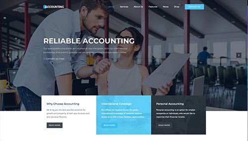
Accounting – Themeforest
$59
Investtex – Themeforest
$69