In the world of architecture, your website is your first building. It is a digital structure that must communicate your firm’s aesthetic philosophy, technical precision, and creative vision before a client ever reviews a blueprint. For an architect, a portfolio is more than a list of projects – it is a visual narrative of space, light, and form. To win high-value commissions, your online presence must radiate sophistication, innovation, and unwavering attention to detail.
Our design team evaluated hundreds of architectural websites – from boutique residential firms and interior design studios to large-scale sustainable design and building engineering practices. We looked for the top 11 examples that masterfully balance minimalist UI with immersive storytelling, specifically analyzing their project gallery transitions, typography choices, and the seamless integration of high-resolution architectural photography.
Whether you specialize in modern residential work or large-scale urban development, these examples represent the current benchmark for architectural web design in 2026.
Note on Our Selection Process: We recently audited this guide to remove outdated designs and firms that no longer meet our performance standards. This curated list now focuses on the top 11 architect websites providing the most strategic value in 2026.
Top Architectural Company Website Designs
1. 10 Design
Why We Chose 10 Design
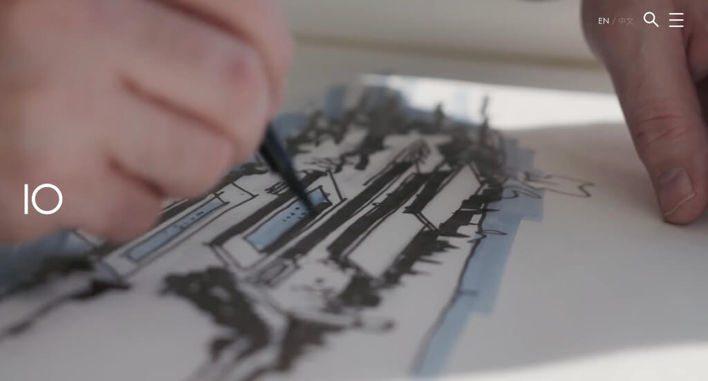
The website for 10 Design serves as a premier benchmark for “Architectural Brand Dominance and Scale-Driven Capability Mapping.” For an international, award-winning master planning and architecture practice, a digital storefront must reflect the immense structural scale and creative precision of its global portfolio. This platform masterfully accomplishes this by merging a highly confident, high-contrast aesthetic with an explicit, upfront breakdown of their industry specialties directly on the home page.
Key Design Highlights:
- High-Impact Cinematic Hero and Editorial Aesthetic: The website opens with a compelling video loop integrated into a bold, high-contrast layout featuring heavy typography and expansive, large imagery. This commanding visual style immediately signals a top-tier international design house, matching the premium, avant-garde nature of their architectural scale from the exact moment a client lands on the site.
- Transparent Global “Expertise” Matrix: A major structural asset of the home page is the dedicated “Expertise” directory, which explicitly defines the sectors they dominate. Clearly listing their specializations – spanning master planning, mixed-use developments, and sustainable civic architecture – allows international developers and municipal clients to instantly align their massive project scopes with the firm’s technical capabilities.
- Curated Global Project Showcase: The home page integrates a beautifully organized portfolio section that highlights iconic, real-world developments they have successfully brought to life across the globe. This visual gallery serves as undeniable proof of their spatial mastery, allowing prospective partners to quickly review their design execution across diverse cultural and geographic landscapes.
- Thought Leadership and Blog Integration: The platform smoothly incorporates a feed of recent blog posts and architectural insights directly into the homepage framework. Showcasing up-to-date commentary on urban design trends, sustainable building practices, and firm milestones establishes their team as proactive industry leaders who shape global architectural conversations.
2. Olson Kundig
Why We Chose Olson Kundig
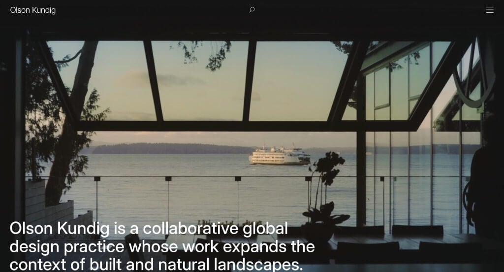
The website for Olson Kundig serves as a premier benchmark for “Cinematic Spatial Storytelling and Uncompromising Minimalist Architecture.” Reflecting the firm’s world-renowned reputation for rugged, tactile, and highly refined contextual design, their digital storefront abandons traditional grid layouts in favor of an immersive, moving-image portfolio. It treats the browser screen exactly like a physical gallery, ensuring their architectural philosophy is felt through scale and motion.
Key Design Highlights:
- Cinematic Scrolling Video Narrative: Rather than utilizing static photos or text blocks, the homepage consists of a sequence of full-bleed, giant video segments that play automatically as you scroll down. Combining these massive, moving visual showcases of their architecture with short, simple, and bold typography creates an intense sense of physical scale, pulling the user directly into the atmosphere of each custom home and project.
- Spectacular Desktop Hamburger Mega Menu: The desktop navigation introduces a truly spectacular hamburger mega menu that transforms standard site browsing into an elegant design event. Clicking the minimalist trigger expands a sprawling, full-screen overlay that neatly organizes their massive archive of cabins, cultural projects, and leadership bios without distracting from the artistic weight of the primary interface.
- Uncompromising Mobile Design Pizazz: While many luxury websites lose their immersive edge when scaling down to smaller screens, this platform keeps the exact same visual power and pizazz on mobile. The responsive framework maintains the fluid, high-fidelity video flows and striking bold typography, ensuring that on-the-go clients, developers, and designers experience the same premium storytelling.
- Stripped-Back, Bold Editorial Copy: The text across the homepage is intentionally brief, direct, and heavily weighted. By relying on sparse, high-impact phrases rather than dense paragraphs, the interface lets the raw texture of the materials and the movement of the architecture handle the storytelling, reinforcing the firm’s confident, minimalist design identity.
3. Ross Barney Architects
Why We Chose Ross Barney Architects
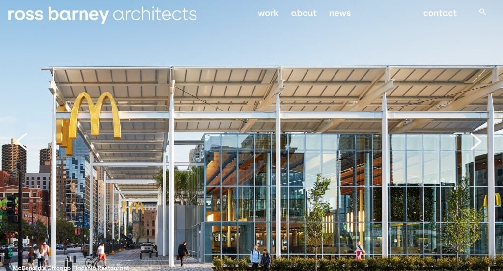
The website for Ross Barney Architects serves as a premier benchmark for “Visually-Driven Authority and Minimalist Portfolio Immersion.” In the high-end architectural and design sector, a digital storefront must let the work speak for itself without overwhelming visitors with industry jargon. This platform masterfully achieves that by utilizing a heavy-image, low-text framework that transforms the homepage into a premium, fluid digital gallery.
Key Design Highlights:
- High-Impact Above-the-Fold Project Slideshow: The website opens with an expansive, full-bleed slideshow built directly into the hero area, showcasing large, crisp images of successfully completed projects. Leading with these premium architectural assets instantly validates the firm’s craftsmanship and design caliber from the moment a user arrives.
- Cinematic Continuous Media Feed: As users explore further down the home page, the layout maintains its visual momentum by introducing a stream of highly impactful images and videos. Mixing these dynamic video elements with static, large-format photography breaks up the scrolling pattern and creates an immersive look at the textures, spaces, and physical flow of their developments.
- Stripped-Back, Intentional Typography: The copy throughout the homepage is kept to a strict minimum, relying instead on text that is bold and scaled slightly larger than expected. This stylized editorial approach ensures that key brand statements or project titles make a lasting impression without competing against the primary visual media for the user’s attention.
- Clean and Agile Mobile Discovery: The platform features a highly responsive mobile framework that translates the visual weight of the desktop site cleanly onto smaller displays. This layout structures the large media blocks and bold headers into a simple, stacked vertical path, ensuring that on-the-go clients and developers can browse the portfolio with zero navigation friction.

4. Wardle
Why We Chose Wardle Studio
The website for Wardle Studio serves as a premier benchmark for “Avant-Garde Spatial Presentation and Definitive Editorial Authority.” Reflecting an elite level of architectural mastery, this digital storefront breaks away from predictable, rigid layout grids. Instead, it uses bold interactive design choices and dynamic formatting to turn a simple portfolio review into a highly engaging artistic journey.
Key Design Highlights:
- Captivating High-Scale Hero Video: The home page opens with an incredibly interesting, massive hero video loop that dominates the viewport. This large-scale, cinematic visual asset immediately pulls the visitor into their creative world, capturing the raw geometry, material finishes, and grand scale of their architectural environments right from the start.
- Asymmetrical and Dynamic Layout Sequencing: As users scroll down the page, the interface reveals a highly unique, non-traditional layout structure paired with impactful images and text blocks. This artful placement breaks up typical scrolling patterns, giving each custom project and design philosophy its own distinct breathing room while drawing the eye naturally down the page.
- Loud and Authoritative Desktop Hamburger Menu: The desktop navigation introduces a bold, high-contrast hamburger menu that feels beautifully “loud” yet remains incredibly easy to navigate. Clicking the minimalist trigger opens an expansive, stylized overlay that pairs strong typography with a clean organizational map, making deep site archives effortlessly accessible.
- Integrated Prestige Public Validation: Authentic testimonials are woven directly into the home page layout to provide immediate real-world validation. Showcasing these high-caliber client reflections right alongside their physical project galleries anchors the studio’s avant-garde marketing claims with trustworthy confirmation of their execution and professional care.
5. VLK Architects
Why We Chose VLK Architects
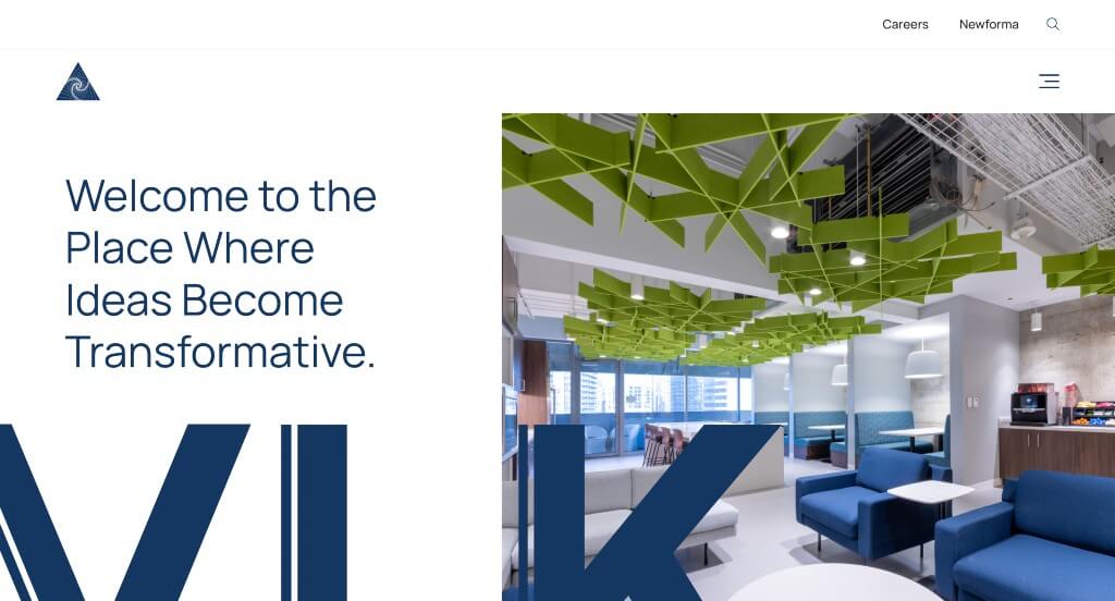
The website for VLK Architects serves as a premier benchmark for “Method-Driven Spatial Architecture and Simplified Navigational Discovery.” For an architectural firm handling intricate institutional and commercial projects, a digital presence must prove it can manage complex, multi-phase assignments without overwhelming the user. This platform masterfully accomplishes this by translating their detailed, step-by-step methodology into an approachable visual journey directly on the home page.
Key Design Highlights:
- The “Inspiration Into Action” Process Roadmap: A major structural highlight of the home page is the detailed section titled “Learn How We Put Inspiration Into Action.” This narrative roadmap clearly breaks down the various stages of their architectural approach, starting with deep academic studies and moving systematically through data-driven storytelling and physical visualization. Showcasing this blueprint upfront reassures major clients that their designs are backed by rigorous research and proven workflows.
- Streamlined, Ultra-Simple Menu Architecture: Rather than crowding the interface with an overwhelming array of submenus and technical categories, the platform utilizes a very simple, stripped-back menu structure. This clean approach removes choice fatigue, allowing corporate developers, school boards, and municipal clients to find exactly what they need – whether it is portfolios, services, or contact info – with zero navigation loops.
- Fluid and Clean Mobile Journey: The platform features an incredibly agile responsive framework that translates the firm’s detailed text blocks and process graphics cleanly onto smaller handheld displays. This mobile layout ensures that the comprehensive process maps, client accounts, and project links scale down into a clean, easy-to-follow vertical path, keeping mobile exploration completely frictionless.
- Verified Institutional Client Validation: Authentic client reviews are woven smoothly into the home page layout to supply immediate real-world validation. Presenting these professional testimonials alongside their process breakdowns anchors the firm’s design claims with trustworthy confirmation of their project management, collaborative culture, and structural execution.
6. KPF
Why We Chose Kohn Pedersen Fox (KPF)
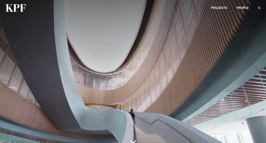
The website for KPF serves as a premier benchmark for “Global Scale Demonstration and Elegant Navigation Architecture.” As one of the world’s preeminent architecture firms responsible for shaping iconic city skylines, their digital storefront must convey immense structural scale while remaining completely effortless to explore. The platform achieves this by pairing a high-impact, cinematic media core with a highly structured, ultra-clean navigation framework across all devices.
Key Design Highlights:
- Cinematic Global Portfolio Hero Video: The home page opens immediately with a high-definition video loop integrated into the primary hero area. Showcasing sweeping aerial views, intricate architectural geometries, and the vibrant urban life surrounding their completed supertall skyscrapers and master plans, this visual asset instantly establishes the firm’s elite global footprint the moment a visitor arrives.
- Targeted “Specialty Expertise” Capability Directory: A major structural asset of the home page layout is a dedicated Specialty Expertise section that explicitly highlights the diverse sectors they dominate. Clearly organizing their technical solutions – ranging from transit-oriented developments and commercial high-rises to advanced research facilities – allows international developers and civic planners to instantly match their massive project scopes with KPF’s specialized teams.
- Beautifully Articulated Desktop Menu Layout: The desktop interface features a beautifully laid out global menu system that strikes a perfect balance between comprehensive information and minimalist design. It neatly categorizes an extensive archive of projects, insights, and global locations into an elegant, well-spaced structure that removes choice fatigue and makes site exploration feel premium.
- Clean and Agile Mobile User Journey: The platform utilizes an incredibly responsive mobile framework that translates the visual weight of their global portfolio cleanly onto smaller screens. By streamlining complex media blocks and navigation pathways into a straightforward, easy-to-follow vertical path, the design ensures that on-the-go clients and researchers experience a completely frictionless browsing experience.
7. Austin Fox Architecture
Why We Chose Austin Fox Architecture
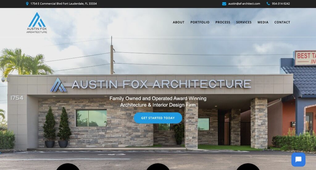
The website for Austin Fox Architecture serves as a premier benchmark for “Direct Capability Mapping and Accountability-Driven Brand Alignment.” For a modern architectural practice, a digital presence must immediately distill its core services while providing unwavering trust indicators to convert high-intent prospects. This platform masterfully accomplishes that by placing an explicit breakdown of its three core disciplines right at the top of the user journey, backed by a strong satisfaction guarantee and immediate conversion pathways.
Key Design Highlights:
- Immediate Triple-Discipline Icon Directory: Positioned strategically right below the primary hero area is a minimalist directory featuring three clean icons that represent exactly what the firm delivers: planning, architecture, and interior design. This immediate visual breakdown clarifies their operational scope in under two seconds, ensuring corporate developers and residential clients instantly know the team can manage a project from initial land layout to final indoor finishes.
- Middle-Anchored Client Satisfaction Guarantee: A major strategic asset built directly into the middle of the home page is a dedicated feature showcasing their explicit client satisfaction guarantee. Elevating a formal commitment to quality and collaboration to the front page handles consumer skepticism upfront, giving prospective clients immediate confidence in the firm’s project management and professional accountability.
- Instant Conversational Chat Integration: The homepage incorporates a dedicated live chat widget built directly into the user interface. Providing this real-time communication pipeline gives browsing property owners, developers, and partners a low-barrier, instant channel to ask rapid questions about initial consultation availability, regional zoning experience, or booking timelines without needing to send an email.
- Grassroots Community Validation Layout: Authentic client testimonials are woven smoothly into the home page framework to supply immediate, real-world proof of execution. Presenting these verified accounts of design precision, budget adherence, and seamless construction management anchors the firm’s artistic claims with trustworthy community confirmation.
8. Oh
Why We Chose OH
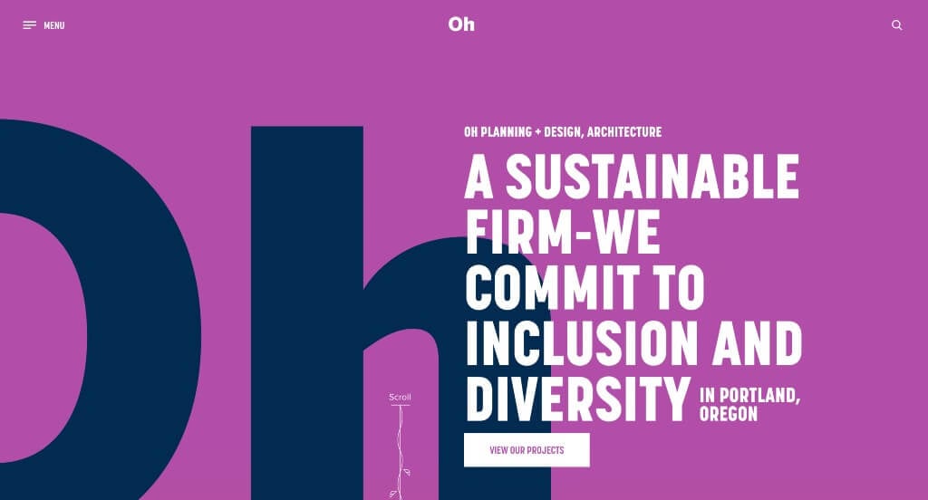
The website for OH serves as a premier benchmark for “Kinetic Brand Immersion and Whimsical Navigational Continuity.” For a creative architectural or design studio, a digital storefront must go beyond standard portfolio grids to prove they think outside the box. This platform masterfully accomplishes that by turning the user experience into a playful, interactive journey – using highly unique visual layering and custom scroll mechanics that keep visitors thoroughly engaged across all screen sizes.
Key Design Highlights:
- Unique Die-Cut Hero Video Layering: The website makes an unforgettable first impression with a visually stunning, custom-layered hero area. The background video loop sits entirely behind a bold purple brand overlay that has the letters “oh” cleanly cut out of the center. This creative peek-through masking technique instantly signals a high level of graphic sophistication and spatial ingenuity the second the site loads.
- Playful Kinetic Scroll Continuity: As users explore down the home page, an interactive, vine-like line illustration smoothly grows and follows the cursor’s descent down the page. This subtle, whimsical scroll animation acts as a continuous visual guide, breathing life into standard content blocks and encouraging the user to keep scrolling to see how the graphic unfolds.
- Impactful and Highly Structured Desktop Hamburger Menu: The desktop layout features a bold, high-contrast hamburger menu that instantly transforms navigation into an expressive design feature. Clicking the trigger opens a large, beautifully spaced overlay that makes exploring project galleries, studio bios, and contact links feel intentional, loud, and incredibly easy to manage.
- Clean and Cohesive Mobile Journey: While websites with heavy animations and layered graphics often break on handheld devices, this platform features an incredibly clean and agile mobile framework. The responsive layout retains the visual charm and brand colors of the desktop experience while organizing everything into a simple, friction-free vertical path that on-the-go clients can navigate with ease.
9. FALK Built
Why We Chose Falkbuilt
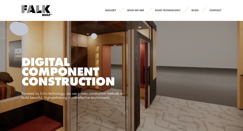
The website for Falkbuilt serves as a premier benchmark for “Disruptive Product Demonstration and Advanced Technology Transparency.” For a company leading the charge in digital component construction (pre-fabricated interior spaces), a website cannot just talk about innovation – it has to visually prove how it accelerates the building process. This platform masterfully succeeds by using highly informative, interactive media assets to show exactly how their digital workflow translates into real-world, flexible interior spaces.
Key Design Highlights:
- High-Context Prefab Interior Hero Demonstration: The homepage opens with an exceptionally informative hero video loop that shows a single room rapidly morphing through different structural layouts and finish options. By leading with this quick-change visualization, the platform instantly demonstrates their primary business model – pre-fabricated, customizable interior solutions – allowing corporate, healthcare, and educational clients to grasp the core product benefit in under five seconds.
- Echo Software Visualization Core: To build deep trust in their proprietary workflow, the middle of the home page features a dedicated video showcasing their Echo platform – the advanced software they use for cloud-based planning and 3D interior design. Giving prospective clients a direct window into how their digital twin technology prevents field errors and streamlines supply chains removes standard construction guesswork upfront.
- Human-Centric Staff Transparency Mosaic: The homepage incorporates an authentic image spotlighting the actual engineering, manufacturing, and support staff behind the company. Humanizing the technical brand in this way gives corporate buyers and general contractors immediate confidence that their massive commercial fit-outs are backed by a real, accessible team of skilled specialists.
- Simple, Friction-Free Mobile User Journey: The platform utilizes an incredibly streamlined, responsive layout engineered for flawless exploration on handheld displays. This mobile interface translates dense software explanations and room transformation videos into clean, vertical stacks, ensuring that on-the-go architects and developers can review the firm’s technical capabilities with zero navigation fatigue.
10. Williams Lester Architects
Why We Chose Williams Lester Architects
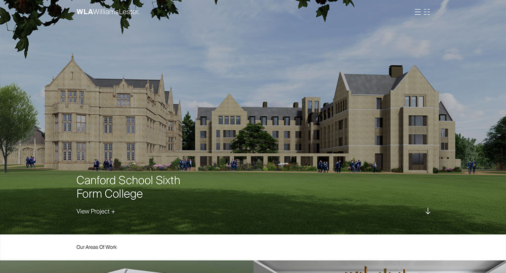
The website for Williams Lester Architects serves as a premier benchmark for “Kinetic Brand Artistry and Immersive Portfolio Engagement.” In the luxury residential and commercial architectural sectors, a digital presence must go beyond basic project galleries; it needs to reflect a deep understanding of spatial rhythm, structural elegance, and creative innovation. This platform masterfully accomplishes this by treating its home page like a living, interactive exhibition space – blending bold aesthetic choices with smooth web animations that keep users thoroughly engaged.
Key Design Highlights:
- Kinetic Interaction and Automated Animations: A major standout asset of the home page design is its beautiful use of motion graphics. The user interface features a mix of subtle animations that trigger automatically to draw focus, alongside highly reactive hover animations that respond fluidly to user interaction. This kinetic pacing adds a layer of modern sophistication, making the act of exploring their design work feel alive, intentional, and polished.
- Bold Color Palettes and High-Contrast Media: The website embraces a confident, editorial look driven by a bold use of color paired with deeply impactful, large-format imagery throughout the entire homepage. Rather than hiding behind a standard, plain-white grid, the platform uses these rich colors and dramatic project photographs to set a premium tone, ensuring their architectural statements leave a lasting memory.
- Curated Past-Project Showcase Showcase: The home page integrates a beautifully structured gallery dedicated entirely to highlighting their elite past projects. This curated display serves as immediate, visual proof of their spatial mastery, allowing prospective property developers and private clients to quickly evaluate their building execution, material choices, and design versatility across different environments.
- Continuous Testimonial Carousel Validation: To anchor their artistic claims with reliable real-world proof, the homepage incorporates an interactive client testimonial slider. Showcasing a steady rotation of verified, five-star feedback regarding their collaborative approach, zoning navigation, and construction oversight builds instant confidence for high-end buyers long before an initial consultation is booked.
11. Sasaki
Why We Chose Sasaki
The website for Sasaki serves as a premier benchmark for “Kinetic Brand Alignment and High-Density Editorial Fluency.” As a pioneer in integrated design, planning, and landscape architecture, Sasaki’s digital storefront needs to show how different disciplines work together to solve complex problems. The platform masterfully achieves this by matching a brilliant, interactive branding moment with a rich grid of ideas and projects that feels incredibly clean without ever feeling cold or empty.
Key Design Highlights:
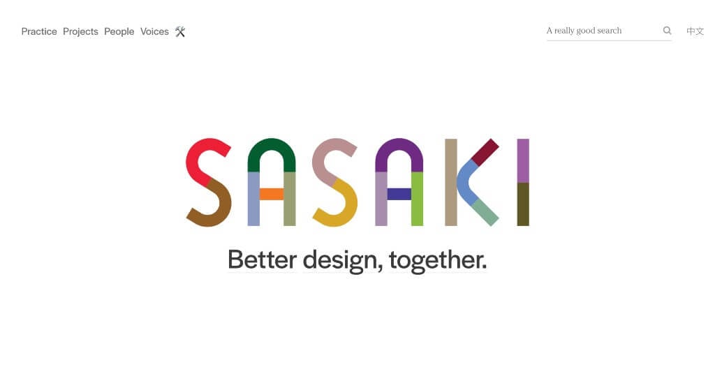
- Deconstructive Kinetic Brand Transition: The website makes an unforgettable first impression with a highly creative, responsive logo design in the hero framework. As you begin to explore down the page, the physical letters of the logo gracefully break apart and shift outward, clearing the screen to place a sharp, intentional focus on their core philosophy: “better design together.” This sleek animation beautifully mirrors the firm’s collaborative approach to breaking down traditional design silos.
- Rich Ideas, Projects, and Accolades Ecosystem: Rather than offering a standard, static portfolio list, the home page acts as a lively editorial hub that weaves together real-world projects, design ideas, and industry awards. Each distinct block functions as an intuitive navigational gateway, allowing municipal planners, university boards, and private developers to jump straight into detailed case studies that highlight the firm’s global impact.
- Sophisticated High-Contrast Minimalist Canvas: While the user interface leans heavily on a crisp, mostly white aesthetic, the layout never feels plain or empty. By utilizing generous whitespace, precise grid margins, and deep typography scaling, the design lets the rich colors of their landscape architecture and urban planning photography take center stage, giving the entire experience a premium, museum-gallery feel.
- Adaptive Mobile Optimization and Content Flow: The shift from the expansive desktop layout to smaller mobile screens is executed beautifully through subtle, deliberate design adjustments. Instead of simply shrinking elements, the responsive framework refines spacing, optimizes font sizes, and adjusts the grid layout to ensure that on-the-go clients and design researchers enjoy a fluid, natural vertical scrolling journey on any handheld device.
WordPress Architectural Themes
You can find free themes at wordpress.org or explore architectural-inspired templates on ThemeForest.
Dessau – Themeforest
$85
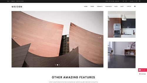
Maison – Themeforest
$85
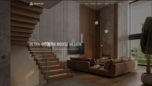
ArchSan – Themeforest
$129
Haus – Themeforest
$49