In the audiology and hearing health industry, your website is often the first touchpoint in a patient’s journey toward better hearing. Whether you are a private practice owner or part of a large hospital network, your online presence must do more than list services – it must communicate clinical authority, patient-centered care, and a mastery of modern hearing technology. In 2026, a top-tier audiology site must prioritize accessibility, clear paths to care, and the establishment of immediate trust.
Our design team evaluated hundreds of audiology websites to identify the top 10 examples that masterfully balance professional credibility with an intuitive user experience. We analyzed these sites for mobile-friendly appointment scheduling, educational resource clarity, and the effective use of patient success stories.
From local hearing aid clinics to specialized pediatric audiology practices, these designs represent the gold standard for the industry in 2026.
Note on Our Selection Process: We recently audited this guide to remove outdated designs and sites that no longer meet our performance standards. This curated list now focuses on the top 10 audiology websites providing the most strategic value in 2026.
Top Audiology Website Designs
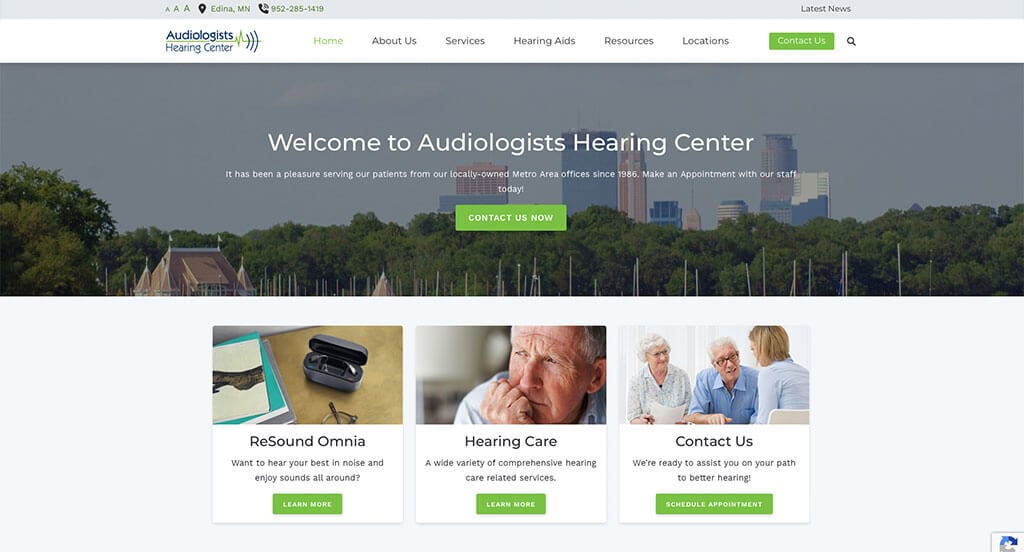
1. Audiologists Hearing Center
Why We Chose Audiologists Hearing Center
The website for Audiologists Hearing Center serves as a premier benchmark for “High-Trust Clinical Audiology Merchandising and Patient-Centric Accessibility Architecture.” For an elite hearing healthcare practice, the digital storefront must immediately project exceptional medical safety, deep clinical expertise, and approachable, high-trust technological solutions. This platform masterfully succeeds by organizing its homepage into a clear, comforting roadmap that seamlessly guides patients experiencing hearing loss away from clinical intimidation and directly into localized care pathways.
Key Design Highlights:
- Comprehensive Front-Page Services Blueprint: The homepage completely avoids vague medical summaries, choosing instead to clearly lay out their advanced audiology services directly in the main scroll path. Explicitly mapping out core pillars – such as comprehensive hearing evaluations, precise hearing aid fittings, custom ear protection, and specialized tinnitus management – allows patients and their families to instantly assess the clinic’s capabilities and match them to their personal auditory needs.
- Interactive Global Device and Brand Slider: Positioned dynamically within the core homepage layout is a dedicated, beautifully integrated manufacturer carousel highlighting the elite, world-class hearing aid brands they work with. Showcasing leading-edge technology pioneers – such as Phonak, Oticon, and Resound – reassures patients that the practice provides unbiased access to the most sophisticated, state-of-the-art auditory devices available on the market today.
- Persistent Frictionless Sticky Header Navigation: To maintain effortless, fluid site navigation for users of all technical backgrounds and ages, the desktop experience utilizes a beautifully engineered sticky header. As users scroll deep into the homepage content or explore service details, the primary navigation bar pins elegantly to the top of the viewport, keeping essential phone numbers, appointment gateways, and location links instantly accessible at any exact moment.
- Authentic Community-Backed Patient Review Grid: Integrated smoothly into the primary homepage flow is a dedicated showcase of verified patient testimonials and local reviews. Highlighting real-world praise regarding life-changing hearing improvements, gentle patient-care philosophies, and exceptionally compassionate audiologists injects a vital layer of peer-to-peer reassurance, actively neutralizing clinical anxiety right where families are choosing their healthcare provider.
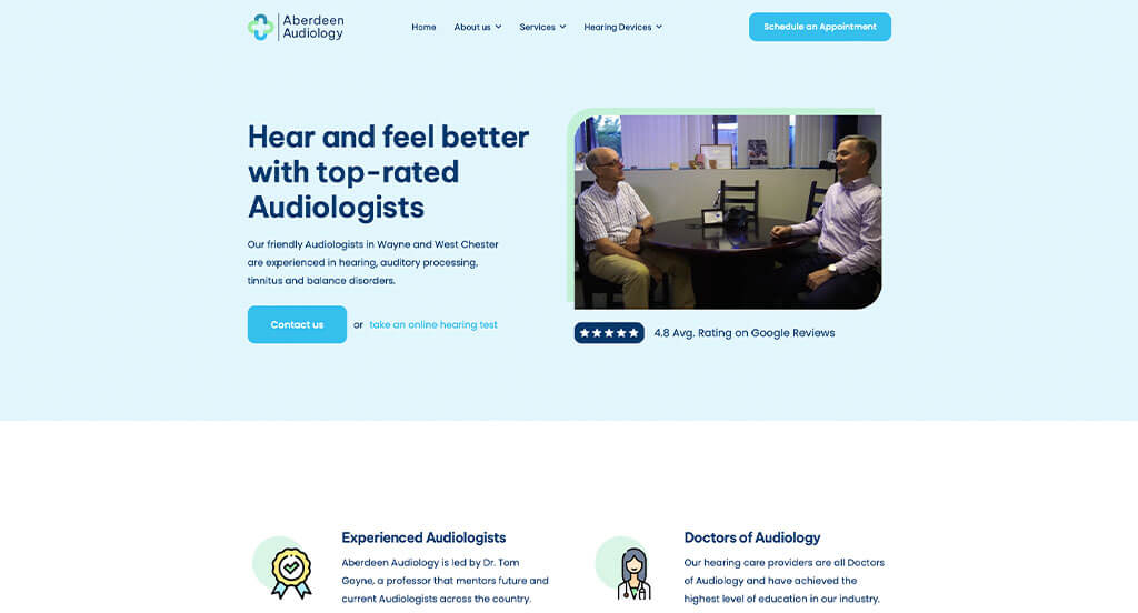
2. Aberdeen Audiology
Why We Chose Aberdeen Audiology
The website for Aberdeen Audiology serves as a premier benchmark for “High-Trust Auditory Merchandising and Patient-Centric Discovery Architecture.” For a leading independent hearing healthcare practice, the digital storefront must project deep diagnostic expertise, exceptional clinical transparency, and a welcoming, supportive atmosphere. This platform masterfully succeeds by treating its homepage as a comforting, media-rich virtual consultation path that systematically guides patients from initial hearing concerns directly into verified medical validation.
Key Design Highlights:
- Immersive, Accessibility-Focused Hero Video Loop: The website establishes immediate operational authority and comfort with a high-definition video sequence dominating the primary hero real estate. By capturing warm, real-world interactions between compassionate audiology specialists and smiling patients, the media instantly demystifies the clinical environment, letting families know exactly what to expect from their personalized care path.
- Interactive Front-Page Services Slider: Rather than forcing patients or their families to hunt through dense medical directories, the homepage cleanly organizes their core treatments into a beautifully integrated content carousel. This interactive slider allows users to seamlessly scroll through essential clinical offerings – ranging from comprehensive diagnostic hearing evaluations and advanced hearing aid fittings to specialized tinnitus relief and custom ear protection – without creating layout friction.
- Proactive Structural FAQ Conversion Triage: Positioned smoothly within the lower homepage scroll path is an expansive, accordion-style Frequently Asked Questions directory. By directly addressing common, high-anxiety patient questions – such as how to identify early signs of hearing loss, how insurance coverage applies, and what the diagnostic process entails – the interface efficiently builds patient confidence and removes pre-appointment friction right before the user completes their journey.
- Authentic Community-Backed Patient Review Grid: Integrated smoothly into the primary homepage layout is a dedicated repository of verified patient testimonials and reviews. Highlighting real-world praise regarding life-changing hearing improvements, gentle provider techniques, and meticulous customer service injects a commanding layer of local social proof, validating the practice’s elite reputation right at the critical moment of user conversion.
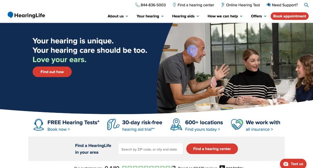
3. HearingLife
Why We Chose HearingLife
The website for HearingLife serves as a premier benchmark for “High-Scale Audiology Merchandising and Frictionless Patient-Acquisition Funnels.” As one of the largest networks of hearing care clinics across the country, their digital storefront must effortlessly guide thousands of diverse users – from tech-savvy seniors to adult children managing care for their parents – toward localized auditory health solutions. This platform masterfully succeeds by converting complex medical technology options into an incredibly clear, highly structured consumer interface that eliminates all buying anxiety.
Key Design Highlights:
- Frictionless “Book an Appointment” Header Integration: Maximizing patient intake from the absolute moment the page loads, the primary layout features a high-contrast, action-oriented “Book an Appointment” call-to-action button pinned directly inside the global header navigation. Positioned in this premium screen space, the gateway ensures that high-intent prospects can seamlessly transition from deep research to securing a localized clinical slot from any point on the website.
- Multi-Dimensional Device Discovery and Navigation Engine: A major structural highlight of the homepage is its highly intuitive, consumer-first sorting matrix for hearing aid exploration. Rather than overwhelming users with technical specs, the interface allows visitors to easily filter and view hearing aid selections through four highly practical tracks: by type, by brand, by price, or by insurance coverage. This personalized alignment accommodates every unique budgetary and technical preference with zero friction.
- Structured “Why Choose Us” Core Value Matrix: Embedded smoothly within the primary homepage scroll path is an explicit, highly persuasive section outlining exactly four foundational reasons why patients should trust HearingLife with their hearing health. By cleanly communicating their core brand promises – such as their personalized approach, quality hearing aide solutions, and aftercare program – the interface builds immediate institutional credibility right where families are making their provider decisions.
- Omnichannel “Four-Way” Communication and Contact Triage: To comfortably accommodate the varying comfort levels and communication preferences of its diverse patient demographic, the homepage features four distinct, easily accessible contact methods. Giving users the immediate freedom to choose between calling a direct line, opening a live chat, sending an email, or requesting a call back completely eliminates conversational friction, welcoming prospective patients into a highly supportive and personalized care pipeline.
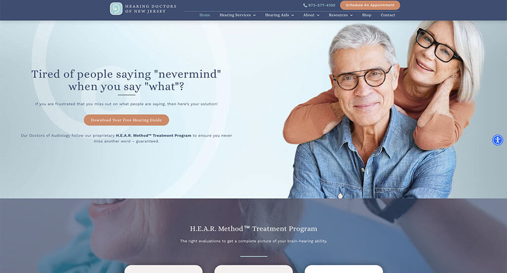
4. Hearing Doctors of New Jersey
Why We Chose Hearing Doctors of New Jersey
The website for Hearing Doctors of New Jersey serves as a premier benchmark for “High-Trust Audiological Merchandising and Frictionless Patient Acquisition Architecture.” For a leading independent practice specializing in advanced hearing care and tinnitus relief, the digital storefront must immediately project deep medical authority, compassionate care, and absolute procedural transparency. This platform masterfully succeeds by structuring its homepage as a multi-layered trust ecosystem that keeps the path to clinical consultation entirely effortless across all devices.
Key Design Highlights:
- Dual-Action Frictionless Booking Conversion Matrix: The interface maximizes patient intake velocity by deploying a highly accessible, multi-tiered appointment gateway. Beyond featuring a clear “Book Your Appointment” call-to-action button pinned directly inside the global header navigation, the platform maintains a persistent sticky booking button anchored along the bottom of the screen. This dual setup ensures that a high-intent user can seamlessly transition into a scheduling portal at any exact moment during their layout scroll.
- Front-Page Specialized Medical Provider Showrooms: A major psychological and trust-building triumph of the homepage is the integration of detailed provider biographies directly within the primary scroll path. Introducing their elite, doctoral-level audiology specialists right on the front page humanizes the practice, immediately establishing deep medical credibility and alleviating clinical anxiety before a patient ever steps foot in the office.
- Comprehensive Hearing Services and Treatment Blueprint: The homepage entirely avoids vague medical generalizations, choosing instead to clearly organize their advanced audiological offerings into highly structured, scannable blocks. By explicitly mapping out core treatment pillars – such as comprehensive hearing evaluations, advanced hearing aid technology, pediatric audiology, and specialized tinnitus management – the layout allows families to rapidly match their unique auditory challenges with the clinic’s technical capabilities.
- Multi-Format Video and Text Patient Validation Grid: Positioned smoothly within the lower homepage flow is a beautifully executed patient testimonial repository combining both written reviews and high-fidelity video success stories. Providing unfiltered, face-to-face visual proof of real-world hearing transformations alongside standard text reviews creates an unmatched layer of peer-to-peer social proof, powerfully validating the practice’s clinical outcomes and patient-first philosophy.
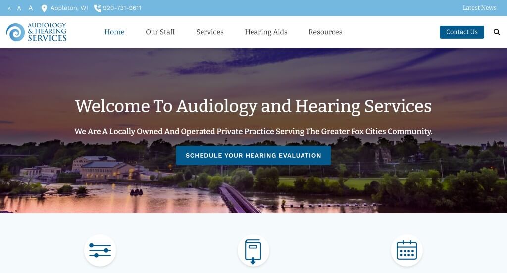
5. Audiology & Hearing Services
Why We Chose Audiology & Hearing Services
The website for Audiology & Hearing Services serves as a premier benchmark for “High-Trust Clinical Audiology Merchandising and Patient-Centric Digital Architecture.” For an independent hearing healthcare practice, the digital storefront must immediately project exceptional medical safety, deep clinical expertise, and a welcoming, accessible atmosphere. This platform masterfully succeeds by organizing its homepage into a clear, comforting roadmap that balances institutional authority with an intensely personalized approach to patient care.
Key Design Highlights:
- Personalized Front-Page Doctor’s Welcome Matrix: Setting the practice completely apart from cold, overly corporate medical networks is the prominent integration of a personal welcome letter from the leading audiologist directly on the homepage. By sharing a compassionate, mission-driven statement regarding their patient-first philosophy and dedication to treating hearing loss, the interface humanizes the clinical environment and alleviates patient anxiety from the moment the page loads.
- Interactive Global Device and Brand Slider: Positioned dynamically within the core homepage layout is a dedicated, beautifully integrated manufacturer carousel highlighting the elite, world-class hearing aid brands they carry. Showcasing leading-edge technology pioneers allows patients to instantly recognize trusted names and reassures families that the practice provides comprehensive access to the most sophisticated, state-of-the-art auditory devices available.
- Persistent Frictionless Sticky Header Navigation: To maintain effortless, fluid site navigation for users of all technical backgrounds and age groups, the desktop experience utilizes a beautifully engineered sticky header. As users scroll deep into the layout or explore service details, the primary navigation bar pins elegantly to the top of the viewport, keeping essential contact lines, appointment gateways, and location links instantly accessible at any exact moment.
- Ultra-Clean Mobile Viewport and Touch Ergonomics: Translating a medical practice layout onto smaller viewports is flawlessly managed through an expertly optimized mobile framework. The smartphone interface elegantly balances whitespace, condenses multi-column grids into clean single stacks, and ensures that critical call-to-action touch targets remain perfectly clear and unobstructed for families looking to secure localized care on the go.
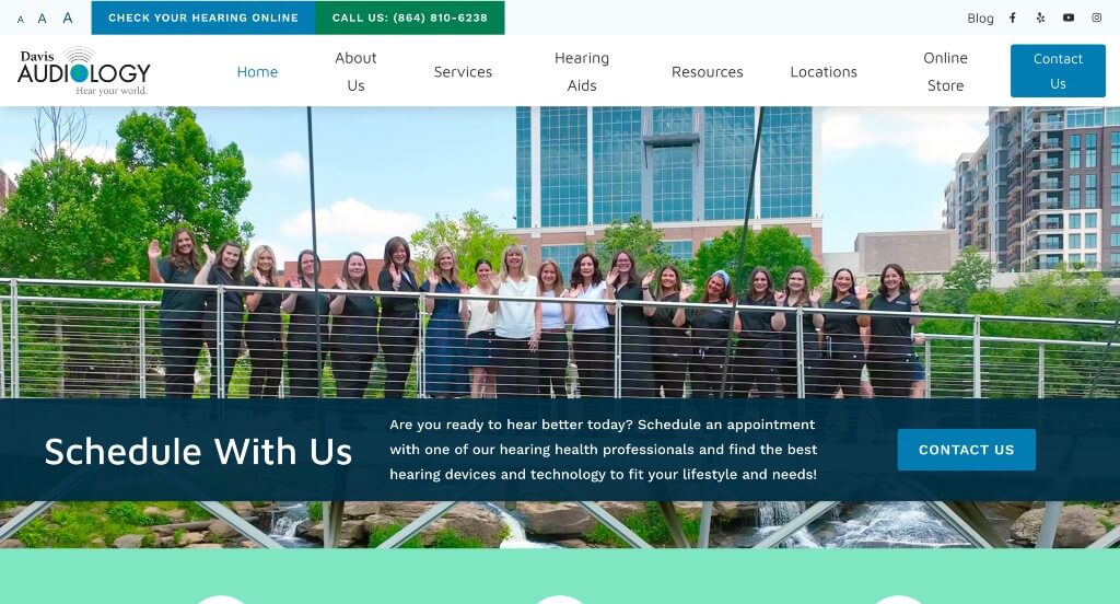
6. Davis Audiology
Why We Chose Davis Audiology
The website for Davis Audiology serves as a premier benchmark for “High-Trust Compassionate Care Merchandising and Patient-Centric Onboarding Architecture.” For an elite audiology practice, the digital storefront must immediately project deep medical authority, exceptional diagnostic safety, and an incredibly supportive, family-focused environment. This platform masterfully succeeds by organizing its homepage into a highly transparent, humanized virtual consultation path that systematically removes clinical anxiety.
Key Design Highlights:
- Dynamic Real-Time Customer Review Overlay: A standout interactive and conversion-focused highlight of the layout is a persistent rating badge overlaying the bottom left corner of the screen. By automatically cycling through authentic, high-praise testimonials and verified ratings given by real patients, the interface continuously establishes a powerful layer of passive social proof without disrupting the user’s primary browsing flow.
- Immersive Patient-Provider Collaborative Video: The website commands immediate operational trust with an authentic video segment integrated directly into the homepage layout. By capturing genuine, real-time interactions between compassionate audiology specialists and smiling patients working together through diagnostic fittings and consultations, the media entirely demystifies the clinical setting and highlights a warm, patient-first care philosophy.
- Front-Page Specialized Professional Provider Showrooms: Rather than burying their medical team credentials in deep background subpages, the homepage proudly showcases their elite team of doctoral-level audiology providers directly in the main scroll path. Introducing the faces, names, and warm personas of the specialists on the front page humanizes the practice, building deep clinical credibility and immense patient confidence before the user ever schedules a visit.
- High-Clarity Categorized Audiology Services Blueprint: The homepage completely avoids vague medical generalizations, choosing instead to clearly layout their advanced hearing services in highly structured, scannable blocks. Explicitly mapping out core pillars – such as comprehensive hearing evaluations, cutting-edge hearing aid technology, specialized tinnitus management, and custom ear protection – allows families to rapidly match their unique auditory challenges with the clinic’s exact technical capabilities.
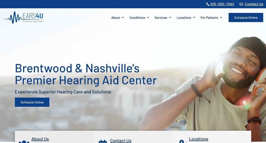
7. Ears 4 U Hearing Center
Why We Chose Ears 4 U
The website for Ears 4 U serves as a premier benchmark for “High-Trust Auditory Merchandising and Patient-First Care Portals.” For an established hearing health clinic, the digital storefront must immediately project deep medical credibility, technical safety, and local accountability. This platform masterfully succeeds by treating its homepage as an open, approachable virtual consultation space, seamlessly blending comprehensive clinical definitions with direct patient validation frameworks that eliminate onboarding friction.
Key Design Highlights:
- Frictionless “Book Appointment” Header Integration: Maximizing patient acquisition from the absolute moment a user lands on the site, the primary layout features a high-contrast, action-oriented appointment booking button pinned directly inside the global header navigation. This premium screen placement ensures that whether a client is performing deep research or a family member is acting on behalf of a parent, the gateway to securing an appointment remains permanently available from any viewport.
- Persuasive “Why Patients Choose Us” Structural Matrix: Embedded smoothly within the primary homepage scroll path is a dedicated, highly impactful section outlining the foundational pillars of the practice’s care philosophy. By cleanly communicating their core advantages – such as personalized treatment plans, cutting-edge diagnostic technology, and a warm, compassionate staff – the interface builds immediate institutional trust right where families evaluate their options.
- Comprehensive Front-Page Services and Treatment Blueprint: The homepage entirely avoids ambiguous medical generalizations, choosing instead to clearly organize their advanced audiological offerings into highly structured, scannable content blocks. By explicitly mapping out core treatment pillars – ranging from comprehensive hearing evaluations and precision hearing aid fittings to specialized maintenance and ear care – the layout allows users to rapidly self-select the exact clinical solutions aligned with their personal needs.
- Authentic Community-Backed Patient Review Grid: Anchoring the credibility of the homepage journey is a dedicated section spotlighting authentic client testimonials and verified reviews. Showcasing real-world praise regarding life-changing hearing improvements, precise adjustment techniques, and welcoming front-desk hospitality injects a vital layer of local social proof, validating the practice’s elite reputation right at the critical moment of user conversion.
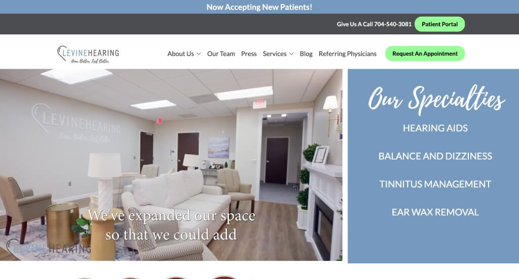
8. Levine Hearing
Why We Chose Levine Hearing
The website for Levine Hearing serves as a premier benchmark for “High-Trust Clinical Audiology Merchandising and Compassionate Patient Connection.” For an independent, family-owned hearing health practice, the digital storefront must immediately project deep technical safety, exceptional diagnostic expertise, and a warm, welcoming clinical environment. This platform masterfully succeeds by treating its homepage as an authentic virtual consultation path, using multi-layered video storytelling and clear organizational structures to completely eliminate clinical anxiety for patients and their families.
Key Design Highlights:
- Transparency-Driven Facility and Provider Hero Video: The website commands immediate operational authority and comfort with a high-fidelity video loop dominating the primary hero real estate. By capturing real-time, warm interactions between their leading specialists and smiling patients inside their pristine Charlotte facility, the media completely demystifies the hearing care experience the exact split second the page loads.
- Front-Page “Our Specialties” Clinical Blueprint: The homepage entirely avoids vague medical summaries, choosing instead to organize their core capabilities into a dedicated, highly scannable “Our Specialties” section. Explicitly mapping out key clinical paths – such as advanced hearing aid technology, precise hearing evaluations, and customized auditory fittings – allows prospective patients to rapidly match their personal hearing challenges with the clinic’s specialized solutions.
- Humanized “Meet Our Team” Showroom: Rather than hiding their medical credentials in deep background directories, the homepage proudly showcases their elite team of audiology and hearing specialists directly in the main scroll path. Putting friendly faces, names, and warm professional personas on the front page builds immense personal credibility and gives families a reassuring sense of familiarity before they ever step foot in the office.
- Immersive Video Patient Testimonial Hub: Positioned cleanly within the lower layout workflow is an invaluable, high-impact video patient testimonial feature. Providing unfiltered, face-to-face visual proof of a real client sharing their emotional journey toward improved hearing injects an unmatched layer of peer-to-peer social proof, powerfully validating the practice’s life-changing clinical outcomes right at the point of conversion.
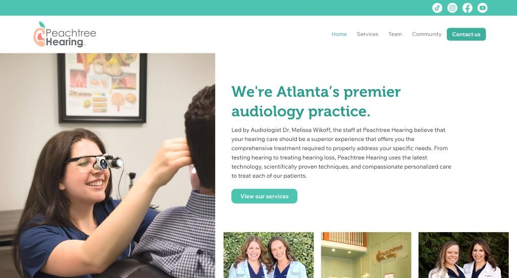
9. Peachtree Hearing
Why We Chose Peachtree Hearing
The website for Peachtree Hearing serves as a premier benchmark for “High-Fidelity Audiological Merchandising and Immersive Patient-First Connection.” Operating in a highly competitive medical landscape, their digital storefront must effortlessly project advanced diagnostic authority, pristine facility standards, and a deeply compassionate approach to hearing healthcare. This platform masterfully succeeds by transforming its homepage into a media-rich, transparent virtual consultation path that systematically dismantles clinical anxiety through authentic visual evidence and peer validation.
Key Design Highlights:
- Transparency-Driven Operational Hero Video Loop: The website commands immediate clinical authority and immense comfort through a high-definition video sequence dominating the homepage. By providing an unfiltered look at their leading doctoral-level specialists, their state-of-the-art facility, the advanced diagnostic tools they use, and genuine, warm interactions with smiling clients, the media completely demystifies the patient experience the exact split second the page loads.
- Comprehensive Front-Page Services and Treatment Blueprint: The homepage completely avoids vague medical catchphrases, choosing instead to clearly organize its advanced audiological offerings into highly structured, scannable blocks. Explicitly mapping out core clinical pillars – such as comprehensive diagnostic testing, advanced hearing aid technology, specialized tinnitus therapy, and pediatric audiology – allows families to rapidly match their unique auditory challenges with the clinic’s specialized solutions.
- Persuasive “Why Choose Peachtree Hearing?” Value Matrix: Positioned strategically within the primary homepage scroll path is a dedicated section detailing the foundational pillars of the practice’s care philosophy. By cleanly articulating their core brand promises – such as independent, un-biased device selections, elite doctor-level expertise, and a patient-first treatment model – the layout builds immense institutional credibility exactly where users are evaluating their healthcare options.
- Multi-Format Video and Text Testimonial Hub: Anchoring the validation phase of the homepage journey is an exceptionally robust repository of patient reviews, uniquely featuring an extensive array of high-fidelity video testimonials alongside written feedback. Allowing prospective patients to watch and hear real individuals share their emotional, life-changing journeys toward restored hearing creates an unmatched layer of peer-to-peer social proof, powerfully validating the practice’s clinical outcomes right at the final point of conversion.
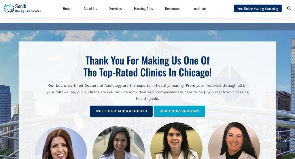
10. SoniK Hearing Care Services
Why We Chose Sonik Hearing
The website for Sonik Hearing serves as a premier benchmark for “High-Trust Digital Audiology Merchandising and Frictionless Patient Acquisition Layouts.” For a modern hearing healthcare practice, the digital platform must immediately project exceptional clinical expertise, technical reliability, and an approachable, patient-first care philosophy. This platform masterfully succeeds by organizing its homepage into a seamless virtual consultation path, balancing clear service definitions with multiple direct scheduling funnels that remove all friction from the patient onboarding journey.
Key Design Highlights:
- Comprehensive Front-Page Services and Treatment Blueprint: The homepage completely avoids dense medical jargon, choosing instead to clearly organize their core audiological offerings into highly structured, scannable blocks. By explicitly mapping out key clinical pathways – such as comprehensive hearing evaluations, advanced hearing aid fittings, and specialized maintenance care – the layout allows patients and their families to instantly align their unique auditory challenges with the clinic’s specialized solutions.
- Dual-Placement “Schedule Online” Conversion Architecture: A major transactional triumph of the interface design is its highly strategic, multi-tiered appointment gateway. By pinning a clear “Schedule Online” call-to-action button directly within the global header navigation – and mirroring a direct booking module lower down the homepage toward the footer – the framework ensures that high-intent users can seamlessly transition into a localized scheduling portal from any point in their scroll path.
- Front-Page Editorial Insights and Auditory Health Triage: Positioned smoothly within the primary homepage flow is a dedicated feature section highlighting their curated blog and educational resources. Spotlighting timely pieces on hearing loss prevention, advancements in digital hearing technology, and practical maintenance tips elevates the platform from a standard clinic into an authoritative, forward-thinking partner in long-term auditory wellness.
- Authentic Community-Backed Patient Review Grid: Anchoring the credibility of the homepage journey is a dedicated repository of verified patient testimonials and reviews. Showcasing real-world praise regarding life-changing hearing transformations, compassionate provider communication, and meticulous clinical care adds a vital layer of local social proof, actively neutralizing patient hesitation right at the critical moment of user conversion.
WordPress Audiology Themes
You can find free themes at wordpress.org or consider audiology-inspired templates at ThemeForest.
Medicare – Themeforest
$69
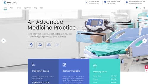
MediClinic – Themeforest
$69
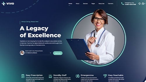
Vivo – Themeforest
$69
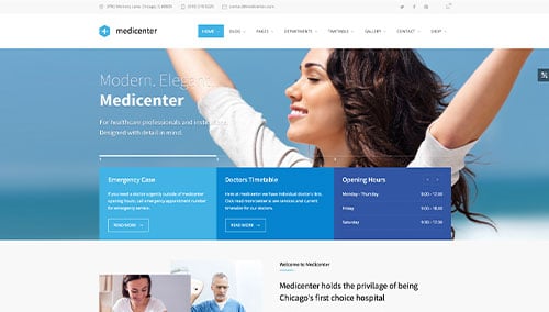
MediCenter – Themeforest
$69