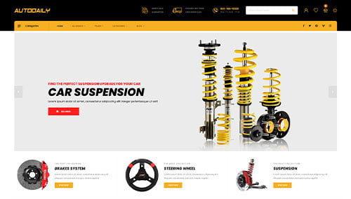
In the automotive sector, a website must perform with the same precision as the vehicles it showcases. Whether it is a global manufacturer or a specialized repair facility, an online presence serves as a high-stakes digital showroom where engineering excellence must meet intuitive navigation. For modern automotive brands, success is defined by the ability to move a user from initial curiosity to a service appointment or showroom visit through a high-performance interface.
Our marketing and design team conducted an extensive audit of the automotive digital landscape, evaluating hundreds of platforms across the industry. We narrowed the field to the top 10 examples that represent the pinnacle of automotive web design in 2026. Our analysis focused on the integration of high-definition interactive galleries, streamlined service scheduling tools, and mobile-optimized search filters that allow users to find exactly what they need with zero friction.
Whether you are a dealership aiming to increase lead volume, a repair shop building local authority, or a parts supplier optimizing for e-commerce, these examples provide the definitive blueprint for success. Use these industry leaders to inspire a digital presence that reflects the power, reliability, and innovation of your automotive business.
Note on Our Selection Process: We recently updated this guide to ensure every featured site meets our 2026 standards for data security, technical SEO, and immersive user experience. This curated list focuses on the manufacturers, dealerships, and technology companies that are currently setting the pace for the automotive industry.
Top Auto Company Website Designs
1. AutoZone
Why We Chose AutoZone
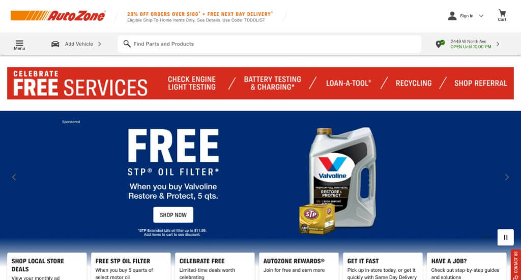
The digital storefront for AutoZone serves as a premier benchmark for “High-Velocity Utility Merchandising and Context-Driven Automotive E-Commerce Architecture.” For a massive retail enterprise dealing with hundreds of thousands of complex parts, the online experience must rapidly cut through clutter to deliver exactly what a driver needs to fix their vehicle. The platform accomplishes this masterfully, combining rigid organizational structures with real-time marketing layers to ensure both DIY mechanics and everyday drivers can find parts, maximize savings, and buy with absolute confidence.
Key Design Highlights:
- Structured “Shop by Category” Discovery Blueprints: Managing an immense catalog of mechanical components, fluids, and accessories requires highly efficient layout choices. The website establishes an immediate logical anchor by highlighting a clean, icon-driven “Shop by Category” directory right upfront, allowing users to instantly self-select their exact path – whether searching for brakes, batteries, or powertrain components – without digging through endless submenus.
- Real-Time Weather-Adaptive Product Showrooms: The homepage drives massive seasonal relevance by dynamically updating its primary product displays to match current climate and weather patterns. Highlighting seasonal essentials – such as wiper blades and winter additives during freezes, or air conditioning recharge kits and cooling system flushes during summer heatwaves – provides immediate utility, anticipating drivers’ urgent maintenance needs based on real-world conditions.
- Persistent, Search-First Sticky Header Frameworks: Ensuring fluid navigation as users explore dense technical specifications or product fitment guides, the interface utilizes a robust sticky header menu. Keeping the vehicle selector tool, shop location tracker, and primary global search bar locked at the top of the viewport eliminates tedious backtracking scroll fatigue, ensuring essential utility tools are always a single click away.
- High-Visibility Pre-Fold Value and Promotion Banners: Positioned strategically directly below the main header framework, the website integrates a dedicated, high-contrast block highlighting active deals and discounts. Placing immediate financial incentives – such as loyalty point bonuses, bundle deals, and seasonal coupon codes – right at the top of the scroll path captures price-conscious shoppers instantly, driving higher conversion rates before users even engage with the primary content below.

2. Icon Motorsports
Why We Chose Icon Motosport
The digital presence for Icon Motosport serves as a premier benchmark for “High-Octane Technical Merchandising and Visceral Lifestyle Commerce Architecture.” Catering to a passionate subculture of street riders and track racers, an apparel and gear website must do more than simply catalog inventory – it has to match the raw grit, adrenaline, and engineering rigor expected by its audience. The platform achieves this masterfully, combining macro-level engineering showcases with aggressive lifestyle media to translate high-stakes physical performance into an immersive online shopping journey.
Key Design Highlights:
- Visceral, Macro-Engineering Hero Video Showrooms: The platform commands immediate authority by swapping out generic promotional slides for a high-fidelity, gritty hero video loop right at the top of the fold. Focusing intensely on the “nitty-gritty” structural elements of their helmets – such as the weave of the carbon fiber, the lock mechanism of the shield, and the precision aerodynamic venting – instantly validates their engineering prestige and safety standards before the user interacts with a single product link.
- High-Impact “New Releases” Drop Hubs: Capitalizing on hyper-current consumer demand and seasonal style refreshes, the homepage gives prominent placement to a dedicated “New Releases” matrix. Spotlighting their absolute latest graphic drops and gear innovations directly in the primary scroll path keeps the digital experience incredibly fresh for returning brand advocates and establishes what the cutting edge of riding gear looks like right now.
- Structural “Shop by Shell Type” Discovery Gateways: Moving past simple aesthetic filtering, the website integrates a highly practical, performance-driven search directory directly on the front page. Allowing riders to segment inventory based on distinct helmet shell shapes accommodates precise physiological fitment and preference constraints, giving buyers a swift and highly confident path to finding their exact match.
- Experiential, High-Velocity Track Action Showrooms: Anchoring the lower half of the user experience in a massive dose of brand authenticity, the homepage integrates a high-octane media module depicting riders wearing their helmets in intense racing environments. Showcasing the product being pushed to its limits on the track functions as an ironclad performance proof-engine, perfectly bridging high-end product engineering with the defiant, asphalt-burning lifestyle of the riding community.
3. Auto Trader
Why We Chose AutoTrader
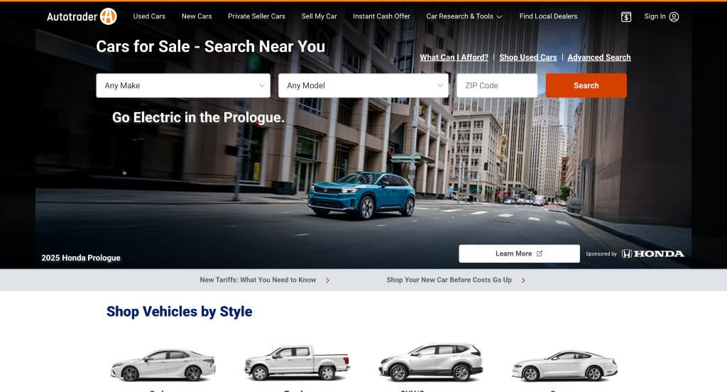
The digital portal for AutoTrader serves as a premier benchmark for “High-Velocity Aggregator Merchandising and Intent-Driven Automotive Search Architecture.” As one of the largest automotive marketplaces online, the platform faces the immense challenge of organizing millions of listings without overwhelming the user. The website navigates this scale masterfully by pairing an immediate, search-first hero workspace with psychological confidence filters and rich consumer education hubs, instantly transforming a massive dataset into a highly personalized car shopping experience.
Key Design Highlights:
- Search-First Intent-Driven Hero Workspaces: The homepage bypasses traditional promotional fluff by turning the primary hero fold into a high-utility vehicle search console. By putting macro-level configuration controls – like make, model, price, and location fields – right at the user’s fingertips from the initial click, the site immediately captures shopping intent and accelerates the path deep into relevant vehicle listings.
- Aesthetic and Functional “Shop by Style” Discovery Gateways: Recognizing that many shoppers think in terms of daily utility rather than specific manufacturing jargon, the homepage features a beautifully mapped matrix to filter vehicles by body style. Grouping inventory into intuitive visual categories – such as SUVs, Trucks, Sedans, or electric vehicles (EVs) – allows buyers to easily self-select their lifestyle path and browse cohesive vehicle shapes instantly.
- Psychological Trust Filters for High-Confidence Browsing: To tackle the natural consumer anxiety surrounding hidden mechanical wear, the homepage integrates a specialized entry point dedicated to vehicles with no reported issues. Providing single-click access to pre-filtered inventories of accident-free and clean-title cars removes huge barriers of buying friction, instantly boosting buyer confidence before they ever connect with a dealership.
- Coordinated Consumer Education and AutoTrader Blog Hubs: Solidifying their role as trusted consumer advocates beyond a simple transaction network, the homepage features a dedicated, highly visible automotive news and advice blog showcase. Directly highlighting vehicle reviews, long-term road tests, and practical buying guides within the primary scroll path provides deep context, empowering shoppers to make informed financial decisions as they navigate the buying process.
4. Rivian
Why We Chose Rivian
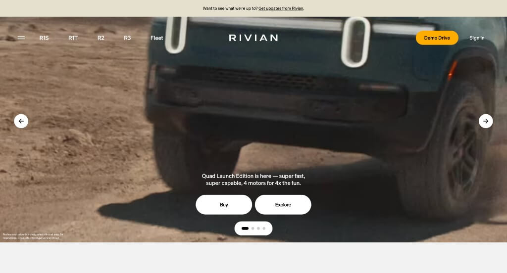
The digital showcase for Rivian serves as a premier benchmark for “Immersive Sustainable Merchandising and Kinetic Narrative Architecture.” As an electric vehicle manufacturer rooted in outdoor exploration, their online destination must do more than display product specs – it must evoke the visceral feeling of adventure while proving high-tech engineering capability. The platform navigates this masterfully by blending seamless scroll-driven mechanics with cinematic, user-controlled media layers to make digital exploration feel as active and modern as driving the vehicles themselves.
Key Design Highlights:
- Kinetic “Scrollytelling” Narrative Frameworks: The website replaces traditional static scrolling with a dynamic scrollytelling experience that transforms the layout as you scroll. As users move down the page, vehicle components seamlessly assemble, text overlays transition seamlessly, and background environments shift, capturing the user’s attention and guiding them through a beautifully orchestrated, step-by-step tour of the vehicle’s engineering.
- Experiential, Feature-Focused Feature Video Matrices: Rather than relying purely on text specs, the homepage hosts a high-fidelity video grid showcasing the distinct utilities of their vehicles. These looping, bite-sized clips vividly illustrate real-world applications – like their rugged off-road modes, versatile gear tunnel storage, and outdoor kitchen setups – proving the trucks’ utility through movement.
- Deep-Dive Digital Product Interface Showrooms: Transitioning from rugged physical capability to advanced interior tech, the lower half of the homepage features a dedicated video zooming in on their custom center console display. Showing the fluid touch screen, topography mapping, and over-the-air vehicle diagnostics in action instantly validates Rivian’s high-tech prestige, giving buyers a real sense of the daily cabin experience.
- Expansive, Full-Width Lifestyle Showcases: The website establishes an immediate sense of wild scale by implementing an open, full-width screen layout anchored by stunning lifestyle imagery. Immersing the vehicle seamlessly into rugged, real-world outdoor landscapes – like misty forests and desert dunes – perfectly captures the brand’s identity, inspiring buyers to envision the vehicle as their ultimate gateway to the outdoors.
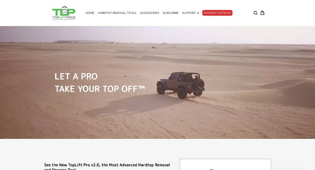
5. Top Lift Pros
Why We Chose Top Lift Pros
The digital storefront for Top Lift Pros serves as a premier benchmark for “Niche Mechanical Merchandising and High-Demonstration Utility Architecture.” Selling a highly specialized, premium tool designed to solve a specific physical pain point – removing bulky Jeep and Ford Bronco hardtops – requires an interface that prioritizes operational proof and mechanical compatibility. The website achieves this masterfully, combining clear vehicle-matching pathways with rich instructional media and transparent brand evolution maps.
Key Design Highlights:
- Compatibility-Driven “Shop by Vehicle” Discovery Gateways: Because automotive accessories are strictly dependent on exact vehicle specs, the platform integrates an intuitive compatibility filter directly on the homepage. Segmenting shopping corridors by vehicle type – such as specific models of Jeep Wranglers or Ford Broncos – removes absolute buying friction, ensuring customers dive into a product list guaranteed to fit their exact ride.
- Friction-Reducing Product Demonstration Showrooms: For a unique mechanical hoisting tool, text and static photos alone cannot fully explain the ease of use. The homepage solves this by featuring a prominent gallery of real-time product videos. Showing the mechanical lift in motion as a single person effortlessly removes a heavy hardtop in under two minutes functions as an ironclad proof-engine, eliminating customer skepticism before they reach the checkout button.
- Persistent, Conversion-First Sticky Navigation Headers: Ensuring seamless exploration as users look through custom accessory lines, safety specs, or shipping details, the platform employs a locked sticky menu framework at the top of the viewport. This architectural choice keeps primary shopping tabs and customer support shortcuts immediately accessible at any scroll depth without interrupting the visual narrative.
- Chronological “Our Innovation” Brand Growth Directories: Building massive engineering credibility, the homepage features a beautifully mapped corporate growth section tracking where they started, where they stand today, and their roadmap for future releases. Laying out this evolutionary timeline grounds the premium pricing of the tool by showing the years of rigorous testing, patents, and long-term commitment backing the design.
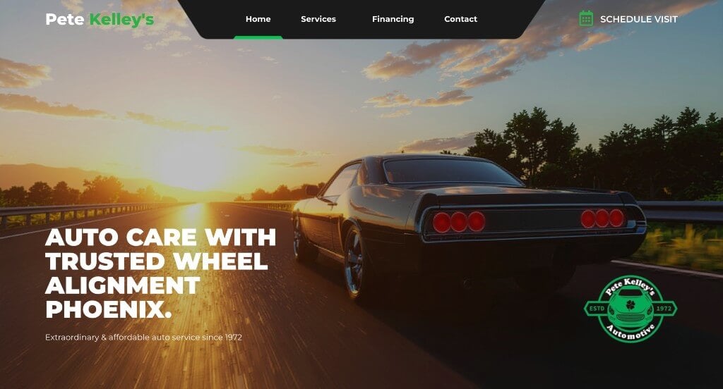
6. Pete Kelley’s Auto Service
Why We Chose Pete Kelley’s Automotive
The digital presence for Pete Kelley’s Automotive serves as a premier benchmark for “Hyper-Local Service Merchandising and Multi-Tiered Trust Validation Architecture.” In the automotive repair industry, consumer behavior is heavily driven by anxiety over reliability, fairness, and technical competence. A successful web presence must immediately defuse this skepticism and prove the shop’s operational integrity. The platform navigates this masterfully by prioritizing third-party credentials and a transparent layout of their repair capabilities directly on the front page.
Key Design Highlights:
- Pre-Fold Industry Award and Recognition Showrooms: The website establishes immediate local authority by positioning a dedicated showcase of their industry accolades directly below the primary hero fold. Displaying these honors right at the top of the scroll path signals a long-standing history of regional excellence, capturing the user’s confidence before they even look through service prices.
- Transparent, Comprehensive Auto Service Directories: Eliminating the guesswork of whether the shop can handle a specific mechanical issue, the homepage maps out a clear, structured outline of their core automotive services. Explicitly itemizing their capabilities – ranging from routine fluid maintenance to complex engine diagnostics – allows drivers in urgent need of repair to quickly confirm the shop’s expertise.
- Value-Driven “Why Choose Us” Professional Anchors: Anchoring the core of the homepage is a dedicated section that explicitly details the distinct benefits of choosing their garage over corporate dealership alternatives. Highlighting critical consumer advantages – such as technician certifications, parts warranties, and family-owned values – builds strong relational trust and highlights their customer-first philosophy.
- Multi-Channel Third-Party Trust Validation Hubs: To seal customer trust with objective proof, the homepage integrates a high-visibility panel showcasing their official Google, RepairPal, and Better Business Bureau (BBB) ratings. Aggregating these highly respected, independent verification badges in one prominent place functions as an ironclad validation engine, assuring vehicle owners of their flawless community reputation.
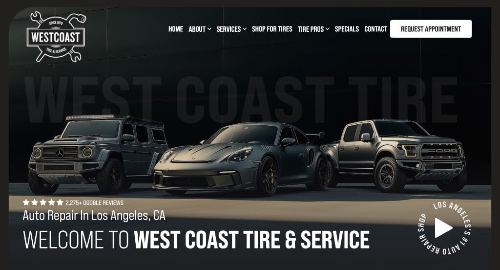
7. West Coast Tire Pros
Why We Chose West Coast Tire & Service
The digital storefront for West Coast Tire & Service serves as a premier benchmark for “High-Utility Local Service Curation and Conversion-First Interface Architecture.” In an industry often plagued by cluttered, legacy layouts and hyper-aggressive sales pitches, this automotive hub takes a refined, user-centric approach. The website navigates this masterfully by pairing an ultra-clean, utilitarian visual aesthetic with prominent booking shortcuts and modern service segmentation to capture busy, high-intent drivers instantly.
Key Design Highlights:
- Utilitarian, High-Contrast Grayscale Layouts: The interface utilizes a highly intentional, minimalist grayscale color scheme that strips away visual noise and neon promotional distractions. This clean design choice projects a sense of modern, industrial professionalism, allowing critical call-to-action details and text information to stand out with massive structural contrast.
- Modernized Next-Generation Automotive Service Directories: The homepage prioritizes immediate clarity by breaking down its foundational mechanical offerings into highly distinct visual blocks. Explicitly spotlighting specialized modern capabilities – like convenient mobile tire services and dedicated Electric Vehicle (EV) maintenance options – reassures forward-thinking drivers that the garage is fully equipped to service cutting-edge fleets alongside traditional vehicles.
- High-Visibility “Request an Appointment” Conversion Anchors: Eliminating the typical friction of digging through multi-layer menus to schedule a slot, the header integrates a large, high-contrast appointment request button. Locking this prominent action item right at the peak of the global visual hierarchy ensures that drivers in need of urgent repairs can launch the booking pipeline within seconds of loading the page.
- Peer-Validated Community Trust Hubs: To counter the standard consumer hesitation that often surrounds auto repair transparency, the homepage embeds a dedicated showcase of real customer reviews. Featuring authentic, local accounts of technical precision, fair pricing, and reliable turnaround times directly within the primary scroll path establishes immediate relational trust before the consumer enters the scheduling funnel.
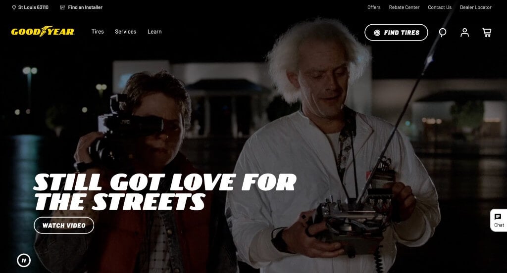
8. Goodyear Tires
Why We Chose Goodyear
The digital presence for Goodyear serves as a premier benchmark for “Enterprise-Level Utility Merchandising and High-Conversion Frictionless Commerce Architecture.” Managing an extensive national catalog of tire models alongside a massive network of retail auto service centers requires an interface that values structural organization above all else. The platform achieves this masterfully, combining expansive navigational directories with real-time customer support tools and rich consumer education hubs to turn complex technical selections into a straightforward, confident buying journey.
Key Design Highlights:
- Symmetric, High-Engagement Mega Menu Directories: Organizing thousands of distinct tire models, vehicle compatibility fitments, and mechanical services requires a highly efficient navigational blueprint. The site utilizes a spacious, multi-column mega menu that maps out their entire retail inventory into clean, logical categories – allowing users to filter by tire size, vehicle type, or specific performance conditions at a single glance.
- Transparent, High-Utility Auto Service Registries: Bypassing the confusion of whether a local service center can handle a specific mechanical repair, the homepage features a clearly structured breakdown of their foundational maintenance offerings. Explicitly detailing capabilities – ranging from routine oil changes and brake replacements to advanced alignment tune-ups – allows drivers in need of immediate service to quickly verify their options.
- Immediate, High-Utility Live Chat Assistance Channels: Recognizing that finding the exact tire specifications or scheduling a time-sensitive installation can trigger buying hesitation, the platform integrates an active live chat module directly into the user interface. Providing this real-time customer support window gives shoppers immediate, expert guidance right when they are making technical configuration decisions.
- Coordinated Consumer Advocacy and Goodyear Blog Hubs: Solidifying their role as trusted automotive safety experts beyond simple tire sales, the homepage showcases a dedicated consumer education and lifestyle blog stream. Highlighting practical tire care advice, seasonal driving safety guides, and innovative tire technology deep-dives directly within the main scroll path provides rich context that empowers customers to make highly informed buying choices.
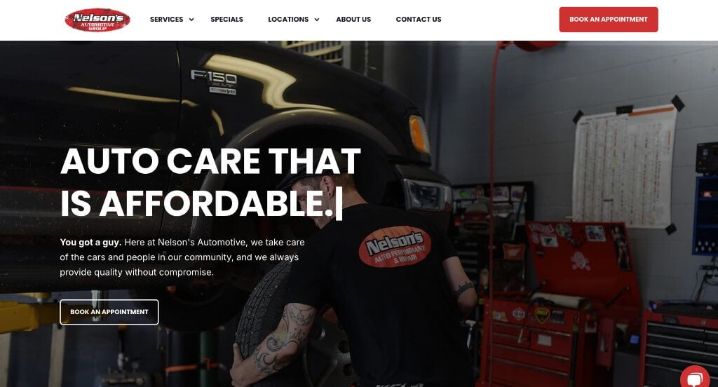
9. Nelson’s Automotive
Why We Chose Nelson’s Repair
The digital home for Nelson’s Repair serves as a premier benchmark for “Multi-Location Service Merchandising and High-Warmth Operational Architecture.” For a growing automotive repair enterprise with a footprint expanding across multiple communities, the primary digital challenge is maintaining a trustworthy, independent garage feel while projecting large-scale regional reliability. The platform achieves this masterfully, combining intuitive multi-facility directories with personalized media elements and a modern, high-utility service grid.
Key Design Highlights:
- Persistent, Conversion-First Sticky Navigation Menus: Ensuring smooth, seamless user exploration as customers search deep into specific repair pages, location maps, or scheduling forms, the platform utilizes a locked sticky header framework. Keeping essential shopping links, contact shortcuts, and appointment buttons anchored at the top of the viewport completely eliminates tedious backtracking scroll fatigue.
- Humanizing, Facility-Focused Video Showrooms: The website immediately dismantles the standard anxiety surrounding auto mechanics by embedding a high-fidelity video module on the homepage. Showcasing real-time footage of their clean, modern facility, high-tech diagnostic gear, and friendly staff working on cars transforms the digital storefront into an inviting window, establishing deep relational trust before a user ever books a service.
- Structured, Multi-Location Regional Directories: Transparently serving diverse service regions without confusing local drivers, the homepage features a beautifully integrated showcase highlighting their multiple service locations. Organizing each facility with clear maps, distinct phone lines, and neighborhood-specific operating hours right on the front page ensures customers can quickly identify their closest service center with a single glance.
- Visual-First, High-Utility Service Grid Matrices: Bypassing dense walls of technical text that can overwhelm vehicle owners, the homepage organizes its mechanical capabilities into a sleek, clean grid layout. Itemizing repair offerings – ranging from simple oil changes to complex electronic diagnostics – using clear icons and descriptive blocks gives drivers an instant, easy-to-scan confirmation of the shop’s diverse technical expertise.
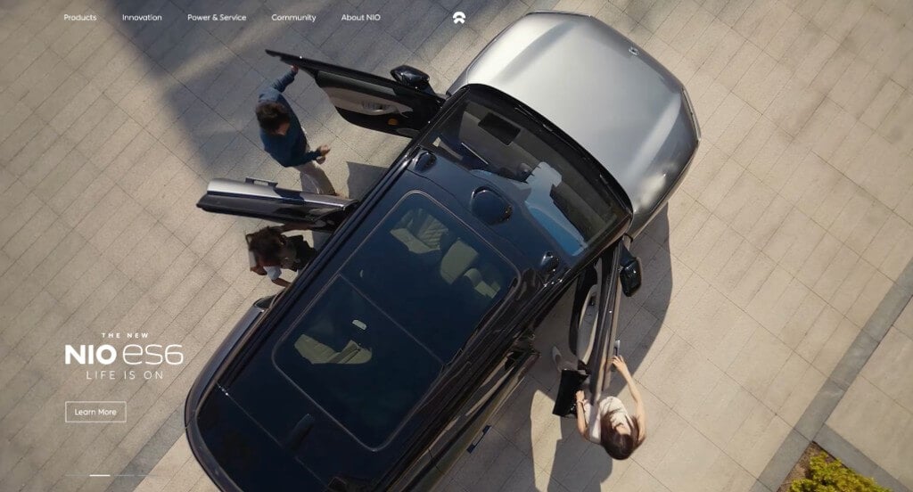
10. NIO
Why We Chose NIO
The digital showcase for NIO serves as a premier benchmark for “Next-Generation Electric Mobility Merchandising and High-Fidelity Premium Commerce Architecture.” As an international leader in smart, premium electric vehicles, NIO’s digital experience must mirror the high-tech precision and luxury design language of the cars themselves. The platform navigates this masterfully by pairing immersive, high-velocity cinematic media with crisp product segmentation and persistent utility layers to deliver a futuristic, high-engagement vehicle exploration experience.
Key Design Highlights:
- High-Velocity Cinematic Hero Video Showrooms: The platform commands immediate brand authority by filling the primary hero fold with a high-fidelity video loop capturing their vehicles in fluid motion. Showcasing sleek silhouettes carving through scenic mountain passes and illuminated cityscapes instantly charges the site with an editorial, premium energy, setting a sophisticated tone before a user engages with any interface controls.
- Hyper-Focused Product Quality and Smart Feature Close-ups: Bypassing traditional, flat automobile photography, the site utilizes ultra-sharp, high-detailed imagery that emphasizes the brand’s premium craftsmanship. Immersive macro shots highlighting specialized interior tech, fine leather stitching, aerodynamic body contours, and advanced sensor suites give users a vivid, tactile sense of the vehicle’s luxury build quality directly on screen.
- Pre-Fold “Next-Gen Fleet” Model Showcases: Capitalizing on immediate consumer curiosity, the homepage positions a streamlined portfolio showcase of its distinct vehicle models directly beneath the hero video container. Displaying their line of premium sedans and SUVs right at the top of the scroll path gives high-intent buyers an instant, direct portal into customized configuration and specification pages without digging through submenus.
- Persistent, Minimalist Sticky Navigation Frameworks: Ensuring completely fluid navigation as users dive deep into battery-swapping technology deep-dives, lifestyle collections, or user community hubs, the interface implements a translucent sticky header menu. Keeping primary brand categories and globally recognized navigation links locked elegantly at the top of the viewport eliminates scroll fatigue while maintaining an ultra-clean, spacious layout.
WordPress Automotive Themes
You can find free themes at wordpress.org, or consider automotive-inspired templates at ThemeForest.
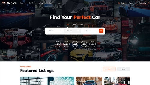
Vehica – Themeforest
$79
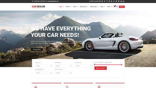
Car Dealer – Themeforest
$89
WooCommerce Automotive Themes
You’ll find numerous ecommerce automotive themes for WooCommerce on ThemeForest.
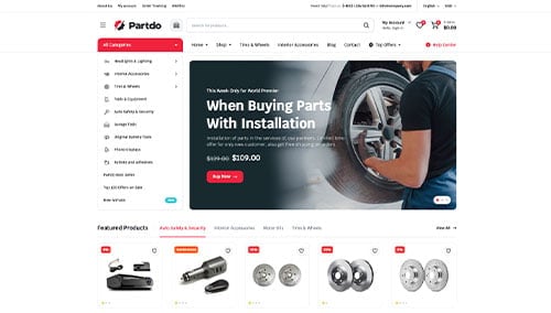
Partdo – Themeforest
$19
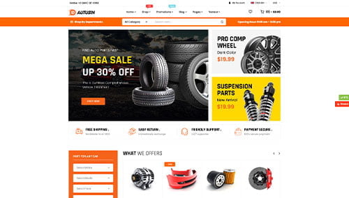
Autusin – Themeforest
$59
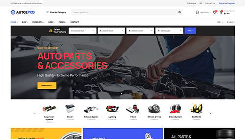
Autozpro – Themeforest
$49
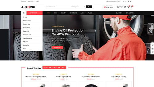
Autovio – Themeforest
$59
Shopify Automotive Themes
Explore free and paid themes at themes.shopify.com, or consider options available through marketplaces like ThemeForest.
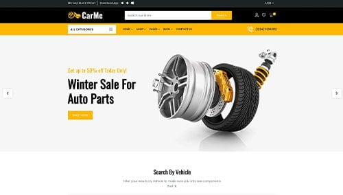
Carme – Themeforest
$39
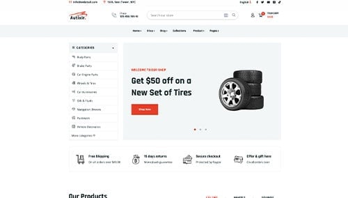
Autixir – Themeforest
$48
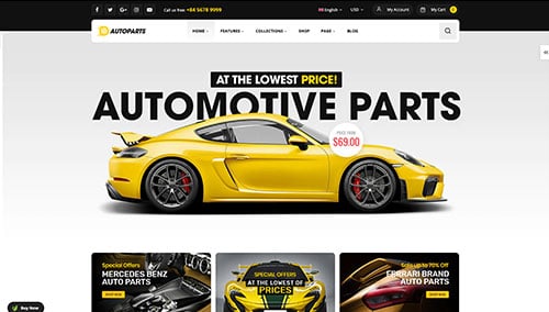
AutoParts – Themeforest
$59
Autodaily – Themeforest
$56