In an era of fragmenting attention spans, a blog is no longer just a repository for text – it is a sophisticated platform for storytelling, brand authority, and community engagement. For publishers and businesses alike, the challenge is no longer just producing content, but creating a digital environment that balances visual immersion with effortless readability. A high-performing blog must instantly signal credibility while guiding users through a seamless journey from the first headline to the final call to action.
Our design and development team recently audited our expansive list of blog designs, filtering through hundreds of sites to identify the “best of the best.” We narrowed our selection down to 11 definitive examples that represent the benchmark for blog design in 2026. We specifically analyzed these sites for their typographic hierarchy, strategic use of whitespace, and mobile-first navigation patterns – the essential elements that convert casual scrollers into loyal subscribers.
Whether you are launching a minimalist personal brand, a high-volume news outlet, or a corporate content hub, these curated examples offer actionable blueprints for modern web design. Use these industry leaders to inspire your layout, improve your site’s dwell time, and refine your digital identity.
Note on Our Selection Process: We recently refined this guide to prioritize quality over quantity. Every site on this list has been vetted for its 2026 performance standards, ensuring it delivers a superior user experience across all devices. This is a highly curated selection of the blogs providing the most strategic value to readers today.
11 Best Blogger Website Designs
1. 500px
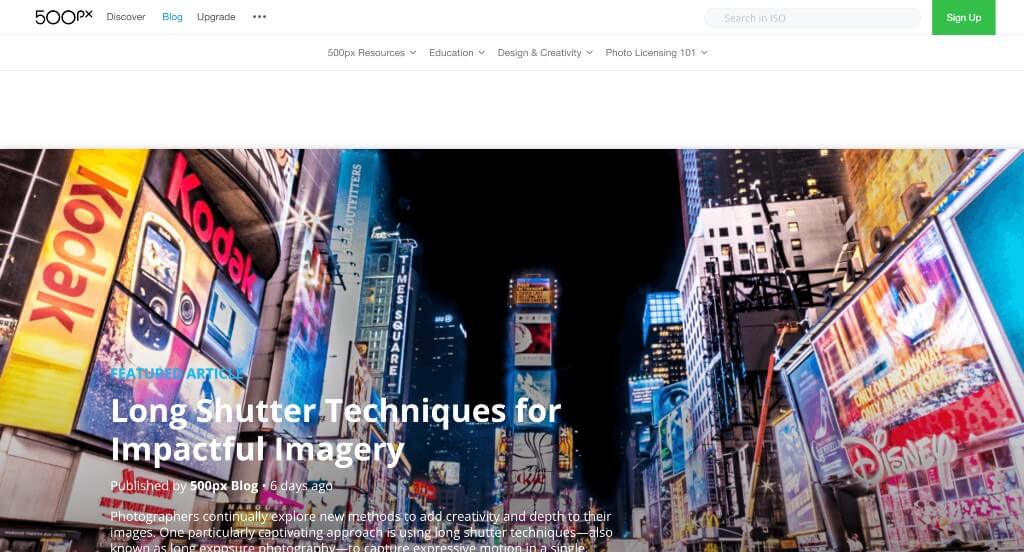
Lots of large images are used in various places to grab attention. We loved how titles, the author and how recent a post is can all be noticed along with a short paragraph about each post all within this landing page. It was also a great choice to include lots of buttons to take people to new areas. From a marketing perspective, we liked how they utilized bold lettering for titles.
2. Web Design Depot
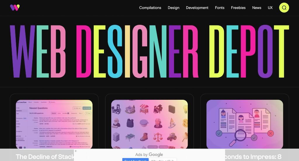
This is a stellar choice to look at if you are hoping for additional inspiration. We loved the stunning bright colors used for their company name. Additionally, all of their bright content contrasts well with their black backgrounds. Subtle animations that appear upon hover was amazing for them. Another thing that we enjoyed was how a filter of sorts was placed over many of their images before hover.
3. The Blonde Abroad
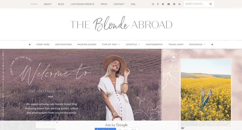
This was by far one of our favorite examples because of the blend of graphics and creative fonts that pair together nicely. We loved their interesting image frames that create a unique feel for their pages. Using postcard and other simple mailing graphics was an addition that we really liked. Another great idea that we appreciated was a map that shows a variety of places she’s traveled and where she is currently.
4. Create & Cultivate
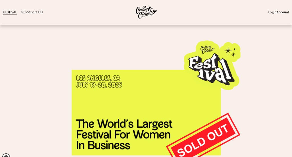
We loved how this one had a feature that displayed “For the ____________”, dropping their stereotyped readers. Additionally, using a few different accent colors was nice to brighten up this overall feel. All of Create & Cultivate’s information was formatted into short paragraphs, which was nice because it wasn’t overwhelming. We also loved their interesting logo that mainly used text.
5. Color Me Courtney
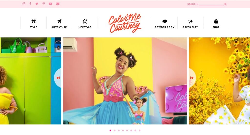
We could feel the vibrancy shining through every area of these pages. Decorative fonts are used to create a more appealing look. Additionally, a beautiful combination of colors are used for text, backgrounds, buttons, images and more. Showing a highlighted banner showing publication dates was a good addition that every blog should use somehow. Using a bubbly, positive tone while writing is something that Color Me Courtney does a great job with. Finding ways to include social media was also very well done in this one.
6. The Recipe Critic
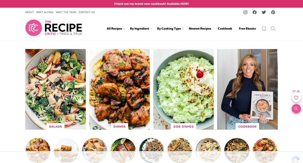
This was a very exciting layout that uses bright pinks to accent some areas. Images were of extreme quality and looked sooooo yummy! We thought it was interesting to have a free meal plans for weeks that includes a shopping list to save time on your weekly meal prep. Another thing that we really liked was how recipes could be separated by meat or method of cooking. Having a section for upcoming holidays (and the traditional foods) was a great choice.
7. Smashing Magazine
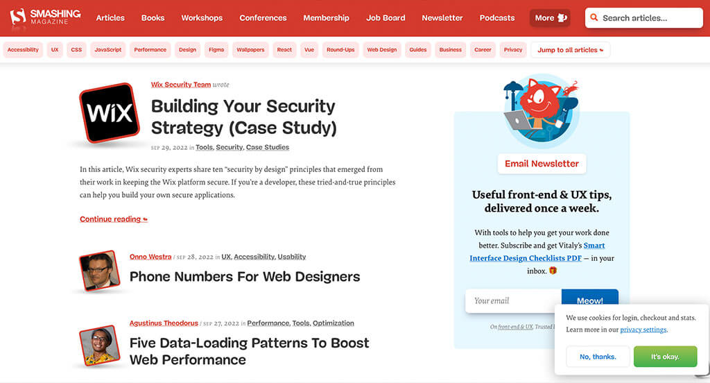
Smashing Magazine’s most unique quality was hands-down their use of their logo over and over as a photo frame. We felt that their bubbly text for titles was different, and it helped them stand out. Red and white was a great choice to help all their content pop and feel exciting. Another thing you might notice is their use of their cat mascot to get people involved more. Including all of their topics in the footer was an aspect we couldn’t ignore.
8. Awwwards
Almost instantly, we noticed how very large text was used throughout to make a statement. Along with that, it was nice to have large imagery to add a bit of variety. On this landing page, we felt it was perfect to have only very short paragraphs to hook customers into certain posts. It was also cool how they added in their business’ case studies within this blog.
9. Cookie + Kate
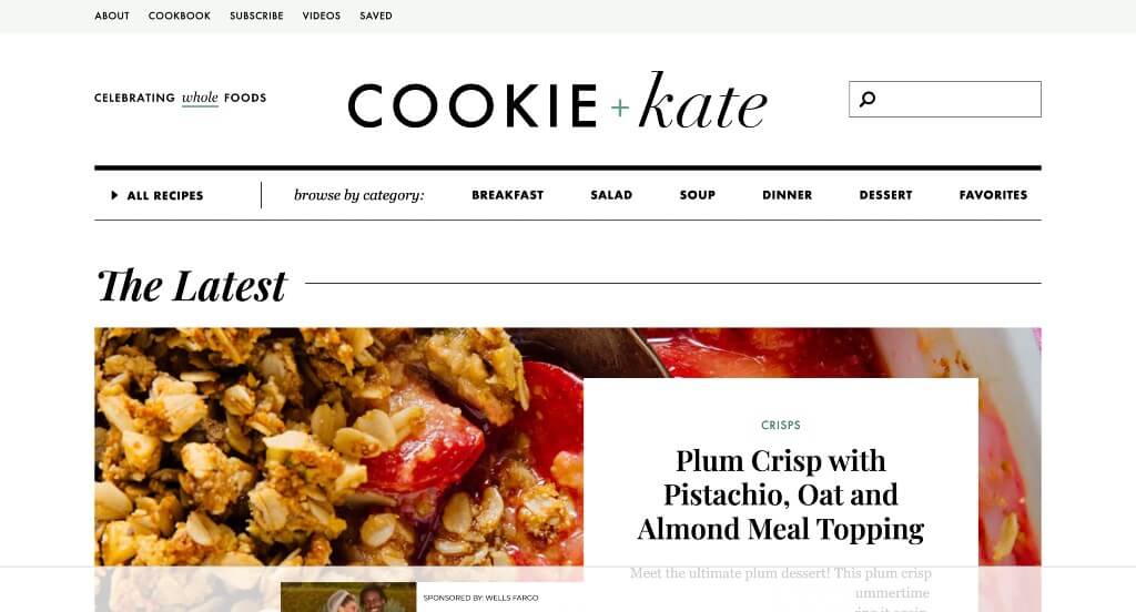
Lots of tasty looking images are included right away to get viewers excited about this content. We loved Cookie + Kate’s feature to find a perfect recipe by typing filters: course, cuisine, ingredient, diet, and season. Including information about this author was perfect because it gets people feeling more connected to this content. Usability was another thing that we felt this example did very well with.
10. GirlBoss
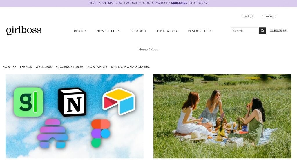
Our favorite part about this one was certainly their interesting fonts. Beyond that, it was nice to use different versions of this font for titles, subtitles and content. We also liked how they customized their images to make a more personal feel. Another feature of GirlBoss that was great was their colorful backgrounds in areas. Their navigation bar was also pretty simple, so it was easy to read and use.
11. Salt In Our Hair
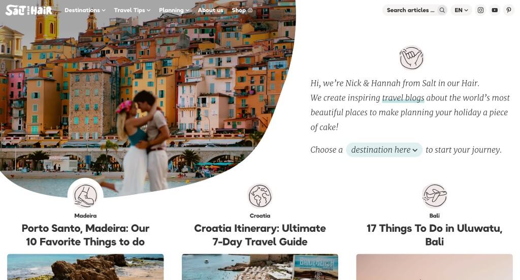
We absolutely loved how this layout made use of space carefully to create something outstanding. We appreciated their cute little graphics that match well with their overall feel. Sorting their information by travel destination was a smart choice for any travel blog to follow. We also really enjoyed their different fonts that were unique to their company, while still looking professional.
Recommended WordPress Blog Themes
Katen – Themeforest
$39
Schematic – Themeforest
$69

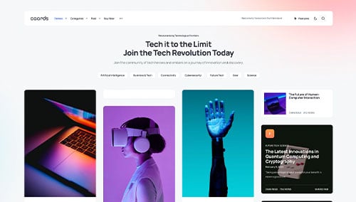
Caards – Themeforest
$69
Sunflower – Themeforest
$59
