In the craft beer industry, a brewery’s website is the digital front door to the taproom experience. It is a vital tool for translating a physical product – defined by flavor, aroma, and atmosphere – into a compelling visual narrative. For modern breweries, a successful online presence must go beyond a simple list of beers on tap; it must cultivate a brand identity that resonates with craft enthusiasts while providing the high-speed functionality required for mobile users looking for their next pour.
Our digital marketing team recently audited a vast landscape of beverage websites, filtering through hundreds of entries to find the “best of the best.” We narrowed our selection to 11 definitive brewery websites that lead the industry in immersive storytelling, visual branding, and mobile-responsive functionality. We paid particular attention to how these sites handle interactive tap lists, e-commerce integration for merchandise, and the seamless promotion of event calendars.
Whether you are a startup microbrewery building your first brand or a regional powerhouse looking to modernize your digital presence, these examples represent the benchmark for beverage web design in 2026. Use these industry leaders to inspire your own layout and help your brewery stand out in an increasingly crowded market.
Note on Our Selection Process: We recently updated this guide to ensure every featured site meets our 2026 standards for performance, accessibility, and visual innovation. This curated list focuses on the craft breweries, microbreweries, brewpubs, and regional brands that are providing the most strategic value to their fans and followers today.
Top Brewery Website Designs
1. Against The Grain Brewery
Why We Chose Against the Grain Brewery
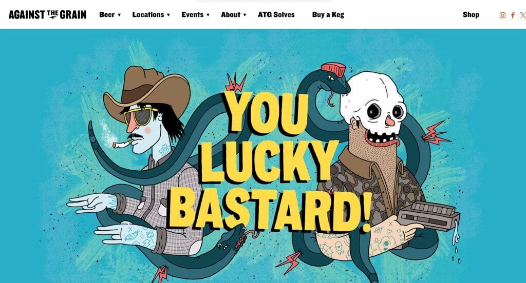
The digital storefront for Against the Grain Brewery serves as a premier benchmark for “High-Identity Craft Beverage Merchandising and Minimalist Hospitality Architecture.” In a crowded craft beer market often dominated by chaotic, overly complex label designs, a brewery’s digital presence needs to strike a balance between raw, industrial authenticity and effortless user navigation. The platform achieves this masterfully, utilizing a stark, high-contrast visual canvas that lets their production craft and brand heritage take center stage.
Key Design Highlights:
- Edgy, High-Contrast Black, White, and Orange Visual Showrooms: The website establishes a bold, counter-culture identity by executing a clean black-and-white layout accented with a vibrant, energetic orange. This minimalist color strategy acts as a striking frame, giving the entire digital presence a modern, rebellious aesthetic that allows full-color imagery and product art to pop off the screen with maximum visual weight.
- Authentic, Industrial Heritage Hero Showrooms: Immediately immersing visitors in the physical craft of production, the primary hero banner features a stunning photograph of the brewing facility. Highlighting the massive stainless steel fermentation tanks alongside rustic wooden aging barrels instantly communicates a deep dedication to both brewing science and traditional barrel-aging artistry before a visitor even reads a line of text.
- Simplistic, Zero-Friction Main Navigation Frameworks: To prevent cognitive overload and keep tap targets clear, the site employs a hyper-focused, streamlined main menu area. Stripping away unnecessary subcategories and messy drop-downs ensures that users – whether looking for taproom hours, a current tap list, or merchandise – can find exactly where they want to go in a single glance.
- Authoritative, Relationship-Building Brand Story Modules: Anchoring the entire digital experience in local heritage and liquid culture, the homepage features a beautifully integrated section dedicated to the brewery’s origin story. Sharing the passion, grit, and philosophy behind their growth transforms the website from a simple directory into a compelling brand narrative that builds deep loyalty with craft beer enthusiasts.
2. Lion’s Tail Brewing Co.
Why We Chose Lion’s Tail Brewing Co.
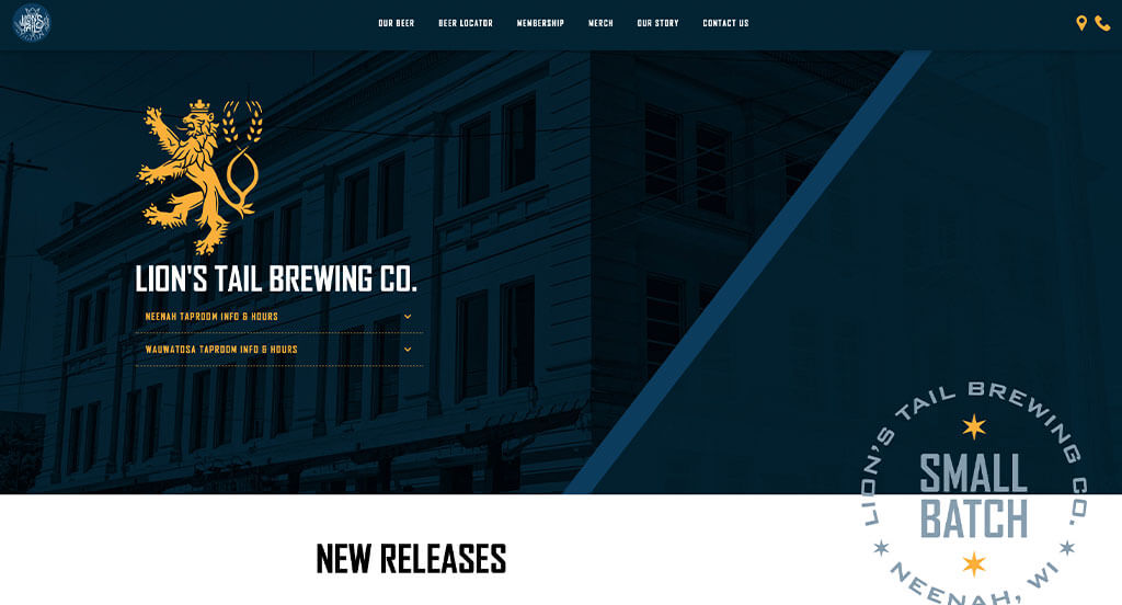
The digital storefront for Lion’s Tail Brewing Co. serves as a premier benchmark for “Multi-Location Hospitality Merchandising and Event-Driven Community Architecture.” For a thriving craft brewery, a website must act as a dynamic community hub that bridges the gap between digital discovery and real-world foot traffic. The platform navigates this masterfully by pairing real-time event tracking with highly structured location logistics, ensuring taproom enthusiasts can instantly find what’s happening and where to go.
Key Design Highlights:
- Dual-Tiered, Event-First Conversion Showrooms: The homepage prioritizes its status as a social epicenter by introducing a high-impact, dual-tiered event framework. Placing an urgent, high-visibility upcoming events list directly inside the primary hero area captures immediate user attention, while a comprehensive, fully detailed interactive calendar further down the page provides deep-dive exploration for long-term weekend planning.
- Symmetric, Multi-Location Logistics and Offering Matrices: Seamlessly managing a multi-taproom footprint, the homepage features a highly structured comparative layout dedicated to both of their distinct brick-and-mortar locations. This section elegantly outlines operational hours, direct contact channels, specific food availability, and unique taproom offerings for each site, preventing consumer confusion and streamlining the local guest journey.
- Persistent, Friction-Free Sticky Navigation Menus: Ensuring fluid site exploration as users browse deep event lists and location details, the interface utilizes a seamless sticky menu anchored at the top of the viewport. This design choice guarantees that essential utility links – such as tap lists, merchandise, and booking options – remain instantly accessible from any scroll depth, eliminating backtracking friction.
- Mobile-First, High-Utility Header Action Shortcuts: Capitalizing on immediate, on-the-go user intent, the website integrates dedicated functional icons directly into the main header layout that link straight to GPS directions and direct phone dialing. This clever touchpoint removes administrative searching for traveling users, letting hungry or thirsty guests call ahead or map their route to either taproom in a single tap.
3. Midwest Coast Brewing
Why We Chose Midwest Coast Brewing Co.
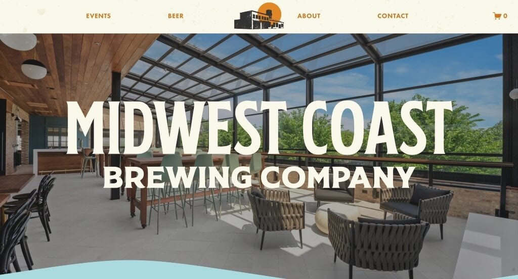
The digital storefront for Midwest Coast Brewing Co. serves as a premier benchmark for “Lifestyle-Driven Hospitality Merchandising and Experiential Taproom Architecture.” For a neighborhood craft brewery, a website needs to capture the actual atmosphere of the physical space while keeping the community informed. The platform achieves this effortlessly, shifting the narrative away from typical high-octane branding and instead using an expansive, laid-back design that feels as welcoming and relaxed as an afternoon in their taproom.
Key Design Highlights:
- Chill, Atmosphere-Driven Full-Width Visual Showrooms: The platform establishes its signature relaxed vibe from the moment the page loads by employing an expansive, full-width screen layout paired with a calming, gentle color palette. This open design choice mimics the airy, welcoming environment of their physical taproom, giving the entire digital presence a chill, laid-back aesthetic that instantly makes visitors feel at ease.
- Transparent Facility Transformation and Innovation Timelines: Keeping their community connected and engaged, the homepage prominently features real-time updates and improvements made to the brewery. Documenting these space upgrades and facility updates builds a deep sense of shared ownership and narrative progression, inviting loyal patrons to come in and experience the latest physical enhancements firsthand.
- Interactive, Low-Friction Upcoming Event Sliders: To consistently drive weekend foot traffic without cluttering the interface, the homepage utilizes a smooth, interactive upcoming events slider. This beautifully integrated module lets social seekers effortlessly swipe through food truck pop-ups, trivia nights, and community gatherings, keeping the neighborhood informed at a single glance.
- Socially Coordinated Live Instagram Connection Streams: Seamlessly bridging the gap between digital content and everyday community culture, the homepage features a live-linked Instagram media grid. Showcasing real-time photos of real guests, fresh pour aesthetics, and behind-the-scenes brewery life acts as an organic social-proof engine that keeps the web presence looking fresh, authentic, and deeply connected to its following.
4. Camden Town Brewery
Why We Chose Camden Town Brewery
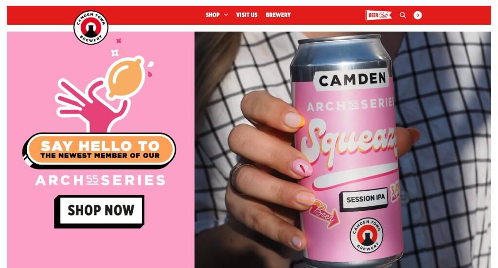
The digital storefront for Camden Town Brewery serves as a premier benchmark for “High-Contrast FMCG Merchandising and Mobile-First Beverage Architecture.” For an established metropolitan brewery, a website must rapidly translate bold, retail-shelf product recognition into a clean, lightning-fast digital experience. The platform achieves this masterfully, ditching the dark, moody aesthetics typical of traditional breweries in favor of a crisp, ultra-modern interface built specifically for seamless mobile browsing and immediate product discovery.
Key Design Highlights:
- Vibrant, High-Contrast Pop Visual Showrooms: The website establishes an immediate, refreshing brand identity by setting eye-catching, hyper-saturated brand colors against a clean, stark white canvas. This minimalist background strategy functions like a gallery frame, allowing their bold typographic labels and colorful beer cans to pop off the screen with massive visual weight and instant retail recognition.
- Interactive “Meet the Beers” Product Matrices: Moving beyond flat inventory text, the homepage features a beautifully organized, highly engaging “Meet the Beers” showcase. This intuitive product gateway lets casual grocery shoppers and craft enthusiasts alike effortlessly browse their core lineup of lagers and pales, treating each brew with its own distinct visual personality and flavor profile notes.
- Zero-Friction Lateral Slide-Out Menus: To keep the primary browsing viewport completely uncluttered while maintaining deep site navigation, the platform utilizes a sleek, left-side slide-out menu. Tapping the navigation icon triggers a smooth transition that reveals clear category links without overwhelming the user, ensuring a spacious, high-end feel throughout the entire digital experience.
- Responsive, Thumb-Optimized Mobile Scrolling Architecture: Recognizing that the modern consumer browses primarily on the move, the entire homepage layout is meticulously optimized for single-hand mobile interactions. Stripping away heavy code, complex mouse-hover dependencies, and horizontal clutter ensures a fluid vertical scroll path that makes tracking down local stockists or checking taproom details effortless on any screen size.
5. Flying Monkeys Craft Brewery
Why We Chose Flying Monkeys Craft Brewery
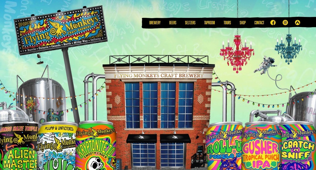
The digital storefront for Flying Monkeys Craft Brewery serves as a premier benchmark for “Maximalist Identity Merchandising and Immersive Kinetic Brand Architecture.” While many modern beverage sites lean into sterile minimalism, this platform completely embraces a chaotic, psychedelic, and high-energy aesthetic that perfectly mirrors their “Brew Fearlessly” ethos. The interface achieves this masterfully, utilizing advanced scroll-driven animations and a bold, rebellious voice to transform standard product browsing into an unforgettable digital ride.
Key Design Highlights:
- Kinetic, Layered Overlap Hero Scroll Effects: The website makes an unforgettable, high-energy impact the absolute second the page loads. As the user begins to explore, a sophisticated, multi-layered parallax scroll effect seamlessly glides physical beer cans upward, overlapping the primary hero artwork. This kinetic depth creates an immediate sense of forward momentum and hooks the visitor’s attention right off the bat.
- Scroll-Driven “Brew Fearlessly” Assembly Lines: Bringing their dynamic production personality to life, the dedicated “Brew Fearlessly” section features an interactive animation where colorful beer cans march horizontally across the screen in response to the user’s vertical scroll. This clever mechanical feedback turns passive page scrolling into an active, playful exploration of their experimental liquid portfolio.
- Cohesive, Edgy, and High-Warmth Cultural Showrooms: Every content block down the page is meticulously styled to scream that the brewery is fun, edgy, slightly wild, and deeply welcoming all at once. By blending surrealist vector art, vibrant color clashes, and conversational copy, the site establishes an authentic anti-corporate persona that invites beer lovers to join their eccentric counter-culture family.
- Frictionless Pre-Footer Featured Product Matrices: Strategically anchoring the bottom of the user journey, the homepage showcases a dedicated “Featured Beers” product line directly above the footer. Placing this high-contrast product showroom at the end of the cultural scroll ensures that after visitors are fully immersed in the brand’s wild story, they are immediately presented with clear paths to explore flavor profiles and discover their next favorite brew.
6. Sierra Nevada Brewing Co.
Why We Chose Sierra Nevada Brewing Co.
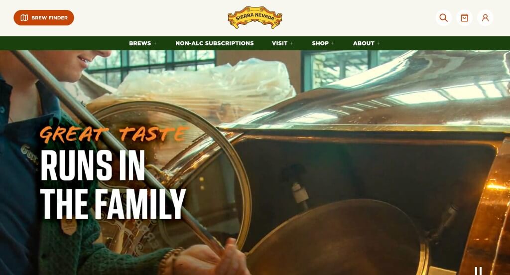
The digital storefront for Sierra Nevada serves as a premier benchmark for “Legacy-Driven Heritage Merchandising and Editorial Beverage Architecture.” As one of the foundational pioneers of the American craft beer movement, the platform’s core challenge is to honor decades of rich brewing history while maintaining a modern, highly functional interface for contemporary consumers. The website navigates this beautifully, combining subtle interactive animation with deep-dive storytelling to transform a corporate homepage into an immersive, community-centered digital magazine.
Key Design Highlights:
- Subtle, Narrative-Driven Scrollytelling Frameworks: Rather than overwhelming the user with jarring animations, the website masterfully weaves in “just a little bit” of scrollytelling. This controlled use of motion allows graphic elements, texture layers, and product highlights to glide smoothly into place as the user moves down the page, adding a premium sense of depth and polish without distracting from the core content.
- Symmetric, Community-First Event Directories: To keep national brand enthusiasts engaged with localized taproom experiences, the homepage features a beautifully organized upcoming events roster. This structured layout cleanly communicates seasonal festivals, live music schedules, and exclusive beer releases, transforming a large-scale manufacturing brand into a highly accessible local social destination.
- Coordinated Editorial Insight and Lifestyle Blog Hubs: Solidifying their status as trusted thought leaders in outdoor lifestyle and zymurgy culture, the homepage features a curated showcase of their active blog. Integrating campfire recipes, sustainability updates, and deep-dive brewing science articles directly into the primary scroll path provides immense value to casual readers well beyond simple product advertisement.
- Authoritative, Relationship-Building History Showrooms: Recognizing that their legendary origin story is a massive asset, the homepage includes a dedicated historical retrospective. Giving users a brief, compelling glimpse into their early days of hand-built copper kettles – paired with a clear call-to-action button to dive deeper – builds immediate brand loyalty and reminds the modern drinker of the grit and passion that built the craft beer industry.
7. Bell’s Brewery
Why We Chose Bell’s Brewery
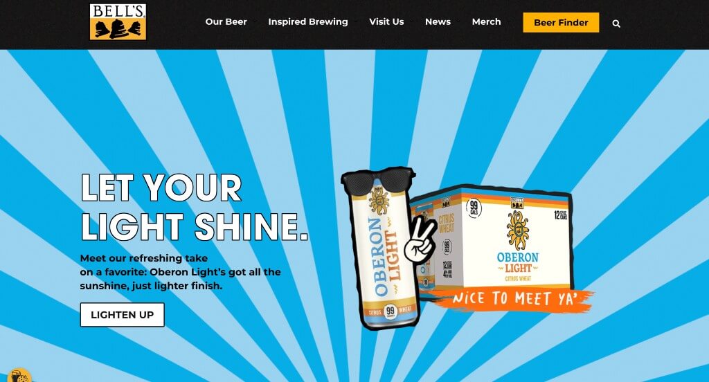
The digital storefront for Bell’s Brewery serves as a premier benchmark for “Charm-Driven Heritage Merchandising and High-Engagement Interactivity Architecture.” As one of the most beloved craft breweries in the Midwest, the platform’s core design mission is to scale their welcoming, eccentric brand personality into a national digital experience. The interface accomplishes this beautifully, pairing delightful, scroll-responsive illustrated details with playful community features to turn regular digital browsing into a lighthearted exploration of their liquid portfolio.
Key Design Highlights:
- Playful, Micro-Animated Illustrated Showrooms: The website injects a sense of handmade care and whimsy by embedding subtle micro-animations into small graphic details as you scroll. These minor, responsive movements – like a shifting graphic icon or a rotating illustration accent – create an engaging visual layer that rewards curiosity, mirroring the creative, artisan spirit found in their brewing philosophy.
- Persistent, Conversion-Optimized Sticky Headers: Ensuring fluid site navigation as users browse deep into product details or regional events, the interface utilizes a seamless sticky menu anchored at the top of the viewport. This design choice guarantees that essential utility links – such as their beer finder, taproom menus, and merchandise shop – remain instantly accessible from any scroll depth, eliminating backtracking friction.
- Interactive, Gamified Flavor-Discovery Quizzes: Breaking away from traditional flat product directories, the homepage features a beautifully designed, highly engaging flavor quiz. This interactive element gamifies the selection process, inviting both newcomers and long-time fans to answer casual lifestyle questions to find their perfect liquid match, significantly boosting on-site engagement and lowering the barrier to entry for complex flavor profiles.
- Symmetric, Community-First Event Directories: To keep brand enthusiasts connected to live taproom experiences, beer releases, and regional festivals, the homepage features a beautifully organized section for featured events. This structured block showcases high-priority community gatherings directly in the primary scroll path, seamlessly converting online traffic into real-world foot traffic for their hospitality spaces.
8. Samuel Adams
Why We Chose Samuel Adams
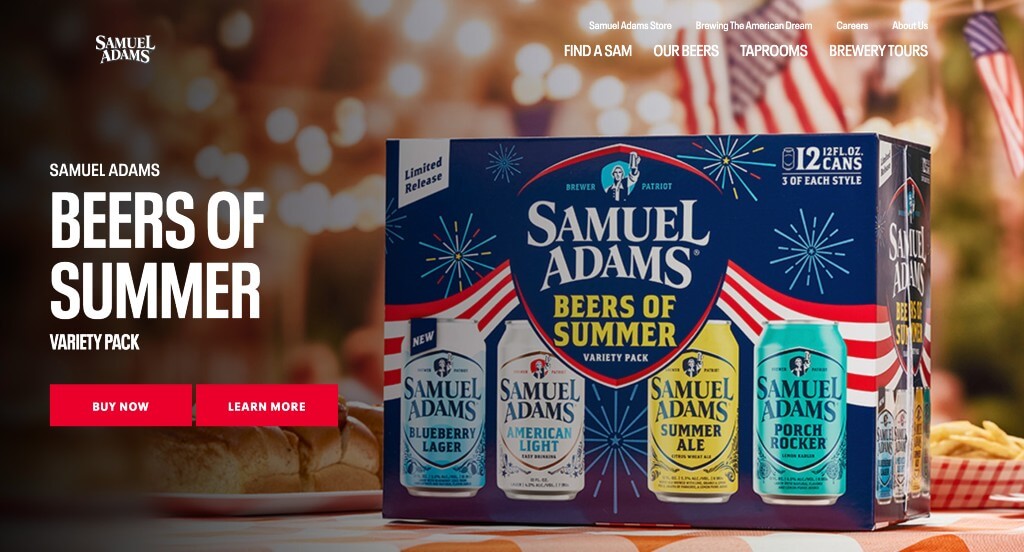
The digital presence for Samuel Adams serves as a premier benchmark for “Enterprise Heritage Merchandising and Decentralized Hospitality Architecture.” As one of the most prominent flagships of the American craft beer revolution, the platform must balance high-volume retail push alerts with localized taproom discovery. The website navigates this scale masterfully by pairing high-visibility product showcases with an ultra-clean, utility-driven layout that keeps its nationwide distribution and brick-and-mortar experiences perfectly aligned.
Key Design Highlights:
- High-Impact Seasonal and Flavor Showrooms: The homepage immediately captures seasonal consumer intent by prioritizing a dedicated “Featured Beer” spotlight right upfront. By centering the opening digital fold around their latest flavor innovation or timeless seasonal release, the site instantly drives retail interest and establishes what the brand tastes like right now.
- Persistent Headers with Minimalist Mega Menu Directories: Ensuring seamless navigation across a massive library of content, the interface pairs a sticky navigation banner with a simplified mega menu. This layout choice organizes their vast selection of products, historical timelines, and gear shops into highly scannable, spacious dropdown links – preventing option fatigue while maintaining immediate access from any page depth.
- High-Utility Global Announcement Overlays: Positioning critical alerts directly above the main header framework, the integrated announcement ribbon serves as a dynamic corporate notice board. This dedicated space ensures that time-sensitive sweeps, direct-shipping updates, or seasonal contest promotions catch the eye instantly without cannibalizing the core brand aesthetic below.
- Symmetric, Multi-Location Hospitality Directories: Effectively bridging nationwide grocery retail with regional hospitality, the homepage features a dedicated location showcase. Highlighting their distinct physical taprooms and breweries – complete with easy access to direct booking channels, hours, and menu previews – effortlessly converts online brand affinity into real-world foot traffic and local community engagement.
9. Brooklyn Brewery
Why We Chose Brooklyn Brewery
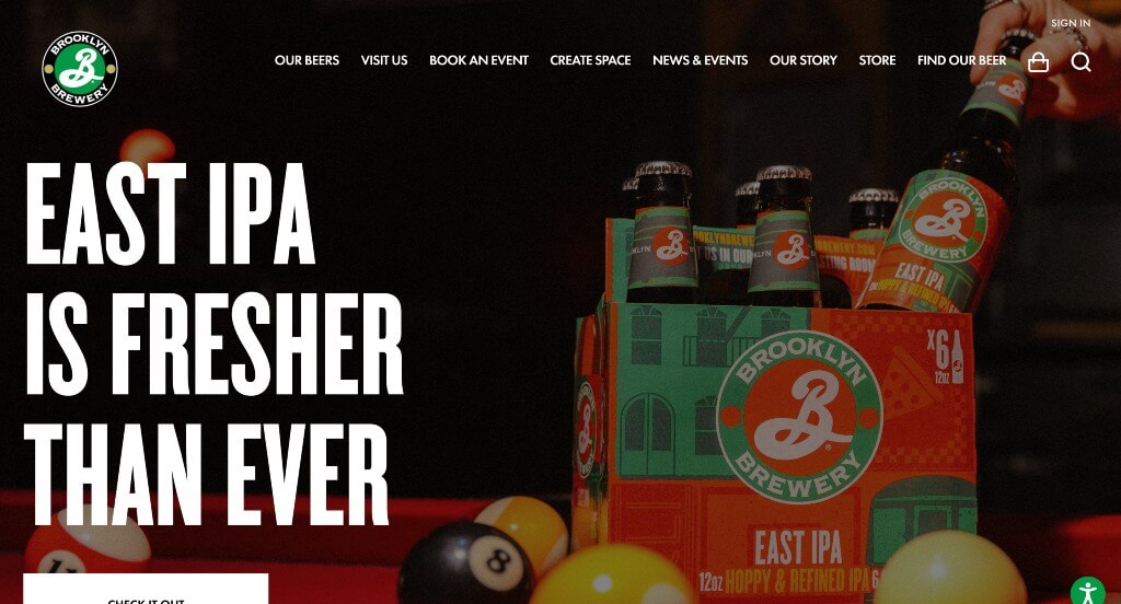
The digital storefront for Brooklyn Brewery serves as a premier benchmark for “Urban Heritage Merchandising and High-Impact Lifestyle Architecture.” Representing a globally recognized brand tied directly to its borough’s culture, the platform must balance international retail dominance with the gritty, artistic community roots that built it. The website achieves this masterfully, utilizing an expansive full-width canvas and dynamic multimedia elements to turn regular product navigation into a bold statement of cultural flavor and identity.
Key Design Highlights:
- High-Impact, Multi-Flavor Portfolio Hero Showrooms: The homepage immediately anchors its liquid variety by featuring an expansive hero image showcasing a vibrant lineup of their core and seasonal beer flavors. Giving visitors a direct, colorful look at their packaging design and diverse product range right above the fold sets a bold, appetizing tone and immediately establishes the brand’s versatility.
- Expansive, Bold Full-Width Visual Frameworks: The website establishes a confident, contemporary aesthetic by employing an open, full-width screen layout anchored by massive, high-contrast typography and oversized imagery. This graphic strategy rejects cramped grid structures, giving the content plenty of room to breathe and projecting a premium, large-scale feel that effortlessly commands the user’s attention.
- Foundational, Relationship-Building Executive Video Showrooms: Humanizing the global manufacturing enterprise, the homepage features a high-fidelity video narrative directly from the leadership team. Hearing firsthand about the brewery’s early struggles, creative philosophy, and culinary dedication grounds the corporate brand, building deep relational trust with consumers who value authenticity.
- Symmetric, Event-First Community Activation Matrices: To ensure that their local taproom stays activated as a cultural epicenter, the homepage features a beautifully integrated showcase of upcoming community events. This structured layout highlights local art galleries, culinary pop-ups, and live performance schedules directly within the main scroll path, seamlessly converting international digital brand traffic into regional foot traffic.
10. STL Beer
Why We Chose STL Beer
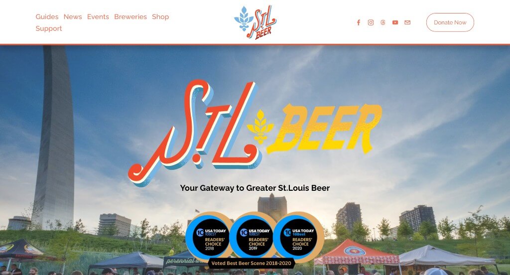
The digital home for the St. Louis Brewers Guild serves as a premier benchmark for “Non-Profit Trade Association Merchandising and Decentralized Craft Culture Architecture.” Unlike an individual corporate brewery site, a guild platform must function as a collective community umbrella – simultaneously advocating for independent local businesses, driving regional event revenue, and processing charitable support. The interface achieves this beautifully, keeping complex logistical updates organized and accessible within a unified community hub.
Key Design Highlights:
- Persistent, Navigation-Optimized Sticky Headers: Managing a data-heavy regional directory requires effortless site movement, which the platform guarantees by utilizing a seamless sticky navigation bar. As users scroll through dense blocks of news and brewery lists, the primary menu options stay locked at the top of the screen – ensuring that interactive maps, festival details, and member portals remain a single click away at all times.
- Coordinated Editorial Insight and Guild Blog Hubs: Solidifying their role as the official voice of the local brewing scene, the homepage features a dedicated, highly visible news and blog showcase. By highlighting recent industry shifts, brewery opening announcements, and behind-the-scenes profiles of local brewers directly on the front page, the guild keeps both casual consumers and trade members informed on the pulse of the market.
- Symmetric, High-Velocity Regional Event Matrices: To maximize attendance at annual heritage festivals and collaborative guild events, the homepage anchors its layout around an upcoming events directory. Presenting high-priority community gatherings in a clear, structured block directly within the primary scroll path allows beer enthusiasts to easily map out their weekend plans and purchase tickets without diving into deep submenus.
- Immediate, Friction-Free Advocacy Donation Gateways: Explicitly highlighting its status as a non-profit support organization, the website integrates a direct donation channel right on the homepage. Positioning this clear mechanism to financially support independent craft advocacy within the main user path empowers passionate community advocates to fund educational programs, legislative efforts, and local hospitality grants in a few fluid steps.
11. Lakefront Brewery
Why We Chose Lakefront Brewery
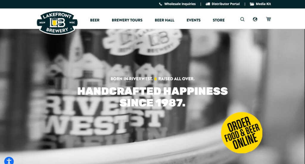
The digital home for Lakefront Brewery serves as a premier benchmark for “High-Velocity Retail Integration and Experiential Hospitality Architecture.” As a pioneer in the craft beer industry renowned for its legendary tour experience and eclectic culture, the platform must seamlessly convert casual web visitors into local taproom guests and online shoppers. The interface masterfully balances commercial variety with structural organization, mapping out a direct digital path from product exploration to community engagement.
Key Design Highlights:
- Visual Product Portfolio Showrooms: The homepage drives immediate consumer desire by positioning a high-impact showcase of their core, seasonal, and award-winning beers directly in the primary scroll path. Highlighting their unique packaging design and distinct flavor profiles upfront gives grocery shoppers and craft beer fans instant brand familiarity.
- Symmetric, High-Engagement Mega Menu Directories: Managing a diverse portfolio of flagships, organics, and limited releases requires streamlined site layout choices. The navigation menu utilizes a specialized, spacious “Beer Mega Menu” framework that splits their entire liquid inventory into clean, highly scannable visual columns – allowing enthusiasts to rapidly filter by style or availability without clicking through multiple pages.
- Experiential, Community-First Event Modules: Capitalizing on their reputation as a central neighborhood social gathering spot, the homepage features a beautifully integrated featured events registry. Placing high-priority taproom activities, live music schedules, and specialized pairing dinners directly on the front page effortlessly drives real-world foot traffic to their physical riverside space.
- Direct-to-Consumer Lifestyle Merchandise Showrooms: Seamlessly extending the brand experience past the taproom glass, the homepage integrates a dedicated lifestyle gear and apparel showcase. Spotlighting popular t-shirts, custom glassware, and branded novelty items right on the front page opens up immediate, low-friction revenue channels for passionate brand advocates looking to take a piece of the brewery culture home.
WordPress Brewery Themes
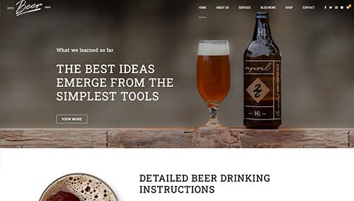
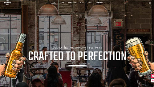
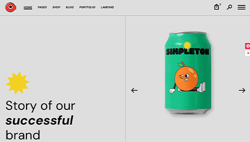
You can find free themes at wordpress.org or explore brewery-inspired templates on ThemeForest.
Craft Beer – Themeforest
$69
Brewski – Themeforest
$79
Bluebeard – Themeforest
$79
Weisber – Themeforest
$59