In the cleaning and janitorial industry, your website is the digital face of your standards. A cluttered or outdated site sends the wrong message about the quality of your work. To win high-value contracts and recurring residential clients, your online presence must communicate professionalism, reliability, and an unwavering attention to detail.
Our design team evaluated hundreds of websites across the cleaning sector – including residential services, commercial janitorial firms, and specialized industrial cleaners. We analyzed these sites for user trust signals, transparent pricing structures, and seamless booking or quote-request flows.
Whether you are scaling a local maid service or managing a large-scale commercial cleaning enterprise, these 13 examples represent the benchmark for digital excellence in 2026.
Note on Our Selection Process: We recently audited this guide to remove outdated designs and sites that no longer meet our performance standards. This curated list now focuses on the top 13 cleaning company websites providing the most strategic value in 2026.
Top Cleaning Company Website Designs
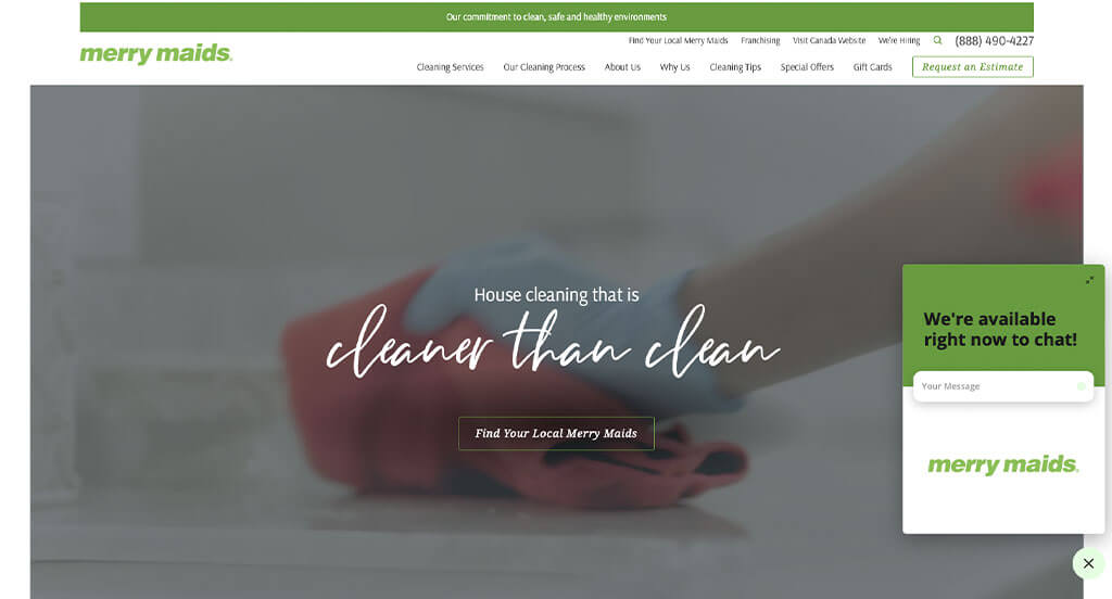
1. Merry Maids
Why We Chose Merry Maids
The Merry Maids website is a masterclass in “Corporate Trust and High-Efficiency Design.” As a nationally recognized brand, the site uses a sophisticated, high-contrast visual style to convey professionalism while ensuring that the path to a clean home is as short as possible for the visitor.
Key Design Highlights:
- Sophisticated High-Contrast Branding: The site utilizes a clean, simple layout with deep, dark colors accented by a vibrant signature green. This modern palette feels premium and “fresh,” using the bright green strategically to draw the eye toward important buttons and informational highlights without overwhelming the user.
- Built-in Reputation Management: By prominently featuring testimonials on the homepage, Merry Maids leverages its massive brand footprint to build immediate local trust. These reviews serve as essential social proof, reassuring homeowners that they are inviting a vetted, high-quality professional into their private spaces.
- Proactive Knowledge Base: The inclusion of a dedicated FAQ section on the homepage addresses the most common hurdles to booking – such as pet policies, insurance, and cleaning supplies – before the user even has to ask. This self-service information reduces friction and qualifies leads more effectively.
- Frictionless Conversion Pathway: The site features a high-visibility “Free Quote” button pinned directly in the header. This ensures that no matter how deep a user scrolls or which sub-page they visit, the primary call to action is always accessible, catering to the “ready-to-buy” customer.
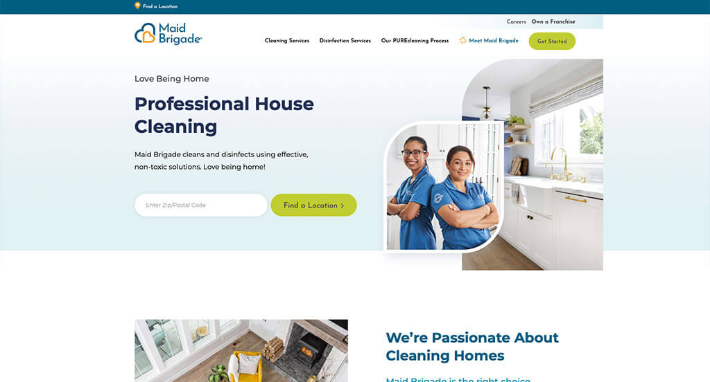
2. Maid Brigade
Why We Chose Maid Brigade
The Maid Brigade website is a premier example of “Persistent Utility” in web design. By ensuring that the most vital contact and pricing tools are literally “glued” to the user’s experience – especially on mobile – the site removes all effort from the booking process, making it one of the most conversion-focused layouts in the cleaning industry.
Key Design Highlights:
- Double-Point Estimate Entry: The site prioritizes immediate lead generation by offering “Request an Estimate” calls to action in both the header and the hero area. This dual-placement ensures that whether a user is skimming the navigation or focusing on the main imagery, the path to a price quote is impossible to miss.
- Integrated Local Reputation: By showcasing Google reviews directly on the homepage, Maid Brigade leverages real-time social proof. This transparency is crucial for a service that requires a high degree of trust, allowing the 5-star experiences of previous customers to act as a powerful endorsement for new visitors.
- Sticky Mobile Conversion Bar: In a brilliant move for mobile UX, the site features two persistent buttons at the bottom of the screen – one to call and one for an estimate. These remain visible as the user scrolls, ensuring that the “decision-making” tools are always within thumb-reach, regardless of where the user is on the page.
- Dynamic Visual Flow: The site utilizes elegant slide-in animations as the user scrolls down the page. This adds a layer of modern “polish” and visual interest, making the consumption of information feel more interactive and less like reading a static list of services.
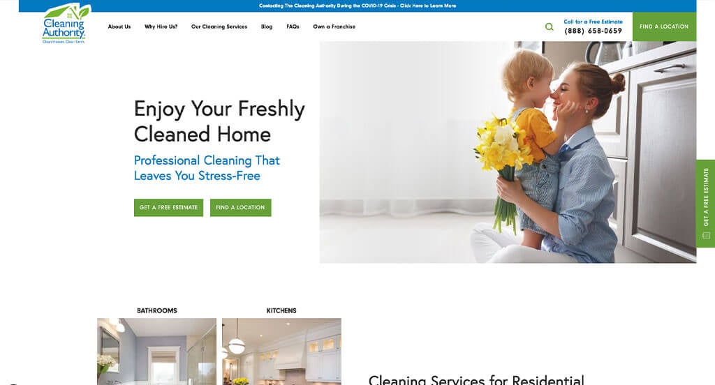
3. The Cleaning Authority
Why We Chose The Cleaning Authority
The Cleaning Authority’s website is a masterclass in Proprietary Authority and Accessibility. By combining a high-impact visual introduction with a unique, trademarked service model, the site moves beyond being a simple service provider and positions itself as a systematic industry leader.
Key Design Highlights:
- High-Transparency Hero Video: The homepage opens with a high-quality video background featuring real employees performing their cleaning duties. This “behind-the-scenes” look humanizes the brand and provides visual evidence of their professional standards and uniformed consistency before the user even reads a word.
- Persistent “Sticky” Lead Capture: A standout feature of the site is the permanent “Free Estimate” slide-out tab on the right side of the screen. By keeping this tool accessible across every page and at every scroll depth, they ensure that the barrier to requesting a quote is virtually non-existent.
- Proprietary “Detail-Clean Rotation System”: The company prominently features their trademarked cleaning system on the homepage. By branding their specific methodology and providing a link to learn more, they create a “Unique Selling Proposition” (USP) that differentiates them from competitors who offer generic cleaning services.
- Structured Service Education: The dedicated service area clearly outlines exactly what the company offers, categorized for easy browsing. This section works in tandem with their rotation system explanation to provide a comprehensive look at the value and depth of their cleaning packages.
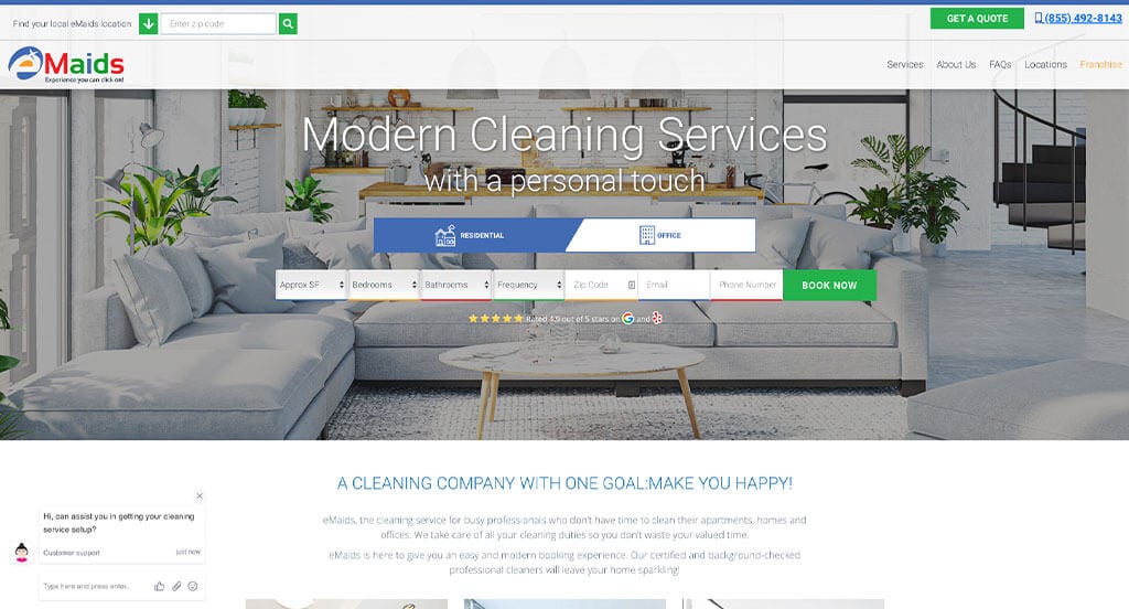
4. eMaids
Why We Chose eMaids
The eMaids website is a standout example of “Instant-Action Design.” By placing a functional booking engine directly in the primary viewing area, the site eliminates the traditional “request a quote” waiting period, catering perfectly to the modern consumer who values immediate results and a friction-free digital experience.
Key Design Highlights:
- Integrated Booking Engine: The hero area features a fully functional, multi-step booking tool rather than a simple contact form. This allows users to select their service, input their home details, and schedule a cleaning without ever leaving the homepage, significantly increasing the conversion rate for high-intent visitors.
- Streamlined Mobile Contact: On mobile devices, the site features a prominent phone icon in the header. This ensures that for customers who prefer a personal touch or have specific questions, the company is just a single tap away, maintaining a high level of accessibility for users on the go.
- Transparent Service Catalog: The homepage includes a detailed services list with clear, concise descriptions. By laying out exactly what each cleaning package entails – from standard residential to deep cleans and office services – they manage expectations and help users quickly identify the right solution for their needs.
- Pre-emptive Customer Support: By placing a comprehensive FAQ section directly above the footer, eMaids addresses common questions regarding insurance, supplies, and scheduling at the exact moment a user finishes scrolling. This proactive approach to customer service helps resolve final hesitations right before the user reaches the bottom of the page.
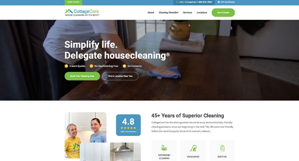
5. Cottage Care
Why We Chose CottageCare
The CottageCare website excels at building a reputation of trust and community involvement. By balancing their national reach with a “local-heart” feel, the site focuses on the people behind the service, making it clear that they are more than just a cleaning company – they are a community-minded organization.
Key Design Highlights:
- “As Featured In” Credibility Stack: The homepage prominently displays an “As Featured In” section highlighting their mentions in various magazines and publications. This third-party validation provides immediate national authority, signaling to visitors that CottageCare is a recognized and respected leader in the professional cleaning industry.
- Community-Focused Storytelling: A standout feature is the “Giving Back” section, which details the company’s engagement with their community. By highlighting their philanthropic efforts, CottageCare humanizes their brand and appeals to socially conscious consumers who prefer to support businesses that contribute to the greater good.
- Continuous Social Proof: The site utilizes a testimonials carousel on the homepage to cycle through positive customer experiences. This dynamic element allows them to showcase a high volume of social proof without taking up excessive vertical space, constantly reinforcing their commitment to customer satisfaction.
- Layered Service Navigation: The homepage features a nicely outlined services section where each cleaning category is paired with a link for more information. This allows for a “clean” initial overview while giving detail-oriented users a clear path to dive deeper into their specific “Act of Freedom” cleaning philosophies and checklists.
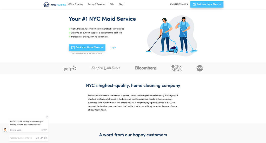
6. Maid Marines
Why We Chose Maid Marines
The Maid Marines website is a masterclass in High-Velocity Conversion. It is designed for the modern, busy consumer who wants to skip the “back-and-forth” and get an immediate solution. By combining automated customer service with instant booking tools and extreme transparency, the site acts as a 24/7 sales engine that never sleeps.
Key Design Highlights:
- Omnipresent Booking Access: The site features a functional booking widget directly in the hero area, allowing users to get a price and schedule a clean in seconds. This is paired with a sticky footer containing a “Book Now” option, ensuring that the primary call to action is never more than a thumb-click away, no matter how far down the page a user scrolls.
- Real-Time Engagement: To assist users who may have specific questions during the booking process, the site utilizes a live chat bot. This provides an immediate safety net, resolving potential customer hesitations in real-time and preventing users from leaving the site to find answers elsewhere.
- Multi-Platform Social Proof: The homepage features an integrated slider showcasing reviews from both Google and Yelp. By pulling from multiple reputable third-party sources, Maid Marines provides a well-rounded and transparent view of their reputation, building deep trust with users who value cross-platform verification.
- Service Transparency: A standout feature is the comprehensive list of what is included in a “Standard Cleaning.” By explicitly detailing every task – from dusting baseboards to emptying trash – the site removes any ambiguity about their value proposition and sets clear, professional expectations before the team even arrives.
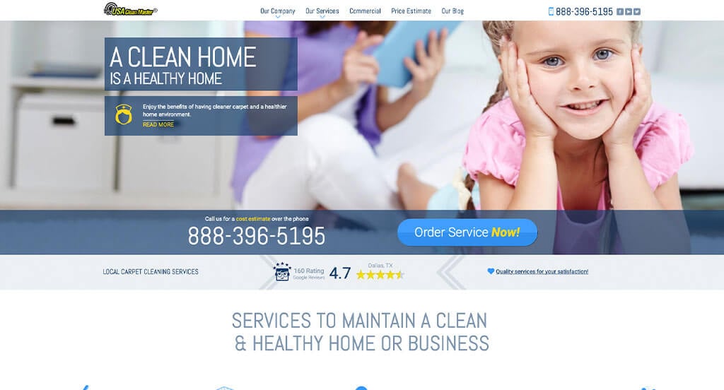
7. USA Clean Master
Why We Chose USA Clean Master
The USA Clean Master website is a standout example of “Information-Driven Accessibility.” By utilizing interactive modular popups and deep-link review stacks, the site manages to provide a massive amount of technical detail without overwhelming the user, creating a professional and highly navigable experience.
Key Design Highlights:
- Interactive Multi-Action Service Modals: A highlight of the homepage is the specialized service area. When clicking a service tile, a modal popup appears that provides a clear description, a button to “Learn More” for deep-dive research, and an “Order Service” button for immediate conversion. This three-tiered approach caters to researchers and ready-to-buy customers simultaneously.
- Trust-Stack Navigation: Right below the hero area, the site displays aggregated Google rating information for various major service locations. This serves as an immediate “Trust Stack,” and the inclusion of a link that jumps further down the page to the full reviews section allows for seamless verification of their 5-star reputation.
- Urgency-Focused Contact Suite: The site prioritizes immediate connection by placing a prominent phone number and “Book Now” button both in the top header and within the hero area. This ensures that the two primary methods of contact – calling for an estimate or booking online – are the most visible elements on the page.
- Proactive Knowledge Base: By featuring a dedicated FAQ section on the homepage, USA Clean Master addresses common logistical hurdles like service frequency, eco-friendly products, and stain treatment methods. Placing these answers directly in the user’s path helps build professional authority and reduces the friction typically associated with booking specialized cleaning services.
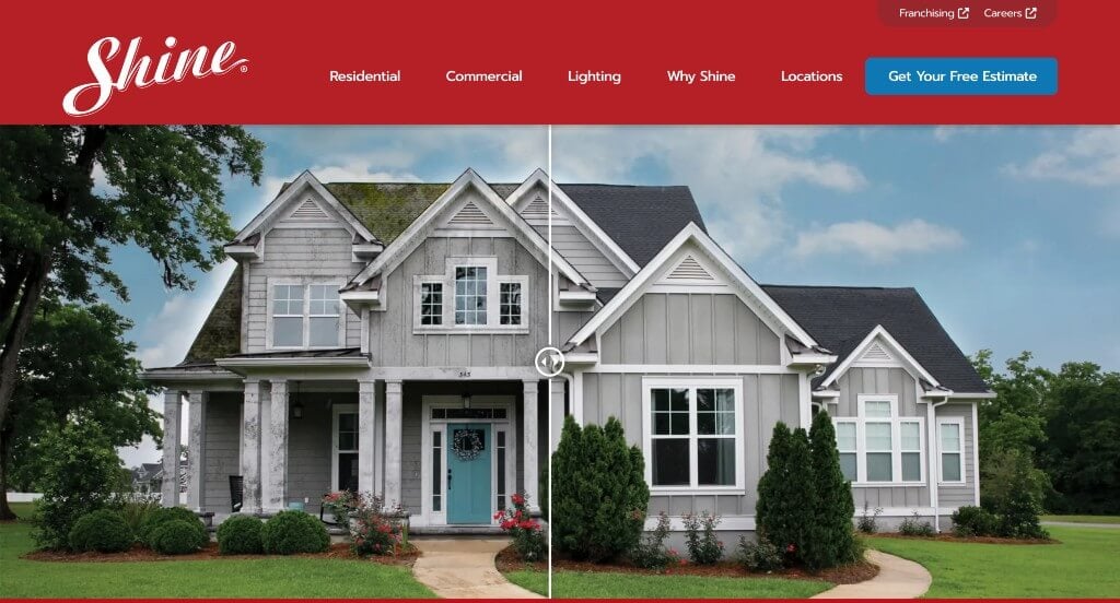
8. Shine Window Cleaning
Why We Chose Shine Window Cleaning
The Shine Window Cleaning website is a masterclass in “Process-Driven Professionalism.” By combining high-action visuals with a simplified roadmap of their services, the site effectively lowers the barrier to entry for homeowners, making a premium service feel accessible, organized, and reliable.
Key Design Highlights:
- Frictionless Estimate Access: The header features a high-contrast “Get a Free Estimate” button that remains visible throughout the browsing experience. This provides a constant, clear call to action, ensuring that users who are ready to move forward never have to search for the starting point.
- Dynamic Action Hero: The site utilizes a high-quality background video that showcases their technicians in action. Seeing the team using professional equipment and safety gear provides immediate visual proof of their expertise and “white-glove” approach to window and holiday light servicing.
- Simplified 3-Step Roadmap: To demystify the hiring process, the homepage outlines a clear 3-step process (typically: Request, Schedule, and Shine). This “easy-as-1-2-3” framework reduces mental friction for the customer and sets professional expectations for how the service relationship will function.
- Validated Local Excellence: By integrating customer reviews directly on the homepage, Shine leverages the power of social proof. Highlighting real-world success stories right next to their service descriptions reinforces their brand promise and builds the necessary trust required for home-service transactions.
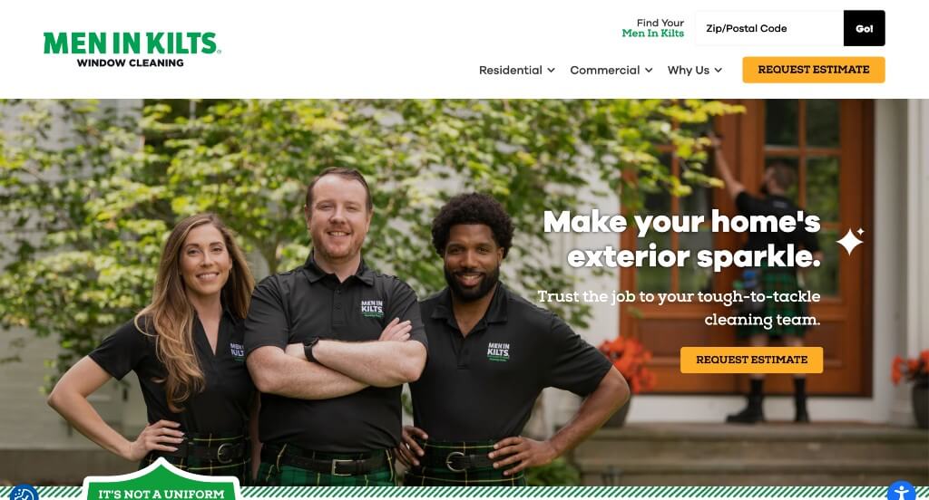
9. Men In Kilts
Why We Chose Men In Kilts
The Men In Kilts website is a premier example of “High-Impact Thematic Branding.” By leaning heavily into their unique visual identity and using advanced interactive elements, they transform a standard utility service into a memorable brand experience that feels both fun and exceptionally professional.
Key Design Highlights:
- Interactive “Visual Proof” Service Suite: The site features a sophisticated dynamic service selector where clicking a specific service (like window cleaning or gutter clearing) instantly updates the primary image to match. Even more impressive are the hotspot elements on the image, which allow users to click for deeper insights. This interactive “show and tell” approach is far more engaging than a static list and helps customers visualize the exact results they can expect.
- Iconic Brand Differentiation: The “What Sets Us Apart” section prominently features their signature tartan kilts. By centering their marketing on this unique uniform, they create an immediate “Pattern Interrupt” in a crowded market. It’s not just window cleaning; it’s a memorable event that builds massive brand recall and word-of-mouth potential.
- High-Frictionless Conversion: The site prioritizes lead generation with prominent “Request an Estimate” buttons positioned strategically above the fold. This ensures that the moment a visitor is hooked by the creative branding, the path to starting a project is immediate and obvious.
- Proof of Performance: By showcasing reviews directly on the homepage, Men In Kilts proves that their “kilted” approach is backed by serious technical skill. The social proof acts as the necessary anchor, ensuring that while the branding is fun, the service quality is top-tier and customer-verified.
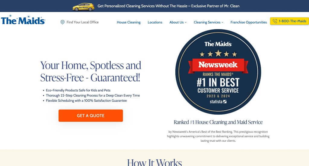
10. The Maids
Why We Chose The Maids
The Maids’ website is a standout example of “Tiered Service Clarity.” By breaking down their offerings into distinct plans and using interactive popups for deeper exploration, they make it incredibly easy for homeowners to find the exact level of care their house needs without feeling overwhelmed by options.
Key Design Highlights:
- Transparent Service Tiering: The homepage features a side-by-side comparison of three distinct cleaning plans. By outlining the specific details and frequencies of each, The Maids helps users self-select the best fit for their lifestyle and budget, effectively qualifying leads before they even reach out.
- High-Engagement Service Modals: Rather than taking users to a new page for every service, the site utilizes interactive tiles that trigger modal popups. These modals provide a “snapshot” of information and a direct “Book Now” option, keeping the user’s journey focused and fast while still offering a link for those who want a deep dive.
- High-Contrast Conversion Header: The site uses vibrant, high-visibility buttons in the header for calling and getting a quote. This ensures that the two most important user actions are visually prioritized against the rest of the site’s palette, making it effortless for a visitor to transition from browsing to booking.
- Educational Authority via Blogging: By showcasing an active blog directly on the homepage, The Maids positions itself as a household expert. Sharing tips on cleaning and home maintenance not only helps with SEO but also builds a relationship with the visitor by providing free value and proving their deep industry knowledge.
11. The Pampered House Maid Service
Why We Chose Pampered House
The Pampered House website thrives on “Personalized Professionalism.” By blending a comprehensive service menu with a transparent, relationship-driven onboarding process, the site makes the prospect of inviting a cleaning service into your home feel safe, customized, and incredibly easy.
Key Design Highlights:
- Comprehensive “Cleaning Menu”: The homepage features a well-organized list of specialized services, ranging from Post-Remodeling to Priority Cleaning. By labeling their offerings as a “menu,” they reinforce the idea of a customizable experience where homeowners can pick and choose the exact level of care their space requires.
- Streamlined Mobile Accessibility: On mobile, the site is designed for immediate contact, featuring a prominent phone number in the header. This ensures that local Arlington residents can quickly transition from browsing to a live conversation with a single tap, catering to the “on-the-go” nature of modern home management.
- Transparent Multi-Channel Reviews: The site prominently features customer testimonials, but takes trust a step further by offering “Web Specials” incentivizing users to leave reviews on Google, Yahoo, or Yelp. This strategy ensures a steady stream of fresh, third-party social proof that reinforces their long-standing reputation in the community.
- Low-Friction Consultation Pathway: By placing a convenient contact form directly on the homepage, Pampered House captures high-intent leads without forcing them through multiple clicks. The layout even explains the “walk-through” process next to the form, removing the “fear of the unknown” and showing exactly how they create a personalized profile for every home they service.
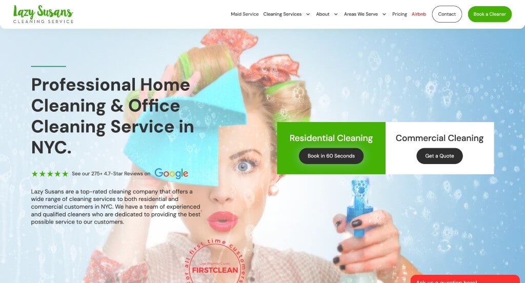
12. Lazy Susans Cleaning Service
Why We Chose Lazy Susans Cleaning
The Lazy Susans Cleaning website is a great example of “User-Centric Navigation.” It excels at providing a smooth, high-tech interface that prioritizes live communication and geographic clarity, ensuring that visitors can verify service availability and get answers in real-time.
Key Design Highlights:
- Grid-Based Service Discovery: The homepage features clean service tiles that act as intuitive gateways to deeper information. Each tile is linked to a dedicated page, allowing users to move from a broad overview of “Deep Cleaning” or “Office Cleaning” to a specific, detailed checklist with a single click.
- Real-Time Support Integration: By incorporating a live chat feature, Lazy Susans provides immediate assistance to visitors. This is a critical tool for capturing leads who might have unique scheduling needs or specific questions that aren’t covered in the standard text, preventing them from bouncing to a competitor.
- Geographic Transparency: The site includes an integrated location map on the homepage. This visual tool allows New York City residents to instantly confirm if their specific neighborhood is within the service radius, removing one of the most common “friction points” in the booking process.
- Social Proof Validation: The homepage prominently displays Google reviews, leveraging the power of local reputation. Seeing a high volume of positive feedback alongside their list of services provides the necessary psychological “green light” for new customers to trust the company with their home.
- Comprehensive Service List: In addition to the visual tiles, the site provides a clear list of services provided, ensuring that both visual learners and those looking for a quick text reference can find what they need. This double-layered approach to information ensures that no service offering is overlooked by the visitor.
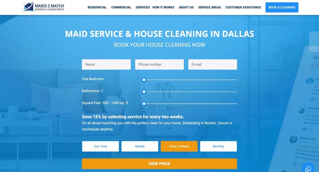
13. Maids 2 Match
Why We Chose Maids 2 Match
The Maids 2 Match website is a masterclass in “Conversion-First Design.” By placing the booking process front and center, the site caters to the “now” generation of homeowners who want to skip the introductory fluff and get straight to the solution.
Key Design Highlights:
- High-Velocity Hero Form: The most striking feature of the site is the hero area, which is entirely dedicated to a booking form. By asking for “Home Size” and “Zip Code” immediately, the site transforms the landing page into a functional tool. This “zero-click” entry point significantly reduces the bounce rate for high-intent visitors who are ready to schedule.
- Hyper-Local Geographic Proof: The inclusion of a detailed service area map on the homepage provides instant visual confirmation of their coverage. This helps potential clients in the Dallas-Fort Worth area feel confident that they are in the right place, while also boosting the site’s local SEO relevance.
- Modular Service Exploration: The site uses clean, icon-driven service tiles to categorize their offerings, such as Deep Cleaning, Move-In/Out, and recurring services. This layout allows users to quickly scan the page and identify the specific service that matches their needs without getting bogged down in heavy text.
- Trust-Building Sequence: The design follows a logical psychological flow by placing customer reviews immediately followed by a “Why Choose Us” section. By showing the results (the reviews) before the reasons (the company values), the site provides the social proof necessary to make their professional claims feel earned and authentic.
WordPress Cleaning Themes
You can find free themes at wordpress.org, or explore cleaning-inspired templates at ThemeForest.
We Clean – Themeforest
$69
Cleaning Service – Themeforest
$59
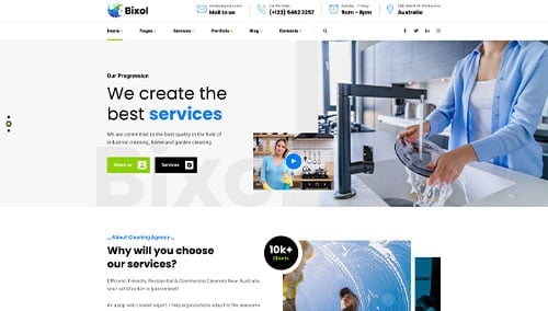
Bixol – Themeforest
$48
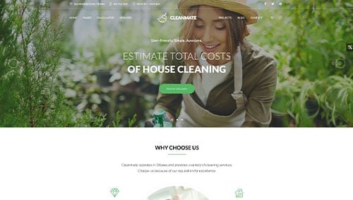
CleanMate – Themeforest
$69