In the expertise-driven economy of 2026, a consultant’s website is far more than a digital resume – it is a foundational platform for authority and intellectual influence. For independent advisors and global consultancy firms alike, an online presence must achieve a sophisticated balance: projecting deep subject-matter expertise while offering a frictionless, high-trust path to engagement. To thrive in today’s market, your design must move beyond generic corporate jargon to embrace “Proof-Led Positioning,” using quantified case studies, proprietary frameworks, and high-impact thought leadership to validate your value before the first discovery call is ever booked.
Our team evaluated hundreds of consulting platforms – ranging from boutique management advisors and specialized IT consultants to high-profile executive coaches and global strategy powerhouses. We narrowed the field to the top 12 examples that represent the gold standard for the professional services sector. Our analysis focused specifically on niche-specific messaging, interactive “Value Calculators,” and the strategic integration of multi-step lead qualification forms and embedded scheduling tools that filter for high-intent prospects while showcasing the consultant’s unique methodology.
Whether you are a solo practitioner looking to command higher fees or a partner at a scaling firm seeking to automate your inbound funnel, these examples provide the definitive benchmark for consultant web design in 2026.
Note on Our Selection Process: We recently reviewed this list to ensure every featured site demonstrates a clear commitment to modern standards for mobile-first readability, fast loading of long-form content, and secure lead-capture protocols. This curated collection focuses on consultant websites that prioritize intellectual authority and conversion clarity, providing the most strategic value to both the advisor and the client in 2026.
Top Consulting Company Website Designs
1. Science of People
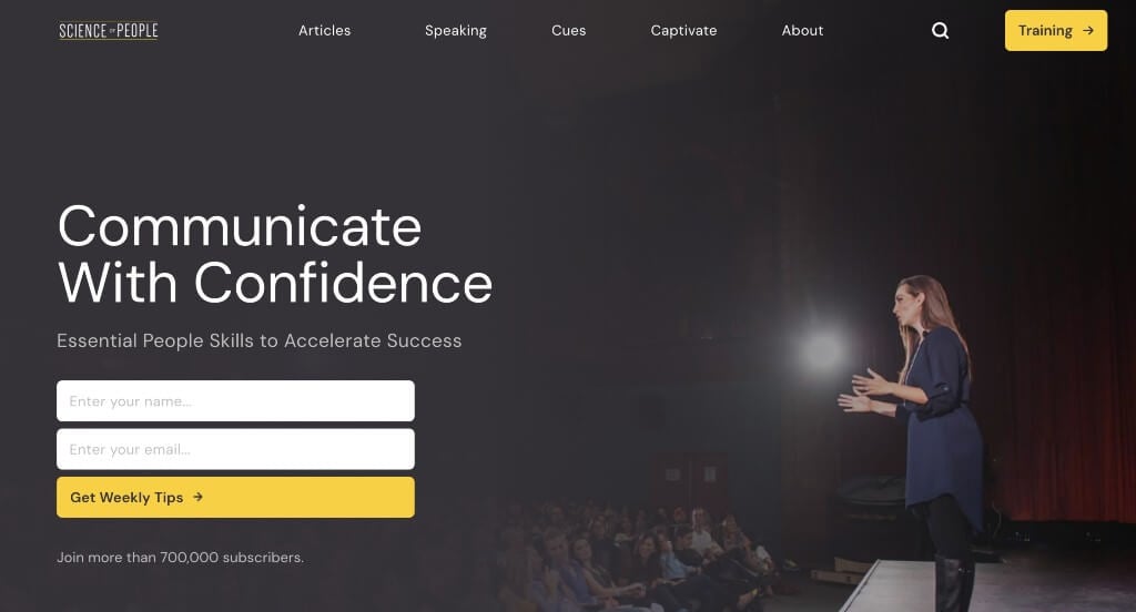
Science of People has a very classy feel to it, thanks to its use of white, gray, black and yellow. We thought it was nice to include lots of linking text, images and buttons to allow for visitors to navigate better. It was smart how they included small little gray tabs showing categories for each blog article. Another feature that we noticed was how their image backgrounds were customized to allow for a cohesive look.
2. AHEAD

We loved how there was accents of dark blue in order to highlight certain information. Short paragraphs, organized carefully was something that was extremely helpful. There was also lots of buttons to help move people through all of their information. We liked how there are rounded lines in many areas, to keep everything looking great. A search bar was another great inclusion that we absolutely loved.
3. Grand Studio
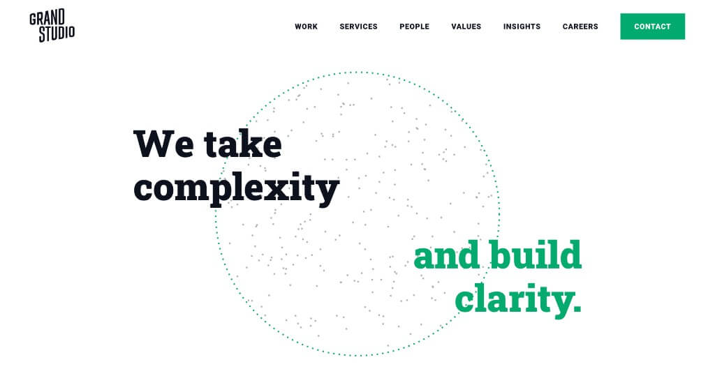
One of the things that we really loved about this example was their accents of green that are sure to highlight important phrases, information and links. We liked their use of simple background patterns that look amazing. Along with all of that, we really enjoyed how these paragraphs were kept short making it easier to read through the information.
4. Kesslers
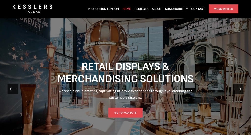
We really liked how there was lots of examples of past projects to get possible customers more excited. Showing companies that they proudly work with was also a good choice. Incorporating social media was another impactful feature that helps them stay connected. Their font choice was amazing, standing out from others. Their use of patterned backgrounds was something else that we liked.
5. HeronCode
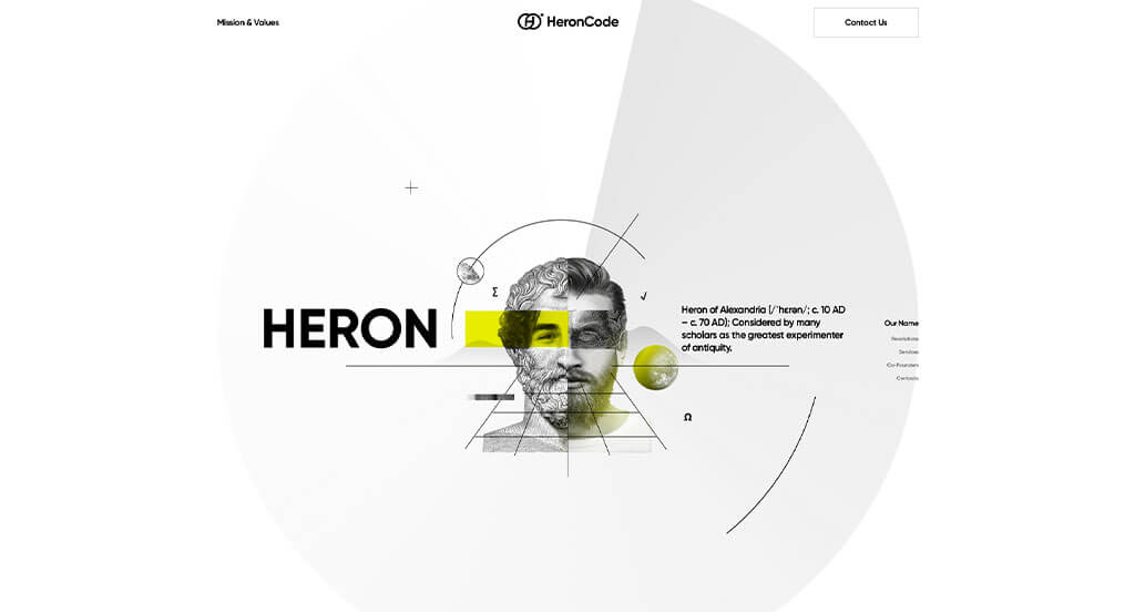
Right away, we loved how this example had an interesting animation that introduced their logo. Upon entering their site, we loved how their transitions help create unity using similar graphics and animations. Having a simplified timeline was another aspect we really liked. We loved their flow of content, making it easy to comprehend everything.
6. Launchpad
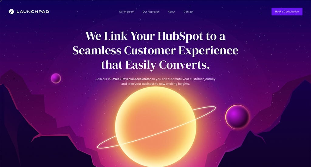
Launchpad has an artistic feel, thanks to its use of black, white, pink, purple and blue. We loved how their graphics matched well with the aesthetic of their pages. Using buttons to enhance usability was an impactful feature, as always. It was cool how a lot of their title texts are outlined and almost hidden into the background to create a more interesting feel.
7. Dierks + Company
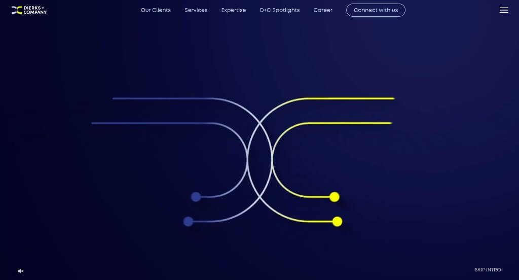
We really loved how there was graphics that became animated upon the center line coming in contact with them. Including bright accent colors was something else that grabbed out attention for sure. Some other graphics served as icons to connect visuals to written content. Simple navigation was another thing that was well done in Dierks + Company’s site.
8. EVP Consulting
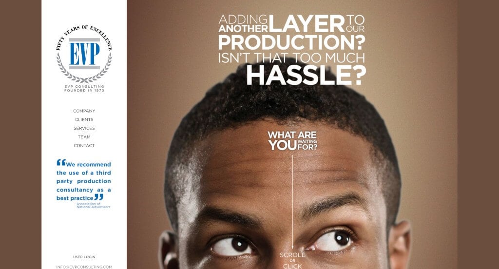
We loved how text was displayed in a way that grabs our attention. We thought their logo was smart because it creates a prestigious feeling. Bright colors with graphics were also used interestingly in order to create a stunning look. Their domain was simple, and easy for customers to revisit if they wish. Using icons to show customers progression through their content was another perfect idea.
9. Accenture
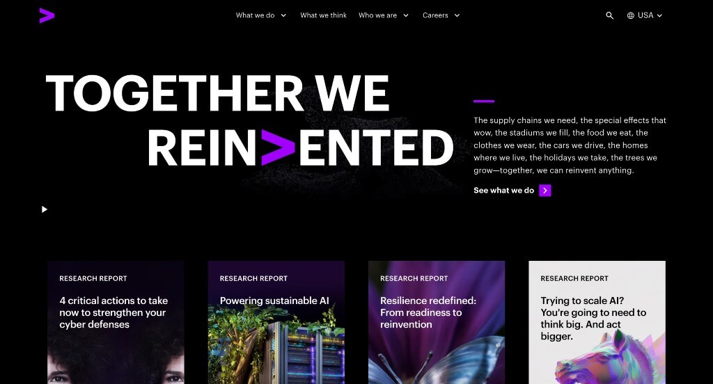
Accenture carefully embraced using a bright purple color to accent everything, which we absolutely loved. Having a black background helped to create an almost luxurious and mysterious feel. Their interesting hover animation to turn images into written content was another thing that we loved. Including different sized fonts to create a statement was nice to create a great visual hierarchy.
10. Sharif Walker
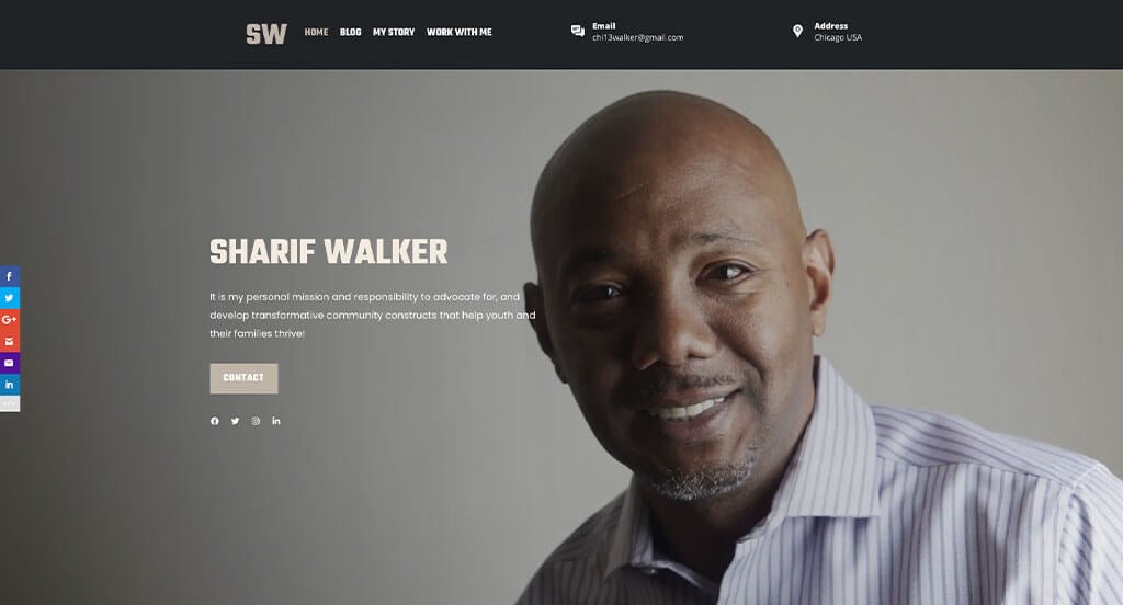
Right away, we noticed how Sharif Walker’s template made great use of bold and basic fonts, to help create a more straightforward, professional look. There was also a few bullet points that are used in order to maintain an organized feel. They also made use of alternating color blocks in attempts to break up lengthy content. A variety of different sized images was another thing that stood out to us.
11. VanRein Compliance
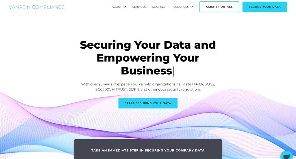
The beginning of this example looked great because of their text that types itself with a flashing cursor. Their information was organized well and blocked into sections which was a smart choice. Showing lots of companies that trust them was a great way to look more reliable as a brand. Including a live chat was another feature that could come in handy.
12. Analytics8
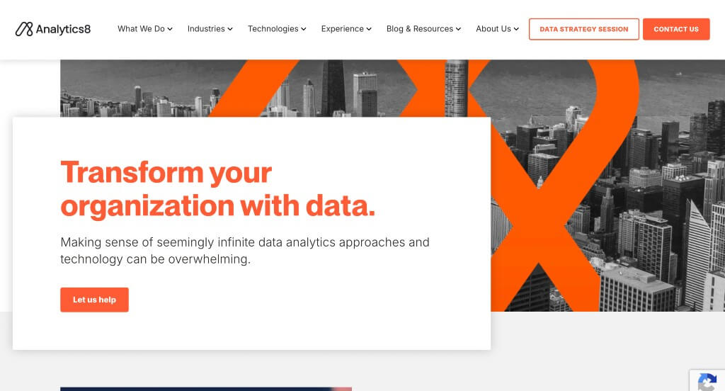
We absolutely loved how this example used bright orange colors to liven up their website. This was a stunning logo design that really stood out to us, especially because it was placed in different parts of their website. Keeping paragraphs short and to the point was helpful because viewers were able to read and comprehend their information easier.
WordPress Consulting Themes
You can find free themes at wordpress.org or consider consulting-inspired templates at ThemeForest.
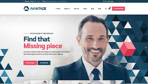
Avantage – Themeforest
$69
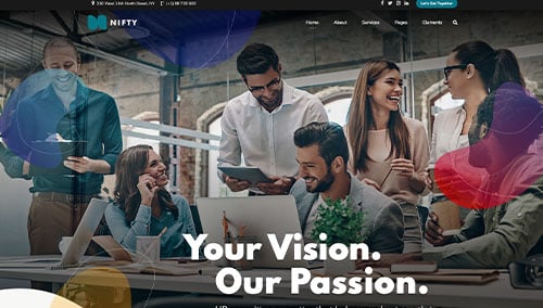
Nifty – Themeforest
$69
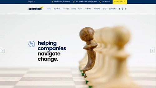
Consulting – Themeforest
$59
Consultancy – Themeforest
$69