In the high-trust world of early childhood education for 2026, a daycare website is much more than a digital brochure – it is a vital bridge of reassurance between a provider and a family. For childcare centers and preschools, an online presence must achieve a delicate balance: projecting a warm, nurturing environment while offering a frictionless, high-security portal for information and enrollment. To thrive in today’s market, your design must move beyond static galleries to embrace “Transparent Care,” using immersive virtual tours and real-time curriculum insights to build a foundation of safety and trust before a parent even schedules a visit.
Our team evaluated hundreds of childcare platforms – ranging from boutique Montessori schools and local community daycares to national early-learning franchises and specialized infant care centers. We narrowed the field to the top 17 examples that represent the gold standard for the industry. Our analysis focused specifically on interactive classroom walkthroughs, staff credential transparency, and the strategic integration of parent communication hubs that streamline the tour-booking and registration process while highlighting the center’s commitment to safety and developmental milestones.
Whether you are a center director looking to fill enrollment gaps or an educator building a new brand from the ground up, these examples provide the definitive benchmark for daycare web design in 2026.
Note on Our Selection Process: We recently reviewed this list to ensure every featured site demonstrates a clear commitment to modern standards for mobile responsiveness, intuitive navigation, and high-speed visual performance. This curated collection focuses on daycare websites that prioritize warmth, security, and administrative clarity, providing the most strategic value to both the provider and the modern parent in 2026.
Top Childcare Website Designs
- 1. Lightbridge Academy
- 2. Kid-Tastic
- 3. New Horizon Academy
- 4. Kinderberry Hill
- 5. Kiddie Academy
- 6. Goodstart Early Learning
- 7. Babilou Family
- 8. Principrin School
- 9. Creative Care
- 10. The Learning Experience
- 11. Busy Bees
- 12. Vivvi
- 13. Sunshine Learning Center
- 14. Kidz Stuff
- 15. Tooney Town
- 16. Learning Zone Watercress
- 17. G8 Education
1. Lightbridge Academy
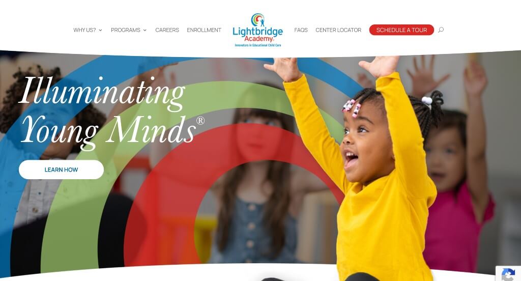
One of the first things that we noticed here was their use of bright colors within their pages and especially the images. We liked how their logo appeared in lots of different areas to improve their brand identity. There was lots of beautiful font choices that we really appreciated because it makes their website feel more professional.
2. Kid-Tastic
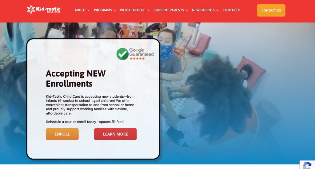
Kid-Tastic is very straightforward daycare website design with lots of information. Having short and to the point paragraphs really helped us when considering placing this company on our list of best child care website designs. As a company, standing out from competitors is something Kid-Tastic clearly wants. Lastly, we thought it was helpful to have client testimonials.
3. New Horizon Academy
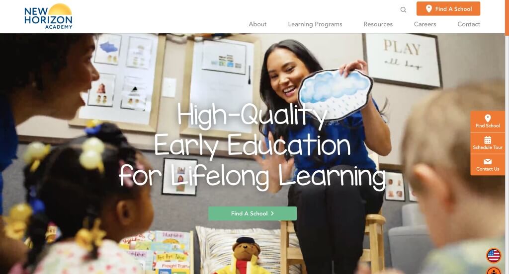
New Horizon Academy features an automatically playing video showing of a variety of children. There was a great balance of images, bright colors, and simple matching icons. A few features that stood out to us were the client testimonials, helpful resources, and a newsletter sign-up option. We also really liked their use of graphics and simple animations. Don’t forget to consider New Horizon Academy when looking for inspiration for your next site.
Related: Make this year one to remember. Start a digital marketing campaign for your childcare center to start growing your company!
4. Kinderberry Hill
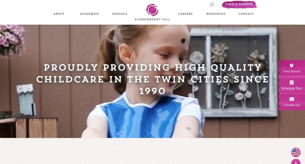
Kinderberry Hill uses headlines and backgrounds to simulate being written out or painted by hand – creating a playful feel. Choosing different background color blocks and many images allows for an easy-to-read design. Using a variety of colors that all work together was another respectable quality about Kinderberry Hill’s template.
5. Kiddie Academy
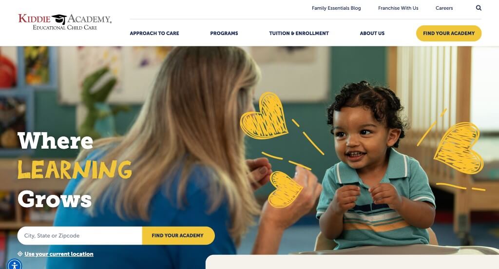
This site uses a simple blue, yellow and white theme throughout along with many pictures. We thought it was smart to add in links leading to more information. Customer reviews and informative posts can be seen throughout this site. It was interesting that Kiddie Academy chose to create a template that is extremely professional and educational looking. Also, social media links for Facebook, Twitter, and Instagram making it easy to connect with the business.
6. Goodstart Early Learning
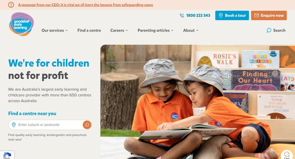
We loved this example because of their light feel to their pages. Their information was very well organized, making it easy to find and read information that appears within their website. We thought this logo design was simple and unique so we liked it. Adding in a search bar to find facilities in your area was another choice that we appreciated.
7. Babilou Family
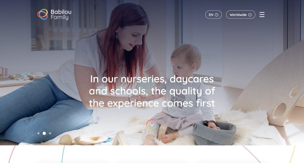
This was an example that we loved because of their subtle accents of colorful lines. Their font choices were simple and very easy to read which is always a plus. Along with that, we loved how this domain matches with their company’s name. Including a map to show all of their locations was another choice that we liked.
8. Principrin School
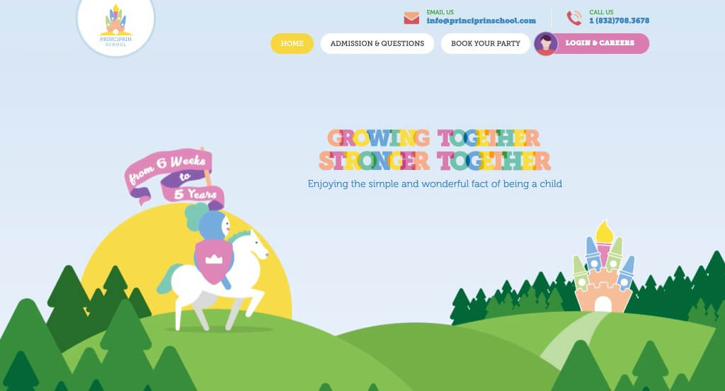
Principrin School was definitely one of our favorite web templates for, and for so many good reasons. Right away, we see a fairy tale theme – built up by graphics – that attracts to young children. We enjoyed all the bright colors that creates an energetic and playful feel. While it might seem strange, explaining why potential customers should choose their company helps highlight what customer’s kids could experience. Lastly, we really liked the playful logo design that also served as a loading icon.
9. Creative Care
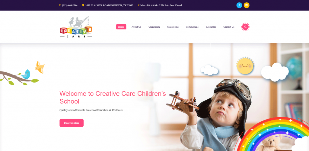
Due to graphics, fonts, colors and imagery within Creative Care’s site, it’s obvious that as a company, they value creativity. It was helpful for them to have short and to the point paragraphs as many parents don’t have time to read entire essays about child care centers. Being able to read client testimonials, quick facts and information from their blog is relaxing for many possible clients to have a good understanding of Creative Care as a company.
10. The Learning Experience
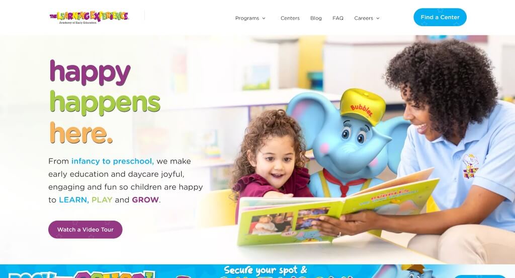
Mainly, we noticed this company’s color choices that are harmonious with each other. It was creative how animal characters are brought to life in their images. These characters are also used as an imaginative way to help children learn. It was a great idea to have buttons to help with navigation. We also liked that this company created their own informational blog.
11. Busy Bees
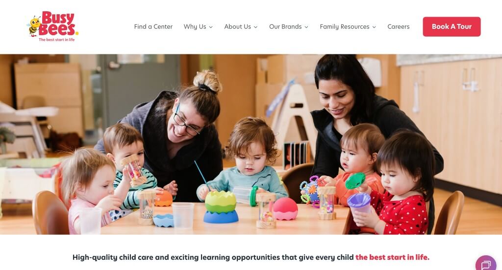
One of our favorite parts about this example was how they used little bee characters to show off the age categories that they provide daycare for. Including a short form to provide information about tuition costs was another smart choice. We thought it was nice how information on their facility director was shown because it helps to build trust with those incoming customers.
12. Vivvi
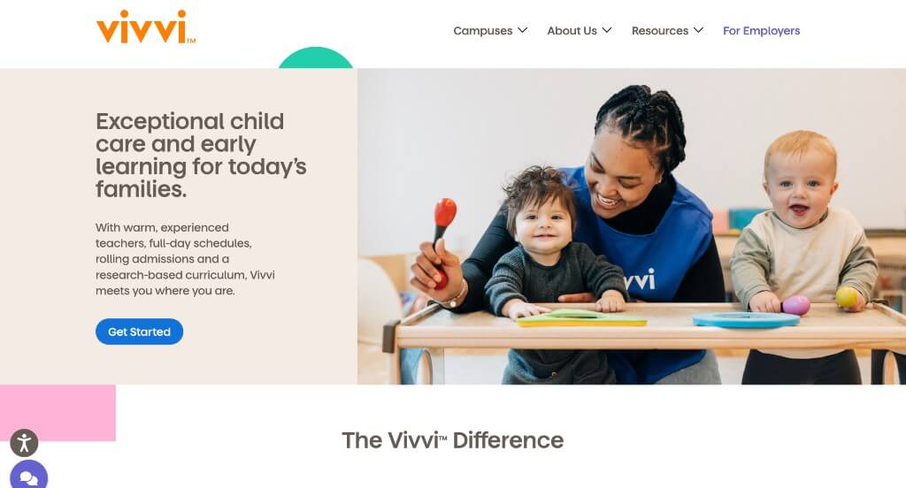
Vivvi utilizes many colors but is still simple. It was useful that this company chose to use bright colors to highlight important information. Images are surely balanced with white space to help maintain flow of content. We immediately noticed a playful loading animation. Adding in upcoming events in a place that can be accessed easily was. a smart choice. Lastly, it was nice that they included buttons for better navigation.
13. Sunshine Learning Center
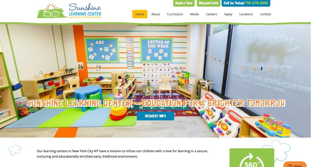
If you are looking for inspiration for a bright, creative and childish site, make sure to check out this one. We though the playful doodles sprinkled around their site really added to it. A brightly-colored playroom shows possible customers what it looks like inside. Due to not having as much written content, it isn’t overwhelming to viewers. A featured section displays curriculum for each targeted age group. Having a bold font for titles was also helpful because it separates content within this site.
14. Kidz Stuff
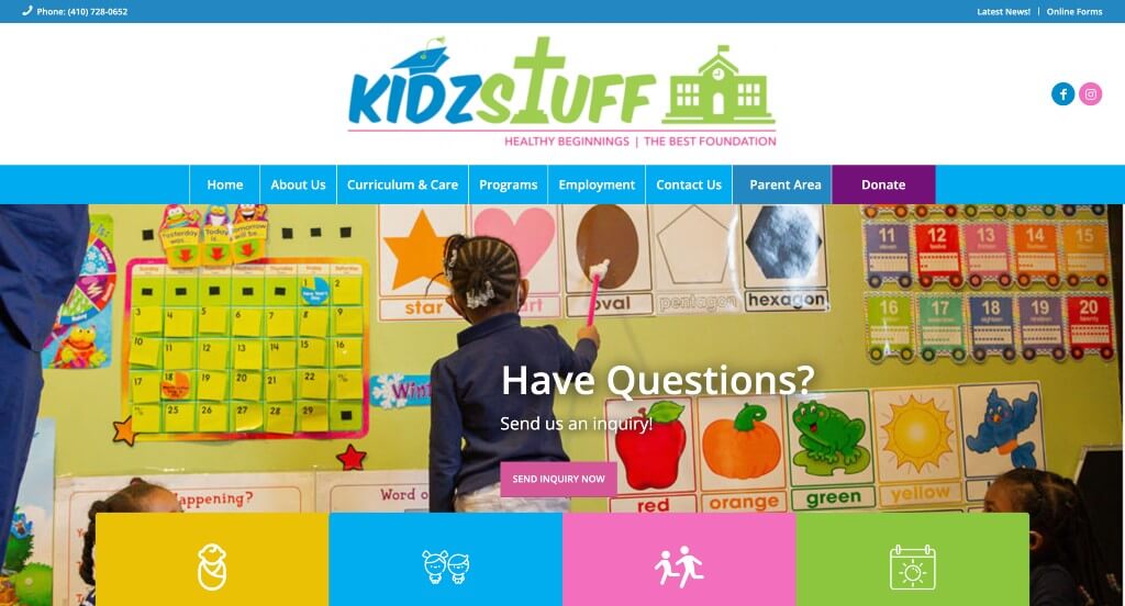
This daycare website’s homepage is straightforward. We thought it was interesting for their logo design to show what is important to them. Important information is visible and more information can be found within all of their links. Listing how many years, how many staff members, and how many students are in their care now helps to build trust with their company. Their phone number and social media links are visible in many different places that can be accessed easily.
15. Tooney Town
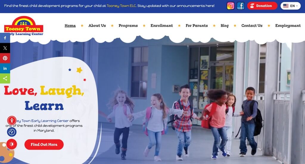
This website uses primary colors for its color scheme which really makes the website stand out from competitors. Because they have more than one location, they make a point to show both locations along with contact information for both locations. Their sticky header makes it very easy to navigate through information. Social media links for both locations are included so customers can stay connected.
16. Learning Zone Watercress
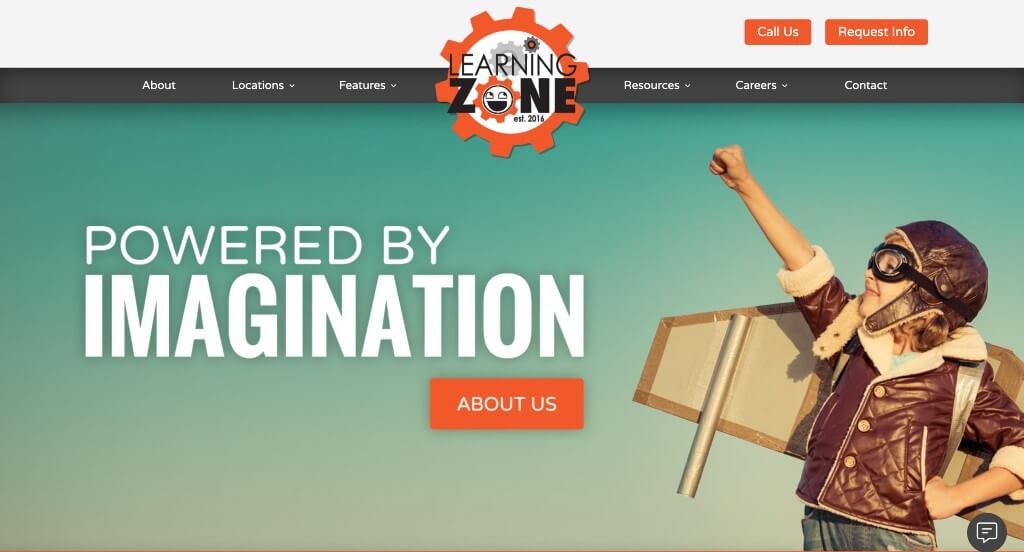
Here we have an example that starts with large images on a slider which looks stunning and really introduces their company. This logo was interesting because it made use of gears which are often a symbol for learning. Using those same gears for image frames was another thing that we really liked. A bright orange accent really highlighted links and other information.
17. G8 Education
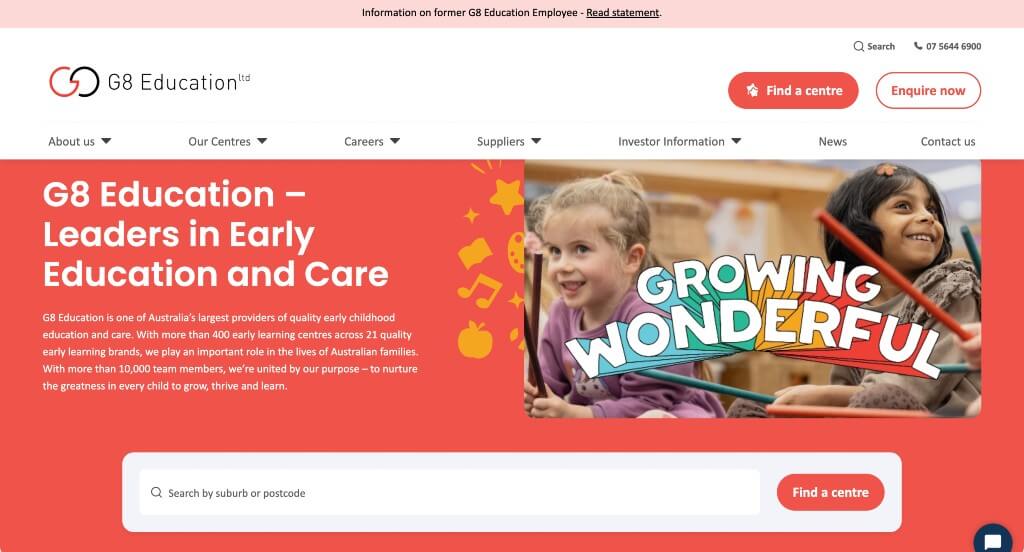
This was a wonderful example because of their blend of graphics and images to create a visually appealing design. We thought this logo was modern and easy to recognize which is helpful for a logo. Including a search bar to see if their is a location near you was another smart choice. We also liked how they including a live chat feature within the page.
WordPress Childcare Themes
Find free themes at wordpress.org or explore childcare templates on ThemeForest.
Kids Planet – Themeforest
$69
Happy Baby – Themeforest
$69
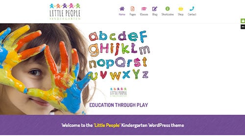
Little People – Themeforest
$59
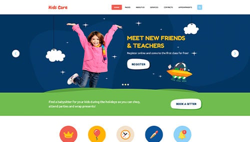
Kids Care – Themeforest
$69