In the rapidly evolving academic landscape of 2026, an education website has transformed from a simple information repository into a dynamic engine for enrollment and student engagement. For universities, K-12 schools, and e-learning platforms, an online presence must achieve a sophisticated balance: projecting academic prestige and tradition while offering a frictionless, mobile-first digital experience. To thrive in today’s competitive market, your design must move beyond static text to embrace “Intent-Based Pathways,” using personalized navigation to guide prospective students, parents, and alumni toward their specific goals with absolute clarity.
Our team evaluated hundreds of educational platforms – ranging from Ivy League universities and global MOOC providers to boutique private academies and specialized technical training centers. We narrowed the field to the top 13 examples that represent the gold standard for the sector. Our analysis focused specifically on interactive program finders, immersive virtual campus tours, and the strategic use of alumni outcome data and social proof that validates the institutional ROI before an application is ever submitted.
Whether you are an admissions director looking to modernize your recruitment funnel or a digital officer at a scaling ed-tech startup, these examples provide the definitive benchmark for education web design in 2026.
Note on Our Selection Process: We recently reviewed this list to ensure every featured site demonstrates a clear commitment to modern standards for page load performance, intuitive information architecture, and inclusive design patterns. This curated collection focuses on education websites that prioritize user journey clarity and institutional authority, providing the most strategic value to both the educator and the learner in 2026.
Top Educational Companies
1. BrainPOP
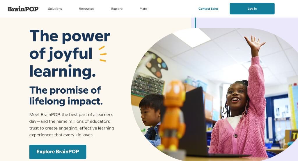
Simple animations was something that took this one to another level. We loved all their small graphics that make it more exciting to look at. Additionally, there’s a variety of types of content, making it easy to find something that works for readers to comprehend. Showing characters involved in their teaching methods was smart, but they never distracted from content in this example.
Related: Set up an awesome paid advertising campaign with the help of a PPC agency with experience helping educational organizations.
2. Instructure
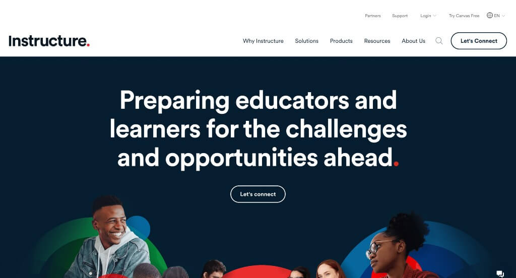
Our favorite part about Instructure, creator of Canvas, was their abstract arrangement that grabs attention quickly. We loved how they continually used hexagons throughout (as image frames and award frames) because it creates a sense of unity. Their large fonts used for titles was another feature that we felt needed to be recognized.
3. National Geographic
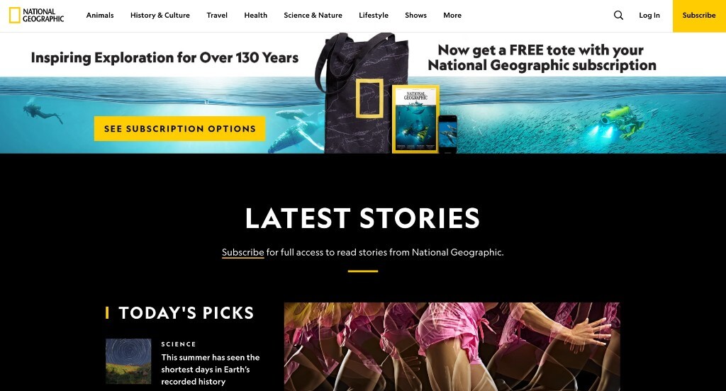
National Geographic is known for their bright yellow rectangle, so using the same yellow within this site was a smart idea. Including a variety of topics that interest many different age groups was perfect. We loved their use of dark (black) backgrounds to contrast their text in a more pleasing way. They clearly had marketing in mind when building a simple email list sign-up to keep customers updated.
4. Course Hero
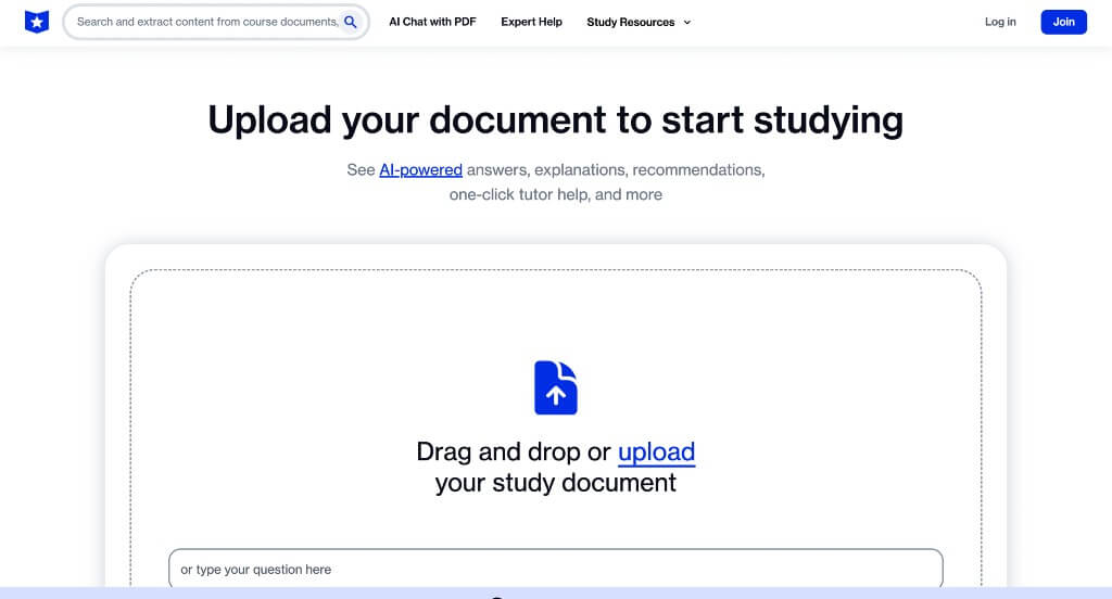
Although this uses a very simple color scheme, we loved how they effectively balance white space. It’s seamless organization allows for customers to read information with ease. Allowing viewers to type in their school and class to find pre-made study guides was very nice. Being able to drop your PDF right into this site was a unique feature that students will enjoy.
5. Gilman School
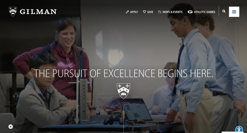
We loved how this one made use of animations that follow along with whatever point in this site the viewer is at. Their interactive timeline-like feature was our favorite. Lots of content was included, but it never felt overwhelming. Displaying their logo in a variety of places was nice because it continued to remind people who they are. Their use of inspirational phrases really helped to set them apart from other schools.
Related: Lift your educational website in search results by implementing SEO techniques that get you found online!
6. Alverno College
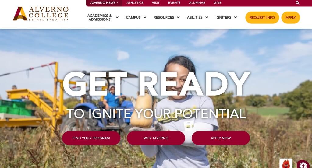
Alverno College picked a stunning color scheme and stuck to it – it can be noticed throughout this entire design along with their logo. We thought it was cool to include percent statistics about them. Although their logo was simple, it was interesting and caught our attention. Having two buttons attached to their sticky header that includes their application and instructions to request information was something we liked.
7. The New School
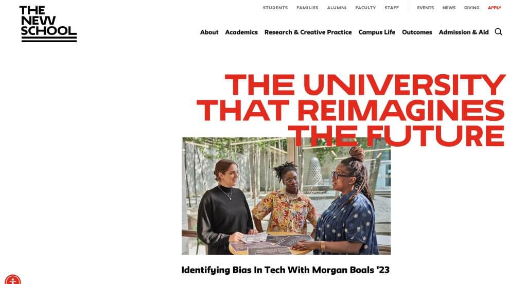
Reds that accent titles, buttons and more was a very impactful part of this example. Showing off announcements to keep people engaged with current news is smart. We liked how linked images had unique hover animations that lets viewers know that there is more information to be explored. Their interesting placement for images helped them stand out because it was more asymmetrically balanced.
8. Marquette University
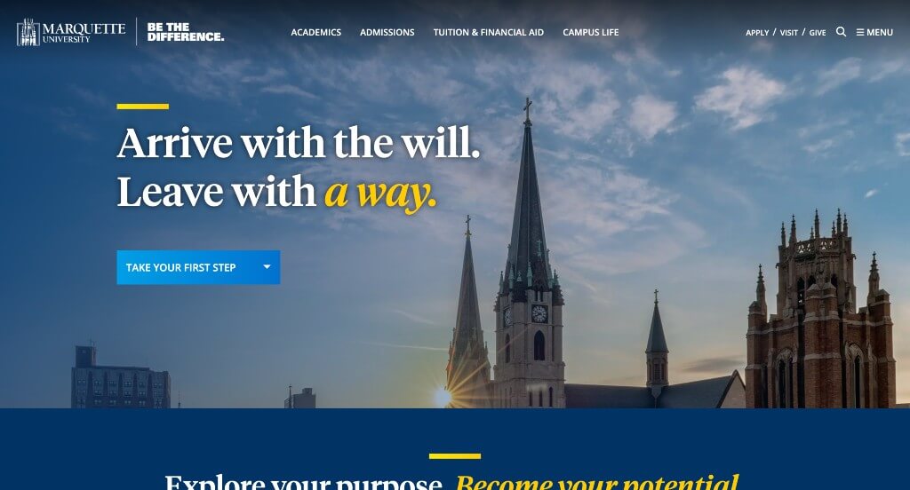
This is an outstanding example, so if you are a university looking for inspiration, you cannot miss this one. Their unique graphics and photo frames was what stood out to us the most. But, they also did great at using high-quality images, and overlapping them looked amazing. Including short, inspirational phrases was something that we really liked.
Related: An educational company can rely on digital marketing services to design and build conversion funnels, manage online reputation, and improve lead generation.
9. Carnegie Mellon University
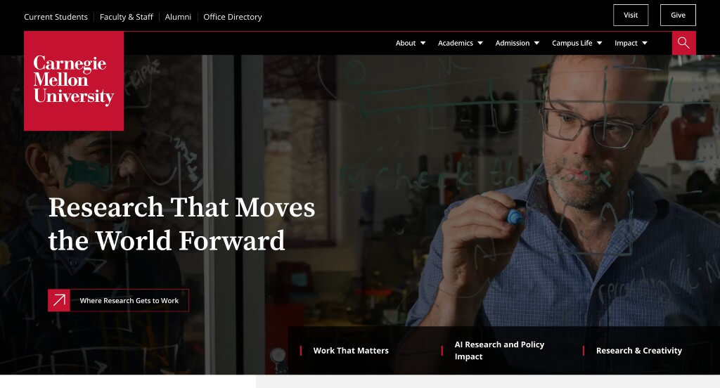
Using a video right away to emphasize the joys of this school was something that we enjoyed. We loved their color choices and use of animated graphics. Their interesting way of displaying images and layering rectangles for titles was unique, helping them stand out. Showing their top initiatives was another aspect that they did very well with.
10. Tufts University
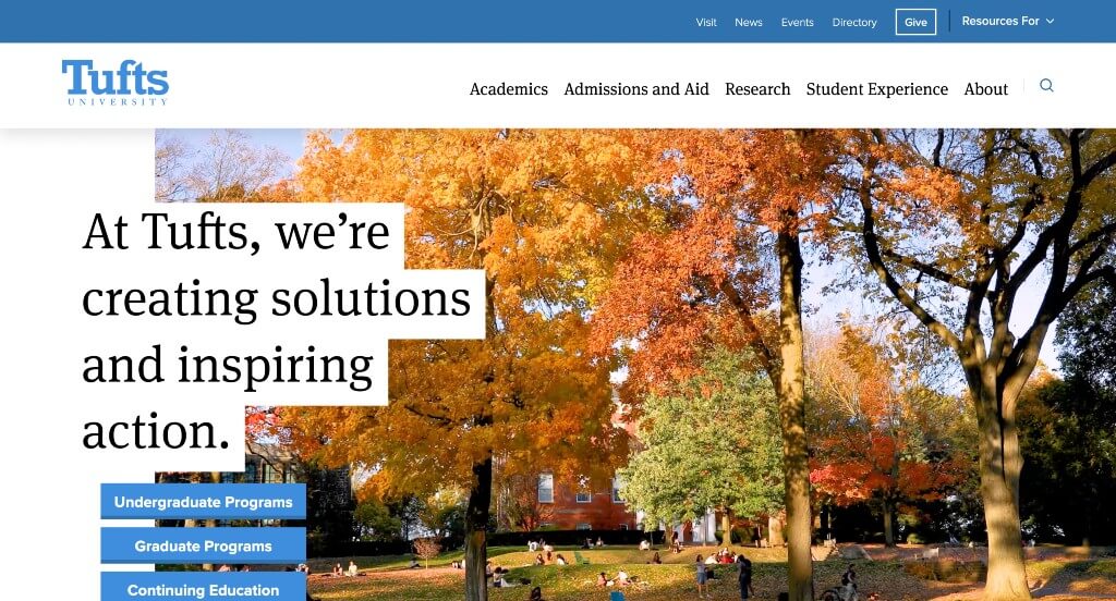
Each area of this example shone with excellence. There was lots of buttons and short paragraphs which was absolutely perfect. Showing a variety of statistics related to their school was very helpful for those wishing to apply or learn more. We liked how a variety of different image sizes are used for a better look. Titles use a bold fonts to grab attention was perfect.
11. University of Texas
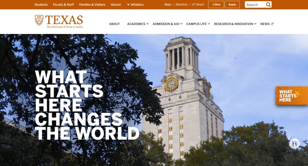
Large and bold text for titles was something that grabbed our attention right away. Including lots of number statistics about their school was appreciated. We absolutely loved their interesting textures used as backgrounds throughout this example. Smooth transitions was also among our favorite parts of University of Texas. Their giant graphic of their school near the bottom of this homepage was very impactful.
12. International Grammar School
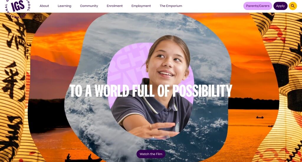
We loved the energetic feel portrayed for this company just from seeing their video. It was really cool to have titles that flipped through different languages, reaching more audiences. Their template was free of distractions which was very helpful. An interesting background pattern was created in different languages which we thought was cool.
13. Clemson University
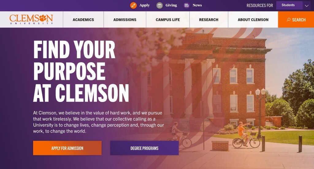
The loading icon was unique for them, and we loved it. Using their paw print in lots of different areas was another thing that we enjoyed. We also liked how a search bar for majors and programs was included. Their color scheme was beautiful and matched well because it is their school colors. Their interesting graphic near the bottom was also really cool.
WordPress Educational Themes
You can find free themes at wordpress.org or explore educational templates on ThemeForest.
Educator – Themeforest
$79
Eikra – Themeforest
$49
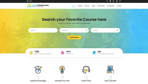
Kalvi – Themeforest
$49
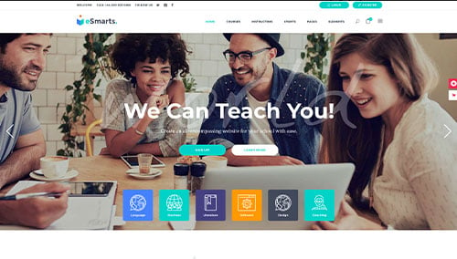
eSmarts – Themeforest
$85