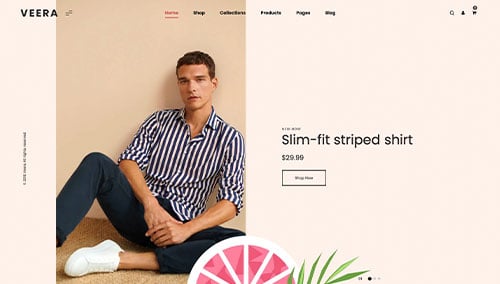
In the high-stakes world of fashion, a website is the ultimate digital runway. It is the primary space where a brand’s narrative meets consumer intent, requiring a sophisticated blend of high-fidelity imagery and seamless e-commerce architecture. For modern fashion labels and retailers, an online presence must do more than display products; it must create an immersive atmosphere that reflects the brand’s identity while providing a frictionless path from discovery to checkout.
Our design and marketing team recently conducted a comprehensive audit of the fashion industry’s digital landscape, evaluating hundreds of sites – from avant-garde luxury houses and sustainable startups to high-volume retail platforms. We have narrowed our selection to 11 definitive examples that lead the industry in editorial-style layouts, kinetic typography, and mobile-first shopping experiences. Our analysis focused on how these brands utilize asymmetrical grids and micro-interactions to capture attention in an increasingly crowded social-commerce market.
Whether you are a boutique accessory designer building a niche following or a global clothing brand optimizing for conversion, these examples offer a masterclass in modern fashion web design. Use these industry leaders as a blueprint to elevate your digital aesthetic and build deeper emotional connections with your audience.
Note on Our Selection Process: We recently updated this guide to ensure every featured site meets our 2026 standards for performance, accessibility, and visual storytelling. This curated collection focuses on the clothing brands, retailers, and stylists currently providing the most strategic value to fashion-forward consumers.
Top Fashion Website Designs
1. Gym Shark
Why We Chose Gymshark
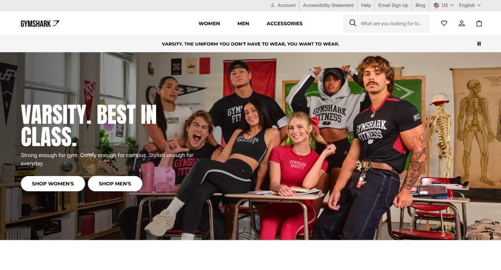
The digital storefront for Gymshark serves as a premier benchmark for “High-Velocity Activewear Merchandising and Community-Driven DTC E-Commerce Architecture.” As a global powerhouse in fitness apparel, their platform must cater to a digital-native audience that demands both rapid shopping utility and deep community connection. Gymshark masters this balance by pairing high-energy, aspirational media with hyper-responsive navigation paths that transform immediate visual inspiration into frictionless checkouts.
Key Design Highlights:
- High-Fidelity Product and Aspirational Lifestyle Showrooms: The platform commands immediate cultural authority by anchor-linking the storefront with razor-sharp, high-contrast photography. Blending hyper-focused studio product detail shots with authentic, raw fitness lifestyle imagery allows users to simultaneously evaluate garment performance – like stitch tensile strength and material texture – while connecting with the brand’s athletic identity.
- Instant-Inspiration “Trending Now” Product Gateways: Capturing high-velocity consumer trends and seasonal workout drops, the homepage integrates dedicated entry points to shop by what is popular right now. Giving immediate front-page real estate to crowd-tested apparel selections eliminates browsing fatigue for trend-conscious buyers, pushing high-intent traffic straight toward top-performing inventory corridors.
- Friction-Free Kinetic Product Slider Matrices: To cleanly showcase an expansive array of performance lines, colorways, and accessories without creating an endlessly long vertical page, the homepage utilizes highly interactive product sliders. These touch-responsive horizontal carousels let users glide through curated collections – like seamless leggings, sweat-wicking tops, or lifting gear – keeping exploration engaging while maintaining a clean grid structure.
- High-Utility Global Announcement Ribbons: Positioned at the absolute peak of the visual hierarchy, the layout utilizes a dynamic global announcement bar. This dedicated real-time ticker highlights critical fulfillment incentives, active flash sales, and shipping cutoff thresholds without disrupting the premium aesthetic of the primary digital showroom below.
2. Urban Outfitters
Why We Chose Urban Outfitters
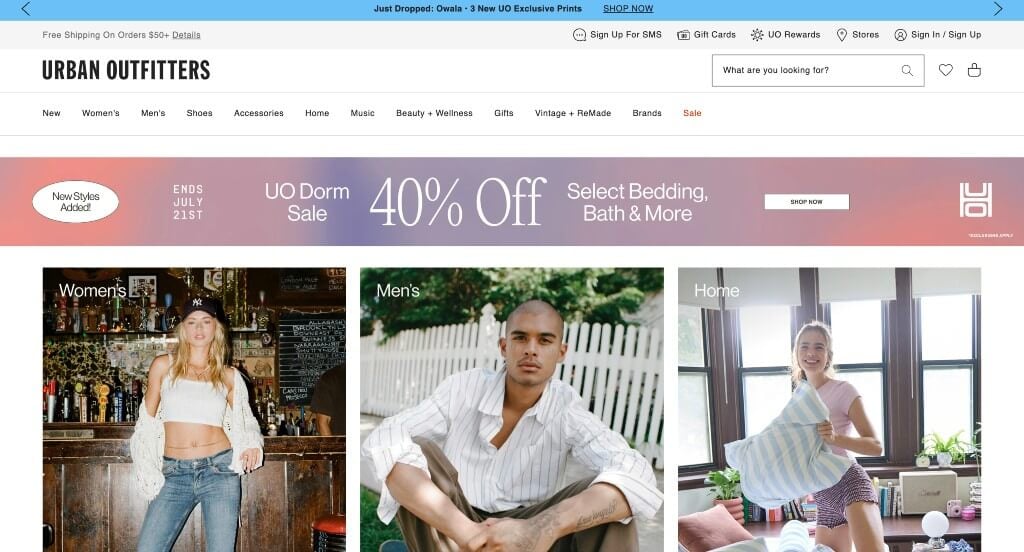
The digital flagship for Urban Outfitters serves as a premier benchmark for “High-Velocity Youth-Culture Merchandising and Hyper-Responsive Retail E-Commerce Architecture.” Catering to a fast-moving, trend-driven audience, the digital experience must balance lookbook style inspiration with robust search and discovery engines. The platform achieves this masterfully, combining sprawling architectural navigation corridors with rich, lifestyle-driven media to transform lifestyle inspiration into swift, high-volume transactions.
Key Design Highlights:
- High-Impact, Subculture-Driven Lifestyle Showrooms: Rather than arranging apparel in sterile, clinical white grids, the homepage is dominated by expansive, high-fidelity lifestyle imagery. Immersing their seasonal collections into authentic, real-world urban settings and candid editorial contexts gives items an immediate cultural relevance that allows target demographics to effortlessly project the clothing into their own wardrobes.
- Instant-Action “Shop the Look” Homepage Gateways: Capitalizing on immediate visual inspiration, the platform allows users to dive directly into shopping funnels straight from the homepage layout. By turning large editorial collages and seasonal lifestyle banners into direct, clickable shopping portals, the site bridges the gap between passive trend browsing and active product evaluation.
- Symmetric, Multi-Category Sticky Mega Menus: Managing a massive, overlapping catalog of apparel, accessories, home decor, and vintage items requires an incredibly robust navigational layout. The site implements a sprawling mega menu housed inside a locked sticky header framework, putting their entire product matrix just a hover away at any scroll depth without creating visual clutter.
- Search-First, Predictive Navigation Consoles: Recognizing that modern shoppers often look for specific trends, colors, or brands, the header features a prominent, robust search input field. Equipped with intelligent auto-suggestions, popular search terms, and instant visual indexing, this high-utility tool lets users cut through the massive inventory catalog and pull up precise product matches in seconds.
3. Young & Reckless
Why We Chose Young & Reckless
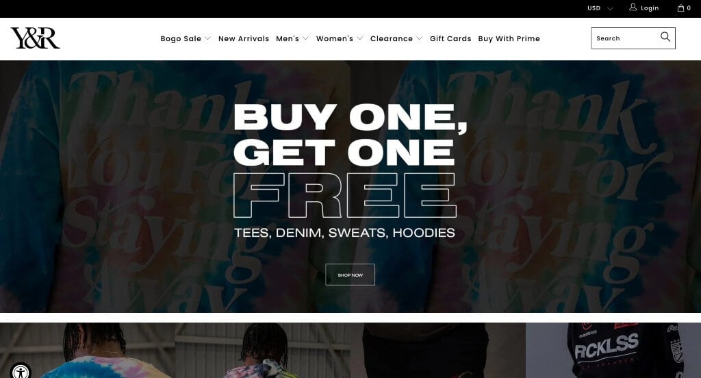
The digital storefront for Young & Reckless serves as a premier benchmark for “High-Velocity Streetwear Merchandising and Youth Culture Commerce Architecture.” As a brand deeply rooted in actionsports, street style, and skate culture, the digital experience must project bold individuality while serving a digital-native audience that demands immediate access to the latest drops. The platform captures this vibe perfectly by anchoring the layout with raw, high-contrast streetwear aesthetic imagery and streamlined e-commerce corridors built for swift conversions.
Key Design Highlights:
- High-Energy, Subculture-Driven Hero Showrooms: The platform commands immediate cultural authority by turning the primary hero fold into an intense visual hook. Featuring high-contrast, bold streetwear aesthetics and dynamic lifestyle imagery capturing peak youth culture movement, it instantly locks in the target demographic’s attention and conveys a defiant, expressive style profile before the user scrolls an inch.
- Instant-Action “Shop from the Scroll” Gateways: Bypassing standard browsing barriers, the homepage functions as a high-conversion transactional workspace. By integrating interactive product cards, rapid “add-to-cart” capabilities, and immediate pricing overlays directly into the main front-page scroll path, the site allows users to shop featured drops instantly without forcing them down deep, multi-click pathways.
- Symmetric, High-Density Mega Menu Blueprints: Organizing comprehensive apparel layers – ranging from graphic tees and hoods to specialized activewear and accessories – requires clean navigation structures. The platform utilizes a multi-column, organized mega menu that cleanly distributes their entire apparel catalog, letting trend-conscious buyers pinpoint exact collections or sizing options with a single effortless hover.
- Hyper-Focused Product Quality and Material Close-ups: To back up the bold branding with tangible quality assurance, the storefront utilizes crisp, high-fidelity studio product photography. Highlighting garment detail, fabric weights, graphic screen-prints, and seam textures against minimalist backdrops ensures that buyers can shop with maximum confidence regarding product fit and premium material quality.
4. Zara
Why We Chose Zara
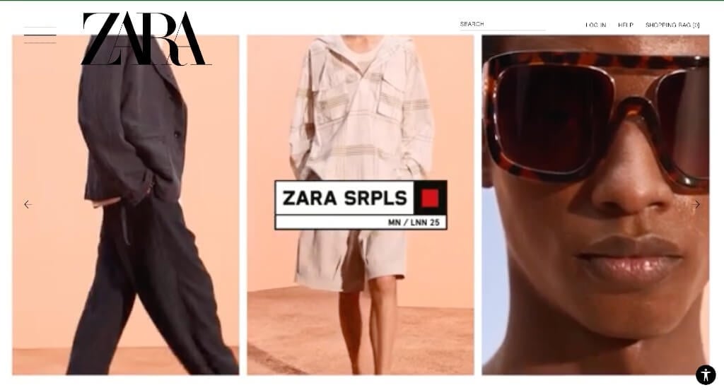
The digital flagship for Zara serves as a premier benchmark for “High-Fashion Avant-Garde Merchandising and Radical Interface Autonomy Architecture.” Defying standard retail e-commerce conventions, Zara approaches its platform as a living editorial lookbook rather than a transactional database. By discarding traditional grid rigidities and putting visual presentation completely in the user’s control, the platform captures the experimental, boundary-pushing essence of high fashion while maintaining a highly sophisticated, minimalist structure.
Key Design Highlights:
- Radical and Avant-Garde Visual Frameworks: Breaking far away from traditional web structures, the platform features a highly unique, unconventional homepage layout. Rejecting generic, predictable product grids, it treats the screen as a fluid, high-editorial canvas where white space, overlapping text, and staggered image placements force users out of passive scrolling routines and demand intense visual engagement.
- Dual-Perspective User Navigation Matrices: To cater to both inspiration-seeking browsers and high-intent shoppers, the homepage integrates an innovative viewing toggle that completely changes the page layout. Users can freely switch between an ultra-immersive layout focused on sweeping model imagery or a traditional, clean product grid layout that mirrors a classic, high-velocity e-commerce storefront.
- Cinematic, High-Fashion Editorial Showrooms: The front page functions as an expansive gallery space dominated by massive, high-contrast lifestyle and editorial images. Immersing seasonal apparel drops into hyper-stylized contexts – featuring color-accurate fabric draping and moody, dramatic lighting – allows the brand to communicate premium brand positioning and artistic value before showcasing pricing metadata.
- Expansive Desktop Hamburger Mega Menu Systems: Managing a vast global catalog of apparel across women’s, men’s, kids’, and home collections requires an incredibly deep navigation engine. Bypassing traditional top-bar links, the site hides its sprawling directory behind a clean, minimalist hamburger menu button that opens into a massive, full-screen mega menu canvas, offering an organized and clean map of its inventory without cluttering the editorial visuals below.
5. Coach
Why We Chose Coach
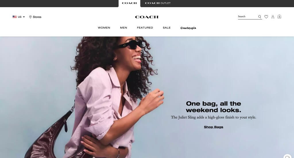
The digital flagship for Coach serves as a premier benchmark for “Modern Luxury Curation and High-Fidelity Minimalist Commerce Architecture.” As an international authority in premium leather goods and fashion, the online experience must translate the tactile prestige of a physical luxury boutique into a digital canvas. The platform achieves this masterfully, combining expansive navigational frameworks with clean, spacious aesthetics and real-world social validation to create a high-conversion storefront that feels both timeless and deeply modern.
Key Design Highlights:
- Full-Width Minimalist Canvas Architecture: The website projects an immediate sense of elite luxury by anchoring its entire structure around an expansive, full-width screen layout dominated by crisp whites and soft neutral tones. Bypassing distracting colorful borders or loud promotional blocks creates an editorial lookbook feel, allowing the vibrant colors and detailed textures of the premium leather goods to stand out with maximum visual power.
- Symmetric Mega Menu with Sticky Header Integration: Managing a deep global catalog of handbags, ready-to-wear apparel, and seasonal drops requires immaculate organization. The interface implements a spacious mega menu housed inside a locked, translucent sticky header framework. This ensures that the entire organized shopping directory remains accessible at any scroll depth, eliminating backtracking scroll fatigue without cluttering the luxurious editorial layout below.
- Instant-Action Homepage Shopping Matrices: Capitalizing on immediate visual inspiration, the homepage functions as an active transactional workspace. By integrating streamlined product collections, instant “Add to Bag” buttons, and price details directly into the primary front-page scroll path, the site allows users to shop featured drops instantly without forcing them down deep, multi-click pathways.
- Socially Coordinated Live Instagram Curations: Seamlessly blending aspirational luxury with real-world community styling, the homepage features an integrated Instagram media grid. Showcasing candid customer unboxings, everyday street-style outfit checks, and real-world product pairings adds an authentic layer of peer validation that grounds the high-fashion brand, building confidence before buyers enter the checkout funnel.
6. Nordstrom
Why We Chose Nordstrom
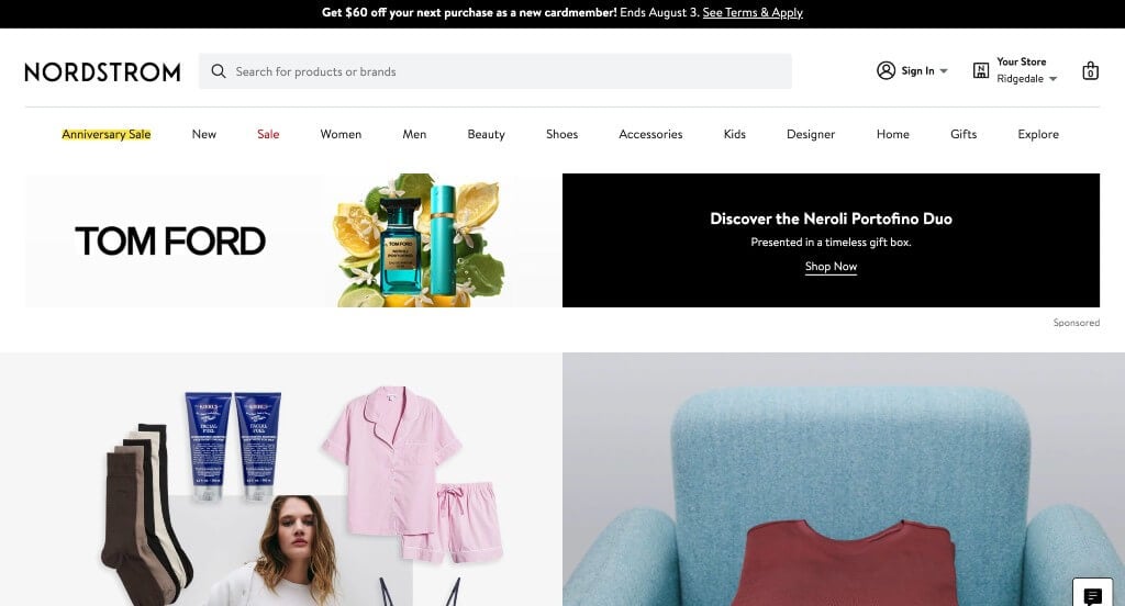
The digital ecosystem for Nordstrom serves as a premier benchmark for “High-Velocity Multi-Brand Curation and Intent-Driven Department Store Architecture.” As an enterprise retail giant managing an massive collection of designer fashion, beauty, and home items, the primary digital challenge is organizing dense inventory layers without sacrificing consumer inspiration. The platform achieves this masterfully, combining sprawling, systematic navigation engines with highly curated trend lookbooks and action-oriented layouts to make large-scale online shopping feel incredibly personalized and efficient.
Key Design Highlights:
- Hyper-Symmetric Multi-Column Mega Menu Blueprints: Organizing thousands of distinct retail brands, apparel cuts, shoe sizes, and cosmetic lines requires a highly advanced navigation matrix. The platform employs an expansive, screen-wide mega menu system that maps out inventory into highly organized, scannable columns based on departments, trends, and specific shopping occasions. This clean information architecture lets consumers bypass generic site sorting and drop straight into hyper-specific subcategories with a single hover.
- Instant-Action Homepage Direct-Purchase Gateways: Rather than treating the homepage as a passive collection of billboard advertisements, the interface functions as a high-conversion transactional workspace. By embedding interactive style cards, clear price tags, and rapid size-selection overlays directly into the main front-page scroll path, users can shop trending items and new seasonal arrivals instantly without getting bogged down in slow, multi-click corridors.
- Strategic High-Energy Color Accents: To maintain their clean, premium brand identity while creating highly effective visual guideposts, the platform injects vibrant, high-energy pops of color throughout the homepage. Using these bright tones selectively on flash-sale banners, top holiday filters, and priority action buttons instantly draws the eye to high-incentive shopping hubs without clashing with the underlying high-contrast typography.
- Curated “Get Inspired” Editorial Lookbook Matrices: Perfectly bridging corporate mass-merchandising with personalized styling boutiques, the homepage features a beautifully mapped “Get Inspired” lookbook gallery. Spotlighting professional style mockups, complete outfit pairings, and current seasonal fashion ideas directly in the user’s view gives shoppers immediate creative inspiration, transforming a simple item search into an active wardrobe-building experience.

7. Rolex
Why We Chose Rolex
The digital flagship for Rolex serves as a premier benchmark for “Ultra-Luxury Visual Merchandising and High-Prestige Heritage Architecture.” As arguably the most recognized luxury horology brand in the world, the online destination must transcend basic e-commerce utility. Instead of pushing hard sales or dense product specifications, the platform treats timepieces as historic monuments. By pairing high-stakes cinematic storytelling with elite spatial layout choices, the interface evokes a powerful sense of timeless achievement, precision engineering, and absolute confidence.
Key Design Highlights:
- Cinematic, High-Stakes Hero Adventure Showrooms: The homepage commands instant gravity by dedicating its entire initial fold to an immersive, high-fidelity hero video loop. Blending sweeping footage of deep-sea exploration, high-altitude mountaineering, and prestigious sporting events with slow-motion macro captures of luxury timepieces immediately ties the brand to human achievement. This narrative pairing makes the watch feel less like a retail product and more like an essential tool for an extraordinary life.
- Restrained, High-Precision Kinetic “Scrollytelling” Layers: To preserve a feeling of timeless elegance while subtly engaging tech-savvy audiences, the platform integrates a highly intentional, understated scrollytelling mechanism. As users glide down the canvas, text elements slowly float into view and watch components subtly shift with micro-animations. This delicate interaction mirrors the microscopic, fluid mechanical movements inside a Rolex perpetual movement without causing visual distraction.
- Expansive, Full-Width Luxury Canvas Framings: The platform leverages an open, full-width screen layout anchored by striking, edge-to-edge product and environmental imagery. Presenting their gold, platinum, and oystersteel timepieces at such a massive scale projects extreme brand confidence, allowing the immaculate polishing, fine dial details, and light refractions to speak for themselves against minimalist backdrops.
- Symmetric Desktop Hamburger Mega Menu Systems: Managing a legendary watch catalog – ranging from classic dress models like the Datejust to technical diving watches like the Submariner – requires clean navigation. The interface strips away messy top-bar menus, hiding its vast global directory behind a clean, elegant desktop hamburger button. When opened, it reveals an expansive full-screen mega menu that separates collections into clean, beautifully spaced vertical columns, preserving a clutter-free environment.

8. INDEE
Why We Chose Indee Collection
The digital storefront for Indee Collection serves as a premier benchmark for “Fluid Mobile-First Merchandising and Youthful Lifestyle E-Commerce Architecture.” Designing for a contemporary, trend-conscious generation requires an online space that feels energetic, highly visual, and optimized for rapid scrolling on handheld screens. The platform navigates this masterfully by pairing authentic lifestyle storytelling with a clean, touch-responsive grid structure that turns everyday inspiration into immediate product discovery.
Key Design Highlights:
- Vibrant, In-Motion Lifestyle Showrooms: Rather than boxing their collections into clinical, plain white backgrounds, the homepage embraces high-fidelity lifestyle photography. Showcasing the garments being worn naturally in real-world, candid settings infuses the site with an approachable personality, allowing consumers to gauge material movement, styling versatility, and fit comfort instantly.
- Instant-Action Homepage Category Gateways: Minimizing the steps required to browse, the homepage integrates direct category entry points right into the main scroll path. Organizing inventory into intuitive, clickable segments – like tops, denim, or new season drops – enables users to bypass formal drop-down navigation and self-select their exact style corridor the moment inspiration strikes.
- Frictionless, High-Velocity Mobile Conversion Engine: Recognizing that modern boutique traffic overwhelmingly stems from mobile devices, the interface boasts an incredibly responsive smartphone layout. Transitioning beautifully into single- or double-column cards with touch-optimized target buttons, the site ensures that swiping through galleries and checking out feels fast and natural, entirely avoiding the awkward pinching or tiny text blocks common to desktop-heavy templates.
- High-Utility Global Announcement Ribbons: Positioned at the very top of the global header hierarchy is a sleek announcement bar. Housed in a high-contrast stripe above the main menu links, this flexible space ensures that time-sensitive customer perks – such as worldwide shipping specials, new collection updates, or active promotion codes – capture visual priority without disrupting the energetic visual layouts below.

9. Lucky Brand
Why We Chose Lucky Brand
The digital flagship for Lucky Brand serves as a premier benchmark for “Heritage Denim Merchandising and Contextual Lifestyle E-Commerce Architecture.” As a brand deeply rooted in classic American denim culture, the online experience must do more than simply display apparel – it must highlight the craftsmanship of their core denim line while offering complete, inspired outfit ideas. The platform achieves this masterfully, combining expansive spatial layouts with immersive editorial curation and single-click shopping funnels to turn visual inspiration into effortless purchases.
Key Design Highlights:
- High-Priority Pre-Fold Denim Showrooms: Recognizing that denim is the undisputed anchor of their brand identity, the homepage positions a massive, dedicated denim feature directly beneath the initial hero fold. Giving top visual priority to their signature product line – complete with clear breakdowns of fits, washes, and styling cuts – captures high-intent denim shoppers immediately, guiding them into core inventory paths right at the start of their journey.
- Expansive Full-Width Canvas Layouts: The platform leverages an open, edge-to-edge screen layout that maximizes digital real estate. Bypassing cluttered, narrow columns creates an editorial lookbook feel, allowing the detailed textures of the clothing, subtle fabric washes, and rich color palettes to stand out with premium visual presence.
- High-Fidelity Contextual Lifestyle Showrooms: Rather than setting apparel against cold, sterile studio backdrops, the homepage is filled with vibrant, high-fidelity lifestyle imagery. Immersing their seasonal collections into warm, authentic environments gives the clothing immediate character, helping buyers easily visualize the styles in their own everyday wardrobes.
- Transactional “Shop the Look” Editorial Matrices: Anchoring the lower portion of the homepage is an interactive, curated style showroom that showcases complete, head-to-toe outfits. By allowing users to shop multiple matching items directly from a single styled image, this high-utility feature bridges the gap between passive trend browsing and active product selection, encouraging effortlessly larger cart sizes.
10. NastyGal
Why We Chose Nasty Gal
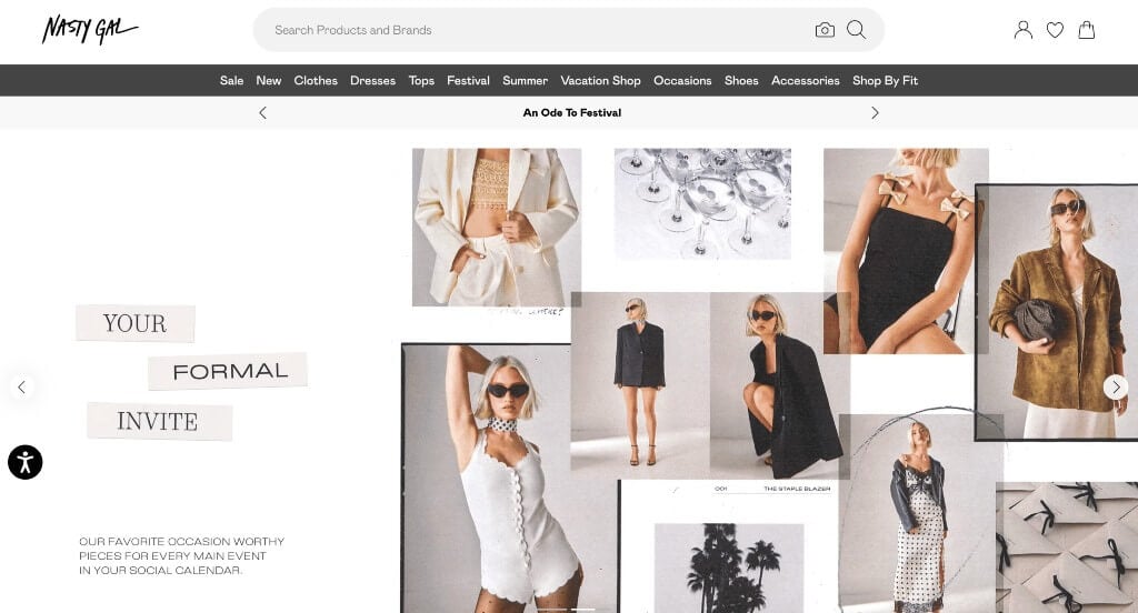
The digital flagship for Nasty Gal serves as a premier benchmark for “High-Velocity Fast-Fashion Merchandising and Hyper-Segmented Trend Architecture.” Catering to a digital-native, trend-driven audience, the online experience must blend high-impact visual drama with ultra-fast sorting systems. The platform achieves this masterfully, combining an expansive, uninhibited editorial canvas with immediate, occasion-based filtering matrices that allow inspiration-seeking shoppers to pinpoint hyper-specific style aesthetics within seconds.
Key Design Highlights:
- Expansive, High-Impact Full-Width Layouts: The homepage instantly elevates its brand presence by utilizing a complete edge-to-edge screen canvas dominated by massive, high-fidelity imagery. Rejecting restrictive borders or cramped product blocks, this open lookbook layout gives their bold, high-attitude style campaigns maximum visual power, creating an immersive fashion runway feel from the second the page loads.
- Instant-Action “What’s Hot” Dynamic Trend Gateways: Capitalizing on high-velocity seasonal demand, the homepage features a direct portal to shop what is trending right now. Rather than dropping users into a generic list, this section integrates instant filtering tabs for high-intent style categories – such as festival-ready outfits, holiday wear, or the absolute newest drops – allowing shoppers to instantly match their specific weekend or event plans.
- Symmetric, Multi-Column Mega Menu Systems: Organizing a massive, fast-moving inventory of apparel, shoes, and accessories requires a powerful navigation engine. The platform implements a spacious mega menu that cleanly distributes their entire catalog into organized columns based on trends, fit types, and sale events. This layout allows users to bypass multi-layer sorting pages and jump directly to hyper-specific subcategories with a single hover.
- Curated Capsule and Brand Partner Showrooms: Anchoring the lower half of the homepage is a dedicated section spotlighting specialized brand collaborations and distinct sub-labels. Elevating these unique curation channels at the base of the scroll path introduces shoppers to premium product tiers and capsule collections, driving deeper exploration into the catalog beyond everyday staples.
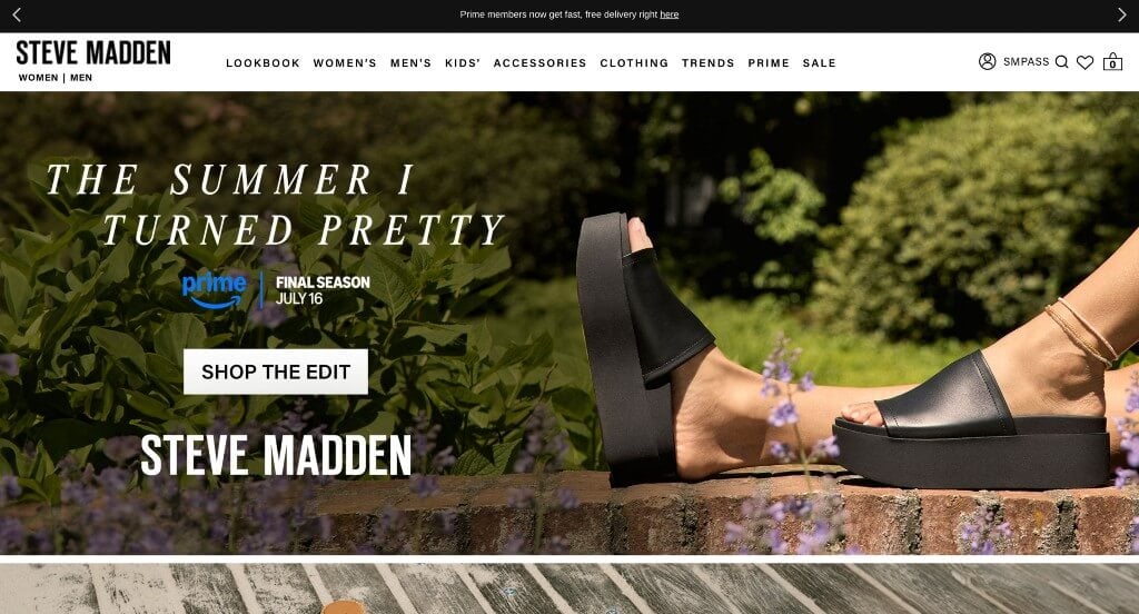
11. Steve Madden
Why We Chose Steve Madden
The digital presence for Steve Madden serves as a premier benchmark for “High-Velocity Footwear Merchandising and Immersive Direct-to-Consumer (DTC) E-Commerce Architecture.” As a leading force in trend-setting footwear and accessories, the brand’s online space must balance striking visual energy with high-efficiency transactional utility. The website masterfully achieves this by blending spacious, fashion-forward layout designs with dual-path discovery entry points and persistent navigation layers to turn instant style inspiration into frictionless customer checkouts.
Key Design Highlights:
- Spacious Full-Width Structural Layouts: The web design maximizes modern desktop viewports by utilizing an open, edge-to-edge structural grid. Eliminating restrictive margins and boxy boundaries gives the website a premium, editorial runway feel, allowing large-scale design elements and bold typography to span the screen with total confidence.
- Persistent Sticky Header and Symmetric Mega Menu Engines: Handling an extensive retail inventory spanning women’s shoes, men’s lines, handbags, and clothing capsules requires elite navigation design. The platform integrates a multi-column mega menu mapped inside a locked sticky header. This architectural choice keeps the entire organized shopping directory accessible at any scroll depth, preventing backtracking fatigue without cluttering the visual spaces below.
- Dual-Path “Products vs. Collections” Discovery Gateways: Catering simultaneously to focused buyers and relaxed browsers, the homepage splits its discovery funnels seamlessly. Visitors can immediately shop individual trending products with active pricing overlays, or click broad lifestyle category portals – such as sandals, boots, or heels – tailoring the shopping path to the user’s specific state of intent.
- High-Fidelity, High-Contrast Lifestyle Showrooms: Rather than relying entirely on clinical, plain studio cutouts, the homepage features rich, high-fidelity lifestyle photography. Immersing their distinctive, bold shoe designs into energetic, real-world fashion contexts gives products immediate lifestyle relevance, enabling trend-conscious buyers to effortlessly project the pieces into their own wardrobes.
WordPress Fashion Themes
Free themes can be found at wordpress.org, or explore fashion-inspired templates on ThemeForest.
Azalea – Themeforest
$85
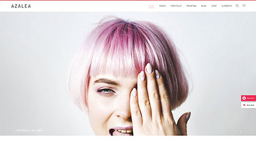
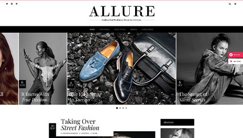
Allure – Themeforest
$69
WooCommerce Fashion Themes
A wide range of e-commerce fashion themes for WooCommerce are also on ThemeForest.
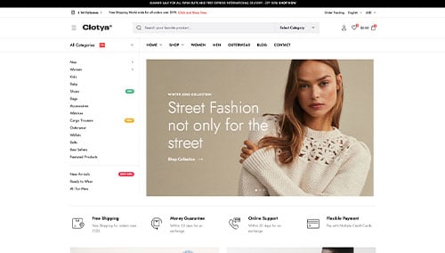
Clotya – Themeforest
$29
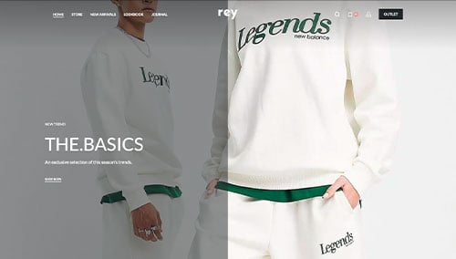
Rey – Themeforest
$69
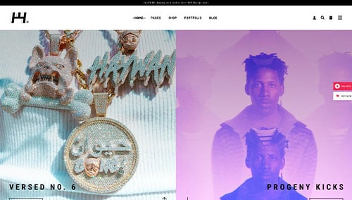
Haaken – Themeforest
$75
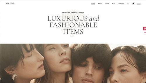
Valeska – Themeforest
$79
Shopify Fashion Themes
Explore more free and paid themes at themes.shopify.com, or browse options through marketplaces like ThemeForest.
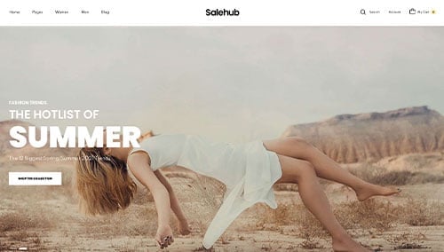
SaleHub – Themeforest
$59
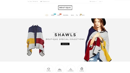
Boutique – Themeforest
$59
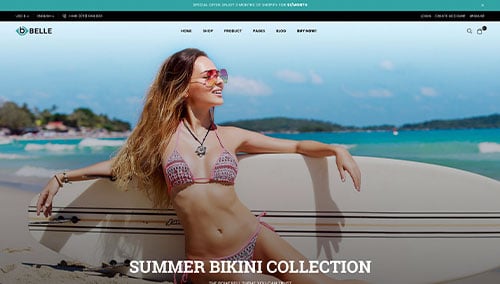
Belle – Themeforest
$79
Veera – Themeforest
$69