In the high-stakes financial landscape of 2026, a finance website is no longer just a digital portal – it is a foundational architecture of trust and security. For fintech innovators, wealth management firms, and institutional banks, an online presence must achieve a masterful balance: projecting “rock-solid” stability while offering a frictionless, human-centric user experience. To thrive in today’s market, your design must move beyond sterile corporate templates to embrace “Transparent Performance,” using real-time data visualizations and clear fee structures to eliminate consumer skepticism before a single dollar is managed.
Our team evaluated hundreds of financial platforms – ranging from disruptive neobanks and AI-driven investment tools to heritage asset managers and boutique wealth advisors. We narrowed the field to the top 9 examples that represent the gold standard for the sector. Our analysis focused specifically on trust-building “micro-humanizations,” dynamic performance charts, and the strategic integration of bank-grade security signals that provide immediate reassurance in a sector where digital safety is the ultimate luxury.
Whether you are a fintech founder scaling a new payments rail or a financial advisor modernizing your boutique brand, these examples provide the definitive benchmark for finance web design in 2026.
Note on Our Selection Process: We recently reviewed this list to ensure every featured site demonstrates a clear commitment to modern standards for mobile encryption, fast data-loading speeds, and intuitive navigation. This curated collection focuses on finance websites that prioritize clarity over complexity and institutional authority, providing the most strategic value to both the firm and the modern investor in 2026.
Top Financial Company Website Designs
1. Thrivent Financial
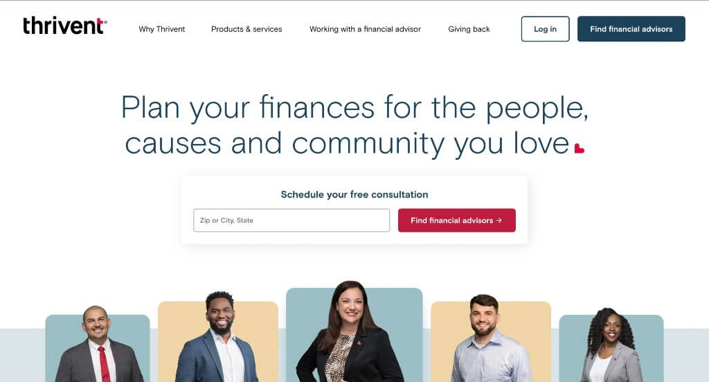
This is a great website design example for finance companies who are looking for a custom look and feel. The balanced layout was likely the most impactful quality in the homepage of Thrivent Financial. Another thoughtful quality in this professional finance site was the inclusion of graphics. Thrivent Financial clearly had a focus on conversions when designing the navigation bar with organized categories for their website. If you are looking for template examples for your next finance site, be sure to check this one out.
2. Vestox
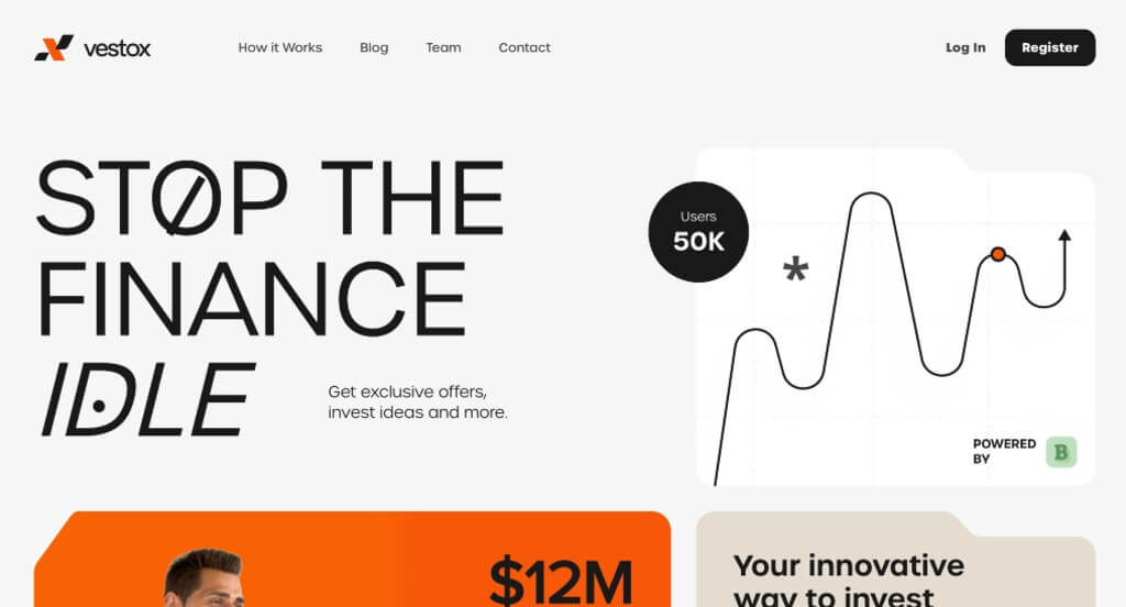
This was a very unique example because of their use of smaller boxes to organize information in a creative template. Accents of bright orange was a nice way to highlight important information or just add some color to their pages. Their use of multiple fonts blended together made for a look that stands out from all of their competitors.
3. Sight Banking
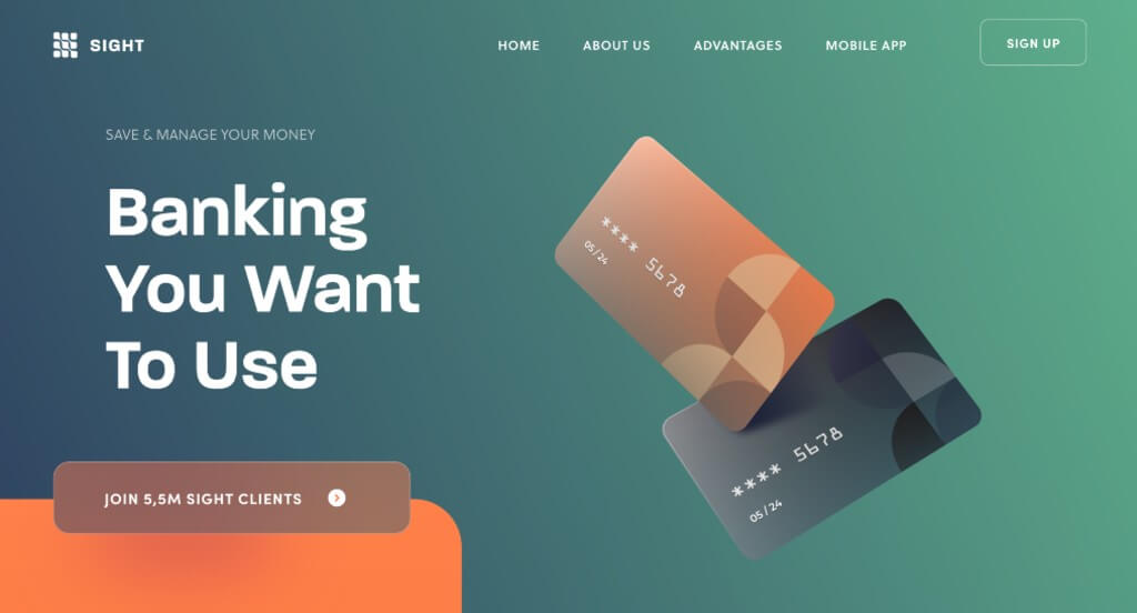
The colors that were used within this example weren’t the typical choices, but it stood out to us more that way. We liked how they showed banking cards right away so people have an idea about what this business does. We thought their use of frames for content and images further down in their page was also a smart idea.
4. Revolut
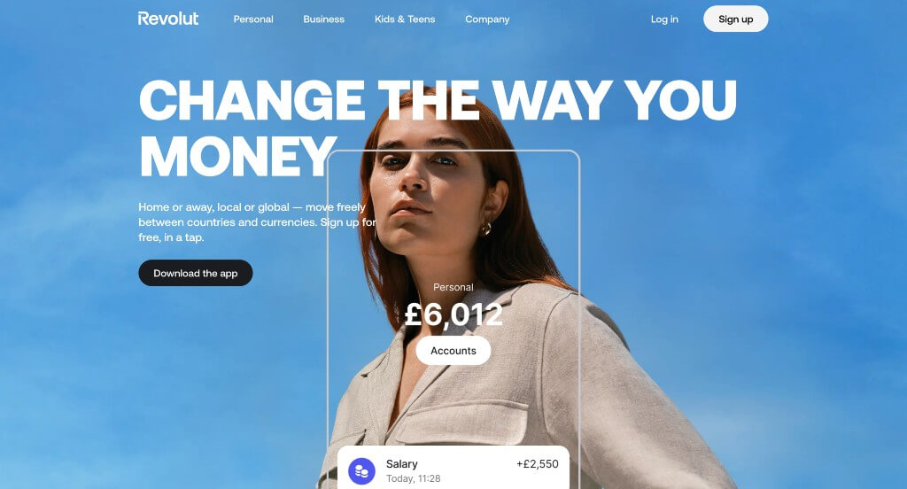
We loved how this example started and its unique transition as viewers dive further into this site. These fonts are bold which makes them super easy to read, and it still looks great. This color scheme was very modern which helped them feel like a more professional business. This web domain matched with their company name which was another thing that was nice to include.
5. Butter Payments
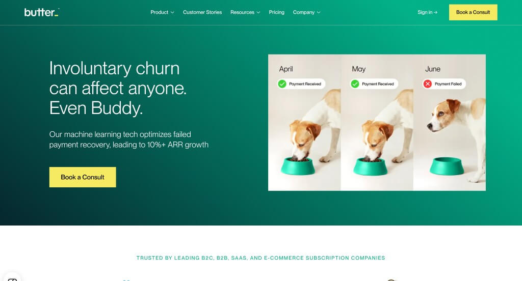
We loved how these backgrounds were more basic while still looking professional. Showing popular brands that are their clients helps to build trust with incoming customers. Including some percentages is a great way to show that their business will help you be more successful. This navigation bar was well labeled and used drop downs in order to keep everything more organized.
6. Chesapeake Advisors

This is a good example of a website design for finance companies who are looking for a professional website. The blue, green and white color scheme was likely the most impactful feature in the homepage of Chesapeake Advisors. The layout with had a good balance of white space was a nice touch for a custom site. Chesapeake Advisors had digital marketing in mind when building the page dedicated to links and forms for clients. Don’t skip past this website when hunting for design ideas for your next finance website!
7. Radix Financial Group
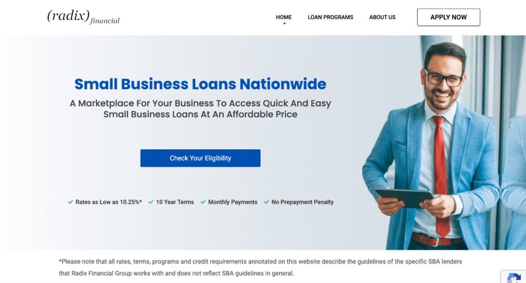
This example was more simple which was one of the things that we really liked. Adding in buttons was a smart way to organize their information without overwhelming their pages. Keeping paragraphs short and straight forward was another thing that was nice because it helps viewers stay engaged. Including a loan calculator was another helpful touch that we appreciated.
8. CyberCube

This example started out with an automatically playing video as a background which created a more unique look when first entering this page. Accents of bright colors was a great way to guide people’s eyes towards certain information. Along with all of that, we liked how there were animations to make their template stand out. This font was also professional and simple, which is always helpful.
9. Vouch

We loved this color scheme that was chosen and used throughout their entire website, even the images. Including a live chat was a nice way for people to ask quick questions without going through the hassle of writing out an email. We thought it was nice how much of their content used transitions as viewers scroll in order to introduce their information.
WordPress Financial Themes
You can find free themes at wordpress.org, or explore finance-inspired templates on ThemeForest.
Financity – Themeforest
$64
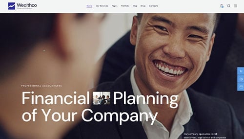
WealthCo – Themeforest
$69
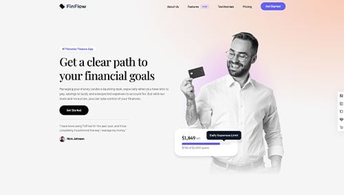
FinFlow – Themeforest
$59
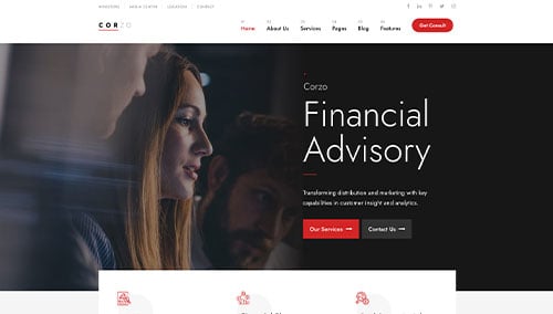
Corzo – Themeforest
$64