In the residential construction industry, your website is your digital showroom. Before a client ever walks through a physical model home, they use your online presence to judge the quality of your finishes, the creativity of your floor plans, and the professionalism of your management. To capture high-value leads in a competitive market, your design must communicate luxury, architectural precision, and unwavering reliability.
Our design team evaluated hundreds of home builder websites – from luxury custom builders and large-scale residential developers to specialized remodeling and modular home firms. We looked for the top 12 examples that masterfully balance aspirational visual storytelling with a seamless user experience, specifically analyzing their project gallery architecture, mobile-friendly consultation flows, and the effective use of video and 3D tours.
Whether you are a boutique custom builder or a regional developer, these examples represent the benchmark for home building web design in 2026.
Note on Our Selection Process: We recently audited this guide to remove outdated designs and construction sites that no longer meet our performance standards. This curated list now focuses on the top 12 home builder websites providing the most strategic value in 2026.
Top Home Builder Website Designs

1. UnionMain Homes
Why We Chose Union Main Homes
The website for Union Main Homes stands out as a premier benchmark for “Immersive Lifestyle Narratives and Frictionless Inventory Mapping.” For prospective homebuyers navigating the highly visual process of purchasing a new property, a digital platform must quickly create an emotional connection while making critical real estate data instantly searchable. This platform masterfully answers those needs by pairing cinematic background media with a streamlined, low-barrier property discovery engine directly on the home page.
Key Design Highlights:
- Cinematic High-Fidelity Hero Loop: The website opens with a large, high-quality background video loop built directly into the home page hero framework. Leading with this polished, cinematic visual presentation allows families to immediately experience the upscale design aesthetics, open-concept floor plans, and community lifestyles of their neighborhoods before looking at a single blueprint.
- Frictionless Location and Price-Point Mapping: A major functional asset of the home page layout is an intuitive discovery section that makes it easy to quickly view exactly where communities are located and their starting price points. This structured overview provides high-intent buyers with an effortless navigational path to deeper interior pages for specific move-in ready homes, eliminating standard real estate search friction.
- Streamlined Neighborhood Inquiry Portal: The home page integrates a direct contact form positioned strategically within the main page flow. Embedding this accessible intake tool directly on the front page gives prospective buyers an immediate, hassle-free pathway to request community details, schedule a model home tour, or connect with a sales counselor without jumping through extra menu hoops.
- Grassroots Community Validation Matrix: Authentic buyer testimonials and homeowner success stories are woven smoothly into the home page layout to supply immediate real-world validation. Showcasing these verified experiences regarding craftsmanship, build times, and customer service anchors the builder’s reputation with trustworthy, community-driven confirmation.

2. CBH Homes
Why We Chose CBH Homes
The website for CBH Homes stands out as a premier benchmark for “Above-the-Fold Inventory Triage and Dynamic Micro-Interaction Architecture.” For modern homebuyers, a real estate platform must eliminate search friction instantly while injecting memorable, interactive brand moments that elevate the user experience. This site masterfully balances these needs by pairing a powerful, high-intent discovery filter at the highest point of visual contact with a fluid, highly engaging layout that translates perfectly to smaller screens.
Key Design Highlights:
- Immediate Above-the-Fold Property Triage: A major functional asset of the layout is the integration of comprehensive property search filters directly within the primary hero area. Allowing visitors to instantly input and adjust their home preferences right upon arrival bypasses standard multi-step navigational barriers, placing tailored property listings just a single click away.
- Dual-Purpose High-Contrast Communication Header: The global header configuration prioritizes a prominent, bold phone number that explicitly indicates users can either call or text. Highlighting this dual-purpose communication route at the absolute highest point of the visual hierarchy removes immense friction for mobile-first shoppers who prefer text-based inquiries over traditional phone calls.
- Dynamic Hover-Animated Brand Showcase: In the “We are CBH Homes” section, the interface utilizes a unique, fluid interactive element where hovering over specific brand icons causes crisp, hidden images to smoothly animate out from behind them. This polished, playful micro-interaction injects visual delight into the browsing experience, capturing attention and making the company’s culture feel modern and approachable.
- Streamlined Mobile User Experience: The platform features a highly optimized, clean mobile layout architecture engineered specifically for smaller handheld displays. This responsive design pattern structures dense real estate data, filter menus, and image carousels into uncluttered, highly legible blocks, allowing on-the-go buyers to scan available inventory with zero layout friction.
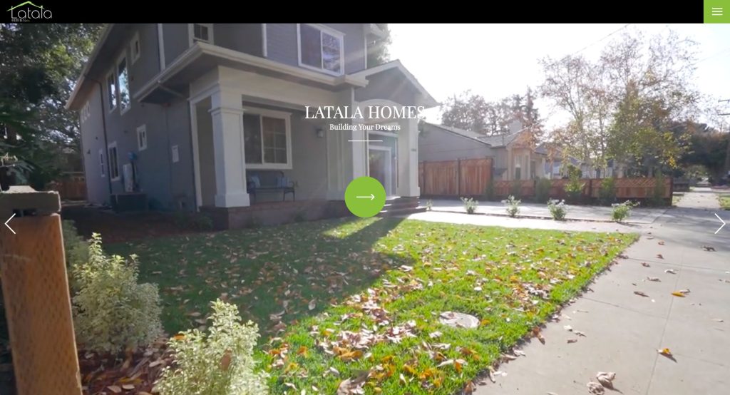
3. Latala Homes
Why We Chose Latala Homes
The website for Latala Homes stands out as a premier benchmark for “Visual Portfolio Dominance and Structured Project Sequencing.” For custom home building and high-end remodeling clients, a digital platform must immediately establish design credibility through high-fidelity visuals while clarifying the operational scope of their building solutions. This platform masterfully answers these design expectations by placing its actual craftsmanship at the absolute center of a clean, structured home page layout.
Key Design Highlights:
- High-Impact Visual Portfolio Showpiece: A major structural asset of the home page is the prominent integration of their custom construction and design portfolio. Showcasing real-world building projects, architectural details, and finished interiors upfront provides immediate, undeniable proof of their craftsmanship, allowing prospective homeowners to assess their stylistic capabilities right from the start.
- Granular Building Services Blueprint: The home page features a dedicated, well-organized breakdown discussing their specific construction and design services. Outlining these capabilities directly on the main layout clarifies their operational scope, making it incredibly easy for visitors to determine if the team’s expertise matches their particular custom build, addition, or remodeling needs.
- Streamlined Administrative Anchor Footer: The global footer configuration acts as a clean, centralized communication hub by grouping their primary contact phone number directly alongside their active social media links. Placing these connection points permanently at the base of the page offers a predictable, low-friction anchor for users ready to dive into deeper visual research on social galleries or initiate a direct project consultation.
- Grassroots Community Validation Integration: Authentic client testimonials are woven smoothly into the home page framework to supply immediate real-world validation. Presenting these detailed accounts of reliable communication, timeline management, and structural execution anchors the builder’s professional marketing claims with trustworthy community confirmation.

4. KB Home
Why We Chose KB Home
The website for KB Home serves as a premier benchmark for “Real-Time Consumer Engagement and Kinetic Brand Storytelling.” In the competitive national homebuilding market, a digital platform must systematically reinforce consumer trust while delivering a smooth, modern browsing experience across all devices. This site masterfully achieves this by matching instant communication gateways with fluid layout transitions directly on the home page.
Key Design Highlights:
- Kinetic Scroll-Animated Typography: As users explore the home page, the layout utilizes crisp text animations that smoothly trigger during vertical scrolling. This dynamic typographic behavior captures visual attention, helps pace the delivery of key messaging, and makes information about communities and build qualities feel deeply engaging and modern.
- Instant Conversational Chat Integration: A standout functional asset of the user interface is the integration of a dedicated live chat widget. Providing this real-time communication pipeline gives browsing buyers an immediate, low-barrier channel to ask questions about community locations, base pricing, or floor plan availability without needing to wait on email responses or make a phone call.
- Streamlined Mobile Navigation Framework: The platform features a highly optimized, clean mobile user interface engineered specifically for smaller handheld displays. This responsive design pattern condenses extensive real estate search criteria and image galleries into uncluttered visual blocks, allowing on-the-go buyers to scan home models and tap key navigation menus with zero layout friction.
- Continuous TrustBuilder Reviews Slider: The home page layout prioritizes immediate social proof by embedding an interactive customer testimonial slider. Showcasing a steady rotation of verified, real-world buyer experiences regarding home craftsmanship, build trackers, and design studio support anchors the company’s national brand identity with transparent community confirmation.

5. Shea Homes
Why We Chose Shea Homes
The website for Shea Homes serves as a premier benchmark for “Lifestyle Segment Mapping and Interactive Nationwide Discovery.” As a major builder with an expansive geographical footprint, their digital presence must quickly steer users toward different housing types – from modern townhomes to master-planned resort communities – without overwhelming them. This site masterfully accomplishes this by matching an elegant lifestyle categorization hub with a highly responsive, visual mapping utility directly on the home page.
Key Design Highlights:
- Granular “Choices for Living” Segmentation: A major structural highlight of the home page is the dedicated “Choices for Living” section, which clearly defines and breaks down their various community and home styles. Organizing their vast portfolio into distinct visual pillars lets target buyer groups immediately identify options that match their unique lifestyle – whether that means traditional family homes or active adult neighborhoods.
- Interactive Nationwide Inventory Map: The platform integrates a dynamic nationwide map that visually showcases exactly where people can find communities. Bypassing rigid, multi-step search drop-downs, this immersive interactive element allows home shoppers to click directly on broad regions to see localized construction availability and starting home developments across the country.
- Instant Conversational Chat Integration: A standout functional asset of the user interface is the integration of a dedicated live chat widget. Providing this real-time communication pipeline gives browsing buyers an immediate, low-barrier channel to ask rapid questions about specific community build times, phase releases, or pricing without needing to wait on email responses.
- Continuous Grassroots Customer Reviews: The home page layout prioritizes immediate social proof by embedding customer reviews directly into the main page flow. Showcasing these authentic, real-world buyer narratives regarding structural design support and home quality anchors the company’s brand identity with transparent community confirmation.

6. Ivory Homes
Why We Chose Ivory Homes
The website for Ivory Homes serves as a premier benchmark for “Value-Proposition Positioning and Streamlined Consumer Engagement.” For individuals searching for a new home, a digital storefront must immediately separate its craftsmanship from competitors while maintaining an approachable, low-barrier pathway for questions. This platform masterfully answers those needs by pairing explicit corporate advantages with a highly responsive, friction-free communication matrix directly on the home page.
Key Design Highlights:
- Structured “Why Choose Ivory?” Value Showcase: A major strategic asset of the home page layout is the dedicated “Why Choose Ivory?” section. This clear visual block explicitly outlines the firm’s unique value propositions – such as market longevity, construction quality, and community scale – giving prospective homebuyers immediate, compelling arguments to choose them over competing home builders right from the start.
- Streamlined Intake Portal Integration: The layout incorporates a dedicated contact form positioned strategically just above the website’s footer. Embedding this accessible inquiry tool directly into the main page flow removes unnecessary communication barriers, giving high-intent home shoppers a quick, hassle-free pathway to submit information and coordinate an on-site model tour.
- Instant Conversational Chat Integration: A standout functional element of the user interface is the integration of a dedicated live chat widget. Providing this real-time communication pipeline gives browsing buyers an immediate, low-barrier channel to ask rapid questions about current lot availability, neighborhood pricing, or quick move-in homes without having to make a phone call.
- High-Contrast Brand and Logo Identity: The platform utilizes a standout logo and distinct brand styling that firmly establishes their presence at the highest point of the visual hierarchy. Maintaining this crisp, bold branding throughout the homepage anchors the builder’s regional authority, making the entire digital browsing experience feel cohesive, memorable, and professional.
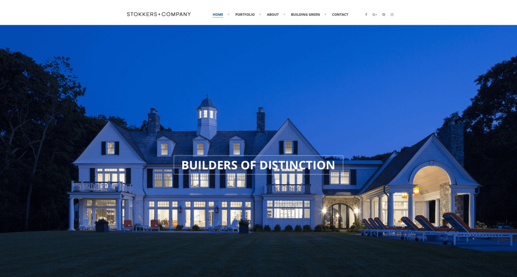
7. Stokkers & Company
Why We Chose Stokkers & Company
The website for Stokkers & Company serves as a premier benchmark for “Editorial Visual Dominance and Lifecycle Project Tiering.” In the ultra-luxury custom residential market, a digital storefront must rely on elite visual storytelling to justify its high-end craft. This platform masterfully achieves that by matching stunning, full-bleed imagery with a production-stage architectural layout that captures projects across their entire development lifecycle.
Key Design Highlights:
- Editorial and High-Fidelity Imagery Focus: A major visual anchor of the website is the utilization of gorgeous, high-resolution lifestyle images spanning across the homepage. Leading with these polished, magazine-quality project assets immediately signals a high tier of custom luxury, allowing discerning clients and architects to judge their precision and material scale from the moment they arrive.
- Lifecycle “Our Work” Portfolio Grid: Rather than showcasing only static, completed residences, the “Our Work” section utilizes a cohesive grid highlighting completed estates alongside active builds and high-end remodeling transformations. Categorizing portfolio assets by their completion stage gives prospective buyers absolute transparency into the firm’s active project timeline and massive operational capabilities.
- Omnichannel Social Connectivity Matrix: The interface architecture features permanent social media links positioned uniformly within both the global header and foundational footer elements. Duplicating these gateways at the bookends of the user journey provides an immediate, low-barrier pathway for researchers to jump off into continuous lifestyle updates, build documentation, and design inspiration on external channels.
- Uncluttered Mobile Interface Pattern: The platform features an incredibly clean mobile navigation framework engineered explicitly for smaller screens. This responsive layout structures high-resolution images and portfolio metadata into simple, stacked vertical blocks, allowing on-the-go users to comfortably explore custom estates without experiencing standard interface clutter.

8. JDG Constructions
Why We Chose JDG Constructions
The website for JDG Constructions serves as a premier benchmark for “Immersive Spatial Previews and Value-Driven Capability Mapping.” For custom home building and high-end residential construction clients, a digital platform must quickly substantiate its quality claims with tactile, visual proof. This site masterfully balances these expectations by matching a dynamic spatial video walkthrough with a transparent breakdown of their construction specialties directly on the home page.
Key Design Highlights:
- Immersive Video Walkthrough Showcase: A major experiential asset of the home page is the integration of a high-fidelity video showcasing a detailed walkthrough of a finished custom home. This cinematic look at a completed space allows prospective clients to immediately feel the physical flow, material textures, and building scale, mimicking an on-site walkthrough right from their screen.
- Structured “We Excel In…” Authority Hub: The home page layout features a dedicated “We Excel In…” section that explicitly details their core competencies and building philosophies. Defining these technical advantages directly on the front page acts as a strong competitive filter, giving property owners immediate, clear arguments to select this team for complex custom renovations or new builds.
- Lifecycle “Projects” Portfolio Matrix: The home page integrates a beautifully organized “Projects” section that highlights a curated selection of residential properties they have successfully built. This visual gallery serves as immediate, undeniable validation of their craftsmanship, letting users quickly review real-world architectural layouts and finish details to match against their own design aspirations.
- Thought Leadership and Blog Integration: The platform smoothly incorporates a feed of recent blog posts directly into the home page framework. Showcasing up-to-date commentary on design trends, building materials, and construction tips establishes their team as proactive industry experts who educate clients well before the breaking-ground phase begins.

9. The Farrell Companies
Why We Chose Farrell Companies
The website for Farrell Companies serves as a premier benchmark for “High-Impact Luxury Visuals and Fluid Multi-Device Interface Engineering.” In the high-end custom building and luxury real estate markets, a digital storefront must rely on elite visual storytelling to reflect its premium craftsmanship. This platform masterfully achieves that by matching cinematic, full-bleed media with a flawlessly executed navigation architecture that feels premium across both desktop and mobile layouts.
Key Design Highlights:
- Cinematic High-Fidelity Hero Loop: The website opens with a dynamic, high-quality video loop playing directly within the homepage hero framework. Leading with this polished, cinematic background video allows visitors to immediately experience the architectural scale, landscape integrations, and interior flows of their signature luxury estates from the exact moment they land on the site.
- Large, Impactful Structural Imagery: Throughout the homepage, the design relies heavily on expansive, full-bleed imagery that highlights their properties in crisp detail. Utilizing these bold visual blocks rather than standard text-dense sections lets the scale and fine finishes of their residential developments speak for themselves, signaling an uncompromising standard of custom luxury.
- Flawless Multi-Platform Menu Architecture: The menu framework is a standout design achievement, delivering beautiful aesthetics and effortless functionality across both desktop and mobile layouts. Transitioning smoothly from an expansive desktop configuration to an elegant, responsive mobile drawer, the menu system ensures that deep portfolio categories, team insights, and contact channels remain effortlessly accessible without ever cluttering the screen.
- Uncluttered and Agile Mobile Experience: The platform features an incredibly clean, responsive mobile layout engineered specifically for smaller handheld displays. This design pattern structures high-resolution media galleries and project overviews into highly legible vertical stacks, allowing on-the-go clients and investors to comfortably navigate the luxury portfolio with zero layout friction.

10. CCS Homes
Why We Chose CCS Homes
The website for CCS Homes serves as a premier benchmark for “Balanced Content Sequencing and Fluid Mobile Discovery.” For prospective custom home buyers, a digital storefront must project design credibility and trustworthiness without overwhelming the user with dense walls of text. This platform masterfully balances these priorities by anchoring its home page with high-fidelity project galleries and real-world buyer confirmation in a layout optimized for any screen size.
Key Design Highlights:
- High-Impact and Crisp Imagery Focus: Throughout the home page, the layout utilizes exceptionally high-quality images that showcase their residential projects in sharp detail. Leading with these premium, well-lit visual assets immediately establishes their building standards, allowing users to assess the firm’s architectural styling and craftsmanship the second they arrive.
- Tactile Base-Anchored Project Slider: Positioned strategically at the bottom of the home page directly above the footer is an interactive project image slider. Placing this fluid visual carousel at the end of the user journey serves as an excellent closing showcase, allowing high-intent visitors to smoothly swipe through completed home layouts right before hitting primary contact channels.
- Uncluttered and Agile Mobile Navigation: The platform features an incredibly clean mobile layout architecture engineered specifically for smaller handheld displays. This responsive design pattern ensures that dense image carousels, custom floor plan menus, and contact options scale down beautifully into tap-friendly vertical blocks, giving on-the-go researchers a friction-free browsing experience.
- Grassroots Community Validation Matrix: Authentic client testimonials are woven smoothly into the home page framework to supply immediate, real-world validation. Presenting these verified accounts of construction reliability, timeline management, and client care anchors the builder’s marketing claims with trustworthy community confirmation.

11. AR Homes
Why We Chose AR Homes
The website for AR Homes serves as a premier benchmark for “Premium Brand Transitions and Dynamic Visual Narrative Architecture.” In the luxury custom home building sector, a digital storefront must reflect an elite level of custom design and artistry. This platform masterfully accomplishes that by pairing fluid, artful layout shifts with an elegant desktop interface that makes browsing multi-million dollar estates feel deeply experiential.
Key Design Highlights:
- Elegant Minimalist Desktop Hamburger Menu: A major architectural asset of the desktop interface is a beautifully integrated hamburger menu. Rather than crowding the header with a traditional text-heavy menu bar, this clean, minimalist trigger collapses complex structural navigation – like regional builders, floor plans, and model homes – into a gorgeous full-screen overlay that keeps the main display feeling pristine and focused.
- Dynamic Backdrop Shifts and Visual Variety: As users explore the home page, the layout utilizes subtle, refreshing changes in background colors and textures to divide information blocks. This intentional design pacing breaks up standard grid layouts, guiding the viewer’s eye downward while maintaining high visual interest across every section.
- Elite High-Fidelity Project Carousel: The homepage features an interactive image slider dedicated exclusively to showcasing the luxury estates they have designed and built. Presenting these massive, high-contrast visual portfolios front and center allows high-end buyers to immediately appreciate their mastery of lighting, soaring structural scales, and premium materials.
- Low-Friction Base-Anchored Intake Portal: Positioned strategically toward the end of the homepage is a streamlined contact request form. Placing this accessible inquiry tool at the culmination of the visual experience gives high-intent buyers a direct, effortless pathway to connect with a builder, request an architectural lookbook, or schedule an elite model home tour right when their interest is highest.

12. Schumacher Homes
Why We Chose Schumacher Homes
The website for Schumacher Homes serves as a premier benchmark for “High-Intent Conversion Placement and Proactive Buyer Triage.” For custom home builders, a digital storefront must immediately inspire families with dynamic visual storytelling while removing all friction from the discovery process. This platform masterfully achieves that balance by combining clear call-to-action buttons with built-in educational resources right on the home page.
Key Design Highlights:
- High-Contrast Call-to-Action Header Integration: A standout functional asset of the website design is the placement of a bright, prominent “Schedule a Meeting” button built directly into the global header. By fixing this high-contrast call-to-action at the very top of the interface, the platform ensures that eager buyers can easily lock in an appointment at any point during their browsing experience, regardless of how far down the page they scroll.
- Cinematic Home Page Hero Narrative: The website opens with a high-fidelity video loop playing directly within the primary hero framework. Leading with this dynamic, lifestyle-focused background video allows prospective homeowners to immediately experience the spacious floor plans, architectural details, and interior craftsmanship of completed homes from the exact moment they land on the site.
- Proactive Client Inquiry Triage Hub: To address common building anxieties, construction timelines, and financing questions upfront, the home page features a dedicated frequently asked questions (FAQs) section. Providing direct, transparent answers right on the main layout helps clarify the custom building path, building immediate confidence for nervous buyers before they even reach out.
- Streamlined Home Page Intake Portal: The layout smoothly incorporates a direct contact form positioned strategically within the home page flow. Embedding this accessible inquiry tool directly into the main page framework eliminates the need to navigate to an external page, providing high-intent shoppers with a fast, low-barrier pathway to request community information or pricing brochures.
WordPress Home Builder Themes
You can find free themes at wordpress.org or explore home builder templates on ThemeForest.
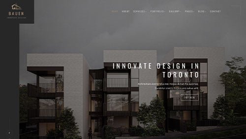
BAUEN – Themeforest
$59
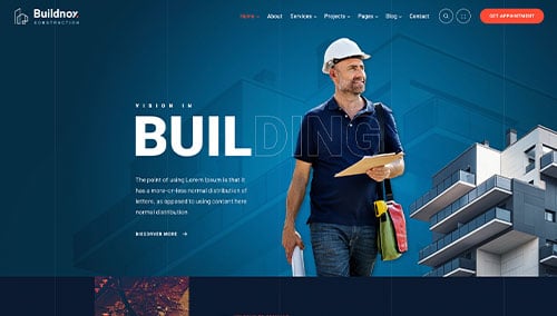
Buildnox – Themeforest
$49
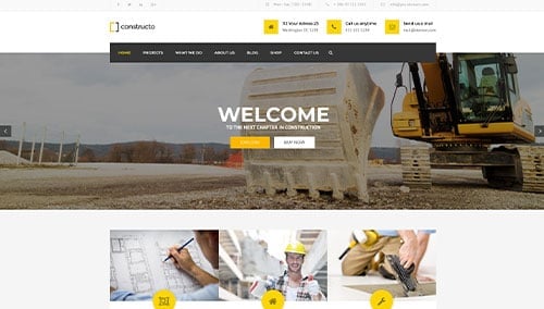
Constructo – Themeforest
$59
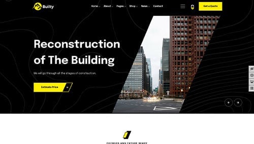
Builty – Themeforest
$49