For heating and cooling professionals, your website is your 24/7 digital dispatcher. It’s the place where homeowners in a crisis look for immediate solutions and where commercial clients look for long-term mechanical expertise. In a competitive local market, your design must communicate responsiveness, technical authority, and trust.
Our design team has evaluated hundreds of sites across the HVAC industry – from residential service contractors to industrial mechanical engineering firms. We looked beyond the visuals to find the sites that excel in mobile optimization, emergency call-to-action placement, and service area clarity.
Whether you focus on smart home energy efficiency or large-scale building automation, these 12 examples represent the highest standard for HVAC web design in 2026.
Note on Our Selection Process: We recently audited this list to remove outdated designs and sites that no longer meet our performance standards. This curated list now focuses on the top 12 HVAC websites providing the most strategic value in 2026.
Top Heating & Cooling Website Designs
1. Modern HVAC
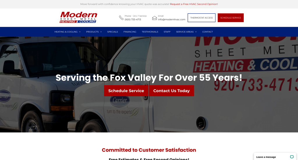
Why We Chose Modern HVAC
The Modern HVAC website is a prime example of a “frictionless” user experience, designed to convert visitors into customers as quickly as possible. By prioritizing ease of scheduling and financial accessibility, the site addresses the most common hurdles a homeowner faces when dealing with heating and cooling issues.
Key Design Highlights:
- Instant Service Conversion: The header features a high-contrast “Schedule Service” button that remains accessible from every page. This ensures that customers – especially those in emergency situations – can book an appointment without having to navigate through multiple sub-menus.
- Integrated Google Reputation: The homepage includes a dynamic reviews slider that pulls in real-time Google testimonials. By showcasing authentic customer feedback directly on the landing page, the company builds immediate trust and provides third-party validation of their service quality.
- Value-Oriented Comparison: The “Why Choose Us” section on the homepage effectively breaks down the company’s unique selling points. This clear list helps visitors understand the specific benefits of choosing Modern HVAC over a competitor, focusing on reliability and professional expertise.
- Proactive Financing Solutions: By prominently mentioning financing options on the homepage, the site helps alleviate the “sticker shock” often associated with major HVAC replacements. The “Learn More” button provides a low-pressure way for customers to explore payment plans, making a high-ticket purchase feel more attainable.
2. Synergy Home

Why We Chose Synergy Home
The Synergy Home website is built with a “Customer-First” philosophy, specifically designed to lower the barrier to entry for new clients. By combining generous introductory offers with clear geographic transparency, the site makes it incredibly easy for homeowners in their service area to feel confident in making that first call.
Key Design Highlights:
- Real-Time Reputation Management: The homepage features integrated Google reviews, providing live social proof that reflects their current standing with customers. This transparency allows the company’s high-quality service to speak for itself through the voices of local homeowners.
- Aggressive Value Propositions: By prominently offering financing and free diagnostics for new customers, the site removes the financial friction often associated with HVAC repairs. These offers are highly effective at converting hesitant visitors into active leads.
- Comprehensive Geographic Transparency: The site includes an integrated “Areas We Serve” map alongside a detailed city list. This visual and text-based combination ensures that visitors can instantly confirm if they are within the service radius, which helps qualify leads and improves local SEO.
- Thumb-Friendly Mobile UX: On mobile devices, the site features a prominent phone icon placed strategically in the header next to the navigation menu. This ensures that even when the “hamburger” menu is closed, the most important action – calling for service – is always just one tap away.
3. The Cooling Company

Why We Chose The Cooling Company
The Cooling Co. website is one of the most innovative in the HVAC space, utilizing “Interactive Utility” to engage visitors. By providing real-time data and self-service tools, the site moves beyond being just a digital brochure and becomes a functional resource that solves customer problems before a technician even arrives.
Key Design Highlights:
- Real-Time Availability Transparency: A unique overlay in the bottom corner of the site provides a live update on the next available appointment. This creates a sense of urgency while setting realistic expectations for the customer, significantly increasing the likelihood of a conversion from high-intent users.
- Self-Service Troubleshooting Tool: The hero area features an integrated AC troubleshooting widget that allows homeowners to diagnose issues instantly. This interactive element provides immediate value and positions the company as a helpful expert, rather than just a service provider.
- Gamified Lead Generation: The site includes a hidden “ladybug” easter egg that moves across the screen, revealing a special discount offer when clicked. This clever bit of gamification encourages users to interact with the page and provides a fun, memorable way to capture leads.
- Clear Service & Value Proposition: The homepage provides a highly organized outline of their services, paired with a dedicated “Why Us” section. By linking each service to a detailed interior page, the site ensures that users can easily find deep-dive information on specific HVAC solutions.
4. Residential Heating and Cooling

Why We Chose Residential Heating & Air Conditioning
This website excels at “Relationship Marketing,” focusing on the long-term bond between the company and its customers. By using a powerful narrative of loyalty and showcasing the friendly faces behind the service, the site shifts the focus from a one-time repair to a lifetime of reliable comfort.
Key Design Highlights:
- Real-Time Customer Support: The inclusion of a prominent live chat widget allows for immediate engagement with visitors. This tool is essential for answering quick questions and capturing leads in real-time, providing a level of accessibility that modern consumers expect.
- Compelling Long-Term Social Proof: The site features a unique video testimonial showcasing a customer named Diane. By contrasting her experience 10 years ago with her continued satisfaction today, the company provides extraordinary proof of their consistency and long-term commitment to quality.
- Approachable Brand Personality: The “Why Choose Us” section is paired with cute, professional photos of the staff, instantly humanizing the business. This approach builds a sense of familiarity and trust, making homeowners feel comfortable inviting these specific technicians into their homes.
- Omnipresent Conversion Points: The layout features convenient “Call” and “Schedule” buttons strategically placed in the header, throughout the homepage, and in the footer. This ensures that no matter where a user is on the page, the path to booking a service is always visible and friction-free.
5. Clear Air Conditioning & Heating
Why We Chose Clear Air Conditioning & Heating
The Clear Air website is a prime example of “Conversion-Ready Design,” particularly for the mobile-first consumer. By layering instant communication tools over a foundation of fresh, educational content, the site positions itself as a modern and highly responsive service provider in the competitive Arizona market.
Key Design Highlights:
- Immediate Multi-Channel Engagement: The site features an integrated live chat interface, offering an alternative for users who prefer text-based communication over a phone call. This proactive support tool ensures that even after-hours inquiries are captured, providing a seamless point of entry for tech-savvy homeowners.
- Streamlined Mobile Utility: The mobile header is a masterclass in utility, prominently featuring a phone link, a “Book Now” button, and an instant quote option. This “triage” of contact methods ensures that whether a user is in an emergency or just researching prices, the next step is always visible at the top of their screen.
- Dynamic Educational Authority: By showcasing an actively updated blog directly on the homepage, the company proves it is an industry leader that stays current with HVAC trends and maintenance tips. This commitment to content not only helps with SEO but also builds long-term trust by providing free value to the visitor.
- Verified Local Success: The homepage highlights authentic customer testimonials, serving as a constant reminder of their proven track record. This social proof is essential for converting “window shoppers” into confident customers by showing a consistent history of five-star service in the local community.
6. Boston Standard

Why We Chose Boston Standard Plumbing & Heating
The Boston Standard website balances playful branding with a high-transparency business model. By combining unique animations that reinforce their brand identity with upfront pricing and clear geographic targeting, the site manages to feel both incredibly professional and approachable to the average homeowner.
Key Design Highlights:
- Memorable Brand Animation: As you scroll through the homepage, a stylized service van drives across the screen. This clever bit of “scroll-telling” not only makes the browsing experience more engaging but also reinforces the company’s brand and physical presence in the minds of potential customers.
- Upfront Pricing Transparency: One of the site’s most effective trust-building features is the prominent display of transparent pricing directly on the homepage. By addressing the “how much will this cost” question immediately, they eliminate a major barrier to inquiry and position themselves as an honest, no-surprises service provider.
- Extensive Regional Coverage: The homepage includes a comprehensive list of service areas, leaving no doubt about their geographic reach. This detailed list is excellent for local SEO and ensures that residents across the greater Boston area can quickly verify that they are within the company’s footprint.
- Action-Oriented Mobile Header: The mobile interface is designed for high-speed conversion, featuring dedicated buttons for both phone calls and online scheduling right in the header. This dual-path approach caters to both the “I need someone now” emergency caller and the “I want to book later” planner, ensuring no lead is left behind.
7. Legacy AC

Why We Chose Legacy Heating & Cooling
Legacy AC succeeds by leaning into character-driven branding, which makes their company far more memorable than a generic HVAC contractor. By pairing a friendly mascot with high levels of transparency and direct access to their team, they create a brand identity that feels both established and highly approachable.
Key Design Highlights:
- Iconic Character Branding: The company utilizes a custom mascot named Leo, who is integrated consistently throughout the website and their service fleet. This “spokes-lion” helps build brand recall, making the company stick in the minds of homeowners long after they leave the site.
- Strategic FAQ Integration: By featuring a dedicated FAQ section on the homepage, the site proactively addresses common customer concerns regarding HVAC repairs and maintenance. This helps reduce “analysis paralysis” and positions the company as an educational resource and an authority in their field.
- High-Frictionless Conversion: The site places a prominent contact form directly below the hero area, allowing users to reach out immediately without having to scroll or navigate to a separate page. This placement is ideal for capturing high-intent leads who want to move quickly.
- Authentic Human Connection: Instead of using generic stock photography, the site features real pictures of their actual technicians. Showing the professional, uniformed team members who will actually be entering a client’s home builds a vital layer of safety and trust before the first appointment is even booked.
8. Reeis Air Conditioning

Why We Chose REEIS Air Conditioning
The REEIS website is a masterclass in visual consistency and authority building. By aligning their digital presence perfectly with their real-world fleet and professional accolades, they create a “larger-than-life” brand image that feels incredibly stable and trustworthy for Arizona homeowners.
Key Design Highlights:
- Cohesive Brand Identity: The site makes excellent use of its distinctive blue and pink color palette, carrying these colors from the logo through to the website accents and even the vehicle wraps. This consistency ensures that the brand is instantly recognizable, whether a customer sees them online or passing by on the street.
- Tangible Professionalism: By utilizing authentic images of their technicians and service vehicles, REEIS removes the anonymity often found in the trades. Seeing the actual team and the clean, branded trucks builds a sense of security and proves they are a legitimate, well-equipped operation.
- High-Level Authority Signals: The homepage prominently displays a wide array of accolades and industry awards. This “trophy case” approach serves as immediate proof of their expertise, making it clear that they are recognized by third-party organizations for their high standards and technical skill.
- Social Proof Integration: The site features prominently showcased customer testimonials, providing the final layer of trust needed to convert a visitor. By letting satisfied clients do the talking, REEIS reinforces its reputation for quality service and customer care right on the front page.
9. PV Heating & Air

Why We Chose PV Heating, Cooling & Plumbing
PV Heating, Cooling & Plumbing has created a website that masterfully balances personal accessibility with corporate professionalism. By putting the owners and technicians at the forefront, they strip away the “faceless corporation” feel and replace it with a culture of accountability and high-level expertise.
Key Design Highlights:
- High-Conversion Hero Suite: The hero area is a masterclass in efficiency, combining a friendly staff photo with a “Trust Stack” that includes third-party ratings, a prominent phone number, and a “Book Now” CTA. This ensures that every essential piece of information a customer needs is visible within seconds of the page loading.
- Behind-the-Scenes Transparency: Immediately below the fold, the site features a high-quality video of their team in action. By showing technicians performing actual HVAC work, they demystify the service process and provide visual proof of their professionalism and attention to detail.
- Distinctive Geometric Branding: The site utilizes a unique, consistent design language where images feature a “notched” or angled-corner aesthetic. This subtle architectural detail creates a cohesive, modern look that differentiates their visual content from the standard rectangular grids used by competitors.
- Founder-Led Trust Building: A standout feature on the homepage is the interactive “Meet the Owners” section, where visitors can click to view the specific qualifications and backgrounds of the leadership team. This level of transparency humanizes the brand and assures clients that the company is run by hands-on experts who are personally invested in the quality of the work.
10. Preferred Home Services

Why We Chose Preferred Home Services
The Preferred Home Services website is a powerhouse of multi-location conversion and brand consistency. By utilizing a high-energy color palette and integrating real-time scheduling tools directly into the primary viewing area, they have created a digital experience that feels both incredibly urgent and highly professional.
Key Design Highlights:
- Integrated Hero Booking Suite: The “above-the-fold” area is designed for maximum efficiency, featuring a direct booking calendar and location-specific phone numbers alongside verified Google ratings. This allows customers to move from “searching” to “scheduled” without ever leaving the hero section, drastically reducing the steps to conversion.
- High-Vibrancy Brand Identity: The site makes excellent use of a high-contrast blue and lime green color scheme, which is applied consistently through custom iconography and UI elements. This bold aesthetic is memorable and helps the company stand out in a sea of traditional, muted blue and red HVAC websites.
- Authentic “On-the-Job” Imagery: Instead of polished studio shots, the site features real photos of technicians working on-site. Seeing the staff in their actual work environments provides a transparent look at the company’s day-to-day operations and reinforces their reputation as a hardworking, local service provider.
- Incentivized Conversion Offers: The homepage prominently displays exclusive discount banners and service offers. By placing these financial incentives directly in the path of the user, the site provides an immediate “reason to call,” helping to capture price-sensitive leads and reward new visitors for their interest.
11. Bardi

Why We Chose Bardi Heating, Cooling & Plumbing
The Bardi website is a fantastic example of high-density, low-clutter design. By using interactive elements like scrollers and maps, they manage to pack a massive amount of service information and geographic data into a clean, modern interface that never feels overwhelming to the visitor.
Key Design Highlights:
- Mobile-First Accessibility: The mobile version of the site features a streamlined header with “Call” and “Book Now” buttons positioned directly next to the logo. This ensures that the two most important user actions are always thumb-accessible, allowing for instant conversion even on smaller screens.
- Compact Service Navigation: Rather than listing every service in a static block of text, the site uses a sleek horizontal service scroller. This allows the user to browse through their diverse offerings – from plumbing to HVAC – in an engaging, interactive way that preserves the homepage’s clean aesthetic and “white space.”
- Prominent Reputation Stack: The homepage features customer reviews prominently, ensuring that social proof is central to the user experience. By placing these testimonials in high-traffic areas of the page, Bardi reinforces its 5-star reputation at every stage of the scrolling journey.
- Detailed Geographic Mapping: The site includes a professional service area map paired with a comprehensive city list. This dual-visual approach is perfect for both user experience (allowing homeowners to “see” if they are in the zone) and local SEO (ensuring search engines can index every specific municipality they serve).
12. Arizona Comfort Specialists

Why We Chose Arizona Comfort Specialists
Arizona Comfort Specialists utilizes a vibrant, high-contrast visual identity to cut through the noise of a crowded market. Their website excels at “Utility-First Navigation,” ensuring that the most important financial and contact tools are never more than a click away, regardless of where the user is on the page.
Key Design Highlights:
- Distinctive Brand Palette: The site features a unique and memorable color scheme that departs from the standard “red and blue” HVAC tropes. By pairing their creative logo with these bold brand colors consistently across the layout, they build strong brand recall and a professional, modern image.
- Integrated Social Validation: The homepage features seamlessly integrated Google reviews, providing live proof of their service quality. This transparency is key for local service providers, as it allows potential customers to see real-time feedback from their neighbors in the Arizona area.
- Modular Service Navigation: The use of clean, icon-driven service tiles makes it incredibly easy for visitors to identify the specific help they need. These tiles act as clear “entry points” to deeper service pages, organizing complex information into a digestible, user-friendly grid.
- High-Utility Action Bar: The “top bar” of the website is packed with value, containing direct links to call, view current specials, and explore financing options. By placing these three high-priority items in the most visible area of the site, they cater to the “bottom of the funnel” user who is ready to book or needs to solve a budget concern immediately.
WordPress HVAC Themes
You can find free themes at wordpress.org or consider HVAC-inspired templates at ThemeForest.
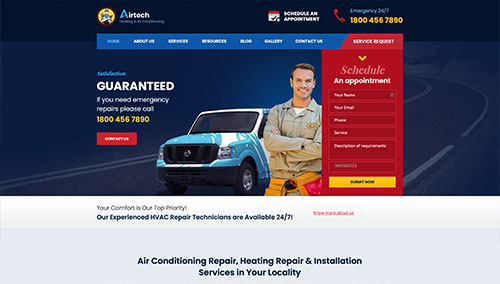
Airtech – Themeforest
$59
HeaCool – Themeforest
$59
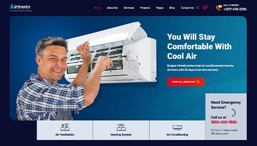
Airtronix – Themeforest
$49
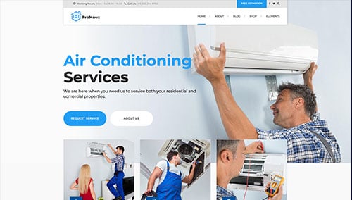
ProHauz – Themeforest
$69