In the era of “information overload” in 2026, an information website is far more than a digital library – it is a critical filter for clarity and authoritative knowledge. For news organizations, digital publishers, and educational portals, an online presence must achieve a masterful balance: organizing vast amounts of complex data while offering a frictionless, high-speed discovery experience. To thrive in today’s attention economy, your design must move beyond cluttered layouts to embrace “Semantic Architecture,” using intuitive content hierarchies and AI-assisted search tools to deliver the exact right answer to the user in seconds.
Our team evaluated hundreds of informational platforms – ranging from global news hubs and specialized research wikis to interactive digital magazines and community-driven knowledge bases. We narrowed the field to the top 12 examples that represent the gold standard for the sector. Our analysis focused specifically on readability-first typography, scroll-triggered data visualizations, and the strategic use of cross-functional internal linking that reduces bounce rates by guiding the user deeper into the topic through logical, “breadcrumbed” pathways.
Whether you are a digital publisher looking to increase session duration or a non-profit organization building a global resource hub, these examples provide the definitive benchmark for information web design in 2026.
Note on Our Selection Process: We recently reviewed this list to ensure every featured site demonstrates a clear commitment to modern standards for mobile-first readability, ultra-fast page load velocity, and intuitive information architecture. This curated collection focuses on information websites that prioritize content accessibility and intellectual authority, providing the most strategic value to both the publisher and the knowledge seeker in 2026.
Top News & Information Website Designs
1. Wired
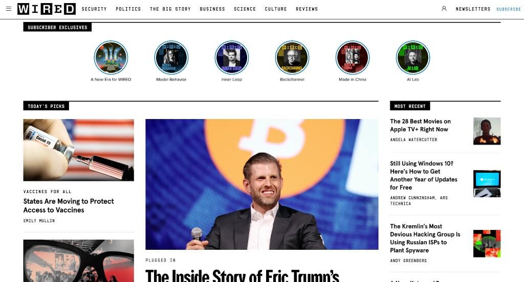
White space is carefully balanced in every area of Wired, which is something that all companies should effectively do. This logo grabs attention and gets people interested about learning about a topic. Adding in small tabs to show topics and subtopics was another feature that anyone could enjoy. A search bar was also included in order for viewers to find what they are looking to read about.
2. Time
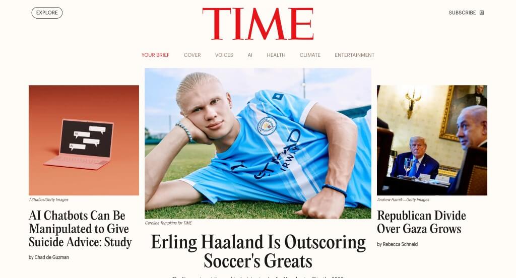
There was lots of great ways to grab attention within Time. We also thought it was a cool feature to have “Milestones” interviews with well-known individuals. They carefully mix articles and videos to create something that many people can enjoy. Time also utilized a layout that has a good balance of white space, which is always nice.
3. BBC
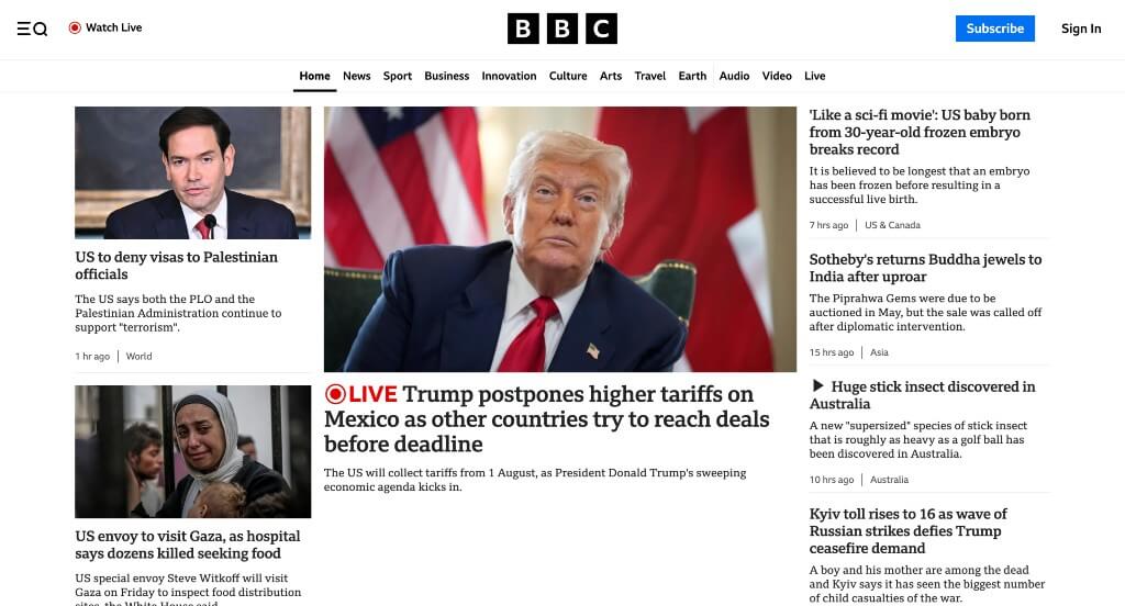
Right away, customers can notice how this navigation bar has lots of buttons, making it easy to find information that they’re interested in. An audio section was also very nice to include because not all news companies include this. High-quality images is something that’s essential for this type of business. Many people also might notice how they can gain quality information either as articles, videos, audio, or live.
4. The Intercept
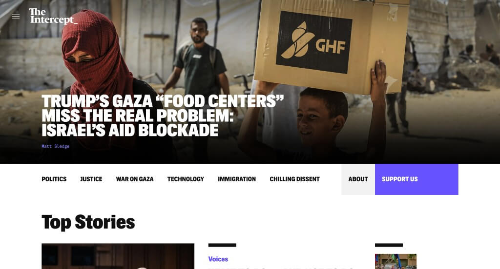
Bold fonts grabbed our attention right away, which was amazing because people are wanting to read information almost instantly. Letting text change color upon hover if it leads to an article or another page was a smart choice. We felt that their use of a few different fonts paired carefully together was a cool thing to see. This example also used dark backgrounds, which seems to look more mysterious and different.
5. Vanity Fair
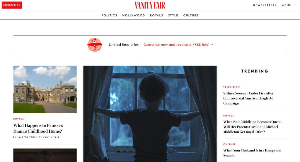
We really loved the use of large images in multiple areas to grab attention. Their red accents can be used to highlight certain areas and of course point out where more content is located (through buttons and links). Lots of information is always included about current award ceremonies or galas and the aftermath of them. Vanity Fair was thinking about brand recognition when finding a domain that matches their company name.
6. The New Yorker
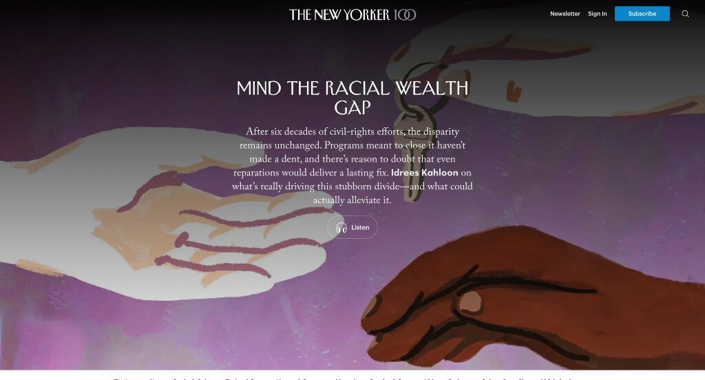
One of our favorite parts about this one was their feature “The Ledge”, that informs viewers with what they need to know on a day-to-day basis. Adding in a few creative graphics was a nice touch too. Including games, quizzes and contests was another aspect that we very much enjoyed. Offering podcasts and a shop was unique, but we still loved it.
7. Bloomberg
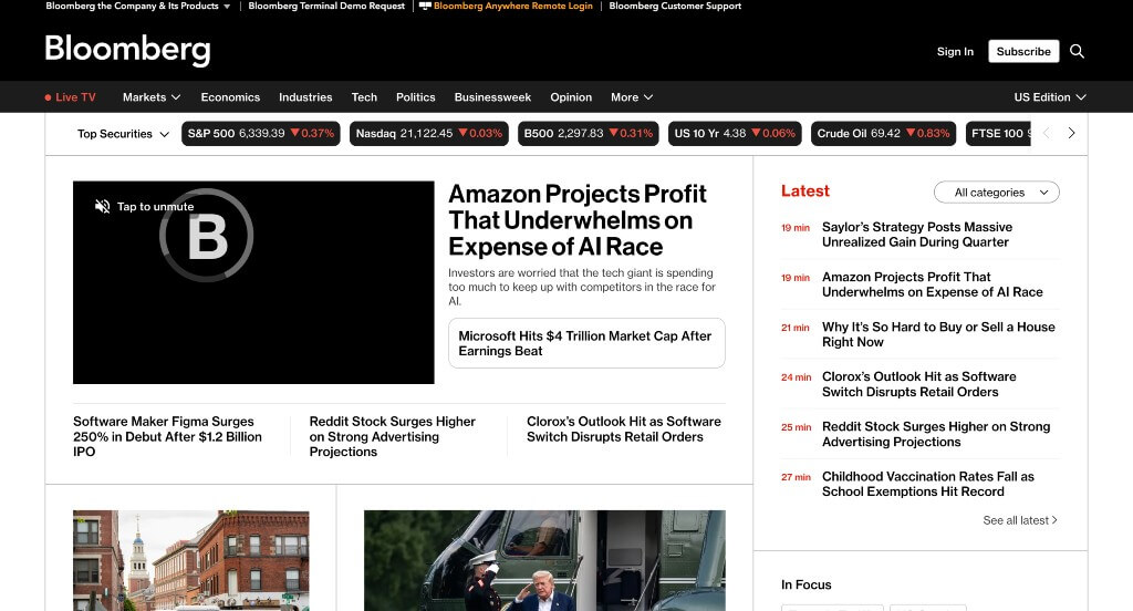
After scrolling for a little bit, you’ll notice their variety of content. Another thoughtful feature was their distinctive categories for each article. Bloomberg clearly had visual hierarchy in mind when choosing large fonts for titles. We also thought it was nice how this company used a balance of images and videos.
8. TechCrunch
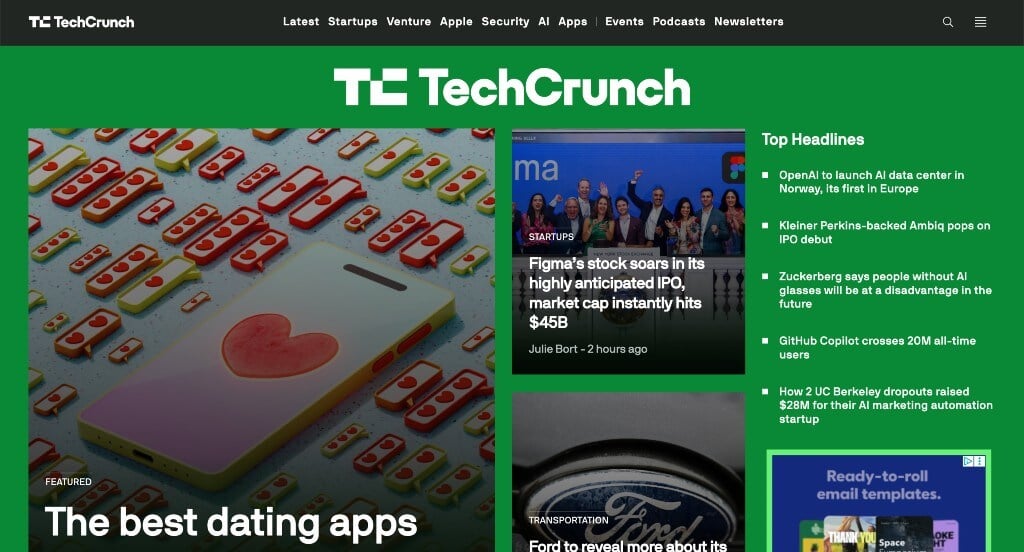
One of the first things we noticed was their creative logo that appears in a variety of areas throughout their site. Using bullet points in a bunch of places to help keep things organized was smart. We liked their small bursts of green and yellow accents. TechCrunch also picked a domain that matched their company name.
9. New York Magazine
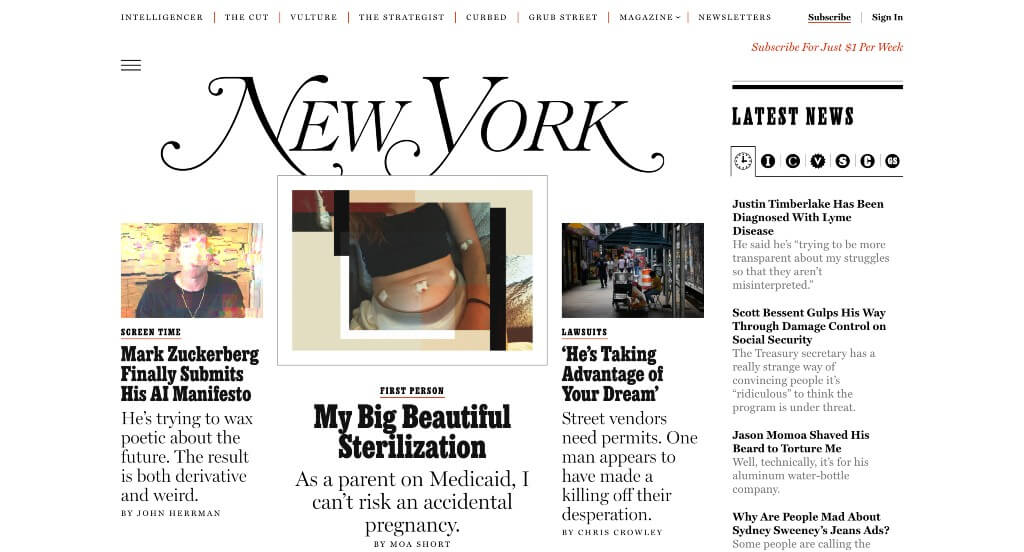
This company has lots of interesting title names, making people excited to read recent news. Because they are trying to make money, you will run into lots of paywalls, however, they clearly label their pricing. We really enjoyed their use of different fonts that creates a look that we all can enjoy.
10. Think Global Health
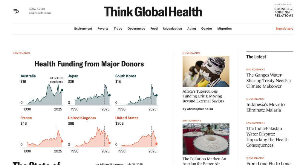
The accents of bright red was something that we loved about Think Global Health. Including statistics in this example was refreshing. Lots of high quality images are used to elevate this example to another level. A search bar was also added in, which we thought was a nice touch.
11. Billboard

This example made sure to place a variety of image sizes within it which was nice especially because it attracts readers to certain areas. Including the Billboard Hot 100 is something that we loved, because it’s what they are known for. The variation of media was an amazing choice for them. Their content also branched off into important subtopic of their desired focus.
12. Good Good Good
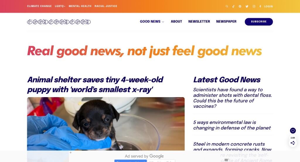
This example used lots of bright colors which helped it stand out more against their competitors. Making use of italics for some of their fonts was another smart choice that helps their information with links easier to find. Using little tabs to show what type of information is featured in certain articles was a great way to help organize everything.
WordPress News Themes
Browse free themes at wordpress.org or explore news-inspired templates at ThemeForest.
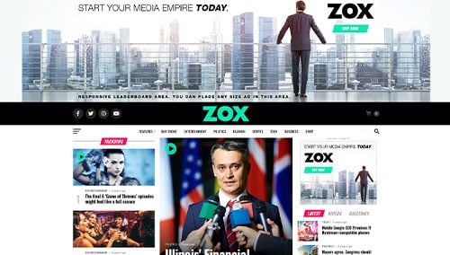
Zox News – Themeforest
$55
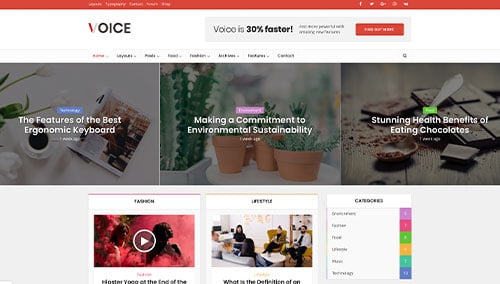
Voice – Themeforest
$69
SmartMag – Themeforest
$59
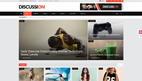
Discussion – Themeforest
$79