In the world of interior design, your website is your digital portfolio – a curated space where your aesthetic vision must be felt before a single word is read. Because your work is rooted in balance, texture, and atmosphere, your online presence must do more than just display photos; it must evoke an emotional response and demonstrate your mastery of form and function. To attract high-value commissions, your design must radiate sophistication, creative authority, and an uncompromising eye for detail.
Our design team evaluated hundreds of interior design websites – from boutique residential studios and kitchen & bath specialists to large-scale commercial and sustainable design firms. We identified the top 10 examples that masterfully balance minimalist UI with immersive visual storytelling, specifically analyzing their project gallery transitions, typography elegance, and the seamless integration of high-resolution professional photography.
Whether you are a solo designer building a signature brand or a multi-disciplinary firm, these examples represent the benchmark for interior design excellence in 2026.
Note on Our Selection Process: We recently audited this guide to remove outdated designs and sites that no longer meet our performance standards.
Top Interior Decorator Website Designs
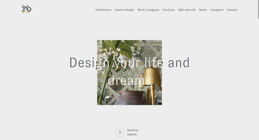
1. Jean-Louis Deniot
Why We Chose Jean-Louis Deniot
The website for d&b en-space serves as a premier benchmark for “Immersive Spatial Audio Merchandising and Experiential Digital Architecture.” As a world-class authority in professional audio technology and acoustic room emulation, their digital platform must translate the invisible, emotional power of sound into a compelling visual and narrative journey. This platform masterfully succeeds by treating its homepage as an interactive showcase, coupling premium media assets with advanced narrative techniques that perform beautifully across both desktop and mobile devices.
Key Design Highlights:
- Immersive Scroll-Driven Narrative (Scrollytelling): The website completely moves away from traditional, static web design by utilizing an elegant scrollytelling framework. As users scroll through the homepage, content blocks, smooth transitions, and interface layers unfold dynamically. This interactive journey mirrors the fluid, enveloping nature of spatial audio technology itself, guiding the visitor through a carefully curated story of acoustic engineering.
- Impactful, Ultra-High-Fidelity Visual Imagery: Because acoustic technology cannot be heard directly through a web browser, the platform leverages stunning, high-resolution imagery to visually communicate sound quality. The homepage features striking photographs of world-class concert halls, opera houses, and live performance spaces, creating an immediate emotional impact and connecting the brand with peak artistic performance.
- Global Footprint and International City Showcase: Establishing immense institutional credibility, the homepage proudly maps out the world-renowned reach of their installations. By explicitly listing major international cultural capitals and cities where their audio systems are deployed, the platform provides definitive global validation, proving that the world’s most prestigious acoustic venues trust their engineering.
- Ultra-Clean Mobile Viewport and Seamless Interaction: Translating an experiential, scroll-heavy animation system onto smaller screens is flawlessly managed via an expertly optimized mobile framework. The smartphone interface simplifies the complex, desktop-driven scrollytelling path into a beautifully responsive, single-column scroll. Maintaining generous whitespace, crisp typography, and touch-optimized touch targets ensures that designers, architects, and AV engineers can comfortably evaluate their global work while on the move.
2. Giorgi Girl Design
Why We Chose Giorgi Girl
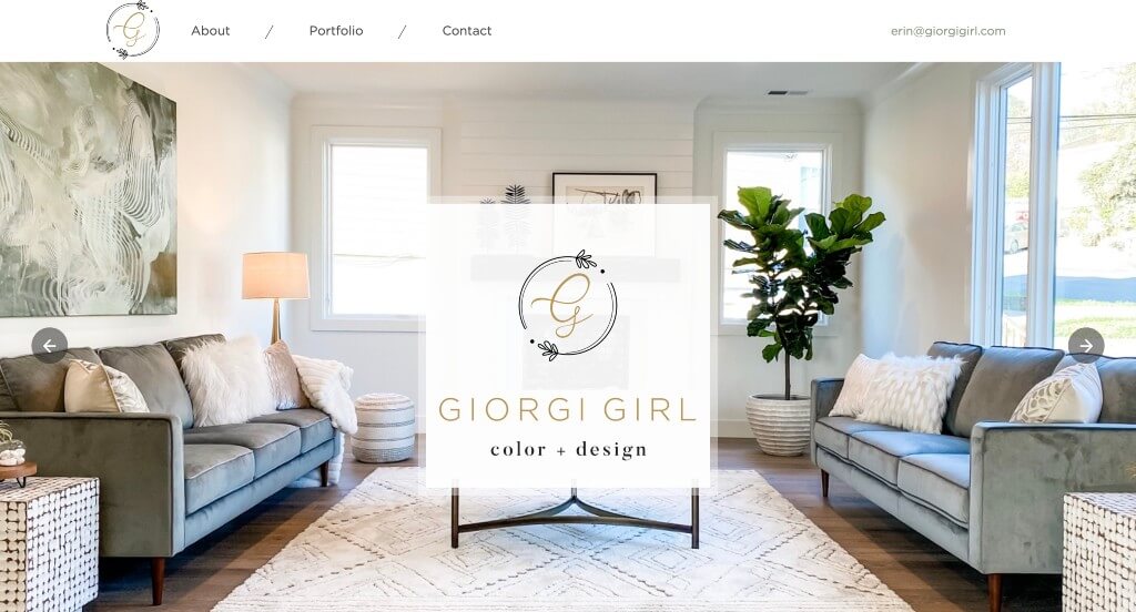
The website for Giorgi Girl serves as a premier benchmark for “Immersive Luxury Interior Design Merchandising and High-Trust Visual Architecture.” As an elite boutique interior design studio, the digital storefront must immediately convey a sophisticated aesthetic, meticulous attention to detail, and a flawless sense of space and scale. This platform masterfully succeeds by treating its homepage as a high-fidelity visual gallery, seamlessly combining rich portfolio media with interactive elements that give prospective clients absolute confidence in her artistic execution.
Key Design Highlights:
- Gorgeous, Editorial Portfolio Imagery: The platform instantly commands authority by packing the homepage with stunning, full-bleed photography of real interior projects. By showcasing carefully styled living spaces, bespoke furniture arrangements, and high-end finishes, the website lets the design work speak for itself, creating an immediate emotional and aspirational connection with luxury homeowners.
- Interactive Before-and-After Transformation Slider: A major tactical and engagement triumph of the homepage layout is the integration of a fluid, interactive image slider. This component allows users to manually swipe between “before” and “after” views of a renovated space, providing dramatic, undeniable proof of her ability to conceptually reimagine and elevate complex residential interiors.
- Comprehensive Front-Page Services Blueprint: The website completely eliminates project ambiguity by explicitly detailing her core design tracks and capabilities directly within the primary homepage scroll path. Clearly explaining her design services ensures that visitors – whether looking for full-scale custom builds, comprehensive room renovations, or precision spatial staging – can instantly map their project needs to her specific studio offerings.
- Front-Page Client Testimonials and Social Proof: Overcoming the natural hesitation that comes with high-end, high-investment design services is gracefully achieved by embedding direct client testimonials directly into the homepage layout. Displaying glowing endorsements from past homeowners provides immediate relational trust, assuring prospective clients that her execution is as professional and collaborative as her aesthetics are beautiful.
3. Karim Rashid
Why We Chose Karim Rashid
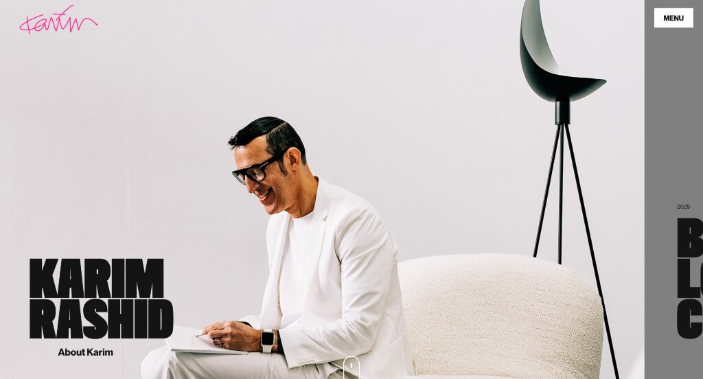
The website for Karim Rashid serves as a premier benchmark for “Immersive Avant-Garde Portfolio Architecture and Digital Design Merchandising.” As one of the world’s most prolific and recognizable industrial designers, his digital storefront must reflect his signature “sensual minimalism” while managing a vast, multi-disciplinary catalog. This platform masterfully succeeds by prioritizing bold visual dominance, interactive project categorization, and sleek, minimalist navigation frameworks that deliver a flawless, high-impact experience across both desktop and mobile viewports.
Key Design Highlights:
- Cinematic Multi-Project Hero Carousel: Capturing the absolute peak of visitor attention the exact split second the page loads, the layout utilizes a fluid, full-screen image slider within the primary hero real estate. By continuously cycling through vibrant, high-fidelity photographs of his most iconic recent breakthroughs, the interface sets a commanding, world-class artistic tone and immediately hooks potential global partners.
- Interactive Project Taxonomy Matrix with Hover Mechanics: The website avoids a cluttered gallery layout by organizing an incredibly diverse portfolio – spanning Products, Hotels, Interiors, Furniture, and Lighting – into a clean, block-based directory. Amplified by elegant hover animations that reveal depth and title text when interacted with, this framework lets users discover his design footprint through an engaging, tactile browsing experience.
- Sleek Desktop Hamburger Menu and Integrated Social Ecosystem: Breaking away from traditional, rigid desktop header layouts, the site embraces a minimal hamburger menu layout for its primary global navigation. This design choice frees up massive amounts of screen real estate for portfolio imagery, expanding smoothly upon click to reveal a highly organized site directory paired with directly integrated social media channels for seamless community cross-pollination.
- Ultra-Clean Mobile Viewport and Gestural Continuity: Translating a fluid, visually intense portfolio onto smaller screens is flawlessly managed via an expertly optimized mobile framework. The smartphone interface handles dense visual grids by condensing them into single-column, high-readability scrolls that retain his distinct pop-culture aesthetic. Large touch targets, minimal load lag, and intuitive gesture controls ensure that curators, manufacturers, and design enthusiasts can effortlessly evaluate his work on the go.
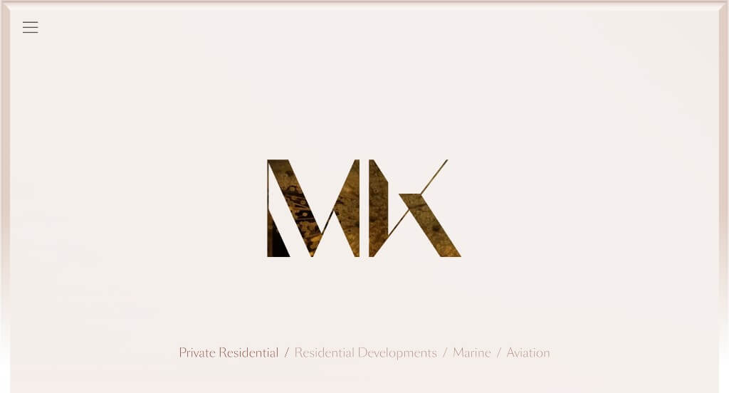
4. Martin Kemp Design
Why We Chose Martin Kemp Design
The website for Martin Kemp Design serves as a premier benchmark for “Ultra-Luxury Residential Architecture and High-End Bespoke Merchandising.” As a world-class studio creating exceptional interiors, architecture, and custom products for a discerning global clientele, their digital storefront must instantly convey exclusivity, uncompromising detail, and artistic authority. This platform masterfully succeeds by treating its homepage as a curated, high-fidelity gallery that balances striking visual proof with the core values of heritage and elite editorial validation.
Key Design Highlights:
- Immersive, High-Fidelity Visual Showrooms: The platform immediately commands luxury positioning by dominating the homepage with large, stunning, ultra-high-quality imagery. By showcasing sweeping views of opulent residences, refined material textures, and perfectly balanced spaces, the design allows the portfolio to speak for itself, creating an immediate aspirational connection with high-net-worth clients.
- Front-Page “Latest Projects” Curation: Rather than hiding their current portfolio behind deep navigational layers, the homepage features a dedicated showcase for their most recent architectural and design triumphs. This layout strategy ensures that returning clients, developers, and partners are immediately greeted with the studio’s contemporary creative direction and evolving design footprint.
- Dedicated “Craftsmanship” Philosophy Segment: A major narrative triumph of the homepage is the integration of a section explicitly celebrating their dedication to the artisan process. By highlighting the pride, precision, and bespoke materiality that go into every custom creation, the interface transforms abstract design concepts into a tangible testament to enduring quality and master-level execution.
- Prestigious “Press” and Editorial Triage: Overcoming skepticism in the high-stakes luxury market is gracefully achieved through a dedicated media and press module right on the front page. Showcasing features and mentions from elite international design publications establishes immediate institutional credibility, validating the studio’s standing at the absolute pinnacle of global interior architecture.
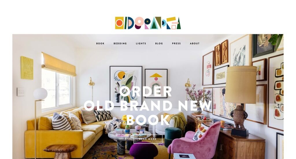
5. Old Brand New
Why We Chose Old Brand New
The website for Old Brand New serves as a premier benchmark for “Maximalist Visual Merchandising and High-Energy Creative Studio Architecture.” As the digital home of celebrated designer, photographer, and author Dabito, the storefront must instantly convey a signature style rooted in bold color theory, rich textures, and a seamless blend of vintage and modern design elements. This platform masterfully succeeds by treating its layout as a dynamic, high-contrast canvas that allows vibrant visual assets and interactive micro-animations to serve as the primary brand ambassadors across both desktop and mobile form factors.
Key Design Highlights:
- Vibrant, Color-Forward Portfolio Imagery: The platform instantly commands attention by dominating the layout with stunning, ultra-saturated photography of interior spaces, textiles, and art curation. By showcasing rooms packed with bold color blocking, plant-filled corners, and eclectic design pairings, the website allows the design work to completely define the user experience, creating an immediate emotional and inspiring connection with visitors.
- Playful Animated Logo Integration: Injecting a sense of personality and creative motion right at the absolute peak of the site architecture, the primary brand logo features a subtle, custom animation. This kinetic detail acts as an instant visual hook, reflecting the studio’s artistic ingenuity and setting a whimsical, modern tone the moment the site initializes.
- Interactive Front-Page Project Showcase: The website avoids the trap of feeling cluttered by gracefully organizing a wide variety of creative projects – spanning interior design, art direction, photography, and lifestyle branding – into a clean, cohesive layout. Each featured project card provides seamless click-through opportunities, allowing potential clients, brands, and design enthusiasts to dive deeper into specific design narratives and case studies.
- Ultra-Clean Mobile Viewport and Gestural Continuity: Translating a highly rich, visually intense layout onto smaller screens is flawlessly managed via an expertly optimized mobile framework. The smartphone experience condenses complex grids into a single-column, fluid scroll path. Large touch targets, swift image loading, and intuitive navigation ensure that users can effortlessly gather design inspiration or review the studio’s portfolio on the go.
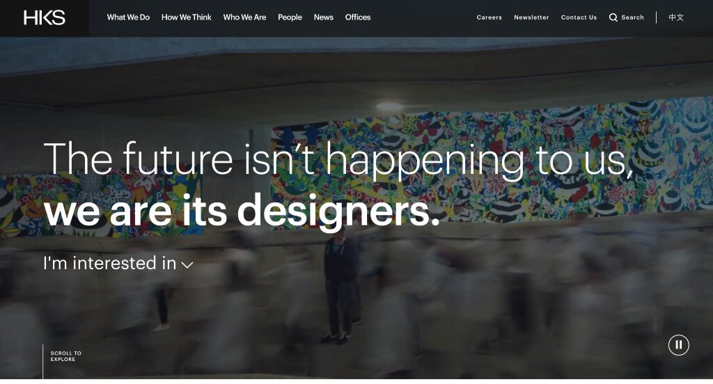
6. HKS Inc
Why We Chose HKS Architects
The website for HKS (hksinc.com) serves as a premier benchmark for “Immersive Global Architecture Merchandising and High-Intent B2B Conversion Infrastructure.” As one of the world’s most influential architectural and design firms – responsible for iconic stadiums, luxury hotels, and massive medical centers – their digital storefront must translate colossal, multi-billion-dollar design capabilities into structured, client-focused pathways. This platform masterfully succeeds by treating its homepage as a dynamic global showroom, pairing an elegant interactive project taxonomy with streamlined navigation that performs flawlessly across both desktop and mobile viewports.
Key Design Highlights:
- Immediate High-Conversion Hero Action Portal: Capitalizing on top-tier screen real estate the exact split second the layout initializes, the interface embeds a streamlined call-to-action dropdown selection menu directly within the primary hero area. This intuitive component allows prospective clients, partner developers, and talent candidates to self-select their specific intent – instantly funneling traffic toward targeted business lines, portfolio branches, or regional offices without forcing users through traditional deep-site searches.
- Global Architecture and Multi-Sector Project Showcase: The homepage completely eliminates corporate ambiguity by dominating the central scroll path with an expansive, highly visual compilation of their active and completed masterpieces worldwide. Spanning massive sports entertainment venues, cutting-edge healthcare campuses, and sustainable urban developments, this structural layout provides immediate proof of their international scale and multidisciplinary engineering dominance.
- Inspiring “Design Excellence” Philosophical Catalyst: A major narrative triumph of the homepage architecture is the dedicated segment titled “Design Excellence.” Rather than relying solely on technical project logs, this section leverages high-impact editorial storytelling and media to actively engage visitors in their creative philosophy. By detailing how the firm blends research, human-centric design, and sustainable innovation, the interface successfully converts abstract architectural practices into an inspiring corporate vision.
- Ultra-Clean Mobile Viewport and Seamless Interaction: Translating a massive, visually heavy global enterprise framework onto smaller screens is flawlessly managed via an expertly optimized mobile layout. The smartphone interface simplifies the broad desktop layout into a beautifully responsive, single-column scroll path that keeps imagery razor-sharp and fluid. Generous whitespace, crisp typography, and touch-optimized interactive elements ensure that developers, city planners, and designers can effortlessly evaluate the firm’s global impact while on the move.
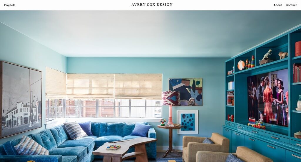
7. Avery Cox Design
Why We Chose Avery Cox Design
The website for Avery Cox Design serves as a premier benchmark for “Bespoke Colorist Interior Merchandising and High-Trust Editorial Portfolio Architecture.” As an elite interior design studio celebrated for its archival-inspired color palettes, historic patterns, and tailored eclectic spaces, the digital storefront must immediately project deep art-historical knowledge, high craftsmanship, and spatial clarity. This platform masterfully succeeds by treating its homepage as a curated, high-fidelity gallery that seamlessly balances artistic fearlessness with intuitive client validation across both desktop and mobile form factors.
Key Design Highlights:
- Immersive, Large-Scale Editorial Visual Showrooms: The platform immediately commands luxury market authority by dominating the homepage layout with large, stunning, ultra-high-quality imagery of completed design projects. By showcasing rooms defined by rich textures, layered textiles, and bold, custom-painted millwork, the website creates an immediate emotional and inspiring connection with prospective clients, letting her unique spatial storytelling take center stage.
- High-Visibility Global Announcement Bar: Capitalizing on the absolute peak of visual real estate, the interface utilizes a clean, minimal announcement bar running directly above the primary global header navigation. This dedicated banner acts as an essential communication channel, instantly alerting visitors to studio updates, new design features in major shelter publications, or regional updates without cluttering the main navigation menus.
- Front-Page Client Validation and Social Proof: Overcoming the natural hesitation that comes with high-end, deeply personal residential design services is gracefully achieved by embedding direct client testimonials directly into the homepage scroll path. Displaying direct praise from homeowners regarding her collaborative execution and precise spatial management establishes immediate operational credibility and trust.
- Ultra-Clean Mobile Viewport and Snackable Content Continuity: Translating a visually rich, color-saturated design universe onto smaller viewports is flawlessly managed via an expertly optimized mobile framework. The smartphone interface handles dense visual grids by condensing them into a fluid, single-column scroll path that keeps photography razor-sharp. Large touch targets, minimal load lag, and elegant typography ensure that prospective clients, brands, and design enthusiasts can effortlessly evaluate her work on the go.
8. Viterbo Interior Design
Why We Chose Viterbo Interior Design
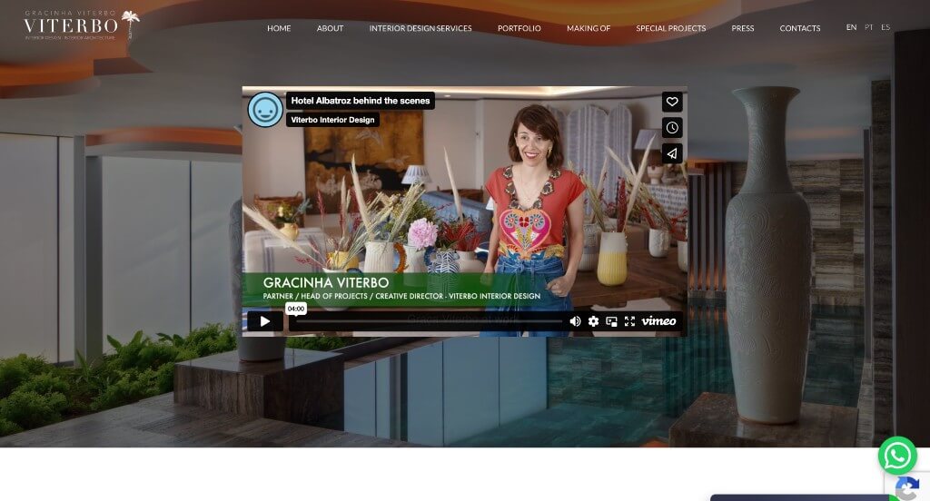
The website for Viterbo Interior Design serves as a premier benchmark for “Immersive Conceptual Merchandising and High-Trust Luxury Design Architecture.” As an international luxury interior design studio, their digital storefront must effortlessly bridge the gap between rigorous spatial architecture and the deeply personal, emotional journey of creating a home. This platform masterfully succeeds by treating its homepage as a sophisticated, interactive narrative canvas that couples playful visual framing with immediate customer engagement tools and authoritative institutional proof.
Key Design Highlights:
- Playful Polaroid-Driven “What We Do” Taxonomy: Breaking entirely away from the static grid layouts typical of corporate design firms, the homepage utilizes a highly unique visual framework to showcase its core services. Using a stylized arrangement of digital “Polaroid” photos to represent distinct project phases and capabilities, the interface adds a tactile, nostalgic, and deeply artistic layer to their portfolio, transforming service discovery into an engaging narrative experience.
- Instant Conversational Onboarding and Live Chat Integration: Recognizing that high-end design clientele value immediate, personalized communication, the platform features a highly responsive live chat interface positioned subtly within the viewport. This interactive touchpoint lowers onboarding friction, allowing luxury homeowners, commercial developers, and potential partners to instantly connect with a studio representative at any point during their inspiration journey.
- Prestigious “Awards and Recognitions” Trust Hub: Overcoming consumer hesitation in the high-investment luxury market is gracefully achieved through a dedicated institutional validation segment directly on the homepage. Spotlighting their major international industry awards, design accolades, and prominent media features establishes immediate global credibility, proving their standing at the absolute pinnacle of the interior design industry.
- Integrated Lifestyle Content and Community Cross-Pollination: Positioned smoothly within the lower homepage scroll path is a beautifully synchronized media matrix pairing their curated corporate blog with a live Instagram content feed. Weaving these real-time channels directly into the front page ensures the platform operates as a living editorial newsroom – continuously updating visitors with fresh design trends, behind-the-scenes studio breakthroughs, and lifestyle inspiration.
9. LLI Design
Why We Chose LLI Design
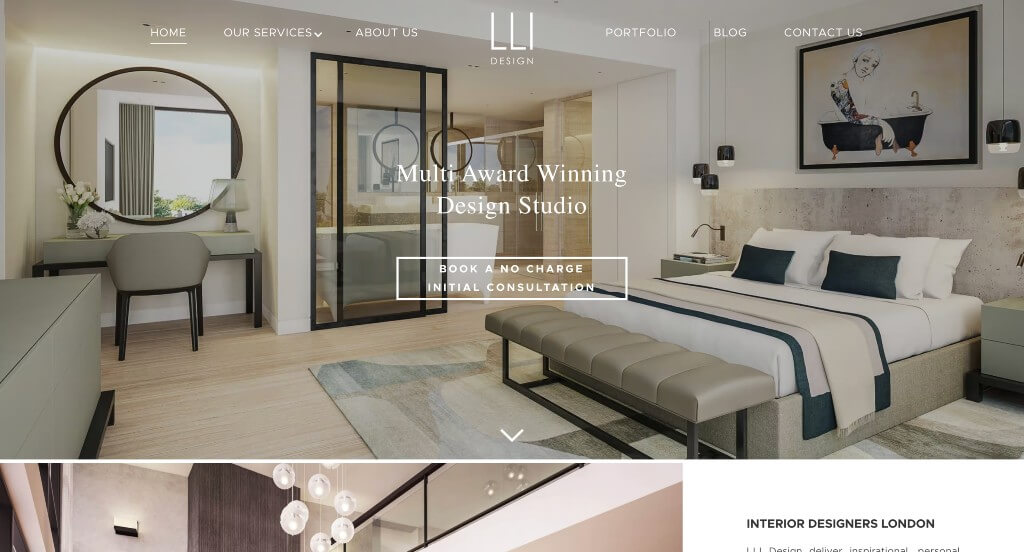
The website for LLI Design serves as a premier benchmark for “High-Trust Luxury Interior Merchandising and Frictionless Studio Onboarding Architecture.” As an award-winning interior design practice creating high-end residential spaces, their digital storefront must translate absolute spatial sophistication, meticulous craftsmanship, and high structural execution into a compelling visual narrative. This platform masterfully succeeds by treating its homepage as an elite, editorial showroom that balances bold artistic proof with a permanent, high-conversion consultation gateway.
Key Design Highlights:
- Persistent Frictionless Sticky Navigation and Action Portal: To maintain an effortless user journey as visitors process highly rich visual data, the interface features a beautifully engineered sticky header menu. As prospective clients scroll deep into the homepage content, a prominent, high-contrast “Book Now” call-to-action button pins cleanly to the top of the viewport, keeping this critical transactional entry point continuously accessible within the immediate viewing frame.
- Immersive, High-Fidelity Visual Showrooms: The platform immediately commands luxury positioning by dominating the homepage with large, stunning, ultra-high-quality imagery of completed design projects. By showcasing sweeping views of opulent rooms, custom finishes, and perfectly balanced lighting profiles, the design allows the portfolio to speak for itself, creating an immediate emotional and aspirational connection with discerning homeowners.
- Prestigious “Accolades” Institutional Validation: Overcoming consumer hesitation in the high-investment custom design market is gracefully achieved through a dedicated excellence hub directly on the homepage. Spotlighting their major national and international industry awards and design trophies establishes immediate technical credibility, proving their standing at the absolute pinnacle of the interior design industry.
- Elite Editorial Triage and “Featured In” Curation: Deepening its authoritative brand positioning, the homepage features a prominent validation section highlighting their media footprints. Showcasing recognizable features and mentions from elite international architecture and style publications provides definitive social proof, assuring prospective clients that the studio’s creative vision is highly recognized by the design industry’s core gatekeepers.
10. Elite Design Studio
Why We Chose Elite Design Studio
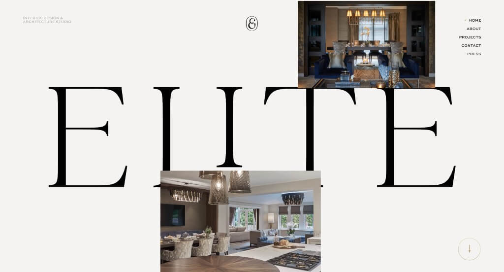
The website for Elite Design Studio serves as a premier benchmark for “Radical Minimalist Portfolio Architecture and High-Impact Visual Merchandising.” As a premium creative practice, their digital storefront completely rejects traditional corporate layouts, opting instead to remove text clutter and let their design work dictate the absolute core of the user experience. This platform masterfully succeeds by treating its homepage as a pure, cinematic canvas that strips away standard user interactions to focus entirely on visual dominance, brand reinforcement, and smooth cross-device continuity.
Key Design Highlights:
- Commanding, Front-and-Center Brand Identity: Rather than hiding its corporate mark in a standard top-left corner, the platform leans into an aggressive, “in-your-face” branding strategy with a massively scaled primary logo. By establishing this strong visual anchor immediately, the site ensures that the studio’s identity is deeply memorized by the visitor, creating an unforgettable baseline for their creative authority the second the interface initializes.
- Hypnotic No-Scroll Vertical Motion Showroom: Breaking entirely away from traditional web paradigms that require continuous manual user scrolling, the homepage utilizes an innovative, automated no-scroll framework. The screen real estate is entirely captured by an elegant, continuous vertical scroll of high-fidelity project images cycling smoothly across the viewport. This cinematic movement transforms the landing page into a living art installation, capturing absolute user attention without causing navigational fatigue.
- Ultra-Minimalist Frameless Navigation Ecosystem: To allow the moving project imagery to speak entirely for itself, the interface leverages a highly disciplined, minimalist menu system. By tucking secondary links, structural details, and contact directories behind a clean, non-intrusive navigation framework, the layout eliminates standard web clutter, ensuring the visitor’s eye remains completely focused on the artistry, scale, and craftsmanship of the portfolio.
- Flawless Mobile Fluidity and Gestural Adaptability: Translating an unconventional, motion-heavy desktop experience onto smaller screens is a notorious design challenge, yet the platform manages it beautifully via an expertly optimized mobile framework. The smartphone interface smoothly converts the unique vertical image stream into a responsive, highly stable view that maintains razor-sharp image quality. Retaining the prominent branding while adapting to a touch-first environment ensures that prospective clients, curators, and partners experience the exact same luxury artistic impact on the go.
WordPress Interior Design Themes
You can find free themes at wordpress.org, or consider interior design-inspired templates at ThemeForest.
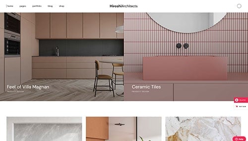
Hiroshi – Themeforest
$89
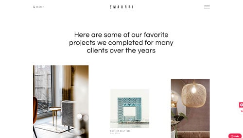
Emaurri – Themeforest
$79
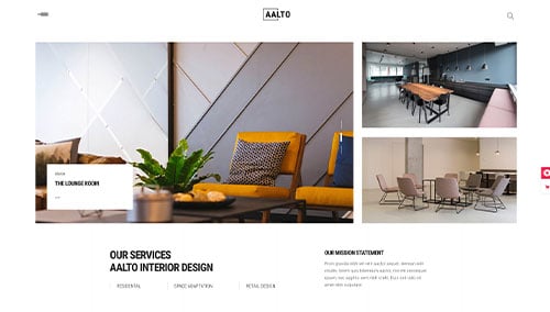
Aalto – Themeforest
$85
Ratio – Themeforest
$79