In the luxury retail landscape of 2026, a jewelry website is much more than an online catalog – it is a digital flagship store and an engine for high-trust storytelling. For fine jewelers and boutique designers, an online presence must achieve a delicate balance: projecting an aura of “quiet luxury” and craftsmanship while offering a frictionless, high-security shopping experience. To thrive in today’s market, your design must move beyond static imagery to embrace “Tactile Digitalism,” using high-definition 360-degree views and immersive video to replicate the brilliance and scale of a physical viewing.
Our team evaluated hundreds of jewelry platforms – ranging from heritage houses and bespoke engagement specialists to sustainable lab-grown diamond pioneers and avant-garde fashion brands. We narrowed the field to the top 15 examples that represent the gold standard for the industry. Our analysis focused specifically on AI-powered virtual try-on tools, interactive ring builders, and the strategic use of ethical sourcing transparency that builds consumer confidence before a significant investment is ever made.
Whether you are a traditional jeweler modernizing your legacy brand or a D2C startup scaling a global collection, these examples provide the definitive benchmark for jewelry web design in 2026.
Note on Our Selection Process: We recently reviewed this list to ensure every featured site demonstrates a clear commitment to modern standards for mobile image performance, secure payment processing, and intuitive product filtering. This curated collection focuses on jewelry websites that prioritize visual elegance and commercial trust, providing the most strategic value to both the brand and the modern collector in 2026.
Top Jewelry Store Website Designs
1. Elizabeth Gage
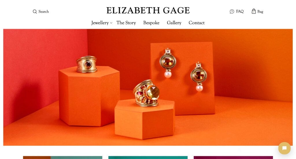
Likely this business’ most notable feature is their stunning backgrounds for their imagery. Showing all their products on a variety of different shaped podiums was a unique choice. Keeping all of their other website elements simple and clean really helped to create a luxurious feel for their company. We loved how a whole page was included to share out their story as a business. Finally, their menu was very well organized, making it easy to find information.
2. James Allen
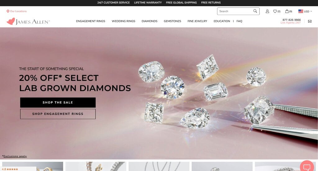
Here we have an example for anyone expecting to find something shiny and sleek. From a web design perspective, their variety of fonts and colors that work together in harmony was amazing. Their images did a great job showcasing the features of each and every product. Very short paragraphs can be used to keep things organized and simple. If you are looking for template options for your next jewelry web page, give some thought to this one.
3. Swarovski
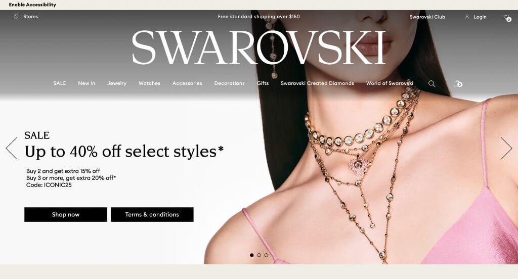
From a design viewpoint, we thought Swarovski did a great job using typography for this custom template. Including bold images were probably the most impactful feature in this homepage. Beige colors are used to allow for a very simple, fresh design. Offering free shipping was something that customers will be sure to notice while scrolling through this professional example. They had website marketing in mind when building the promotions throughout their website.
Related: Need help reaching a bigger audience to get leads? Consider digital marketing within your jewelry store’s advertising budget.
4. Tini Lux
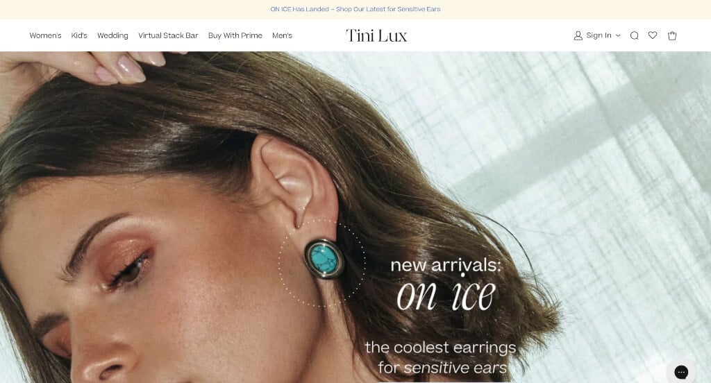
Here is a design that achieves greatness on each and every page. High quality images of their products on and off models was an addition that customers will be sure to notice. Thin lines are used to create graphics to describe the qualities of their business. Including lots of information about “clean” jewelry helps customers understand exactly what this company strives for. Making sure all of their paragraphs are short and straightforward was brilliant because people can skim through faster. Showing comparison images with clean jewelry versus hypoallergenic jewelry was a great way to pull in more people.
5. Solange
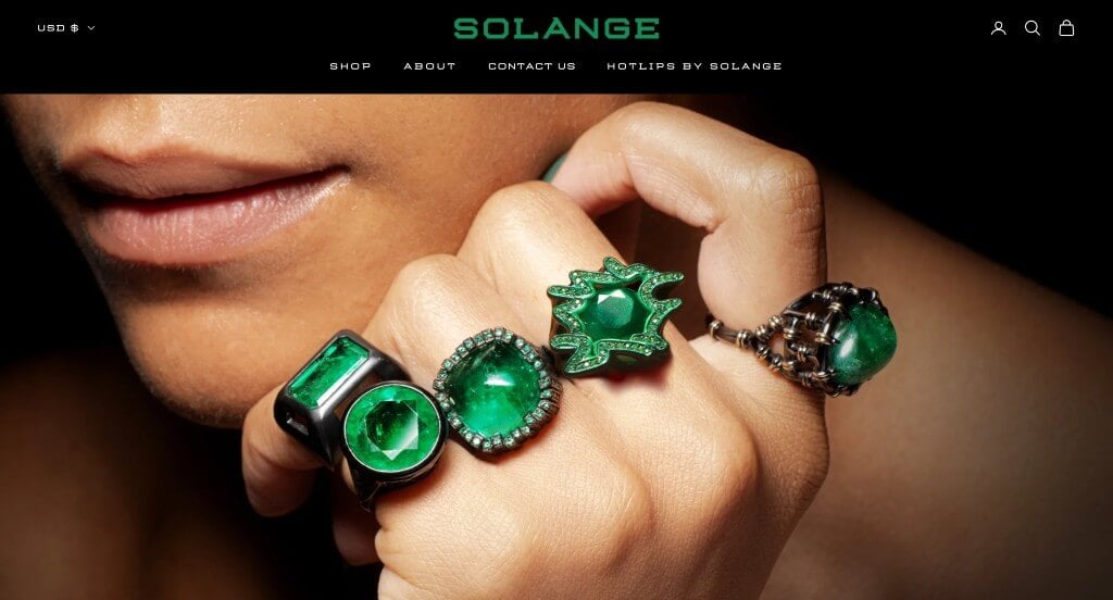
This brand screams luxury. Black backdrops can be noted for all of their imagery allowing for their products to really take the spotlight. Their thin fonts and outlined buttons also create a feeling of high quality. Adding in short automatically playing videos was something else that we liked about this design. Another feature that was creative was their variety of jewelry collections. Finally, they had a navigation bar that was very easy to use, making customers more happy because they’ll be able to find the information that they are looking for.
6. BaubleBar
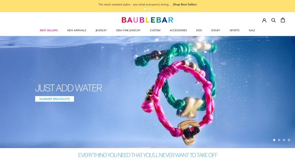
In this example, everything is gold and shimmery. Including lots of images help organize all of their unique products, making them easier to find by people searching through their site. Using capital letters that are bold and professional was something else that we really enjoyed. The dropdown navigation bar was a nice touch for a professional site like this one. Their variety of products aside from jewelry made it easy to recognize this design.
7. John Hardy
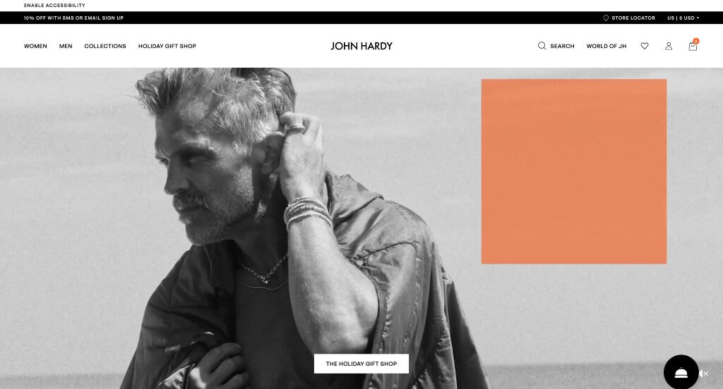
Here’s another extremely unique company. They use a variety of backgrounds to evoke a gender-neutral feel that encourages both men and women to buy their products. One of the features that caught our attention was definitely John Hardy’s use of images throughout this entire site. To add onto that, their images are creatively enhanced to make them more interesting that just a bracelet on a wrist. Adding in a specific shop based on the upcoming holiday was a brilliant choice.
8. Bea Bongiasca
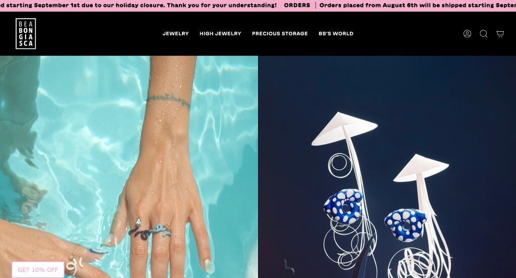
Here’s another web template that stands out to us. We loved their unique products that seem to have unity in their designs. Maintaining a clean and intuitive layout, Bea Bongiasca keeps things simple for a jewelry business. We loved how there was short paragraphs to help describe things within their site. Their large buttons were another aspect that is extremely helpful for anyone trying to navigate through this example. We loved how their images were well planned, making their imagery stand out.
9. Daisy London
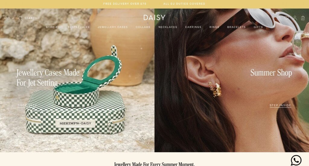
Stunning imagery was clearly important to this company when building their design. It was cool how images were used as backdrops for their buttons. Including a front-page carousel for ads was likely the most impactful feature within Daisy London. Additionally, we loved their menu that had lots of categories to provide a well-organized design. It was a smart choice to include an automatically scrolling bar on the top of their page showcasing important information. Showing off their color options and prices right on their homepage was a great option.
10. Missoma
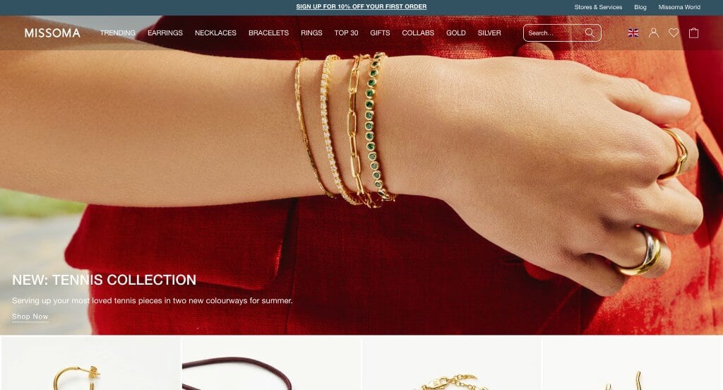
We liked how a grid style was used to display a variety of images for viewers. It was a great addition to have customer reviews included right in their homepage. We really enjoyed their small little graphics that add a some character. Adding in posts from their Instagram page was another feature that we couldn’t miss. As you scroll through, you might also notice their easy to read drop down menu. Their advertisements for sustainability, free shipping, and discounts helped make them stand out from their competitors. Finally, we loved that they included a search bar to help customers find something specific.
11. Auvere
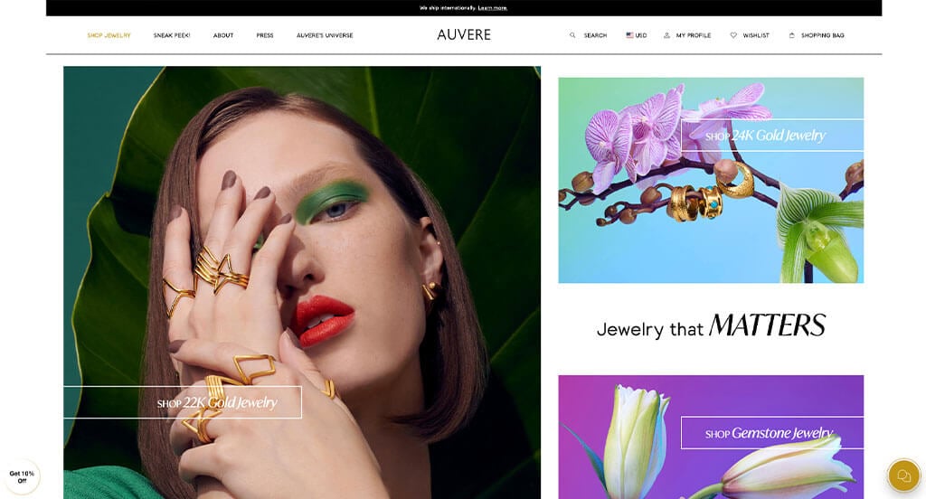
The most impactful part about this design was their high-quality and stunning imagery. Having short paragraphs to help keep their content looking uncluttered. Their buttons were a simple option, but including an awesome font with it will get people to click on the links for sure. Another thoughtful aspect of this professional site was their modern design. We thought it was a good choice to add a bright red circle with writing to show which pieces have won awards. We also thought it was a great choice to include their packaging designs that of course evoke a luxurious style with their dark purple and gold color scheme.
12. Studs
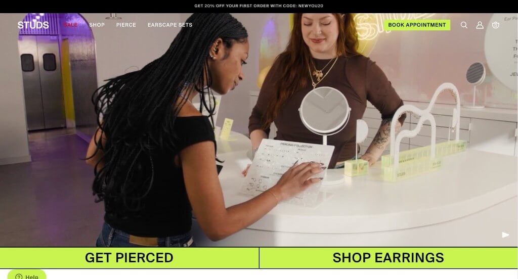
We love, love, loved this example. Their layout was what really stood out to us with their creative grid format. Studs used lots of bright colors as accents to create some life in their pages. Scrolling through this template, we noticed some automatically playing videos, which we liked. Attention to detail was another thoughtful feature in this professional web page that we enjoyed. We thought it was smart to allow customers search for earrings based on their piercing placements. Additionally, circling the product on their model’s ear was another smart choice.
13. Holden
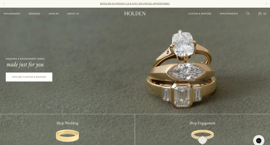
This design was definitely one of our favorites. Their images appear to have a warm filter over them, giving them a natural feel. The olive green and white color scheme used here stood out to us because it looks clean and classic. We enjoyed how they were providing support to the LGBTQ community by donating some of their profits to the Trevor Project. Including lots of different blog series for their articles was another great choice. Holden clearly had a focus on ease of use when building the format for this website.
14. Brilliant Earth
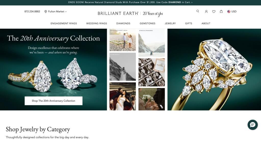
Right away, we noticed that this company utilizes lots of images to help guid customers to the perfect product for them. Showing a variety of diamond shapes was another great choice that this company decided on. Having a section just for their holiday collection was extremely smart because they’ll get extra products sold. Another thoughtful quality in this custom layout was how usable it is. It was also a unique option to have buttons that let customers search by price ranges.
15. David Yurman
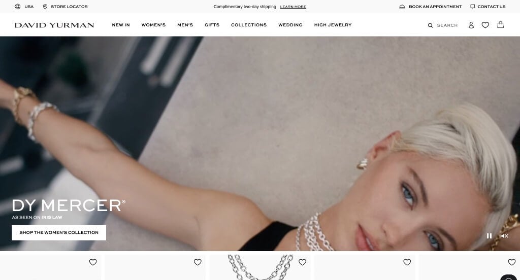
David Yurman did a nice job with their heart feature that can save items for later so customers can decide later if they’ll purchase it. Something that was simple but smart was their domain that matched with their company name. Additionally, those images are extremely high quality, making them shine in this template.
WooCommerce Jewelry Themes
Explore a variety of ecommerce jewelry themes for WooCommerce on ThemeForest.
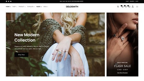
GoldSmith – Themeforest
$39
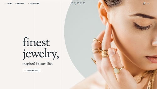
Bijoux – Themeforest
$89
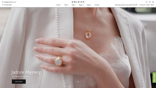
Goldish – Themeforest
$49
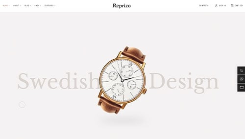
Reprizo – Themeforest
$69
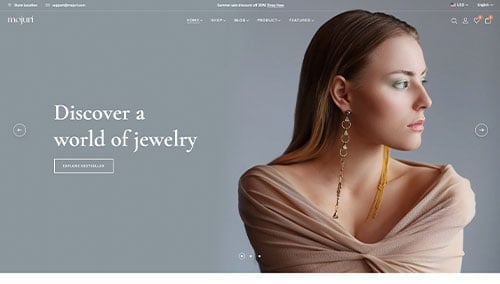
Mojuri – Themeforest
$69
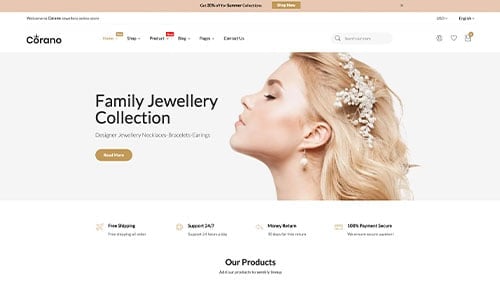
Corano – Themeforest
$59
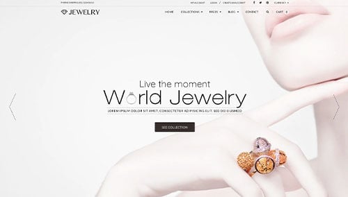
Jewelry – Themeforest
$49
Anamika – Themeforest
$59