In the global manufacturing sector, your website is your most influential business development asset. Whether you are a specialized component fabricator or a large-scale industrial machinery producer, your online presence must immediately communicate operational excellence, technical capability, and supply chain reliability. To compete in 2026, a manufacturer’s website must go beyond a basic product list to demonstrate a commitment to innovation and precision.
Our design team evaluated hundreds of industrial websites – from pharmaceutical and automotive manufacturers to food, beverage, and chemical processing firms. We looked for the top 10 examples that masterfully balance industrial branding with a high-performance user experience (UX), specifically analyzing their product catalog architecture, technical specification accessibility, and the effective use of facility storytelling.
Whether you are an OEM (Original Equipment Manufacturer) or a specialized niche provider, these examples represent the current benchmark for digital excellence in the manufacturing world.
Note on Our Selection Process: We recently audited this guide to remove outdated designs and sites that no longer meet our rigorous standards for performance and professional branding. This curated list now focuses on the top 10 manufacturing websites providing the most strategic value in 2026.
Top Manufacturer Website Designs
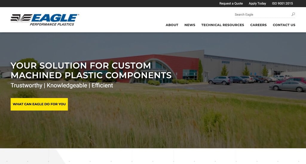
1. Eagle Performance Plastics
Why We Chose Eagle Performance Plastics
The website for Eagle Performance Plastics (eagle-plastics.com) serves as a premier benchmark for “Precision Industrial Manufacturing Merchandising and Technical Value Conversion.” For a leading supplier of custom-machined plastic components and fabrication services, the digital storefront must immediately establish heavy-duty industrial credibility and clear communication regarding material advantages over traditional metals. This platform masterfully succeeds by organizing its layout into an outcome-driven, operational map that connects physical facility transparency directly to sector-specific solutions.
Key Design Highlights:
- Operational Facility and Human-Capital Hero Video Loop: The homepage opens with a high-fidelity video sequence that commands immediate industrial authority. By flashing real-world footage of their expansive manufacturing floor, high-tech CNC machining setups, and skilled technicians actively programming and inspecting components, the media instantly validates their massive output capacity and strict quality-control environment the split second the page loads.
- Interactive Material Advocacy Slider: A major architectural and educational triumph of the homepage layout is a dedicated, smooth slider component showcasing the distinct material benefits of custom plastics. This carousel outlines exact technical reasons to choose engineered plastics – such as weight reduction, corrosion resistance, self-lubrication, and substantial long-term cost savings – effectively educating procurement managers and industrial designers right during the initial discovery phase.
- Front-Page Case Study Validation Triage: Positioned cleanly within the primary homepage flow is a dedicated showcase for past case studies. Highlighting these real-world project outcomes and engineering solutions directly on the main scroll path provides an essential layer of institutional trust, proving the firm’s capacity to take complex custom parts from blueprint to high-tolerance reality.
- Highly Segmented “Industries Served” Sector Index: The homepage incorporates a structured “Industries Served” framework that maps out their deep familiarity with specialized commercial sectors, such as food processing, packaging technology, conveyor systems, and material handling. This vertical segregation allows original equipment manufacturers (OEMs) and corporate decision-makers to immediately see their own technical requirements in the firm’s portfolio, reinforcing localized industry regulatory compliance.
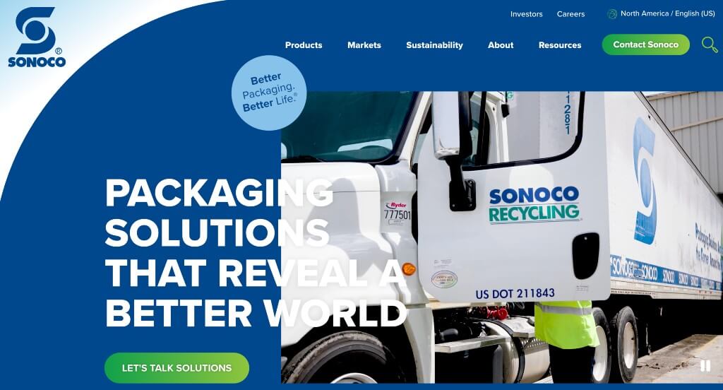
2. Sonoco
Why We Chose Sonoco
The website for Sonoco serves as a premier benchmark for “Enterprise Packaging Merchandising and High-Scale Industrial Trust Architecture.” As a global leader in high-performance sustainable packaging and industrial materials, their digital storefront must project massive manufacturing capacity and supply chain reliability while remaining highly accessible. This platform masterfully succeeds by structuring its homepage as a clear, authoritative solution map that transforms an expansive global catalog into a clean, value-driven journey for corporate procurement teams and brand managers.
Key Design Highlights:
- Cinematic, High-Scale Operational Hero Video Loop: The website establishes immediate industrial authority with a sweeping, high-fidelity video sequence dominating the primary hero space. By flashing dynamic footage of advanced manufacturing floors, precision logistics, global team collaboration, and consumer packaging in motion, the media instantly captures the massive scale and tech-driven impact of the company’s global operations the split second the page loads.
- Thematic “Why Market Leaders Choose Sonoco” Value Anchor: Positioned prominently on the homepage is a dedicated, highly structured strategic section explicitly detailing their competitive advantages. This segment translates their long-standing industry presence, focus on sustainable materials, and engineering expertise into direct, high-value corporate arguments – instantly reassuring elite enterprise brands that they are partnering with a top-tier industry leader.
- Interactive Product Framework Slider Engine: To organize a massive and complex product portfolio without overwhelming the viewer, the homepage incorporates a fluid, beautiful interactive slider. This carousel allows packaging engineers and corporate buyers to rapidly scroll through their primary product categories – such as flexible packaging, rigid paper containers, and protective consumer components – maximizing catalog exposure without adding clunky layout friction.
- Highly Segmented “Markets We Serve” Sector Index: The homepage features a beautifully organized directory mapping out the diverse vertical industries they commonly support. Explicitly partitioning their engineering and regulatory familiarity into specific commercial sectors – including food and beverage, healthcare, home and laundry, and heavy industrial – allows business stakeholders to immediately self-identify and recognize Sonoco’s tailored market capability.
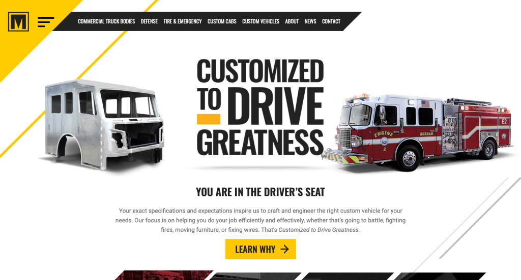
3. Marion Body Works
Why We Chose Marion Body Works
The website for Marion Body Works serves as a premier benchmark for “Heavy-Duty Fleet Merchandising and High-Velocity B2B Commercial Trust Architecture.” For a legendary American manufacturer of commercial truck bodies, fire and rescue vehicles, and defense equipment, the digital storefront must immediately project unyielding structural engineering, manufacturing durability, and physical reliability. This platform masterfully succeeds by treating its homepage as a high-fidelity showroom, balancing action-oriented media with structured capabilities matrices that guide commercial fleet managers seamlessly through the validation process.
Key Design Highlights:
- Action-Oriented Fleet Performance Hero Video Loop: The website commands immediate authority with a high-definition video sequence dominating the primary hero space. By flashing real-world, high-impact footage of their custom truck bodies and emergency vehicles actively performing in rugged, demanding field environments, the media instantly validates the durability and premium craftsmanship of their builds the exact split second the page loads.
- High-Clarity Manufacturing and Capabilities Directory: Rather than relying on vague industrial summaries, the homepage features a beautifully organized and concise layout explicitly defining the specific types of work they do. By cleanly partitioning their manufacturing divisions – spanning commercial truck bodies, specialized fire and rescue apparatus, custom defense vehicles, and advanced metal fabrication – the interface allows procurement teams to rapidly assess the firm’s precise operational fit.
- Persistent Frictionless Sticky Header: To maintain fluid, zero-friction site navigation across an expansive corporate ecosystem of vehicle lines, parts, and service options, the desktop layout utilizes a beautifully engineered sticky header. As users scroll deep into the heavy industrial content, the primary navigation bar pins elegantly to the top of the viewport, ensuring that critical capability drop-downs, career portals, and contact gates remain instantly accessible at any moment.
- Front-Page Editorial Blog and Fleet Insights Triage: Positioned smoothly within the lower homepage layout is a dedicated feature section for their industry blog and insights channel. Highlighting timely updates on fleet safety standards, custom engineering breakthroughs, and company milestones elevates the platform from a clinical manufacturing plant to an active, progressive, and authoritative leader in the heavy transportation sector.
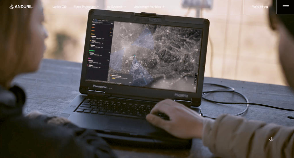
4. Anduril
Why We Chose Anduril
The website for Anduril Industries serves as a premier benchmark for “Next-Generation Defense Merchandising and Immersive Cinematic Tech Architecture.” For a pioneering defense technology company reimagining military hardware through artificial intelligence and autonomous systems, the digital storefront must project cutting-edge software agility alongside robust aerospace and hardware precision. This platform masterfully succeeds by departing from traditional corporate military styles, opting instead for a sleek, immersive dark mode environment that frames their hardware as high-tech, futuristic solutions.
Key Design Highlights:
- Cinematic Autonomous Mission Hero Video Loop: The website commands immediate authority with a high-definition, cinematic video sequence dominating the primary hero space. By flashing raw, atmospheric field footage of autonomous drones tracking, intercepting, and executing precision monitoring tasks, the media instantly captures the advanced software-first capabilities of their defense tech the second the page loads.
- Premium Dark-Mode Cinematic Visual Framing: A major aesthetic triumph of the platform is its uncompromising dark-background design framework. This deep, modern backdrop strips away all visual clutter, acting as a high-contrast canvas that allows the vibrant colors, tactical green interfaces, and sharp, high-fidelity field videos of their equipment to pop with unmatched clarity and cinematic intensity.
- High-Tech Cross-Platform Product Showcase Directory: Woven seamlessly into the homepage scroll path is an editorial grid highlighting their primary autonomous systems and tech creations. Breaking away from dry military specifications, these blocks showcase their hardware – such as lattice counter-UAS platforms, interceptors, and underwater vehicles – as sophisticated, software-driven units, allowing procurement teams to easily grasp the scope of their defense catalog.
- Sleek, High-Density Aerospace Mega Menu: To cleanly organize a vast ecosystem of defense domains, autonomous hardware pipelines, and extensive software architectures, the desktop interface relies on a beautifully organized mega menu. The dropdown segments their capabilities cleanly into legible columns with sharp typography, giving military stakeholders, partners, and top-tier engineering talent a zero-friction path to deep-site engineering breakthroughs.
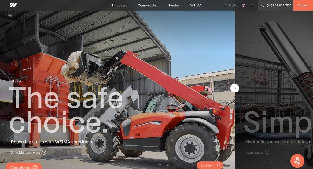
5. Weima
Why We Chose WEIMA
The website for WEIMA (weima.com/us) serves as a premier benchmark for “High-Performance Industrial Machinery Merchandising and Dynamic B2B E-Commerce Conversion.” For a global leader in industrial shredding and briquetting technology handling complex waste management and recycling challenges, the digital storefront must clearly communicate heavy-duty machinery capabilities while creating a fast, approachable sales environment. This platform masterfully succeeds by structuring its homepage as a clean, highly modern showroom that balances real-time customer support with high-visibility product tiering.
Key Design Highlights:
- Strategic Front-Page Product and Solution Showcases: The homepage avoids confusing corporate generalizations, choosing instead to display their primary size-reduction machinery and recycling solutions directly in the main scroll path. Outlining their engineering systems by material types – such as wood, plastics, paper, and metal – allows industrial operators to instantly map WEIMA’s massive machinery catalog to their specific factory recycling requirements.
- High-Visibility “Best Sellers” Product Engine: A standout commercial feature of the homepage layout is a dedicated section highlighting the brand’s best-selling shredders and briquetting presses. Spotlighting these proven, highly popular models directly on the front page simplifies the purchasing funnel, giving prospective buyers and procurement managers an immediate, trusted starting point for their equipment evaluation.
- Editorial Thought Leadership and Blog Feature Triage: Integrated smoothly within the lower homepage workflow is a dedicated section for their industrial blog and news dispatches. Highlighting real-world application stories, maintenance advice, and global sustainability trends elevates the platform from a standard equipment distributor into an authoritative, forward-thinking partner in modern manufacturing and circular economy initiatives.
- Instant Expert Conversational Support Portal: To assist high-intent commercial buyers who might have time-sensitive pre-purchase questions regarding throughput capacity, power specifications, or custom material testing, the interface incorporates an active live chat widget. This direct communication layer removes typical industrial buying friction, providing an immediate, welcoming channel that converts casual site browsers into qualified manufacturing leads.
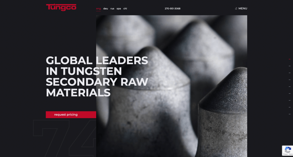
6. Tungco
Why We Chose Tungco
The website for Tungco (tungco.com) serves as a premier benchmark for “Industrial Material Recycling Merchandising and Multi-Generational Trust Architecture.” For a global leader in tungsten scrap recycling, a digital presence must project rigorous processing capabilities, procurement transparency, and absolute corporate integrity. This platform masterfully succeeds by converting what could be a dry industrial transaction into a story of generational reliability, pairing their commercial value proposition with highly structured processing maps.
Key Design Highlights:
- Thematic “Our Process” Operational Matrix: A major structural and educational highlight of the homepage is the dedicated “Our Process” sequence. By mapping out exactly how tungsten scrap is received, analyzed, and processed into high-purity recycled raw materials, the interface provides procurement managers and suppliers with immediate transparency into their strict quality control and eco-friendly standards right during the initial discovery phase.
- Cinematic “Tungco Generations” Heritage Video: The homepage commands immediate emotional and corporate authority by featuring the “Tungco Generations” video prominently in the layout. Spotlighting the company’s multi-generational history, family-owned foundation, and long-standing industry evolution instantly humanizes the brand, proving to international partners that the firm balances massive global scaling with deep-rooted corporate stability.
- Highly Focused “Why Work With Us” Value Engine: Positioned directly within the main homepage scroll path is a structured segment explicitly detailing their core competitive advantages. This section translates complex metallurgical recycling workflows into clear, direct business outcomes – such as fair market pricing, rapid settlement times, and uncompromised environmental compliance – efficiently validating the brand over less transparent scrap brokers.
- Front-Page Client Testimonial and Partner Triage: Integrated smoothly near the lower half of the homepage journey is a dedicated directory of verified client testimonials. Showcasing real-world feedback from global suppliers and manufacturing partners regarding reliable payouts and exceptional customer service adds a vital layer of peer-to-peer social proof, solidifying buying and selling confidence just before the final call to action.
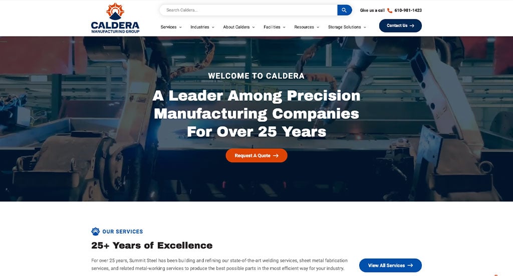
7. Caldera Manufacturing Group
Why We Chose Caldera Manufacturing Group
The website for Caldera Manufacturing Group serves as a premier benchmark for “Immersive Industrial Merchandising and Narrative-Driven B2B Conversion Architecture.” For an elite, full-service metal fabrication and manufacturing partner, the digital storefront must communicate heavy-duty machinery capabilities and structural precision while remaining deeply engaging to procurement managers and engineers. This platform masterfully succeeds by converting a traditional industrial website into a cinematic, fluid journey that guides users from operational validation directly into multi-layered navigational endpoints.
Key Design Highlights:
- Immersive Scrollytelling Homepage Journey: The website completely reimagines the traditional industrial scroll by utilizing a dynamic “scrollytelling” framework. As the user moves down the page, content elements, typography, and service capabilities fluidly assemble and shift to build a linear narrative, explicitly mapping out how the company solves complex production bottlenecks and scales alongside their clients’ manufacturing needs.
- Impactful, Multi-Media Operational Assets: Woven directly into the scrollytelling path are exceptionally high-fidelity photographs and crisp video segments. Showing real-world footage of laser cutting, precision bending, and skilled welding technicians in action brings the physical manufacturing floor to life, validating their strict quality standards and massive output capacity with high visual impact.
- Sleek Desktop Hamburger Navigation Engine: To preserve the cinematic purity of the scrollytelling narrative, the primary desktop view strips away cluttered header navigation in favor of a minimalist hamburger menu button. When activated, it expands into a clean, intuitive overlay that organizes their services, capabilities, and company insights into a simple, frictionless site discovery directory.
- Dual-Stage Terminal Navigation Menu: A brilliant structural triumph occurs at the absolute conclusion of the homepage scroll path. Recognizing that users who finish the scrollytelling journey are highly engaged, the interface introduces an entirely separate, fully expanded navigation matrix right above the footer. This seamless transitional map ensures that prospects can effortlessly dive into targeted subpages – such as deep case studies or equipment lists – without needing to scroll back to the top of the screen.
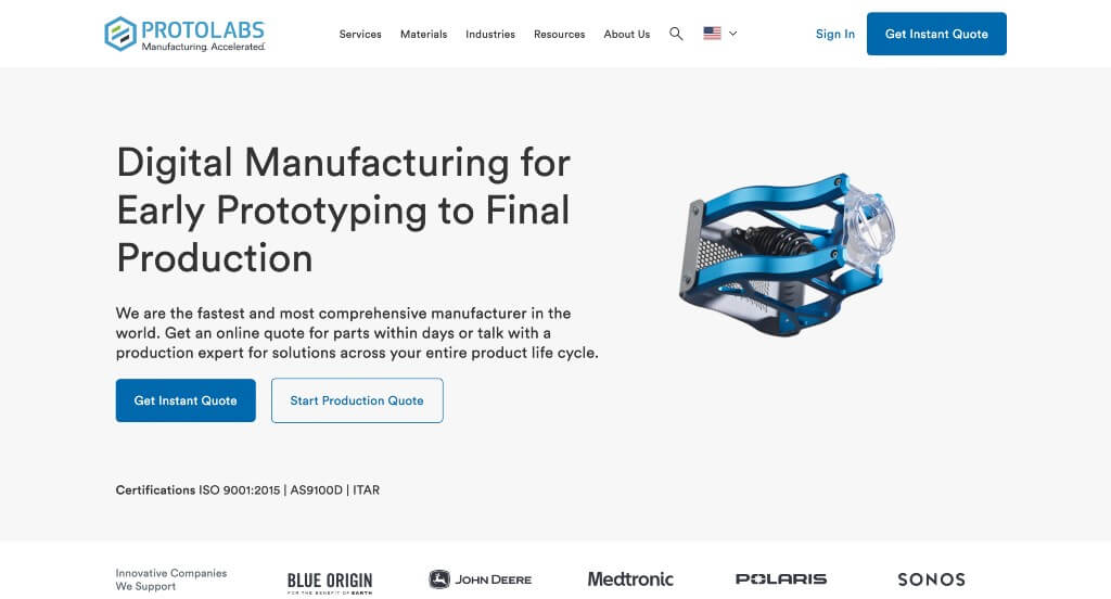
8. Protolabs
Why We Chose Protolabs
The website for Protolabs serves as a premier benchmark for “High-Velocity Digital Manufacturing Merchandising and Frictionless On-Demand Funnel Architecture.” As a global pioneer in rapid prototyping and low-volume production, their digital storefront must reflect the exact speed, automation, and tech-driven precision of their underlying factories. This platform masterfully succeeds by treating its homepage as an intuitive, transactional gateway that bridges complex industrial manufacturing with modern software-as-a-service (SaaS) onboarding mechanics.
Key Design Highlights:
- Frictionless “Instant Quote” Header Integration: The primary layout features a high-contrast, conversion-focused “Get a Quote” call-to-action button pinned directly inside the global header navigation. Positioned in this premium real estate, the button ensures that engineers, designers, and procurement managers can instantly pivot from casual site discovery directly into their automated digital quoting engine from any point on the website.
- High-Density Manufacturing Capabilities Directory: The homepage bypasses vague corporate summaries, opting instead to explicitly define their core manufacturing capabilities in highly structured, scannable blocks. By neatly breaking down their primary service pillars – such as rapid injection molding, precision CNC machining, 3D printing, and sheet metal fabrication – the interface allows technical buyers to instantly assess their precise operational fit.
- Sleek, Multi-Layered Industrial Mega Menu: To cleanly organize a vast ecosystem of manufacturing tolerances, material guides, and design-for-manufacturability (DFM) resources, the desktop interface relies on a robust mega menu. The dropdown partitions complex service variations and technical resource centers into clean, beautifully spaced columns, giving users a zero-friction discovery path to deep technical data sheets.
- Segmented “Industries We Serve” Sector Index: Woven seamlessly into the homepage scroll path is a dedicated directory highlighting the diverse vertical markets they support. Explicitly showcasing their engineering and regulatory familiarity across sectors like aerospace, medical devices, automotive, and consumer electronics reassures enterprise clients that Protolabs possesses the localized compliance knowledge and scalability needed for highly specialized components.
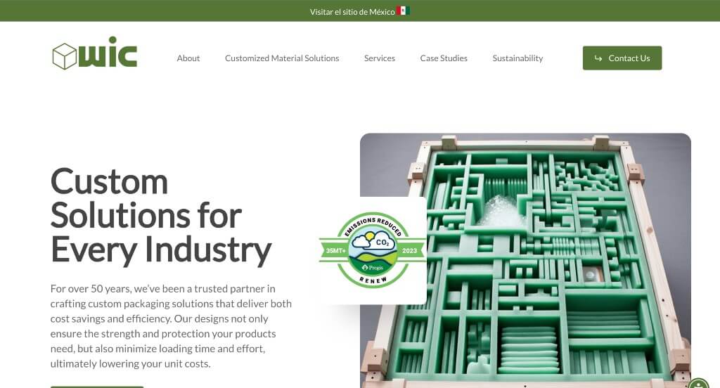
9. WIC
Why We Chose Western Industries Corporation (WIC Packaging)
The website for Western Industries Corporation (wicpackaging.com) serves as a premier benchmark for “Precision Industrial Packaging Merchandising and High-Trust Contract Manufacturing Architecture.” For an elite provider of contract packaging, custom labeling, and flexible fulfillment solutions, the digital storefront must immediately project operational flexibility, strict regulatory compliance, and seamless supply chain alignment. This platform masterfully succeeds by organizing its homepage into a highly clear, value-driven roadmap that transforms specialized industrial workflows into an accessible and high-trust experience for corporate brands.
Key Design Highlights:
- High-Clarity “Flexible, Custom Services” Mapping: The homepage completely avoids vague operational descriptions, choosing instead to clearly lay out their core packaging, assembly, and fulfillment capabilities in highly structured, digestible blocks. By emphasizing their adaptable custom scaling – defining everything from rapid turnaround labeling to specialized assembly mechanics – the interface allows brand managers to immediately grasp how easily the firm can absorb their manufacturing bottlenecks.
- Highly Segmented “Industries Served” Sector Index: A major structural highlight of the homepage layout is the dedicated directory mapping out the diverse vertical markets they commonly support. Explicitly showcasing their specialized packaging familiarity across competitive commercial sectors allows enterprise stakeholders to instantly self-identify and recognize that WIC possesses the precise material handling and operational background required for their products.
- Front-Page Quality Assurance and Certification Showcase: To build immediate corporate credibility with brands that require strict safety and manufacturing standards, the homepage prominently features their official certifications and compliance badges. Displaying these quality-control markers directly on the primary scroll path provides a powerful layer of validation, assuring procurement officers that their inventory will be handled within a top-tier, legally compliant facility.
- Editorial Thought Leadership and Insights Triage: Positioned smoothly within the lower homepage layout is a dedicated feature section for their industry blog and resource center. Highlighting timely advice on packaging material trends, logistical efficiencies, and supply chain updates elevates the platform from a clinical contract vendor into a forward-thinking, authoritative partner committed to modern distribution excellence.
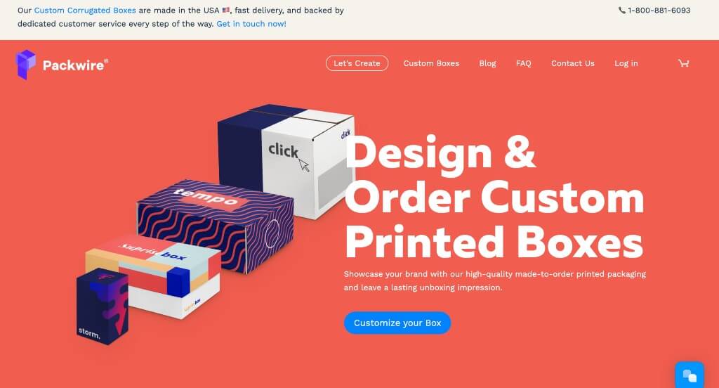
10. Packwire
Why We Chose Packwire
The website for Packwire serves as a premier benchmark for “High-Velocity Custom Packaging Merchandising and Frictionless E-Commerce Funnel Architecture.” For a brand specializing in custom-printed boxes and on-demand packaging solutions tailored for e-commerce businesses, the digital storefront must feel distinctly agile, creative, and highly streamlined. This platform masterfully succeeds by converting complex corrugated manufacturing specs into an accessible, highly visual step-by-step journey that removes all intimidation from custom box design.
Key Design Highlights:
- High-Clarity Creation and Ordering Process Matrix: A major structural triumph of the homepage is the explicit layout outlining their custom box design and production pipeline. By breaking down the workflow into highly digestible, sequential steps – spanning box style selection, real-time 3D design customization, and rapid turnaround fulfillment – the interface allows boutique brands and enterprise companies alike to immediately understand how easily they can take a concept from screen to doorstep.
- Proactive Structural FAQ and Blog Conversion Triage: Positioned smoothly at the lower half of the homepage journey is a beautifully paired educational content block. By featuring their trend-forward packaging blog followed immediately by an expansive, accordion-style Frequently Asked Questions directory, the layout efficiently resolves design anxieties – such as structural tolerances, minimum order quantities, and print specifications – right before the user completes their scroll path.
- Community-Backed Customer Review Grid: Integrated directly into the primary homepage flow is a dedicated showcase of verified customer reviews and real-world brand unboxing experiences. Highlighting success stories from thriving modern startups adds an essential layer of authentic peer-to-peer social proof, validating the company’s crisp print quality, structural reliability, and shipping accuracy right where prospects are evaluating the platform.
- Instant Conversational Ordering Support Channel: To immediately assist fast-moving entrepreneurs who might have time-sensitive queries regarding dielines, custom dimensions, or bulk pricing tier adjustments, the interface incorporates an active live chat portal. This real-time accessibility removes massive pre-purchase friction, providing an immediate, welcoming communication channel that converts casual site browsers into committed customer accounts.
WordPress Manufacturing Themes
Find free themes at wordpress.org or explore manufacturing-inspired templates at ThemeForest.
Industrialist – Themeforest
$79
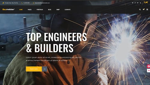
Baumeister – Themeforest
$79
Manufacturing – Themeforest
$59
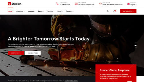
Steeler – Themeforest
$59