In the medical spa and aesthetic wellness industry, your website is the digital front door to your practice. Before a client ever books a consultation, they use your online presence to evaluate your aesthetic eye, your clinical professionalism, and the luxury experience they can expect in your care. To stand out in a saturated market, your design must communicate refined sophistication, medical authority, and visible results.
Our design team evaluated hundreds of aesthetic websites – from boutique skin care spas and specialized laser clinics to high-end wellness centers and non-surgical cosmetic practices. We looked for the top examples that masterfully balance luxury branding with a seamless patient journey, specifically analyzing their mobile-friendly booking integration, before-and-after gallery architecture, and provider credential transparency.
Whether you are a solo injector building a boutique brand or a multi-location wellness institute, these examples represent the current benchmark for medspa web design in 2026.
Note on Our Selection Process: We recently audited this guide to remove outdated designs and sites that no longer meet our performance standards.
Top Med Spa Website Designs
1. Beauty Boost Spa
Why We Chose Beauty Boost Med Spa
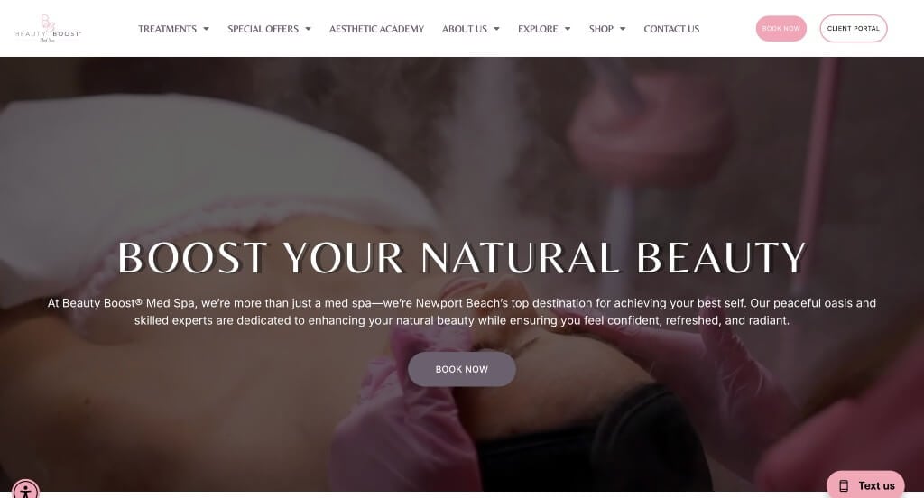
The website for Beauty Boost Med Spa serves as a premier benchmark for “Premium Clinical Aesthetics Merchandising and Frictionless Patient Conversion Architecture.” For an elite medical spa offering advanced cosmetic treatments, the digital storefront must immediately project pristine clinical safety, artistic beauty, and an upscale, welcoming atmosphere. This platform masterfully succeeds by treating its homepage as a high-fidelity visual consultation, seamlessly connecting immersive treatment demonstrations with persistent booking funnels that remove all friction from the patient onboarding journey.
Key Design Highlights:
- Immersive Patient-Experience Hero Video Loop: The website commands immediate operational authority and visual trust with a sweeping, high-definition video sequence dominating the primary hero space. By flashing real-world footage of specialized practitioners carefully performing injections, facial treatments, and laser therapies on smiling clients, the media instantly demystifies the clinical process and showcases authentic, beautiful outcomes the exact split second the page loads.
- Frictionless “Book Now” Global Conversion Matrix: A major transactional triumph of the interface design is the strategic deployment of the “Book Now” call-to-action button. Pinned prominently inside the global header navigation – and repeated beautifully at high-intent intervals throughout the homepage scroll path – the button ensures that prospective patients can instantly transition from casual discovery to scheduling a consultation from any point on the website.
- High-Contrast Services Tile Directory: The homepage avoids confusing medical blocks by organizing its treatment menu into an elegant grid of visual service tiles. Each tile pairs a clean, minimalist aesthetic with clear typography highlighting their core treatments – such as Botox, dermal fillers, and advanced skincare solutions – allowing clients to rapidly self-select their desired aesthetic goals.
- Instant Expert Conversational Support Portal: To immediately assist fast-moving clients who might have time-sensitive pre-appointment questions regarding pricing, downtime, or treatment compatibility, the interface incorporates an active live chat feature. This real-time accessibility removes typical medical-spa booking anxieties, providing an immediate, welcoming communication channel that converts casual site browsers into scheduled patient accounts.
2. Miami Skin Spa
Why We Chose Miami Skin Spa
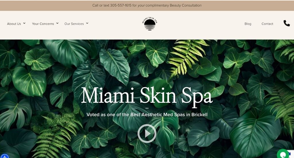
The website for Miami Skin Spa serves as a premier benchmark for “High-Trust Clinical Aesthetics Merchandising and Patient-Centric Discovery Architecture.” For an elite medical spa specializing in advanced body contouring and laser skincare solutions, the digital storefront must immediately project exceptional clinical safety, modern dermatological expertise, and clear, realistic expectations. This platform masterfully succeeds by structuring its homepage as a comprehensive, empathetic virtual consultation path that systematically guides prospective patients from skin analysis directly into real-world validation.
Key Design Highlights:
- Comprehensive Front-Page Services Blueprint: The homepage bypasses vague beauty catchphrases, choosing instead to clearly lay out their advanced medical-spa services in highly structured, scannable blocks. Explicitly mapping out core pillars – such as laser hair removal, body contouring, facial rejuvenation, and specialized skin therapy – allows clients to instantly assess the spa’s technological capabilities and match them to their personal aesthetic goals.
- Empathetic Skin Concerns Diagnosis Index: A major educational and psychological triumph of the homepage layout is a dedicated section designed to address specific skin and body concerns. By organizing pathways around common patient challenges – such as acne scarring, loose skin, hyperpigmentation, or stubborn fat – the interface speaks directly to the user’s personal needs, helping them self-identify and discover the exact clinical solutions available to treat their specific conditions.
- High-Fidelity “Before and After” Results Matrix: Positioned seamlessly within the primary homepage flow is an essential gallery of verified before-and-after patient photographs. Providing clear, unfiltered visual proof of successful treatment outcomes directly on the front page establishes immense medical credibility and institutional trust, effectively resolving patient hesitation during the critical discovery phase.
- Transparent “What to Expect” Structural Journey: Woven smoothly into the lower homepage scroll path is a dedicated “What to Expect” section outlining their operational pipeline. By detailing the end-to-end patient experience – from the initial personalized skin consultation through the custom treatment phase and into essential post-care support – the interface completely demystifies the medical spa experience, reducing booking anxiety and building high-trust confidence before the final call to action.
3. Hi, Finch
Why We Chose Hi, Finch
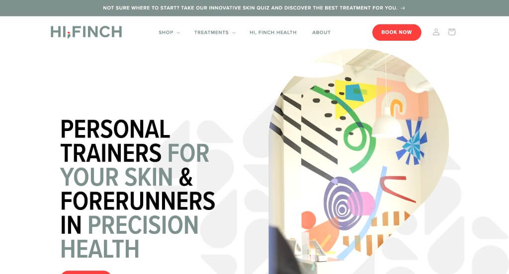
The website for Hi, Finch (hifinch.com) serves as a premier benchmark for “Modern Athletic Aesthetics Merchandising and Immersive Patient Onboarding Architecture.” As a progressive Nashville-based medical spa and concierge medicine practice that brands itself as “personal trainers for your skin,” their digital storefront must break away from traditional cold, clinical aesthetics. This platform masterfully succeeds by adopting a welcoming, lifestyle-oriented design framework that seamlessly bridges retail skin products, interactive customer validation, and video-driven operational transparency.
Key Design Highlights:
- Immersive, Transparency-Driven Video Storytelling: A major experiential highlight of the homepage is its dynamic deployment of immersive video segments. By capturing real-time skin treatments in progress, giving virtual tours of their beautifully designed modern facility, and showcasing their welcoming staff in action, the visual media entirely demystifies the medical spa experience – instantly letting new patients know exactly what to expect from their first visit.
- Front-Page Bestsellers Product Showcase Engine: The homepage effectively capitalizes on its dual clinical and retail model by highlighting an e-commerce-style showcase of their bestselling skincare products directly in the primary scroll path. Displaying custom formulations like “Fresh AF” and “Baby Face” alongside clear pricing and rapid purchasing options instantly transforms the site into a high-utility retail storefront, capturing secondary revenue streams during initial brand discovery.
- Sleek, High-Density Navigational Mega Menu: To flawlessly coordinate their comprehensive clinical divisions spanning medical aesthetics, advanced injectables, and data-driven concierge medicine membership plans, the desktop interface utilizes an elegant mega menu. The dropdown partitions their technical service offerings, treatment prerequisites, and retail skin lines into clear, beautifully spaced columns – ensuring a zero-friction path to deep educational resource subpages.
- Community-Backed Patient Review Matrix: Woven smoothly into the lower layout flow is a dedicated repository of verified customer testimonials. Showcasing real-world praise regarding natural-looking results, welcoming patient environments, and the team’s scientific expertise acts as a commanding layer of peer-to-peer social proof, actively neutralizing booking hesitation and establishing high corporate integrity just before the final call to action.
4. Marina Medspa
Why We Chose Marina Medspa
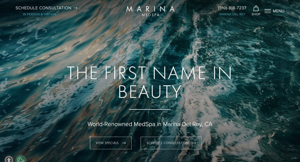
The website for Marina Medspa serves as a premier benchmark for “High-End Clinical Aesthetics Merchandising and Multi-Layered Trust Architecture.” As an elite Los Angeles-based medical spa founded by renowned industry pioneer Dr. Grant Stevens, the digital storefront must project unrivaled clinical prestige, safety, and luxurious cosmetic artistry. This platform masterfully succeeds by coupling expansive visual framing with real-world clinical validation frameworks that confidently guide prospective patients from initial exploration into long-term brand loyalty.
Key Design Highlights:
- High-Impact Cinematic Hero Canvas: The website establishes immediate aesthetic authority with an expansive, full-width hero layout anchored by eye-catching, high-fidelity imagery. Stripping away cluttered visual noise, these crisp and commanding lifestyle visuals capture the essence of upscale, modern skin care and youthful vitality, instantly elevating the brand’s premium market placement the exact split second the page loads.
- Comprehensive Multi-Domain Treatment Showcases: The homepage bypasses vague skincare summaries, choosing instead to clearly organize their advanced offerings directly in the primary scroll path. By cleanly separating and highlighting core treatment divisions – such as body contouring, facial rejuvenation, cosmetic injectables, and medical-grade lasers – the interface allows patients to rapidly review capabilities and self-select their specific beauty needs.
- High-Fidelity “Before and After” Results Gallery: Woven seamlessly into the core homepage flow is an essential gallery of verified before-and-after client outcomes. Providing unfiltered, side-by-side visual proof of clinical transformations directly on the main scroll path builds immense corporate integrity and medical validation, successfully neutralizing consumer hesitation during the early discovery phase.
- Front-Page Patient Review and Social Proof Matrix: Anchoring the credibility of the homepage journey is a dedicated section spotlighting authentic client testimonials and verified reviews. Showcasing real-world praise regarding gentle provider techniques, pristine facility environments, and natural-looking aesthetic results injects a powerful layer of peer-to-peer reassurance right where users decide to commit to a consultation.
5. Face Foundrie
Why We Chose FACE FOUNDRIÉ
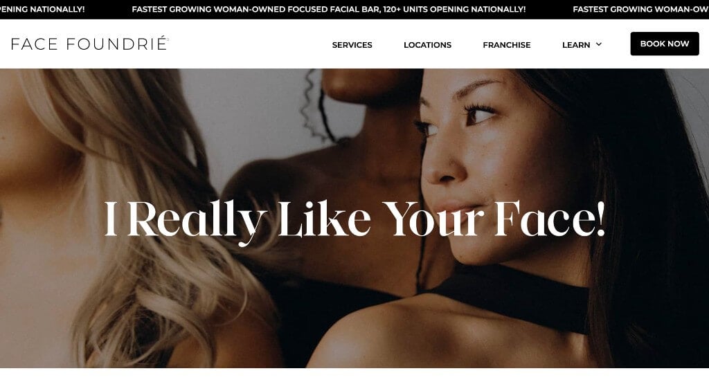
The website for FACE FOUNDRIÉ serves as a premier benchmark for “High-Velocity Skincare Merchandising and Frictionless Lifestyle Aesthetics Funnels.” As an all-inclusive focused facial bar designed for a fast-paced society, their digital storefront must project accessible luxury, clinical efficiency, and modern wellness. This platform masterfully succeeds by converting complex skincare routines into an approachable, high-trust digital space that seamlessly pairs educational content with immediate appointment booking hooks.
Key Design Highlights:
- High-Clarity Categorized Services Blueprint: The homepage entirely avoids dense medical or cosmetic jargon by cleanly outlining their treatments in highly structured, scannable content blocks. By explicitly grouping their menu into intuitive paths – such as “Next-Level + Focused Facials,” “Mini Facials,” and “Enhancements” – the interface allows beauty-conscious clients to instantly assess their skincare offerings and pricing tiers with zero confusion.
- Frictionless Header “Book Now” Conversion Matrix: Strategically pinned directly inside the global header navigation is a high-contrast, action-oriented “Book Now” call-to-action button. Occupying this premium real estate ensures that prospective clients can instantly transition from casual site browsing into a localized scheduling workflow from any point on the website.
- Front-Page Editorial Skincare and Tech Insights Triage: Positioned smoothly within the primary homepage scroll path is a dedicated feature section for their editorial blog and founder retrospectives. Showcasing expert advice on acne prevention, anti-aging breakthroughs, and lifestyle wellness trends elevates the platform from a standard service counter into an authoritative, forward-thinking partner in modern dermatology.
- Ultra-Clean Mobile Viewport and Touch Ergonomics: Translating a franchise-wide aesthetic ecosystem onto smaller devices is flawlessly handled through a highly polished responsive framework. The mobile smartphone interface beautifully balances typography scaling, condenses multi-column grids into clean single stacks, and ensures that critical call-to-action touch targets remain perfectly optimized for smooth, frictionless scrolling on the go.
6. Glasskin
Why We Chose Glasskin
The website for Glasskin (getglasskin.com) serves as a premier benchmark for “High-Frequency Skincare Merchandising and Direct-to-Consumer Conversion Architecture.” As an active skincare studio specializing in targeted “skin workouts,” clean ingredient formulations, and high-tech facials, their digital storefront must effortlessly balance local medical-aesthetic bookings with a thriving national retail shop. This e-commerce platform masterfully succeeds by keeping the path to beautiful, luminous skin entirely frictionless, pairing immediate call-to-action urgency with real-world customer validation.
Key Design Highlights:
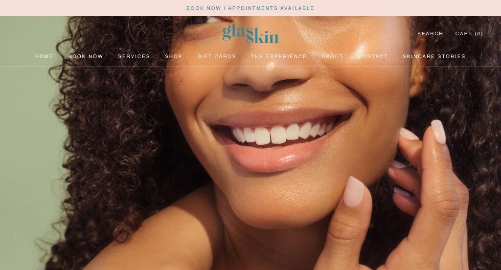
- Frictionless “Book Now” Announcement Bar Integration: The interface captures high-intent traffic immediately by placing a prominent “Book Now” call-to-action button directly within the global header’s top announcement bar. Utilizing this ultra-premium real estate ensures that whether a client arrives looking to schedule an in-studio treatment or check daily updates, the gateway to securing an appointment remains highly visible and available above the fold.
- Persistent Frictionless Sticky Header: To anchor navigation seamlessly across an expanding catalog of botanical skin remedies, membership club portals, and localized studio locations, the desktop experience utilizes a beautifully engineered sticky header. As users explore deep into the layout, the clean navigation bar tracks effortlessly down the viewport, keeping essential shopping cart gates and core directories accessible at any exact moment.
- Front-Page Clean Aesthetic Product Showcase: Capitalizing heavily on their dual-model service and retail structure, the homepage features a beautifully minimalist product grid directly in the primary scroll path. Spotlighting their signature botanical cream serums, defense mists, and clean complexion protectors with elegant imagery and straightforward pricing instantly converts a casual service browser into a high-utility retail buyer.
- Community-Backed Customer Review Matrix: Integrated smoothly within the lower homepage journey is a dedicated repository of verified customer testimonials. Highlighting real-world praise regarding natural, dewy results, specialized practitioner expertise, and the calming atmosphere of their active studio injects a commanding layer of peer-to-peer social proof, actively neutralising booking hesitation right before the final scroll path ends.
7. Beverly Hills Med Spa
Why We Chose Beverly Hills Med Spa
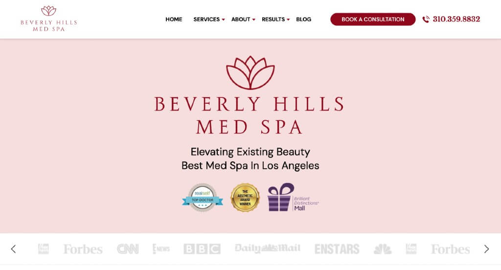
The website for Beverly Hills Med Spa serves as a premier benchmark for “Premium Aesthetic Merchandising and High-Trust Patient Acquisition Architecture.” Operating in one of the most competitive luxury cosmetic markets in the world, their digital storefront must project unrivaled clinical prestige, safety, and elite aesthetic artistry. This platform masterfully succeeds by treating its homepage as an interactive digital consultation, blending comprehensive treatment data with real-time social validation and high-intent booking mechanisms.
Key Design Highlights:
- Frictionless “Book a Consultation” Header Integration: The primary interface design maximizes user onboarding by positioning a high-contrast, action-oriented “Book a Consultation” call-to-action button directly inside the global header navigation. Pinned to this premium real estate, the button ensures that whether a prospective patient is researching deep-site procedures or reviewing credentials, the gateway to securing an elite appointment remains permanently accessible from any viewport.
- Comprehensive Front-Page Services and Treatment Matrix: The homepage completely avoids vague medical catchphrases, choosing instead to clearly lay out their advanced aesthetic offerings in highly structured, scannable blocks. By explicitly mapping out their primary treatment pillars – such as cosmetic injectables, advanced laser resurfacing, body contouring, and medical-grade skincare – the interface allows patients to rapidly self-select the exact enhancements aligned with their personal beauty goals.
- Authentic Community-Backed Patient Review Grid: Integrated smoothly into the primary homepage scroll path is a dedicated repository of verified patient testimonials and reviews. Showcasing real-world praise regarding natural-looking outcomes, gentle practitioner techniques, and pristine clinical standards adds an essential layer of institutional trust, effectively neutralizing patient hesitation during the critical evaluation phase.
- Live “Social Proof” Instagram Feed Synchronization: Positioned cleanly within the lower layout workflow is an active, visually rich Instagram social media feature matrix. Displaying real-time updates, lifestyle imagery, educational video clips, and patient journeys directly from their active feed seamlessly bridges clinical authority with contemporary lifestyle branding, keeping prospective clients continuously connected to the clinic’s real-world culture.
8. Spa Luxe
Why We Chose Spa Luxe
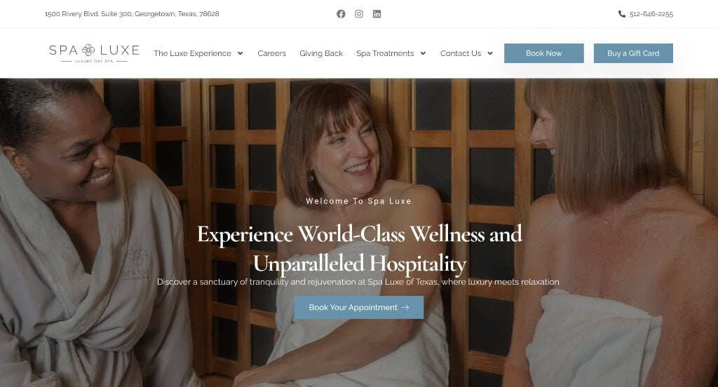
The website for Spa Luxe (spaluxe.com) serves as a premier benchmark for “High-Trust Wellness Merchandising and Frictionless On-Demand Hospitality Funnels.” As an award-winning day spa and med spa sanctuary, their digital storefront must instantly project tranquility, world-class luxury, and clinical refinement. This platform masterfully succeeds by organizing its homepage into an intuitive user journey that balances immediate transactional readiness with a clear, stress-free pathway for new guests.
Key Design Highlights:
- Immediate Triple-Threat Call-to-Action Action Hub: Positioned with high visibility directly below the main hero area is a beautifully streamlined array of three distinct conversion buttons: “Buy a Gift Card,” “Book Now,” and “Work With Us.” By instantly surface-leveling these high-priority user pathways, the interface simultaneously caters to revenue-generating gift buyers, high-intent booking clients, and prospective talent before they even begin scrolling deep into the site.
- High-Density, Categorized Services Matrix: The homepage serves as an exceptional digital menu, clearly mapping out their comprehensive array of wellness and aesthetic offerings in clean, well-spaced directories. From specialized massage therapy and body treatments to advanced HydraFacials, neuromodulators, and laser hair removal, the layout allows guests to rapidly cross-reference their personal wellness and anti-aging goals with the spa’s diverse technical capabilities.
- Transparent Step-by-Step Guest Onboarding Pipeline: A major educational and psychological triumph of the homepage is a dedicated section that visually details their three-step client journey. By outlining exactly what a guest should expect – from scheduling a visit online to receiving a warm welcome tour and finalizing a highly customized care plan – the interface entirely demystifies the luxury spa experience and reduces booking hesitation.
- Authentic Front-Page Guest Validation Grid: Integrated smoothly into the primary scroll path is a dedicated repository of verified testimonials and customer reviews. Showcasing real-world praise regarding unmatched customer attention, personalized care plans, and a sanctuary-like atmosphere injects a commanding layer of peer-to-peer social proof, validating the spa’s elite reputation right at the critical moment of user conversion.
9. Radiance Medspa
Why We Chose Radiance Medspa Atlanta
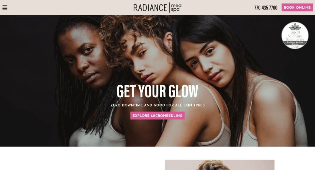
The website for Radiance Medspa Atlanta serves as a premier benchmark for “High-Touch Clinical Aesthetics Merchandising and Frictionless Patient-Onboarding Architecture.” Situated in the highly competitive Atlanta metropolitan market, the digital storefront successfully projects decades of specialized skincare expertise, clinical safety, and natural-looking rejuvenation outcomes. The platform masterfully treats its homepage as an interactive consultation space, blending real-time procedure visualizations with persistent conversion funnels that seamlessly transition casual visitors into committed clients.
Key Design Highlights:
- Frictionless “Book Online” Header Integration: Maximizing client acquisition right from the start, the primary interface features a high-contrast, action-oriented “Book Online” call-to-action button pinned directly inside the global header navigation. Positioned in this premium screen space, the gateway ensures that high-intent prospects can instantly pivot from deep-site procedural research to securing a localized appointment at any point in their user journey.
- Immersive Front-Page Clinical Treatment Showcase: A major educational and psychological triumph of the homepage layout is the integration of a high-fidelity video showcasing a popular aesthetic treatment being actively performed on a client. By revealing the precise, gentle nature of their clinical methods in real time, the media removes treatment anxiety, demystifies the clinical setting, and establishes immense procedural transparency before the client books a visit.
- Authentic Community-Backed Peer Review Matrix: Integrated smoothly into the primary homepage scroll path is a dedicated repository of verified client testimonials. Highlighting real-world praise regarding welcoming staff environments, immaculate clinical cleanliness, and impactful long-term skincare results adds a vital layer of local social proof, actively validating the facility’s 50+ years of combined team experience right where prospects evaluate the brand.
- Live “Social Proof” Instagram Feed Synchronization: Positioned cleanly within the lower layout workflow is an active, visually rich Instagram social media feature matrix. Displaying real-time updates, seasonal skincare tips, and behind-the-scenes glimpses of their Vinings-based clinic seamlessly bridges clinical authority with contemporary lifestyle branding, keeping prospective clients continuously connected to the brand’s active community culture.
10. Spavia Day Spa
Why We Chose Spavia Day Spa
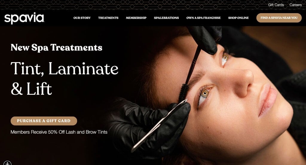
The website for Spavia Day Spa serves as a premier benchmark for “Accessible Luxury Wellness Merchandising and High-Density Recurring Revenue Funnels.” Positioned as an elite hybrid bridging mass-market wellness centers and unattainable high-end luxury resort spas, their digital storefront must immediately project deep serenity, operational excellence, and a high-end customer journey. This platform masterfully succeeds by converting complex relaxation services into a clean, media-rich interface that seamlessly balances treatment transparency with local booking mechanics.
Key Design Highlights:
- Immersive Facility and Team Showrooms: A standout experiential element of the homepage is the integration of high-fidelity video media designed to showcase their staff and resort-like facilities. Giving prospective guests a sweeping look at their spotless treatment rooms, retreat spaces, and welcoming specialists entirely demystifies the day spa experience, letting visitors see exactly what to expect from their customized journey.
- Comprehensive Multi-Pillar Services Blueprint: The homepage acts as a beautiful, intuitive directory, cleanly mapping out their treatments into defined core pillars: Relax (massage therapy), Recenter (advanced skincare and facials), and Renew (body wraps and beauty treatments). This structured mapping allows both casual gift buyers and wellness-conscious clients to instantly scan and identify specialized menu offerings tailored to their personal needs.
- Multi-Location Community Validation Grid: Woven smoothly into the primary homepage scroll path is a dedicated repository of verified customer reviews pulled from various nationwide locations. Featuring real-world praise regarding meticulous estheticians, professional staff, and the long-lasting benefits of their custom spa treatments injects a powerful layer of social proof right where users evaluate the brand’s national credibility.
- Ultra-Clean Mobile Viewport and Touch Continuity: Translating a large, franchise-wide day spa network onto smaller viewports is flawlessly managed through an expertly optimized mobile framework. The smartphone interface elegantly balances expansive whitespace, stacks layout elements cleanly, and keeps essential call-to-action touch zones fluid and unobstructed for users looking to book a session on the go.
11. Blue Lagoon Iceland
Why We Chose Blue Lagoon
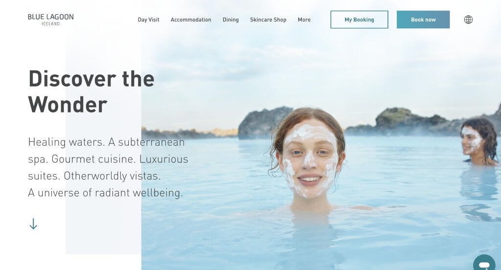
The website for the Blue Lagoon (bluelagoon.com) serves as a premier benchmark for “World-Class Wellness Merchandising and High-Conversion Hospitality Architecture.” As one of Iceland’s most iconic natural wonders and an internationally acclaimed geothermal spa resort, their digital storefront must effortlessly balance immense volcanic scale with an inviting, ultra-luxurious guest journey. This platform masterfully succeeds by treating its homepage as an editorial oasis, seamlessly shifting high-intent traffic from casual inspiration directly into localized reservation tracks.
Key Design Highlights:
- Frictionless “Book Now” Global Header Integration: Maximizing guest booking velocity from the exact moment the layout loads, the interface features a high-contrast, conversion-focused “Book Now” call-to-action button anchored permanently inside the global navigation header. Positioned in this premium screen real estate, it ensures that prospective international travelers can instantly transition from site exploration to securing their arrival slot from any viewport.
- Comprehensive Front-Page Services and Packages Blueprint: The homepage completely avoids vague resort descriptions, choosing instead to clearly organize their multi-layered offerings in highly structured, scannable content blocks. From general day admissions to exclusive, volcanic-terrain journeys at the luxurious Retreat Spa, in-water massage treatments, and Michelin-starred dining options, the interface lets users effortlessly map out and customize their ideal wellness itinerary.
- Front-Page Travel Insights and Editorial Storytelling Triage: Positioned smoothly within the lower homepage scroll path is a dedicated feature section highlighting their curated travel blog and informational stories. Spotlighting practical trip-planning facts, skin science breakdowns, and local geological insights elevates the platform from a standard booking site into an authoritative, forward-thinking curator of the authentic Icelandic wellness experience.
- Persistent Mobile Action Hub and Fluid Ergonomics: Translating a large-scale, multi-destination resort ecosystem onto smaller viewports is flawlessly managed via a persistent, thumb-friendly sticky button anchored along the bottom of the smartphone screen. By keeping the critical booking gateway floating safely within reach at all times, the mobile framework eliminates layout friction and provides effortless navigation for time-conscious travelers booking on the go.
12. GLANZ
Why We Chose Glanz Aesthetics
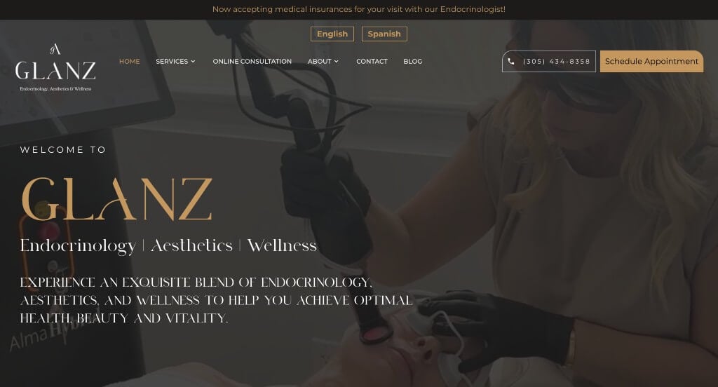
The website for Glanz Aesthetics serves as a premier benchmark for “Clinical-Grade Wellness Merchandising and High-Trust Medical Aesthetics Architecture.” For an elite practice specializing in advanced cosmetic treatments and skin health, the digital storefront must project pristine safety, deep medical authority, and customized cosmetic artistry. This platform masterfully succeeds by converting complex anti-aging and clinical concepts into an approachable, elegant user journey that seamlessly bridges medical expertise with real-world patient success.
Key Design Highlights:
- Immersive, Transparency-Driven Hero Video Loop: The website establishes immediate operational authority and aesthetic trust with a sweeping, high-definition video sequence dominating the primary hero space. By capturing real-time aesthetic treatments, advanced skin rejuvenation, and welcoming client interactions, the media instantly demystifies the clinical environment and showcases authentic, professional care the exact split second the page loads.
- Front-Page Specialized Medical and Endocrinology Authority: A major structural and psychological triumph of the homepage layout is the prominent integration of their specialized medical staff bios, highlighting an on-staff Endocrinology doctor. Showcasing deep-rooted knowledge in hormonal and metabolic health directly alongside aesthetic offerings provides an immense layer of medical validation, assuring patients that their beauty treatments are backed by true clinical science.
- Comprehensive Multi-Pillar Treatment Blueprints: The homepage entirely avoids ambiguous beauty summaries by clearly organizing its comprehensive menu of services into structured, highly scannable content blocks. Detail-oriented layouts break down their distinct clinical offerings – ranging from specialized injectables and advanced facial rejuvenation to modern body sculpting – allowing patients to rapidly match their personal aesthetic goals to the clinic’s specialized capabilities.
- Authentic Community-Backed Patient Testimonial Grid: Integrated smoothly into the core homepage scroll path is a dedicated repository of verified patient reviews and testimonials. Highlighting real-world praise regarding natural-looking transformations, precise medical care, and an exceptionally professional atmosphere injects a vital layer of local social proof, actively neutralizing patient hesitation right before the final call to action.
13. Urban Nirvana
Why We Chose Urban Nirvana
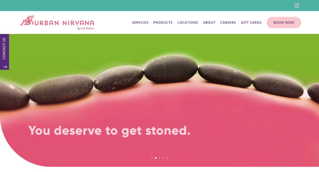
The website for Urban Nirvana (urbannirvana.com) serves as a premier benchmark for “Vibrant Wellness Merchandising and High-Conversion Day Spa Architecture.” Operating multiple luxury spa and salon destinations across South Carolina, their digital storefront masterfully transitions away from the cold, clinical look of traditional medical centers and the muted, sterile palettes of standard day spas. Instead, the platform embraces a high-energy, boutique aesthetic that treats self-care as an essential, joyful lifestyle choice rather than a quiet afterthought.
Key Design Highlights:
- Frictionless “Book Now” Global Header Hub: To maximize booking velocity from the moment a user arrives, the interface features an explicit, high-contrast “Book Now” call-to-action button pinned directly within the global header navigation. This premium placement ensures that whether a client is trying to coordinate a massage in Charleston or a hair styling appointment in Columbia, the gateway to localized scheduling portals remains unobstructed and immediately accessible from any subpage.
- Vibrant and Energizing Color Palette: Setting the brand completely apart from typical industrial or wellness spaces is its bold, fashion-forward color layout. Utilizing a beautifully balanced, eye-catching palette of playful pink, deep purple, and vivid teal, the website instantly radiates a friendly, modern vibe that makes the journey into luxury rejuvenation feel exceptionally welcoming, creative, and refreshingly approachable.
- Front-Page Multi-Pillar Services Showcase: The homepage layout acts as an intuitive visual directory by cleanly highlighting their primary service pillars directly in the main scroll path. By structuring their menu into highly defined pathways – spanning advanced therapeutic massages, customized facial skin treatments, and precision hair salon services – the layout allows beauty-conscious clients and busy gift buyers to instantly map out the exact experience they need.
- Community-Backed Client Review Matrix: Woven smoothly into the lower homepage workflow is a dedicated section celebrating authentic customer feedback and success stories. Displaying real-world praise regarding exceptional therapeutic massage strokes, highly skilled color treatments, and welcoming front-desk hospitality injects an essential layer of local social proof, actively neutralizing booking hesitation right before the user commits to a session.
WordPress Medical Spa Themes
You can explore free themes at wordpress.org or browse through medical spa-inspired templates on ThemeForest.
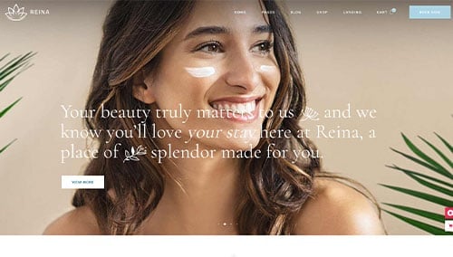
Reina – Themeforest
$79
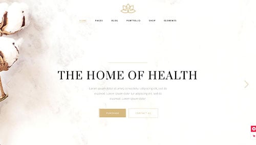
Aviana – Themeforest
$79
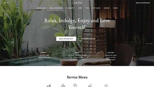
Chérie – Themeforest
$79
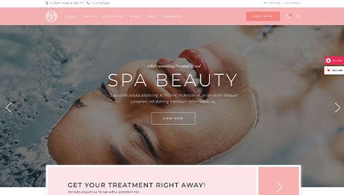
Oaza – Themeforest
$79
WooCommerce Medical Spa Themes
You’ll find a wide range of ecommerce medical spa themes for WooCommerce on ThemeForest.
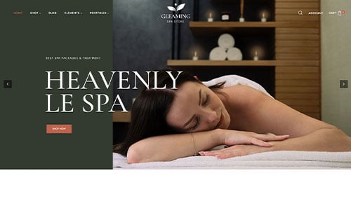
Gleaming – Themeforest
$38
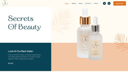
Allora – Themeforest
$39
Shopify Medical Spa Themes
Explore free and paid themes at themes.shopify.com or consider options available on marketplaces like ThemeForest.
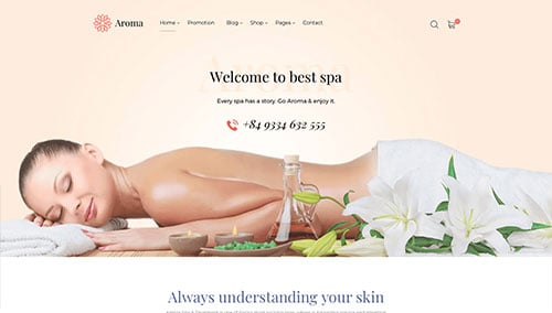
Aroma – Themeforest
$79
Romatic – Themeforest
$56