In an era where mobile traffic accounts for the majority of global web activity, “responsive design” is no longer the goal – mobile-first excellence is. A truly effective mobile website does more than just stack elements vertically; it prioritizes speed, simplifies complex interactions, and respects the ergonomics of the modern smartphone user. To succeed in 2026, your mobile presence must offer a frictionless journey that rivals a native app.
Our UX and development team evaluated hundreds of websites to identify the 12 examples that master the mobile experience. We looked beyond basic responsiveness to find sites that excel in thumb-driven navigation, rapid Core Web Vital performance, and adaptive content layouts. These selections showcase how brands can maintain their aesthetic identity while delivering a highly optimized experience on the smallest screens.
Whether you are optimizing an e-commerce storefront or a professional service landing page, these examples represent the benchmark for mobile web design in 2026.
Note on our Selection Process: We regularly audit this list to ensure every featured site remains a leader in mobile usability and technical performance. This curated list focuses on the top 12 mobile websites providing the most strategic value for modern businesses.
Top Mobile-Friendly Website Designs
1. Squaredot
Why We Chose Squaredot
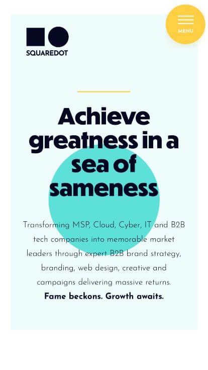
The website for Squaredot serves as a premier benchmark for “High-Trust B2B Tech Merchandising and Expressive Corporate Agency Architecture.” As an award-winning B2B marketing agency focused on transforming tech, cloud, cybersecurity, and managed service providers (MSPs) into memorable market leaders, their digital storefront must completely smash the stereotype that B2B marketing has to be dull or rigid. This platform masterfully succeeds by structuring its brand identity into a highly interactive, geometrically unified narrative canvas that prioritizes extensive social proof and institutional validation across mobile and desktop viewports.
Key Design Highlights:
- Top-Notch Geometric Visual Identity and Brand Alignment: The platform commands incredible creative authority by infusing its core corporate identity directly into the webpage layout. Executing a highly sophisticated, consistent color palette electrified by geometric shapes that explicitly call back to their logo and company name, the user interface functions as a living embodiment of their design capabilities, establishing an unforgettable baseline for their branding authority.
- Front-Page “B2B Hall of Fame” Mobile Case Study Matrix: Cleverly adapting complex portfolio grids for smaller screens, the mobile layout replaces traditional clunky project listings with an elite, highly navigable section titled the “B2B Hall of Fame.” This dedicated segment allows enterprise technology companies, scale-ups, and prospective partners to effortlessly swipe through their completed campaigns, web builds, and strategic transformations on the go.
- Prestigious Industry Awards and Accolades Showrooms: Overcoming institutional skepticism in the hyper-competitive tech consulting sector is gracefully achieved through a dedicated excellence module right on the mobile homepage. Spotlighting their major industry recognitions, design trophies, and agency awards directly within the initial mobile viewport establishes immediate global credibility, proving they can make clients “famous” in their respective markets.
- High-Trust Client Review Hub for Fluid Onboarding: Deepening its authoritative brand positioning on mobile, the platform seamlessly integrates direct client testimonials and success metrics straight into the homepage scroll path. Showcasing authentic, enthusiastic endorsements from corporate marketing directors and tech executives gives prospective partners immediate operational validation, assuring them that the agency consistently delivers exceptional returns on investment.
2. Warby Parker
Why We Chose Warby Parker
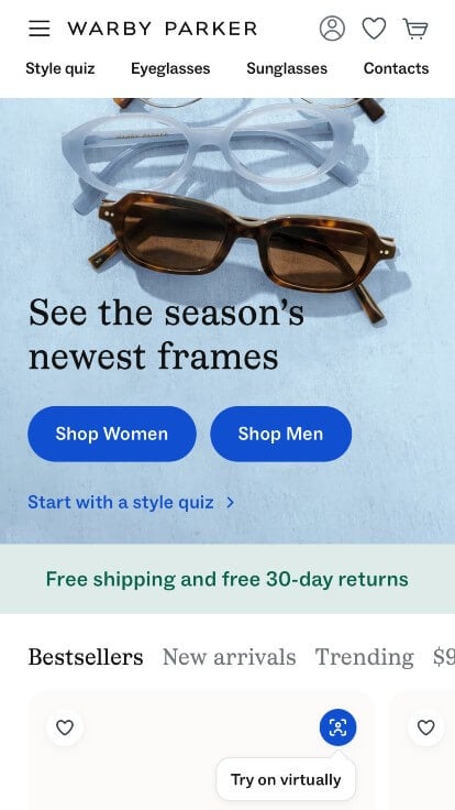
The website for Warby Parker serves as a premier benchmark for “High-Velocity Direct-to-Consumer (D2C) E-Commerce and Frictionless Omnichannel Architecture.” As a pioneer in the eyewear industry, their digital storefront must effortlessly balance large-scale inventory discovery with complex medical services like prescription verification and vision insurance triage. This platform masterfully succeeds by treating its homepage as an intuitive, user-centric lifestyle retail funnel that eliminates buying friction and builds massive consumer trust.
Key Design Highlights:
- Expansive, High-Usability Mobile Navigation System: Managing a vast retail directory spanning eyeglasses, sunglasses, contact lenses, and eye exams on smaller viewports is flawlessly achieved through an expertly engineered mobile menu. The interface breaks down complex product categories into intuitive, flat hierarchies with clear typography, ensuring that smartphone users can effortlessly navigate to specific styles or schedule local doctor appointments with minimal taps.
- Fluid Swipable Product and Category Sliders: Rather than forcing users down deep, multi-layered click paths, the homepage integrates smooth, gesture-optimized horizontal swipe carousels. This layout choice allows visitors to effortlessly swipe through featured optical styles, trending sunglasses shapes, and home try-on favorites directly from the front page, keeping the browsing experience highly tactile and interactive.
- Frictionless Insurance Benefit Verification Portal: Overcoming a primary financial hurdle in prescription retail, the homepage features an accessible, interactive contact form widget designed to instantly check insurance compatibility. By allowing users to quickly select their provider and determine out-of-pocket savings right on the main scroll path, the site drastically reduces checkout abandonment and shortens the consumer decision-making cycle.
- Authentic Social Proof via “Warby Parker in the Wild”: To build deep lifestyle affinity and prove how their frames fit a diverse range of real-world faces, the homepage features a curated visual section titled “Warby Parker in the Wild.” Showcasing user-generated content and everyday customers wearing their products bridges the gap between digital retail and authentic human community, giving buyers absolute confidence in their styling decisions.
3. Mammut
Why We Chose Mammut
The website for Mammut serves as a premier benchmark for “High-Performance Outdoor E-Commerce and Immersive Technical Apparel Merchandising.” As a premium Swiss mountaineering and trekking brand with over 160 years of heritage, their digital storefront must effortlessly bridge the gap between heavy technical safety gear (like avalanche beacons and climbing ropes) and premium lifestyle alpine outerwear. This platform masterfully succeeds by treating its homepage as a high-fidelity visual hub, pairing structured product exploration grids with fluid mobile execution and a striking editorial layout.
Key Design Highlights:
- Structured Front-Page Product and Category Grid Matrix: The website eliminates browsing ambiguity by organizing its diverse inventory into a clean, modern grid layout directly on the homepage. This visual architecture cleanly separates key apparel tracks, technical hardware, and footwear collections, allowing mountaineers, skiers, and casual hikers to immediately find their target discipline and dive straight into high-conversion retail pipelines.
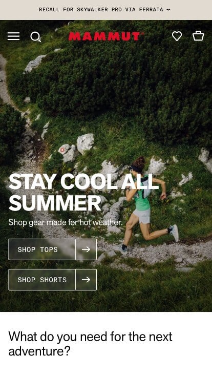
- Dual-Focus High-Fidelity Visual Showrooms: The platform commands incredible brand authority by balancing premium studio product shots with breathtaking, ultra-high-resolution alpine lifestyle photography. Showcasing elite athletes putting their gear to the test in extreme mountain environments creates an immediate emotional and aspirational connection, using visual proof to validate the technical durability, warmth, and weatherproofing of their gear.
- Streamlined Global Announcement Bar Integration: Capitalizing on top-tier visual real estate, the user interface features a clean, high-visibility announcement banner running directly above the primary global header navigation. This dedicated space serves as a critical communication channel, instantly alerting outdoor enthusiasts to seasonal promotions, free shipping thresholds, or crucial product safety updates without cluttering the main aesthetic layout.
- Expansive, High-Usability Mobile Navigation System: Managing an extensive enterprise catalog on smaller screens is flawlessly handled via an expertly optimized mobile menu framework. The smartphone interface organizes complex product filters, regional settings, and specific sport categories into an intuitive, touch-friendly directory, ensuring that users can easily check gear specs, review sizing charts, or place orders while out in the field.

4. Black Diamond
Why We Chose Black Diamond Equipment
The website for Black Diamond Equipment serves as a premier benchmark for “High-Performance Core Outdoor E-Commerce and Authentic Alpine Merchandising.” As a gold-standard manufacturer of climbing, skiing, and mountain trekking hardware, their digital storefront must speak directly to a highly discerning, technical community of athletes who rely on their gear for survival in extreme environments. This platform masterfully succeeds by treating its homepage as a gritty, deeply authentic visual narrative, pairing structured product onboarding with an exceptionally intuitive mobile interface.
Key Design Highlights:
- High-Contrast Alternating Mobile Content Blocks: Navigating long, content-rich homepages on smaller viewports can often cause visual fatigue, but the mobile interface elegantly solves this by alternating background colors to cleanly separate distinct sections. This subtle shift in background tones acts as a natural visual anchor, giving mobile users a highly structured and effortless scrolling experience as they move through different product categories and technical features.
- Authentic Brand Imagery Rooted in Grit and Tenacity: The platform completely bypasses generic, polished outdoor stock photos in favor of striking, ultra-high-quality imagery that perfectly communicates the brand’s core values. Featuring raw, authentic photography of athletes tackling demanding rock faces, pushing through blizzards, and navigating rugged terrain, the website instantly establishes deep cultural credibility with hard-core outdoor enthusiasts, proving the gear is built to endure the harshest conditions.
- Targeted “Mountain Essentials” Seasonal Blueprint: Helping both novice hikers and seasoned mountaineers gear up efficiently, the homepage features a dedicated, highly curated segment titled “Mountain Essentials.” By compiling critical hardware, functional apparel, and safety gear into one streamlined showcase, the interface simplifies the discovery path, allowing users to quickly assemble their ultimate backcountry kit directly from the front page.
- Expansive, High-Usability Mobile Navigation System: Managing an enterprise-level catalog that spans technical climbing hardware, backcountry ski equipment, and heavy-duty technical apparel is a massive design challenge on smartphones. The platform handles this flawlessly with a clean, responsive mobile menu framework. By organizing deep-site product directories into an intuitive, touch-optimized hierarchy, the interface ensures that users can easily check gear specs, review safety standards, or order replacement parts while on the move.

5. Threadless
Why We Chose Threadless
The website for Threadless serves as a premier benchmark for “Crowdsourced E-Commerce Architecture and High-Velocity Creative Merchandising.” As a pioneer in community-driven apparel design and a massive marketplace for independent creators, their digital storefront must effortlessly balance thousands of artist storefronts with high-intent retail navigation. This platform masterfully succeeds by treating its homepage as a dynamic, high-contrast cultural canvas, pairing bold graphics with strategic search accessibility that performs beautifully across both desktop and mobile viewports.
Key Design Highlights:
- Data-Driven “Popular Designs” Curation: The website instantly capitalizes on direct consumer interest by showcasing its top-voted and highest-selling community artwork right in the primary homepage layout. By putting these trending, crowd-approved graphic tees, hoodies, and accessories front and center, the interface creates an immediate sense of social proof and visual discovery that hooks visitors the second they arrive.
- Bold, Color-Forward Category Grid Matrix: Rather than relying on rigid text links or sterile retail menus, the homepage organizes its vast product lines into eye-catching grids packed with bold colors and graphics that pop. This high-contrast visual architecture allows shoppers to instantly self-select specific categories – spanning graphic tees, home decor, skate decks, and accessories – turning a massive inventory search into an exciting and intuitive visual journey.
- Dedicated Front-Page “Artist Feature” Spotlight: Keeping its core community mission at the heart of the retail experience, the homepage reserves premium visual space to celebrate individual independent creators. Highlighting a featured artist’s background, style, and exclusive design collection not only provides immense institutional credibility but also transforms standard consumer shopping into a meaningful, supportive relationship between buyers and artists.
- Frictionless Mobile-First Search Integration: Recognizing that a vast, diverse marketplace requires instantaneous search accuracy on smaller viewports, the mobile interface places a prominent global search bar right at the absolute top of the initial mobile view. Positioning this high-conversion tool in premium, permanently accessible screen real estate allows on-the-go users to bypass standard navigation layers and instantly track down specific designs, themes, or artists with zero friction.
6. ilume
Why We Chose iLume
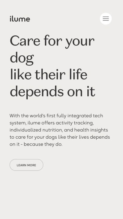
The website for iLume (weareilume.com) serves as a premier benchmark for “Immersive Direct-to-Consumer Wellness Merchandising and High-Impact Experiential Narrative Architecture.” As an innovative leader in personalized pet nutrition and smart health technology, their digital storefront must translate complex scientific algorithms, biometric data, and premium ingredients into an emotional, easily digestible brand story. This platform masterfully succeeds by treating its homepage as a cinematic and interactive journey, combining premium motion assets with refined interactive engineering optimized flawlessly for mobile devices.
Key Design Highlights:
- Mobile-First Scroll-Driven Narrative (Scrollytelling): Moving completely away from static, traditional mobile layouts, the website utilizes an elegant mobile scrollytelling framework. As users swipe through the brand’s narrative on their smartphones, the interface guides them step-by-step through a carefully paced story. This interactive flow turns a standard reading experience into a memorable, theatrical introduction to the company’s core mission.
- Cinematic, High-Impact Media Integration: Capturing absolute user focus the exact split second the interface initializes, the homepage leverages impressive, ultra-high-definition video content. By immediately showcasing dynamic, heartwarming clips of vibrant, healthy pets alongside sleek product close-ups, the platform creates an instant emotional connection with pet parents, using visual proof to validate the health benefits of their ecosystem.
- Crystal-Clear Front-Page Product Blueprint: The website completely eliminates consumer ambiguity by explicitly breaking down how their unique ecosystem works directly within the primary homepage layout. By clearly explaining the integration between their customized meal plans and smart tracker technology, the interface demystifies a multi-layered product offering and transforms technical data into an obvious, consumer-friendly value proposition.
- Dynamic, Fluid Fade-In Animations: To enrich user engagement on smaller screens, the mobile viewport leverages perfectly timed fade-in scroll triggers. As the user moves down the page, text elements, product details, and graphics smoothly materialize within the view. This micro-interaction framework not only controls the cognitive load by feeding information in snackable blocks but also reinforces a sense of premium polish and modern digital engineering.
7. Hestra Gloves
Why We Chose Hestra Gloves
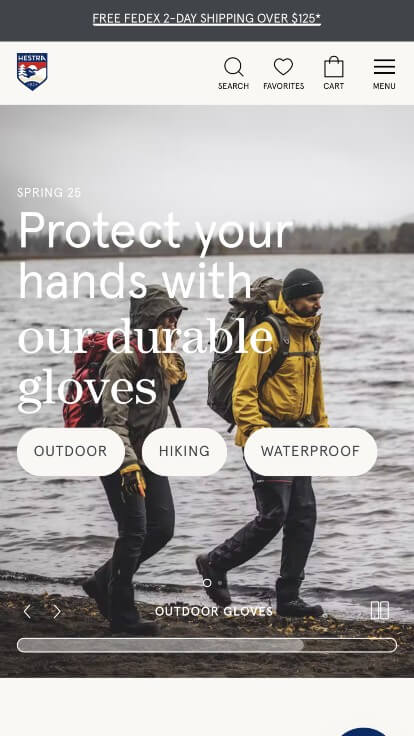
The website for Hestra Gloves serves as a premier benchmark for “Premium Heritage E-Commerce and High-Touch Customer Conversion Architecture.” As a legendary, multi-generational global glove specialist producing high-performance handwear for skiing, mountaineering, and dress wear, their digital storefront must match rugged utilitarian durability with an elegant, frictionless retail experience. This platform masterfully succeeds by balancing its rich alpine heritage with modern conversational commerce tools and structural design conventions optimized flawlessly across both desktop and mobile viewports.
Key Design Highlights:
- Real-Time Conversational Care and Live Chat Integration: Recognizing that high-performance outdoor gear requires exact technical specifications – such as choosing between specific leather treatments, insulation weights, or lining systems – the platform incorporates a highly responsive live chat portal. This interactive touchpoint lowers onboarding friction, allowing outdoor enthusiasts to instantly resolve sizing hesitations or care questions directly with a product specialist.
- Persistent Frictionless Sticky Navigation Framework: To maintain an effortless user journey as visitors process dense product catalogs and technical fabric specifications, the interface features a beautifully engineered sticky header. As users scroll deep into the page content, the primary navigation bar pins cleanly to the top of the viewport, keeping search tools, cart access, and core store branches continuously accessible within the immediate viewing frame.
- Expansive Mobile-First Mega Menu Taxonomy: Managing an extensive retail catalog that spans ski gloves, work gloves, leather dress gloves, and youth collections on smaller viewports is effortlessly achieved via a sophisticated mobile mega menu. The smartphone interface organizes deep-site product directories and filtering categories into an intuitive, touch-friendly expandable directory, making it simple to track down specific styles with minimal taps.
- High-Visibility Mobile Announcement Bar Integration: Capitalizing on top-tier screen real estate, the interface includes a clean, high-contrast announcement banner running directly above the primary global header navigation on mobile. This dedicated space serves as a critical, clutter-free communication pipeline, instantly alerting on-the-go shoppers to shipping thresholds, holiday promotions, or crucial product releases without disrupting the site’s sleek aesthetic balance.
8. Squarespace
Why We Chose Squarespace
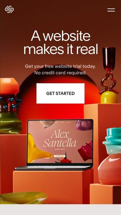
The website for Squarespace serves as a premier benchmark for “Enterprise-Grade SaaS Merchandising and High-Conversion Product Architecture.” As the industry leader in website design, digital commerce, and creative business tools, their own digital storefront must act as the ultimate proof of concept. The platform masterfully succeeds by transforming its homepage into a fluid, responsive showcase that balances clean product demonstration with highly aggressive mobile acquisition pipelines.
Key Design Highlights:
- Expansive Mobile-First Mega Menu Taxonomy: Managing an enterprise catalog that spans website templates, domains, e-commerce infrastructure, and AI tools on smaller screens is seamlessly achieved via a highly sophisticated mobile mega menu. The smartphone interface organizes deep-site links into crisp, expandable accordions, allowing users to rapidly find target resources without feeling overwhelmed by options.
- Persistent “Get Started” Sticky Action Portal: Capitalizing perfectly on top-tier commercial real estate, the mobile viewport locks a high-contrast, permanent “Get Started” call-to-action button to the absolute bottom of the screen. No matter how far a visitor scrolls down the page, this critical onboarding gateway remains continuously accessible, capturing user intent the exact second they decide to act.
- Structured Front-Page FAQ Blueprint: Overcoming technical onboarding friction and answering customer questions long before a trial is initiated, the homepage features a beautifully integrated Frequently Asked Questions (FAQ) repository. Addressing core topics regarding domain pricing, hosting security, and content ownership right on the front page shortens the consumer decision-making cycle and builds immense institutional trust.
- Flush Mobile Edge-to-Edge Fluid Layout Blocks: A particularly impressive hallmark of the mobile layout is its use of borderless visual design. Utilizing their signature “Fluid Engine” architecture, the mobile layout forces select product showcases, high-fidelity graphics, and dashboard mockups to bleed entirely flush with the edges of the smartphone viewport. Eliminating standard margins on media elements maximizes precious screen real estate, drawing the user into an exceptionally premium, immersive view of the software’s interface.

9. Oakridge Park
Why We Chose Oakridge Park
The mobile storefront for Oakridge Park Living serves as a premier benchmark for “Mobile-First Luxury Real Estate Merchandising and High-Fidelity Spatial Portals.” When translating a multi-billion-dollar architectural development onto a smartphone viewport, a site must balance immense media assets with lightweight, fluid navigation.
Key Design Highlights:
- Thumb-Optimized Immersive Media Sliders: Real estate sites are traditionally notorious for slowing down mobile devices with unoptimized video content. Oakridge Park overcomes this on mobile by organizing its high-fidelity video interviews and cinematic flyover films into swipe-friendly, horizontally stacked carousels. This allows smartphone users to control the loading and playback of heavy asset tracks with intuitive touch gestures rather than manual scrolling fatigue.
- Condensed Expandable Residential Accordions: To elegantly categorize their phase-one residential portfolios without causing endless scrolling, the mobile layout simplifies its detailed architecture menu into flat, vertical tap targets. As users select specific designer tracks (e.g., the fully-furnished x Clémande Parisian curation or the natural x Sergio Castiglia oasis), the menu smoothly expands to reveal deep-site links, ensuring instant discovery with minimum screen clutter.
- Responsive Visual Curation Grid for Luxury Co-Branding: Establishing immense institutional luxury alignment on a smaller viewport requires highly strategic spatial management. The mobile homepage utilizes a clean, responsive card-grid setup to showcase its elite partnership ecosystem. Displaying high-end fashion marks (like Louis Vuitton and Brunello Cucinelli) alongside local experiential modules in a scannable grid instantly establishes its status as “Vancouver’s premier cultural hub” on any screen size.
- Frictionless Mobile-First Global Header and Core Portal System: Navigating a massive master-planned ecosystem – comprising residential towers, workspace leasing, and active community updates – is made effortless through an ultra-clean mobile-first hamburger menu layout. By separating the user experience into immediate structural portals (“Living at Oakridge Park” vs. “Visiting Oakridge Park”), the interface eliminates navigational friction, ensuring high-intent buyers and commercial tenants can instantly find their specific pathways.
10. Purple
Why We Chose Purple
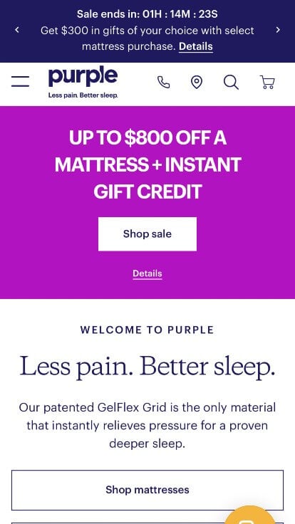
The mobile website for Purple serves as a premier benchmark for “High-Velocity Direct-to-Consumer (D2C) E-Commerce and Immersive Retail Conversion Architecture.” As a disruptive leader in the mattress and sleep technology space, their mobile storefront must rapidly translate their proprietary, tactile product engineering (the GelFlex Grid) into an understandable, high-trust digital purchase. This platform masterfully succeeds by structuring its mobile landing page as a persuasive, high-social-proof conversion funnel optimized for touch-first shopping.
Key Design Highlights:
- Frictionless Conversational Mobile Live Chat: Recognizing that a mattress is a high-consideration, long-term investment, the mobile interface integrates an easily accessible, thumb-optimized live chat feature. This conversational touchpoint gives on-the-go shoppers instant access to sleep specialists, resolving technical questions about firmness tiers, delivery logistics, or warranty details without forcing them to leave the primary shopping funnel.
- Front-Page Star Ratings and Instant Social Proof: Overcoming the digital barrier of purchasing a mattress without testing it physically, the mobile layout displays direct customer star ratings and review counts immediately beneath the product titles featured on the homepage. Injecting this transparent validation directly into the initial product discovery scroll establishes immediate credibility and validates their comfort claims at a glance.
- Transparent Financing and Payment Plan Showcases: To lower the financial barrier to entry and capture high-intent buyers, Purple highlights its core featured products on the homepage alongside clear, accessible financing alternatives (such as low monthly payment plans). Explicitly breaking down the monthly cost right under the retail price shortens the consumer consideration cycle and turns a premium purchase into an affordable lifestyle investment.
- Cinematic, Asset-Rich Product Demonstration Videos: The mobile homepage leverages highly impactful, ultra-crisp video blocks strategically placed in the scroll path to demonstrate the performance of their unique mattresses. By showing dynamic, real-world visual tests – such as how their flexible grid effortlessly cradles a raw egg while supporting heavy pressure – the interface instantly clarifies their proprietary material science far better than static text blocks ever could.
11. Casely
Why We Chose Casely
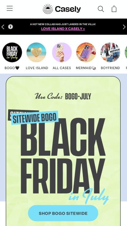
The mobile storefront for Casely serves as a premier benchmark for “High-Velocity Fast-Fashion E-Commerce and Trend-Driven Mobile Merchandising.” As an industry leader in tech accessories and protective phone cases, their digital storefront must effortlessly translate rapid-fire product drops, lifestyle aesthetic trends, and highly diverse device compatibility lists into a punchy, ultra-intuitive shopping funnel optimized for smartphone users.
Key Design Highlights:
- High-Trust Social Proof and Star-Rating Validation: Overcoming the digital barrier of e-commerce shopping is gracefully managed by embedding direct, high-volume customer reviews and aggregate 4.9-star validation directly within the primary homepage flow. Showcasing thousands of verified customer success stories, delivery confirmations, and real-world durability praise right on the front page establishes immediate social proof and builds trust with first-time visitors before they even begin browsing.
- Expansive, Device-Smart Mobile Mega Menu Taxonomy: Managing a massive consumer inventory that spans dozens of phone generations, tech brands (Apple, Samsung, Google), and lifestyle accessories is a massive design challenge on smaller viewports. Casely solves this with a highly sophisticated mobile mega menu. The smartphone interface organizes deep-site directories into flat, expandable accordion hierarchies, allowing users to rapidly isolate their specific phone model or target style collection without getting lost in deep-site link trails.
- Vibrant, Multi-Dimensional Mobile Lifestyle Curation: Because phone cases are as much a fashion statement as a protective need, the mobile viewport trades sterile product mockups for rich, color-forward lifestyle photography. The layout masterfully formats these lifestyle graphics into flexible, vertical blocks and grid matrices that integrate flawlessly on smaller screens. This creates an immersive lookbook atmosphere that naturally encourages users to match their technical accessories with their personal style.
- Frictionless “Join the Club” Subscription and Retailing Blocks: Capitalizing beautifully on top-tier screen real estate, the mobile homepage strategically weaves clear transactional gateways for their unique monthly case subscription box directly into the product scroll path. Displaying these subscription incentives alongside trending collections with clear, bold typography lowers the barrier to entry, turning one-off accessory shoppers into high-lifetime-value recurring members with a single tap.
12. Thrive Market
Why We Chose Thrive Market
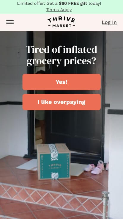
The mobile storefront for Thrive Market serves as a premier benchmark for “High-Velocity Grocery E-Commerce and Value-Driven Subscription Architecture.” As an industry-leading online marketplace for organic and sustainable groceries, their digital platform must translate complex membership value propositions, massive grocery catalogs, and personalized dietary filters into a hyper-intuitive, touch-first shopping funnel.
Key Design Highlights:
- Transparent Member Savings and Financial Value Metrics: Overcoming the natural friction of a subscription paywall, the mobile homepage features a dedicated, high-visibility section quantifying the exact financial benefits of a membership. By explicitly mapping out average yearly savings, price matching guarantees, and how a paid membership sponsors a free subscription for a family in need, the interface leverages data-driven validation to instantly prove the economic value of the platform on smaller viewports.
- Frictionless Mobile Product Category Grid Matrix: Navigating an entire supermarket inventory on a smartphone screen can easily overwhelm a consumer. Thrive Market resolves this by organizing its core inventory into a clean, modern grid setup directly on the homepage. This visual architecture groups massive product branches into touch-optimized icons – spanning food, beauty, home, and pet needs – allowing on-the-go shoppers to completely bypass complex search layers and dive straight into high-conversion retail pipelines.
- Hyper-Personalized “Shop by Lifestyle” Curation Hub: Recognizing that modern grocery shoppers filter their food through highly specific dietary and ethical lenses, the mobile layout prioritizes an interactive, lifestyle-focused shopping section. This gateway allows mobile users to instantly filter the entire marketplace by specific values – such as Organic, Keto, Gluten-Free, Vegan, or Certified B-Corp – with a single tap, transforming an expansive inventory into a highly customized, boutique grocery experience.
- Authentic Social Proof and Member Testimony Showrooms: Validating their grocery quality, shipping reliability, and curation standard is gracefully achieved by embedding direct customer reviews and testimonials within the central mobile homepage flow. Highlighting real-world stories from busy parents, health enthusiasts, and budget-conscious shoppers establishes immediate community trust, giving prospective members the social proof needed to confidently complete the onboarding process.
Suggestions for Creating a Responsive Web Design
1.) Build for touchscreen functionality
Touchscreens are becoming more and more popular, so make sure that your site is optimized for them. One way to do this is to make sure all elements are large enough to be pressed with a finger. There’s nothing worse than trying to click on a tiny button without clicking on a completely different element.

2.) Decide which elements to hide on mobile devices
If your website is going to be viewed on a small screen, such as those found on smartphones, it’s important that you decide what elements should and shouldn’t be included.
For example, if your site has too many buttons or widgets taking up valuable space, it could make the content difficult to view. It would also be beneficial for you to use smaller font sizes so there can still be enough room for all of the text.

3.) Use a fluid design grid
Pixel-based layouts were once the standard for website design, but with large advances made in the technology space, designers now adopt a fluid grid.
A grid makes it quicker and easier to size things proportionally, instead of having to set every element to a different size. This means that you don’t have to worry about figuring out how many pixels one thing should be compared to the other when adjusting for screens of all sizes.
These grids often have a fluid layout with columns, which can be scaled. The width and height of the elements are not uniform, but they will change depending on the size of the screen.

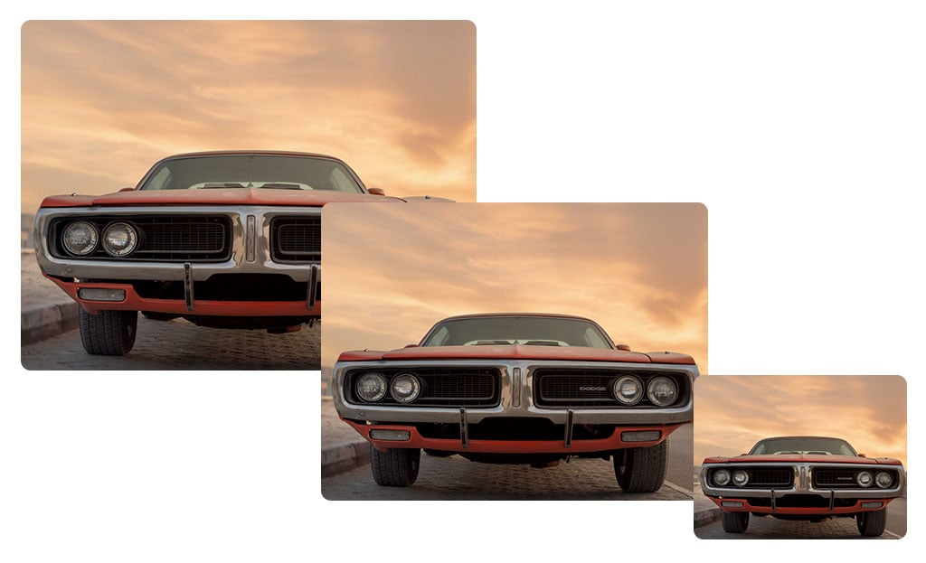
4.) Determine image sizes that will work on all devices
Responsive web design can be a challenge, and one of the most difficult aspects is determining how to size images. Rules are set to determine how images should be handled on different screens. These rules can include the dimensions, positioning, and scaling of multimedia files.
When dealing with images, keep them as small and manageable as possible. Tools like TinyJPG can be used to reduce the image size while preserving quality during uploads.
5.) Decide which micro interactions to include
Micro-interactions are a trend that’s slowly coming into web design. They can make your website more interactive and engaging for the user by adding small features, such as hover effects or notifications to an otherwise static page. These animations are great for giving instant feedback to the visitor, which is great for those who use their mobile to browse online.
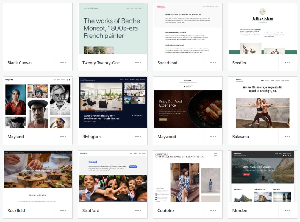
6.) Choose a responsive theme, if you can’t create a custom theme
If you’re not comfortable making a responsive website, then you can take advantage of the many themes available online. Your job will simply be to update colors, branding, and content – nice! You can customize your design as much or little as needed, without ever worrying about whether the website is responsive or not.
If you’re a WordPress user, responsive themes are right at your fingertips with plenty of free and paid options available.
Related: Check out this comparison of Free & Paid Portfolio Sites.
7.) Hire a professional web designer if you need help
You may find it impossible to locate a pre-designed theme that meets your needs or matches the company branding, especially if you are using something other than WordPress.
If you want an aesthetically pleasing site without any technical knowledge needed, and don’t have time to design every individual element by hand, try hiring a professional, (like the team at WebCitz!) to handle it for you!
If you want your website to look good on every device, be sure that the websites designer has a solid background in web design. If anything, this job demands higher quality work with prices reflecting as such – so don’t try cutting any corners!