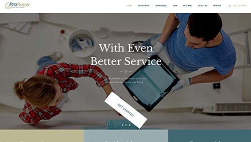
In the professional painting industry, your website is your digital portfolio. Before a homeowner or facility manager ever asks for a color consultation, they look to your online presence to judge your attention to detail, your cleanliness, and the quality of your finished product. To stand out in a crowded local market, your design must communicate aesthetic precision, professional reliability, and high-end craftsmanship.
Our design team evaluated hundreds of painting websites – from residential interior specialists and exterior house painters to large-scale commercial and industrial coating firms. We analyzed these sites for high-impact visual storytelling, mobile-friendly estimate tools, and the effective use of “Before and After” galleries.
Whether you specialize in fine cabinet finishing or massive commercial repaints, these 10 examples represent the benchmark for painting web design in 2026.
Note on Our Selection Process: We recently audited this guide to remove outdated designs and sites that no longer meet our performance standards. This curated list now focuses on the top 10 painting websites providing the most strategic value in 2026.
Top Painter Website Designs
1. Five Star Painting
Why We Chose Five Star Painting
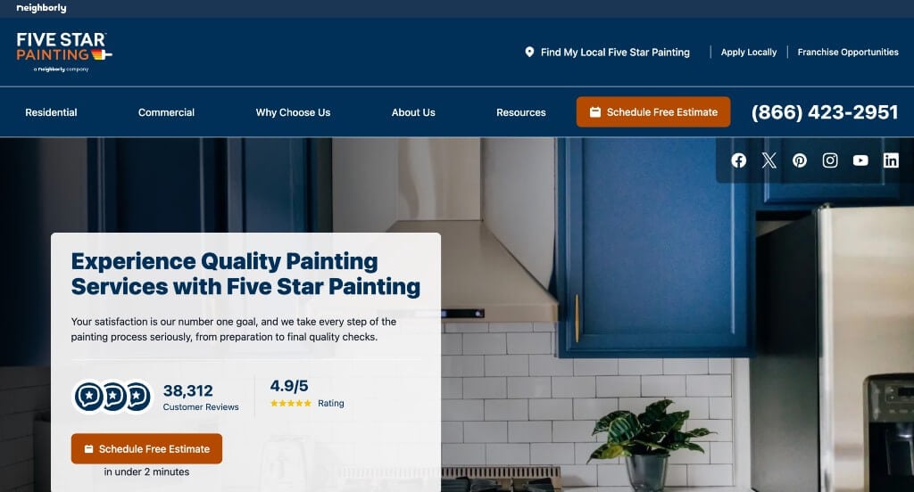
The Five Star Painting website is a premier example of “Scalable Brand Authority and Interactive Customer Support.” By balancing the reach of a national franchise with a deep commitment to local service standards, the site effectively builds trust with homeowners seeking high-quality interior and exterior transformations.
Key Design Highlights:
- Structured Value Proposition: A robust “Why Choose Five Star Painting for Your Next Project?” section outlines their core pillars of service: professional expertise, superior quality, clean work areas, and staying on time and on budget. This transparency helps alleviate common anxieties associated with hiring home contractors.
- Proactive Client Education: The inclusion of an FAQ section directly on the home page provides instant answers to common logistical and technical questions. By addressing topics like project scope and timing, the site builds authority and reduces the “barrier to contact” for new customers.
- Multi-Format Reputation Proof: Customer reviews are integrated throughout the home page to provide social proof. These testimonials validate the company’s technical skill and professionalism with real-world feedback from a variety of past clients.
- Interactive Design Tools: The home page features a color visualizer tool, allowing users to experiment with different paint shades virtually. This interactive element engages visitors early in the decision-making process, helping them visualize the final result before ever committing to a project.
2. Paint Denver
Why We Chose Paint Denver
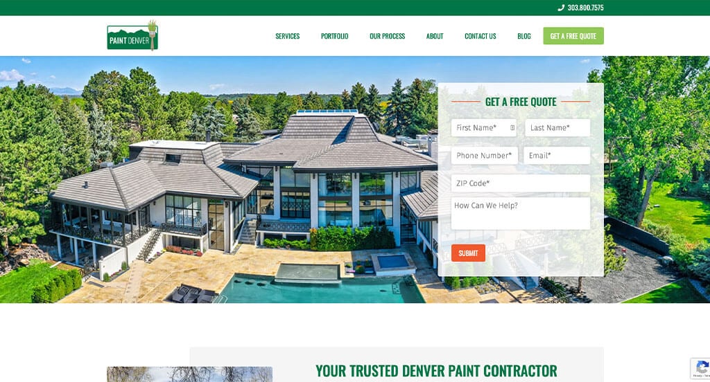
The Paint Denver website is a masterclass in “Visual Proof and Local Authority.” By focusing heavily on recent work and established credentials, the site provides a highly transparent look at their capabilities, ensuring Denver homeowners feel confident in the quality of their craftsmanship.
Key Design Highlights:
- Immediate Reputation Validation: The site features integrated Google reviews directly on the home page. In a service industry where trust is paramount, providing real-time, unedited feedback from local clients serves as powerful social proof that validates the company’s reliability and skill.
- Dynamic Portfolio Showcase: A scroller of recent projects allows visitors to see the “Paint Denver” quality in action. This visual evidence of completed work across various styles and surfaces helps potential customers visualize the possibilities for their own homes and demonstrates a consistent track record of success.
- Layered Value Propositions: The home page features both a “Why choose us as your Denver painting Company?” section and “The Paint Denver Difference” further down. This two-tier approach first addresses general service benefits and then dives deeper into the specific cultural or technical standards that set them apart from local competitors.
- Established Professional Credibility: Awards and affiliates are prominently shown on the home page. Displaying logos from recognized industry associations and local “Best of” awards provides a “stamp of approval” from third-party experts, further cementing their status as a premier local contractor.
3. Hedlund Painting
Why We Chose Hedlund Painting
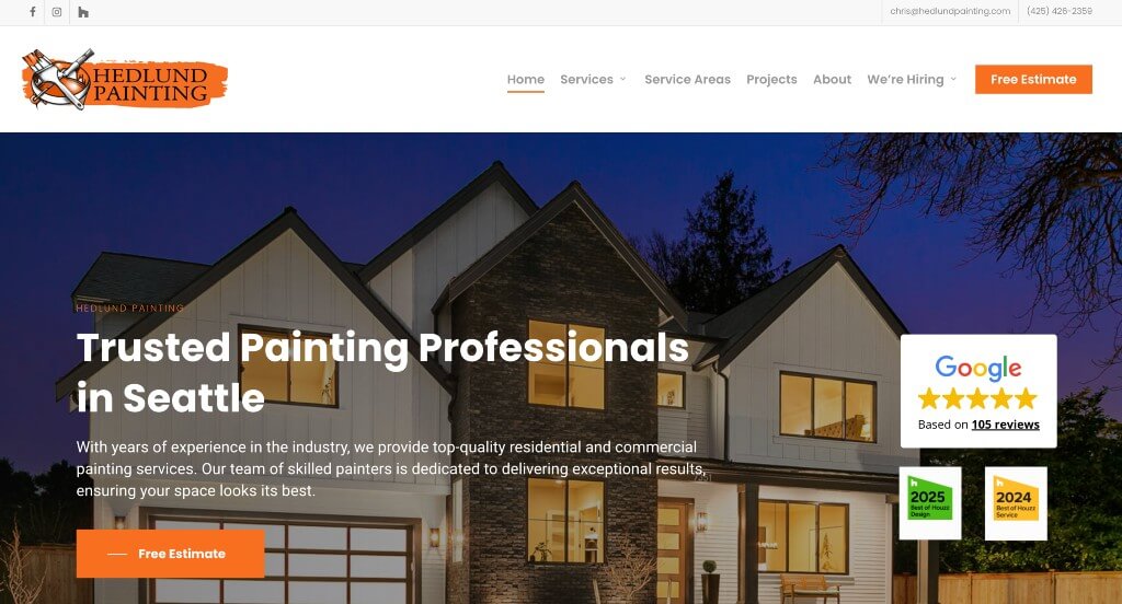
The Hedlund Painting website is a standout example of “Geographic Authority and Visual Credibility.” By combining high-quality evidence of their recent work with a clear explanation of their service boundaries, the site effectively establishes itself as a transparent and reliable partner for residential and commercial painting projects.
Key Design Highlights:
- Visual Proof of Craftsmanship: The home page features a “Recent Projects” slider that showcases high-resolution images of completed work. This allows potential clients to see the precision and quality of their painting finishes firsthand, helping to bridge the gap between a service description and a tangible result.
- Dual-Layered Location Clarity: Both a comprehensive city list and an interactive map are used to define their service area. This ensures that homeowners can instantly verify their eligibility for service while also reinforcing the company’s local presence and commitment to the community.
- Proactive Informational Support: The inclusion of an FAQ section on the home page addresses common concerns regarding timelines, materials, and preparation. By providing these answers upfront, the site reduces customer anxiety and streamlines the inquiry process.
- Authentic Brand Identity: The “About Hedlund Painting” section outlines the specific values and standards that make them a great choice. This area goes beyond a list of services to share the company’s story and professional philosophy, creating a more personal connection with the visitor.
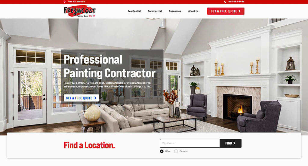
4. Fresh Coat Painters
Why We Chose Fresh Coat Painters
The Fresh Coat Painters website is a premier example of “Local Accessibility and Narrative Trust.” As a large-scale franchise, the site excels at connecting users with local experts through an efficient search interface while using in-depth storytelling to prove their commitment to quality.
Key Design Highlights:
- Localized User Journey: Directly below the hero section, there is a prominent ZIP code entry form to find the closest location. This ensures that even on a national corporate site, the user is immediately funneled to their specific local branch, making the experience feel personal and relevant.
- Narrative-Driven Social Proof: The home page showcases testimonials from past clients that are “wordy and detailed.” Unlike short, generic blurbs, these long-form reviews provide a deeper narrative about the customer experience, addressing specific details about professionalism, punctuality, and the quality of the finish.
- Persistent Mobile Conversion: The mobile header is designed to keep the “Get a Free Quote” button and the phone number clearly visible at all times. This “sticky” approach ensures that potential leads can initiate contact the moment they feel inspired, without having to navigate back to the top of the page.
- Visual Work History: Past projects are showcased on the home page, providing a digital portfolio that allows visitors to verify the company’s versatility. Seeing real-world examples of interior and exterior work helps homeowners visualize the potential transformation of their own spaces.
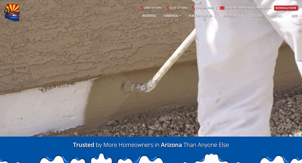
5. Arizona Painting Company
Why We Chose Arizona Painting Company
The Arizona Painting Company website is a masterclass in “Authenticity and Local Leadership.” By utilizing real-life footage and structured value propositions, the site effectively moves beyond generic marketing to prove its hands-on expertise and deep roots in the Arizona community.
Key Design Highlights:
- Immediate Proof of Labor: The hero video features actual workers painting on-site. This choice is incredibly effective for building trust; it replaces stock photography with real footage of their crew in action, allowing potential customers to see the professionalism, safety equipment, and meticulous technique used during a project.
- Narrative Trust Building: The “Why Trust Us?” section focuses specifically on customer testimonials. By framing reviews under a question about “Trust,” the site directly addresses the primary concern of homeowners – reliability – and uses the voices of past clients to provide the answer.
- Regional Service Authority: A dedicated section for “Best House Painting Services in Arizona” clearly highlights their offerings. This not only helps with local SEO but also serves as a comprehensive menu for visitors to quickly identify that the company handles everything from stucco repair to cabinet refinishing.
- Defined Competitive Differentiators: The “What Sets Our Painting Company Apart?” section explicitly outlines their unique advantages. By listing specific standards – such as their background-checked employees, extensive warranties, or high-quality paint products – they give the visitor concrete reasons to choose them over lower-cost, unvetted alternatives.
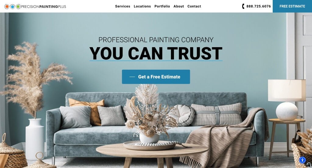
6. Precision Painting Plus
Why We Chose Precision Painting Plus
The Precision Painting Plus website is a benchmark for “Premium Presentation and Financial Accessibility.” By combining high-end visual storytelling with flexible payment solutions, the site successfully appeals to both the aesthetic desires and the practical budgetary needs of modern property owners.
Key Design Highlights:
- Structured Service Clarity: Their core services are clearly outlined on the home page with intuitive navigation. This allows visitors to quickly distinguish between interior, exterior, and specialty services, ensuring that users find exactly what they need within seconds of landing on the site.
- Engaging Visual Motion: The site features visually interesting animations that trigger as you scroll. These subtle transitions create a sense of momentum and “premium” quality, keeping the user engaged with the content and making the brand feel more modern and technologically savvy than the average contractor.
- Lowering the Barrier to Entry: This company offers financing for projects and explains the options directly on the home page with a link to more info. By addressing the financial aspect of home improvement early on, they make large-scale transformations feel more attainable and transparent for budget-conscious clients.
- Dual-Sector Authority: The home page showcases project portfolios for both residential and commercial jobs. Providing specific galleries for different sectors proves their versatility and technical capability, reassuring both a homeowner looking to refresh a bedroom and a business owner managing a large-scale facility.
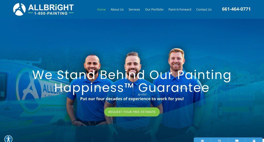
7. All Bright Painting
Why We Chose AllBright Painting
The AllBright Painting website is a premier example of “High-Stakes Credibility and Omnichannel Communication.” By showcasing a portfolio that includes massive landmark projects alongside local residential work, the site positions the company as a top-tier authority capable of handling any scale of painting challenge.
Key Design Highlights:
- Omnichannel Communication Hub: The bottom right of the screen features a sticky contact widget offering four distinct ways to connect: call, text, email, or live chat. This “meet-the-customer-where-they-are” approach ensures that whether a user is in a hurry or looking for a detailed consultation, the barrier to entry is virtually non-existent.
- Massive Scale Social Proof: The home page highlights a specialized project where they painted a rollercoaster at Six Flags Magic Mountain. Showcasing such a high-profile, technically difficult commercial job serves as an ultimate “trust signal,” proving that if they can handle a landmark theme park attraction, they can certainly handle a residential home.
- Verified Local Reputation: Home page testimonials provide a steady stream of social proof from satisfied clients. By featuring real-world feedback alongside their high-profile projects, they maintain a balance between “large-scale expert” and “trusted neighborhood painter.”
- Celebrated Excellence: A dedicated section on the home page showcases their various awards and accolades. Displaying industry recognition and “Best of” badges provides third-party validation of their quality, reinforcing their status as a premier leader in the painting industry.
8. Painter Bros
Why We Chose Painter Bros
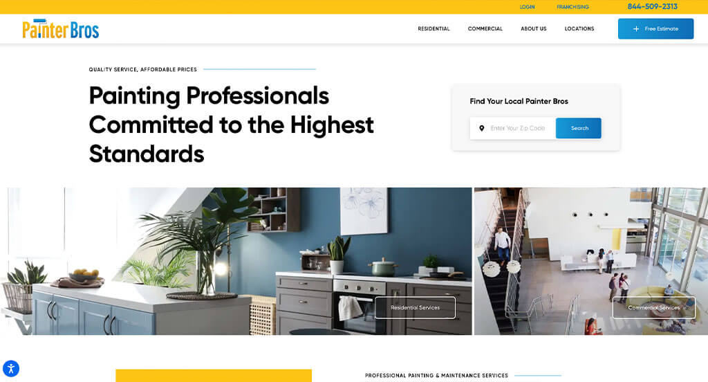
The Painter Bros website is a masterclass in “National Scale with Local Frictionless Entry.” By combining high-authority branding with immediate, interactive lead-capture tools, the site ensures that whether a customer is looking for a small residential refresh or a large-scale commercial contract, the path to starting the project is unmistakable.
Key Design Highlights:
- Immediate “Consultation-First” Hero: The hero area features a prominent lead form to get a free consultation right away. This design choice prioritizes the user’s intent, allowing them to provide their project details immediately without having to navigate to a separate contact page.
- Strategic Conversion Redundancy: The home page is peppered with various CTAs to get a free estimate or contact the team. By placing these buttons after key sections – like their service descriptions and customer testimonials – the site captures the user’s interest at multiple high-intent “decision points” throughout their scroll.
- Dynamic Value Communication: The “Why Choose Us?” section features a unique vertical scroller that highlights their core advantages. This engaging design element draws the eye and makes their key selling points – such as being licensed, insured, and backed by a national brand – feel modern and easy to digest.
- High-Visibility Contact Header: The phone number is prominently displayed in the header. For customers who prefer immediate human interaction or have urgent commercial facility needs, this “always-on” visibility provides a reliable anchor for the brand’s accessibility.
9. AMC Painting
Why We Chose AMC Painting
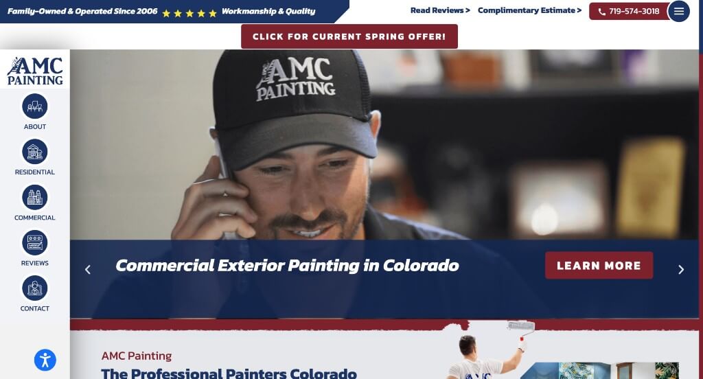
The AMC Painting website is a premier example of “Dynamic Storytelling and Navigational Innovation.” By moving away from standard web layouts and leaning heavily into video-based social proof, the site creates an immersive experience that highlights their professional process and deep-rooted local identity.
Key Design Highlights:
- Immersive Process Transparency: The hero section features a background video showing the crew actually working on-site. This immediate visual evidence of their craftsmanship, safety gear, and professional demeanor builds instant trust, showing homeowners exactly who will be showing up at their door.
- Multi-Layered “Voice of the Customer”: The home page includes both written and video testimonials. While written reviews are great for SEO, video testimonials provide an extra layer of authenticity, allowing potential clients to hear the satisfaction in a real neighbor’s voice.
- Educational Authority: Recent blog posts are showcased directly on the home page. By sharing seasonal tips (like spring painting ideas) and value-boosting project advice, the company positions itself as an industry educator rather than just a service provider.
- Modern Navigational Twist: Instead of the typical top-horizontal header, the site utilizes a unique sidebar menu. This unconventional design choice provides a clean, modern aesthetic and ensures that the main navigation is always accessible without obscuring the high-impact visual content of the site.
- Localized Strategic Incentives: The site effectively uses time-sensitive offers, such as winter savings discounts, paired with prominent mentions of being “Colorado Owned and Operated since 2006,” reinforcing their commitment to the local community.
10. Paint Works
Why We Chose Paintworks London
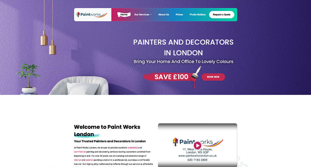
The Paintworks London website is an excellent example of “Process Clarity and Mobile-Optimized Conversion.” By providing a detailed roadmap of their service standards and ensuring that mobile users have constant access to essential actions, the site builds a high level of professional confidence for homeowners in a busy urban market.
Key Design Highlights:
- Comprehensive Value Proposition: The home page clearly explains their professional process, exactly what they provide, and the specific reasons why you should choose them. This structured storytelling removes guesswork for the customer and establishes a high standard of accountability before the first brushstroke.
- Proactive Client Education: The inclusion of an FAQ section directly on the home page addresses common logistical concerns. By providing answers up front, the site reduces friction in the decision-making process and positions the company as a transparent and communicative service provider.
- Service Transparency: Their various offerings are clearly explained throughout the home page. This ensures that visitors can quickly verify the company’s expertise in specific areas – whether residential or commercial – without needing to hunt through sub-menus.
- Frictionless Mobile Action: The mobile view features a sticky footer with “Call Now” and “Book Online” buttons. This persistent placement is critical for conversion, ensuring that a user who is browsing on the go can initiate contact or schedule an appointment the moment they are ready, regardless of where they are on the page.
WordPress Painting Themes
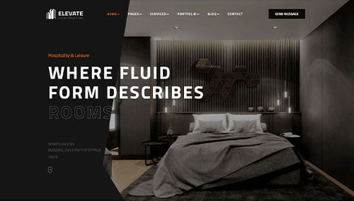
You can find free themes at wordpress.org, or explore painting-inspired templates on ThemeForest.
Elevate – Themeforest
$39
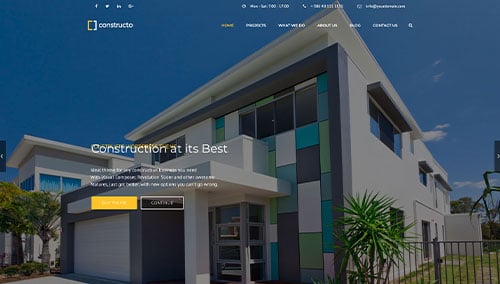
Constructo – Themeforest
$59
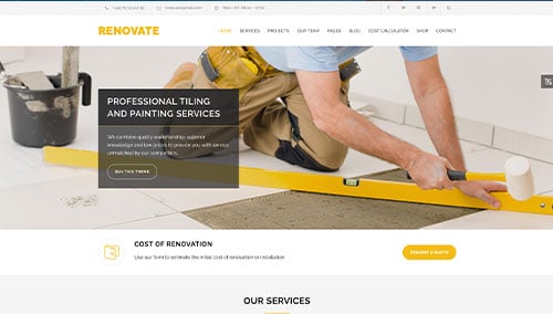
Renovate – Themeforest
$69
ProRange – Themeforest
$69