In the field of plastic and reconstructive surgery, your website is your most influential consultation tool. Before a patient ever steps into your office, they use your digital presence to evaluate your surgical philosophy, your aesthetic eye, and the quality of your results. To compete at the highest level, your design must radiate sophistication, clinical safety, and world-class artistry.
Our design team analyzed hundreds of aesthetic websites – from elite plastic surgery centers and hair transplant clinics to high-end medical spas and dermatology practices. we looked beyond the surface to identify the 13 best examples of conversion-focused luxury design, specifically analyzing their HIPAA-compliant lead flows, “before & after” gallery architecture, and surgeon credential transparency.
Whether you are a solo practitioner building a boutique brand or a multi-surgeon institute, these examples represent the current benchmark for excellence in 2026.
Note on Our Selection Process: We recently audited this guide to remove outdated designs and sites that no longer meet our performance standards. This curated list now focuses on the top 13 plastic surgery websites providing the most strategic value in 2026.
Top Plastic Surgeon Website Designs
- 1. Shafer Clinic
- 2. LaserAway
- 3. Beautyfix MedSpa
- 4. Dream Medical Group
- 5. Cosmetic Surgical Center
- 6. Roy Kim, MD
- 7. Elite Plastic Surgery
- 8. New York Group for Plastic Surgery
- 9. Donaldson Plastic Surgery
- 10. Marina Plastic Surgery
- 11. Body By Ravi Plastic Surgery & Aesthetics
- 12. Pacific Plastic Surgery Group
- 13. Capizzi, M.D.
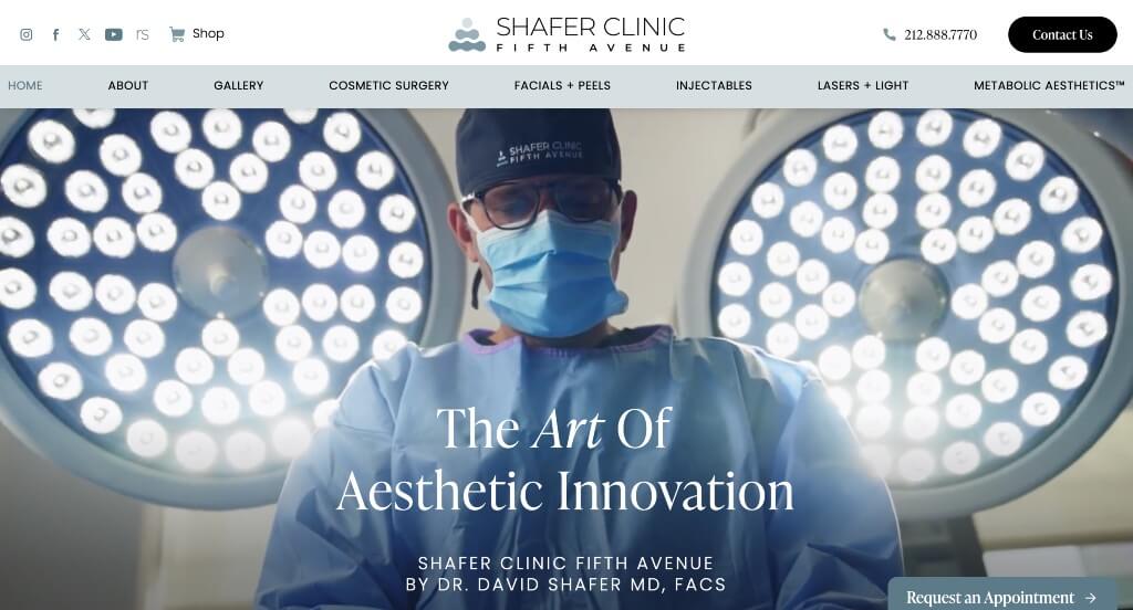
1. Shafer Clinic
Why We Chose Shafer Clinic Fifth Avenue
The Shafer Clinic Fifth Avenue website is a premier case study in “Elite Luxury Authority and Dynamic Spatial Transparency.” In the ultra-competitive Manhattan aesthetic market, a digital platform must balance high-end medical expertise with approachable luxury. This site achieves this by replacing generic corporate layouts with real, transparent proof of their facility and staff directly on the home page.
Key Design Highlights:
- Kinetic Luxury Verification: The main hero area features a high-definition video loop showcasing their actual state-of-the-art Fifth Avenue facility, medical teams, and elegant client interactions. Visually leading with a pristine, real-world look at their office environment humanizes the clinic and establishes a premium aesthetic standard from the exact second a user lands on the page.
- Authentic Visual Representation: Rather than falling back on generic, uninspired stock photography, the images and videos throughout the entire home page exclusively feature actual employees and clinicians working at the practice. This strict commitment to visual authenticity builds immediate consumer trust and eliminates the artificial distance often felt on medical websites.
- Structured Architectural Procedural Grid: The home page maps out an organized, highly comprehensive explanation of the aesthetic procedures they offer. Seamlessly partitioning their extensive treatment lineup into clear, scannable core tracks – including plastic surgery, dermatology, non-invasive injectables, laser skin rejuvenation, and metabolic wellness – allows fast-skimming patients to qualify their needs instantly.
- Authoritative Practitioner Trust Infrastructure: To satisfy the rigorous vetting standards of high-end cosmetic consumers, the home page features dedicated picture bios and elite credentials for the surgeons on staff. Spotlighting their advanced training, board certifications, and industry innovations upfront provides deep medical validation before a patient initiates a formal consultation.

2. LaserAway
Why We Chose LaserAway
The LaserAway website stands out as a premier benchmark for “High-Velocity Retail Medical Aesthetics and Visual Onboarding.” In an industry where consumers frequently browse with a mix of curiosity and hesitation, this platform completely removes barriers to entry. It abandons conservative, clinical gatekeeping in favor of a dynamic, retail-forward experience directly on the home page.
Key Design Highlights:
- Immediate Multi-Service Launchpad: The home page breaks away from standard medical layouts by presenting a vast array of core aesthetic treatments immediately above the fold. Displaying high-visibility tap targets for services like laser hair removal, Botox, dermal fillers, and body contouring gives users an instant visual directory to select a treatment and fast-track their booking process.
- Linearized 3-Step Client Journey: To lower the psychological barrier to starting a new clinical treatment, the platform outlines an incredibly simple 3-step process. Mapping out a transparent, frictionless path – from the initial consultation to personal treatment customization and the final session – demystifies medical aesthetics and encourages new patient acquisition.
- High-Authority Media Validation: The dedicated “LaserAway In the Press” section incorporates prominent media badges and publication mentions from across the lifestyle, beauty, and fashion industries. Aligning the brand with recognizable media outlets provides a powerful layer of mainstream cultural validation that reinforces its status as a trusted industry leader.
- Dual-Action Friction Relief Closure: The home page wraps up at its natural scrolling endpoint with a combined social proof and educational grid. Layering real-world patient transformation reviews alongside an interactive FAQ directory allows browsing consumers to resolve lingering anxieties about pricing, safety, and results right before entering the intake funnel.
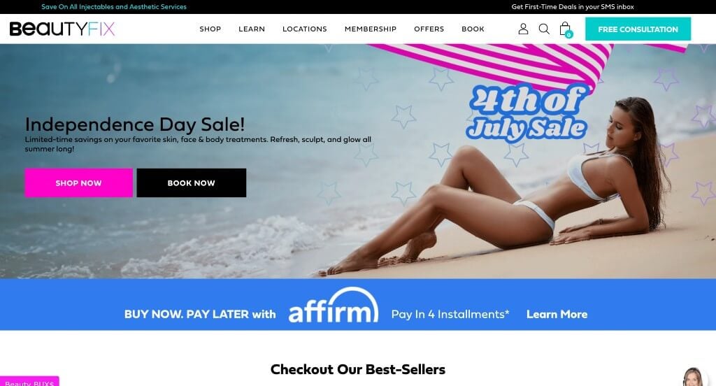
3. Beautyfix MedSpa
Why We Chose BeautyFix MedSpa
The BeautyFix MedSpa website stands out as an exceptional model for “E-Commerce Driven Medical Aesthetics and Radical Pricing Transparency.” Many clinical and medspa platforms gatekeep their service costs behind mandatory consultations, which can cause friction for browsing users. This site completely eliminates that barrier by treating luxury clinical treatments with the transparency of a modern retail experience directly on the home page.
Key Design Highlights:
- Radical Upfront Pricing Matrix: A standout feature of the home page is the direct display of pricing for their various aesthetic procedures. Explicitly listing the costs for high-demand treatments – such as lip fillers, Botox, body contouring, and skin lasers – immediately qualifies leads and builds strong consumer trust before a consultation is booked.
- Multi-Layered Visual Social Proof: The testimonial section goes beyond standard text reviews by pairing verified patient stories with actual lifestyle and transformation photography. Showcasing real-world results alongside client feedback provides highly relatable peer validation right on the main page.
- High-Authority Media Integration: The dedicated “Featured In” section incorporates prominent media and publication badges from major beauty, fashion, and lifestyle outlets. Displaying these recognizable press logos gives the brand immediate mainstream credibility and reinforces its status as a premier national aesthetics authority.
- Educational Content Engine: The latest articles and treatment deep-dives from their beauty blog are featured prominently on the home page. Keeping this educational content fresh establishes continuous clinical expertise and gives patients a reliable resource to research procedures, pre-care, and recovery timelines.
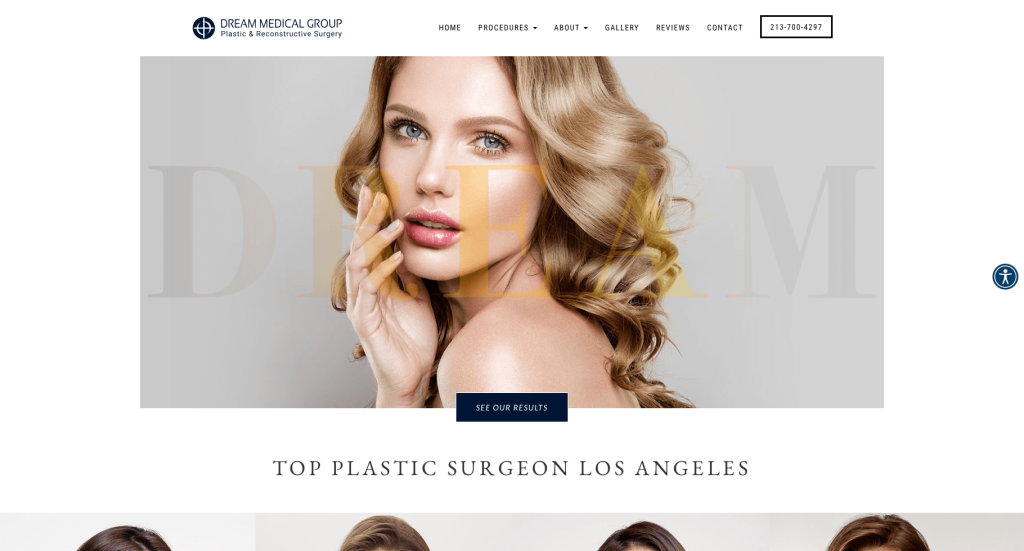
4. Dream Medical Group
Why We Chose Dr. Kenneth Kim
The Dr. Kenneth Kim website is a premier case study in “Global Medical Authority Architecture and Surgical De-risking.” High-value elective and reconstructive procedures require a digital presence that balances rigorous scientific validation with elite craftsmanship. This platform satisfies the detailed scrutiny of discerning domestic and international cosmetic consumers by anchoring its value proposition in technical differentiation and visual outcomes directly on the home page.
Key Design Highlights:
- Three Core Pillars of Technical Differentiation: The home page structures its clinical value proposition by outlining three distinct reasons to choose Dr. Kim. Rather than relying on generic promises of beauty, the site highlights precise technical advantages: Awake Surgery (utilizing local anesthesia to eliminate general anesthesia risks), his Minimal Bleeding Technique (which minimizes blood vessel disruption to accelerate recovery), and his Globally Advanced Techniques (leveraging his background with elite surgical groups like the Dream Medical Group in Seoul).
- Comprehensive Body and Facial Mapping: The areas of the body Dr. Kim operates on are clearly explained through a clean, anatomical service matrix. Breaking his advanced specialties into dedicated surgical tracks – including eyes (such as double eyelid and ptosis surgery), nose, facelift, facial contouring, breast, and body – allows patients to qualify their specific reconstructive or cosmetic goals in a single glance.
- Peer-Reviewed Scientific Validation: To cement immediate medical credibility, the home page showcases published articles and peer-reviewed scientific papers authored by Dr. Kim. Highlighting his extensive contributions to leading international medical journals (such as Plastic and Reconstructive Surgery) proves his status as a pioneering medical educator rather than just a commercial injector.
- Empirical Visual Outcomes: The home page integrates a clear display of before-and-after transformation photography. Presenting these unedited, high-resolution clinical results alongside detailed technical information addresses the primary safety and aesthetic anxieties of browsing consumers right before they engage the clinic’s digital intake.
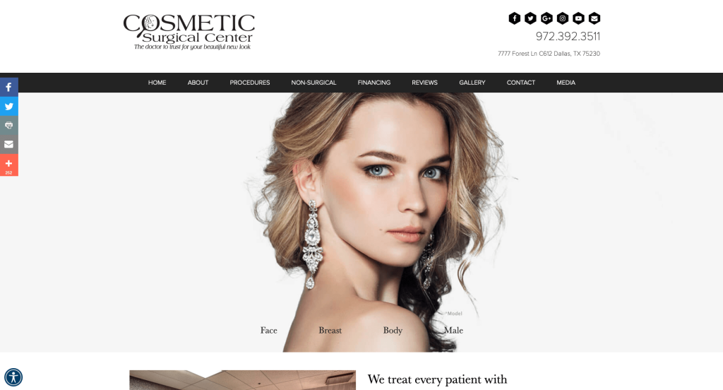
5. Cosmetic Surgical Center
Why We Chose Rai Cosmetic Surgery Center
The Rai Cosmetic Surgery Center website serves as a premier benchmark for “Demographic Inclusivity and Advanced Spatial Visualization.” High-value elective and reconstructive procedures require a digital platform that projects immense medical capability while remaining highly approachable. This site successfully navigates consumer hesitation by combining professional cinematic proof with highly structured, anatomically segmented treatment tracks right on the home page.
Key Design Highlights:
- Cinematic Facility and Process Proof: The main hero area features a top-tier, exceptionally high-quality video loop. By showcasing a pristine look at their state-of-the-art clinical space, advanced equipment, and comfortable patient-staff interactions, the site builds immediate transparency and lowers surgical anxiety from the very first second a user lands on the page.
- Organized Demographic and Anatomical Triaging: Their extensive suite of treatments is clearly outlined and meticulously categorized into five core operational tracks: Body Procedures, Breast Procedures (including specialized reconstruction), Face Procedures, Male Procedures, and Non-Surgical Procedures. Expressly highlighting a dedicated segment for male-specific treatments proactively modernizes their onboarding and captures an expanding aesthetic market.
- Empirical Visual Outcomes: The home page integrates a clear display of high-resolution before-and-after transformation photography. Allowing browsing consumers to see real, unedited clinical results alongside structural information satisfies critical visual vetting standards before they engage the practice’s digital intake.
- Multi-Layered Peer Validation: Authentic patient reviews are built smoothly onto the home page layout. Showcasing verified, long-form stories of compassionate care, natural-looking results, and supportive post-op tracking anchors the center’s elite marketing claims with genuine community confirmation.
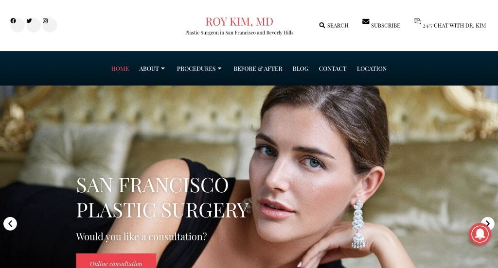
6. Roy Kim, MD
Why We Chose Roy Kim, MD
The web platform for Dr. Roy Kim stands out as a premier benchmark for “Multichannel Patient Education and Multi-Layered Clinical Validation.” In high-value elective medical sectors like cosmetic surgery, building deep consumer safety and intellectual trust is paramount. This site masterfully shifts away from generic sales messaging by transforming the homepage into a rich, transparent learning and evidence ecosystem.
Key Design Highlights:
- Media-Forward Educational Hub: A standout feature of the homepage is the integration of Dr. Kim’s own podcast, The Beauty Standard. Showcasing episodic modules covering international trends, comparative tissue studies, and direct surgical audits positions Dr. Kim as an active clinical educator, building trust with discerning clients before a consultation.
- Frictionless Header Intake Triggers: The homepage hero area incorporates primary call-to-action buttons designed for easy online consultation booking. Placing these intake hooks prominently above the fold simplifies the pathway for high-intent domestic and traveling patients looking to connect with his San Francisco or Beverly Hills teams.
- Empirical Dual-Action Visual Proof: The homepage includes an interactive “Before & After” transformation gallery equipped with sliding overlay comparison tools. Placing these high-definition visual sliders directly above long-form text reviews allows browsing users to simultaneously verify technical surgical outcomes and read about the real patients’ emotional recovery journeys.
- Structured Clinical Procedure Grids: Core clinical offerings are mapped cleanly on the homepage across dedicated pathways for breast enhancement, facial contouring, body sculpting, and non-surgical treatments. Outlining these advanced surgeries alongside transparent procedural metrics ensures quick-skimming users can easily qualify their aesthetic goals.
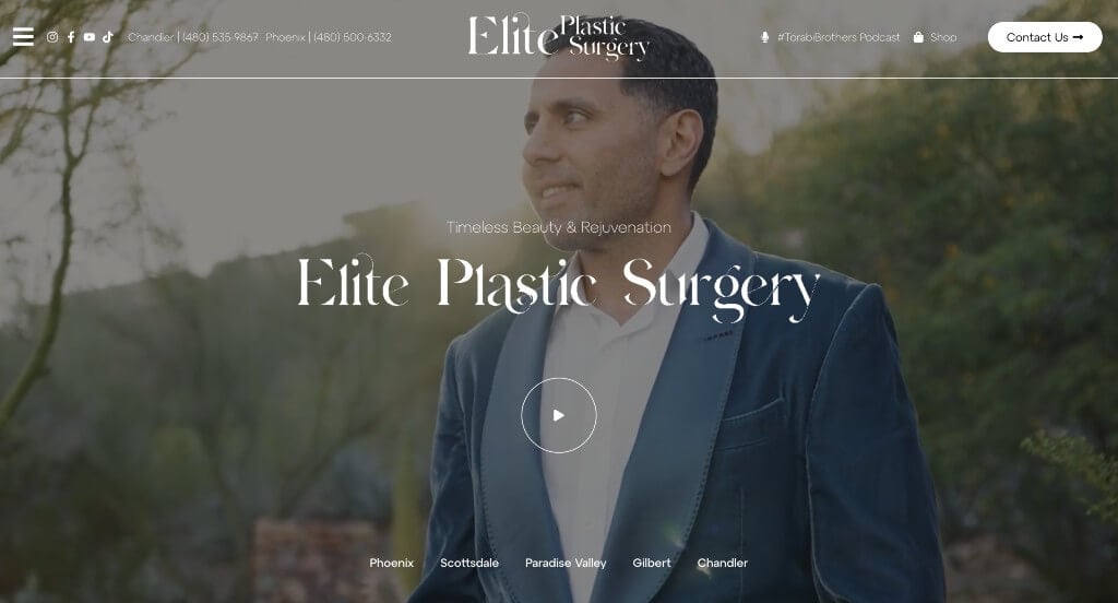
7. Elite Plastic Surgery
Why We Chose Elite Plastic Surgery
The Elite Plastic Surgery website serves as an exceptional model for “Interactive Hospitality Branding and Visual Client Validation.” Aesthetic practices require a digital footprint that balances deep medical authority with an approachable, luxury-tier patient experience. This platform achieves this by matching authentic, humanizing media with a highly intuitive mobile navigation structure directly on the home page.
Key Design Highlights:
- Kinetic Practice and Facility Verification: The main hero area incorporates a high-definition video loop showcasing their actual practitioners, state-of-the-art clinical tools, and genuine, relaxed client-staff interactions. Visually leading with a welcoming, real-world atmosphere humanizes the care team and lowers surgical anxiety from the exact second a user lands on the page.
- Multi-Tiered Narrative Proof Loop: Social proof is prioritized through a staggered testimonial system. The home page prominently features immersive video testimonials that capture the emotional depth of real patient transformations, while structured, long-form written reviews are placed lower on the page to provide an extra layer of trustworthy community confirmation.
- Organized Structural Procedural Grid: Their comprehensive suite of surgical and non-surgical procedures is clearly outlined on the home page. Categorizing their treatments into intuitive, readable modules – such as breast enhancement, body contouring, facial rejuvenation, and medical spa therapies – allows fast-skimming users to qualify their aesthetic goals in a glance.
- Expansive Hospitality Hamburger Navigation: The website incorporates a gorgeously designed hamburger menu that expands seamlessly to fill the screen. Rather than just listing standard subpage links, the expanded overlay integrates essential operational contact data, direct phone lines, and physical office locations, serving as an efficient all-in-one portal for user onboarding.
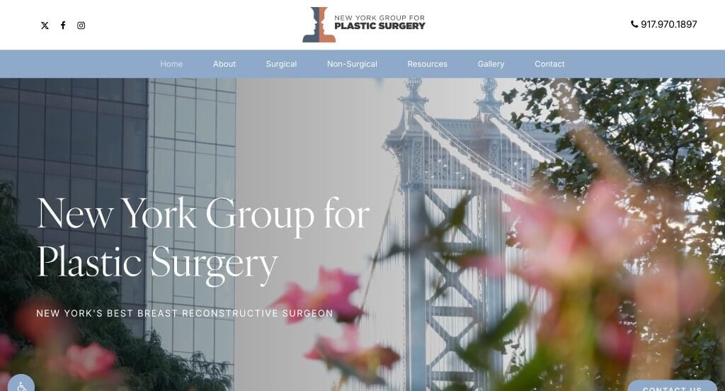
8. New York Group for Plastic Surgery
Why We Chose NYG Plastic Surgery
The website for NYG Plastic Surgery stands out as a premier example of “High-Empathy Pediatric Specialization and Adaptive Mobile Triaging.” Reconstructive surgery platforms – especially those focusing on craniofacial anomalies – must project immense clinical precision while remaining highly supportive for families. This site achieves this by prioritizing life-altering pediatric care and deploying smart, responsive layout optimizations directly on the home page.
Key Design Highlights:
- Specialized Craniofacial Advocacy Architecture: A major highlight of the home page is its dedicated section showcasing specialized reconstructive surgeries for children born with cleft lips, cleft palates, or other congenital facial abnormalities. Highlighting these intricate pediatric procedures upfront immediately establishes the surgeon’s deep humanitarian commitment and elite surgical expertise.
- Intelligent Responsive Conversion Bars: To capture high-intent users across different devices, the platform features a highly adaptive call-to-action utility. On desktop screens, a sleek “Contact Us” tab remains pinned as a sticky element near the bottom right of the screen; as soon as the viewport shifts to mobile, it transforms into an optimized dual-button configuration featuring an immediate phone dialer and an intake button for streamlined thumb navigation.
- Geographic Access Distribution: To accommodate a broad regional patient base, the home page clearly maps out multiple physical office locations. Detailing their distinct clinical centers upfront allows local and traveling families to instantly verify regional availability before entering the formal appointment funnel.
- Empathetic Community Validation Loop: Authentic patient and parent reviews are integrated smoothly lower on the home page layout. Showcasing verified, long-form narratives where families share emotional recovery journeys and praise the clinical team’s infinite patience anchors the practice’s medical credentials in trustworthy peer proof.
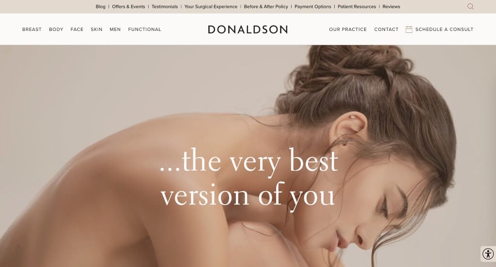
9. Donaldson Plastic Surgery
Why We Chose Donaldson Plastic Surgery
The Donaldson Plastic Surgery website stands out as an exceptional model for “Value-Driven Brand Identity and Fluid Procedural Navigation.” In a crowded aesthetic medical field, high-performing websites must quickly differentiate their philosophy while providing a flawless browsing experience. This platform achieves this by pairing a clear, principle-based mission with highly scannable, interactive components right on the home page.
Key Design Highlights:
- Highly Refined Visual Navigation Menu: The website incorporates a beautifully engineered navigation menu that balances aesthetic clean lines with deep informational structure. This layout makes it incredibly easy for users to dive straight into specific surgical, non-surgical, or medspa pathways without experiencing choice paralysis or messy drop-down clutter.
- Fluid Multi-Service Slider Module: Rather than forcing users to scroll through endless vertical grids of treatments, their core services are prominently displayed in a dynamic, smooth-scrolling horizontal slider. This interactive asset showcases major procedural options like breast, body, and facial rejuvenation compactly, keeping the home page sleek and organized above the fold.
- “Our Core Tenets” Mission Architecture: To build deep, immediate psychological trust, the dedicated “Our Core Tenets” section outlines the foundational pillars that set the practice apart from standard commercial clinics. Expressing these central values – such as a commitment to natural-looking results, safety, and an exceptional patient experience – proactively frames the clinical team as compassionate care advocates.
- Narrative Social Proof Anchoring: Under the engaging heading “What are Patients Saying?”, the home page showcases real-world client reviews. Elevating these authentic, long-form patient narratives about compassionate bedside manner and life-changing results gives browsing consumers the necessary community confirmation to move forward into the scheduling funnel.

10. Marina Plastic Surgery
Why We Chose Marina Plastic Surgery
The Marina Plastic Surgery Click to open side panel for more information platform serves as a premier benchmark for “Cinematic Authority Modeling and Multi-Demographic Patient Mapping.” In highly competitive coastal cosmetic markets, a website must establish immediate elite status while breaking down procedural complexity. This site accomplishes this by replacing standard corporate layouts with layered transparency, comprehensive anatomical filtering, and heavy media validation right on the home page.
Key Design Highlights:
- Dynamic Multi-Faceted Hero Split Screen: The main hero area utilizes an engaging split-screen layout displaying high-quality imagery of their real clinical staff, boutique practice facilities, and relaxed client interactions. Merging these critical brand pillars into a single, unified visual above the fold removes clinical detachment and immediately humanizes the practice environment.
- Organized Demographic and Body Part Triaging: Rather than listing procedures in overwhelming text blocks, the site cleanly details the various body parts and specific consumer groups they work on. Segmenting options into intuitive pathways – such as face, breast, body, and tailored solutions for different patient demographics – helps browsing users effortlessly self-qualify their aesthetic goals.
- Elite Practitioner Trust Infrastructure: To satisfy the rigorous safety and background vetting required by discerning elective surgery patients, the dedicated “Meet Our Doctors” directory introduces their highly skilled physicians. Spotlighting their individual training backgrounds, board certifications, and aesthetic philosophies establishes strong medical credibility before a patient ever initiates an intake request.
- High-Authority Broadcast Media Verification: Under the commanding statement “One of the Most Trusted Voices in Beauty”, the home page acts as a powerful national reputation repository. Proudly showcasing high-profile layout badges from iconic beauty publications alongside major television network appearances firmly moves the practice from a basic local clinic to a nationally recognized thought leader.
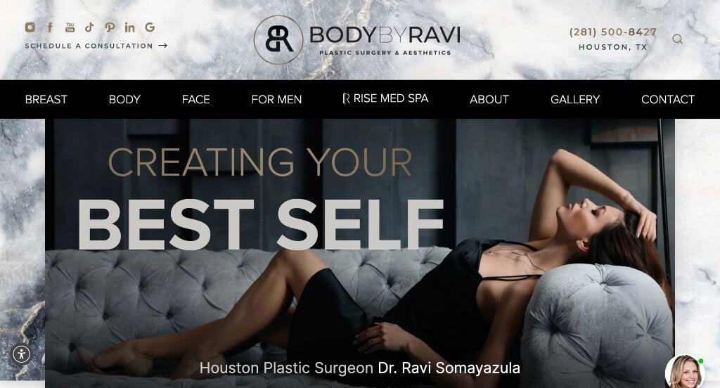
11. Body By Ravi Plastic Surgery & Aesthetics
Why We Chose Body by Ravi Plastic Surgery & Aesthetics
The Body by Ravi Plastic Surgery & Aesthetics website stands out as an exceptional model for “Real-Time Patient Engagement and Transparent Clinical Sourcing.” High-end aesthetic practices require a digital footprint that removes patient hesitation immediately. This platform achieves this by blending authentic visual evidence with responsive communication tools directly on the home page.
Key Design Highlights:
- Kinetic Practice and Interaction Proof: The main hero area incorporates a high-definition video loop showcasing their actual clinical staff collaborating directly with patients. Visually leading with these authentic, comfortable, and professional medical interactions humanizes the care team and lowers surgical anxiety the moment a user arrives on the site.
- Organized Anatomical Triaging: Their core procedural specialties are neatly mapped out on the home page through clear mentions of the specific body parts they operate on. Breaking down treatments into intuitive, recognizable tracks – such as breast, body, face, and non-surgical options – allows fast-skimming users to instantly self-qualify their aesthetic goals.
- Instantaneous Conversational Intake: A prominent live chat widget is integrated directly onto the home page layout. Providing an immediate, real-time channel for browsing users to ask questions about recovery timelines, pricing models, or scheduling options greatly reduces friction and helps convert passive web traffic into active consultations.
- Fluid Narrative Peer Validation: To anchor their clinical expertise in real-world satisfaction, a dynamic patient testimonials slider is featured prominently on the home page. This interactive module lets users scroll through multiple verified, long-form stories highlighting compassionate bedside manners and life-changing results without cluttering the homepage layout.
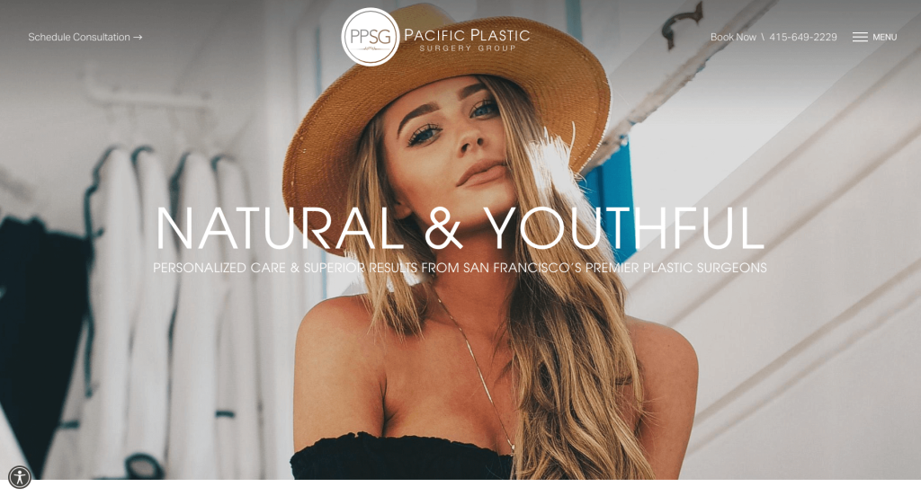
12. Pacific Plastic Surgery Group
Why We Chose Pacific Plastic Surgery Group
The website for Pacific Plastic Surgery Group stands out as a premier example of “Interactive Patient Education and Immersive Mobile Navigation.” High-value elective medical websites must instantly engage browsing consumers while breaking down complex clinical pathways. This platform achieves this by combining real-time communication tools with dynamic, user-driven learning modules directly on the home page.
Key Design Highlights:
- Interactive Micro-Learning Hub: A standout feature of the home page is a dynamic, clickable area that allows users to instantly select different surgery types to reveal deeper information. This interactive module keeps the layout clean while empowering patients to self-triage and learn about specific procedures without being forced to navigate away from the main page.
- Full-Page Immersive Mobile Navigation: The website incorporates a highly refined hamburger menu that expands seamlessly into a beautiful, full-screen overlay. This design choice removes cluttered drop-down submenus, transforming the navigation into a spacious, organized portal that makes exploring the practice’s digital ecosystem effortless on any device.
- Instantaneous Conversational Onboarding: A prominent live chat widget is integrated directly onto the home page layout. Offering a real-time channel for browsing users to ask immediate questions about scheduling, pricing, or surgical recovery dramatically lowers the barrier to entry and fast-tracks high-intent leads into the consultation pipeline.
- Authentic Social Proof Anchor: Real-world peer validation is prioritized through a dedicated patient testimonials section on the home page. Showcasing verified, long-form stories of compassionate care, exceptional bedside manner, and satisfying aesthetic outcomes anchors the group’s medical claims with genuine community validation.
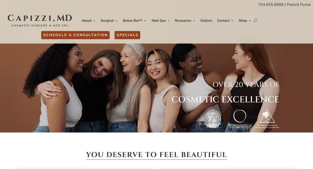
13. Capizzi, M.D.
Why We Chose Capizzi MD
The Capizzi MD website is an exceptional case study in “High-Velocity Client Acquisition and Hyper-Scannable Architectural Navigation.” In a busy luxury aesthetic market, a web presence must immediately eliminate navigation friction while providing clear pathways to both surgical and non-surgical treatments. This platform masterfully balances instant intake accessibility with rich educational resources directly on the home page.
Key Design Highlights:
- Immediate Above-the-Fold Intake Frictionless Design: The home page completely removes booking barriers by integrating primary call-to-action buttons directly into both the main header and the main hero section. This dual-placement strategy allows high-intent users to easily book a consultation the exact second they land on the page without forcing them to scroll or hunt for contact information.
- Refined Mega Menu Architecture: The platform features a beautifully engineered, expansive mega menu that cleanly segments the practice’s extensive service lines. By dividing offerings into highly structured sub-categories – such as surgical tracks (breast, body, face) alongside distinct non-surgical divisions (injectables, lasers, skin treatments) – the site prevents choice paralysis and lets fast-skimming users map out their exact care path.
- Authentic Peer Validation Integration: Real-world patient reviews are showcased smoothly on the home page layout. Elevating these verified community testimonials regarding professional staff support, gentle clinical care, and natural-looking transformations anchors the practice’s elite marketing claims with immediate grassroots trust.
- Dynamic Educational Content Engine: The home page highlights a dedicated section for their latest professional blog articles. Featuring fresh, expert content directly on the main page establishes continuous clinical expertise, answers common procedural questions, and provides a trustworthy research library for browsing patients before they enter the surgical pipeline.
WordPress Cosmetic Surgery Themes
You can find free themes at wordpress.org, or explore cosmetic surgery-inspired templates on ThemeForest.
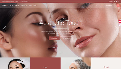
TouchUp – Themeforest
$79
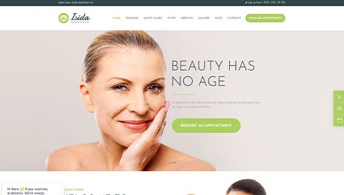
Isida – Themeforest
$69
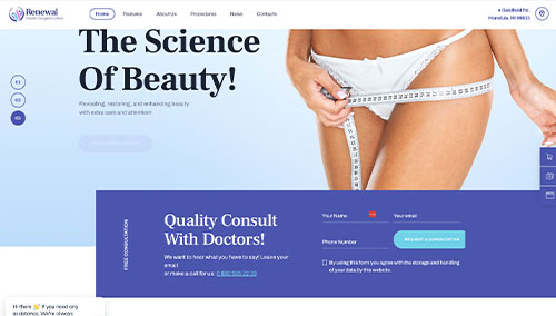
Renewal – Themeforest
$69
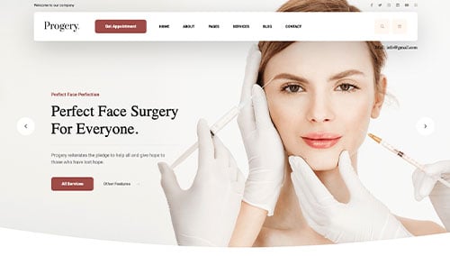
Progery – Themeforest
$69