In the plumbing and mechanical industry, your website is your 24/7 digital dispatcher. For a homeowner in the middle of a plumbing emergency, your site needs to provide two things in under three seconds: a clear way to contact you and the immediate assurance that you are a licensed, reliable professional.
Our design team evaluated hundreds of plumbing websites – from local residential service plumbers to large-scale commercial mechanical contractors. We looked beyond the visuals to identify the 12 best examples of conversion-focused design, specifically analyzing their mobile-first accessibility, emergency response clarity, and the integration of localized trust signals.
Whether you specialize in 24/7 emergency repairs, trenchless sewer lining, or new construction plumbing, these examples represent the current benchmark for the industry.
Note on Our Selection Process: We recently audited this guide to remove outdated designs and sites that no longer meet our performance standards. This curated list now focuses on the top 12 plumbing websites providing the most strategic value in 2026.
Top Plumber Website Designs
- 1. Zest Plumbing & Drain
- 2. Absolute Plumbing
- 3. Red Lilly Plumbing
- 4. Monkey Wrench Plumbers
- 5. Fords Plumbing
- 6. Bumble Bee Plumbing
- 7. Highland Plumbing Inc.
- 8. Local Service Pro Plumbing
- 9. Covenant Plumbing
- 10. Texas Quality Plumbing
- 11. Village Plumbing, Air, and Electric
- 12. Franco Belli Plumbing & Heating
1. Zest Plumbing & Drain
Why We Chose Zest Plumbing & Drain
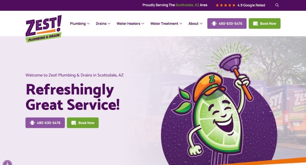
The Zest Plumbing & Drain website is a brilliant case study in “High-Vibrancy Brand Differentiation and Multi-Layered Trust Building.” In an industry often dominated by predictable corporate blues and identical template layouts, this site completely disrupts the local competitive landscape by balancing unforgettable brand aesthetics with a hyper-transparent customer onboarding system.
Key Design Highlights:
- Fearless, Unforgettable Brand Palette: The website breaks completely away from industry standards with its bold color scheme of bright purple and lime green, tied together by a playful, recurring lime wedge logo throughout the home page. This high-contrast design ensures they stay top-of-mind, visually positioning them as a “refreshing,” local alternative to faceless, corporate-owned competitors.
- Streamlined Core Service Ecosystem: The “Our Services” section on the home page smoothly organizes their complete range of capabilities, cleanly categorizing complex offerings like water heaters, drain cleaning, water treatment, and advanced leak detection. This layout confirms their comprehensive technical expertise instantly for visitors dealing with active plumbing crises.
- Transparent Four-Step Process Roadmap: The “How It Works” section provides a highly visible, sequential breakdown of their service path – guiding clients through initial booking, a no-cost dispatch evaluation, transparent upfront flat-rate pricing, and final satisfaction execution. Outlining this blueprint step-by-step removes operational and financial anxiety before a technician ever pulls into the driveway.
- Authentic Local Social Proof Integration: By embedding integrated Google reviews directly on the home page, the site leverages real-time community validation. Showcasing detailed customer feedback that specifically praises their technicians, cleanliness, and non-pushy pricing structure proves that their vibrant brand is fully backed by premier field craftsmanship.
2. Absolute Plumbing
Why We Chose Absolute Plumbing
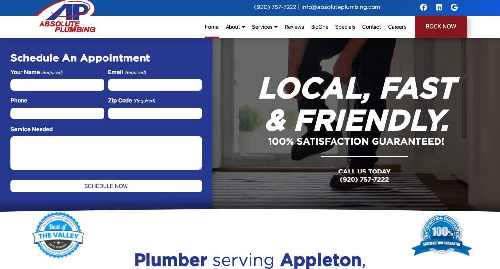
The Absolute Plumbing website stands out as a premier example of “High-Velocity Scheduling and Direct-Value Incentives.” For homeowners dealing with water line issues, broken water heaters, or sudden backups, the site addresses emergency anxiety immediately by shortening the path from landing to booking.
Key Design Highlights:
- Immediate High-Intent Booking: The home page positions a structured “Schedule an Appointment” form directly inside the prominent hero area, matched perfectly by a persistent “Book Now” sticky button right in the header. Giving users immediate booking access allows them to skip scrolling and lock in a dispatch window the exact second they land on the site.
- Strategic Direct-Value Incentives: The “Our Services” section skillfully showcases their primary field capabilities while intertwining targeted coupons and discounts directly within the service listings. Coupling technical capability with upfront cost savings effectively answers the dual user questions of “Can you fix it?” and “Can I afford it?” on a single section scroll.
- Dynamic Trust Anchors: A smooth testimonials carousel integrated on the home page pulls together real-world reviews from satisfied clients. Showcasing recurring stories of technicians arriving on short notice, explaining transparent upfront options, and leaving properties perfectly tidy delivers strong social proof right alongside their service promises.
- Clutter-Free Information Architecture: The homepage structure separates logistical action items from deeper operational educational blurbs, keeping high-intent leads moving forward smoothly through a clean and focused conversion funnel.
3. Red Lilly Plumbing
Why We Chose Red Lilly Plumbing
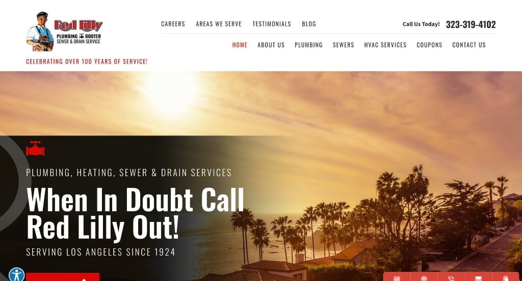
The Red Lilly Plumbing website is an exceptional case study in “Omnichannel Accessibility and Urgent Call-to-Action Design.” In emergency plumbing, a customer’s journey often begins in a state of high stress. This site excels by eliminating structural obstacles, creating instant paths to communication regardless of the customer’s preferred medium.
Key Design Highlights:
- High-Impact Header Elements: The “Book Now” action link and primary telephone contact are displayed prominently inside the header. By utilizing an oversized layout above the fold, the layout satisfies distressed, high-intent property owners who need to lock in a dispatch window instantly without scrolling through information bars.
- Omnichannel Persistent Utility: A highly practical sticky bar remains anchored along the bottom of the viewport as users browse, featuring independent buttons for booking, texting, calling, emailing, and chatting. This interface pattern accommodates different generation communication styles seamlessly – allowing a millennial client to text or web-chat while an older client can tap to make a voice call.
- Instant Dispatch Qualification: A clear list of service area cities on the home page ensures immediate local validation. This prevents homeowners across the Greater Los Angeles and San Fernando Valley regions from wasting time on a company that doesn’t service their neighborhood, optimizing inbound lead qualification.
- Centennial Reputation Validation: Selected customer testimonials are showcased directly on the home page, echoing the company’s century-long track record of service. Featuring text where local homeowners praise their upfront pricing models, clear bilingual communication, and rapid response times validates their brand promises through genuine local proof.
4. Monkey Wrench Plumbers
Why We Chose Monkey Wrench Plumbing, Heating, Air & Electric
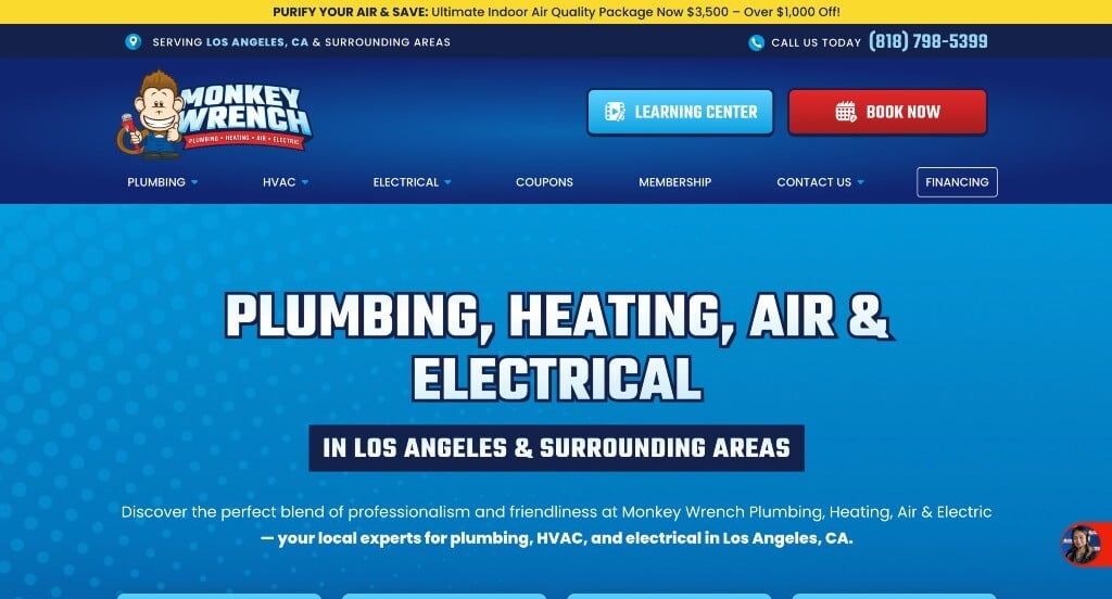
The Monkey Wrench website is an exceptional model for “High-Impact Character Branding and Cross-Trade Architecture.” Home service companies frequently struggle to transition from a single trade into a multi-service business without losing their clear brand identity. This site solves that hurdle perfectly by using an unforgettable mascot to anchor an intuitive, multi-divisional layout.
Key Design Highlights:
- Memorable Character Branding: The site embraces a bold, high-contrast primary color scheme built around a friendly, custom monkey mascot. This cohesive design system stays top-of-mind, giving a technical contracting business an approachable, recognizable personality that stands out from typical monotone corporate competitors.
- Frictionless Header Conversion: Oversized, highly accessible buttons to book service or request an immediate quote are positioned prominently in the header. For homeowners facing sudden plumbing leaks or system breakdowns, keeping these action items permanently visible eliminates searching through submenus.
- Tri-Trade Structural Hierarchy: The home page uses beautifully segmented sections – starting with a dedicated “Our expert team excels in installing & repairing…” area for plumbing specialties – which seamlessly transitions into parallel showcases for their Electrical and HVAC divisions. This logical layout lets users instantly qualify the company’s full cross-trade capabilities without feeling overwhelmed.
- Polished Multi-Platform Reputation Hub: Customer reviews pulled from various third-party platforms are beautifully styled and styled smoothly into the homepage layout. Instead of displaying a plain text list, this design preserves brand consistency while establishing powerful social proof from around the web.
5. Fords Plumbing
Why We Chose Ford’s Plumbing & Heating
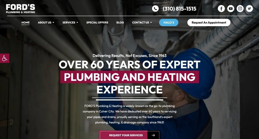
The Ford’s Plumbing & Heating website is a premier blueprint for “Always-On Accessibility and Structured Content Authority.” By keeping communication channels open across all devices and anchoring its technical layout with real-world feedback, the site creates a highly reliable digital environment that converts casual browsers into active clients.
Key Design Highlights:
- Omnichannel Mobile Utility: A highly practical sticky bar remains anchored to the bottom of the screen as users scroll, providing one-touch buttons to book, text, call, email, or chat. This design caters effortlessly to different communication habits – allowing a client in a noisy room to quietly text or web-chat, while an urgent caller can tap to connect immediately with a live operator.
- Polished Service Showcases: Their primary maintenance and installation services are clearly outlined and beautifully styled on the home page. The clean iconography and generous whitespace quickly confirm their dual-trade capabilities to arriving property owners without creating visual clutter.
- Reputation Loop Anchoring: Selected customer testimonials are integrated directly onto the home page. Showcasing actual text-based feedback highlighting their punctuality, upfront pricing options, and clean on-site handoffs provides immediate social proof right next to their core service offerings.
- Educational Content Integration: Recent articles from their professional blog are featured directly on the home page. By sharing timely tips on seasonal maintenance, home safety, and efficiency upgrades, the company transitions from a transactional contractor into a highly valued local educational resource.
6. Bumble Bee Plumbing
Why We Chose Bumble Bee Plumbing
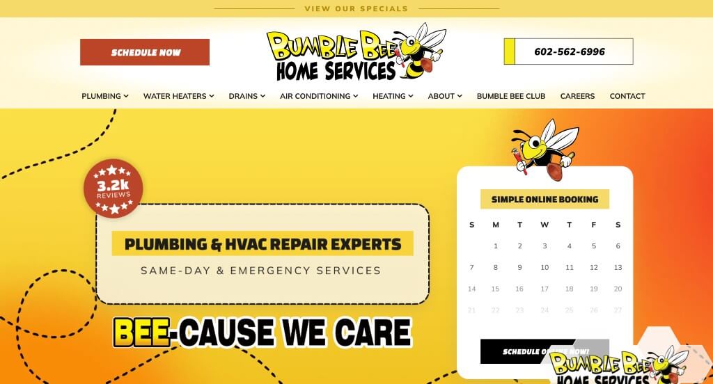
The Bumble Bee Plumbing website is a phenomenal example of “High-Contrast Brand Memory and Spatial Onboarding.” By leaning into a cohesive theme that matches their name, the site transforms what could be a generic service page into a memorable digital experience that stands out in a crowded Arizona market.
Key Design Highlights:
- Unmistakable Thematic Branding: The website makes a striking impression through its use of a cartoon-style bumblebee logo paired with a high-contrast yellow and black color palette. This deliberate design language makes the brand instantly recognizable and memorable to homeowners, breaking away from the standard blue-and-red plumbing templates.
- Frictionless Dispatch Routing: A highly convenient “Schedule” button occupies a prominent, permanent spot within the site header. For users managing a sudden burst pipe or a leaking water heater, keeping this critical action item unmissable prevents frustration and accelerates booking speed.
- Clean Service Architecture: The “Our Services” section is beautifully outlined on the home page with crisp, structured boundaries. By cleanly categorizing their technical capabilities – from drain cleaning to water softener installations – the site ensures visitors can verify their needed repair within seconds of landing.
- Value-to-Location Conversion Loop: The home page perfectly pairs a dedicated “Why Choose Bumble Bee” benefit section with an intuitive service area directory. Laying out their core promises (such as upfront pricing and expert technicians) right next to their geographic boundary check gives arriving property owners immediate local validation.
7. Highland Plumbing Inc.
Why We Chose Highland Plumbing
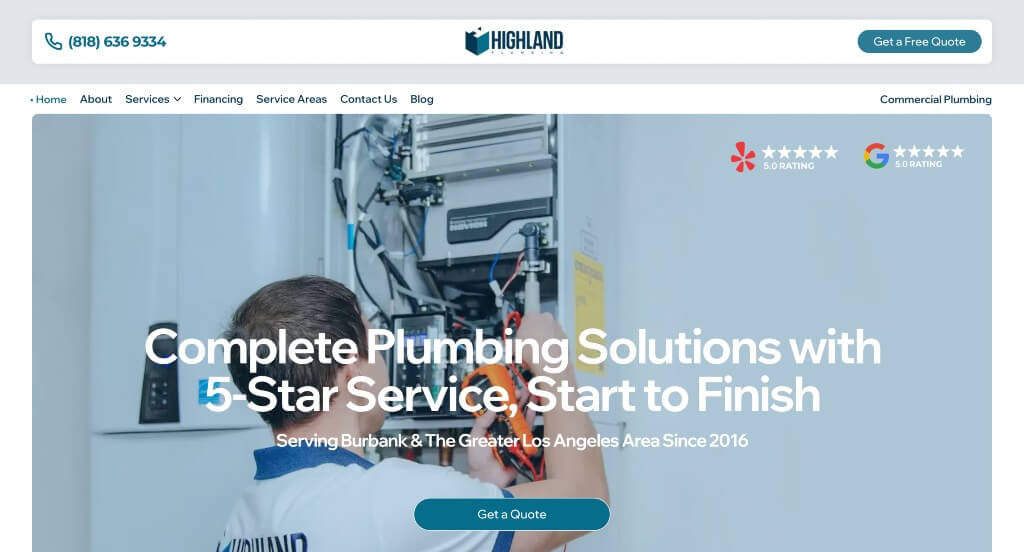
The Highland Plumbing website serves as a standout model for “Local Trust Architecture and High-Speed Lead Generation.” By organizing its layout around immediate user intent and matching third-party verification with simple booking hooks, the site builds an incredibly seamless onboarding path for property owners.
Key Design Highlights:
- Frictionless Header Conversion: A bright, highly visible “Get a Free Quote” button is positioned prominently in the header. For a customer looking to scope out a project or manage a sudden repair, keeping this high-intent call to action permanently above the fold eliminates any searching and lowers the barrier to entry.
- Transparent Service Presentation: Their core plumbing specialties are explained clearly right on the home page. The clean formatting ensures that fast-skimming property owners can immediately confirm that Highland handles their specific issue – whether it’s an intricate fixture install or a deep drain blockage – without having to leave the page.
- Multi-Platform Reputation Hub: Instead of relying on a single source of feedback, the home page integrates customer reviews pulled from various third-party platforms. Showcasing real-world satisfaction metrics across different networks establishes broad-scale digital credibility and deepens consumer trust.
- Geographic-to-Contact Funnel Block: Positioned strategically above the footer is a dedicated service city directory, immediately followed by an easy-to-use digital contact form. This layout creates an ideal spatial funnel: visitors scroll down, visually confirm that their city is serviced, and can immediately fill out the contact form to initiate service when their confidence is highest.
8. Local Service Pro Plumbing
Why We Chose Local Service Pros Plumbing
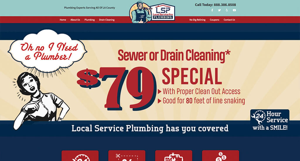
The Local Service Pros Plumbing website is an exceptional model of “Nostalgic Branding and High-Accessibility Financing.” In a crowded market filled with clinical, corporate-looking contractor templates, this site stands out by pairing a charming, old-school personality with highly practical financial solutions for modern property owners.
Key Design Highlights:
- Memorable Heritage Aesthetics: The home page stands out immediately through its distinct, old-timey logo and classic graphic design style. Extending this vintage thematic artwork across the entire home page gives the business a trustworthy, established persona that evokes the feel of a dependable, neighborhood fixture.
- Unified Service & Process Discovery: Both their plumbing services and their actual working process are clearly explained right on the home page. Laying out their technical specialties alongside an explicit breakdown of what to expect during a service visit removes operational friction and helps eliminate consumer anxiety before a technician arrives.
- Defined Structural Advantages: A dedicated “Why Choose Us” section isolates the company’s core values, licensing, and workmanship promises. This explicit layout translates abstract claims of high quality into specific, bite-sized value propositions for fast-skimming readers.
- Frictionless Financing Integration: Recognizing that major plumbing overhauls – like water line replacements or sewer line repipes – can bring unexpected financial stress, the home page highlights flexible payment options. The site explicitly details financing options through various third-party platforms right on the main page, reassuring budget-conscious clients that a critical home repair can fit into their financial plans.
9. Covenant Plumbing
Why We Chose Covenant Plumbing
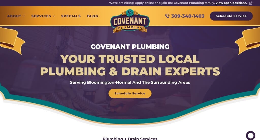
The Covenant Plumbing website is a phenomenal benchmark for “Strategic Brand Differentiation and Micro-Conversion Routing.” While many home service sites fall into predictable, monochromatic layouts, Covenant Plumbing leverages an expressive, high-identity visual language to establish an immediate local connection and guide visitors into a frictionless booking funnel.
Key Design Highlights:
- Vibrant and Harmonious Color Palette: The website stands out instantly through a unique color scheme of orange and purple balanced with a touch of teal. This intentional aesthetic choices elevates the site above standard template designs, projecting an energetic and thoroughly modern corporate identity that stays top-of-mind for local consumers.
- Continuous Call-to-Action Integration: High-intent conversion points, including “Schedule a Service” and “Book Now” buttons, are carefully sprinkled throughout the home page. Placing these entry points immediately following key value pieces – such as their maintenance program details or water treatment breakdowns – captures user intent the exact moment confidence peaks.
- Value-to-Logistics Onboarding Chain: A robust “Why Choose Us” grid outlines their core organizational promises (honesty, upfront pricing, and a one-year workmanship guarantee). This value summary leads directly into a beautifully organized list of served cities paired with a regional dispatch map, giving Central Illinois property owners instant geographic validation.
- Polished Testimonial Presentation: Real-world customer reviews are featured prominently on the home page and are styled beautifully within a clean, custom slider. Showcasing authentic stories of swift emergency response times, friendly technicians, and spotless site cleanups perfectly validates the brand’s commitment to community-first integrity.
10. Texas Quality Plumbing
Why We Chose Texas Quality Plumbing
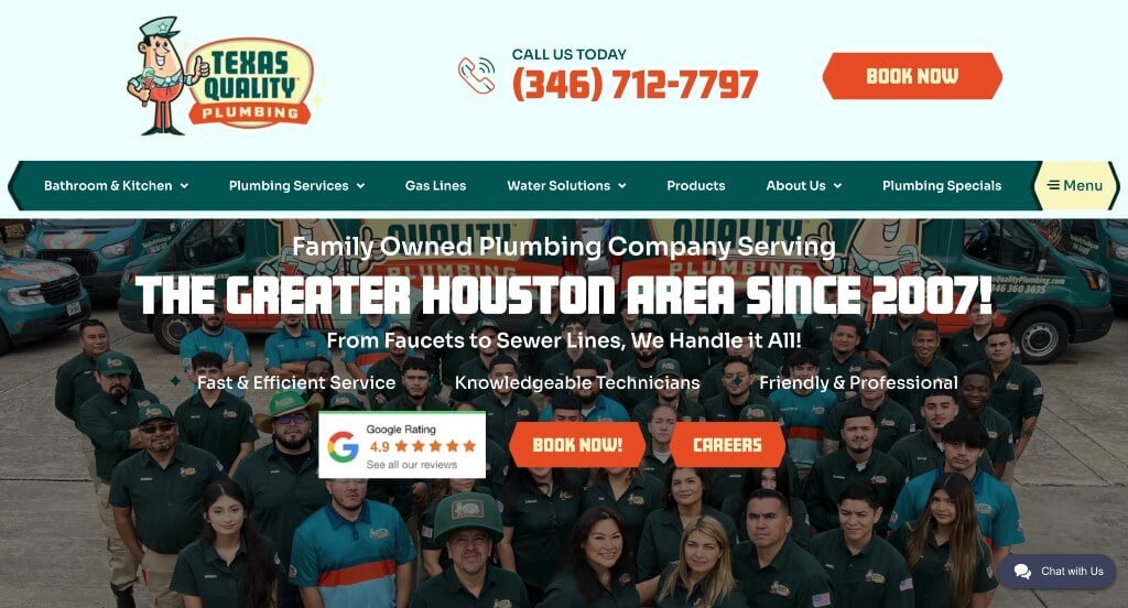
The Texas Quality Plumbing website stands out as an exceptional example of “High-Identity Branding and Spatial Trust Mapping.” While many home service websites look completely clinical or detached, this site combines an unforgettable, friendly personality with clear geographic transparency to deliver a highly reassuring customer experience.
Key Design Highlights:
- Cohesive, High-Identity Design System: The homepage stands out immediately through its unique orange and teal color scheme paired with a friendly, cartoon plumber mascot logo. This deliberate design language breaks away from standard, boring blue plumbing templates, building an instantly memorable brand image backed by highly consistent graphic elements across the page.
- Humanizing Team-First Hero Banner: The main hero section showcases a large, professional staff photograph that displays what appears to be the entire team. Putting real local technicians, dispatchers, and management right at the forefront builds immediate, authentic human trust before a customer ever picks up the phone.
- Dual-Layered Spatial Maps: The site utilizes a brilliant two-part mapping strategy. It features an interactive project map showcasing exactly where they have completed past plumbing jobs, followed closely by a clean service area map outlining their designated Texas dispatch cities. This combination offers indisputable proof of their field experience right alongside geographic validation.
- Real-Time Support and Peer Validation: To streamline user interaction, the site integrates an accessible live chat widget for instant customer inquiries. This immediate point of contact is anchored by detailed, on-page customer testimonials, proving that their vibrant brand image is fully matched by top-tier local craftsmanship.
11. Village Plumbing, Air, and Electric
Why We Chose Village Plumbing, Air & Electric
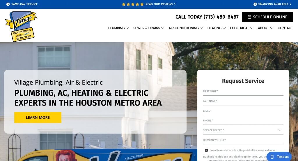
The Village Plumbing, Air & Electric website is a stellar benchmark for “Illustrative Brand Authority and Instant Response Funneling.” Backed by a historic legacy serving the Houston metro area since 1946, this platform completely avoids the dry, mechanical aesthetic common to corporate contractors, replacing it with a rich, highly engaging visual narrative.
Key Design Highlights:
- Polished and Artistic Brand Architecture: The website distinguishes itself through an exceptionally unique logo design, an elegant corporate color scheme, and visually interesting custom graphics utilized throughout the home page. This highly coordinated styling replaces industrial clutter with a high-end, friendly persona that establishes deep psychological trust at first glance.
- Frictionless Contact: Positioned directly below the hero section is a prominent “Request a Callback” form, making immediate contact simple and efficient. For homeowners managing an active household disruption, keeping a clean lead capture widget instantly accessible prevents abandonment and accelerates intake.
- Organized Multidivisional Grid: The dedicated services area on the home page clearly outlines exactly what they can do, cleanly partitioning their comprehensive capabilities across Plumbing, HVAC, and Electrical divisions. This intuitive breakdown permits fast scanning, confirming they are a single-source solution for full-scale residential systems maintenance.
- Integrated Trust and Spatial Validation: To cement its reputation, the platform integrates authentic, high-star Google reviews right alongside an explicit service area map and list. Displaying verified local feedback immediately next to clear county boundaries (Harris, Fort Bend, Montgomery, etc.) offers instant peer validation and neighborhood coverage confirmation in a single scroll.
12. Franco Belli Plumbing & Heating
Why We Chose Franco Belli Plumbing & Heating
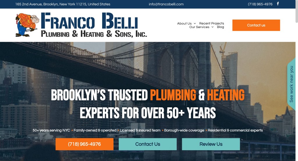
The Franco Belli website is a masterclass in “Hyper-Local Project Transparency and Urban Compliance Authority.” Operating within the complex regulatory landscape of New York City, this platform goes beyond general marketing claims, providing proof of its extensive experience with local building infrastructure and city codes directly on the home page.
Key Design Highlights:
- Interactive Neighborhood Proof Engine: A standout element is the expandable slide-out tab on the right side of the screen (“See work near you”). When clicked, it expands into a regional project map detailing real, recent service calls throughout Brooklyn and Manhattan – such as fixing brownstone boiler violations or resolving commercial pipe freezes. This feature gives arriving property owners immediate proof of local activity.
- Structured Metropolitian Specialty Menu: The services section on the home page clearly explains their comprehensive capabilities. The clean layout explicitly separates standard repairs from highly technical urban services, such as NYC Local Law 152 gas inspections, oil-to-gas conversions, and Department of Buildings (DOB) violation removals.
- Proactive Structural Friction Relief: A dedicated FAQ section on the home page addresses common customer anxieties right away. By answering essential questions about licensing, municipal compliance, and cross-trade capabilities, the site resolves client hesitation before the intake process even begins.
- Relatable Community Validation: To anchor their 50+ year local legacy, a sleek testimonials slider highlights real-world customer stories. Featuring long-form narratives where clients detail complex structural victories – like resolving abandoned, decades-old permit violations – backs up the company’s reputation with genuine local proof.
WordPress Plumbing Themes
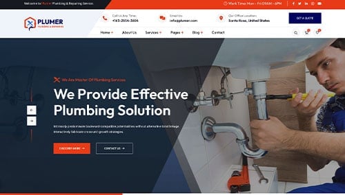
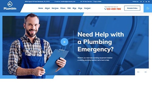
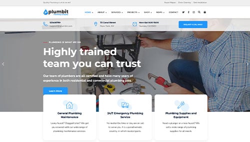
You can find free themes at wordpress.org, or explore plumbing-inspired templates on ThemeForest.
Plumer – Themeforest
$19
Plumbio – Themeforest
$59
Plumbit – Themeforest
$69
Fixnow – Themeforest
$59