In the high-stakes real estate market of 2026, a realtor’s website is much more than a digital portfolio – it is a digital storefront and a platform for neighborhood authority. For top-producing agents and boutique brokerages, an online presence must achieve a masterful balance: projecting personal brand luxury while offering a frictionless, high-speed property search experience. To thrive in today’s competitive landscape, your design must move beyond generic IDX templates to provide “hyper-local” value, using immersive visual storytelling to turn casual browsers into qualified home buyers and sellers.
Our team evaluated hundreds of real estate platforms – ranging from luxury estate specialists and commercial brokers to residential teams and niche relocation experts. We narrowed the field to the top 15 examples that represent the gold standard for the industry. Our analysis focused specifically on interactive neighborhood guides, high-definition video walkthroughs, and the strategic integration of lead-capture valuation tools that offer immediate value to sellers while building a robust, high-intent pipeline for the agent.
Whether you are an independent realtor looking to establish a boutique brand or a team leader scaling a multi-market agency, these examples provide the definitive benchmark for real estate web design in 2026.
Note on Our Selection Process: We recently reviewed this list to ensure every featured site demonstrates a clear commitment to modern standards for mobile-first property searching, ultra-fast imagery loading, and intuitive map-based navigation. This curated collection focuses on realtor websites that prioritize personal brand trust and search functionality, providing the most strategic value to both the agent and the property seeker in 2026.
The Top Real Estate Website Designs
- 1. Fredericksburg Realty Group
- 2. 606 Brokers
- 3. Lakes Sotheby’s Realty
- 4. Lake & Company
- 5. Urban Nest Realty
- 6. Realty One Group Complete
- 7. Beverly Barnett
- 8. The Agency
- 9. Keyes Real Estate
- 10. Homes.com
- 11. Sweet Living Realty
- 12. The Coley Group
- 13. Ripco Real Estate
- 14. Tamara Williams & Company
- 15. Red Oak Realty
1. Fredericksburg Realty Group
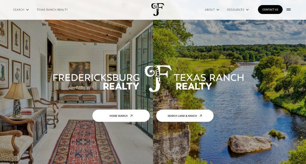
In this example, we noticed how high quality images highlight much of their pages and create a more welcoming feel. Paragraphs are short and straightforward so viewers can easily understand their written content. Buttons were also very helpful to keep everything organized and easy to find throughout their website.
Need a professional website? Schedule your free consultation!
2. 606 Brokers
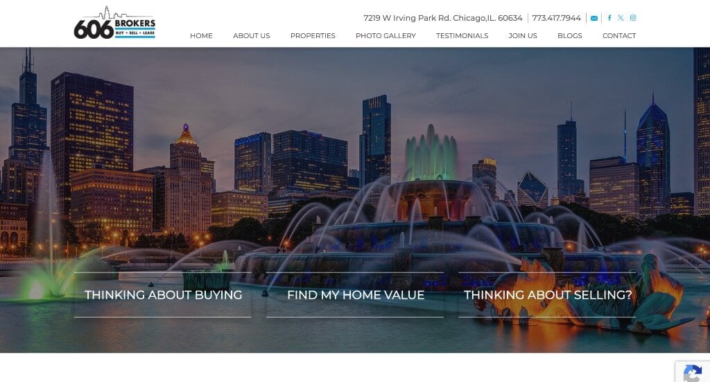
606 Brokers make it really easy to get into contact with them by displaying an address, phone number, and social media links. This homepage was kept simple with many links offering more content, which was helpful. Along with that, we enjoyed how this site added featured listings, customer testimonials, and a contact form. Offering a few different forms to fill out made it easy to receive information about buying, selling, and valuing your house.
3. Lakes Sotheby’s Realty
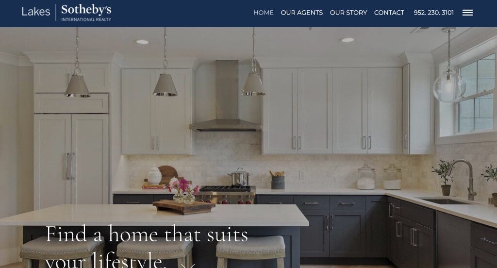
Lakes Sotheby’s Realty has a very simple design, which allows for easy navigation. Including visuals were a good idea to give a better understanding of what they as a company have to offer. Also, a short video clip shows off and explains what their business is about. Lakes Sotheby’s Realty doesn’t only offer realty, they also offer a few different auctions for wine, jewelry, cars, and more.
4. Lake & Company
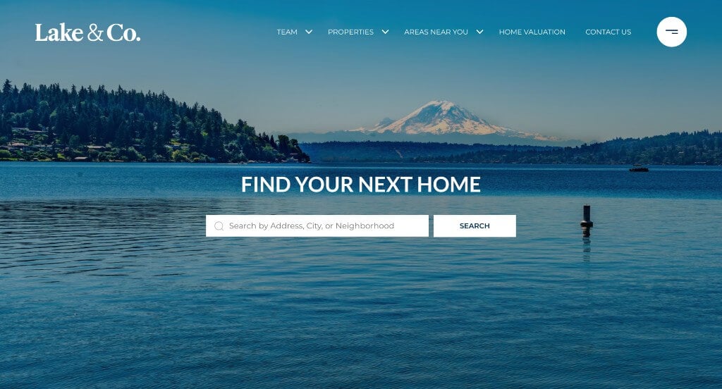
Immediately in this site we see an automatically playing video to attract attention. Lake & Company makes it super easy to contact them with information posted on every page. Also on the homepage, they feature testimonials and informative articles. Additionally, all links are sorted into categories near the bottom of the page to make additional information simple to find.
5. Urban Nest Realty
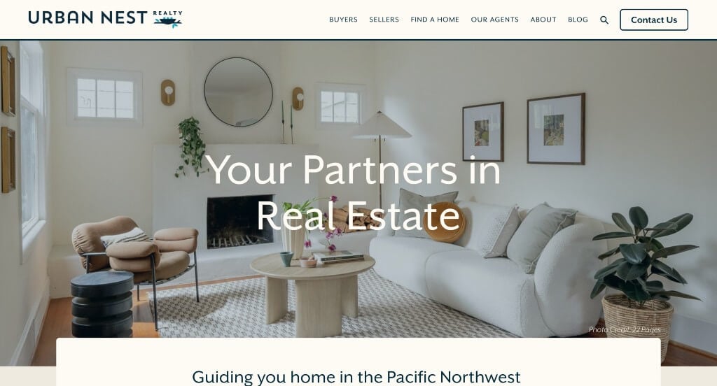
Bright and cheerful colors are used here, along with simple icons and colors to create an exciting template. In their intro clip, showing pending and sold houses helps update viewers who are searching for a new home. Having a layout that different than most other websites helps makes them unique. The content is placed in the middle of the page with a tan background, which focuses the viewer towards the middle of the page.
Related: Looking for help managing a paid advertising campaign for a property management company? Check these services out.
6. Realty One Group Complete

A black and gold color scheme covers the majority of this site, which makes the page stand out and grabs your attention. Realty One Group developed a design that is very easy to navigate because of the sticky header, which helps organize the site. We enjoyed how they chose to talk about their philosophy that everyone has a voice, and everyone wins. Also, using bold, capital letters throughout the whole template really bring the site to life.
7. Beverly Barnett
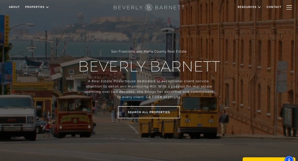
Overall, the template for Beverly Barnett is very informative featuring different news articles and blogs. Also, many helpful resources can be found at the top of the homepage. We did enjoy that this company chose a unique logo design that they displayed all around this site. Also included was simple contact information, information about the company, and available property. Adding in client testimonials also creates a new dimension to customers so they can get a better understanding of the company as a whole.
8. The Agency

Having a simple layout allows for better navigation on the client’s end. They achieve this by having a search engine allowing people to find properties in a specific area, neighborhood, and even schools nearby. Attention is captured with many boxes including an image to showcase different information, accented with a bold red color. The combination of all these features make for a great professional custom design.
9. Keyes Real Estate

This site’s home page has many pictures which allows you to get to know the business. There is a section featuring tweets about properties available to purchase or lease. On top of that, there is an Instagram section to showing plenty of social proof. A sticky header helps keeps everything organized and straightforward making it easy to follow. Make sure to consider this web design when looking for template ideas.
Related: Get help with lead generation, social media marketing, sales funnels, and more from a digital marketing agency with experience helping real estate agents.
10. Homes.com

This is a great website design idea to see when looking for custom layout ideas. The basic orange accent color was definitely a great choice for Homes.com. Another thoughtful quality in this custom we saw was the clearly labeled information related to listed houses. Another interesting feature was the ability to heart a home showcased within their website. Be sure to consider this one-of-a-kind design when developing your next custom website.
11. Sweet Living Realty
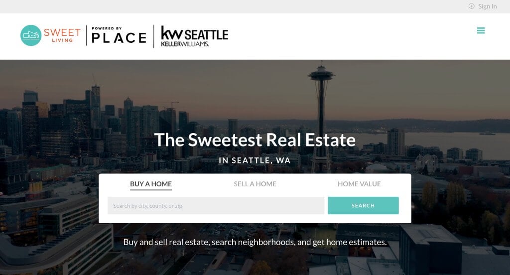
Here’s another great web design example for agents looking for a professional layout. After scrolling past the header, you’ll immediately notice the beautiful teal accent color. Another thoughtful feature in this custom site we noticed was the professional photography. Conversions were in mind when clearly labeling prices of homes in the form of lists throughout their site. Any website designer building websites for realtors will want to consider checking this website out.
12. The Coley Group
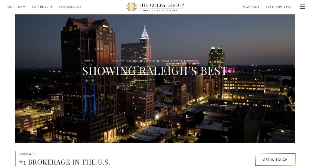
Something that we enjoyed about The Coley Group was their fonts that were professional and bold. We liked their use of large images and videos that are sure to capture the attention of anyone looking at their website. Adding in glints of gold throughout their pages was a great way to get viewers to see their links or content that could be essential for them.
13. Ripco Real Estate
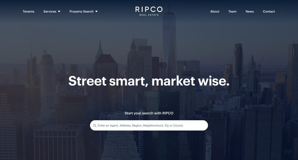
Our web designers thought this website was a good design idea for real estate agents because of their smooth transitions. The accents of red seen throughout the site was another feature we enjoyed. They clearly had internet marketing in mind when building the simple contact information. For real estate firms looking for ideas for their next website, this one will definitely should be in the back of your mind.
Related: Master the art of paid advertising on social media and search engines with the help of an agency that often works with Realtors.
14. Tamara Williams & Company
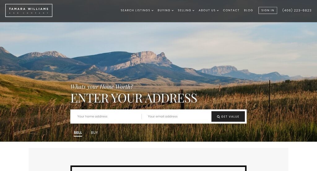
Here we have another example for a realtor to check out when looking for a professional look and feel for their new site. The creative balance of white space was the most impactful quality we noticed. Their informational blog was another reason to include this one in our rankings for the top web design ideas for realty firms. Tamara Williams & Company clearly had a focus on website accessibility when creating the simplistic template. If you are looking for examples for your next realtor site, be sure to check this one out.
15. Red Oak Realty
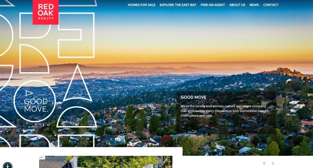
We liked how this company combined the colors of red, white, black and blue to create a custom web design layout. We thought this was a good homepage example for real estate firms because they created a layout that appears to have ads, but really it links to other areas within their page. Bright red accents paint the majority of this site. Red Oak Realty clearly had website accessibility in mind when building the optimized content. You won’t be disappointed after reviewing this one for design ideas for your next site!
WordPress Realtor Themes
You can find free themes at wordpress.org, or explore real estate-inspired templates on ThemeForest.
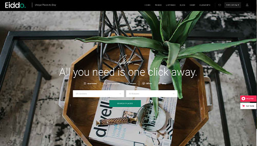
Eddio – Themeforest
$85
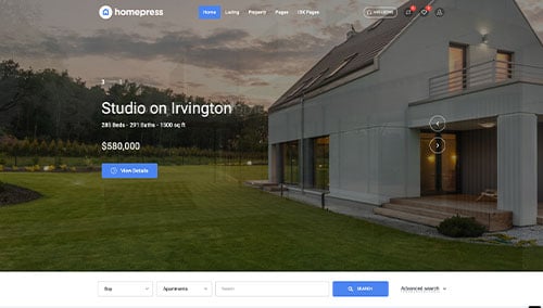
HomePress – Themeforest
$59
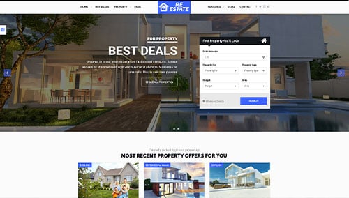
ReEstate – Themeforest
$39
WP Residence – Themeforest
$69