For a small business, your website is the ultimate equalizer. It is the platform that allows a local boutique, a family-owned service company, or an emerging manufacturer to compete alongside national brands by projecting professionalism, reliability, and unique brand personality. In 2026, a successful small business site must do more than just exist – it must be a high-performance conversion tool that turns local searches into loyal customers.
Our design team evaluated hundreds of small business websites across various platforms, including WordPress, Shopify, and WooCommerce. We identified the top examples that masterfully balance budget-conscious efficiency with high-end aesthetic appeal, specifically analyzing their local SEO optimization, mobile-first contact accessibility, and the effective use of customer social proof.
Whether you are a brick-and-mortar retailer, a specialized service provider, or a home-based entrepreneur, these examples represent the benchmark for small business digital excellence in 2026.
Note on Our Selection Process: We recently audited this guide to remove outdated designs and sites that no longer meet our performance standards.
Top Small Business Website Designs
1. Skin By Gabby
Why We Chose Skin by Gabby
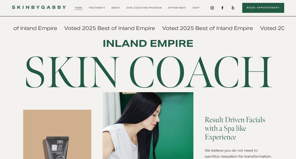
The desktop website for Skin by Gabby serves as a premier benchmark for “Boutique Wellness Merchandising and High-End Aesthetic Hospitality Architecture.” In the luxury skincare and clinical aesthetics market, an online presence must immediately project absolute pristine hygiene, advanced specialized mastery, and a deeply calming, high-end spa environment. The digital interface flawlessly secures this elite positioning, ditching cramped layouts for a grand canvas that turns a visitor’s initial virtual touchpoint into a serene, high-trust digital waiting room.
Key Design Highlights:
- Cinematic, Full-Width Luxury Layout Framing: The website embraces a generous, full-width desktop layout that leverages edge-to-edge spatial design to communicate modern luxury. By allowing large lifestyle elements, generous white space, and soft palettes to spread across the full width of the screen, the framework evokes a premium feeling of tranquility and high-end elegance that mirrors the atmosphere of a physical luxury medical spa lounge.
- Persistent, High-Conversion “Book Appointment” Header Gateway: Positioned intentionally in the global desktop navigation header, a high-visibility booking button remains anchored across the user’s research path. This friction-free conversion portal allows prospective patients to transition from reading about treatments to scheduling a live skin consultation the moment they decide to invest in a service.
- Comprehensive Front-Page Treatment and Service Blueprints: Demystifying advanced skincare procedures is handled elegantly through a dedicated treatment index on the homepage. By mapping out their full spectrum of services – from customized advanced facials and chemical peels to clinical skin therapies – directly in the primary scroll path, the layout allows clients to quickly find the exact treatment path tailored to their skin goals.
- Fluid, Self-Contained Client Review Testimonial Sliders: Overcoming natural consumer hesitation around advanced skincare treatments is achieved seamlessly via a dynamic customer testimonial slider on the homepage. Showcasing authentic client success stories, glowing multi-star ratings, and personal skin transformations inside an interactive carousel delivers powerful social proof without creating vertical clutter on the layout.
2. Loro Eats
Why We Chose Loro
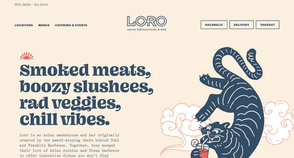
The desktop website for Loro serves as a premier benchmark for “High-Velocity Fast-Casual Merchandising and Frictionless Culinary Conversion Architecture.” Created by legendary Texas chefs, this Asian smokehouse concept needs an interface that instantly capitalizes on high-intent hunger cues while preserving its laid-back, creative brand identity. The digital storefront masterfully achieves this, matching lightning-fast ordering entry points with textured branding and authentic dining lifestyle imagery to capture hungry digital traffic.
Key Design Highlights:
- Immediate Above-the-Fold Order Matrix: The interface completely bypasses standard digital friction by placing high-visibility transactional buttons firmly inside the primary hero zone before a user even begins to scroll. By grouping direct, stylized buttons for localized takeout, on-demand delivery, and nationwide shipping via Goldbelly into the top viewport, Loro captures hungry diners instantly – allowing returning guests or long-distance fans to lock in an order within seconds of landing on the site.
- Playful, Brand-Rich Graphic and Typographic Architecture: Breaking completely away from generic, sterile restaurant templates, the layout embraces custom Asian-inspired illustrations, vibrant colors, and funky, retro-modern fonts. This highly curated design language reflects the restaurant’s unique culinary fusion, transforming a standard web layout into an energetic, memorable brand extension.
- Authentic Atmosphere and Action-Driven Photography: Rather than relying entirely on cold, isolated studio food shots, the homepage features a warm array of lifestyle photography. By displaying images of a buzzing, full dining room, cooks working behind the kitchen line, and a guest happily walking away with a to-go bag, the visual story sells the entire Loro experience – framing it as an energetic, accessible, and high-hospitality community hangout.
- Persistent, Friction-Free Sticky Header Navigation: Ensuring that essential utility links remain effortlessly within reach as users browse, the platform utilizes a locked sticky header. This structural bar stays anchored to the top of the viewport during scrolling, keeping critical pathways – like location selectors, menus, and direct reservation tools – instantly accessible without forcing users to scroll all the way back up the page.
3. Milk Jar Candle Co.
Why We Chose Milk Jar
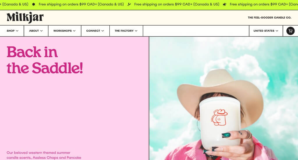
The desktop website for Milk Jar serves as a premier benchmark for “Sensory E-Commerce Merchandising and Inclusive Cause-Driven Brand Architecture.” As a brand specializing in hand-poured candles and natural body care, their digital storefront must translate invisible fragrances into a tangible visual experience while celebrating their core mission of workplace inclusivity. The desktop interface flawlessly secures this, blending a bold “neo-brutalist” pop aesthetic with deeply creative sensory routing to make conscious shopping both visually stimulating and incredibly straightforward.
Key Design Highlights:
- High-Contrast, Neo-Brutalist Visual Layout: Moving completely away from pale, fragile e-commerce grids, the homepage embraces a vibrant color palette framed by thick, bold black outlines around sections. This confident, retro-modern design language establishes a highly structured visual grid that guides the eye naturally through distinct content modules, giving the brand a playful, artistic, and memorable consumer identity.
- The “Scent Seer” Multi-Track Discovery Engine: Overcoming the classic challenge of selling home fragrance online is handled beautifully through multi-tiered navigation filters. The homepage allows users to seamlessly shop by product category, instantly view their “Best Smellers,” or interact with the curated “Scent Seer” tool – a smart module that categorizes fragrances by explicit scent types (like earthy, sweet, or fresh) to help buyers easily find their perfect match from afar.
- Textured, High-Sensory Product Imagery: Because you can’t smell a screen, the photography on the homepage is engineered to look like it smells incredible. By placing their beautifully designed jars alongside rich, real-world texture cues – such as fresh botanicals, warm woods, and cozy, glowing lifestyle backdrops – the visual design triggers instant sensory associations, making the products feel tangibly aromatic and inviting.
- Dynamic Cause-Driven Charity Marquee Engine: Proudly highlighting their commitment to philanthropy, the homepage incorporates an active, moving text marquee that proudly showcases how much money they have raised for community charities. This eye-catching ticker turns their social impact into a primary brand feature, continuously reminding shoppers that their purchases directly support a larger, meaningful cause.
4. Solo Salon
Why We Chose Solo Salon
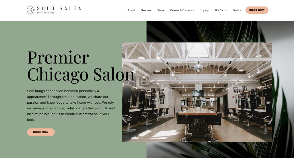
The digital presence for Solo Salon – Elizabeth Click to open side panel for more information (alongside its sister location SOLO SALON WASHINGTON Click to open side panel for more information serves as a premier benchmark for “High-End Beauty Merchandising and Relationship-Driven Salon Conversion Architecture.” In the luxury hair and styling market, a website cannot rely entirely on generic stock imagery; it must immediately project artistic precision, individual customization, and an inviting, fashionable community energy. The desktop interface masterfully delivers this positioning, utilizing authentic client galleries and professional team spotlights to build instant styling trust.
Key Design Highlights:
- Persistent, Friction-Free Sticky Header Navigation: Ensuring that essential utility links and online booking channels remain effortlessly within reach as users browse, the platform features a locked sticky header. This structural bar stays anchored to the top of the viewport during scrolling, keeping core paths – like appointment booking portals, service menus, and location guides – instantly accessible without forcing users to scroll back up.
- Authentic Service Blueprints with Real Client Galleries: Rather than hiding pricing structures behind descriptions or relying on clinical stock imagery, the homepage outlines their technical cutting, coloring, and styling services alongside beautiful, real-life pictures of clients captured inside their physical space. This transparent visual mapping lets prospective guests instantly assess the salon’s real-world versatility, texture mastery, and execution quality before committing to a look.
- Integrated Front-Page Social Proof Hubs: Overcoming the classic anxiety of choosing a new hair stylist is addressed smoothly through a curated matrix of verified client reviews on the homepage. Displaying authentic guest testimonials and explicit ratings within the primary exploration path delivers immediate reassurance, proving their consistency in execution, hospitality, and customer satisfaction.
- Relationship-First Team and Talent Showrooms: Recognizing that beauty and styling choices are built entirely on personal connection, the homepage features a dedicated “Our Team” gallery section. Highlighting their roster of specialized colorists and master stylists directly on the landing page humanizes the upscale brand, allowing prospective clients to preview their talent pool and find a creative match for their specific hair goals.
5. Vortic Watches
Why We Chose Vortic Watch Co.
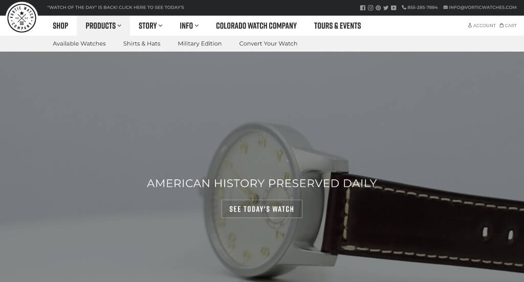
The desktop website for Vortic Watch Company serves as a premier benchmark for “Heritage Luxury Merchandising and High-Trust Engineering Storytelling Architecture.” Because they manufacture one-of-a-kind timepieces by salvaging antique, turn-of-the-century American pocket watch movements and restoring them into modern wristwatches, their digital storefront faces a unique challenge. It must simultaneously educate consumers on historical engineering, prove structural durability, and sell high-ticket luxury items. The desktop interface flawlessly secures this positioning by centering the layout around cinematic craft restoration and ironclad social proof.
Key Design Highlights:
- Cinematic Historical Restoration Video Showrooms: Because the concept of turning a 100-year-old pocket watch into a rugged modern wristwatch sounds almost impossible to the uninitiated, the homepage features a high-fidelity video module. By walking the viewer straight through their engineering process – showing the delicate recovery of antique American mechanisms, precision CNC-machining of custom titanium cases, and meticulous hand-assembly – the video expertly justifies their premium luxury pricing through pure mechanical mastery.
- Direct Front-Page One-of-a-Kind Fleet Showcases: Managing a highly volatile, completely unique inventory where no two watches are identical is handled beautifully with a dedicated “Featured Watches” layout on the homepage. By spotlighting specific, ready-to-wear pieces with high-resolution macro photography directly in the primary scroll path, Vortic gives collectors an immediate look at the dial variations, historical patinas, and case designs currently available for acquisition.
- Front-Page Watchmaking Heritage and Blog Engine: Deepening the collector’s emotional connection to the brand, the homepage integrates a dedicated feature section for their active company blog. Showcasing behind-the-scenes engineering deep dives, historical profiles of classic American watch companies (like Waltham and Elgin), and company news directly on the landing page establishes Vortic as a leading authority in horological preservation.
- Integrated Horological Peer-Validation Hubs: Overcoming natural consumer hesitation regarding the accuracy, water resistance, and daily reliability of a restored antique mechanism is handled smoothly by embedding verified client reviews on the homepage. Displaying authentic collector testimonials and multi-star ratings directly within the exploration path provides the rock-solid reassurance premium buyers look for before checking out.
6. The People Vs Coffee
Why We Chose The People Vs Coffee
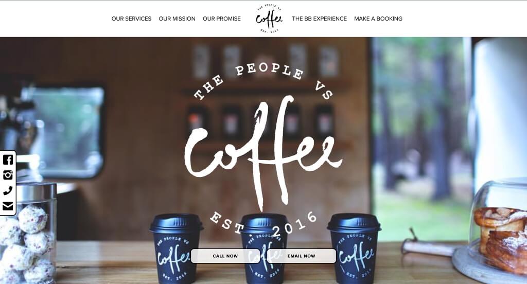
The digital presence for The People Vs Coffee Click to open side panel for more information serves as a premier benchmark for “Mobile Hospitality Merchandising and Purpose-Driven Community Conversion Architecture.” Operating a specialized specialty coffee van and event catering trailer requires an online home that can balance fluid mobile booking mechanics with deep, authentic mission statement branding. The desktop layout masterfully delivers on this by putting community giving, friction-free catering workflows, and delightful micro-interactions right at the front of their virtual cafe experience.
Key Design Highlights:
- Persistent Left-Side Communications Overlay: Built to minimize friction for corporate event planners, festival coordinators, and casual coffee lovers alike, the layout anchors a sticky utility menu to the left side of the screen. This floating hub provides immediate, one-click pathways to connect with the team across social platforms or reach out directly via phone or email, ensuring a business lead is never lost down a deep scroll path.
- Transparent “Our Promise to Give” Social Impact Framework: Seamlessly shifting the brand from a standard beverage merchant to an active force for good, the homepage highlights a dedicated section explaining their community commitment. This clear blueprint outlines exactly how a portion of their coffee sales gives back to localized charity initiatives, instantly turning every mobile booking or single espresso cup purchase into a meaningful act of collective community support.
- Delightful, Personality-Rich Micro-Animations: Breaking away from flat, static digital storefronts, the homepage subtly incorporates playful, motion-rich micro-animations. These lightweight interactive details add a layer of custom whimsy as users scroll through the page, mirroring the friendly, energetic, and high-hospitality experience that clients can expect from the physical coffee truck baristas.
- Direct Mobile Fleet Booking Gateways: Rather than burying event coordination details inside complex multi-tiered menus, the homepage features distinct, action-oriented booking paths for their signature coffee van and trailer fleets. Presenting clear options to reserve either mobile asset straight from the landing page dramatically speeds up the inquiry pipeline for weddings, workplace events, and large-scale markets.
7. Izzy Wheels
Why We Chose Izzy Wheels
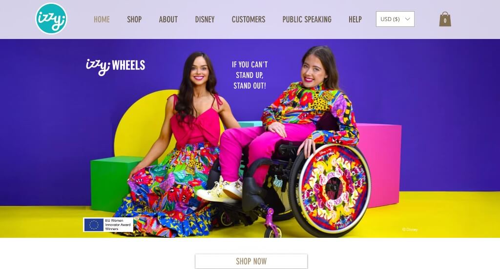
The digital storefront for Izzy Wheels serves as a premier benchmark for “Inclusive Fashion Merchandising and High-Empowerment Assistive Design Architecture.” Founded on the mantra “If you can’t stand up, stand out,” this brand transforms wheelchair wheels into vibrant, highly expressive fashion statements. The digital interface flawlessly mirrors this empowering philosophy, ditching sterile medical aesthetics for an explosion of unapologetic color and elite mobile design to prove that personal mobility and cutting-edge self-expression belong hand in hand.
Key Design Highlights:
- Vibrant, Multi-Chromatic Palette Architecture: The website rejects standard, monotone medical styling in favor of an unapologetically bright, electric color palette that blankets the layout. This deliberate choice instantly flips the narrative surrounding mobility aids, turning the storefront into an inviting, high-fashion art gallery that positions wheelchair spoke guards as the ultimate wearable canvas.
- High-Energy, Inclusive Action Photography: The homepage is anchored by a curated series of vivid, high-energy lifestyle photos showcasing real wheelchair users radiating joy, style, and confidence. By displaying the products in motion across dynamic, fashionable settings rather than static product grids, the visuals celebrate the bold individuality and lifestyle of the brand’s global community.
- Instant Purpose and Product Alignment: The homepage is styled so creatively that visiting users grasp the brand’s identity and core mission within milliseconds. The seamless blend of artistic product close-ups, clear typography, and empowering copy gets buyers excited about personal style and self-expression, demonstrating exactly how a functional piece of equipment can be remixed into a custom work of art.
- Frictionless Mobile-First Fluid Navigation: Recognizing that a vast majority of modern consumer traffic arrives via smartphones, the mobile interface is heavily optimized for effortless browsing. The mobile layout trades dense desktop matrices for ultra-clean layouts, tactile thumb-friendly tap buttons, and crisp, lightweight drop-downs, allowing users to effortlessly explore vibrant designer collections on any screen size.
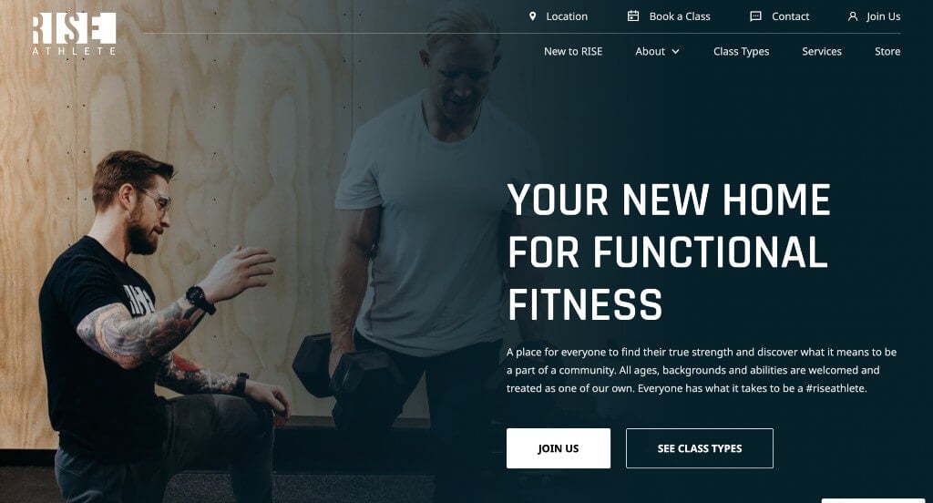
8. Rise Athlete
Why We Chose Rise Fitness
The digital hub for RISE FITNESS Click to open side panel for more information serves as a premier benchmark for “Interactive Athletics Merchandising and Relationship-Focused Gym Acquisition Architecture.” For boutique fitness studios and athletic training facilities, a web experience must go deeper than basic class schedules. It needs to capture the internal team energy, spatial vibe, and supportive member ecosystem that sets the club apart. The interface masterfully delivers on this by prioritizing self-guided discovery modules that let prospective members feel the gym’s values before stepping onto the training floor.
Key Design Highlights:
- The Interactive “Rise Way” Core Principles Blueprint: Rather than listing corporate values in standard text paragraphs, the homepage incorporates a beautifully structured tab system. This workspace allows visiting athletes to click through distinct tabs to reveal the internal training strategies, coaching philosophies, and standard of care that define the gym’s specific identity, making their operational philosophy highly scannable.
- The “Community x Fitness” Multi-Track Explorer: To highlight how they blend athletic performance with social belonging, the layout features a dedicated “Community x Fitness” interface. This section uses an intuitive vertical column of clickable tabs anchored to the left, which dynamically updates the main media panel to show running clubs, social gatherings, and group accountability programs, proving they offer more than just cold workout equipment.
- Integrated Member Success and Review Showrooms: Overcoming natural fitness intimidation – such as fear of injury, lack of progress, or feeling out of place – is handled smoothly by embedding verified client reviews on the homepage. Displaying authentic member testimonials and body-positive success stories directly along the primary exploration path provides strong social proof to build immediate visitor confidence.
- Friction-Free Bottom-of-Page Consultation Gateways: The landing page finishes with a dedicated, clean contact form built directly into the footer area. Positioned right at the end of the narrative scroll path, this tool allows prospective members to immediately submit their information for a free trial or membership consult the moment they finish exploring the facility’s online story.
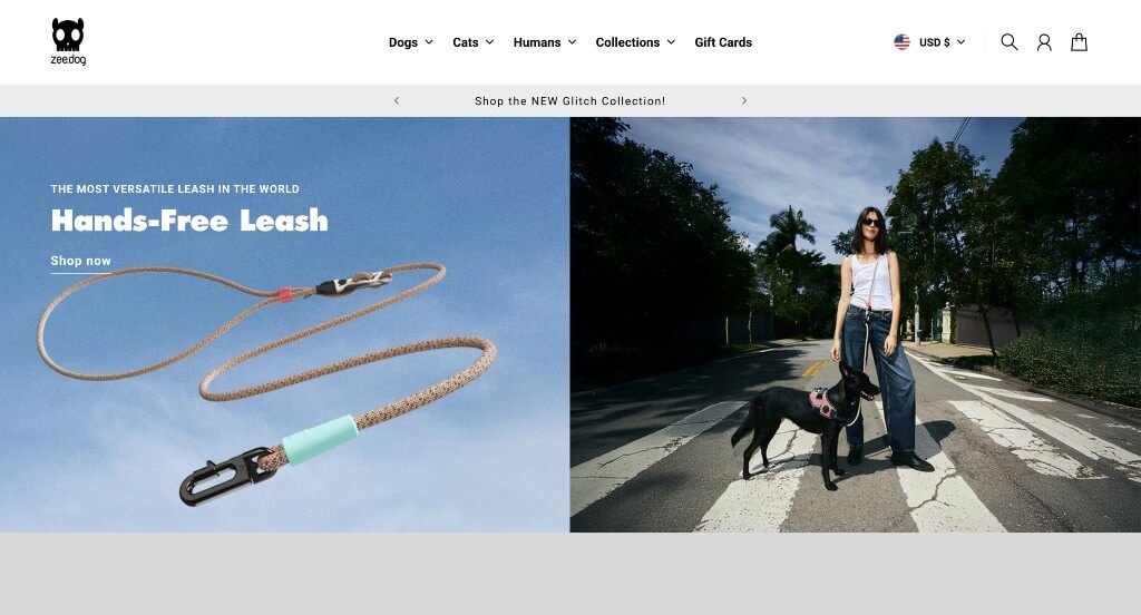
9. Zee Dog
Why We Chose Zee.Dog
The desktop website for Zee.Dog serves as a premier benchmark for “High-Expression Pet Lifestyle Merchandising and Fluid Omnichannel Conversion Architecture.” Moving away from the sterile, clinical look of traditional pet supply stores, Zee.Dog positions itself as a premium streetwear-inspired brand for dogs and cats. The digital storefront beautifully executes this lifestyle positioning, pairing a hyper-visual, uncompromised desktop canvas with effortless mobile layouts to turn routine pet walking accessories into bold personal style statements.
Key Design Highlights:
- Cinematic, Full-Width Narrative Canvas: The website embraces a generous, edge-to-edge desktop layout that leverages massive visual real estate to tell its product stories. By allowing high-contrast lifestyle photography and vivid close-ups of dogs wearing their signature gear to stretch across the full width of the screen, the framework captures the brand’s bold, trendy aesthetic and lets the raw style of the hardware take center stage.
- Streamlined, Multi-Category Desktop Mega Menu: Organizing a massive product ecosystem – spanning graphic dog harnesses, reinforced leashes, modern cat toys, and specialized travel gear – is handled gracefully with an expansive desktop mega menu. Hovering over primary links opens an organized workspace that categorizes collections by pet type, accessory style, and collaborative design drops, letting owners find specific gear sizes without page friction.
- Top-Level Global Announcement Banner: Positioned at the absolute peak of the page layout, a persistent, edge-to-edge announcement bar serves as an optimized information channel. This high-visibility element keeps customers constantly updated on critical transactional updates – such as free shipping thresholds, global seasonal sales, or limited-edition designer product drops – without getting in the way of the main visual narrative.
- Frictionless Mobile-First Scroll Architecture: Recognizing the rapid pace of mobile shopping, the smartphone interface is heavily optimized for smooth, on-the-go browsing. The mobile layout expertly scales down the large-format desktop aesthetic, utilizing fluid vertical scrolling, touch-friendly touch targets, and lightweight media modules that allow pet parents to comfortably browse and checkout from any screen size.
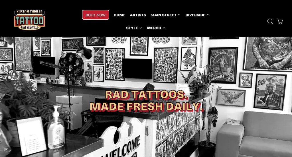
10. Kustom Thrills
Why We Chose Kustom Thrills
The digital storefront for Kustom Thrills Tattoo serves as a premier benchmark for “Counter-Culture Artisan Merchandising and High-Conversion Creative Studio Architecture.” In the high-stakes world of body art and tattooing, an online portal must balance raw, gritty rock-and-roll authenticity with clear operational systems. The desktop interface masterfully locks down this aesthetic positioning, ditching sterile corporate boxes for an atmospheric, gallery-first layout that instantly highlights their industry authority, sterile shop environment, and incredible roster of resident artists.
Key Design Highlights:
- Atmospheric, Retro-Style Monochrome Shop Showrooms: Setting a gritty, high-vibe tone the second the page loads, the hero section utilizes a striking black-and-white background video loop. By guiding visitors directly through their physical shop space – capturing the custom wall art, humming tattoo machines, clean workstations, and collaborative creative energy – the video immediately welcomes guests into their distinct studio culture.
- Persistent, Friction-Free “Book Now” Floating Gateway: Balancing artistic lifestyle with sharp customer acquisition, a dedicated, bright appointment button remains anchored to the bottom-right corner of the desktop viewport. This overlay widget stays in view across the entire exploration journey, providing a direct, instant path for high-intent clients to submit session ideas, select a time window, or secure a consultation deposit the moment inspiration hits.
- Curated Front-Page Artistic Execution Matrices: Proving their diverse capability across countless tattoo styles – spanning American traditional, fine-line, hyper-realism, and vibrant illustrative color work – the homepage integrates a rich gallery of fresh, high-resolution client tattoo photos. Putting these real-world portfolio highlights straight into the primary scroll path gives browsing collectors instant visual evidence of the studio’s precision ink application and clean healing results.
- Roster-First Talent Showrooms with Direct Portfolio Deep Links: Recognizing that clients book specific tattooists rather than just a brand name, the homepage features a dedicated section introducing each resident artist. Every profile card spotlights the artist’s individual creative style alongside a clean, direct link to view their full, personal gallery, allowing collectors to comfortably browse, match with a specialist, and book the perfect hand for their custom piece.

11. Terlingua Real Estate
Why We Chose Terlingua Real Estate
The digital storefront for Terlingua Real Estate serves as a premier benchmark for “Regional Land Merchandising and High-Trust Luxury Acreage Brokerage Architecture.” In the specialized market of West Texas real estate, selling expansive, rugged desert plots and off-grid homesteads requires an interface that captures the grand scale of the landscape while providing concrete, professional transaction pathways. The desktop interface secures this positioning flawlessly, pairing cinematic cinematic backdrops with transparent business blueprints to guide distant buyers into the frontier market.
Key Design Highlights:
- Cinematic, Full-Bleed Regional Hero Showrooms: Capturing the massive, untamed spirit of West Texas is handled instantly upon landing via a high-fidelity hero video loop. By displaying sweeping aerial vistas of the Big Bend region – showcasing vast mountain ridges, winding desert paths, and brilliant open skies – the website bypasses basic property data to focus on the raw emotional lifestyle and romantic freedom of owning desert acreage.
- Founder-Led Mission and Vision Frameworks: Grounding the company’s regional dominance, the homepage features a prominent, personal quote from their CEO and founder. Placing this dedicated statement directly in the initial scroll path humanizes the brokerage, building immediate trust with out-of-town investors by showcasing local expertise, deep community roots, and an authentic passion for protecting and developing the unique desert landscape.
- Comprehensive Commercial and Residential Service Matrices: Demystifying the complexities of desert land transactions – spanning complex acreage mapping, mineral rights navigation, off-grid utilities, and residential listings – is executed through a structured service index on the homepage. This clear breakdown quickly routes buyers and sellers to specialized consultation pipelines depending on their exact real estate goals.
- Direct Front-Page Available Property Showrooms: The homepage functions as a high-visibility digital real estate office, integrating active land and home listings straight into the main navigation scroll. By displaying high-contrast imagery of currently available desert properties alongside baseline prices, acreage sizes, and location highlights, the platform allows high-intent buyers to instantly browse the live inventory before clicking through to full listing sheets.
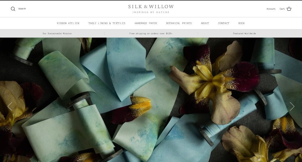
12. Silk & Willow
Why We Chose Silk & Willow
The desktop website for Silk & Willow serves as a premier benchmark for “Artisan Luxury Textile Merchandising and Color-Driven E-Commerce Architecture.” Specializing in plant-dyed, hand-loomed silk ribbons, table linens, and bespoke bridal accessories means their digital storefront must do more than list product measurements – it has to visually communicate texture, movement, and the delicate nuance of natural tones. The desktop layout achieves this beautifully, trading ordinary storefront grids for a high-end editorial canvas that makes shopping by color palette incredibly intuitive.
Key Design Highlights:
- Stunning, Editorial Hero Visual Showrooms: The homepage opens with breath-taking, large-format hero imagery that instantly sets an elite, artistic tone. Rather than using rigid product cutouts, these opening visuals feel like high-fashion editorial art, immediately immersing wedding designers, stylists, and brides into the brand’s romantic, organic world.
- High-Sensory Luxury Product Showcases: The homepage features curated collections utilizing ultra-high-resolution macro photography to put the exquisite craftsmanship of their silks on full display. By capturing the fine, raw frayed edges, delicate sheen, and soft drape of the textiles under natural light, the visual design allows buyers to practically feel the luxurious texture and weight of the fabrics right through their desktop screen.
- Interactive, Color-Matching Discovery Hub: Injecting a moment of high-utility digital brilliance, a custom color-selection widget is anchored to the bottom-right corner of the viewport. Clicking this interactive tool allows users to select a specific color swatch, instantly filtering and displaying products that match that precise shade – a game-changing feature for wedding planners and designers trying to build exact event color palettes.
- Front-Page Editorial Authority and Press Matrices: Solidifying their elite industry standing, the homepage incorporates a dedicated media showcase displaying the logos of prestigious publications they have been featured in. Showcasing stamps of approval from top-tier bridal and design authorities builds immediate trust and reinforces their position as the go-to studio for premium, artisan textiles.
13. KeyNest
Why We Chose KeyNest
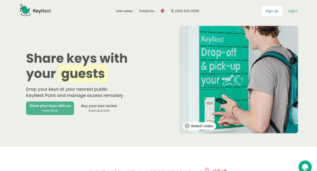
The desktop website for KeyNest serves as a premier benchmark for “Global Property Operations Merchandising and High-Scale Logistics B2B Architecture.” Providing automated smart key exchanges and local locker tracking networks across different continents requires a digital experience that can quickly bridge two worlds: making complex key-handover tracking crystal clear while instantly showing value across various industries. The desktop layout achieves this effortlessly, using a clean, utility-first structure that turns a logistics hurdle into an elegant, high-trust business asset.
Key Design Highlights:
- Instant Core Service and Operational Clarity: The homepage avoids confusing jargon, immediately greeting users with a highly scannable layout that outlines exactly what they do. By laying out their core services – such as secure local shop key exchanges, remote dashboard tracking, and smart locker integrations – visitors quickly grasp how KeyNest automates property entry management within seconds of landing.
- Multi-Industry Target Architecture Ecosystems: Rather than limiting themselves to just one client profile, the homepage explicitly details how their secure exchange network serves diverse business ecosystems. The layout guides viewers through distinct real-world applications – showing exactly how the system saves hours for short-term vacation rental hosts, real estate brokerages, corporate property managers, and mobile cleaning or maintenance teams alike.
- Instant Front-Page Real-Time Live Chat Portals: To immediately assist on-the-go property managers, busy hosts, or potential local retail shop partners, the website integrates an active live chat gateway. This support channel operates right on the front page, lowering conversion friction and assisting businesses with real-time operational questions right when they are ready to sign up.
- Tri-Channel High-Conversion Footer Gateways: The landing page path finishes with an optimized, multi-channel contact command center at the base of the homepage. By providing clear, side-by-side buttons to instantly open a live chat, dial a direct support phone line, or drop a note through a quick contact form, the layout ensures high-intent enterprise clients can reach a representative using whichever communication channel they prefer.
WordPress Business Themes
You can find free themes at wordpress.org or explore business templates at ThemeForest.
Ohlala – Themeforest
$59
Don Peppe – Themeforest
$79

Brewski – Themeforest
$79
MoveMe – Themeforest
$69
WooCommerce Business Themes
You’ll find numerous ecommerce themes for WooCommerce on ThemeForest.
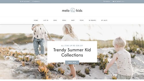
MeloKids – Themeforest
$59
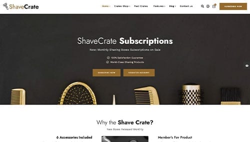
TheCrate – Themeforest
$59
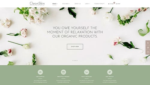
CleanSkin – Themeforest
$69
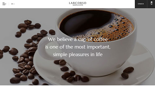
Larcorso – Themeforest
$110
Shopify Business Themes
Discover free and paid themes at themes.shopify.com or explore options through marketplaces like ThemeForest.
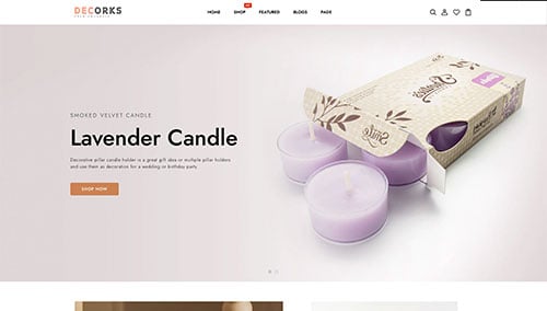
Decorks – Themeforest
$56
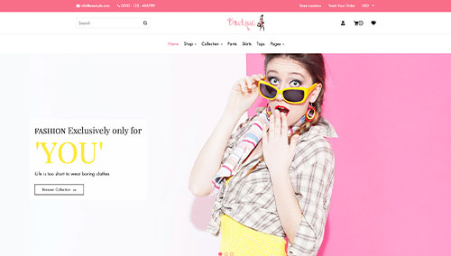
Boutique – Themeforest
$99
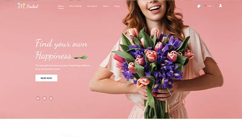
Pookal – Themeforest
$69
Kofi – Themeforest
$39