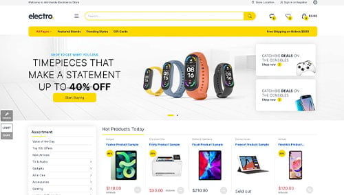
In the technology sector, your website is the ultimate reflection of your product’s quality. Whether you are a SaaS startup, a cybersecurity firm, or an enterprise IT consultancy, your online presence must immediately communicate technical authority, security, and forward-thinking innovation. To win trust in a landscape of rapid disruption, your design must be as high-performing and scalable as the solutions you provide.
Our design and development team evaluated hundreds of technology websites – ranging from cloud computing providers and hardware manufacturers to telecommunications giants and AI-driven software firms. We identified the top 15 examples that excel in modern technical branding, specifically analyzing their interactive data visualizations, clear value-proposition hierarchies, and seamless mobile-first performance.
Whether you are launching a disruptive app or managing a global IT infrastructure firm, these examples represent the current benchmark for technology web design in 2026.
Note on Our Selection Process: We recently audited this guide to remove outdated designs and sites that no longer meet our performance standards.
Top Technology & IT Website Designs
1. Synthesia
Why We Chose Synthesia
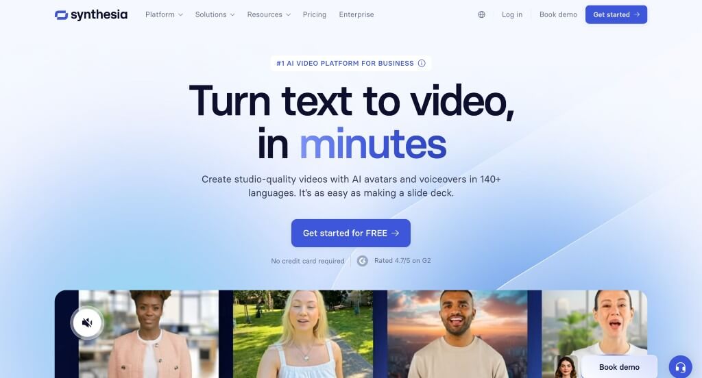
The desktop website for Synthesia serves as a premier benchmark for “AI-Native Video Generation Merchandising and Immersive Product-Led Growth (PLG) Architecture.” As a leading enterprise platform for synthetic media and AI avatars, their digital storefront must effortlessly dismantle the high barrier to entry associated with video production. The desktop interface perfectly achieves this by transforming its landing page into an active production sandbox, allowing corporate trainers and marketing leaders to interactively build and experience AI-generated content before ever signing up.
Key Design Highlights:
- Interactive Tabbed Product Feature Showrooms: Positioned strategically directly below the primary hero area, the website integrates a highly intuitive, multi-tabbed interface framework. Desktop visitors can seamlessly click through distinct operational tabs along the top of this module to view high-fidelity walkthroughs of different software mechanics – such as script-to-video editing, avatar selection, and multi-language translation – visually demonstrating how simple the platform is to use.
- Immersive Client Video Testimonial Galleries: Rather than relying solely on standard text quotes, a platform built on video technology masterfully leverages its own medium for social proof. The homepage features a dedicated, high-impact gallery of video testimonials from verified corporate clients, allowing desktop buyers to witness the crisp rendering quality of the platform’s outputs while listening to real-world success stories regarding production speed and cost savings.
- On-Demand Interactive AI Video Generation Sandbox: A brilliant conversion hook located further down the homepage lets desktop users actively test-drive their core AI video technology in real time. By typing custom text directly into a live creation box on the page, visitors can generate a brief synthetic video snippet on the spot, providing an immediate “aha!” moment that instantly validates the accuracy and capabilities of the software.
- Integrated Front-Page FAQ Blueprint: To preemptively address technical concerns regarding AI ethical guardrails, commercial licensing, custom avatar creation, and pricing tiers, the homepage incorporates a beautifully structured Frequently Asked Questions (FAQ) matrix. Placing this self-service repository directly in the primary scroll path eliminates user friction and accelerates corporate procurement decisions.
2. Link Tree
Why We Chose Linktree
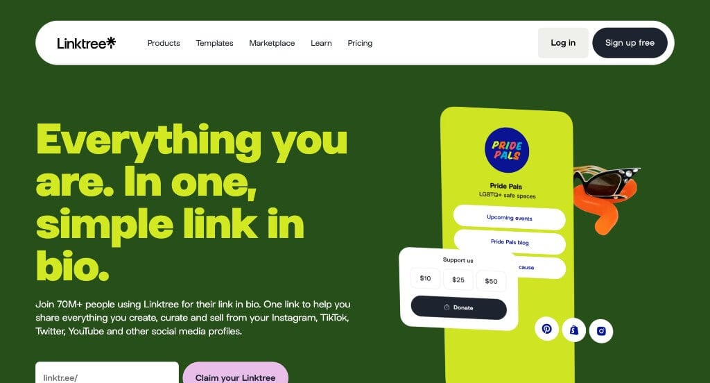
The desktop website for Linktree serves as a premier benchmark for “High-Velocity Creator-Economy Merchandising and Playful Product-Led Growth (PLG) Architecture.” As the pioneer of the “link-in-bio” category unifying digital identities across social platforms, their own desktop presence must balance simple utility with highly expressive design. The widescreen interface perfectly achieves this by wrapping complex directory systems in an energetic, gamified visual environment that instantly resonates with influencers, creators, and modern brands.
Key Design Highlights:
- Playful Aesthetic Engine and Custom Reactive Cursor Tracking: The homepage establishes an immediate, highly engaging first impression by leaning into vibrant, punchy color palettes and cutesy, retro-modern graphic layouts. Elevating this sensory experience across desktop displays, the website deploys custom mouse-interaction tracking – swapping out the default operating system cursor for a stylized, context-aware graphic wrapper that dynamically alerts users to interactive canvas elements.
- Elevated Peer Social Proof and High-Profile Review Showrooms: Overcoming consumer onboarding hesitation is effortlessly handled by embedding authentic customer reviews and user success stories directly into the primary scroll path. Showcasing feedback from a diverse spectrum of global creators, independent businesses, and mega-influencers establishes massive platform reliability while highlighting the real-world ease of consolidating multiple traffic destinations into a single hub.
- Comprehensive Multi-Column Desktop Mega Menu: Managing a expansive corporate feature footprint – spanning specialized monetization tools, e-commerce storefront expansions, and cross-platform analytics – is gracefully executed via a sophisticated desktop mega menu. Hovering over the top-level directory triggers a beautifully organized, wide drop-down panel that maps out solutions by creator niche and template category into clear, scannable columns.
- Integrated Front-Page Self-Service FAQ Blueprint: To streamline user adoption and preemptively answer technical implementation questions, the homepage concludes with a cleanly structured Frequently Asked Questions (FAQ) repository. Addressing core inquiries regarding free-tier capabilities, payment integrations, and account analytics directly on the landing page eliminates user friction, routing desktop visitors straight into a confident sign-up sequence.
3. Rapidops
Why We Chose Rapidops
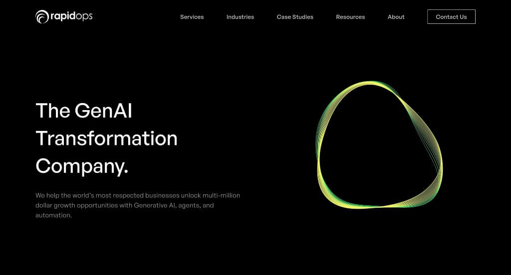
The desktop website for Rapidops serves as a premier benchmark for “High-Impact Digital Transformation Merchandising and AI-Native Enterprise Engineering Architecture.” As an elite technology integrator specializing in generative AI, omnichannel commerce, and advanced analytics, their digital platform must immediately establish technical mastery. The desktop layout flawlessly commands authority by swapping standard corporate summaries for an ultra-modern, narrative-driven blueprint that combines deep capability transparency with interactive storytelling to engage enterprise tech buyers.
Key Design Highlights:
- Structured “Our Offerings” Capability Grid: Providing instant clarity for prospective B2B clients, the homepage features a pristine, highly organized capabilities section. This hub lays out their full engineering portfolio – spanning Generative AI Consulting, autonomous AI Agent development, Enterprise Transformation, and Omnichannel Commerce – allowing visiting CTOs and executives to map Rapidops’ technological competencies to their specific business requirements at a single glance.
- High-Impact Featured Case Study Showrooms: Neutralizing procurement skepticism, the interface integrates a dedicated section displaying real-world product transformations right on the homepage. Showcasing prominent, metrics-focused case studies – such as agentic frameworks for major CRMs or omnichannel overhauls for massive retail networks – proves their real-world implementation capabilities and links strategic tech investments directly to tangible ROI.
- Interactive “Our Differentiators” Scrollytelling Canvas: A major architectural hallmark of the desktop experience is the “Our Differentiators” section, which leverages sophisticated scroll-driven storytelling (“scrollytelling”). As the user scrolls down the page, visual elements fluidly animate to reveal key organizational pillars like their “Born Agile” philosophy, end-to-end operational spirit, and deep industry knowledge – turning standard corporate claims into an engaging, multi-layered visual experience.
- Thought-Leadership Blog Engine Hub: Seamlessly establishing industry authority on the latest technological waves, the homepage concludes with a curated gallery of their recent insights and publication entries. Displaying deep-dive technical articles regarding next-generation digital strategy and application modernization directly on the front page positions the firm as a forward-thinking consultant, building immense credibility with enterprise visitors.
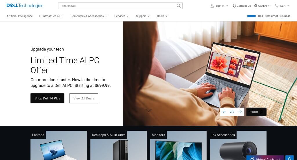
4. Dell Technologies
Why We Chose Dell
The desktop website for Dell serves as a premier benchmark for “Enterprise Scale E-Commerce Systems and AI-Driven Omnichannel Consumer Architecture.” Managing an extensive hardware catalog that spans everyday consumer laptops, extreme gaming rigs, and complex enterprise data centers requires a masterfully engineered entry point. The desktop layout achieves this by integrating advanced artificial intelligence discovery interfaces alongside an omnipresent, multi-channel support grid to seamlessly guide diverse buyer personas through high-consideration technology purchases.
Key Design Highlights:
- AI-Powered Intelligent Search Anchor: Dominating the absolute top of the primary hero layout is a high-visibility, AI-driven search terminal. Positioned right where visitors focus first, this intelligent search interface goes far beyond basic keyword matching – allowing desktop users to type complex, natural-language queries to instantly surface specific hardware specifications, compatibility documentation, or precise enterprise solutions.
- Omnichannel “How Can I Help You?” Support Overlay: Strategically anchored to the bottom-right corner of the viewport is an omnipresent customer service hub. Clicking this persistent overlay opens a unified panel offering immediate connections across four distinct consumer preferences: instantaneous human Live Chat, an automated Virtual Assistant, direct Call Sales options, or a frictionless jump over to Facebook Messenger to chat with sales representatives.
- Dynamic Featured Products and Enterprise Solutions Slider: To prevent visual clutter across their massive inventory while keeping seasonal refreshes front and center, the homepage integrates a smooth, horizontal slider. This module cycles through flagship releases, current hardware promotions, and dedicated corporate solutions, allowing B2B buyers and everyday consumers alike to rapidly browse trending ecosystems from a single, centralized viewport.
- Front-Page Newsroom and Corporate Blog Hub: Establishing Dell’s position at the forefront of digital transformation and computing infrastructure, the lower portion of the homepage features a curated editorial grid. Displaying recent press updates, major tech breakthrough announcements, and deep-dive engineering blogs directly on the landing page builds massive brand authority and bridges retail commerce with technical thought leadership.
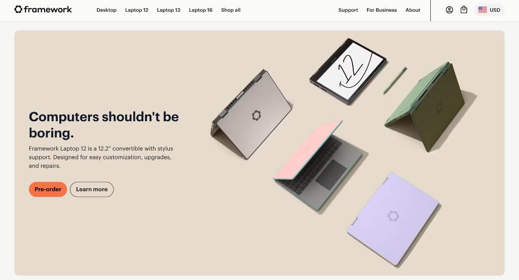
5. Framework
Why We Chose Framework
The desktop website for Framework serves as a premier benchmark for “Mission-Driven E-Commerce Architecture and Disruptive Consumer Electronics Merchandising.” In a marketplace dominated by sealed, unrepairable hardware, Framework’s digital storefront faces the unique challenge of selling high-end laptops while simultaneously educating consumers on a completely new philosophy: total modularity and the right to repair. The desktop interface flawlessly balances these needs, treating physical components like a work of art and using its platform layout to turn everyday shoppers into environmental activists.
Key Design Highlights:
- Streamlined Modular Hardware Mega Menu: Navigating an ecosystem that splits between pre-built laptops, DIY configuration kits, and individual modular upgrade parts is managed seamlessly via an expansive desktop mega menu. Hovering over primary navigation links opens a wide, beautifully clean drop-down panel that maps out main product lines alongside specific expansion cards, mainboards, and replacement components in structured columns, keeping deep-site discovery completely effortless.
- Multi-Tiered Layered Product Showrooms: Rather than focusing solely on a single flagship device, the homepage organizes its layout into a series of distinct product showcases. From their ultra-portable 13-inch configurations to high-performance 16-inch laptops with upgradeable discrete graphics, the interface guides desktop viewers through diverse hardware categories, allowing users to rapidly find the exact computing tier that fits their workflow.
- Exploded-View, High-Fidelity Component Imagery: Highlighting their unique selling proposition, the homepage utilizes crisp, studio-quality images that showcase the literal interior anatomy of their products. By displaying beautifully shot, high-definition photography of individual parts – such as RAM modules, storage drives, magnetic bezels, and modular input segments – the layout visually proves how easy the laptops are to open, modify, and repair.
- Uncompromising, Front-and-Center Mission Manifestos: The homepage completely rejects sterile, corporate retail styling in favor of an bold, identity-driven narrative. Right alongside their product banners, the interface embeds clear, highly visible statements targeting the electronics industry’s electronic waste crisis and planned obsolescence. This structural choice makes their philosophy immediately clear to anyone landing on the site, framing a laptop purchase not just as a hardware transaction, but as a direct vote for a sustainable, fixable tech future.
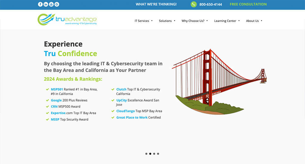
6. TruAdvantge
Why We Chose TruAdvantage
The desktop website for TruAdvantage serves as a premier benchmark for “High-Trust Managed IT Services (MSP) Merchandising and Regionally Focused B2B Conversion Architecture.” In the highly competitive cybersecurity and IT compliance sector, an agency’s digital storefront must immediately project absolute operational reliability, swift responsiveness, and deep technical authority. The desktop layout achieves this by blending multi-layered social proof with a highly structured regional value proposition, giving California business leaders a clear roadmap to secure and scale their corporate technology stacks.
Key Design Highlights:
- Dual-Layer Video and Search Engine Social Proof Showrooms: Overcoming the skepticism of outsourcing critical IT infrastructure is masterfully handled through a two-tiered validation path on the homepage. The layout kicks off with a dedicated “Watch Our Clients’ Success Stories” section featuring high-production video testimonials from actual partners, then beautifully anchors the lower scroll path with live Google Reviews – delivering an undeniable mix of cinematic narrative and verified third-party social proof.
- Geographically Targeted “Why Choose Us” Trust Matrix: Strategically establishing dominant regional authority, the homepage integrates a prominent value-proposition section explicitly detailing eight distinct reasons why California businesses have trusted the firm with their operations. This structured framework talks directly to local compliance mandates, response times, and tailored cybersecurity strategies, turning a standard corporate overview into an intentional, highly persuasive pitch for regional B2B decision-makers.
- Comprehensive Managed IT and Security Offerings Catalog: Providing immediate clarity regarding their technical capabilities, the homepage serves as a beautifully mapped directory of TruAdvantage’s core services. From cloud virtualization and dark web monitoring to fractional CIO consulting and strategic IT helpdesk support, the clean layout allows corporate procurement officers and operations directors to instantly verify tech-stack compatibility.
- Front-Page IT Insights and Thought-Leadership Blog Engine: Showcasing their continuous pulse on the ever-evolving cybersecurity landscape, the homepage concludes with a curated gallery of their latest blog publications. Displaying highly relevant technical guides, optimization tips, and data-protection advice directly on the landing page reinforces the firm’s positioning as a forward-thinking, proactive IT consultant.
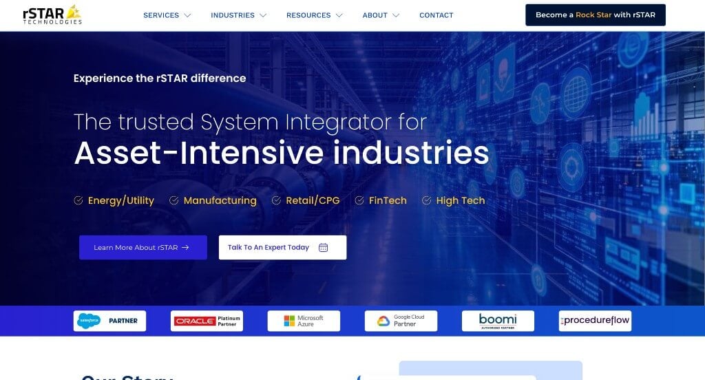
7. rStar Technologies
Why We Chose R-Star Technologies
The digital storefront for R-Star Technology Solutions serves as a premier benchmark for “Industrial-Grade B2B Enterprise Merchandising and High-Efficiency Mobile-First Conversion Architecture.” In the specialized fields of rugged computing, networking infrastructure, and harsh-environment technical deployments, a website must rapidly validate operational capabilities and project immense corporate durability. The interface achieves this beautifully by stripping away unnecessary decorative fluff, prioritizing clean scannability, and engineering a frictionless lead-generation pathway that performs flawlessly across all device tiers.
Key Design Highlights:
- Targeted “Focus Industries” Vertical Matrix: Providing instantaneous structural clarity for procurement officers, the homepage features a dedicated, highly organized “Focus Industries” showroom. This module explicitly maps out the exact demanding sectors the company engineers solutions for – allowing visiting operations managers to immediately self-identify and confirm that R-Star’s hardware and technical services match their specific environmental and regulatory requirements.
- Tier-1 Corporate Validation and Integrated Client Showrooms: Overcoming the intense scrutiny typical of high-stakes enterprise technology investments is gracefully managed through a dual-purpose social proof anchor. The homepage proudly showcases the logos of high-level, industry-leading companies that rely on R-Star, seamlessly blending these elite corporate relationships with direct, deeply detailed client testimonials that explicitly validate their execution speed, technical mastery, and long-term product reliability.
- Frictionless Gateway Terminal and Front-Page Contact Engine: Capitalizing on high-intent B2B traffic the exact moment a prospect finishes browsing their capabilities, the homepage layout eliminates extra clicks by embedding a clean, comprehensive contact form directly at the base of the scroll path. This strategic final section serves as a direct, zero-friction conversion terminal, inviting immediate requests for quotes, technical consultations, or custom project blueprints without forcing users away from the main experience.
- Pristine, Lightweight Mobile Scroll Optimization: Translating an enterprise desktop layout into a flawless handheld experience can often result in clunky text scaling and massive page weight, but R-Star’s mobile interface is exceptionally clean, responsive, and easy to navigate. By pruning data-heavy components, optimizing touch targets, and maintaining an airy, logical vertical stacking pattern, the platform ensures that busy field engineers and corporate executives can effortlessly research products and submit inquiries on the go.
8. Field Edge
Why We Chose FieldEdge
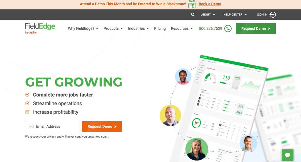
The desktop website for FieldEdge serves as a premier benchmark for “High-Conversion Service SaaS Merchandising and Multi-Persona B2B Conversion Architecture.” As a leading field service management software built specifically for mechanical contractors, their digital storefront must rapidly prove value to both blue-collar trade owners and tech-minded office administrators. The desktop interface masterfully achieves this by utilizing fluid visual pacing alongside tailored value messaging, making it immediately clear how the platform unites field operations with back-office tracking.
Key Design Highlights:
- High-Visibility Header with Instant Demo Reservation Gateway: To maximize software lead generation and capture high-intent commercial traffic the moment a user arrives, the interface positions a prominent, high-contrast “Request a Demo” call-to-action button directly within the main global header. This strategic positioning ensures that no matter where an operational manager travels across the site, the primary onboarding gateway remains permanently accessible.
- Fluid Scroll-Driven Micro-Animations: Breaking away from flat, static text layouts, the homepage features polished, scroll-triggered animations that smoothly filter in content as the desktop viewer advances down the page. This rhythmic loading pattern draws the user’s eyes directly to key features, feature graphics, and product capabilities, transforming standard software documentation into an engaging and dynamic reading experience.
- Tailored Multi-Persona Operational Matrix: A central pillar of the website’s communication strategy is a dedicated homepage section that maps out exactly how the application optimizes workflows across an entire company. Instead of relying on a one-size-fits-all pitch, the layout explicitly demonstrates the software’s unique utility for Business Owners, Field Technicians, and the Office Team within target industries like HVAC, plumbing, and electrical – proving total operational alignment from dispatch to ledger.
- Authentic Social Proof and Trade Testimonial Showrooms: Overcoming software adoption hesitation is gracefully handled by embedding real-world client testimonials directly within the primary homepage scroll path. Showcasing verified reviews and success stories from actual trade contractors builds immediate field credibility, providing the explicit peer validation required to convert skeptical business owners into confident software buyers.
9. Marvel
Why We Chose Marvel
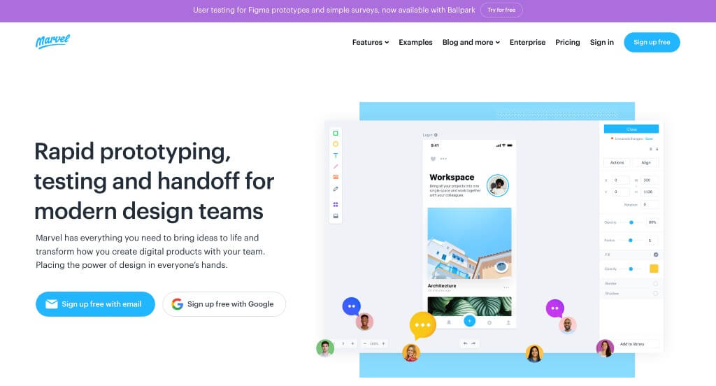
The desktop website for Marvel serves as a premier benchmark for “Streamlined Product-Led Growth (PLG) SaaS Merchandising and High-Contrast Product Showcase Architecture.” As an all-in-one collaborative design and prototyping platform, their digital presence must demonstrate that creating digital products can be incredibly fast, visual, and intuitive. The desktop interface flawlessly embodies this philosophy by stripping away structural clutter, using a clean canvas approach that allows the colorful, interactive elements of their actual software to command absolute attention.
Key Design Highlights:
- High-Visibility Announcement Bar Above the Global Header: Positioned at the absolute peak of the page hierarchy, Marvel features a dedicated announcement bar resting comfortably above the main navigation header. This narrow, high-impact bar serves as a sleek corporate broadcasting tool, capturing the immediate attention of desktop visitors to highlight major product updates, company news, or new feature rollouts without disrupting the core site architecture.
- Interactive, Use-Case Driven Feature Showrooms: To rapidly demonstrate platform capabilities without forcing users into complex video tutorials, the homepage integrates an interactive tabbed interface matrix. Desktop visitors can seamlessly toggle through different core design stages – such as wireframing, prototyping, and user testing – which instantly swaps out contextual screenshots of the app in action, proving the platform’s agility across diverse production scenarios.
- Streamlined, Lightweight Desktop Mega Menu: Rather than overwhelming potential users with an intimidating, multi-column directory tree, Marvel embraces a tighter, smaller mega menu concept. Hovering over top-level options drops down a beautifully simplified grid that isolates just the essential product pillars, resource links, and enterprise plans, giving buyers an immediate path to deep-site content while preserving a clean layout.
- High-Contrast Canvas Where Rich Graphics and Colors Pop: The visual framing of the homepage relies heavily on an expansive, ultra-clean white background. By intentionally removing heavy dark banners or muddy textures, the layout creates a pristine backdrop that makes every colorful software button, user-interface graphic, and high-fidelity product screenshot instantly jump off the screen, mirroring the exact clean-slate feeling of opening a fresh design file.
10. Meltano
Why We Chose Meltano
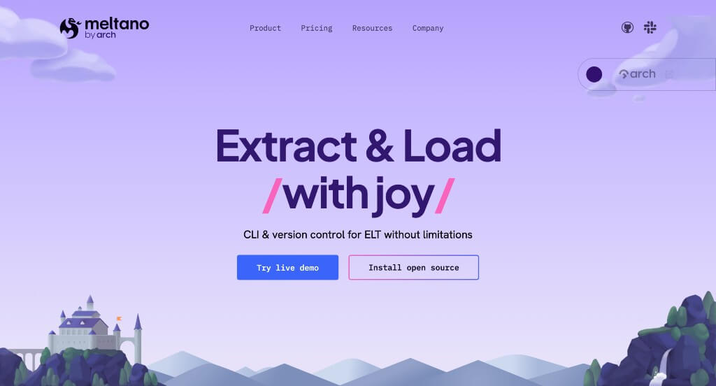
The desktop website for Meltano serves as a premier benchmark for “DataOps Engineering Merchandising and High-Interactivity Developer SaaS Architecture.” As an open-source, code-first data integration platform designed for modern data engineers and platform teams, Meltano must prove that data orchestration can be both mathematically efficient and visually transparent. The desktop interface masterfully accomplishes this by discarding flat documentation formats, using fluid motion mechanics and interactive data dashboards to prove platform ROI before users ever clone a repository.
Key Design Highlights:
- Persistent Sticky Header Framework: To maintain instant navigational accessibility across a content-heavy layout, the website employs an anchored sticky header. This functional overlay keeps primary developer gateways, connector repositories, and community documentation links permanently within reach as technical users execute long-scroll homepage research.
- Cinematic Scroll-Driven Parallax and Kinetic Animations: The second a desktop user navigates away from the primary hero area, the interface triggers a series of sophisticated scroll-driven animations and multi-layered parallax shifts. This fluid spatial staging breathes motion into complex developer concepts, automatically assembling pipeline diagrams and visual components to reward exploration and maintain deep user engagement.
- Scroll-Activated In-Line Platform Video Showrooms: Breaking completely away from standard static software mockups, the homepage embeds automated, loop-optimized clip windows that come to life as users descend the page. These dynamic snippets visually document exactly how Meltano operates in the wild – showcasing live pipeline configurations, code-native setups, and data-flow tracking inside actual developer environments.
- Interactive Cross-Industry Cost Savings Estimator Matrix: Actively countering row-based pricing structures, a major conversion hook on the homepage is a gamified cost-savings calculation terminal. Desktop visitors can fluidly click through dedicated operational tabs tailored to specific industry verticals – including Marketing, Logistics, E-Commerce, and Finance – to instantly view real-time projections of estimated overhead reductions and compute efficiencies unique to their business sector.
11. Mixpanel
Why We Chose Mixpanel
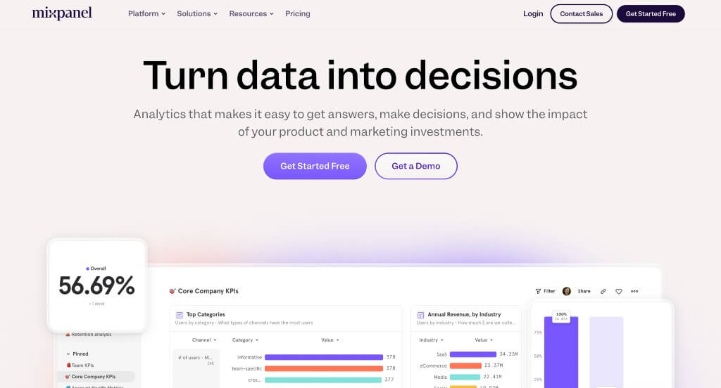
The desktop website for Mixpanel serves as a premier benchmark for “Enterprise Data Analytics Merchandising and High-Conversion Product-Led Growth (PLG) Architecture.” As a global leader in event-based user tracking, Mixpanel’s digital presence must prove that complex behavioral data can be translated into instant, actionable business insights. The desktop layout masterfully achieves this by matching comprehensive product tier breakdowns with deep social proof, transforming technical analytical concepts into a highly accessible, data-driven value proposition.
Key Design Highlights:
- Real-Time Live Chat Gateway Platform: To immediately capture high-intent enterprise buyers and address procurement or technical questions on the spot, the homepage features a direct Live Chat interface. This easily accessible support channel lowers the barrier to entry, allowing corporate teams to instantly engage with product experts and speed up their evaluation process.
- Structured Capabilities and Product Ecosystem Blueprint: The homepage serves as a highly organized directory that clearly details Mixpanel’s core offerings. By explicitly mapping out specialized tracks – such as Product Analytics, Web Analytics, and advanced Metric Trees – the layout ensures that product managers, data scientists, and growth marketers can rapidly confirm the platform matches their technical data goals.
- Dedicated “Why Teams Choose Mixpanel” Advantage Hub: Highlighting their unique competitive edge in a crowded market, a tailored value-proposition section breaks down exactly what makes the platform stand out. This section shifts away from standard feature listings to focus on core operational wins, such as lightning-fast query speeds, flexible data stack integrations, and intuitive reporting, directly addressing the common pain points of modern product squads.
- Rich Peer-Validation Showrooms with Integrated Case Study Gateways: To completely neutralize enterprise purchasing skepticism, the client testimonial section goes far beyond basic text quotes. The homepage features verified customer reviews from top-tier brands, seamlessly attaching direct links to deep-dive case studies so corporate decision-makers can instantly review real-world ROI metrics, data strategies, and implementation successes.
12. PandaDoc
Why We Chose PandaDoc
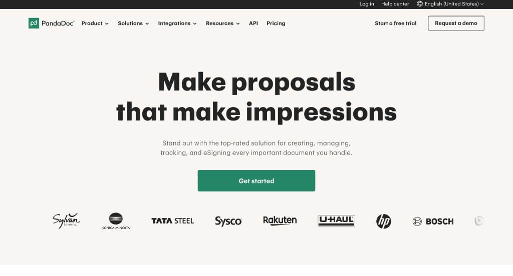
The desktop website for PandaDoc serves as a premier benchmark for “High-Velocity Transactional SaaS Merchandising and Trust-Centric Document Automation Architecture.” As a leading platform for digital signatures, workflow automation, and contract management, their digital storefront must rapidly balance two critical priorities: demonstrating extreme ease of use while projecting absolute, bank-grade document security. The desktop interface masterfully handles this by backing up smooth, visual product walkthroughs with hard compliance metrics and data-driven client proof.
Key Design Highlights:
- Immediate In-Action Product Walkthrough Video: Positioned strategically directly below the primary hero area, the layout embeds a sleek video module showing the software in action. This high-impact visual instantly breaks down the platform’s core interface mechanics, allowing desktop visitors to immediately see how effortlessly teams can create, send, and track documents without forcing them to read through heavy paragraphs or setup documentation.
- Scenario-Driven Interactive Tabbed Feature Matrix: To showcase its deep versatility across different business functions, the homepage integrates an interactive tabbed control section. Desktop users can seamlessly click through various operational scenarios – such as sales proposals, legal contracts, or HR onboarding – instantly updating the interface to show exactly how the software adapts to solve that specific corporate workflow.
- Rigorous Front-Page Security and Compliance Showcase: Recognizing that document automation handles highly sensitive corporate and legal data, the homepage dedicates a prominent, high-trust section entirely to security architecture. By clearly laying out their compliance frameworks, encryption standards, and legally binding e-signature protocols, the platform directly addresses enterprise security questions early in the evaluation process.
- Data-Driven Social Proof with Integrated Customer Impact Metrics: Elevating traditional client feedback into a powerful business case, the homepage features a premium client testimonial spotlight. Rather than just listing a standard text quote, this module combines a high-quality image of the customer with concrete, measurable success metrics – explicitly showing real savings in time, administrative overhead, and contract turnaround speeds.
13. WeHype
Why We Chose Wehype
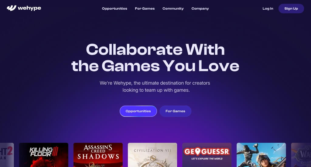
The desktop website for Wehype serves as a premier benchmark for “Influencer Marketing Merchandising and High-Conversion Creator-Economy Architecture.” As a leading platform connecting global gaming brands with premier content creators, their digital storefront must rapidly communicate two core ideas: massive market reach and data-driven campaign performance. The desktop interface masterfully handles this by cleanly explaining their corporate utility alongside friction-free product hooks and hard real-world metrics.
Key Design Highlights:
- Transparent Strategic Value Blueprinting: The homepage serves as an explicit operational map that leaves zero doubt about exactly how Wehype manages campaigns. It breaks down the entire influencer pipeline directly on the landing page, showing desktop brand managers how the platform automates creator discovery, coordinates sponsorships, tracks live data, and optimizes payouts to ensure transparent campaign execution.
- Friction-Free “Free Analytics Tool” Value Hook: A brilliant product-led growth (PLG) conversion tactic embedded directly on the homepage is the promotion of their free analytics software tier. By offering an immediate, high-value tool that lets marketing teams audit and track gaming content performance without an upfront cost, the platform captures high-intent enterprise leads right away and builds immense technical trust.
- Authentic Social Proof and Peer Review Showrooms: Overcoming the skepticism often associated with influencer ROI is gracefully handled by embedding actual client reviews directly into the primary homepage scroll path. Highlighting verified feedback from modern gaming companies and global brands builds immediate platform credibility and provides the explicit peer validation needed to convert visiting marketers into users.
- Data-Driven Featured Case Study Showrooms: To completely cement their execution authority, the homepage features a curated showcase of real-world marketing triumphs. These case studies highlight elite client partnerships with concrete campaign statistics – such as total views generated, acquisition costs lowered, and click-through rates achieved – proving their structural capability to turn creator sponsorships into measurable business growth.
14. Intercom
Why We Chose Intercom
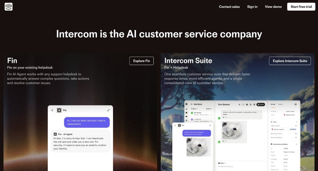
The desktop website for Intercom serves as a premier benchmark for “AI-First Customer Support Merchandising and High-Conversion Omnichannel B2B Architecture.” As a global leader in customer service software and automated support infrastructure, Intercom’s digital presence must immediately practice what it preaches. The desktop layout perfectly demonstrates this by prioritizing immediate, live product accessibility and structured capability maps, showing enterprise operations leaders how to scale support without sacrificing user experience.
Key Design Highlights:
- Omnipresent Real-Time Live Chat Gateway: As the pioneer of the modern customer messaging bubble, Intercom prominently features its own live chat platform on the homepage. This interactive engagement terminal serves as both a direct lead-generation channel for visiting buyers and a live, hands-on demonstration of their ticketing and automated bot workflows in a real-world scenario.
- Feature-Mapped Multi-Tab Product Showrooms: Positioned strategically directly below the primary hero area, the website integrates a highly intuitive, tabbed navigation framework. Desktop visitors can seamlessly click through distinct product pillars – such as their AI agent capabilities, help desk ticketing workspace, and proactive support tools – instantly updating the visual workspace to show high-fidelity screenshots of the platform in action.
- Comprehensive Multi-Column Enterprise Mega Menu: Managing an expansive corporate feature footprint – spanning specialized AI tools, support platforms, app integrations, and developer documentation – is gracefully executed via a sophisticated desktop mega menu. Hovering over top-level navigation elements triggers a spacious drop-down panel that maps out options by business role, use case, and resource category into clean, scannable blocks.
- Elevated Peer Social Proof and Review Showrooms: Overcoming software adoption skepticism is handled smoothly by embedding verified client reviews directly within the main homepage scroll path. Showcasing success stories and efficiency metrics from prominent global brands gives prospective buyers the definitive peer validation required to trust Intercom with their entire customer support ecosystem.
15. B4E Vault
Why We Chose B4E Vault
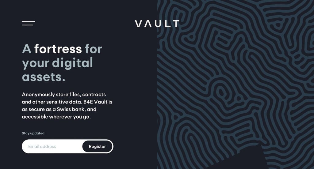
The digital storefront for B4E Vault serves as a premier benchmark for “Ultra-Secure Cyber-Hardware Merchandising and High-Impact Minimalist Interface Architecture.” In a landscape dominated by generic, always-online cloud storage alternatives, B4E faces the unique challenge of selling high-end, disconnected cold-storage server solutions. The interface expertly solves this by trading cluttered, text-heavy landing pages for a striking, motion-driven visual narrative that treats digital file protection with extreme technical gravity.
Key Design Highlights:
- Compact, High-Efficiency Minimalist Hamburger Navigation: To preserve the site’s stark, premium look and prevent structural clutter across wide monitor layouts, the desktop header ditches an oversized navigation grid in favor of a sleek, tiny desktop hamburger menu. This intentional choice keeps the visual canvas completely uncluttered, hiding deep-site directories and settings until a user intentionally triggers the clean overlay panel.
- Cinematic, Loop-Optimized Product Overview Walkthroughs: Positioned directly within the primary scroll path, the homepage incorporates a high-fidelity video module that provides a flawless visual representation of their core software ecosystem. By mapping out exactly how the platform awakens, manages secure file transfers, and returns to cold-storage status, the video effortlessly translates complex cryptographic architecture into an intuitive user journey.
- Fluid Scroll-Driven Parallax and Depth Engineering: Moving away from standard row-by-row layouts, the homepage utilizes sophisticated, multi-layered parallax effects as users descend the page. Layers of text and striking product graphics glide at independent speeds over deep background textures, creating an engaging sense of dimensional depth that mirrors the highly secure, multi-layered architecture of the underlying physical storage technology.
- Pristine, Lightweight Mobile Scroll Optimization: Translating an advanced hardware-software narrative to handheld devices can easily result in stuttering motion or awkward text truncation, but B4E’s mobile interface is exceptionally clean and fluid to navigate. By removing heavy visual components, adjusting font scales dynamically, and preserving a logical vertical stacking rhythm, the platform guarantees a frictionless research path for users on any screen size.
WordPress Tech and IT Themes
You can find free themes at wordpress.org, or explore IT-inspired templates on ThemeForest.
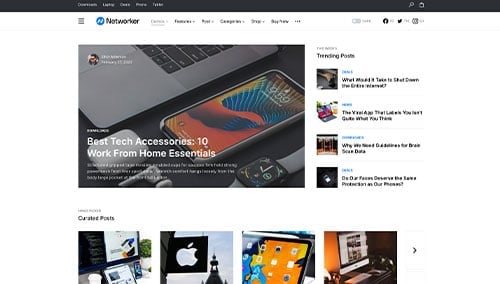
Networker – Themeforest
$69
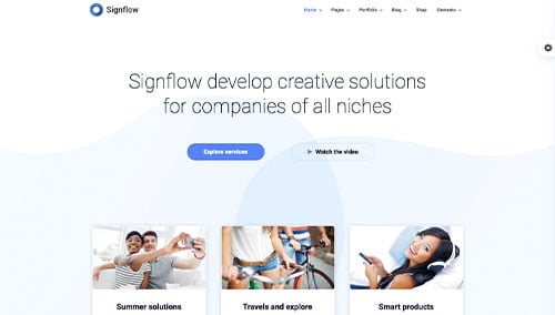
Signflow – Themeforest
$49
WooCommerce Tech and IT Themes
You’ll find a wide selection of ecommerce IT themes for WooCommerce on ThemeForest.
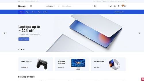
Gizmos – Themeforest
$89
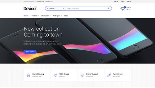
Devicer – Themeforest
$59
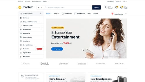
Machic – Themeforest
$39
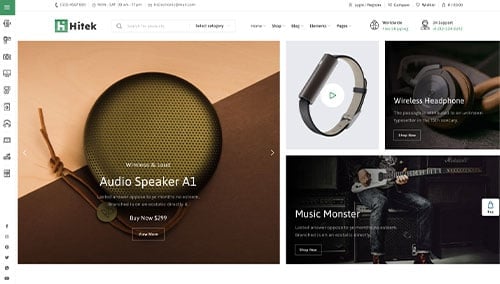
Hitek – Themeforest
$48
Shopify Tech and IT Themes
Shopify IT Themes: Explore free and paid themes at themes.shopify.com, or consider options available on marketplaces like ThemeForest.
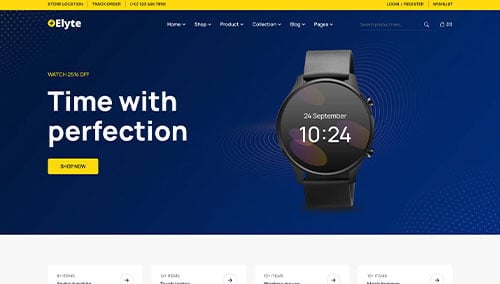
Electrolyte – Themeforest
$59
Electro – Themeforest
$89