In the mental health profession, your website is the digital doorway to your practice and the first point of contact for someone seeking support. Before a client ever reaches out, they use your online presence to evaluate your clinical approach, your professional warmth, and the safety of your environment. To succeed in 2026, a therapist’s website must master the delicate balance between empathetic branding and a frictionless path to care.
Our design and UX team evaluated hundreds of mental health websites – from boutique private practices and specialized child and family clinics to large-scale tele-therapy platforms and group practices. We identified the top examples that excel in human-centric design, specifically analyzing their navigational clarity, provider credential transparency, and the use of calming, high-end visual hierarchies.
Whether you are a solo practitioner building a niche brand or managing a multi-specialty counseling center, these examples represent the current benchmark for therapy web design in 2026.
Note on Our Selection Process: We recently audited this guide to remove outdated designs and sites that no longer meet our performance standards.
Top Therapy Website Designs
1. Everbe Therapy
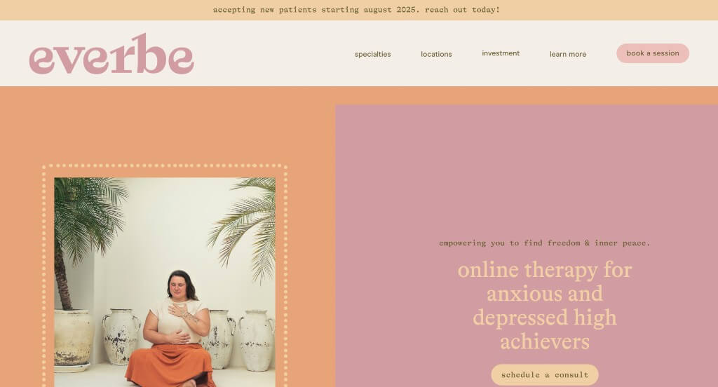
This one grabbed our attention right away because of their colors that are unique for this type of company. These image frames were dainty, but special which helped them as a company stand out more. They still balanced images, text and whitespace well which was something that we appreciated. This domain matched with their name which was smart.
2. Talkspace
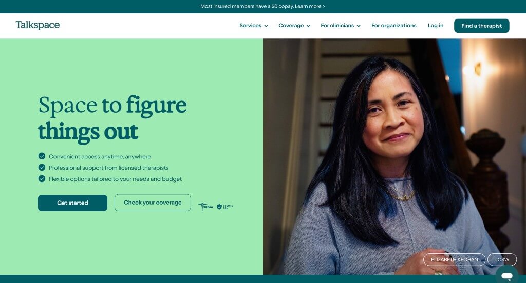
We chose Talkspace because of their color palette that makes good use of pastel colors while still maintaining a clean look. We loved their interactive graphics and buttons that help display lots of information. A FAQ area was added in which we felt was really helpful to clear up common confusion.
3. Rehab Dynamics Physical Therapy
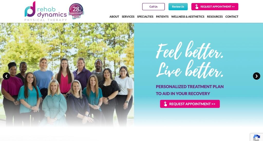
Bright colors help every area pop, and helps certain information stand out more. A simple logo can be noticed that makes use of a lowercase r and d. Additionally, that same logo can be seen in multiple places used as a bullet point. We loved how their navigation bar had lots of drop downs to organize everything.
4. doxy.me
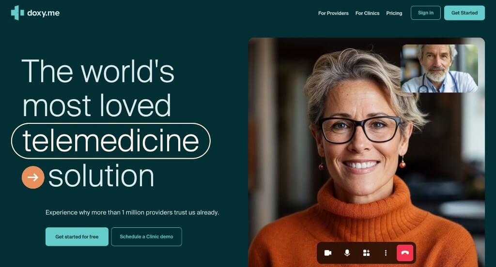
We felt that this company did a great job using graphics looking like phones and including screenshots for an interesting look. Overlapping images also added to their visual appeal. Something that stood out to us was their continuous counter that shows minutes of service provided through them. Buttons are used well to make sure clients can find lots of information that’s needed.
5. 7 Cups
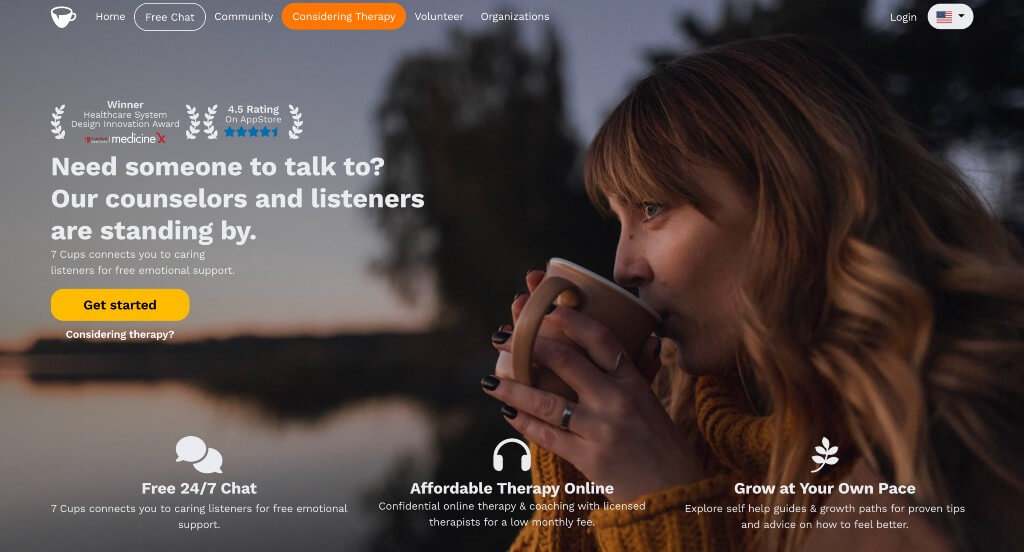
Images within this one tend to go along with nature and all of its beauty. We liked how they included awards they have won along with a rating from Trustpilot and the AppStore. A simple but practical font was a great touch. As for organization, they used bullet points, buttons, and numbered lists to make everything easier to see.
6. Mary DiOrio Psychotherapy
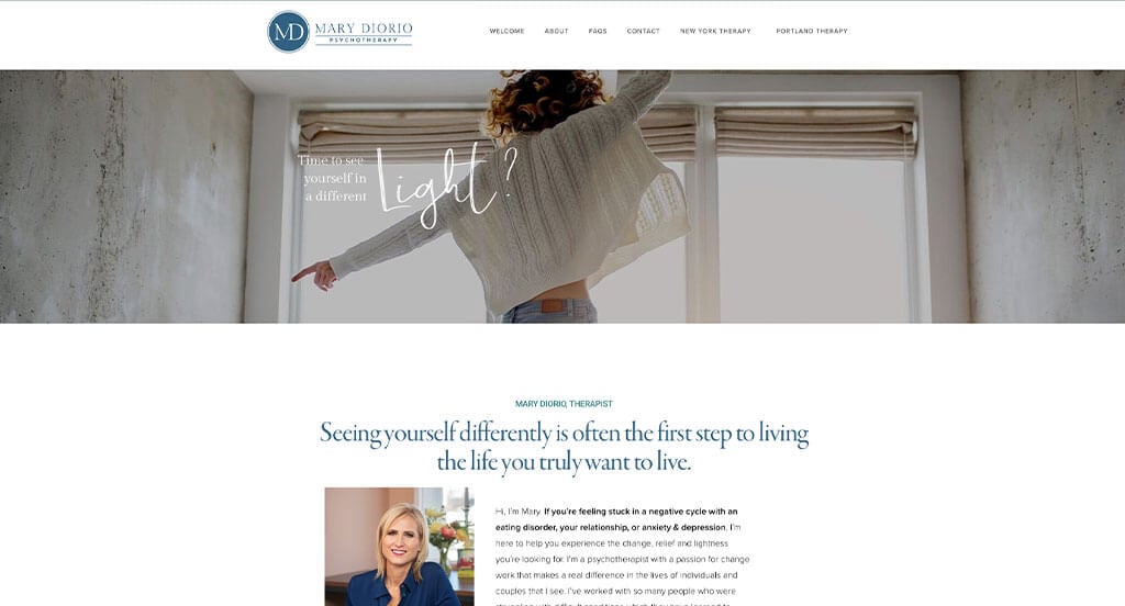
Here’s a great webpage that utilizes thin, professional fonts that appear to make everything feel “lighter”. Along with these fonts, they have decorative fonts for many of the words that they want to accent more. Additionally, imagery is uses lots of white for a cleaner, happier look. A clearly labeled menu was also very helpful for customers to find what is needed. We really loved how a page was dedicated to FAQ, so all of these can be found in one spot.
7. Thriveworks Counseling
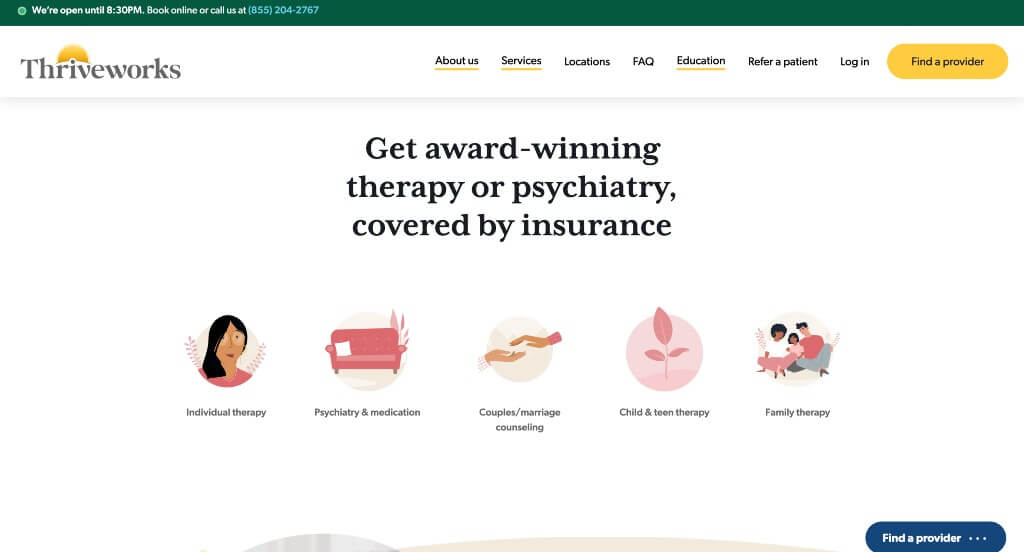
While their color scheme is “all over the place”, it is still uniform and somehow works. Many of their icons started out pink and upon hover were blooming with green, which was beautiful. Their photo frames were another reason that we loved this one. They included lots of their awards to help build up trust with their customers which is always nice. Allowing for people to click on a state and see offerings for them was brilliant.
8. Cypher Mental Health
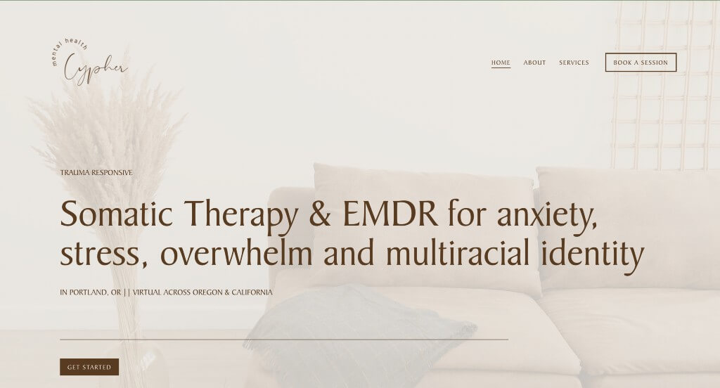
Here we have an example that is aesthetically pleasing. We loved their images that were not only high quality, but they matched well with their overall feel. Their paragraphs were a little lengthier, but they were straightforward which made the information more engaging. Fonts were simple and professional which fits perfectly with their webpage.
9. Brent LoCaste-Wilken
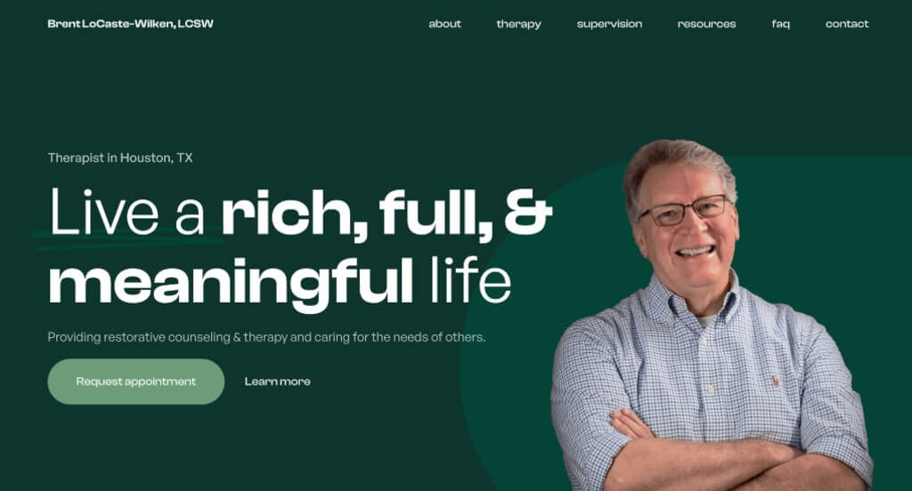
We absolutely loved this color scheme that was relaxing and professional. We loved their font choice because it was bold but never took away from their website. Adding in some statistics was another helpful addition because it helps make them feel more reliable as a company. Using interesting photo frames was something else that we noticed.
WordPress Therapy Themes
You can find free themes at wordpress.org, or consider therapy-inspired templates on ThemeForest.
Celeste – Themeforest
$69
Wellmont – Themeforest
$79
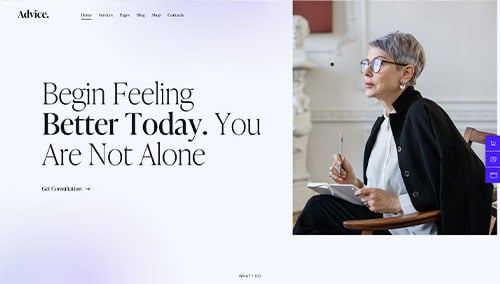
Advice – Themeforest
$69
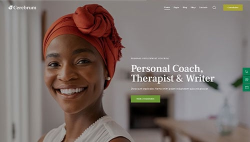
Cerebrum – Themeforest
$69