In the high-velocity travel market of 2026, a travel agency’s website has transitioned from a simple booking engine into an immersive digital concierge and inspiration ecosystem. For luxury tour operators and boutique agencies, an online presence must achieve a masterful balance: projecting the transformative “soul” of a destination while offering frictionless, AI-enhanced planning workflows. To thrive in today’s experience-driven economy, your design must move beyond generic stock galleries to embrace “Anticipatory Exploration,” using immersive video, organic layouts, and personalized itinerary builders to convert “dreamers” into “bookers” with absolute clarity.
Our team evaluated hundreds of travel platforms – ranging from global expedition leaders and luxury safari specialists to niche eco-tourism curators and AI-driven concierge services. We narrowed the field to the top 13 examples that represent the gold standard for the industry. Our analysis focused specifically on “Cinematic Conversion” architecture, interactive day-by-day itinerary blocks, and the strategic integration of sustainability transparency and real-time availability APIs that eliminate planning friction while building deep institutional trust.
Whether you are a boutique agency looking to establish a high-end niche or a global operator modernizing your enterprise digital experience, these examples provide the definitive benchmark for travel agency web design in 2026.
Note on Our Selection Process: We recently reviewed this list to ensure every featured site demonstrates a clear commitment to modern standards for mobile-first “First-Screen Clarity,” ultra-fast page load velocity, and inclusive accessibility. This curated collection focuses on travel websites that prioritize visual storytelling and logistical precision, providing the most strategic value to both the agency and the modern traveler in 2026.
Top Travel Agent Website Designs
1. Context Travel
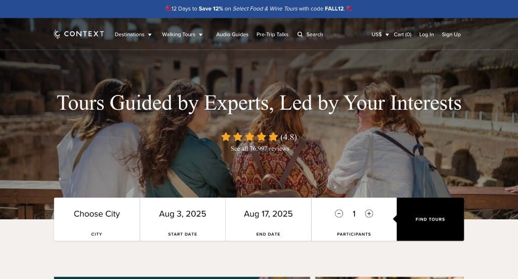
Right away, we noticed their simple logo design shaped like a globe. Reusing this logo in many areas was something else that we thought was smart. Their simple booking feature including city, date and number of participants was an aspect we couldn’t ignore. The logical structure for the content was another perfected quality of Context Travel. Be sure to consider this unique design when developing your next website.
2. With Locals
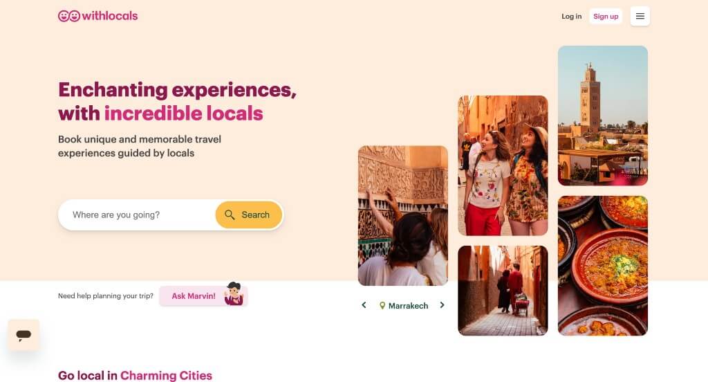
First off, the pink, yellow and peach color scheme used in this site stood out to us because of the warm exciting feel that comes with it. We thought the arrangement for their images helped created a stunning template. We thought that their logo design was cool because it included the aspect of people along with an infinity symbol. Including a search bar was another feature that all customers love.
3. Thrillophilia
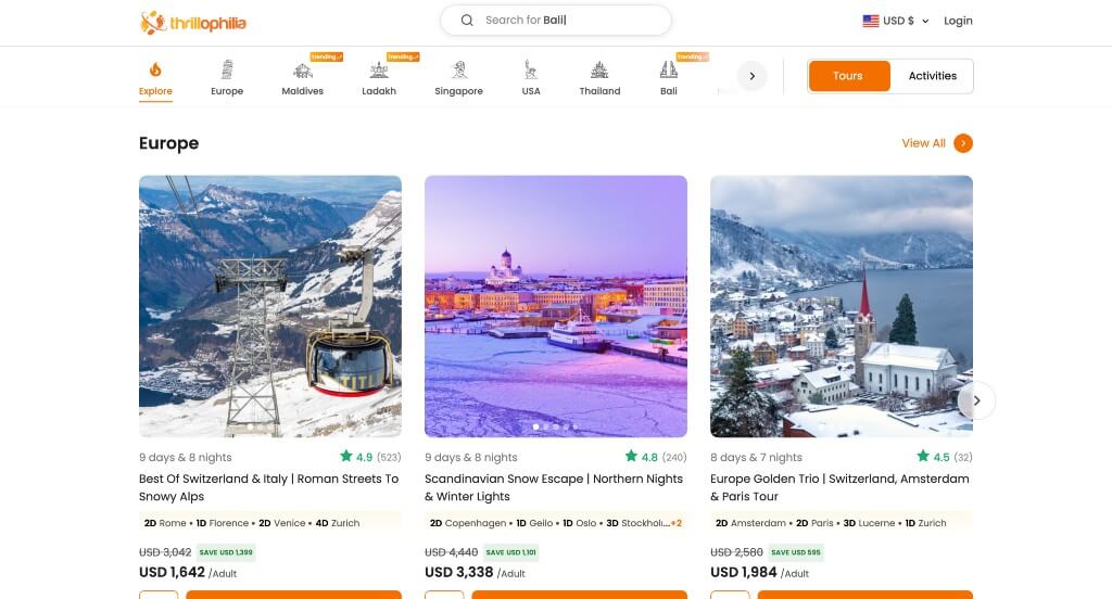
First off, we loved how Thrillophilia used small creative graphics in different areas. Another thing that really made this example better was their logical flow to all their information. Using bright orange as an accent color was smart because it highlighted important information. Their high quality visuals of different destinations was an obvious choice, but still noticed. We also thought it was cool to include star ratings to help comfort clients.
4. Travel Pirates
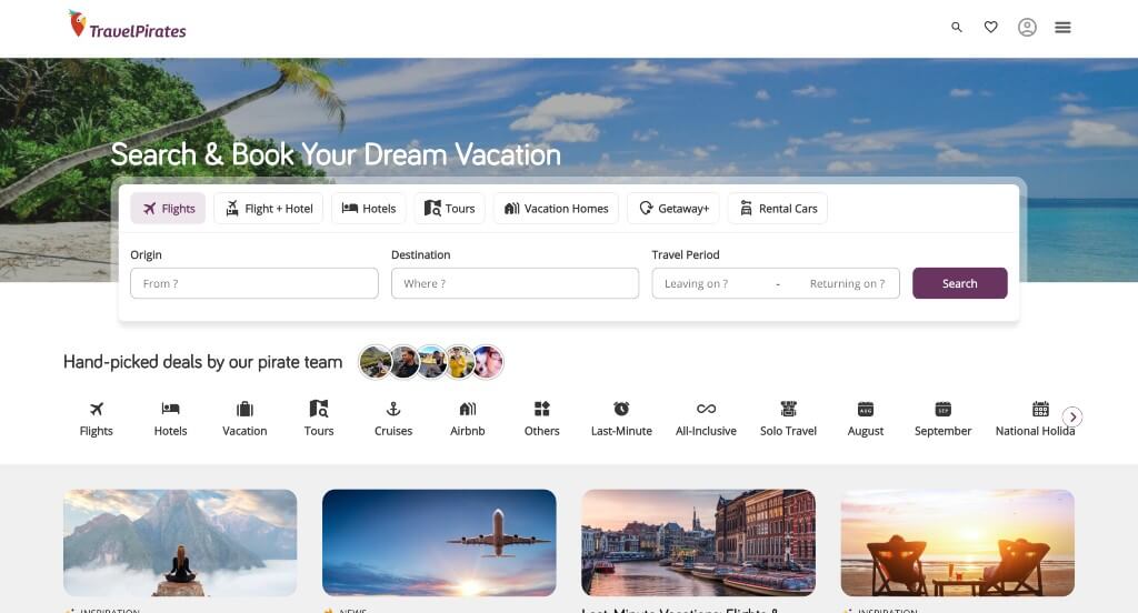
We appreciated how Travel Pirates used white, purple and black to create their custom web design layout. Of all the professional sites we reviewed, one of the features that helped them stand out was their simple graphics and clever logo. Allowing customers to heart certain trips was another feature we enjoyed. From a marketing perspective, we really liked the way a simple layout was utilized.
5. Get Your Guide
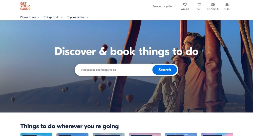
We loved how Get Your Guide used a layout looking like blog posts. It was nice to share “originals” and a favorite button. Our team liked the basic white, dark blue and orange color scheme because it allows for an interesting look focused on the photos. It was smart to highlight the monumental cultural sites. The ability to write and read reviews is another quality of this custom travel experience site we enjoyed. If you are working on creating designs for your travel website, don’t miss out on this one-of-a-kind example!
6. Global Work & Travel
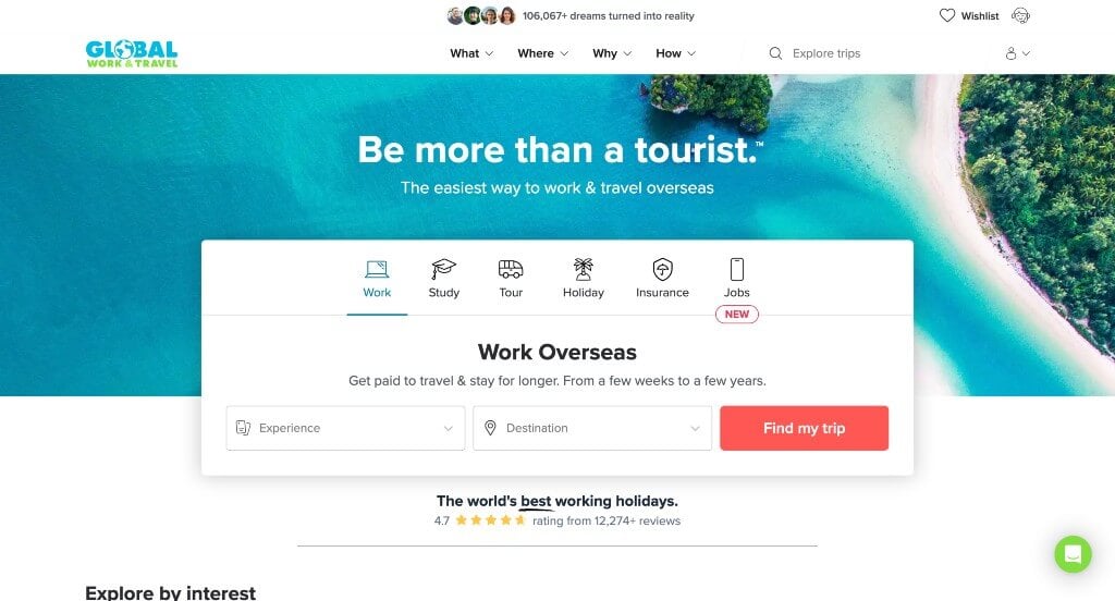
Global Work & Travel ranked because it’s one of the nicer travel agency websites we reviewed. We loved how lots of tropical images were included to show that they are a travel agency. Another quality we liked was their customized content based on age, destination and time traveling. The quality information spread throughout was a unique choice for a custom travel business. From a marketing viewpoint, we really liked the way this travel agency website utilized simple navigation.
7. Tours4fun
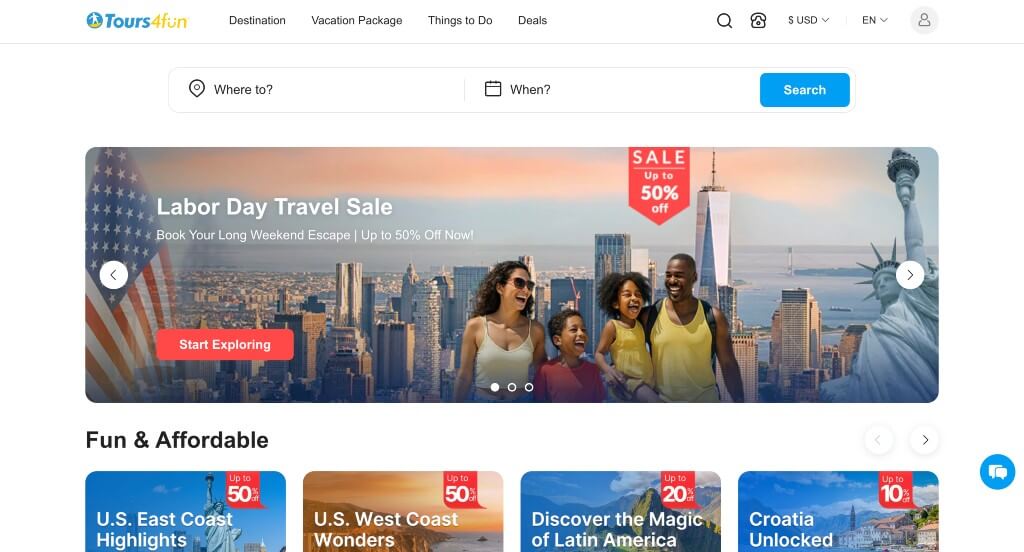
Visuals such as images and videos were definitely the features that stood out most in this example. We also liked how videos are used as backdrops in different areas. Including banners to show their deals was another option that we thought was cool. The email list pop-up to save money and learn about exclusive offers was another great option for this company. We also really loved their use of buttons to help navigate through all of their information. Showing a section for last minute details that displays the original and slashed price along with a timer for the offer ending. Additionally, we loved their use of balanced white space that keeps everything looking sharp.
8. Cox & Kings
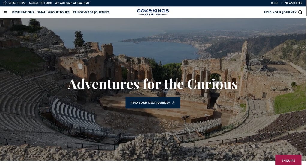
It was amazing to use Trustpilot rating to help customers gain trust with their business. Their high quality visuals of a variety of locations was another choice we couldn’t ignore. Their bold, professional lettering helped their overall design look appealing. Sharing a vacation guide based on the month is a creative idea that any customer would enjoy. We also noticed how they included a short informational blog. As you scroll through the homepage, one of the qualities you’ll notice is their short and straightforward paragraphs. Another feature in this clean site is how they’ve separate sections depending on how many travelers there are.
9. Abercrombie & Kent
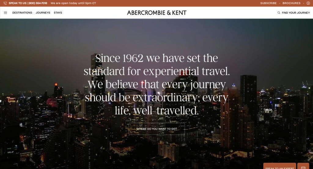
We love how this business makes use of videos for their backgrounds to make it look better. A variety of images from different locations and cultures is always a good idea for a company like this one. As you scroll through, one of the qualities you’ll notice right away is their large font revealing the travel agents contact information. Multiple fonts are also used to help emphasize titles so customers can skim easier. Abercrombie & Kent had website accessibility in mind when designing the eChat Consultant for their website.
10. Black Tomato
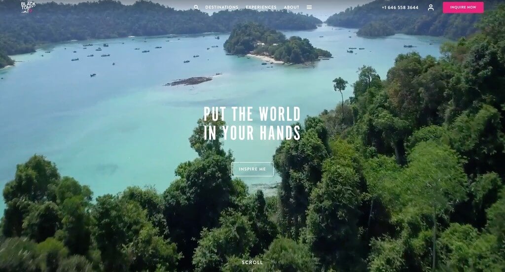
Large images are an essential part of this design. But that didn’t distract us from their their black and white color scheme with an accent of bright pink. Another feature we liked about this custom design is their well labeled navigation bar that included a search bar. Allowing for their domain to match their business name was something else that was helpful. We also thought it was cool to include reviews from popular businesses. They clearly had ease of use in mind when designing the simple navigation for their website.
Related: Launch a paid advertising campaign to start getting leads and inquiries for your travel agency.
11. TrueTrips
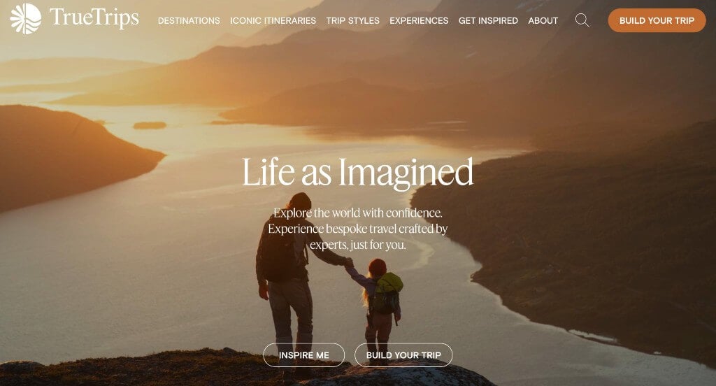
The first thing that we really liked about this design was their survey that allowed customers to design their perfect vacation. We loved how they had different sections for different vacation outcomes like family, romance, friends, single traveler, pride, culture & heritage, culinary, sea & sun, religion, and health & wellness. Additionally, orange and tan was used as a color scheme, which we loved because it seemed exciting. Their logo design utilized the sun and the sea which are big symbols of travel for most people. They had website usability in mind when creating their simple navigation for this website.
12. Lonely Planet
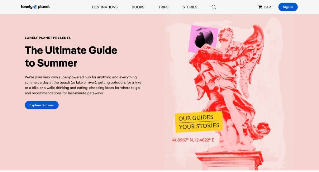
Here’s another example to serve as inspiration for your upcoming web pages! Our web designers really liked Lonely Planet because of their thoughtful blocks that help break up all of their content. We loved their inclusion of buttons and tags showing popular destinations. Another design quality that you can’t ignore is their innovative logo. Utilizing the L and the P from their name to create “land” on the earth was a cool idea. Additionally, it was smart to have a domain that matches their company name.
13. Milk + Honey Travel
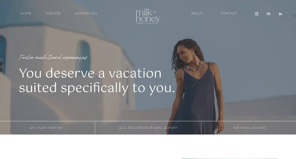
This example was very thoughtful because of the interesting organization throughout their webpage. This navigation bar was well labeled making it very easy to find information. Seeing images overlapped within their pages created a more unique look which we appreciated. Including an introduction for the travel agent was another way to help build trust with this business.